


Accessibility has moved from a specialist concern to a baseline expectation: the European Accessibility Act now applies to private companies selling in the EU, and WCAG 2.2 is the version new guidance references. Teams that treat it as a final audit pay twice, once in rework and once in users who never return. Accessibility is cheapest as a design decision and most expensive as a legal finding.
In this glossary topic:
What is accessibility in digital design?
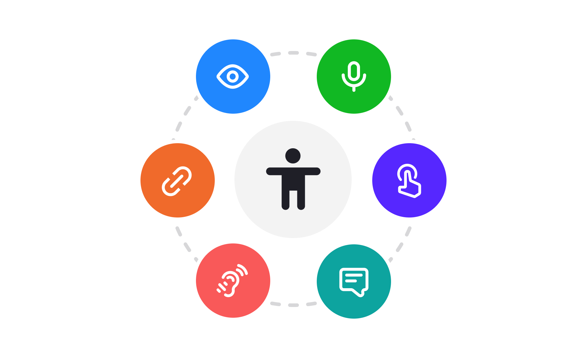
Accessibility is the practice of building digital products that can be used by the widest possible range of people, including those with disabilities. It encompasses the visual, auditory, motor, and cognitive dimensions of how people interact with interfaces and addresses the barriers that arise when products are designed without accounting for these differences.
Approximately 1 in 6 people globally has some form of disability[1], which means inaccessible products exclude a significant portion of any potential user base. But accessibility's benefits extend beyond users with identified disabilities. High contrast between text and background helps everyone reading on a bright screen or a low-quality display. Keyboard navigability helps power users who prefer keyboard-driven workflows alongside screen reader users. Captions help users in noisy environments alongside users with hearing impairments. Designing for accessibility consistently produces interfaces that work better for a broader range of people and contexts.
In many jurisdictions, accessibility is also a legal requirement. The Americans with Disabilities Act (ADA) in the United States, the European Accessibility Act in the EU, Section 508 of the Rehabilitation Act for U.S. government procurement, and equivalent frameworks in other countries establish legal obligations for digital accessibility. Non-compliance carries legal risk and, more fundamentally, represents a failure to serve users who have a right to equal access.
What are the main categories of disability that accessibility addresses?
Accessibility work is organized around the types of differences it needs to accommodate, each of which requires different design and implementation considerations.
- Visual impairments span a wide range: from total blindness, which typically relies on screen readers to access digital content, to low vision, which may use screen magnification, high contrast settings, or large type sizes, to color blindness, which affects how colors are perceived. Design decisions about color contrast, the use of color to convey meaning, text size, and the quality of alt text for images all affect how well a product serves users with visual impairments.
- Auditory impairments affect users who are deaf or hard of hearing. Content communicated through audio, including video, audio players, and alert sounds, requires text alternatives: captions for video, transcripts for audio, and text notifications alongside sound alerts.
- Motor impairments affect how users physically interact with devices. Users with limited hand mobility may rely on keyboard navigation alone rather than using a mouse or touchscreen. Users with tremors may have difficulty with small touch targets or rapid interactions. The primary technical requirements are keyboard accessibility (all functionality reachable and operable without a pointer) and adequate touch target sizes on mobile.
- Cognitive and neurological differences include conditions like dyslexia, ADHD, autism, and memory-related impairments. These are addressed through plain language, clear and consistent navigation, logical content structure, the ability to control timing of interactions, and avoiding content that creates sensory overwhelm (like rapidly flashing animations or high-density interfaces).
What are the WCAG standards?
The Web Content Accessibility Guidelines (WCAG), developed by the W3C's Web Accessibility Initiative, are the primary international standard for digital accessibility. They provide testable criteria organized around four principles, often abbreviated POUR.
- Perceivable means that all information and interface components must be presentable in ways users can perceive. This includes providing text alternatives for non-text content (alt text for images, captions for video), ensuring content doesn't rely solely on sensory characteristics like color or sound, and meeting minimum color contrast ratios.
- Operable means that all interface components and navigation must be operable. The most critical requirement is that all functionality is accessible through keyboard navigation alone. This also includes giving users enough time to read and interact with content, avoiding content that causes seizures (Three Flashes rule), and ensuring users can navigate, find content, and determine where they are.
- Understandable means that information and interface operation must be understandable. Text must be readable. Content must behave predictably. Error messages must help users understand what went wrong and how to fix it.
- Robust means that content must be robust enough to be reliably interpreted by a wide variety of user agents, including current and future assistive technologies. The primary requirement is valid, well-formed markup that assistive technologies can parse correctly.
- WCAG is organized into 3 conformance levels. Level A covers the most basic requirements without which some users are completely blocked. Level AA covers the standard that most organizations target for compliance; it addresses the most significant barriers. Level AAA covers additional enhancements that may not be achievable for all content.
What does accessibility look like in practice?
Color contrast is the accessibility requirement most teams meet first, because it is visible in the design file before any code exists. The WCAG contrast ratio turns a judgment call about readability into a number anyone on the team can check, and the threshold depends on type size: normal-sized text, anything under 18pt regular or under 14pt bold, needs 4.5:1 at Level AA, while large text needs 3:1.
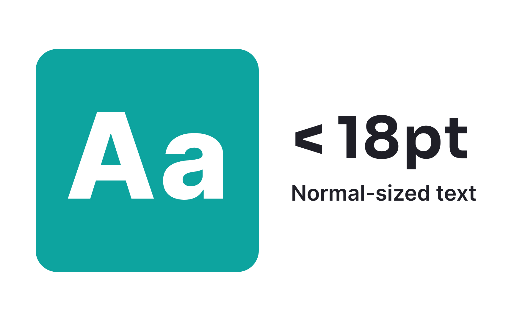
The size boundary WCAG draws before it asks for a ratio: text under 18pt regular, or under 14pt bold, counts as normal-sized and needs the stricter 4.5:1 contrast against its background. From the lesson Color Accessibility.
How is accessibility built into the design process?
The most common and most expensive accessibility failure is treating it as a late-stage retrofit: auditing for accessibility problems after a product is built and engineering fixes to address them. Accessibility requirements discovered and addressed in design are significantly cheaper to implement than ones discovered after development.
In the design phase, accessibility decisions include color selection (ensuring palette meets WCAG contrast ratios), component design (ensuring all interactive states are clearly distinguishable, that touch targets meet minimum sizes, and that components communicate their purpose through more than color alone), and typography (font sizes, line heights, and spacing that support readability at multiple text sizes).
In handoff, accessibility annotations specify the programmatic requirements that aren't visible in the visual design: accessible names for icon buttons, ARIA roles for custom components, reading order for screen reader users, and keyboard interaction patterns.
In development, WCAG criteria are incorporated into the definition of done. Automated tools like Axe and Lighthouse catch approximately 30% of accessibility issues during development. Manual testing with keyboard navigation and screen readers identifies the issues automated tools miss.
User testing with participants who have disabilities produces the most direct evidence of whether a product actually works. Automated audits and expert review tell teams about violations; user testing tells them about experience.


