

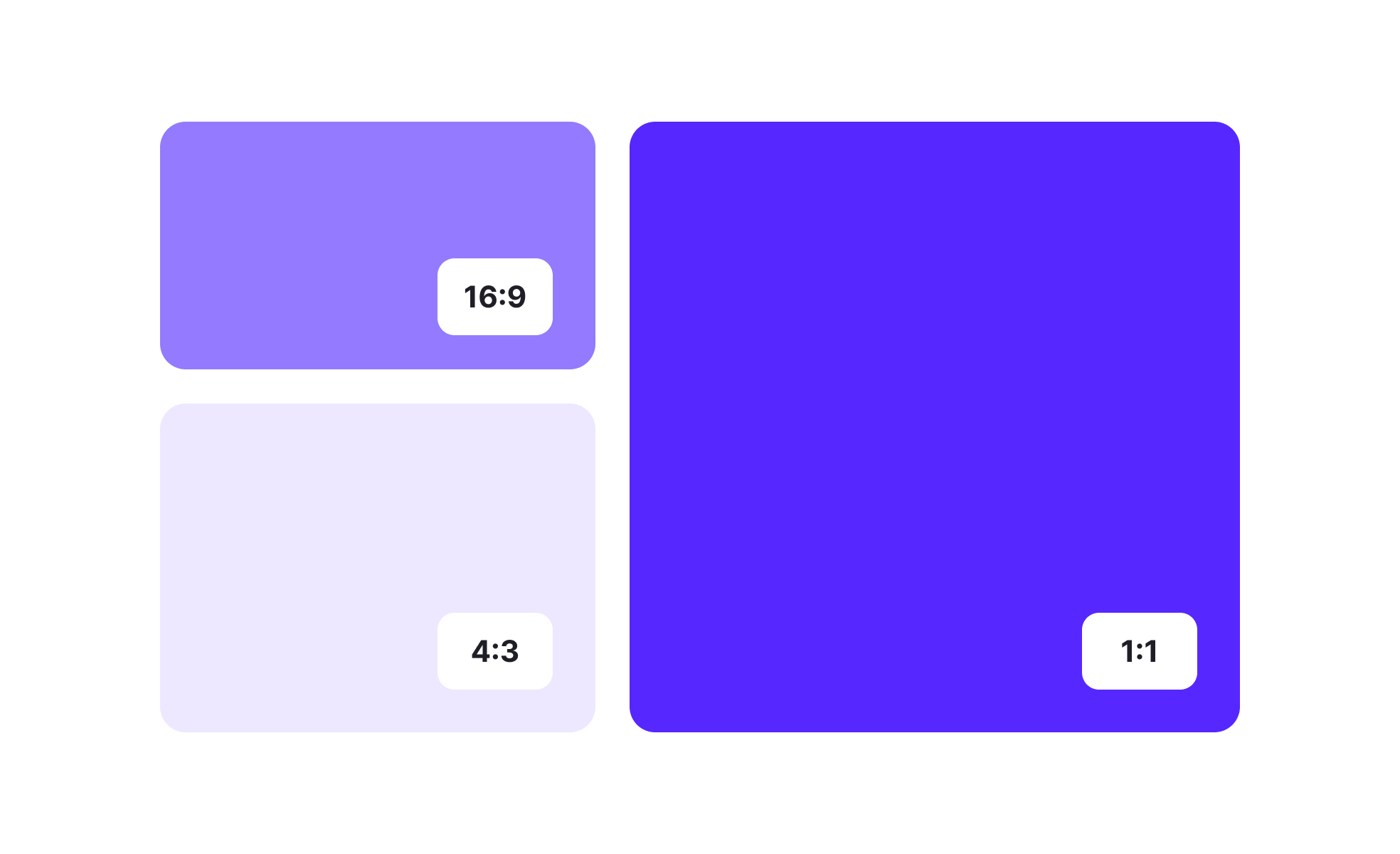
Aspect ratio defines the relationship between the width and height of an element, typically expressed as two numbers separated by a colon, such as 16:9 or 4:3. This proportion determines how visuals are framed, displayed, and interpreted across mediums. Whether designing a screen interface, a printed poster, or a product mockup, aspect ratio affects both functionality and aesthetics.
In UX/UI design, aspect ratio ensures consistency across devices. A video designed for a 16:9 widescreen format may look distorted on a mobile screen if not adapted correctly. Designers rely on responsive layouts that preserve proportions, preventing images from stretching or compressing. This attention to ratio supports clarity, usability, and accessibility across platforms.
Real-world examples highlight the importance of aspect ratio. Instagram initially limited uploads to a 1:1 square format, which shaped the platform’s distinct aesthetic. Over time, it introduced 4:5 and 16:9 options to match user demand for flexibility. Similarly, the film industry shifted from 4:3 television standards to widescreen 16:9, reshaping how audiences experienced visual storytelling.
Aspect ratio also plays a role in accessibility. Poorly handled ratios can result in cropped or distorted content, which confuses users and excludes those relying on assistive technology. By preserving consistent ratios, designers ensure that text overlays, captions, and key visual information remain intact.
Typography and layout choices can also reflect aspect ratio decisions. A poster may be designed for A-series paper sizes like A4 or A3, each with a fixed ratio. Consistency across formats maintains balance and ensures that branding elements remain recognizable whether displayed digitally or in print.
Developers often address aspect ratio with CSS properties like object-fit or responsive frameworks that adjust containers automatically. This technical layer works alongside design principles to ensure that ratios are preserved dynamically. By combining thoughtful design with precise development, teams deliver seamless experiences across screens.
Learn more about this from the Aspect ratio Exercise, within the Intro to Design Layouts Lesson, a part of the UX Design Foundations Course.
Key Takeaways
- Aspect ratio defines the width-to-height relationship of content.
- Preserves balance and prevents distortion across devices.
- Shapes platform identity, as seen with Instagram and widescreen video.
- Supports accessibility by protecting visual clarity and overlays.
- Requires coordination between design and development for responsiveness.


