Recommended resources
Courses
UX Design Foundations
Design Terminology
UI Components I
Color Psychology
Common Design Patterns
Accessibility Foundations
Wireframing
UI Components II
UX Writing
Design Composition
Mobile Design
Typography
UX Design Patterns with Checklist Design
HTML Foundations
Enhancing UX Workflow with AI
CSS Foundations
Introduction to Figma
3D Design Foundations
Information Architecture
Apple Human Interface Guidelines
Introduction to Design Audits
Lessons
Exercises
Projects

Ghost in the kitchen

TRADE.ly

Banking SaaS website landing page💸.

Celebrate Love in Every Color
FAQs
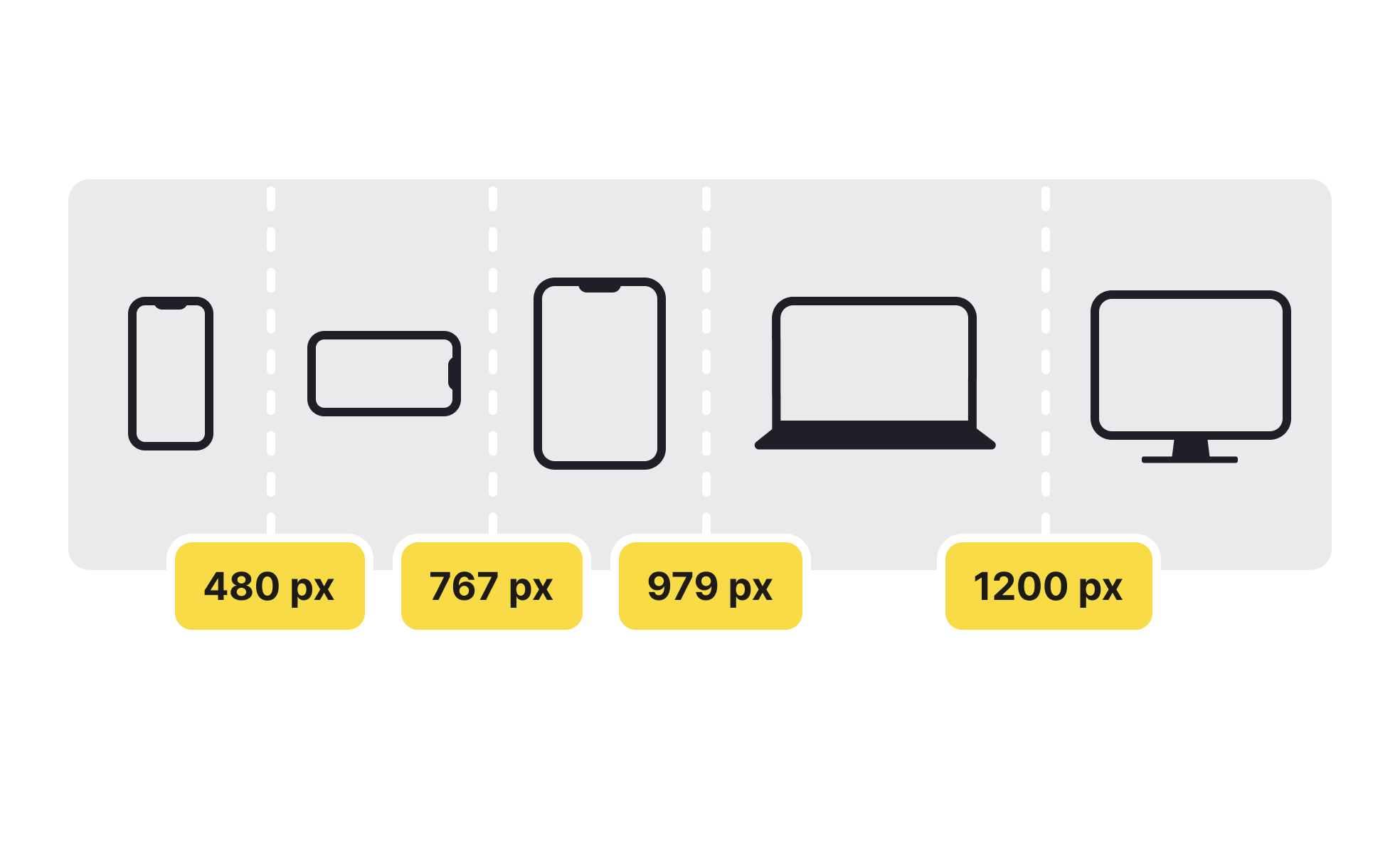
A breakpoint in UX design refers to a specific screen size or device width at which a website or application's layout changes to accommodate different display sizes and resolutions. Breakpoints are an important aspect of responsive design in UX. They help designers ensure that a website or application provides a consistent and optimal user experience across different devices and screen sizes.
A website may have several breakpoints for different devices, such as a desktop, tablet, and smartphone. At each breakpoint, the website's layout would change to ensure that content is presented in a legible and easy-to-use way, regardless of the device and screen size.
Breakpoints in UX design are important because they help ensure that your website or application is optimized for different screen sizes and devices.
By using breakpoints you allow your users to access your content no matter what device they are using, whenever they want. Overall, you provide your visitors with a better, more seamless user experience and accessibility.
Setting breakpoints in design is a crucial part of creating a responsive design that adapts to different screen sizes and resolutions. Here's a general process for setting breakpoints:
- Analyze your content: Start by understanding the content you want to display and how it should change based on screen size.
- Determine the minimum and maximum width: Determine the minimum and maximum width of your design to decide on the range of screen sizes you need to support.
- Identify critical breakpoints: Identify the screen sizes where your design needs to change, such as when text becomes too small to read or images become distorted. These are your critical breakpoints.
- Define the breakpoints: Using your design tool of choice (Figma, Sketch, Adobe XD), set breakpoints at each critical size. In CSS, you can use media queries to define breakpoints.
- Test and adjust: Test your breakpoints on different devices to ensure that the design is visually appealing and functional at each breakpoint. Make adjustments if needed.
- Repeat as needed: As you continue to develop your design, you may need to add or remove breakpoints as needed. Keep testing and adjusting until you have a responsive design that works well across all devices.
It's important to test your breakpoints on a variety of devices and screen sizes and ensure you provide a consistent and optimal user experience across all platforms. You can conduct breakpoint testing in several ways:
• Emulators and Simulators: You can use emulators or simulators to test how your design looks on different devices with varying screen sizes and resolutions.
• Physical Devices: Testing on actual physical devices with different screen sizes and resolutions can give you a more accurate representation of how the design will look and behave.
• Browser Dev Tools: You can use browser dev tools to test breakpoints in real-time. Most modern browsers come with a responsive design mode that allows you to test your website or application in different screen sizes and resolutions.
• Online Tools: There are various online tools available that allow you to test your website or application in different screen sizes and resolutions, without the need for physical devices.