

A container is one of the most fundamental elements in interface design. It acts as a framework for grouping information, setting boundaries, and organizing components in a way that makes digital experiences easier to understand. Whether in a simple card, a navigation drawer, or a dashboard module, containers provide structure and guide user focus.
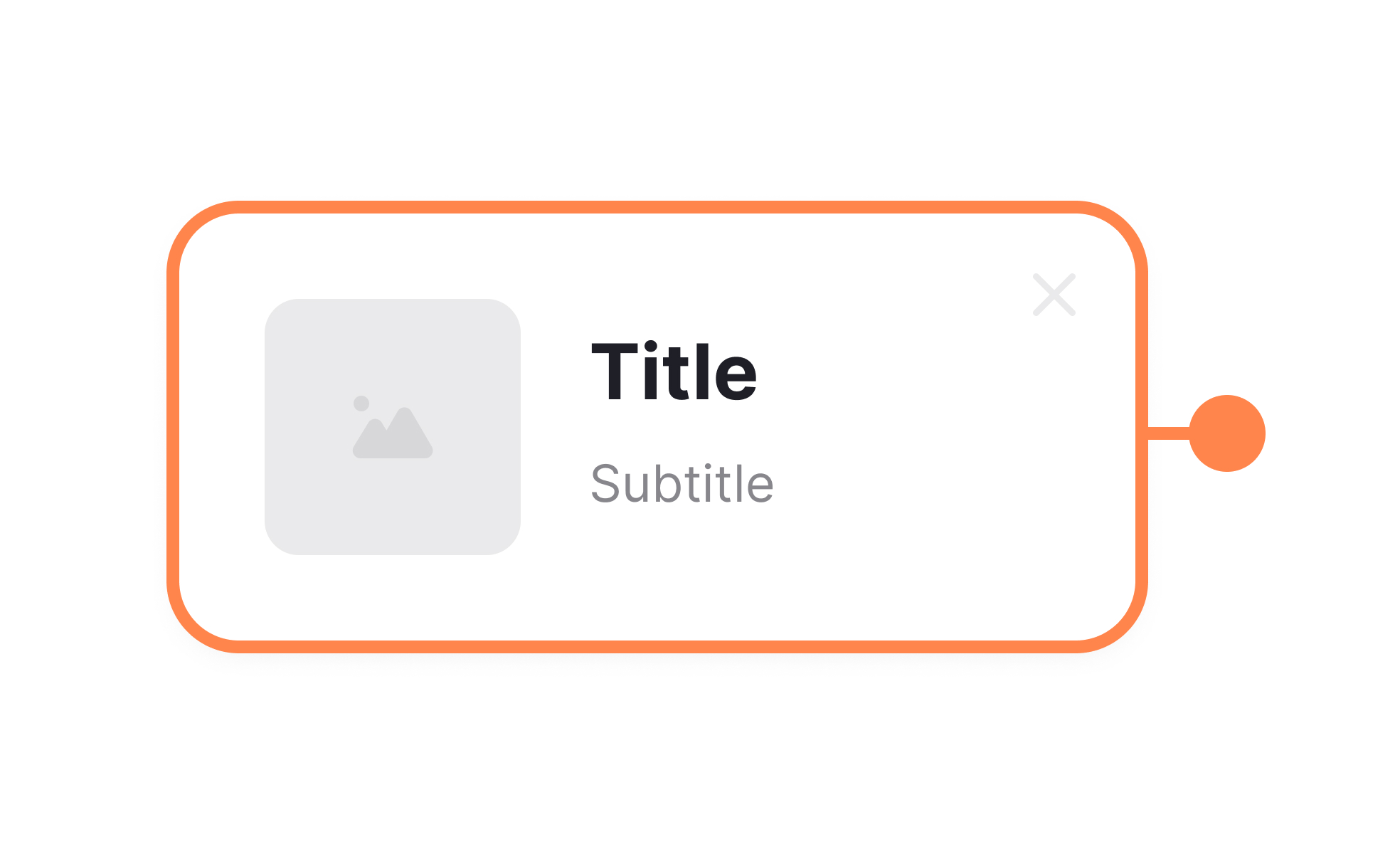
In UX and UI design, containers define how content is displayed and consumed. Designers rely on them to create balance, separation, and emphasis. For example, cards in Material Design serve as containers that group related information, such as a photo, title, and description, making the content scannable at a glance. Without containers, interfaces would risk overwhelming users with an unstructured mass of information.
Containers also play a key role in responsive design. As layouts adjust to different screen sizes, containers ensure that elements remain organized and readable. A container might adapt from a multi-column structure on desktop to a stacked format on mobile, preserving usability. This adaptability makes containers the backbone of accessibility and user experience consistency across devices.
Real-world examples show the value of containers. Platforms like Trello rely entirely on a container-based design, with boards, lists, and cards acting as the core structure. Similarly, e-commerce sites use containers to organize product grids, separating items while still keeping them part of a larger browsing experience. These design choices demonstrate how containers enhance both usability and engagement.
Containers also support visual hierarchy. By using spacing, borders, or background colors, designers can indicate which elements belong together and which stand apart. This hierarchy helps users process information more efficiently, guiding them to the most important actions or insights without confusion. Product teams benefit because a clear hierarchy leads to smoother task completion and fewer errors.
Learn more about this in the Containers Exercise, taken from the Common UI Components Lesson, a part of the Design Terminology Course.
Key Takeaways
- Containers organize and group content in digital interfaces.
- Designers use containers to establish balance, hierarchy, and focus.
- Containers adapt across screen sizes to maintain usability.
- Real-world tools like Trello demonstrate container-based design at scale.
- Accessibility requires containers to be coded for screen reader recognition.


