

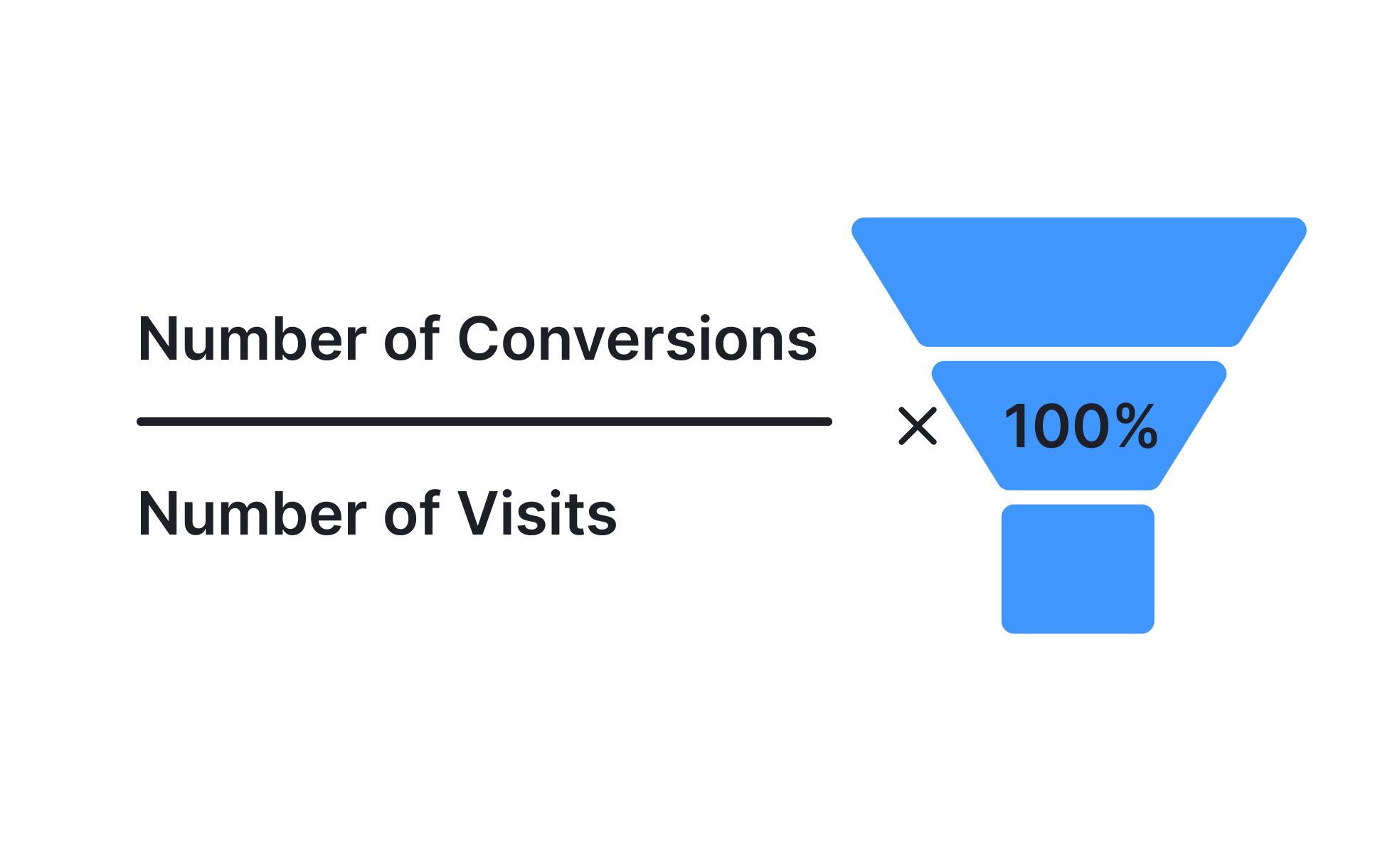
Conversion rate is one of the most common performance measures in both product management and UX design. It tells you how many users, out of all visitors or participants, performed a specific action such as signing up, completing onboarding, upgrading to a paid plan, or finishing a checkout. Because it ties directly to outcomes, conversion rate acts as a sharp feedback tool for validating if design and product decisions are working as intended.
For product managers, conversion rate offers a way to link strategy to business impact. A well-defined funnel breaks down the journey into steps and assigns conversion metrics to each stage. This helps identify where users stall and provides evidence for prioritization. For example, if a subscription platform notices high sign-up but low activation, conversion analysis points to onboarding as the biggest lever for improvement rather than acquisition.
From a design perspective, conversion rate reflects usability and clarity. Microcopy, interface patterns, and information hierarchy directly shape user behavior. A poorly labeled button or a confusing form layout can cut conversion even when interest is high. Designers use A/B testing and heuristic reviews to diagnose such issues. Companies like Airbnb and Shopify consistently measure the impact of subtle design tweaks, showing that even a small copy adjustment or simplified input can raise conversion rates by several percentage points.
Real-world cases highlight its importance. Amazon tested one-click checkout, a design improvement that drastically reduced steps between intention and purchase. The increase in conversion translated to billions in revenue. In SaaS products, firms often experiment with trial-to-paid flows, optimizing CTAs and pricing displays to boost the conversion rate between free and paying users. These examples show how tightly design and product choices intertwine with conversion performance.
Conversion rate also reveals product-market fit signals. A consistently high rate at key funnel steps often indicates that the product addresses real user needs. On the other hand, persistently low rates suggest a mismatch or friction that requires either better messaging, a simpler interface, or a product rethink. When teams track conversion alongside retention, they build a more accurate picture of sustainable growth.
Key Takeaways
- Conversion rate measures how many users complete a target action.
- Product managers use it to identify bottlenecks and prioritize work.
- Designers influence it through usability, clarity, and hierarchy.
- Real-world examples show small design tweaks can drive massive revenue.
- It signals product-market fit when sustained at healthy levels.
- Improvements require both quick wins and structural redesigns.


