Dashboard
A dashboard is a visual interface that brings together key data, metrics, and insights into one accessible view, helping teams make informed decisions.

Dashboards serve as centralized spaces where information is collected, organized, and presented in a clear, visual format. They simplify complex data, allowing users to see trends, monitor key metrics, and evaluate performance in real time. For product managers, dashboards can highlight how features are performing, where users drop off in funnels, or how retention rates are shifting over time. For designers, they can reveal usability testing results, accessibility scores, and feedback from research studies.
In product management, dashboards act as decision-making tools. By consolidating data from different sources, they allow teams to prioritize work based on evidence rather than assumptions. A dashboard that tracks active users, revenue per customer, and churn provides immediate clarity on whether a new product release is having the desired impact. This empowers leaders to act quickly when trends shift.
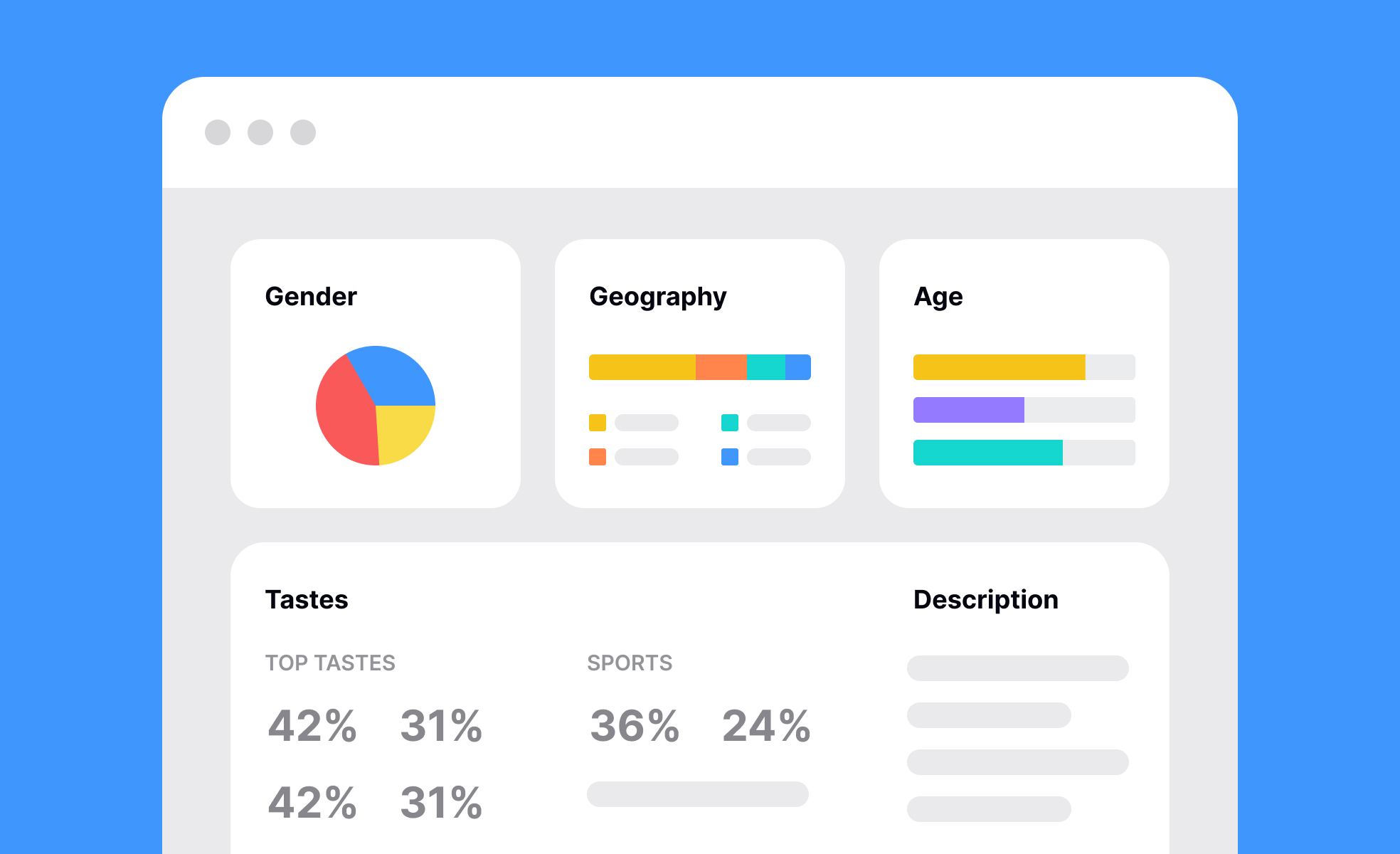
In UX and UI design, dashboards often represent the end product delivered to users. Think of a financial app where customers log in to see their spending habits or a health tracker where individuals monitor steps, sleep, and nutrition. Here, dashboards are not just analytical tools but also a core part of the user experience. Designers focus on clarity, visual hierarchy, and customization so that users can easily digest information without feeling overwhelmed.
There are different types of dashboards, each tailored to specific needs. Operational dashboards track day-to-day processes such as server uptime, customer support ticket status, or delivery logistics. Strategic dashboards highlight broader trends like quarterly revenue growth or long-term engagement. Analytical dashboards go deeper, allowing detailed exploration of data, such as segmenting customer behavior by demographics or testing hypotheses with visualization tools.
Dashboards also need careful design to avoid becoming cluttered or overwhelming. Too many data points can reduce clarity and lead to analysis paralysis. Good design principles emphasize simplicity, focusing on the most important metrics for the intended audience. Interactivity, such as the ability to filter or drill down, can enhance usability without adding complexity.
Learn more about this in the Dashboards Lesson, a part of the Common Design Patterns Course.
Key Takeaways
- Dashboards consolidate complex data into clear, visual formats.
- They support quick decision-making by highlighting key metrics.
- Product teams use them to track adoption, engagement, and retention.
- Designers build dashboards as user-facing features for clarity and usability.
Recommended resources
Courses
UX Design Foundations
Design Terminology
Common Design Patterns
Accessibility Foundations
Wireframing
UI Components II
Design Composition
Mobile Design
UX Design Patterns with Checklist Design
Introduction to Figma
User Psychology
3D Design Foundations
Psychology Behind Gamified Experiences
Reducing User Churn
Apple Human Interface Guidelines
Human-Centered AI
Lessons
Exercises
Briefs
Design an Analytical Dashboard for Mobile
Design an Analytical Dashboard
Projects

Deeply - Your Mindful Companion

Pruvi - Cycling iOS App

Health Tracker - Mobile - Dashboard

NextKit Free Admin Panel

Sidebar Menu
FAQs
An effective dashboard is one that highlights only the most important metrics for its audience. It avoids unnecessary clutter and uses visual hierarchy to guide the eye. This could mean emphasizing KPIs in larger, bold visuals while providing secondary data in smaller charts. Interactivity, such as filtering or segmenting, also helps users extract the exact information they need.
In addition, effective dashboards adapt to the context of the user. A product manager may need a high-level view of feature adoption, while a designer may need detailed usability testing results. Aligning the design of the dashboard to the audience ensures it delivers maximum value.
For product managers, dashboards function as decision-support tools. They track metrics like churn, revenue, and active users, guiding strategic choices and feature prioritization. These dashboards need to pull from multiple data sources and present information that reflects both business and product health.
For designers, dashboards may be part of the actual user-facing product. Examples include fitness apps or analytics platforms where the dashboard itself is the main interface. Here, design principles like color coding, typography, and layout play an even greater role to ensure users can quickly understand the presented information.
Teams often make the mistake of including too much information. This leads to dashboards that feel cluttered and overwhelming. The solution is to start with clear goals: identify what decisions the dashboard should support and limit metrics to those that are directly relevant.
Another common mistake is failing to validate with users. Whether the audience is internal team members or end users, testing dashboards for clarity and usability is critical. Observing how people interact with a dashboard often reveals which metrics are confusing or which visuals fail to communicate effectively.