

TL;DR
- A family of characters with shared design traits.
- Includes letters, numbers, symbols, and punctuation.
- Foundation of visual communication in design.
- Shapes brand identity and readability.
Definition
A typeface is a coordinated set of characters designed with consistent style and proportions, serving as the visual foundation for written communication in digital and physical media.
Detailed Overview
A typeface is more than just a font. While the two terms are often used interchangeably, a typeface refers to the design itself, while a font refers to a specific style and size within that design. For example, Helvetica is a typeface, and Helvetica Bold 12pt is a font. This distinction helps teams understand how typography choices affect readability and design consistency.
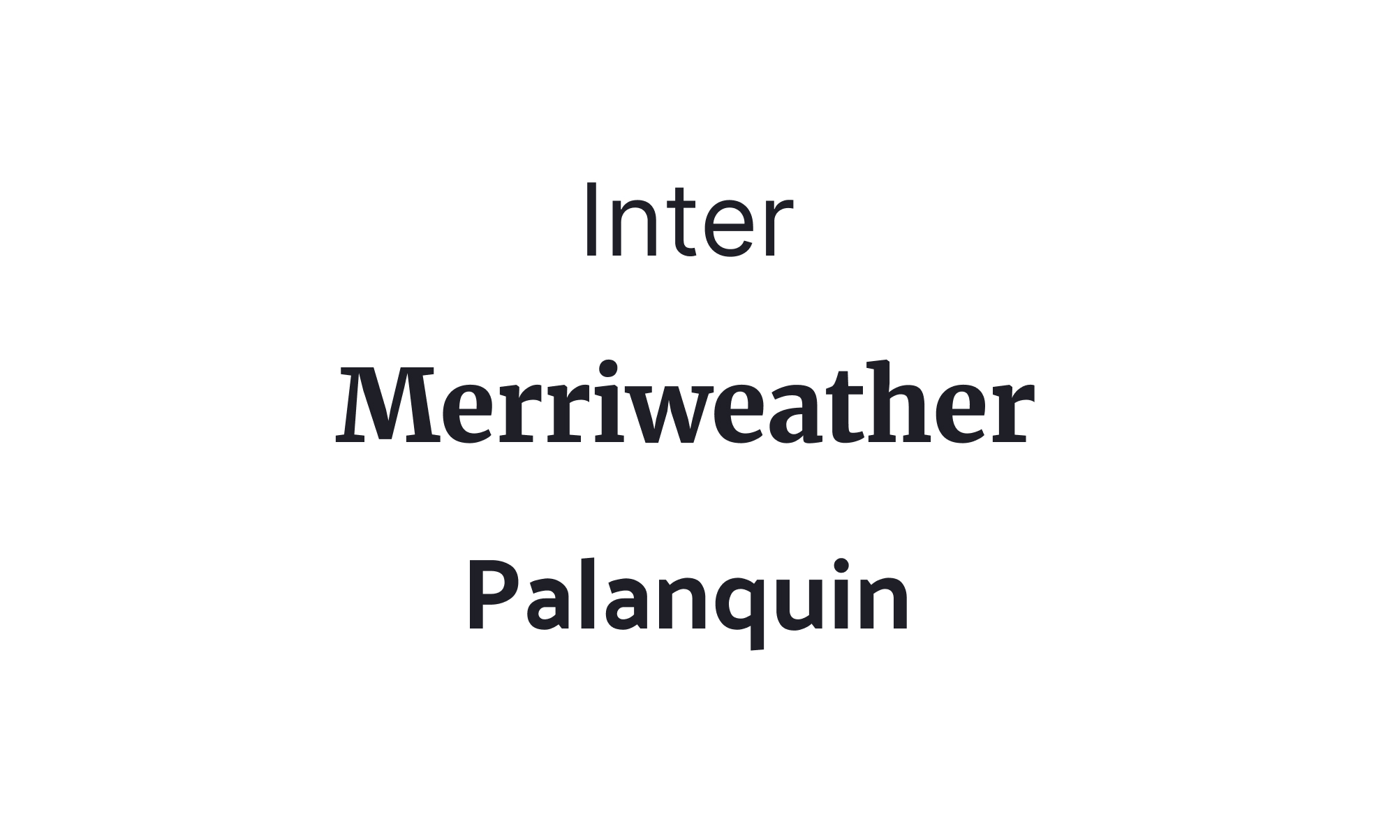
A frequent question is how typefaces influence brand identity. Typefaces carry personality: a serif typeface can communicate tradition or elegance, while a geometric sans-serif may suggest modernity and minimalism. Brands carefully select typefaces to reinforce values and emotional tone. For instance, newspapers traditionally use serif typefaces to signal authority and trust, while tech startups often prefer sans-serif for clarity and approachability.
Another common query involves typeface categories. Major classifications include serif, sans-serif, script, monospace, and decorative. Each serves different functions and conveys different tones. In product design, sans-serif typefaces dominate because of their legibility on screens, while serif or decorative typefaces are often used for headings or branding. Knowing when to apply each type ensures balance between aesthetics and usability.
Teams also ask about the role of typefaces in digital accessibility. Readability is directly tied to typeface design. Poorly chosen typefaces can make text difficult to parse, especially for users with visual impairments. Accessible typography avoids overly decorative fonts for body text, prioritizes clear letterforms, and pairs typefaces with sufficient size and contrast to maintain legibility.
Consistency is another major concern. Without a defined typeface strategy, products risk inconsistency, where different teams or assets use mismatched fonts. A designated typeface within a type system ensures that every screen, document, or marketing material feels aligned. This consistency strengthens both usability and brand recognition.
Learn more about this in the Typeface Exercise, taken from the Intro to Typography Lesson, a part of the UX Design Foundations Course.


