User Interface (UI) Components
UI components are reusable building blocks such as buttons, forms, or cards, that help teams build consistent and efficient product interfaces.


What is UI Component?
Your interface development takes forever and creates inconsistent user experiences because designers and developers build similar interface elements from scratch repeatedly instead of using reusable component systems that ensure consistency and speed up development.
Most teams create interfaces without systematic component approaches, leading to duplicated design work, inconsistent user experiences, and maintenance headaches when design changes need to be implemented across multiple interface elements.
UI components are reusable interface elements like buttons, forms, navigation menus, and content blocks that maintain consistent design and behavior across different pages and applications, enabling faster development while ensuring cohesive user experiences.
Teams using effective UI component systems achieve 60% faster interface development, 70% more consistent user experiences, and significantly reduced maintenance costs because changes can be implemented once and applied everywhere components are used.
Think about how companies like Google use Material Design components to create consistent experiences across different products, or how design systems at companies like Airbnb enable rapid interface development while maintaining brand consistency and usability standards.
Why UI Components Matter for Development Efficiency
Your design and development teams waste time recreating similar interface elements while creating inconsistent user experiences because there's no systematic approach to building and maintaining reusable interface components.
The cost of lacking UI component systems compounds through every interface you build. You get longer development cycles, inconsistent user experiences that confuse customers, and expensive maintenance when design updates require changes across hundreds of individual interface elements.
What effective UI components deliver:
Faster interface development because designers and developers can assemble interfaces using proven components rather than building every element from scratch, dramatically reducing time from concept to finished interface.
When you have comprehensive component libraries, building new interfaces feels like assembly rather than custom development for every design element.
Higher design consistency through standardized components that ensure buttons, forms, and navigation elements behave predictably across different parts of your product, creating cohesive user experiences.
Easier maintenance and updates because design changes can be implemented in component definitions and automatically applied everywhere those components are used rather than requiring individual updates across multiple interface locations.
Better collaboration between designers and developers as component systems create shared language and understanding about interface elements that reduce miscommunication and implementation errors.
Enhanced user experience quality through components that are tested and refined over time rather than one-off interface elements that might have usability issues or inconsistent behavior patterns.
Advanced UI Component Strategies
Once you've established basic UI component systems, implement sophisticated component architecture and management approaches.
Dynamic and Configurable Components: Build components that adapt to different contexts and use cases through configuration options rather than creating separate components for every variation.
Component Composition and Advanced Patterns: Design component systems that enable complex interface creation through component combination rather than just individual element replacement.
Cross-Platform Component Systems: Create component libraries that work across different platforms and frameworks while maintaining consistent design and behavior.
Component Analytics and Usage Optimization: Track component usage and performance to optimize component design based on actual usage patterns rather than theoretical best practices.
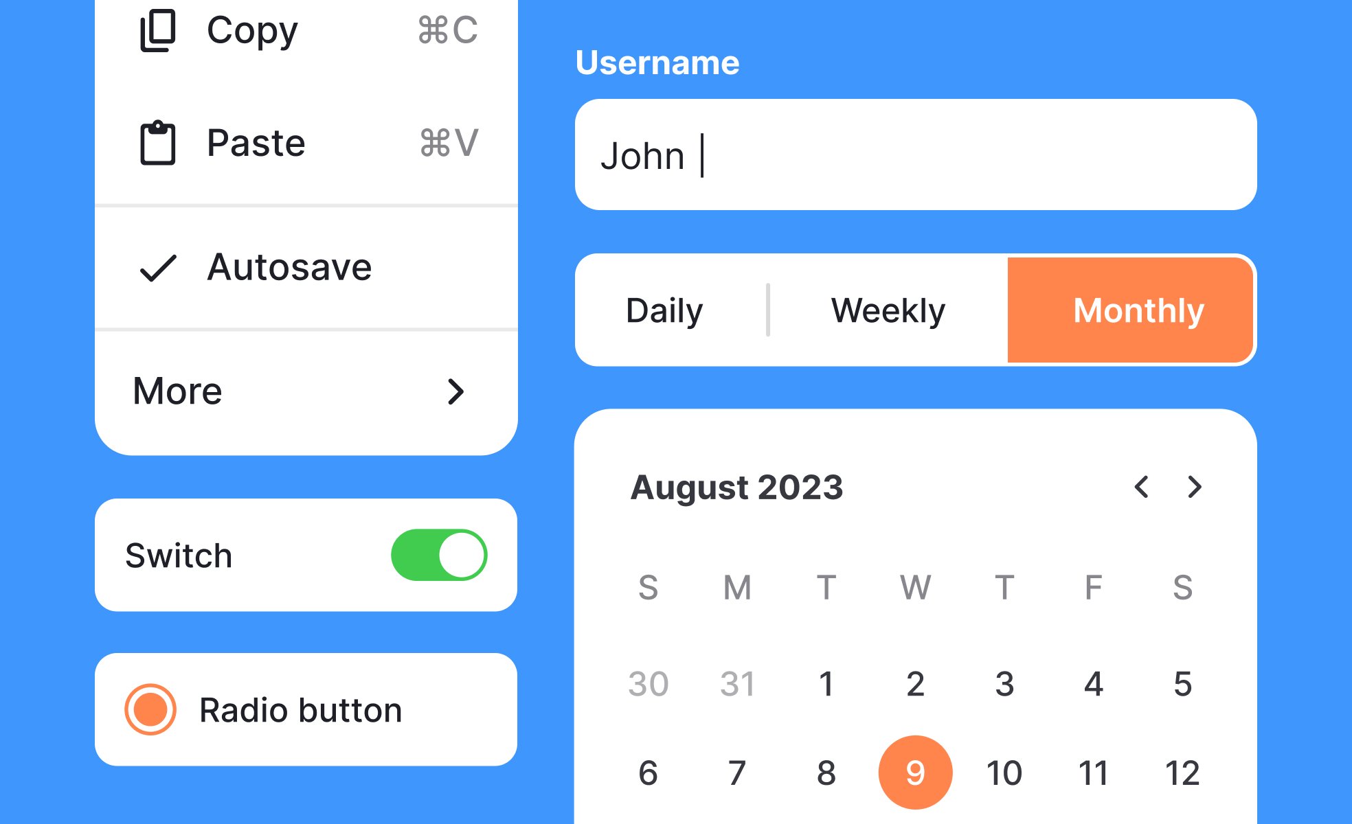
A UI component (short for user interface component) is a distinct element or module within a graphical user interface that serves a specific function or displays certain content. User interface (UI) design and its components are the building blocks of any digital product, including websites, mobile apps, and software applications. Examples of UI components include buttons, forms, menus, navigation bars, and modals. These UI components can be combined and arranged in various ways to create the overall layout and design of the user interface.
UI components are often pre-built and customizable, making it easier for designers and developers to create consistent and cohesive user interfaces, reducing development time and costs. UI components also make it easy to maintain, update and keep the design consistent across different pages of an application or website.
A reusable UI component is a self-contained piece of a user interface that can be easily reused across multiple pages, screens, or applications. This can include simple components such as buttons, text fields, or icons, as well as more complex components such as cards, carousels, or modals. Reusable UI components have several benefits, including:
- Consistency: By using the same components throughout the application, designers can ensure a consistent look and feel, making it easier for users to understand and navigate the interface.
- Efficiency: Developing reusable components saves time, as they can be reused across multiple pages or screens without having to recreate the component from scratch each time.
- Maintenance: Reusable components make it easier to maintain the codebase, as changes to the component can be made in one place and will be reflected across the entire application.
A UI component library is a collection of pre-built, reusable UI components that can be easily added to a web or mobile application. These components are typically designed to be flexible, customizable, and easy to use, with a consistent look and feel. A UI component library typically includes various components, such as buttons, forms, icons, typography, navigation, and other common UI elements.
Brad Frost’s Atomic Design is a methodology for designing digital products and user interfaces. According to this approach, a UI component is a more complex building block that is created by combining multiple UI elements, such as atoms and molecules. UI components are larger and more self-contained than individual UI elements, and they typically have more specific functionality and visual characteristics. They are created by combining UI elements into reusable and modular building blocks that can be used throughout an interface. For example, a navigation menu component might be created by combining UI elements such as a logo, a hamburger icon, and a list of links.
Explore the lesson on Atomic Design by Brad Frost within our most popular UX Design Foundations course.
UI components can be broadly classified into four categories:
- Input Components: These components allow users to input data into the system, such as text fields, checkboxes, radio buttons, and dropdown menus.
- Output Components: These components display information to the user, such as labels, text areas, and images.
- Navigational Components: These components help users navigate through the system, such as buttons, menus, and breadcrumbs.
- Container Components: These components hold other UI elements together, such as panels, tabs, and accordions.
Some common UI elements include:
- Buttons: Used to trigger a particular action or submit a form.
- Input Fields: Used to collect user input, such as text, numbers, or dates.
- Search Fields: Used to search for specific data or content within the system.
- Radio Buttons: Used to select one option from a group of mutually exclusive options.
- Dropdown Menus: Used to select one option from a list of options.
Recommended resources
Courses

UI Components I


UI Components II

Introduction to Design Systems

Lessons

Common UI Component Definitions I
Intro to Icons in UI

Anatomy of UI Components

Assessments

Figma

Wireframing

Design Patterns
Tutorials

Creating Reusable Components in Figma: A Step-by-Step Tutorial


Mastering Elevation for Dark UI: A Comprehensive Guide


Learn 8 essential techniques to design in Figma like a pro

Projects

iOS A11Y Signup Form for SaaS


HireHarbour Allies: UX/UI Case Study for Inclusive Landing Page


Empty State - Education App