

What is a user interface (UI)?
A user interface is the surface through which a person interacts with a digital product. Every element a user sees and touches, buttons, navigation menus, form fields, icons, typography, imagery, and the layout that organizes them, is part of the UI. It's the layer that translates what a system can do into what a user can understand and act on.
The quality of a UI determines whether users can accomplish their goals efficiently, whether they make errors and can recover from them, and whether they develop confidence in the product or frustration with it. A product can have powerful underlying functionality and still fail in users' hands if its interface is unclear, inconsistent, or poorly suited to how users think about the task.
UI design is a discipline that sits at the intersection of visual design, interaction design, and user psychology. It draws on principles of hierarchy, contrast, affordance, and feedback to create interfaces that communicate clearly and support users through tasks without requiring explicit instruction.
How is UI different from UX?
UI and UX are related but distinct, and the confusion between them is common enough to be worth addressing directly.
UI refers specifically to the visual and interactive elements of a product: the buttons, screens, layouts, and components that users see and touch. It's the medium through which interaction happens.
UX, user experience, refers to the totality of how a user experiences a product: not just the interface itself, but the entire journey, including how they discover the product, how they learn to use it, how they feel while using it, whether it solves their problem, and what they remember about it afterward. UX is concerned with the quality of that experience. UI is one significant factor that shapes it.
A product can have a visually polished UI and still deliver poor UX if the underlying structure is confusing, the content doesn't meet user needs, or the flow requires too many steps to accomplish a simple goal. Good UX requires good UI, but a good UI doesn't automatically produce good UX. The distinction matters in practice because it shapes what different roles on a product team are responsible for.
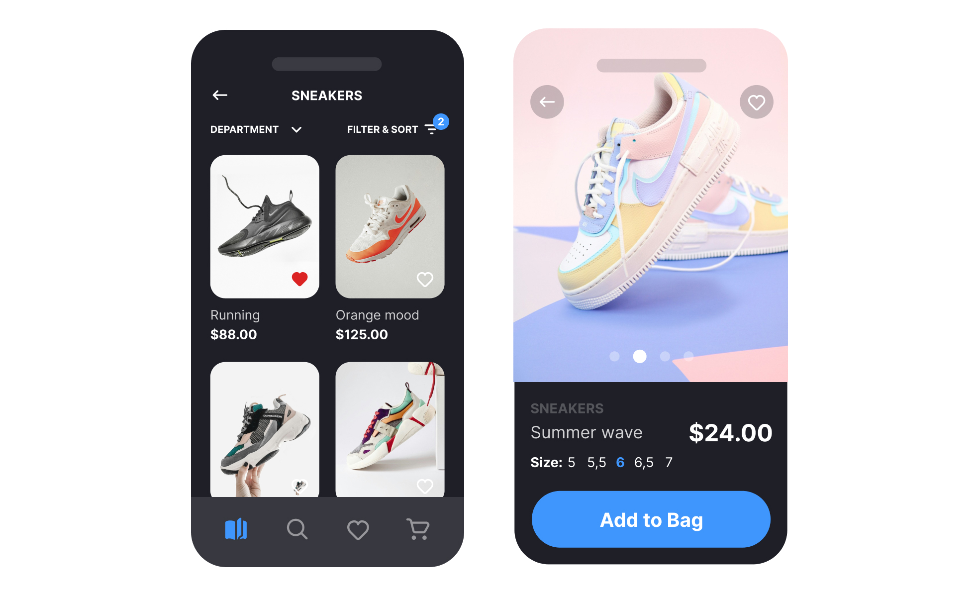
What are the main components of a UI?
A UI is composed of several categories of elements, each serving a different function in the interaction.
- Navigation elements help users understand where they are within a product and how to move through it. Tab bars, navigation bars, breadcrumbs, side menus, and back buttons are all navigation components. Their design and placement directly affect how users build a mental model of the product's structure.
- Input elements allow users to enter data or make selections: text fields, checkboxes, radio buttons, sliders, dropdowns, and date pickers. Their design determines how clearly they communicate what kind of input is expected and whether errors are prevented or caught gracefully.
- Informational elements present content and status: labels, headings, body text, tooltips, badges, progress indicators, and empty states. They carry the language of the product and determine whether users understand what's happening and what to do next.
- Action elements trigger behaviors: buttons, links, and swipe gestures. Their visual design communicates what is clickable and what the action will do. The label, styling, and placement of a button are all UI decisions with direct usability consequences.
- Container elements organize other elements into coherent groups: cards, modals, drawers, and panels. They create the visual structure that lets users understand how content relates and what belongs together.
How does UI design affect usability and brand perception?
The relationship between UI design and usability is direct. An interface where the most important actions are visually prominent, where interactive elements are clearly distinguishable from static ones, and where feedback follows every user action gives users the information they need to navigate confidently. An interface where actions are buried, labels are ambiguous, and feedback is delayed or absent creates the conditions for errors, frustration, and abandonment.
UI also shapes brand perception in ways that product teams sometimes underestimate. Visual choices, the type system, color palette, spacing, and the level of polish in component design, communicate something about the brand before a user has read a word of content. A finance product with a clean, structured interface communicates reliability and attention to detail. A creative tool with bold color and playful interactions communicates energy and expressiveness. These impressions form quickly and are difficult to revise once established.
How has UI design been evolving lately?
Several shifts have changed what effective UI design looks like and how it's produced.
Adaptive and personalized interfaces have moved from aspiration to expectation. Products increasingly adjust layout, content priority, and visual treatment based on user behavior, device context, and settings like dark mode or reduced motion. Designing for a static, uniform interface experience is no longer sufficient for many product contexts.
AI tooling has entered the UI design process at multiple stages. Designers use AI-powered tools to generate layout variations, create image assets, check accessibility compliance automatically, and explore visual directions faster than was possible with traditional design workflows. The output of these tools requires human judgment to evaluate, but the speed advantage has changed the economics of exploration and iteration.
The line between UI designer and developer has also been shifting. Tools like Figma Make can generate production-ready code from a design, and the gap between what a designer produces in a design tool and what gets built in code has narrowed. This has implications for how design and engineering teams collaborate and how handoff is structured.

.svg)


