


Every product has an information architecture, whether anyone designed it or not. Users meet it as the names in the menu, the order of the categories, and the number of clicks between the home screen and the thing they came for. When the structure matches how they think, they never notice it; when it does not, they reach for search, then for support, then for a competitor. Information architecture is the layer of design that decides whether people can find anything at all, and it is settled long before a single screen is drawn.
In this glossary topic:
- What is information architecture?
- What are the components of information architecture?
- How does information architecture differ from navigation design?
- How is information architecture researched and tested?
- How has information architecture changed with AI?
- What does information architecture look like in practice?
- How to learn information architecture
- FAQ

What is information architecture?
Information architecture (IA) is the practice of organizing, structuring, and labeling the content of a product so that people can find what they need and understand where they are. It decides how content is grouped, what those groups are called, how deep the hierarchy goes, and how items that live in different branches are connected through links, tags, and search.
Richard Saul Wurman gave the term its modern meaning in the 1970s, and Louis Rosenfeld and Peter Morville formalized it as a UX discipline in Information Architecture for the World Wide Web, first published in 1998. Their model still holds: good IA sits at the intersection of content (what exists), context (the organization's goals and constraints), and users (who is looking, and how they think about the subject). A structure that honors two of the three and ignores the third makes sense to its authors and to nobody else.
Done well, IA is invisible. People find what they came for without noticing the structure that got them there. Done badly, it shows up as users searching for things they expected in the menu, support tickets asking where an obvious page lives, and analytics full of back-button loops.
What are the components of information architecture?
Rosenfeld and Morville describe IA as four interlocking systems, and nearly every IA decision is a decision about one of them.
- Organization systems decide how content is grouped and ordered: by topic, by task, by audience, alphabetically, chronologically, or in a hybrid that most real products end up with. The structure can be a strict hierarchy, a sequence, or a network of cross-links.
- Labeling systems decide what each group and item is called. A label has to be recognized at a glance by someone who has never seen it, which is why labels drawn from user vocabulary outperform labels drawn from internal or technical terminology.
- Navigation systems decide the paths people follow: global navigation that reaches everywhere, local navigation within a section, contextual links between related items, and the cues that show where the user is now.
- Search systems let people bypass the hierarchy and ask directly, which matters once the content volume outgrows browsing or when users arrive knowing exactly what they want.
Labeling is where IA most often fails, because a category that is perfectly logical inside the company still fails if users do not recognize its name. A menu item called "Solutions" is internally precise and externally meaningless; the same content under "Pricing" or "For teams" gets found.
How does information architecture differ from navigation design?
Navigation is the visible part; information architecture is the structure it exposes. A navigation designer decides whether the menu is a top bar, a sidebar, or a hamburger icon, how many items fit before it collapses, and how the current location is signaled. IA decides what the items are, what they are called, and what sits beneath each one. The same architecture can be presented through completely different navigation, and a redesign of the navigation alone leaves the same findability problems standing in a new coat of paint.
The two get confused because IA failures surface in the navigation. A user who cannot find the return policy blames the menu, and the team reaches for a menu redesign, when the real fault is that returns live under "Account" and users look under "Help." Structure has to be fixed first; navigation can only present the structure it is given. The practical test is to remove all visual design and ask whether the hierarchy still makes sense as a plain outline. If it does not, no amount of navigation craft will save it.
How is information architecture researched and tested?
Good IA is grounded in how users think about the content, not in how the organization thinks about itself. The most common IA mistake is a structure that mirrors the org chart, and research is the only reliable defense against it.
Card sorting reveals users' mental categories. Participants group cards that represent content items and name the groups; patterns across many participants show which groupings feel natural and what vocabulary people reach for. Open sorts, where participants invent the groups, discover a structure; closed sorts, where the groups are given, test whether content lands where the team expects. Tree testing works from the other direction. Participants are given a proposed hierarchy as plain text, with no visual design, and asked to find specific items in it. Success rates, first clicks, and the paths taken show exactly which branches mislead, and the method isolates the structure from the interface so a failure cannot be blamed on the layout.
A content inventory and audit come before either method on any content-heavy product: a complete list of what exists, followed by a judgment of what is current, duplicated, or missing. Search-log analysis rounds out the picture by showing, in users' own words, what they expected to find and where they gave up browsing.
How has information architecture changed with AI?
Search has become the part of IA that changed most. Semantic search, which matches meaning rather than exact words, has moved from specialist tooling into mainstream site-search products, and many help centers now put a conversational assistant in front of their documentation. Users increasingly ask a question instead of following a path, which shifts some of the burden from the hierarchy to the retrieval layer. On the production side, AI features suggest tags, propose categories for new content, and flag duplicates across a content inventory, work that once meant long stretches in a spreadsheet.
None of this removes the need for structure. A conversational assistant retrieving from a muddled, duplicated, inconsistently labeled content set returns muddled answers, and users who cannot verify an answer still fall back to browsing. Search got better at guessing what people mean; structure is still what it has to retrieve. The teams getting the most from AI search are the ones whose IA was already sound.
What does information architecture look like in practice?
The first artifact of IA work is the hierarchy itself, drawn as a tree before any screen exists: a small set of top-level categories, each branching into subcategories, each holding the content that belongs there. Reading it as an outline exposes the decisions that navigation will later have to live with: how many top-level items there are, how deep the deepest branch goes, and whether an item that belongs in two places has been given a home in either.

A hierarchy drawn as a plain tree. Breadth and depth are decided here, and every navigation menu that follows can only present what this tree contains. From the lesson Organization Systems.
The second is the pairing of two research methods that IA projects often run in sequence. Card sorting generates the structure from users' own groupings; tree testing then checks whether the resulting hierarchy actually gets people to the right place. Running only one of the two leaves either the structure or its validation to guesswork.
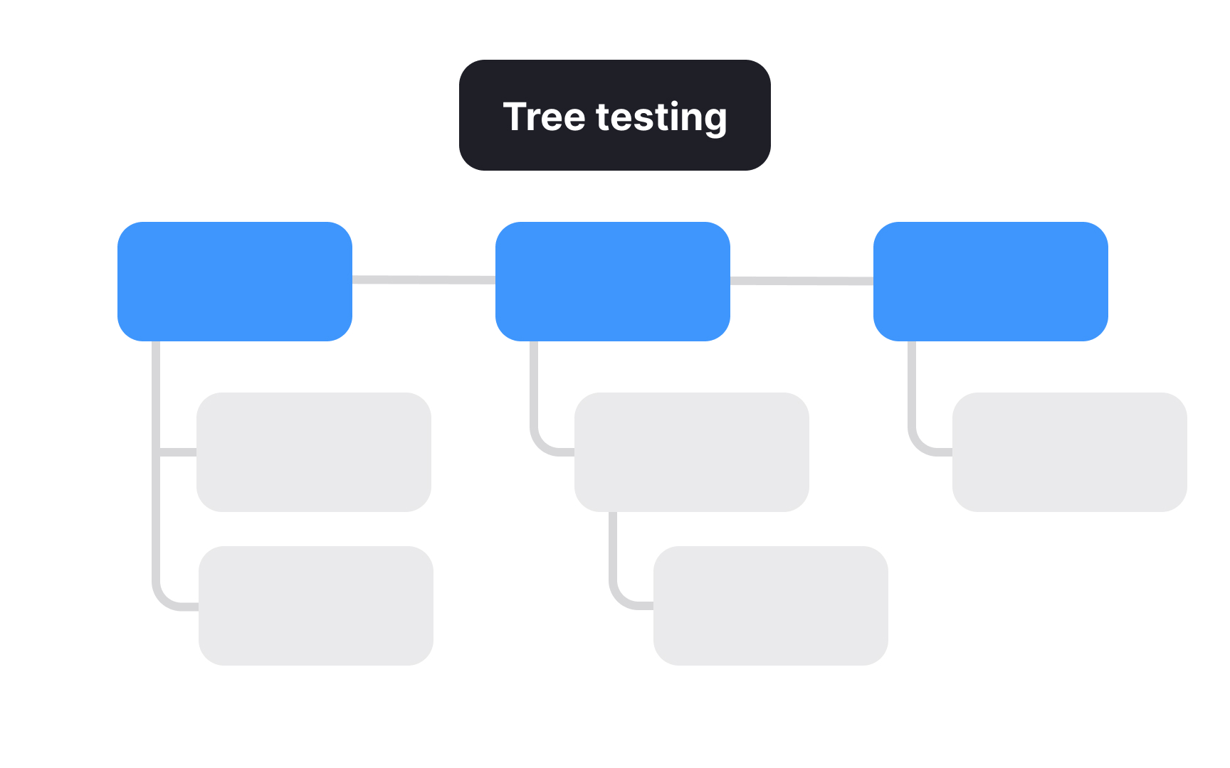
Card sorting asks users to build the categories; tree testing asks them to find items inside a proposed structure like this one, with the visual design stripped away. One generates, the other validates.
How to learn information architecture
Foundations: components and principles
The discipline is easiest to learn from its parts. The Basic Components of IA lesson sets out the four systems, the content-context-users model, and the business value of getting structure right. The Principles of Information Architecture lesson covers Dan Brown's principles, such as treating content as objects, limiting choices, disclosing information gradually, and planning for growth, which together act as a checklist for reviewing any proposed structure.
How people seek information and navigate
Structure only works when it matches how people look. The How People Seek Information lesson distinguishes known-item search from exploratory browsing, the "don't know what I need to know" state, and re-finding, each of which favors a different mix of navigation and search. The How People Navigate lesson covers the cues users read, from labels to context to past experience, and how those cues form the mental model a structure has to fit.
Organizing and classifying content
This is the core of the practice. The Taxonomy lesson covers building the categories, tags, and controlled vocabularies that group related content behind the scenes, and the Content Inventory and Audit lesson covers cataloging what exists and judging what stays, the unglamorous step that every honest restructuring starts with. Organization schemes, from topical and task-oriented to hybrid, have a lesson of their own, linked from the first figure above.
Labeling
Labels carry the whole structure to the user. The labeling systems lesson covers the kinds of labels a product uses, from navigation labels and headings to index terms and icon labels, and how to draw their wording from user research rather than internal habit. It also covers the consistency rules that let a label mean the same thing everywhere it appears.
Testing the structure
A hierarchy is a hypothesis until users try it. The Tree Testing lesson covers setting up a test, writing tasks that do not leak the answer, reading success and directness scores, and knowing the method's limits. It pairs naturally with card sorting for generating the structure in the first place and with broader user testing once screens exist.
Designing navigation systems
Only now does the structure become visible. The Types of Navigation Systems lesson separates global, local, contextual, and utility navigation, and the Common Navigation Patterns lesson covers the components that carry them, from the hamburger menu to mega menus and tab bars. The You're Here navigation lesson covers signaling location through breadcrumbs, highlighted states, and page titles, and the Best Practices for Vertical Navigation lesson and the Utility Navigation lesson close the arc with the sidebar and the account, help, and settings tools that sit outside the main hierarchy. A site map is the artifact that documents the finished structure for the team.


