

TL;DR
- Provides paths to move through products.
- Includes menus, links, icons, and gestures.
- Reduces friction by organizing content clearly.
- Crucial for usability and task completion.
Definition
Navigation refers to the design and arrangement of menus, links, icons, and pathways in digital products that allow users to move between sections, locate features, and achieve goals with clarity and efficiency.
Detailed Overview
Navigation is one of the most critical aspects of digital product design because it determines how easily users can find what they need. It is the framework that guides movement, organizes information, and supports task completion across websites, apps, and other interfaces. Poor navigation leads to confusion, frustration, and abandonment, while effective navigation builds trust and engagement.
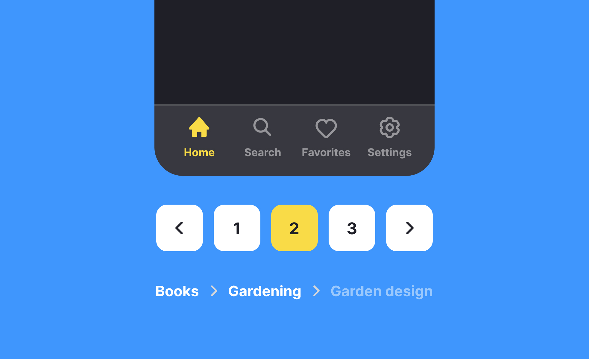
A frequent question is how navigation differs between desktop and mobile products. On desktops, navigation often takes the form of top-level menus, sidebars, or visible links. Mobile interfaces, however, must account for smaller screens and touch interaction. Designers frequently use tab bars, hamburger menus, or gesture-based navigation to preserve screen space while still providing access to core features. Each environment shapes how navigation is structured and prioritized.
Another common query is about hierarchy. Navigation is often divided into primary and secondary layers. Primary navigation leads to the most important sections, while secondary navigation covers supportive or detailed features. A clear hierarchy reduces overload and ensures that users do not feel lost. Flat hierarchies, where all items are presented equally, may work for small products, but large products often require multiple levels of organization.
Teams also ask how navigation impacts discoverability. If navigation is too complex, features may remain hidden, reducing engagement. Testing helps identify whether users can find core features without extra help. Designers often combine visible navigation with contextual elements, such as breadcrumbs, to maintain orientation.
Accessibility concerns also arise frequently. Navigation must be operable by keyboard, screen readers, and assistive technologies. Designers ensure sufficient contrast, logical focus states, and meaningful labels to support inclusivity. A product with poor navigation accessibility excludes a significant portion of potential users.

.svg)


