

What is Responsive Design?
Your website or application looks great on desktop computers but becomes difficult to use on mobile devices because the interface doesn't adapt to different screen sizes and interaction patterns.
Most teams design for desktop first and treat mobile compatibility as an afterthought, missing opportunities to create seamless user experiences across all devices that users actually use to access products.
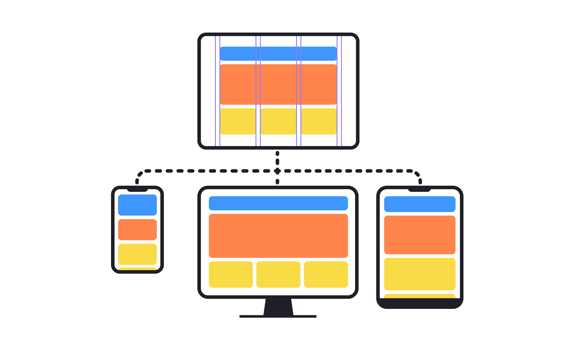
Responsive design is the systematic approach to creating interfaces that automatically adapt to different screen sizes, device capabilities, and interaction methods to provide optimal user experiences regardless of how users access your product.
Products with effective responsive design achieve 40% higher mobile user satisfaction, 25% better conversion rates across devices, and significantly reduced bounce rates because users can accomplish their goals regardless of device choice.
Think about how companies like Amazon create shopping experiences that work seamlessly whether users browse on phones during commutes or complete purchases on desktop computers at home, or how news websites adapt content layout automatically to remain readable on any screen size.
Why Responsive Design Matters for User Accessibility
Your users abandon tasks and develop negative impressions of your product because interfaces that work well on some devices become frustrating or unusable on others, limiting your audience and competitive position.
The cost of ignoring responsive design compounds as mobile usage increases. You lose potential customers who can't use your product effectively on their preferred devices, miss opportunities to engage users in different contexts, and compete at a disadvantage against products that work well everywhere.
What effective responsive design delivers:
Better user experience consistency because interfaces adapt automatically to different devices while maintaining functionality and usability that users expect regardless of how they access your product.
When design responds to device capabilities, users can focus on their goals rather than struggling with interfaces that weren't designed for their screen size or interaction method.
Higher conversion rates across devices because responsive design eliminates friction that prevents users from completing important actions on mobile devices, tablets, or other non-desktop platforms.
Improved search engine visibility as search engines favor mobile-friendly websites that provide good user experiences across different devices and screen sizes.
Reduced development and maintenance costs through single codebase approaches that work across devices rather than maintaining separate mobile and desktop versions that require duplicate development effort.
Enhanced competitive positioning because responsive design enables user engagement in mobile-first markets where competitors with poor mobile experiences lose significant market share.
Advanced Responsive Design Strategies
Once you've established basic responsive design capabilities, implement sophisticated adaptation and optimization approaches.
Progressive Enhancement and Feature Detection: Build responsive design that adapts not just to screen size but to device capabilities, network conditions, and user preferences for optimal performance.
Container Query and Component-Based Responsive Design: Use advanced responsive techniques that enable interface components to adapt to their containers rather than just global screen size changes.
Responsive Typography and Micro-Interactions: Optimize text readability and interactive elements across devices rather than just adapting layout and image sizes.
Performance-Optimized Responsive Loading: Implement sophisticated loading strategies that deliver optimal content and functionality based on device capabilities and user context.

.svg)


