

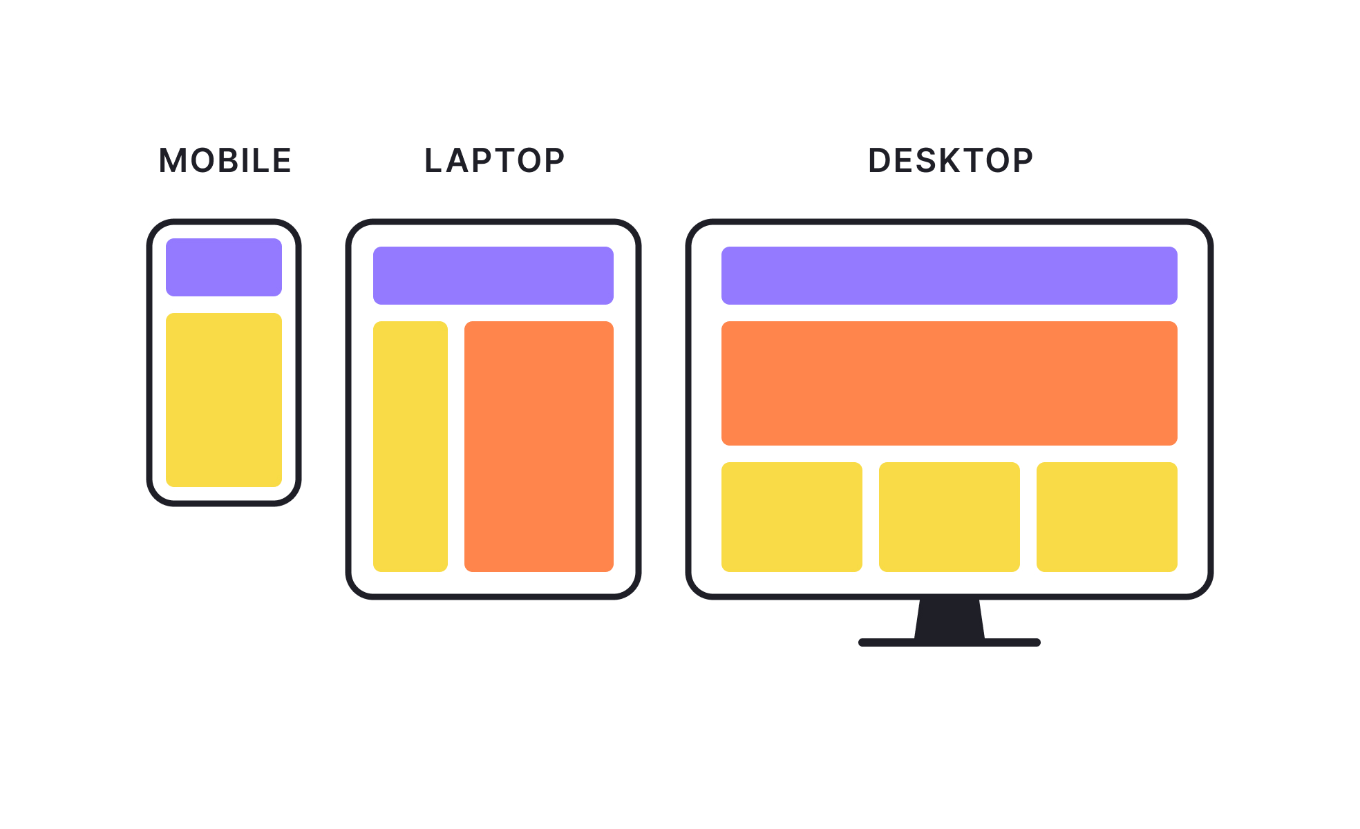
Adaptive design is a web and app design approach that delivers different layouts based on the device or screen size detected. Unlike responsive design, which fluidly adjusts, adaptive design uses predefined breakpoints with separate designs for each.
In UX/UI, adaptive design ensures that the interface feels tailored to the device. For example, a tablet version might use a split-screen layout, while a mobile version simplifies navigation for smaller displays. This can improve usability by optimizing layouts for known constraints.
In product management, adaptive design can be a strategic choice when serving distinct user contexts. For example, enterprise software might have a detailed desktop dashboard for in-office work and a streamlined mobile interface for field employees.
Adaptive design requires careful planning and more upfront design and development work, since multiple versions must be maintained. However, it allows for highly targeted experiences that can better meet user needs in specific environments.
The decision to use adaptive design depends on audience analysis, content priorities, and technical feasibility. Teams may combine it with responsive techniques to balance flexibility and specificity.
When executed well, adaptive design delivers consistent branding and functionality while tailoring the interface to the strengths and limitations of each device category.
Learn more about this in our Responsive vs Adaptive Design Lesson, a part of Mobile Design Course.
Key Takeaways
- Uses fixed layouts for specific screen sizes.
- Optimizes UX for each device type.
- Requires more initial work than responsive design.
- Useful for distinct user contexts.
- Can be combined with responsive methods.


