Creating digital products that people enjoy requires more than technical skill. It demands an understanding of how human beings perceive, remember, decide, and react. Behavioral scientist Dr. Susan Weinschenk has spent decades studying the brain, vision, memory, and motivation. In her book The Psychologist’s View of UX Design, she outlines ten psychological heuristics that influence user behavior. Knowing these patterns helps designers craft interfaces that feel natural and satisfying.
Below, each heuristic is explained in detail with practical guidance on applying it to websites and products.
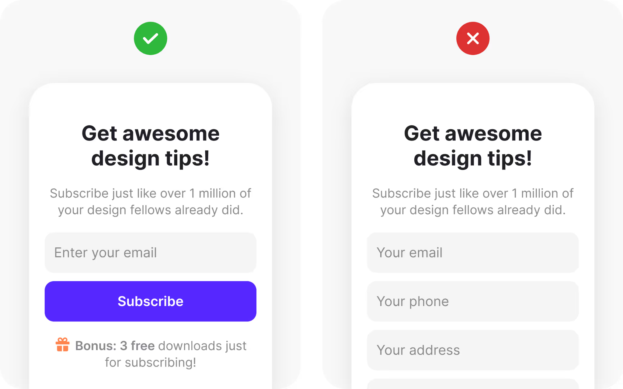
1. People avoid extra effort
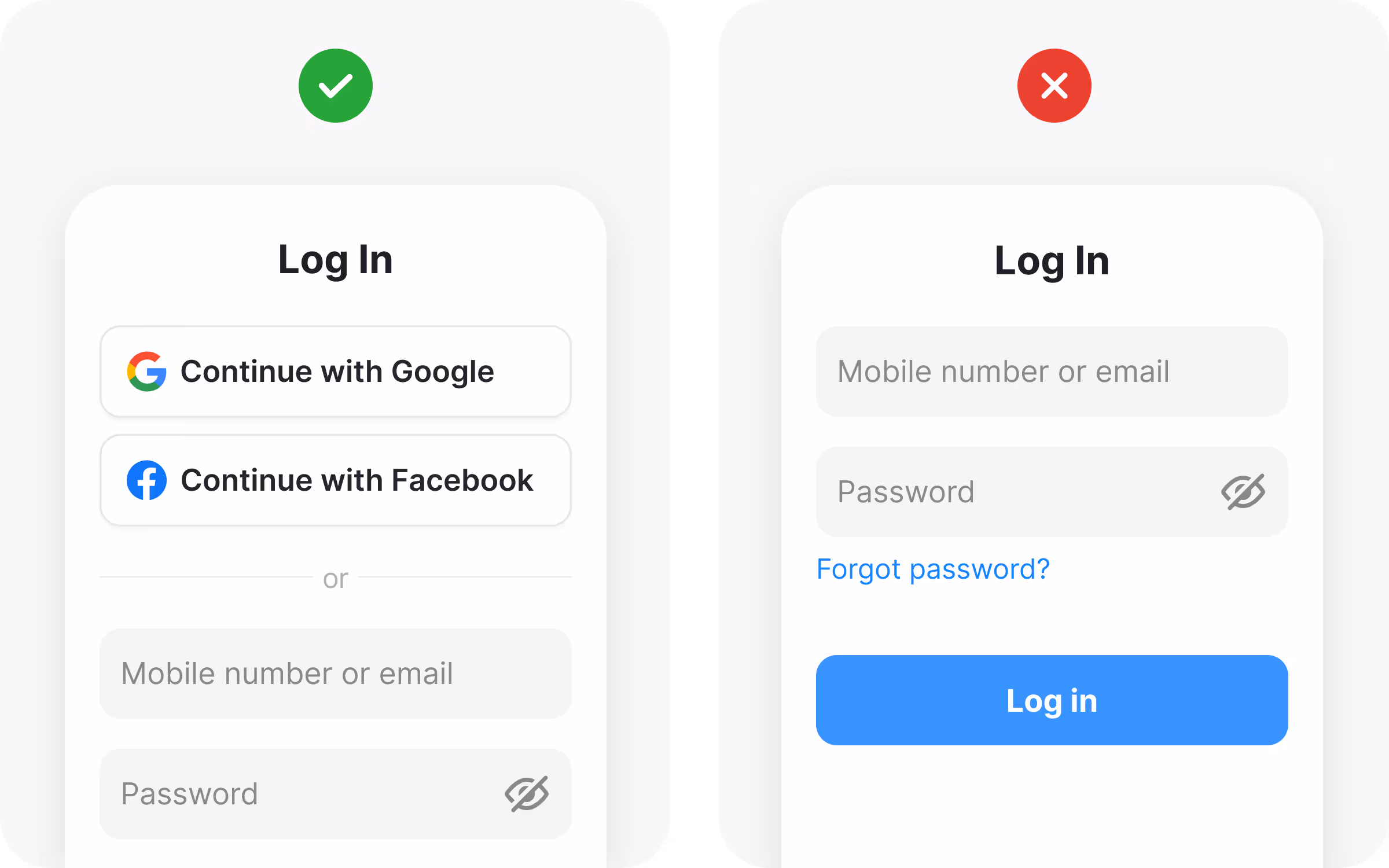
Users naturally choose the path that demands the least work. Every extra tap, click, or piece of information creates friction. Even small obstacles can feel larger when someone is trying to complete a simple task on a crowded train or while multitasking at home. If the experience feels tedious, many will postpone the action or abandon it completely.
To counter this, review every step in your workflow and question its necessity. Could a field be removed or filled automatically? Can you merge two screens without hurting clarity? Features like third-party sign-in or remembering a returning user’s details reduce the need for repeated typing and shorten the path to success. Smart defaults, such as auto-detecting a country or city, can save seconds that feel valuable on a mobile device.
Designers should also pay attention to how tasks are grouped. Even if each action seems minor on its own, a series of small steps adds up to a heavy cognitive load. Streamlined flows give users a sense of progress and control. A single unnecessary confirmation can break momentum, so trimming excess interactions often leads to higher completion rates and a more pleasant experience.
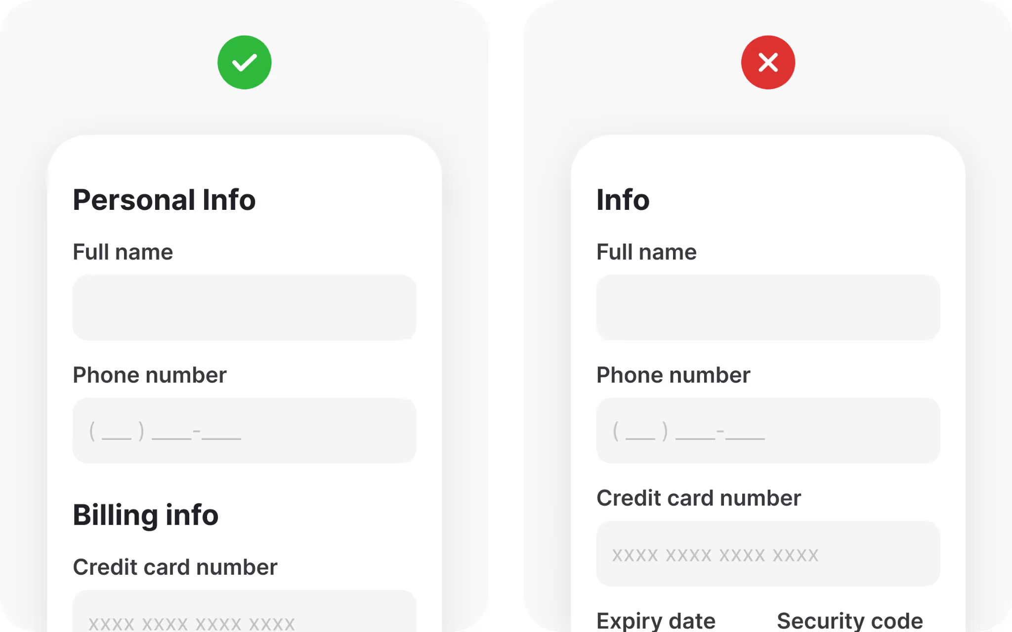
2. People have cognitive limits
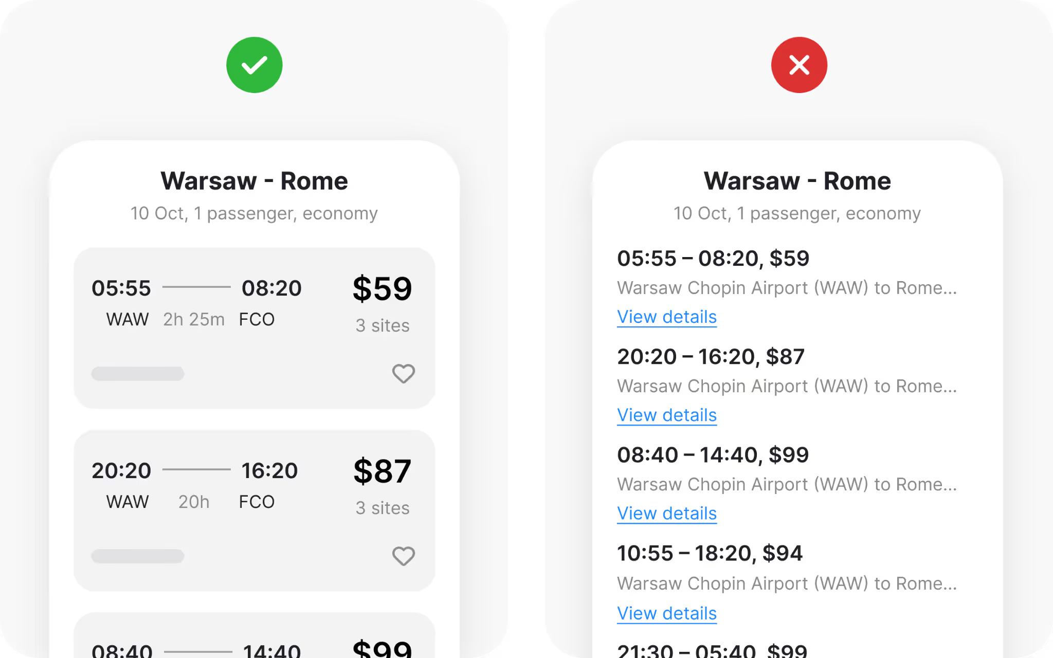
Human attention and memory can handle only a small amount of information at one time. Long registration pages, endless preference checkboxes, or dense text walls overwhelm users and make abandonment more likely. When people feel overloaded, they hesitate, and hesitation often turns into exit.
Progressive disclosure is an effective way to reduce this pressure. Break a long form into short steps and reveal only what is needed for the current action. Present complex information in small, digestible blocks. Clear headings and subheadings give structure and help people scan quickly, which is especially important for users with visual or cognitive challenges. Consistent button labels and predictable placement reduce the mental effort required to interpret each action.
Respecting these limits creates interfaces that feel calm and manageable. Instead of fearing the next screen, users gain confidence with each completed step. Small, focused tasks reinforce a rhythm of progress and prevent the fatigue that comes from processing too much at once.
3. People make mistakes
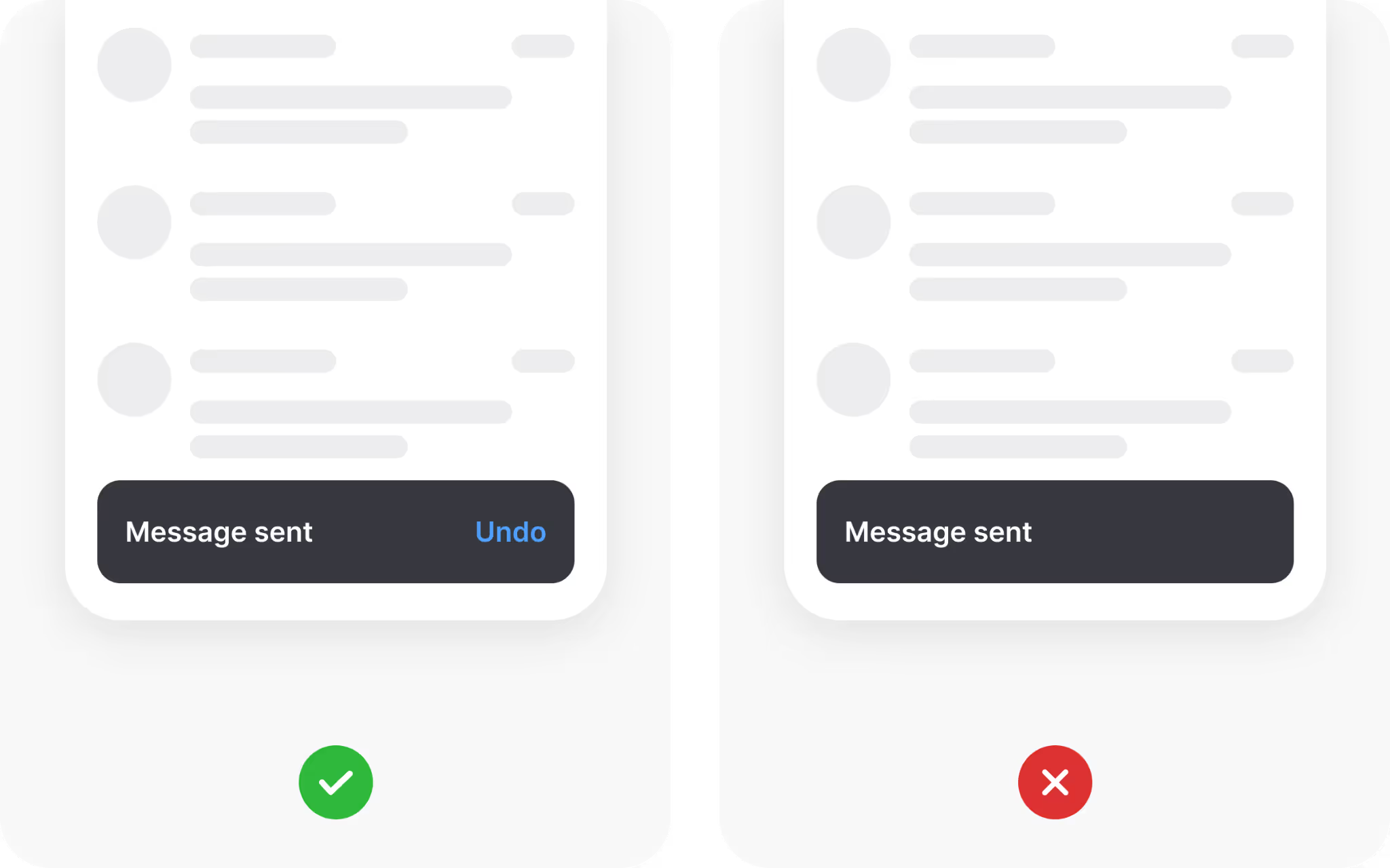
Mistakes are part of learning and exploration. Users will tap the wrong button, misread a label, or type an incorrect character, no matter how carefully they try to avoid it. A design that assumes perfect behavior will frustrate people when the inevitable error occurs.
A better approach is to anticipate common errors and design protections around them. Input constraints prevent invalid data, such as limiting a phone field to digits or formatting a date automatically. Before irreversible actions, present a clear confirmation screen so the user can review the choice. Provide obvious escape routes, such as a cancel button or an “Undo” option, to recover from accidental submissions.
Feedback is equally important. When an error occurs, explain what happened in plain language and guide the user toward a fix. An interface that forgives mistakes and offers clear recovery steps builds trust and reduces anxiety. Users who feel safe experimenting are more likely to engage deeply with a product.
4. Human memory is complex
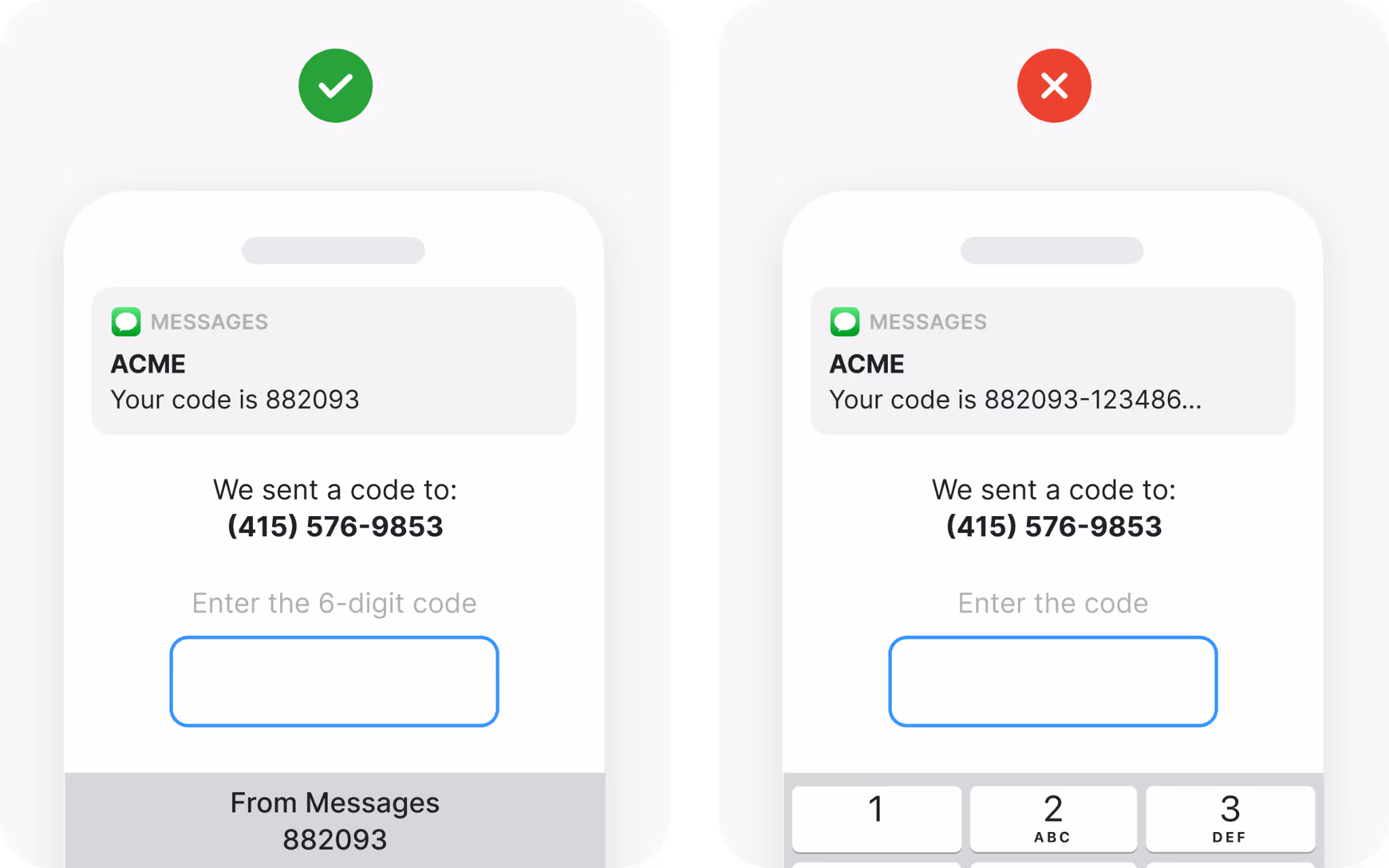
People cannot reliably recall every detail of a previous screen or session. Two individuals can witness the same event and describe it differently, and the same person can forget critical information within seconds. Relying on memory forces users to hold data while performing other tasks, which leads to errors and frustration.
Designers should make key information visible whenever it is needed. If a user must enter a code, display the code alongside the input field rather than expecting them to remember it. Offer predictive text, recent routes, or past selections so users can recognize choices instead of recalling them. This shift from recall to recognition lowers cognitive effort and speeds decision-making.
Supporting recognition also creates a sense of reliability. When users see familiar options or recently used items, they can act confidently without double-checking previous screens. Keeping vital details accessible frees mental space for exploration and allows people to focus on the goal rather than the mechanics of remembering.
5. People are social creatures
Human beings naturally look to others for guidance when making decisions. We watch what friends, family, and even strangers do, and we take comfort in the reassurance that a choice has been validated by a wider group. This instinct for social proof helps us reduce uncertainty and feel confident about our actions.
Designers can build trust by showing evidence of community approval. Ratings, reviews, and user counts communicate that others have already tested a product or service. Real-time indicators, such as “120 people purchased this today” or “30 users are viewing this item,” tap into the same desire for shared experience. When users see that their peers are participating, they feel more confident about joining in.
This principle is especially effective in situations where the stakes feel high, such as booking travel or making a financial commitment. Seeing that others have chosen the same flight or invested in the same tool reduces anxiety and accelerates decision-making. Interfaces that highlight social activity provide not just information but a sense of belonging.
6. Attention is fragile
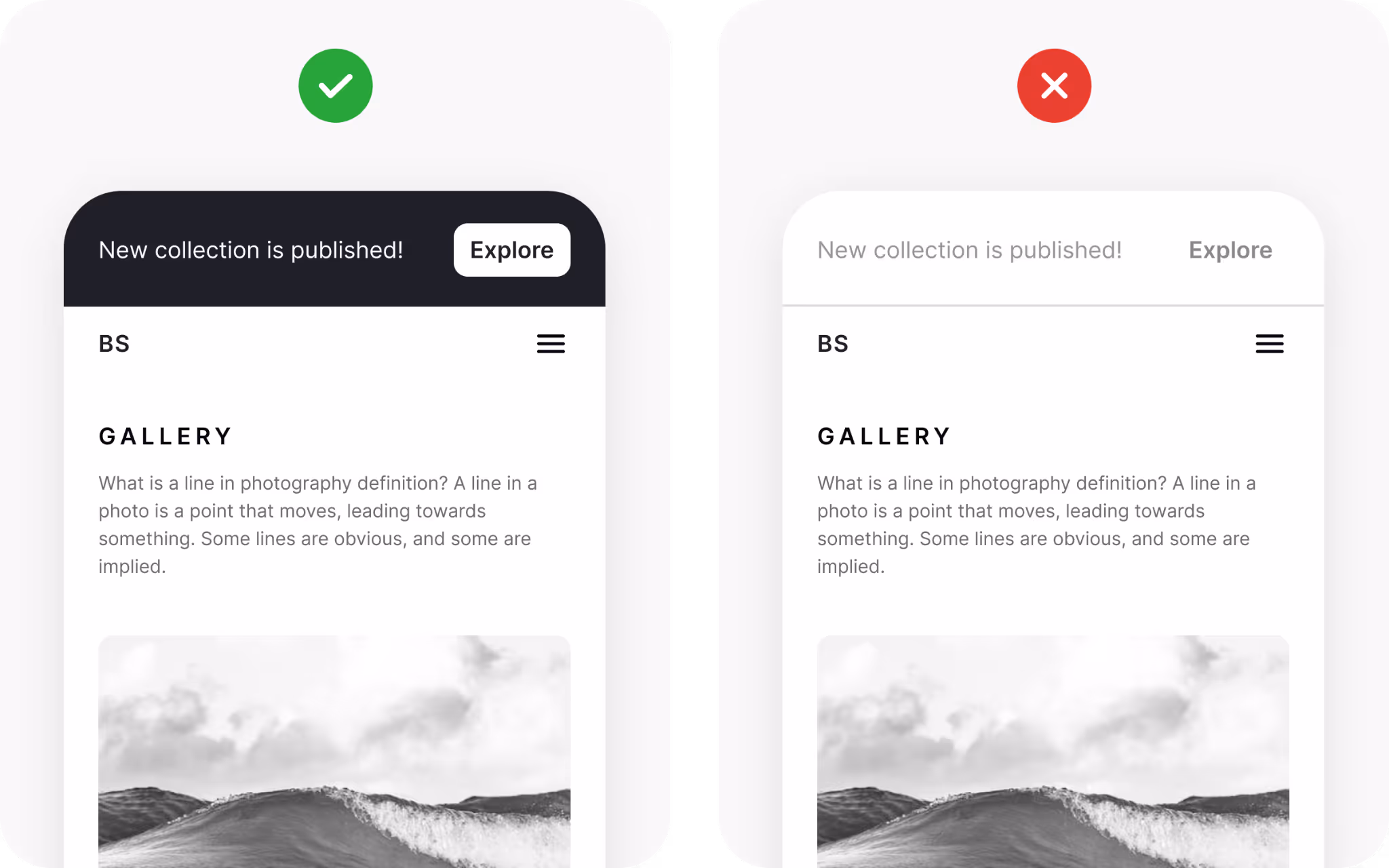
People notice only a fraction of what appears on a screen. Our eyes may land on a button or headline, yet our minds often filter out major changes if we are focused elsewhere. Psychologists refer to this as change blindness, and it can cause users to miss critical updates or calls to action.
Designers must guide attention deliberately. When everything is highlighted, nothing stands out. Choose a single primary action for each screen and give it visual weight through size, color contrast, or placement. Use animation sparingly to signal change, and avoid distracting elements that compete for focus. When motion or color is used carefully, it directs the eye without overwhelming it.
Interfaces that respect the limits of attention help users concentrate on what truly matters. A clear visual hierarchy ensures that important content is seen and understood at the right time, preventing confusion and reducing the mental effort required to interpret the interface.
7. People crave information
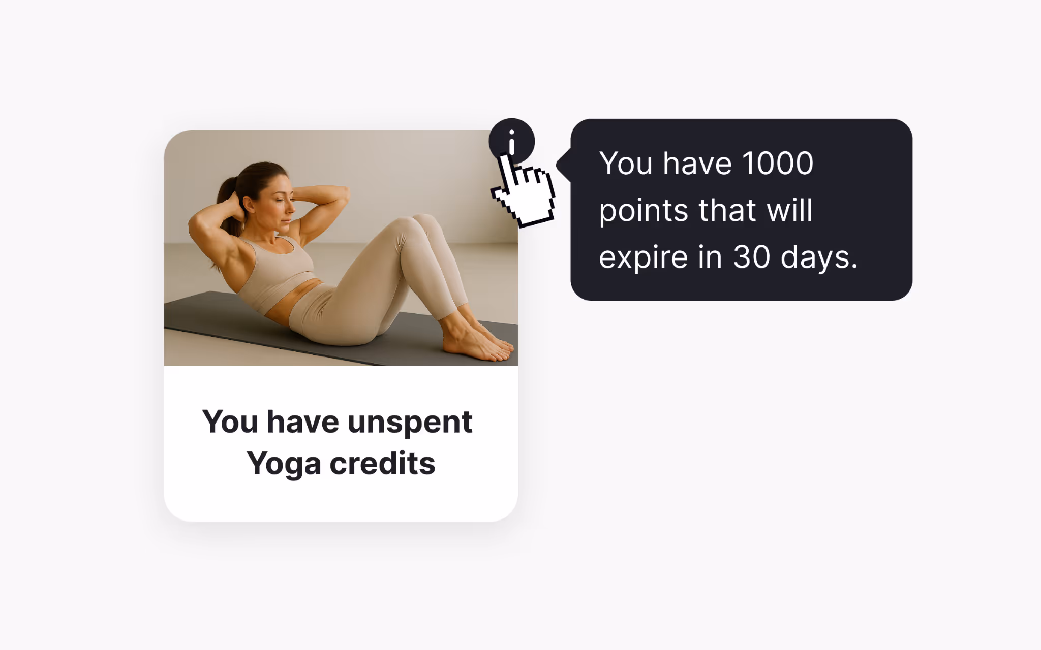
Our brains are wired to seek novelty and reward. New information triggers dopamine release, creating a small sense of pleasure and encouraging continued exploration. Users want to learn and discover, but an excess of content can quickly become overwhelming.
Designers can satisfy curiosity by giving users control over how much information they reveal. Features like “Show More” links, expandable panels, and tooltips allow people to explore at their own pace. This approach keeps screens clean while reassuring users that deeper details are available when they are ready.
The balance between availability and restraint is crucial. Too little information can feel restrictive, while too much creates clutter and anxiety. A thoughtful information hierarchy keeps curiosity alive without sacrificing clarity, making the experience both engaging and manageable.
8. Unconscious processing shapes behavior
Many decisions occur below the level of conscious thought. Background music in a café, the warmth of a color palette, or a friendly photograph can influence choices even when people cannot explain why. Designers who understand these subtle cues can guide behavior in ways that feel natural rather than forced.
Small initial requests often lead to larger commitments. Offering a free trial or a small bonus for signing up encourages users to take the first step, which in turn makes them more comfortable with a future purchase. Positive early experiences create a sense of trust and familiarity that carries into bigger decisions.
Visuals also play a powerful role. Research shows that even simple imagery can shift preferences, such as children choosing healthier food after repeatedly seeing appealing pictures of vegetables. Selecting imagery, colors, and textures with care helps create an emotional atmosphere that supports desired actions without overt persuasion.
9. People create mental models
Every person approaches a new interface with expectations formed by past experiences. These internal maps, or mental models, help users predict how things should work. When a design aligns with these models, interaction feels natural. When it diverges too far, confusion follows.
Designers should identify common patterns within their product category and incorporate familiar elements. Placing a search bar at the top of a page, using a shopping cart icon for purchases, or employing a play triangle for media are all examples of leveraging existing mental models. These cues reduce the need for instructions and let users rely on prior knowledge.
If you choose to introduce a new interaction pattern, provide clear guidance so users can adjust. Onboarding tips, contextual hints, or brief tutorials help people update their mental model without frustration. Respecting what users already know shortens the learning curve and builds trust.
10. Visual design drives interaction
Typography, color, spacing, and proportion are more than decoration. They form the foundation of communication, guiding the eye and shaping understanding. Good visual design organizes content so that users can focus on the right information at the right time.
Group related elements closely to signal their connection and separate unrelated items with adequate space. Use scale and contrast to create hierarchy, making primary actions stand out immediately. Maintain sufficient color contrast to keep text readable in all conditions, and provide alternative cues such as icons or labels for users who cannot rely on color alone.
Strong visual structure makes a product feel intuitive. When information is arranged with care, users can navigate without conscious effort, moving smoothly from one action to the next. A well-crafted layout communicates purpose, supports accessibility, and enhances the overall experience.
Wrapping Up
These psychological heuristics remind us that design is not only about pixels and code but about people. Users avoid unnecessary effort, forget details, and respond to social cues. They seek novelty yet tire when faced with too much information. They carry mental models shaped by past experiences and rely on visual signals to make sense of a screen.
By understanding these patterns, designers can create interfaces that feel natural and supportive. Reducing friction, guiding attention, and offering clear visual structure are not tricks; they are expressions of empathy. When a product aligns with the way people actually think and behave, it becomes easier to use and more enjoyable to return to again and again.