Microinteractions are the unsung heroes of design, adding finesse, engagement, and functionality to every click, tap, and scroll. From the satisfying sound of a message sent to the smooth transition of a menu opening, these tiny details play a pivotal role in shaping user perception and interaction. Microinteractions play a crucial role in shaping how users perceive and interact with products in the digital world. They’re the digital equivalent of a friendly nod or a reassuring smile, making users feel heard, understood, and valued.
Explore the principles, best practices, and creative techniques behind crafting effective microinteractions to create more enjoyable, memorable, and user-centric experiences. Microinteractions can be strategically placed at key moments in the user journey to enhance engagement and satisfaction.
What are microinteractions?

A micro interaction is a small, task-based element in the user interface that provides feedback, guides the user, or adds a touch of engagement. Micro interactions are focused on a single task or feedback mechanism and are designed to provide immediate and clear responses to user actions.
Micro interactions, as a collection of these small elements, play a crucial role in shaping the overall feel of a digital product. Common examples of microinteractions include the visual feedback received when a button is clicked, the animated transition as you toggle between settings, or the gentle vibration of a device to indicate an action’s completion. User input, such as filling out a form or pressing a button, is a common trigger for microinteractions. While individually minor, when aggregated, these interactions significantly impact overall user experience.
How the micro interaction behaves is determined by specific rules, loops, and modes that control its timing and persistence. Understanding how the micro is managed through loops and modes helps designers ensure microinteractions respond appropriately to user actions and inputs.
Elements of microinteractions

Microinteractions play an essential role in enhancing the user experience by providing guidance, feedback, or aiding in task completion. Let’s delve into the main elements that define these interactions:
- Trigger: A trigger is an action that initiates the microinteraction, like when you tap on a smartphone app icon. Triggers can be divided into user triggers (user-initiated actions such as clicking or swiping) and system initiated trigger (actions started automatically by the system when certain conditions are met). System triggers can automatically start microinteractions based on predefined conditions, such as displaying a notification or pop-up.
- Rules: These are the sequence of events after the trigger. For instance, swiping down on a mobile news app might lead to its content refreshing based on predetermined rules. The system responds to both user triggers and system initiated triggers according to these set rules, which define what happens next.
- Feedback: Feedback involves informing users about the ongoing process. A common example is the swirling circle seen during webpage loading. Feedback can be provided in response to both user initiated and system initiated actions, helping users understand the result of their interactions.
- Loops & modes: These elements determine the microinteraction’s duration and repetition. For example, activating the silent mode on a phone keeps it in that mode until changed, illustrating a mode in a microinteraction.[[2]](LINK 4) Modes define the current state or context of the interaction, and modes loops control how the microinteraction repeats, changes states, and persists over time, creating a dynamic and personalized user experience.
Communicating system status and progress

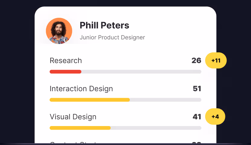
In digital platforms, whether you’re uploading a photo, downloading a file, or refreshing your feed, microinteractions serve as a friendly nudge, saying, “Hang on, I’m working on it!” They visually represent the process, usually through progress indicators such as progress bars, spinning icons, or changing percentages.
These microinteractions offer a comforting assurance, letting users know where they stand in the process. A progress bar, for example, helps users complete tasks by providing clear, real-time feedback on how much of the process is finished. Dynamic loading animations also act as progress indicators during loading times, reducing perceived wait times and enhancing the overall user experience. By doing so, they prevent confusion, reduce impatience, and simply make the waiting time a little more bearable.
Providing system feedback and notifications
One of the fundamental principles highlighted by Jakob Nielsen’s heuristics emphasizes the importance of providing feedback to users about system status.[[3]](LINK 2) When users interact with a system, be it through submitting a form, adjusting settings, or executing other actions, the system must clearly communicate its status in return.
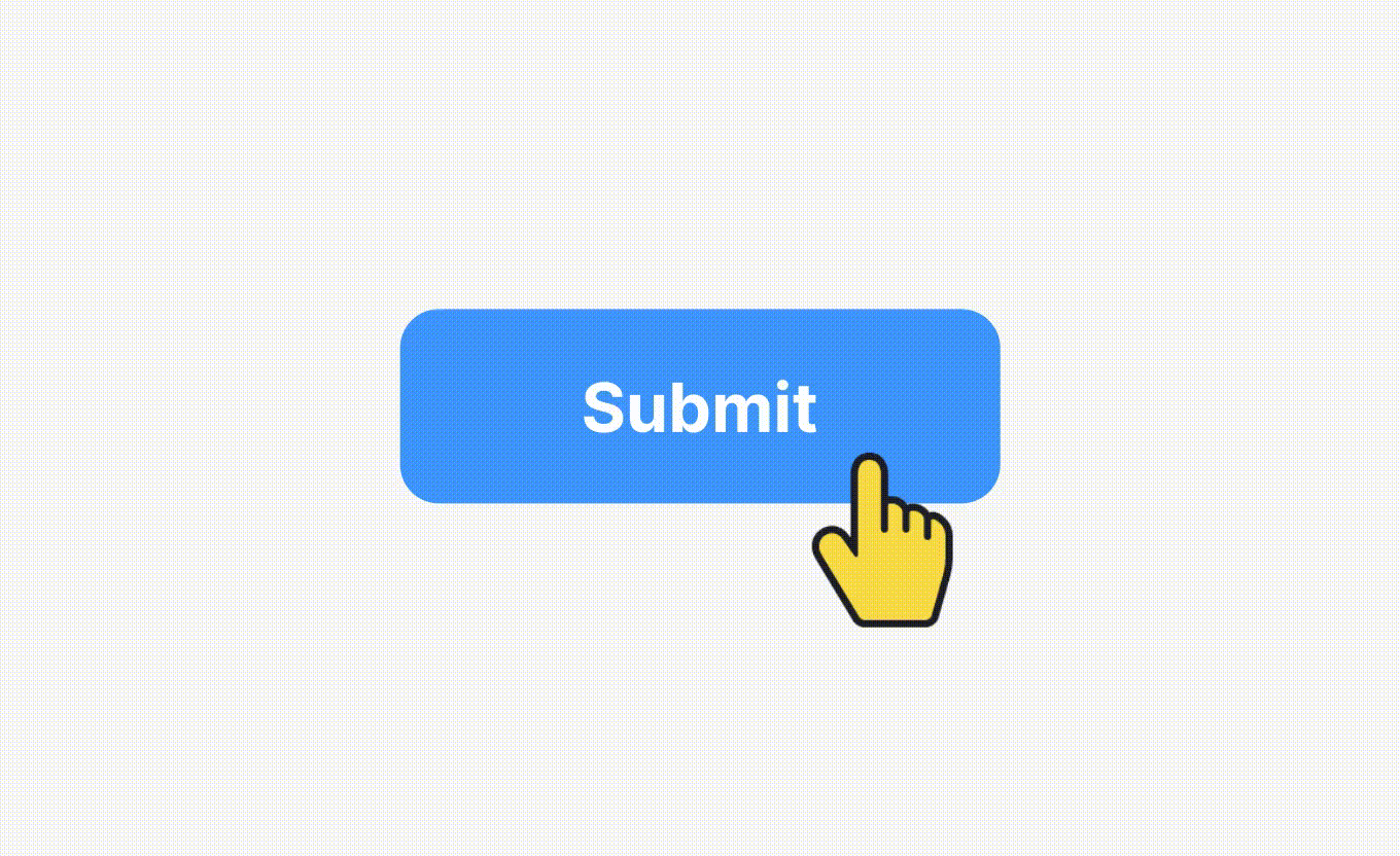
A well-designed microinteraction achieves precisely this by providing feedback to the user instantly, confirming their actions. For instance, when an edited document is saved, a brief “Saved!” notification might pop up. Similarly, if one tries to submit a form without completing the necessary fields, an error message appears, and those empty fields might illuminate or jiggle to draw attention. Providing visual cues, such as color changes or animations, helps guide users and reinforce actions, preventing confusion and improving understanding of the interface. Visual cues are key elements in microinteractions, communicating status and feedback effectively.
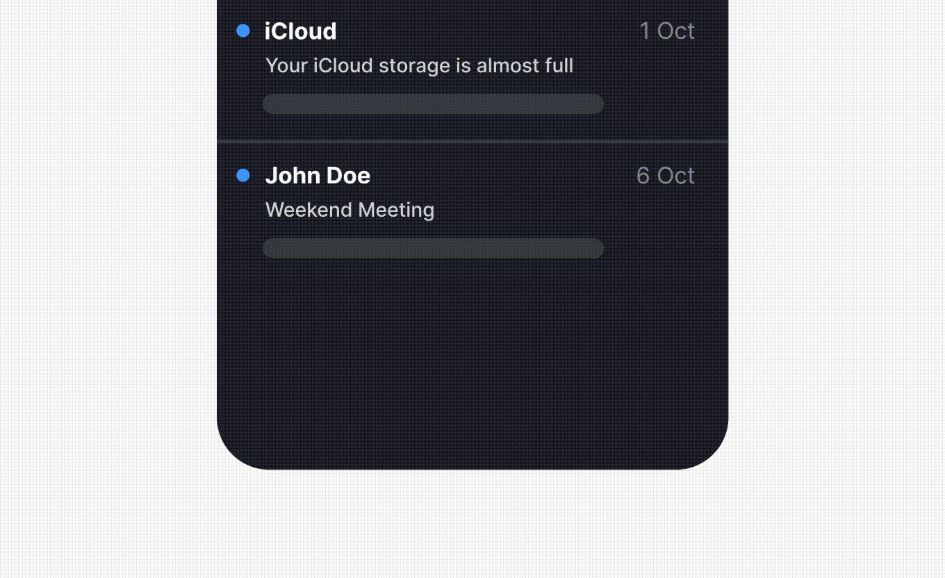
Additionally, notifications, a subset of microinteractions, are designed to keep users informed about system or application events. For example, the unread message badge on email applications alerts users to new incoming communications.
Indicating standby
In UX design, ensuring clarity during moments of inactivity or processing is essential. Microinteractions, designed to indicate standby, play a pivotal role in achieving this clarity. Clear standby microinteractions help reduce usability flaws by preventing user confusion and ensuring users understand the system is still working.
When users command a system, be it loading a page, submitting data, or starting an application, there’s often a brief pause or processing time. Without a clear indication, this pause might be mistaken for system failure or unresponsiveness. Hence, the need for standby signals.
Common microinteractions like rotating loaders, pulsing icons, or a shimmer effect are employed to signify that the system is active and processing the user’s request. Their primary function is to set user expectations, reducing uncertainty and preventing redundant user actions. Consistent standby indicators also help lower the learning curve for new users, making the interface more intuitive.
Supporting undo operations
Microinteractions that support undo operations are more than just an afterthought; they are fundamental to a well-thought-out, user-centric design. They offer users a safety net, acknowledging that errors are part of the human experience. Providing undo options in microinteractions helps reduce user frustration by allowing users to easily correct mistakes, which leads to a smoother and more satisfying experience. In technical terms, this serves to minimize the error rate, one of the critical metrics in usability studies.
By incorporating undo actions in microinteractions, designers are essentially upholding one of the key principles of user experience — forgiveness. In doing so, they build a level of trust and comfort, encouraging continued user interaction with the digital environment.
Preventing rework & user errors
Microinteractions play a crucial role in preventing rework and minimizing user errors, enhancing the overall usability and efficiency of a digital interface. Take, for example, form validation in web forms. As you fill out each field, the system may immediately indicate if the input is valid or not, like showing a green checkmark for a valid email address or a red (X) for an incorrect one. This immediate feedback helps prevent rework by enabling on-the-spot corrections.
However, poorly designed microinteractions can confuse users, leading to more user errors and frustration. Ensuring clarity and simplicity in microinteractions is essential to prevent confusion and support a smooth user experience.
Communicating brand & personality

Microinteractions may seem small, but they wield significant power in communicating a brand’s personality — whether it’s friendliness, professionalism, or reliability. They make users feel connected to the brand, fostering loyalty and trust.
For example, consider a travel booking app. When you successfully book a flight, a delightful animation of a plane taking off might accompany your confirmation message. This microinteraction not only reassures you but also subtly reinforces the brand’s commitment to making your journey exciting and seamless. Positive reinforcement through such celebratory microinteractions can strengthen brand loyalty by creating rewarding emotional responses that motivate users to return. Similarly, a banking app may employ a reassuring “cha-ching” sound when you complete a transaction, instilling a sense of trust and financial security.
Adding fun & engagement
Microinteractions have the ability to inject doses of delight and engagement into user experiences, turning mundane tasks into enjoyable interactions. These subtle design elements create a sense of responsiveness and connection among users. Microinteractions can also encourage users to engage more deeply with the product by providing immediate feedback and motivation through small, rewarding cues.
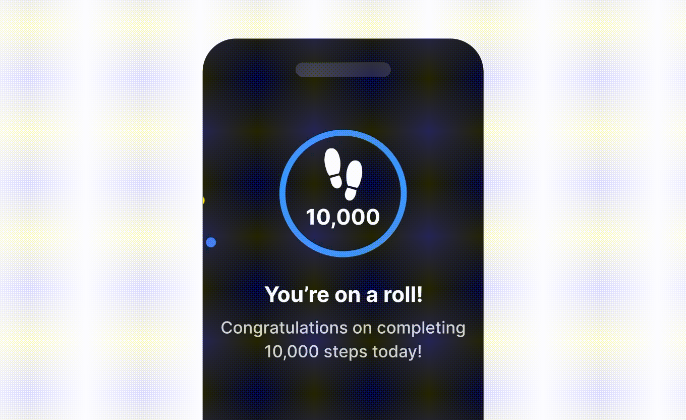
Consider a fitness app for example. When users achieve a daily step goal, a celebratory confetti animation could burst onto the screen. This microinteraction transforms a routine accomplishment into a moment of celebration, making users more likely to return and engage with the app regularly. Subtle interactions, such as small animations or hover effects, further enhance engagement by making the experience feel more intuitive and enjoyable.
Benefits of microinteractions
Look, I've been designing digital products for years, and I can tell you this: microinteractions aren't just some fancy design trend. They're what make or break your user experience. When someone taps a button and gets instant feedback, when a form submission actually tells them it worked, when a download shows real progress — that's what keeps people from wanting to throw their phone across the room. I've watched too many users get frustrated because they weren't sure if something was loading, if their action registered, if they'd broken something. Microinteractions fix that. They're like having a conversation with your users, letting them know "hey, we heard you, and here's what's happening."
But here's where it gets really interesting. These tiny moments don't just prevent disasters — they actually make people want to stick around. I've seen it happen over and over again. A well-crafted loading animation, a satisfying button press, a delightful hover effect — suddenly users are exploring more, clicking around, actually enjoying the experience instead of just tolerating it. And if you do it right, if you really nail the personality of your brand through these small touches, people remember you. They come back. They tell their friends. It's not rocket science, but it's powerful. The best digital products I've worked on weren't just functional — they felt alive, responsive, almost human. That's what happens when you stop treating microinteractions like afterthoughts and start seeing them for what they really are: the difference between a tool people use and a product they love.
Microinteraction examples
Look, I've been designing digital products for years, and I can tell you that microinteractions are everywhere once you start paying attention. They're the secret sauce that makes users actually want to stick around. Take progress bars — they're not just pretty decorations. They're telling your users exactly where they stand, how much work is left, and most importantly, that something is actually happening. I've seen too many projects fail because users thought the system was broken when it was just thinking. And those animated buttons and icons? They're not there to look fancy. They're there because users need to know their click registered. Period. It's the difference between a responsive interface and one that feels dead.
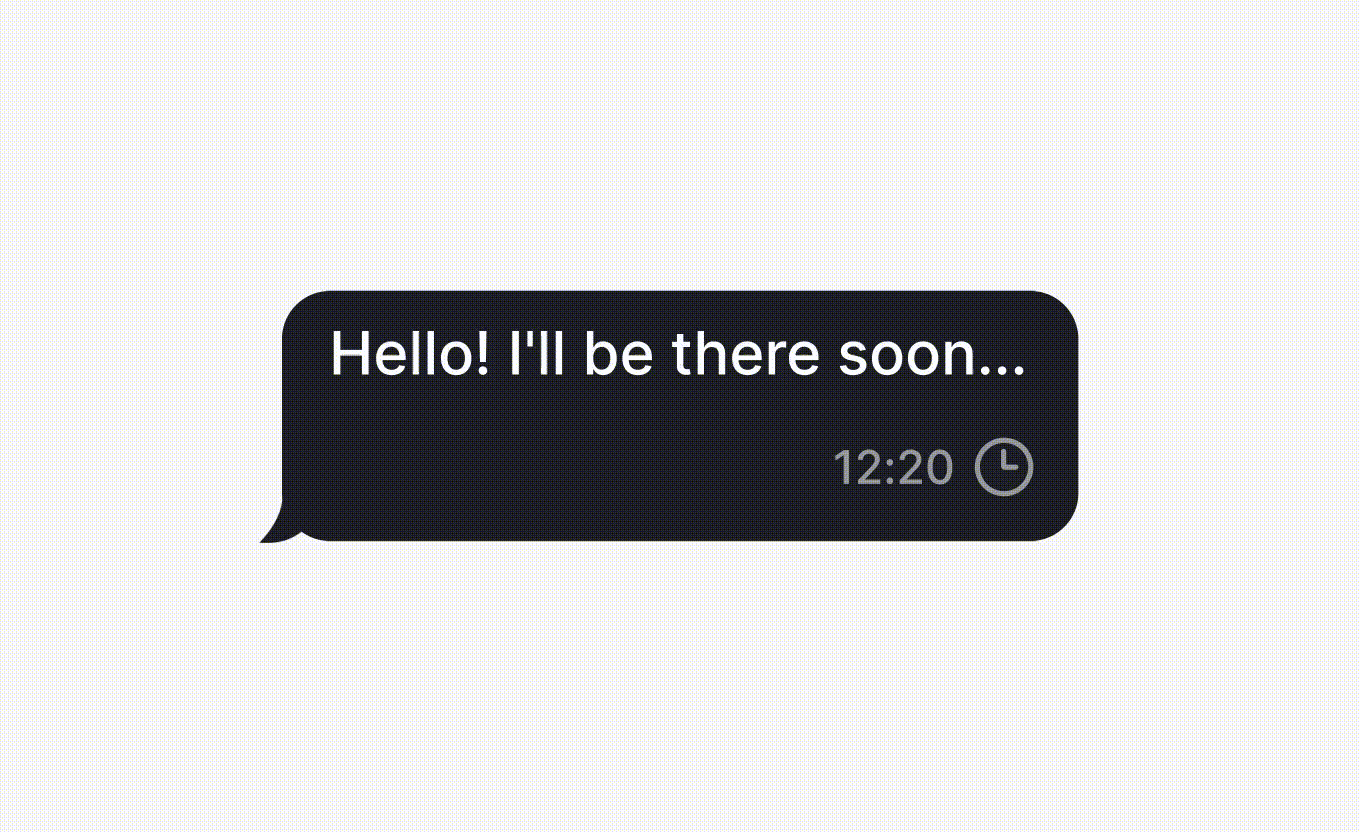
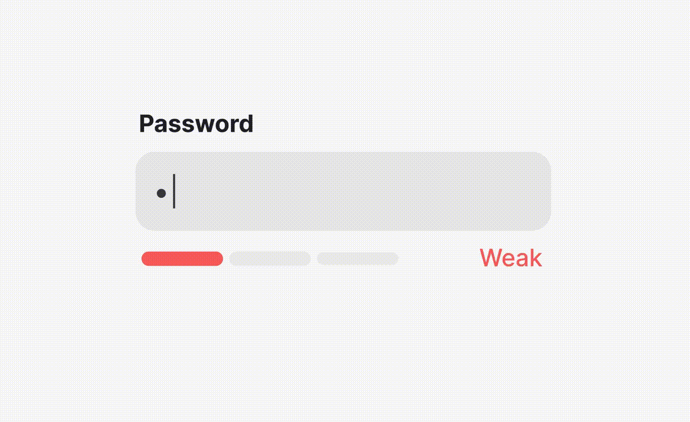
But here's where it gets really interesting — microinteractions can actually save you from support tickets. I'm talking about those real-time validations that catch errors before users hit submit. You know, that red outline that appears when someone types a weak password, or that gentle shake that says "nope, try again." We've all been there, and it beats getting an error page after waiting thirty seconds. And if you've ever used a messaging app, you've experienced the magic of typing indicators and read receipts. Those tiny features? They're what keep people glued to their phones, creating that sense of connection and real conversation. That's the power we're working with here. Whether it's through progress feedback, visual confirmations, or subtle animations that guide attention, these micro-moments transform ordinary interactions into something users actually enjoy. That's not theory — that's what I've seen work, again and again.
The future of microinteractions
Here's the thing about microinteractions — their future isn't just bright, it's about to explode. And honestly, it's about time. No-code tools are finally doing what they should've done years ago: putting the power back in your hands. You don't need to be a coding wizard anymore to create those subtle little moments that make users go "wow." That's huge. It means every designer, every product person who's been sitting on the sidelines thinking "I wish I could build that" — well, now you can. More digital products are going to feel alive, responsive, human. The democratization is real, and it's happening fast.
But here's where it gets really interesting. AI and machine learning aren't just buzzwords anymore — they're about to make microinteractions personal. Like, actually personal. Your app will learn how you tap, how you swipe, what makes you frustrated, what delights you. And then it'll adapt. In real time. That's not science fiction, that's next Tuesday. As users get pickier about what feels intuitive and what doesn't, microinteractions will become the difference between products that feel effortless and ones that make people want to throw their phone across the room. They're going to carry the weight of reducing cognitive load, guiding people through complexity, and making even the most intimidating interfaces feel like a conversation with a friend.
Tips on designing effective microinteractions
It is clear that microinteractions have immense potential to create seamless and delightful user experiences within digital apps. Effective microinteractions start with user research, which helps designers understand user needs, motivations, and behaviors to inform the design process.
To put them to good use, consider these guidelines:
- Purposeful functionality: Ensure each microinteraction serves a clear purpose, whether it’s providing feedback, guiding the user, or adding a touch of delight.
- Seamless integration: Microinteractions should seamlessly blend into the overall interface, maintaining consistency in style, tone, and timing.
- Performance and timing: Fine-tune the timing of microinteractions to be responsive but not intrusive.
- Balance familiarity with innovation: While innovative elements add excitement, familiar elements provide comfort and ease of use.
- Align with user goals and user flow: Design microinteractions to support user goals and fit naturally within the user flow, mapping out the steps users take before and after each interaction.
- Create micro interactions: Break down microinteractions into key components, focusing on simplicity and intuitive design to reinforce positive user feedback.
- Testing and iteration: Conduct thorough user testing during the user testing phase to refine microinteractions based on real-world feedback. Iterate based on user preferences and behavior to optimize their impact.
By following these guidelines, you can create well-designed microinteractions that enhance user experience and contribute to a more engaging and intuitive digital environment.
Conclusion
Look, after years of working in this space, I can tell you that microinteractions aren't just some nice-to-have design detail—they're absolutely essential to creating interfaces that actually work for people. When you understand how triggers, rules, feedback, and loops and modes come together, you can craft experiences that don't just look good, but actually guide users through their journey without them even realizing it. That's the magic of it. You're reducing friction, cutting down on those frustrating moments where people get stuck, and you're building engagement that feels natural, not forced. And here's the thing—as technology keeps evolving at breakneck speed, microinteractions are only going to become more critical. There's so much room for innovation here, so many opportunities to push digital product design forward in ways we haven't even imagined yet. Companies that get this, that actually invest in weaving thoughtful microinteractions into their design strategy, they're the ones creating products that feel intuitive and engaging—products that people actually want to use. Because at the end of the day, that's what it's all about: meeting users where they are and giving them experiences that just work.