What is Hick's Law? Definition and core principle
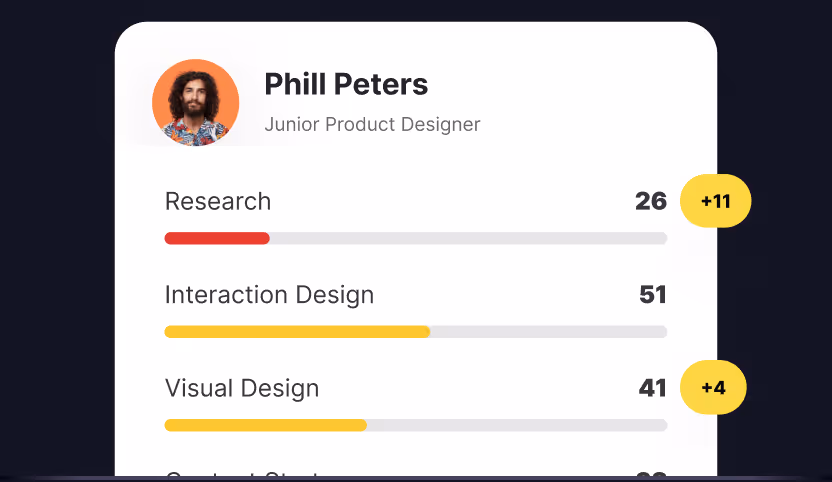
Hick's Law in UX design is the principle that the more choices users face, the longer it takes them to decide, and the more likely they are to abandon the experience entirely. Should a user sign up now or later? Which pricing plan should they choose? Where do they click to get started? The ease or difficulty of these decisions often determines whether someone continues or abandons the journey.
Hick’s Law explains this relationship between choices and decision-making. The law states that the more options people are given, the longer it takes to choose. When options feel excessive, decision-making slows, satisfaction drops, and in many cases, users quit entirely.
For UX designers, this principle has clear implications. Offering too many paths may seem helpful, but it can overwhelm people. The key is to present just enough options to meet needs without creating unnecessary friction. Hick’s Law does not mean always showing fewer choices. It means showing the right choices, in the right way, at the right time.
Keeping options limited and focused
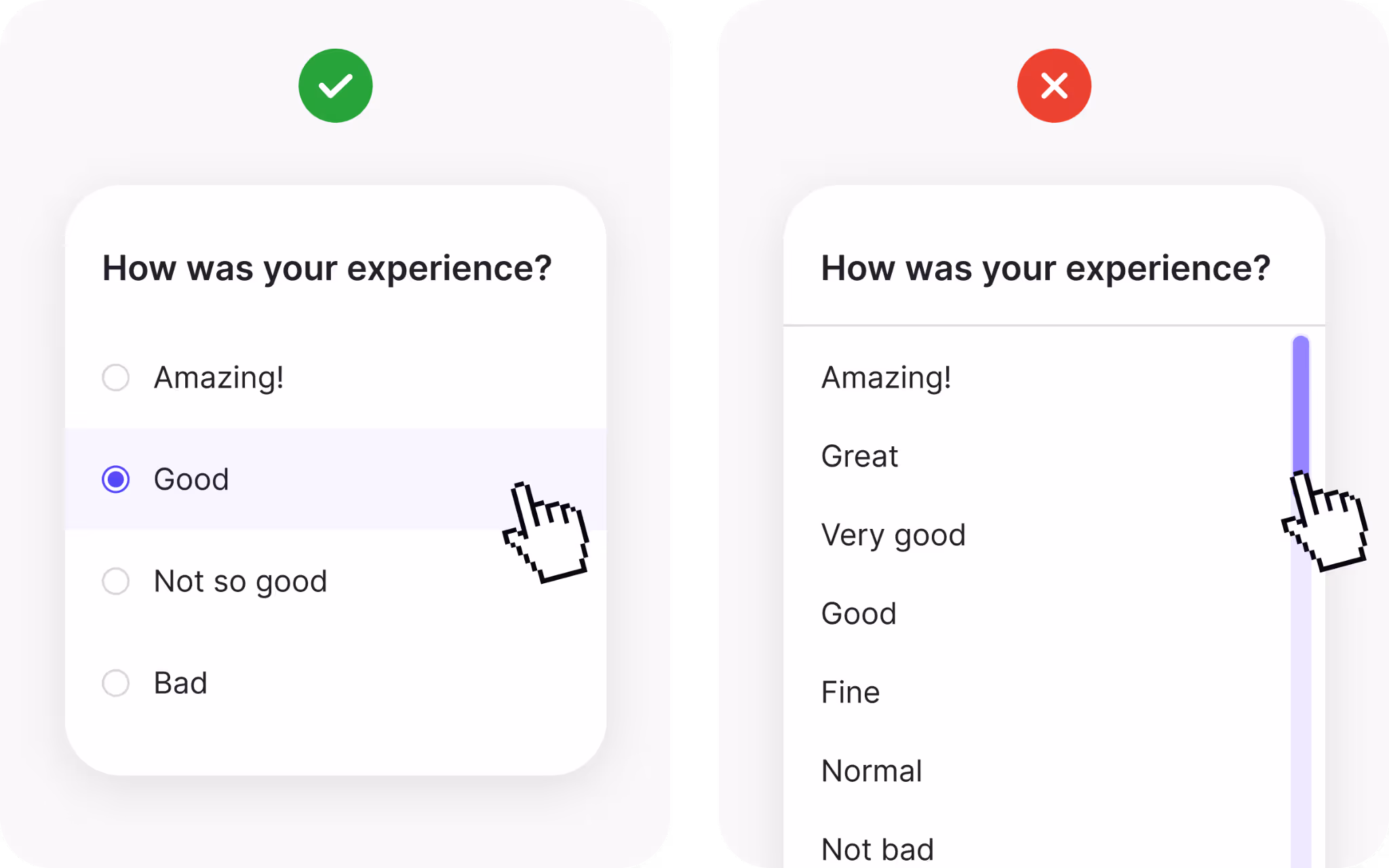
When decision speed is important, limit visible options. A classic example is a feedback form or sign-up flow. If you ask users to make too many choices upfront, they will often give up. The effort required feels disproportionate to the benefit.
This is why short forms outperform long ones. A form asking only for name and email is far more likely to be completed than one with a dozen fields. Each additional choice adds mental weight. By trimming down to the essentials, you increase completion rates and reduce frustration.
Of course, limiting options does not mean withholding important functionality. It means focusing attention where it matters most. The fewer the distractions, the faster people move toward the action you want them to take.
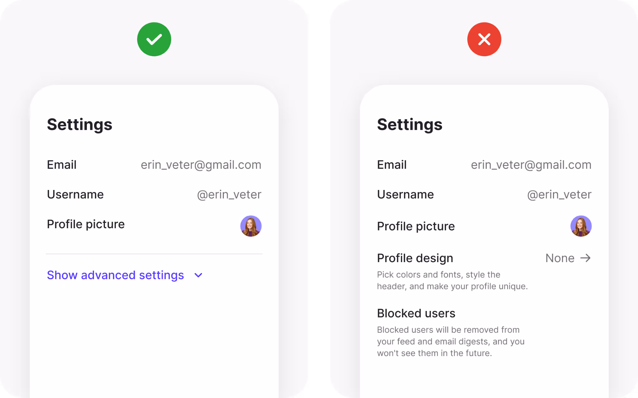
Offering an “Other” option when needed
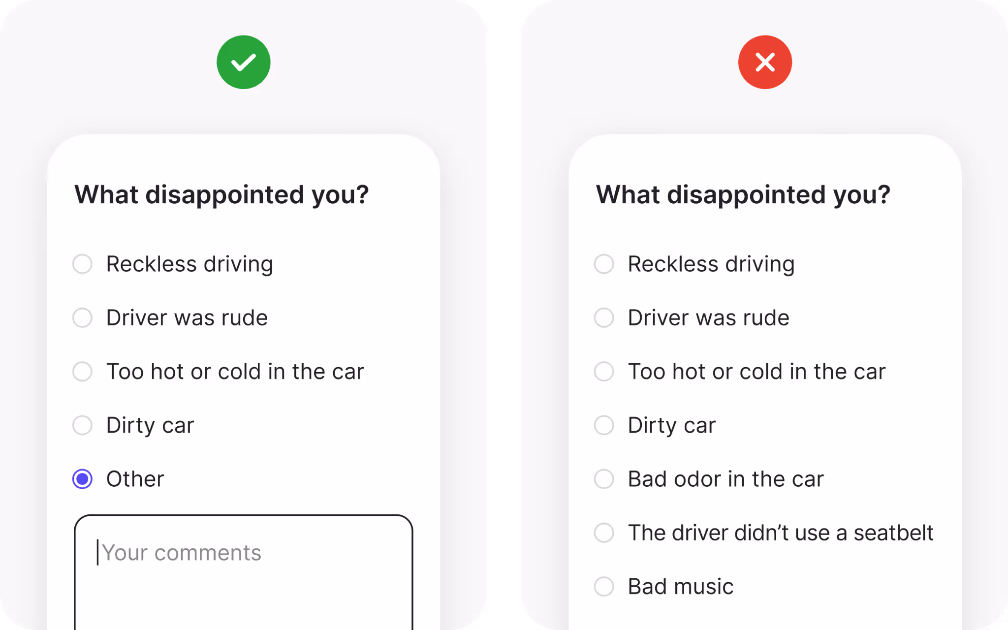
Sometimes, strict limitations do not capture the full picture. For example, when gathering feedback, you may want to know why someone is dissatisfied. Listing only common reasons simplifies the decision, but it restricts the feedback you receive.
Adding an “Other” option with a text field provides flexibility. Users who do not see their experience reflected in the listed choices can share their unique perspective. This keeps the main options simple while still capturing diverse input.
The same approach applies to categorization. Imagine you are running a survey on content preferences. Most categories may be obvious, but edge cases still exist. By including “Other,” you acknowledge variety without overwhelming the interface. Just remember that too much freedom can create scattered results, so balance flexibility with focus.
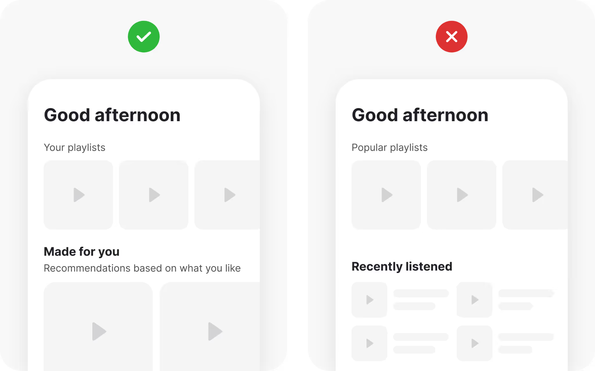
Organizing content with categories
Unstructured lists quickly become overwhelming. Browsing through dozens or hundreds of items without organization feels daunting. This is where categories improve both speed and clarity.
Streaming services provide excellent examples. Platforms like Netflix and Spotify group content into categories such as genres or moods. Instead of scrolling endlessly, users navigate through organized sections that surface relevant items. Without categories, the experience would collapse under the weight of too many choices.
For designers, categories serve two functions: they reduce cognitive effort and create cleaner layouts. Content grouped meaningfully helps users scan quickly and locate what they want without unnecessary searching.
Grouping navigation components
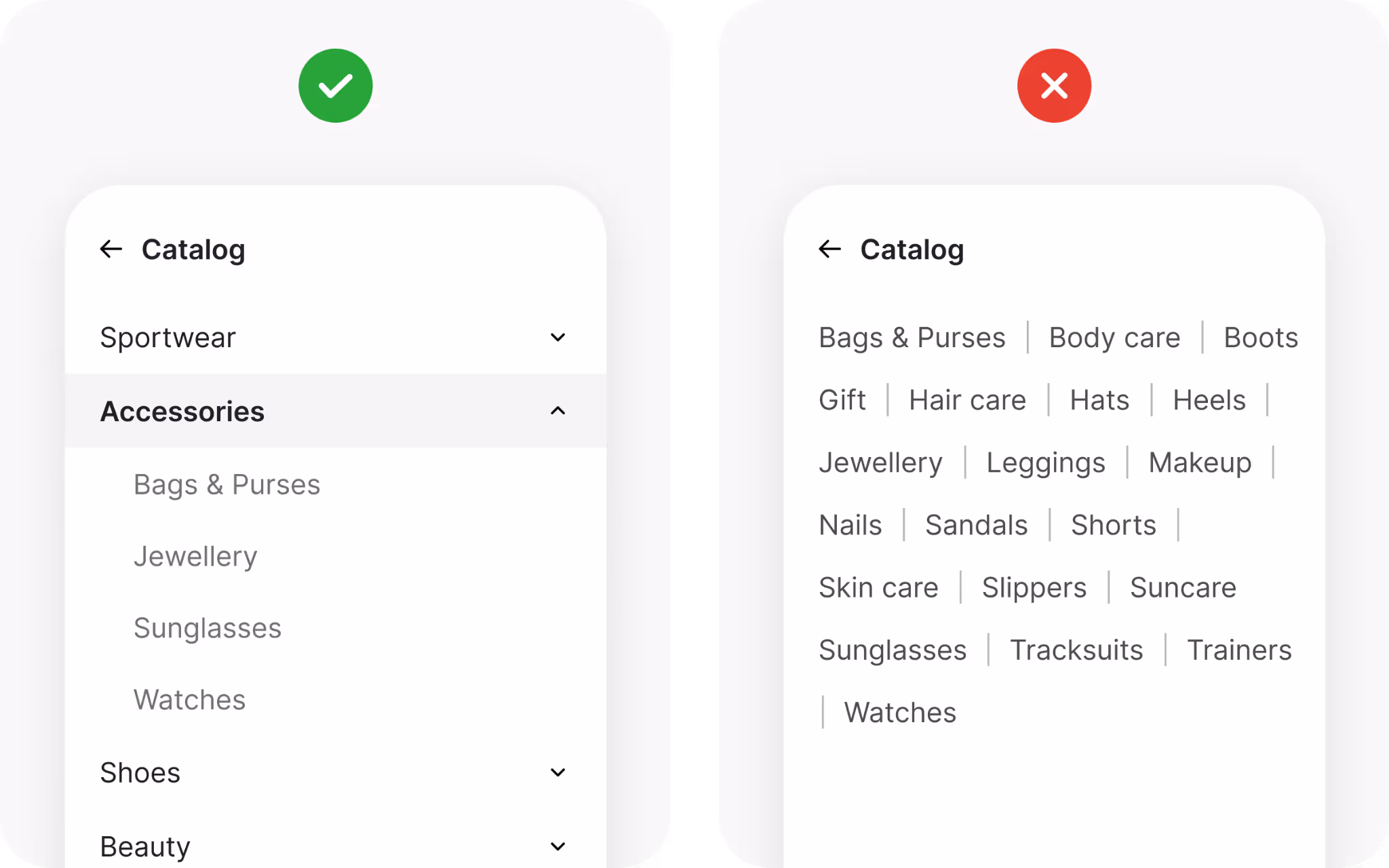
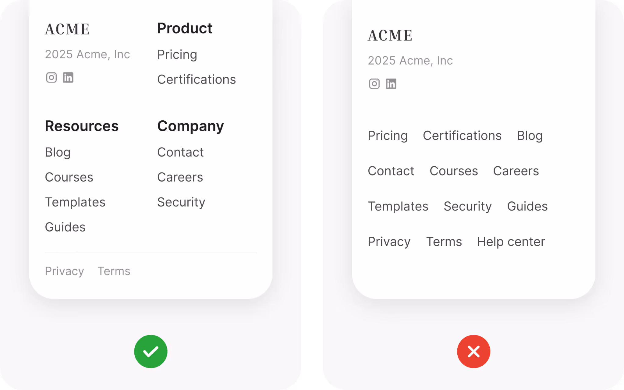
Navigation is one of the most visible applications of Hick’s Law. If menus contain too many choices, users hesitate. Mega menus with dozens of links can feel intimidating unless they are well structured.
Grouping solves this problem. When items are clustered under clear headings, the number of perceived options shrinks. Instead of scanning twenty scattered links, users scan four groups with five links each. The structure speeds up recognition and makes navigation less stressful.
If you are unsure how to group items, ask your users. Card sorting exercises reveal how people naturally categorize content. Using this input to design your menus ensures that navigation feels intuitive, not arbitrary.
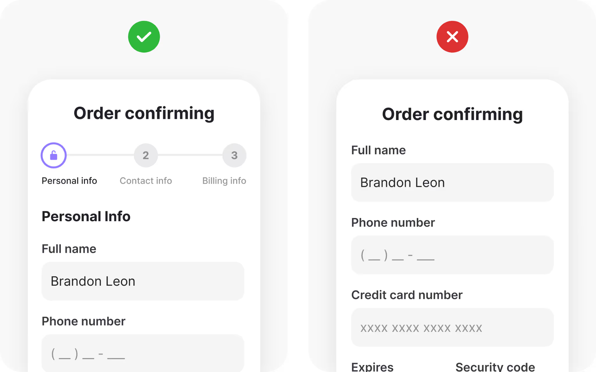
Simplifying forms with smarter flows
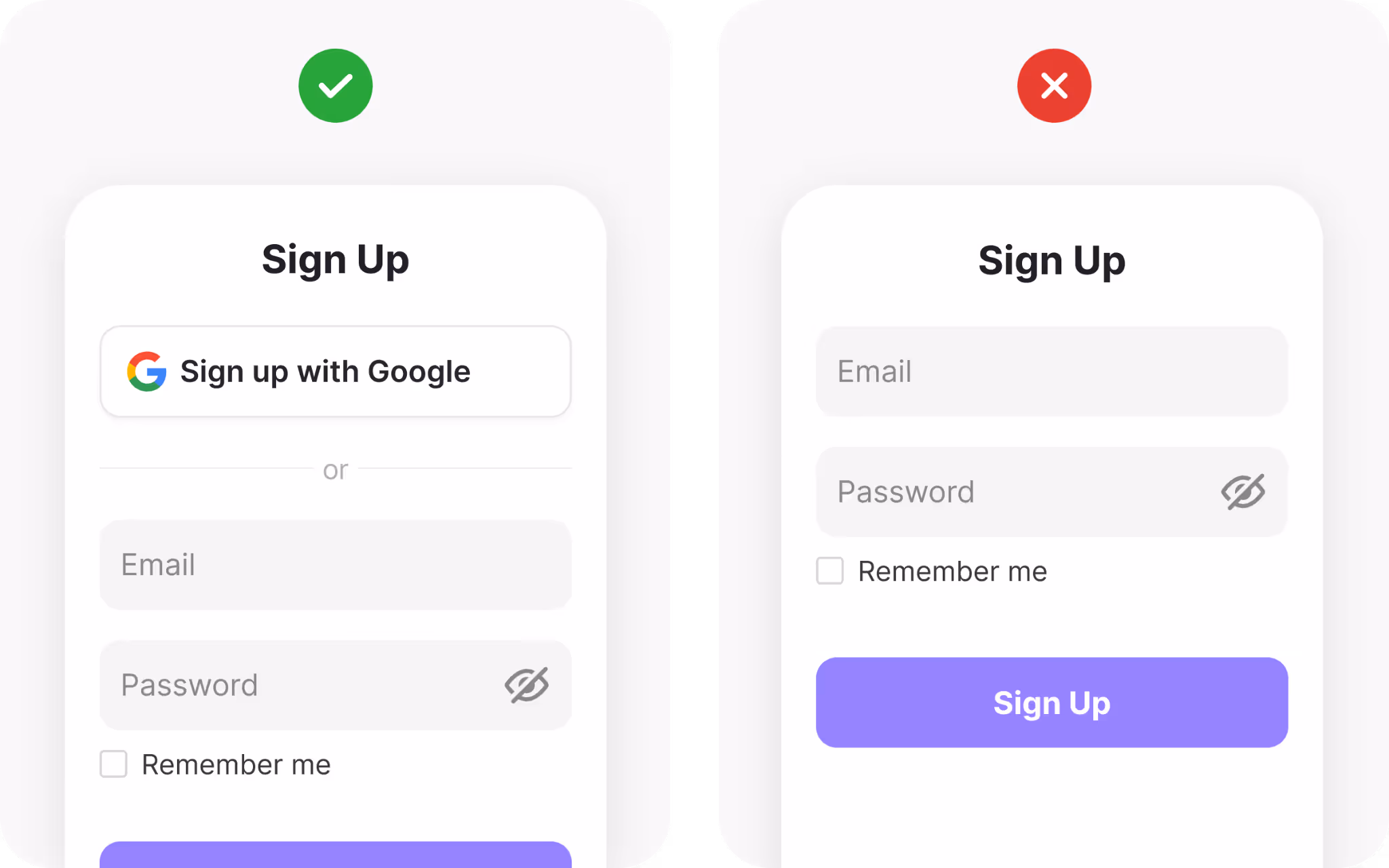
Forms are one of the biggest friction points in digital products. Long, complex forms discourage completion, especially at critical moments like checkout. Hick’s Law explains why: too many fields increase effort and hesitation.
The solution is to streamline. Ask only for what you need. If more details are necessary later, gather them after the account is created or the purchase is complete. Another strategy is to allow sign-up with third-party accounts like Google or Apple. This reduces effort to a single click, while still collecting key information.
Simplification is not only about fewer fields. It is about flow. Breaking long forms into smaller steps with progress indicators reduces perceived effort. Users are more willing to continue when they can see the finish line.
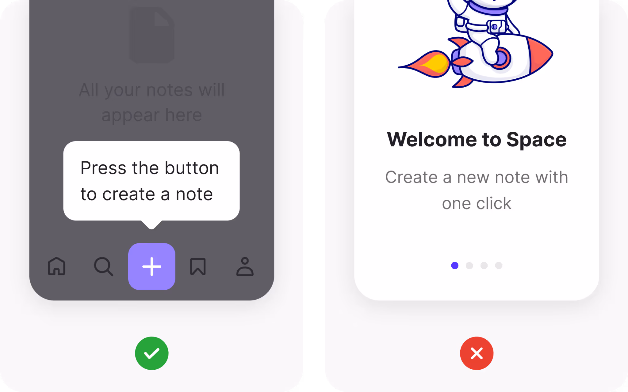
Progressive disclosure: helping users decide faster
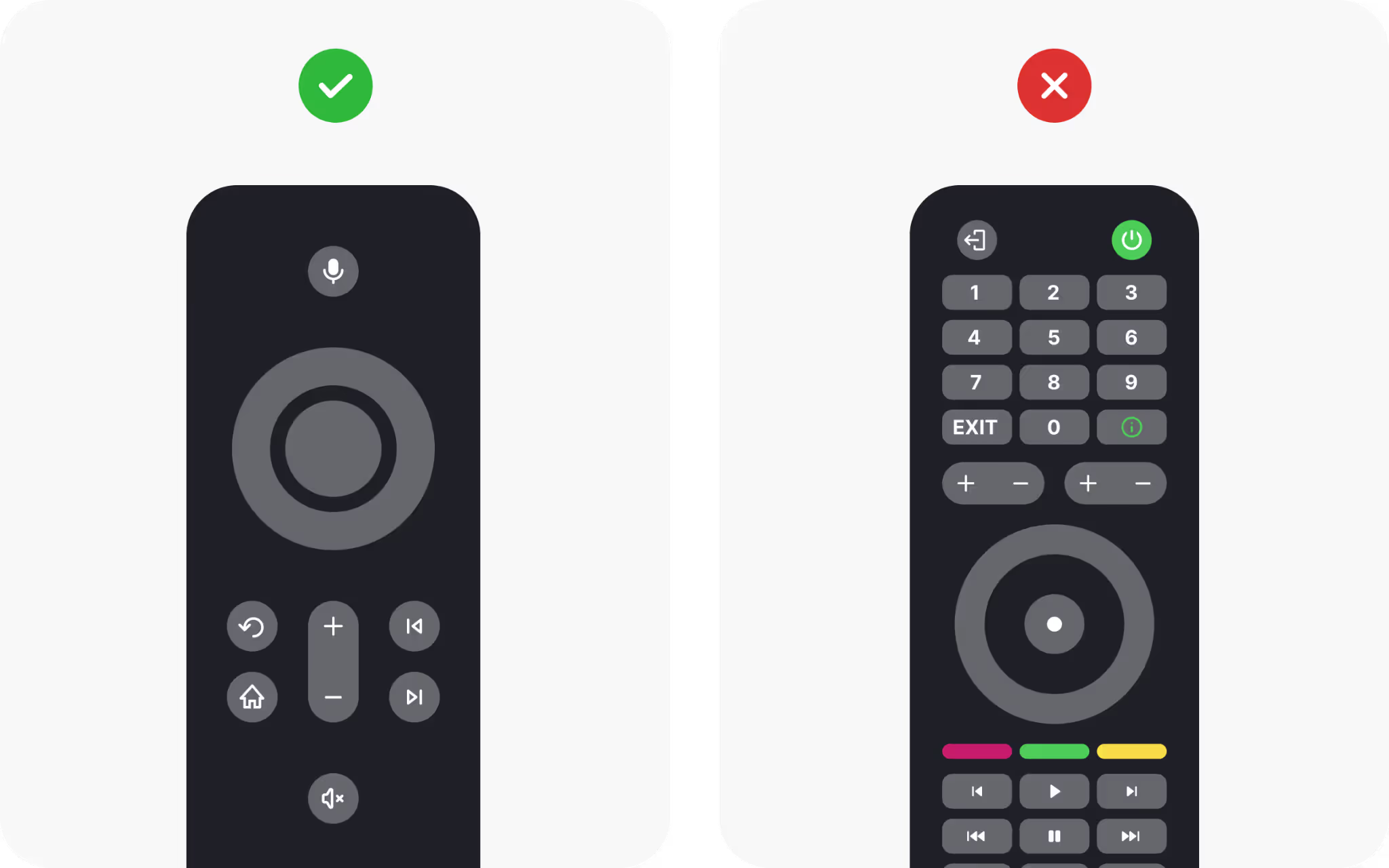
Sometimes the best way to simplify decisions is to hide rarely used options until they are requested. This principle is called progressive disclosure, and it allows designs to stay lean without sacrificing functionality.
Think about TV remotes. Older models had dozens of buttons, many of which were rarely used. Modern remotes reduced the number of visible buttons, focusing on essentials. Extra functions are still available but hidden behind menus or long presses. The result is a cleaner, less intimidating interface.
Designers can apply this by prioritizing the most common actions and keeping advanced options tucked away. This speeds up decisions for most users while still serving those who need more.
Designing social sharing thoughtfully

Social sharing is valuable, but too many buttons can backfire. Offering twenty platforms at once makes it harder to choose and creates visual clutter.
The better approach is to highlight the most common platforms your users actually use, such as Twitter, LinkedIn, or WhatsApp. Place those prominently, then hide less common platforms under a “More” button. This design respects Hick’s Law by reducing visible options while still supporting variety.
By curating sharing options, you encourage action rather than indecision. The right balance of visibility and restraint helps your content spread without overwhelming the page.
Using filters effectively
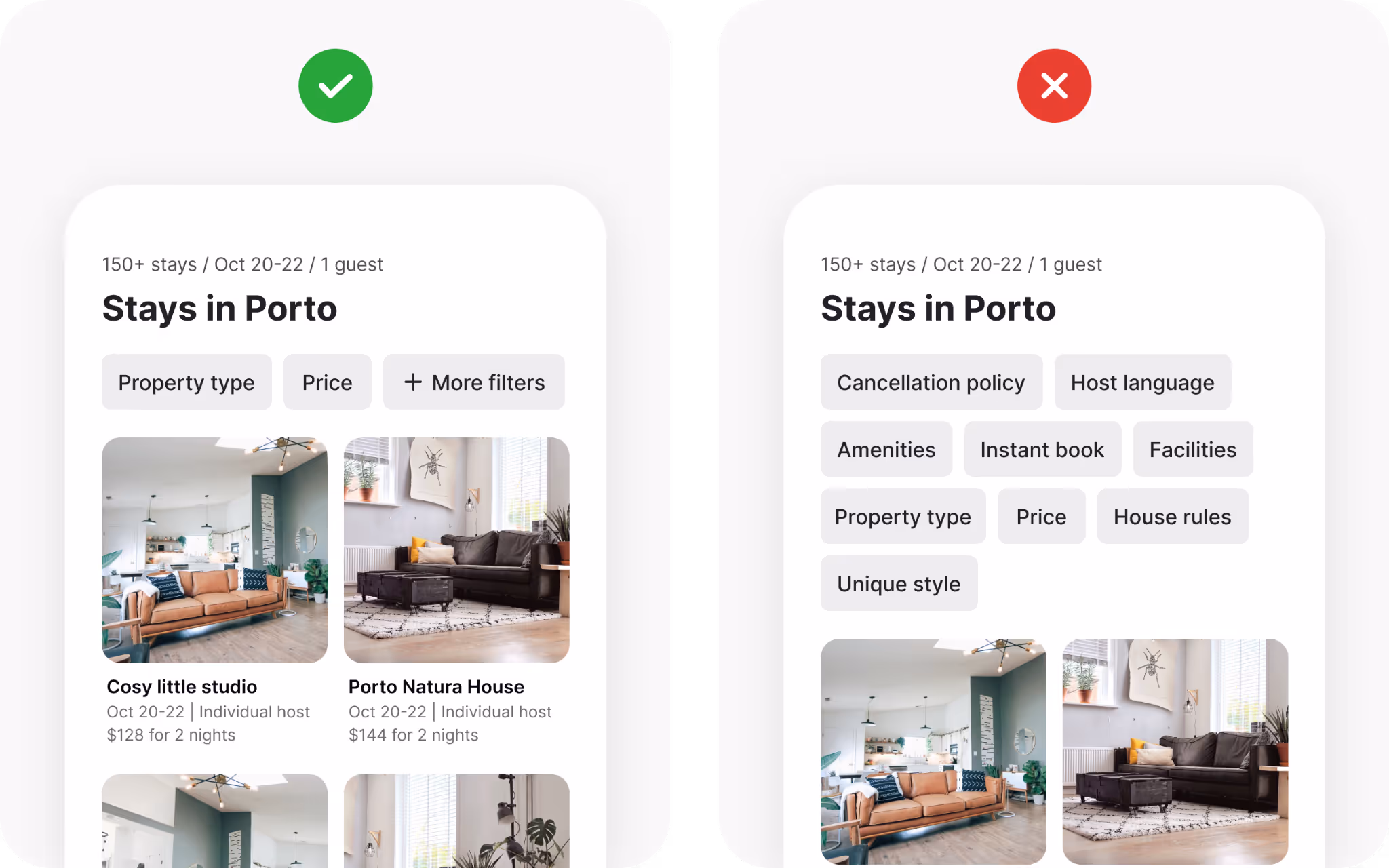
Filters are intended to simplify search, but poorly designed filters often have the opposite effect. Presenting dozens of filtering options at once increases decision time instead of reducing it.
A better method is to focus on the most commonly used filters and make them easy to access. Less common filters can be hidden behind an “Advanced” or “More Filters” option. This way, users who need them can still find them, while the majority of users move quickly with the basics.
Filters work best when they clarify, not complicate. By limiting visible options, you guide people toward faster and more satisfying decisions.
Hick's Law examples: progressive disclosure in action
Progressive disclosure spreads information and actions across multiple steps instead of presenting everything at once. The most familiar example is a step-by-step sign-up flow. Instead of overwhelming users with a long form, each step asks for a small amount of information.
This approach aligns perfectly with Hick’s Law. By reducing the number of visible options at any given moment, decision-making feels manageable. The full complexity is still present, but it is revealed gradually.
Progressive disclosure can apply anywhere information density threatens to overload the user. Whether it is advanced settings, detailed filters, or long instructions, breaking things into smaller, staged parts keeps decisions fast and focused.
Progressive onboarding for new users
Traditional onboarding often bombards users with every feature immediately. This creates cognitive overload and reduces retention. Progressive onboarding takes the opposite approach.
Instead of explaining everything upfront, the product reveals functionality when users naturally encounter it. A tooltip might appear only when someone opens a certain menu for the first time. A guided action might start only when a user begins creating their first project.
By limiting options and information early on, progressive onboarding makes adoption smoother. Users learn gradually, gaining confidence without feeling overwhelmed. This respects both Hick’s Law and real human learning patterns.
Using recommendations to reduce overload
Another way to help people decide faster is to offer curated recommendations. When faced with too many equally valid options, users struggle to choose. By surfacing suggestions based on previous activity, you lower decision time and increase satisfaction.
Streaming platforms again provide good examples. Instead of showing thousands of shows equally, they recommend a handful based on viewing history. This does not eliminate choice but frames it in a way that feels manageable.
Recommendations work because they reduce uncertainty. People feel more confident choosing from a smaller, curated set than from a vast, undifferentiated pool. This not only respects Hick’s Law but also improves the overall experience.
Breaking down complex tasks
Complex tasks often involve many steps. Placing all of them on a single screen creates an intimidating wall of options. Breaking them down into smaller stages reduces cognitive load and increases success.
For example, an e-commerce checkout might ask for shipping details on one page, payment details on another, and confirmation on a final page. Each step feels lighter and faster than a single page with dozens of fields.
Breaking tasks into chunks also reduces errors. With fewer inputs at each stage, users are less likely to make mistakes, and if they do, they only need to correct a small part of the process.
Wrapping up
Hick’s Law reminds us that more is not always better. Every extra choice adds a small layer of hesitation, and enough layers can stop action altogether. By presenting only the right options, grouping content, and revealing complexity gradually, you help people move forward with confidence.
The goal is not to strip away features but to structure them with care. Limit visible choices, guide attention, and let advanced options surface only when needed. When decisions feel quick and clear, users stay engaged and products earn trust.
- Hick’s Law states that decision time increases as the number of visible choices grows.
- Reducing visible options speeds decisions and lowers user frustration.
- Limiting fields in forms or sign-ups improves completion rates by decreasing cognitive load.
- An “Other” option preserves flexibility without overwhelming users with too many choices.
- Organizing content into clear categories reduces scanning effort and aids discovery.
- Grouping navigation items under headings makes large menus feel smaller and easier to use.
- Breaking long forms into smaller steps keeps flows manageable and encourages completion.
- Progressive disclosure hides advanced options until needed, keeping interfaces clean.
- Highlighting only the most common social sharing buttons encourages faster action.
- Showing only the most used filters first prevents search tools from becoming cluttered.
- Progressive onboarding introduces features gradually to prevent new-user overload.
- Curated recommendations reduce uncertainty and help users choose faster.
- Splitting complex tasks into smaller stages lowers cognitive load and reduces errors.
- The goal is not to remove functionality but to present the right options at the right time.