Finding the perfect font combination for your designs can be a challenging task. With a multitude of options available, you'll need to consider various factors such as font moods, styles, and hierarchy before making a decision. Fonts that are too similar may result in a lack of visual interest, while fonts that are too dissimilar can create confusion and discordance. The key is to learn how to create combinations that complement each other while maintaining a readable and cohesive design overall.
Pair serif with sans serif for balance

Serif fonts, characterized by the small decorative lines or strokes attached to the ends of the letterforms, exude a sense of tradition, elegance, and formality. They are often associated with print media and have a long history dating back to the early days of typography. Serif fonts, such as Times New Roman or Georgia, are commonly used for body text in books, newspapers, and magazines due to their legibility and readability in longer passages.
On the other hand, sans-serif fonts, as the name suggests, lack these decorative lines or strokes. They offer a clean and modern aesthetic, often associated with simplicity, minimalism, and a contemporary feel. Sans-serif fonts like Arial, Helvetica, or Gotham are widely used for headlines, subheadings, and other display purposes where a bold and impactful appearance is desired.[1]
When combining serif and sans-serif fonts, the contrast between the two styles can create visual interest and establish a clear hierarchy within your design. Using a serif font for headings and a sans-serif font for body text can help differentiate between different levels of information, making it easier for readers to navigate and comprehend the content. The sharpness and simplicity of sans-serif fonts can provide a complementary backdrop that allows the serif font to stand out and command attention.
Pro Tip: Look for complementary attributes of the chosen serif and sans-serif fonts, such as similar x-height, overall proportions, or letterform shapes to ensure a cohesive and visually pleasing combination.
Use font size to create hierarchy
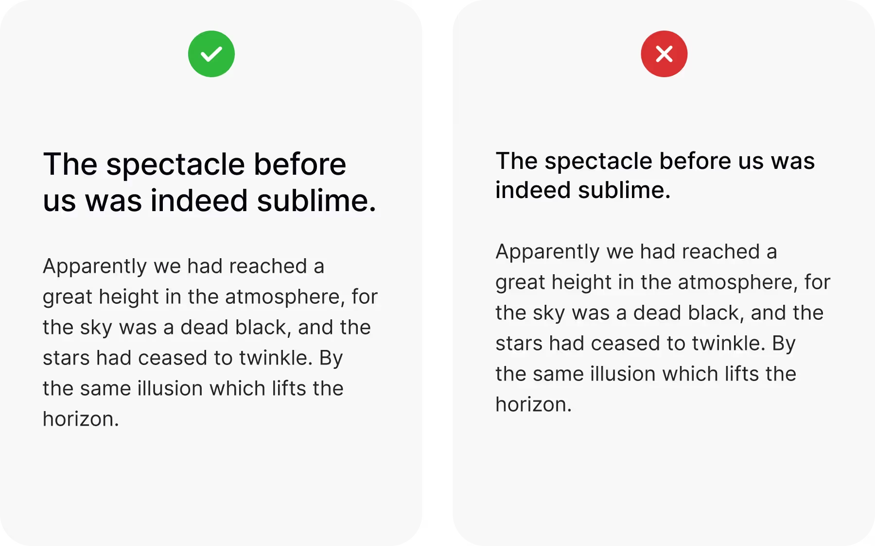
Varying font sizes is one of the simplest and most effective ways to guide the reader’s eye through a design. Larger text naturally draws attention and works well for headings, titles, or key messages that need to stand out. By giving these elements more visual weight, you create clear entry points for the reader and highlight what matters most.
Smaller font sizes, on the other hand, help push less important content, like captions, footnotes, or secondary details, into the background. This contrast makes the main content easier to scan and ensures that supporting information doesn’t compete for attention. Using size in this way helps build a visual hierarchy that improves clarity, balance, and overall readability.
Adjust font weight to create contrast
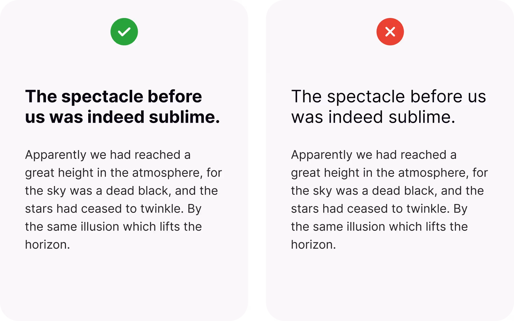
To further enhance the contrast between your fonts and strengthen the visual impact of your typography, consider playing with their weight. ****Font weight refers to the thickness or heaviness of the strokes within a typeface. It can significantly influence the overall appearance and hierarchy of your design.
There are two main approaches you can take when playing with font weight:
- Matching different typefaces. Matching different typefaces with contrasting weights can create a striking visual contrast. For example, pairing a bold and heavy sans-serif font with a lighter and more delicate serif font can generate a dynamic interplay between the two styles.
- Utilizing different weights within the same typeface. This combination can be particularly effective in creating a clear visual hierarchy, with the bold font commanding attention for headings and important elements, while the lighter font provides a balanced and readable body text.
Alternatively, using different weights within the same typeface can offer a more cohesive and unified look while still providing contrast. Many typefaces come with a range of weights, such as thin, regular, medium, bold, and black. By utilizing these variations, you can maintain a consistent visual style while emphasizing different levels of information.
Assign distinct roles

The principle of “do one thing and do it well” also applies to typography. When you give each font a specific role in your design, you avoid unnecessary overlap and keep the overall look clean and cohesive. A font used for headings should focus on grabbing attention, while a font chosen for body text should prioritize readability. Captions or secondary details might use a lighter or more neutral style so they don’t compete with the main content.
By assigning distinct roles, you create a system that readers can quickly understand and follow. This not only strengthens hierarchy but also makes your design more predictable and user-friendly. Without this structure, fonts may compete with each other, leading to visual noise and confusion.
Consistency comes from repeating these roles across your design. For example, if a bold serif always marks section titles and a sans serif always carries the body text, the reader will immediately know what to expect. Over time, this predictability builds trust and makes navigating the content smoother and more intuitive.
Don’t mix moods
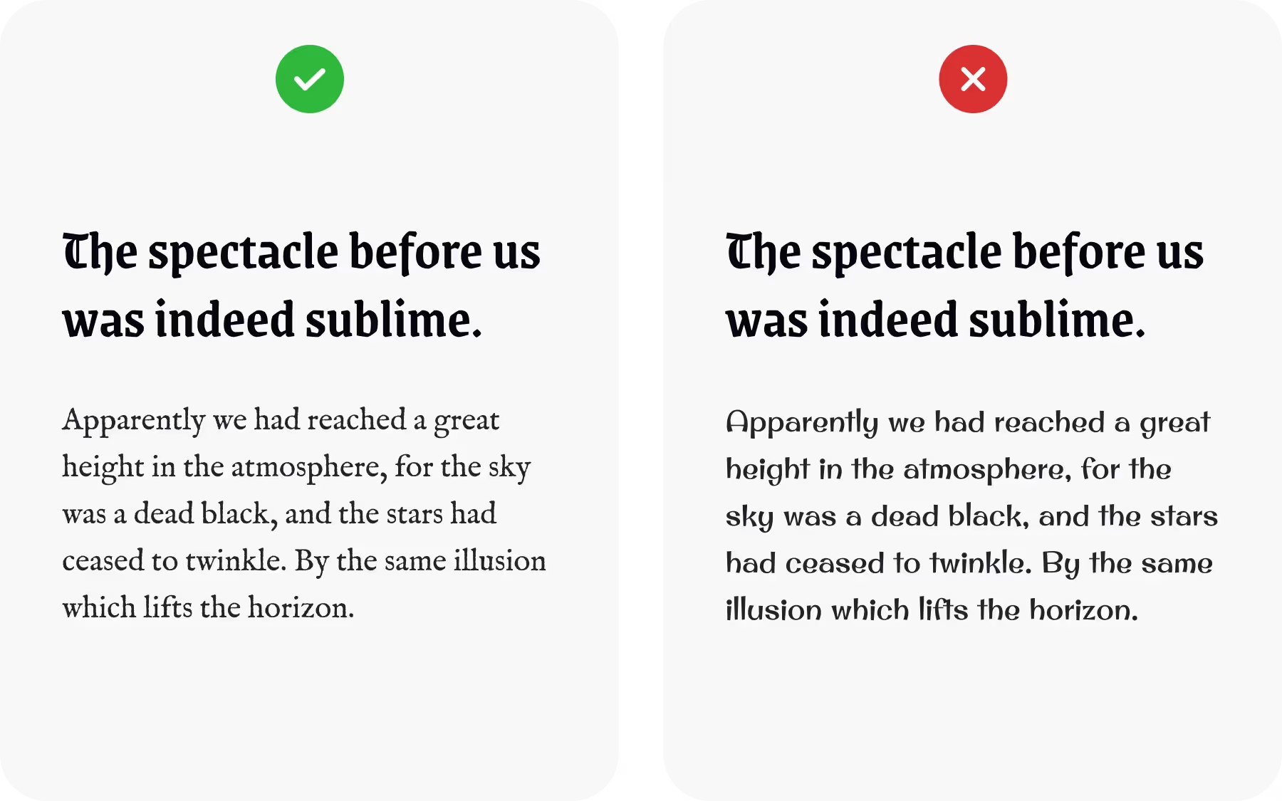
Fonts have their own personalities, ranging from serious and professional to playful and decorative, and everything in between. These personalities are conveyed through attributes such as letterforms, stroke styles, proportions, and overall design.
To ensure a harmonious font pairing, limit yourself to fonts that align with the specific mood or personality you're aiming to convey. If your design requires a serious and authoritative tone, opt for fonts with a clean and structured appearance, such as classic serifs or modern sans-serifs. On the other hand, if you're aiming for a playful and whimsical vibe, consider selecting fonts with rounded letterforms, decorative elements, or handwritten styles.
By choosing fonts that share a similar mood, you create a consistent visual language that enhances the overall cohesiveness of your design. The fonts work in harmony to reinforce the intended message and evoke the desired emotional response from your audience.
Pair strong fonts with neutral ones for balance
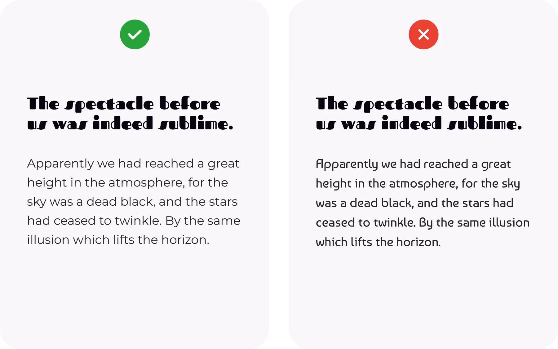
When one font carries a strong personality, it's best to pair it with a more neutral counterpart to achieve a harmonious and balanced design. Combining two fonts with equally strong personalities can lead to visual clashes and distract from the overall message you want to convey.
By selecting a font with a distinct personality and pairing it with a more neutral font, you create a complementary relationship where each font plays a specific role. The font with a strong personality becomes the focal point, grabbing the viewer's attention and conveying the intended mood or style. Meanwhile, the neutral font acts as a supporting element, providing balance and allowing the primary font to shine.
A neutral font doesn't necessarily mean dull or boring. It simply refers to a font that is more versatile and adaptable, with less pronounced stylistic elements or unique characteristics. These fonts often have a more understated design, allowing them to work well in various contexts and alongside fonts with stronger personalities.
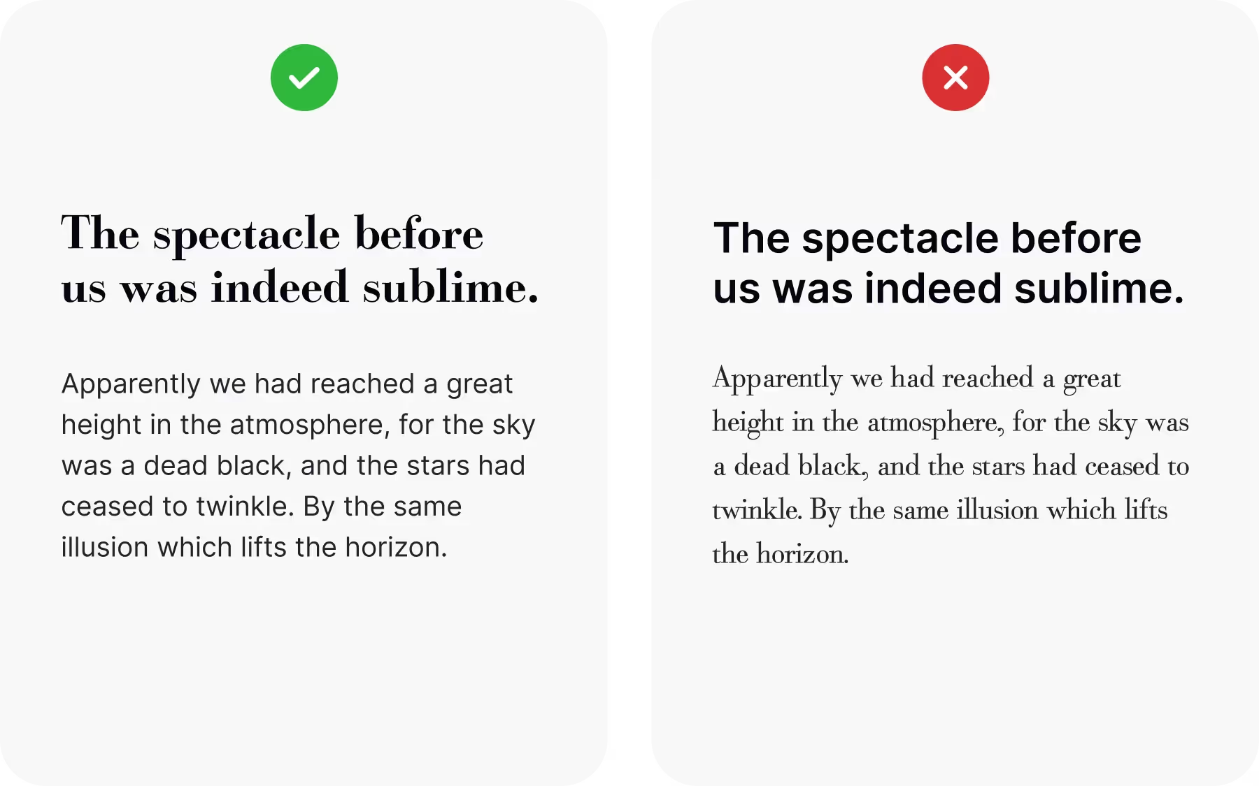
Match font proportions to avoid discord
Contrast in font pairings can create visual interest and add depth to your typography. However, it's important to avoid creating discordant combinations that hinder readability and coherence in your design. To strike a balance between creativity and visual harmony, consider selecting fonts with similar proportions and x-heights.
Fonts with similar proportions have a consistent relationship between the width and height of their letterforms, creating a sense of coherence when used together. This consistency helps maintain a balanced and harmonious composition, ensuring that the fonts work together seamlessly.
Use one typeface confidently by varying weights
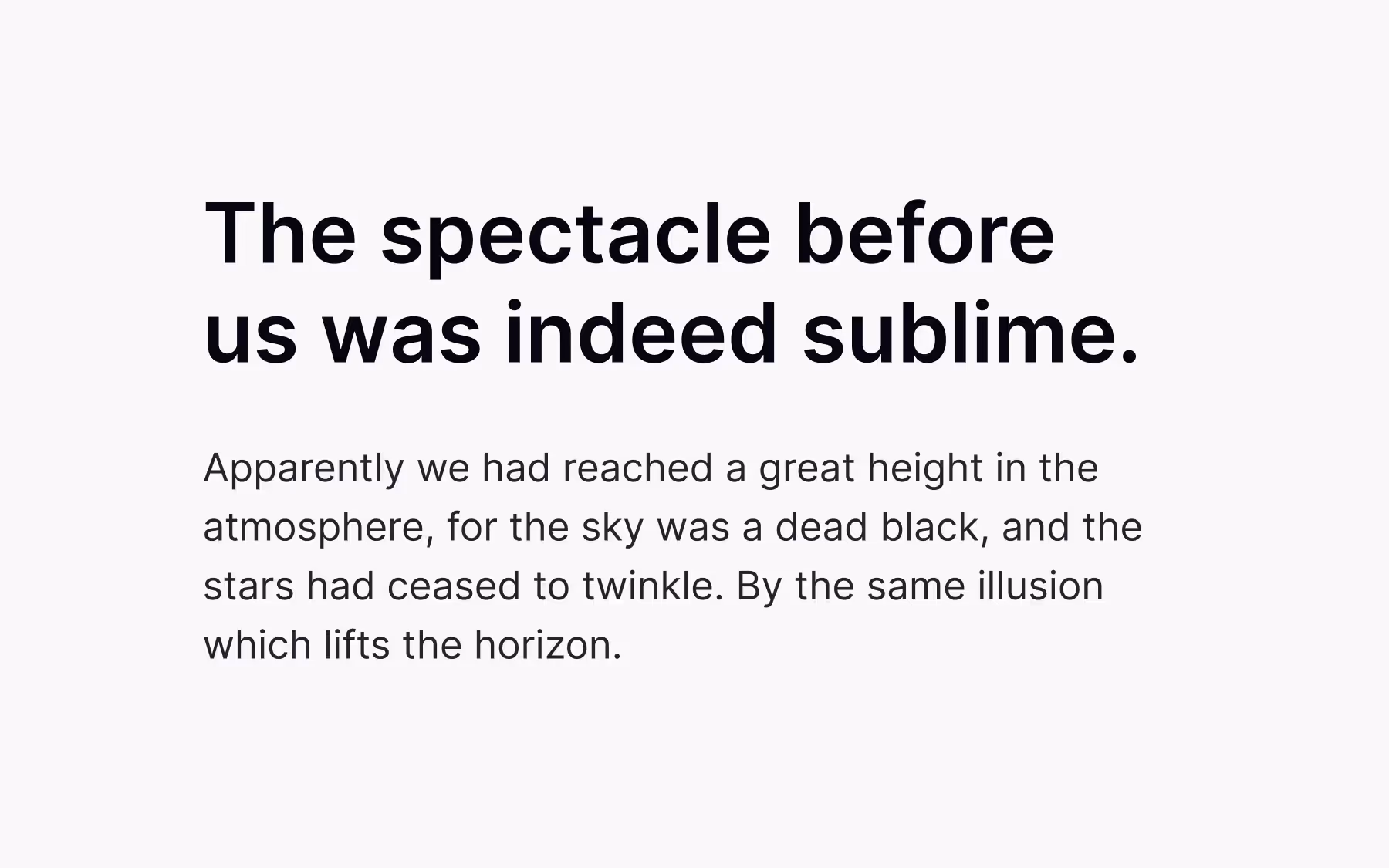
Many designers hesitate to rely on a single typeface, worrying it might make their design feel plain or limited. In reality, sticking to one typeface can create a clear, cohesive, and professional visual identity. If the typeface you’ve chosen captures the right mood and communicates your message effectively, there’s no need to force additional fonts into the mix.
The key is to take advantage of the typeface’s range of weights and styles. Light, regular, medium, and bold variations can build contrast, hierarchy, and emphasis without sacrificing consistency. This approach allows you to keep your design engaging and versatile while maintaining a polished and harmonious look.
Limit typefaces to keep designs coherent
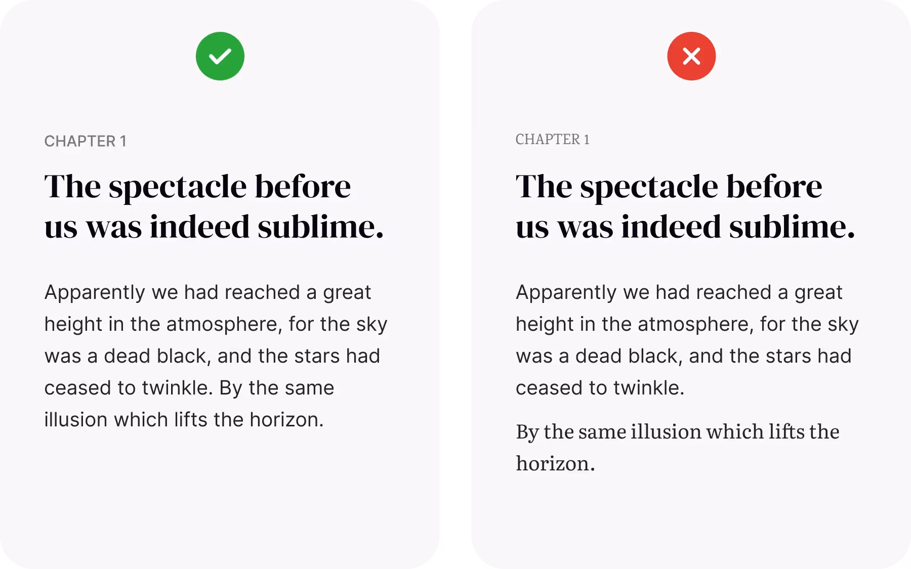
Finding the right balance in the number of typefaces used in a design is crucial for maintaining visual coherence and avoiding clutter. While a single typeface can create a cohesive look, there are situations where incorporating additional typefaces can enhance the design's effectiveness and expressiveness. However, it's generally advisable to limit the number of typefaces to two or three at most to prevent the design from becoming unnecessarily messy or disjointed.[2]
By using two complementary typefaces, you can create contrast, establish hierarchy, and add visual interest to your design. The primary typeface serves as the foundation, conveying the overall mood and personality of the design. The secondary typeface complements the primary one by providing contrast in style, weight, or structure, enhancing readability, and emphasizing specific elements.
If a third typeface is considered, it should have a distinct purpose or role, such as for special accents, pull quotes, or specific design elements. This additional typeface should be used sparingly and not overwhelm the design.
Assign typefaces to the right roles for clarity
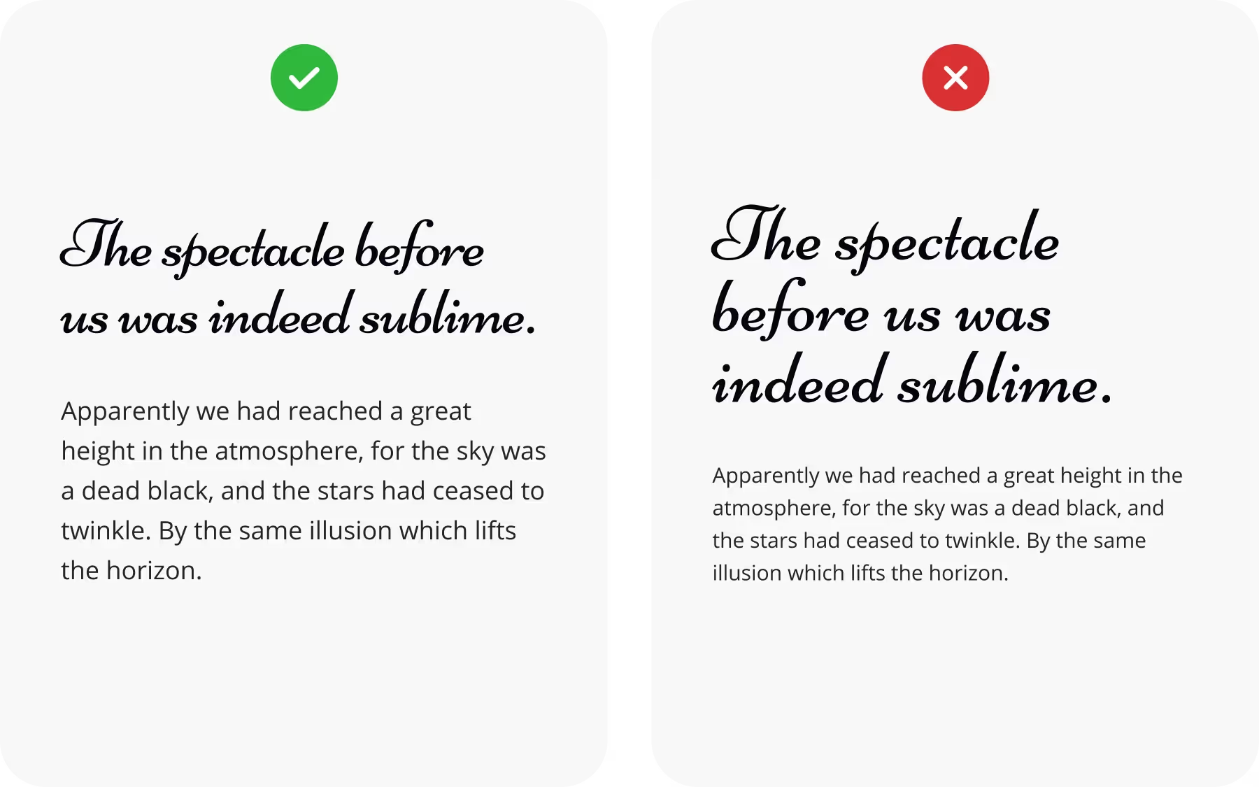
Certain typefaces are better suited for specific roles based on their design characteristics and legibility at different sizes. Typefaces with intricate details, decorative strokes, or unusual proportions often work best as display fonts that are perfect for headlines, titles, or large-scale design elements where their personality can shine. However, these same qualities make them difficult to read in long passages, so they should never be used for body text.
For continuous reading, text typefaces are designed with clarity and balance in mind. Their proportions, spacing, and stroke widths make them comfortable to read at smaller sizes, which is why they are well-suited for paragraphs, captions, and supporting details.
Assigning roles according to these inherent qualities ensures both visual impact and readability.
Wrapping up
Font pairing is both an art and a strategy. While it’s tempting to always choose the fonts you personally like most, good design sometimes means picking the option that works better for readers, even if it’s not your favorite. Typography is about finding the balance between beauty and function: fonts should express style and personality, but never at the expense of clarity or usability. By assigning clear roles, keeping the number of typefaces under control, and balancing contrast with consistency, you create designs that look polished and feel effortless to read. In the end, the best font pairings are the ones that quietly guide users, letting the content and not the typography itself take center stage.
If you're looking to learn more about typography, fonts, and how to use them effectively in your designs — feel free to join uxcel.com and start learning typography for free with our interactive Typography course.