Typography is far more than arranging letters on a page. Each letter is a carefully designed structure made up of distinct parts that influence legibility, character, and overall visual harmony. Designers call this structure type anatomy, and it provides a shared vocabulary to describe every curve, stroke, and intersection within a typeface. Understanding these details allows designers to select fonts with intention, pair them effectively, and fine-tune their use for screens or print.
This guide combines three lessons into one extended resource. It explains every major component of a letter, why it matters, and how it affects both aesthetics and readability. Whether you are choosing fonts for a brand, refining a digital interface, or studying typography as a craft, these terms give you the tools to see type with an expert eye.
If you want to skip the reading part and learn interactively about typography, fonts, type anatomy — make sure to check out our Typography course.
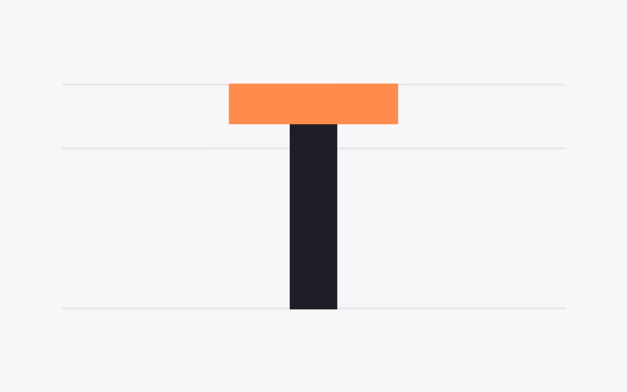
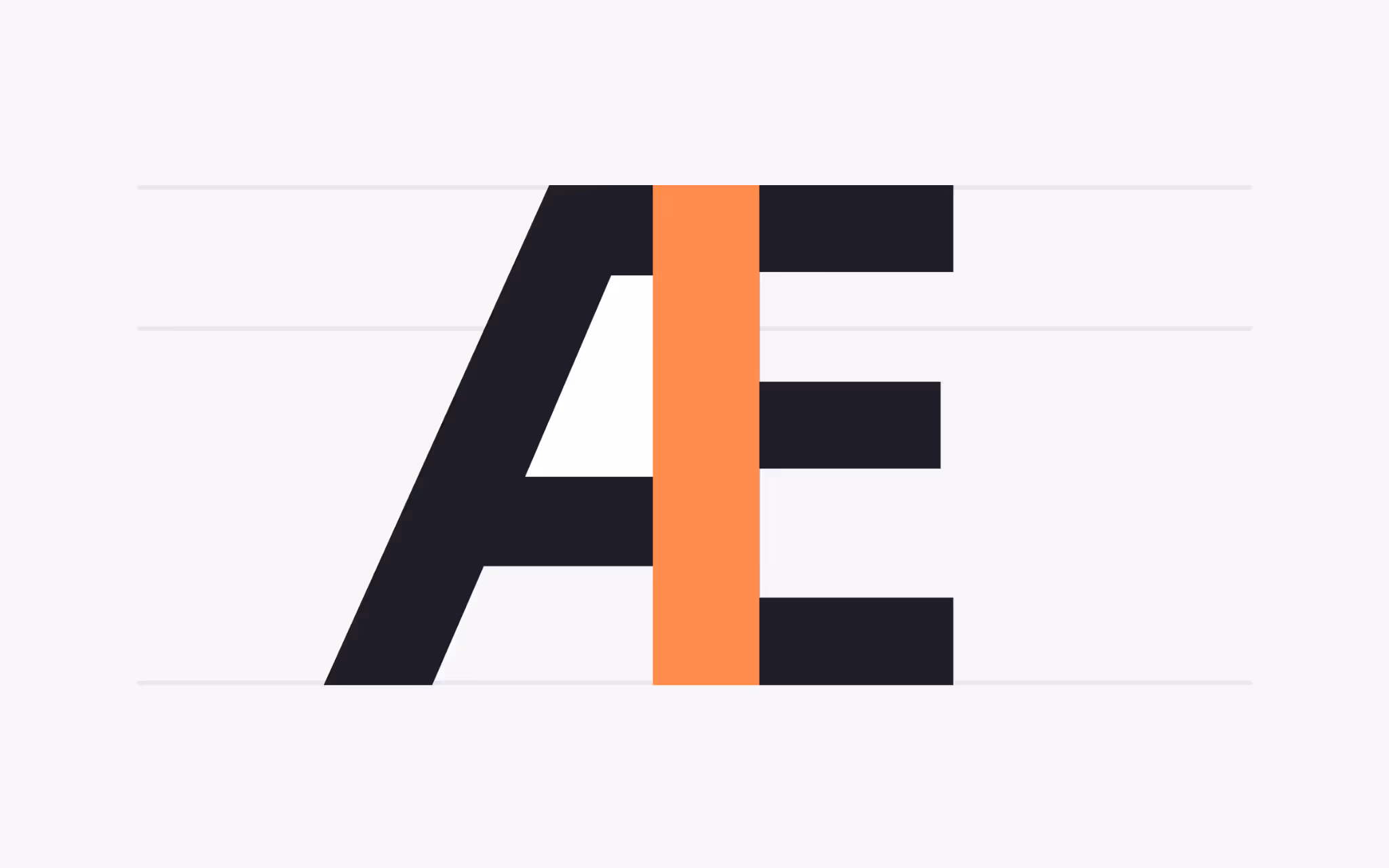
Crossbar
What is a Crossbar?
The crossbar is a horizontal stroke that connects two stems or cuts across the middle of a character. It appears in uppercase letters such as A, H, and E, and also forms the internal bar inside lowercase e or uppercase R. Designers can adjust the angle, weight, and position of the crossbar to create different personalities within a typeface. A low crossbar on an A produces a grounded, stable feeling, while a higher crossbar creates a more open and elegant look.
In practical terms, crossbar thickness influences readability. A thin crossbar on small text may disappear on low-resolution screens, while a heavy bar can dominate the letter at large sizes. When comparing typefaces for body text, examining the crossbar ensures the font will remain legible under different conditions.
Arc
What is an Arc?
The arc is a curved stroke that extends from a straight stem, adding motion and character to a letter. You can see arcs in lowercase j, f, a, u, and t. Unlike a simple curve, an arc flows outward from the stem and then turns back, creating a sense of growth and movement.
The size and steepness of an arc affect the rhythm of a typeface. A tight arc gives letters a compact, energetic feel, while a wide, gentle arc creates a calm and relaxed appearance. Designers often evaluate arcs when pairing fonts to ensure that their curves share a similar energy and do not clash when used together.
Arm
What is an Arm?
An arm is a horizontal or diagonal stroke that does not connect to another stroke on one or both ends. The top of a T, the horizontal lines of F and E, and the diagonals of K are all examples of arms. Arms can be long or short, straight or angled, and their length affects the balance of a character.
Long, bold arms command attention and create strong horizontal movement across a line of text. Short or tapered arms, on the other hand, provide a softer and more contained rhythm. When selecting a display typeface, arms help set the overall visual weight and can either strengthen or soften the appearance of headlines.
Beak
What is a Beak?
A beak is a decorative stroke found at the end of an arm, often seen in serif typefaces on letters such as S, F, or T. True to its name, the beak curves outward like a bird’s beak and finishes with a crisp point. Although small, it contributes to the elegance and direction of a typeface.
Beaks guide the eye along a line of text, subtly leading readers from one letter to the next. They can vary from sharp and dramatic to smooth and understated, allowing designers to choose fonts that match the tone of a project. A typeface with prominent beaks might feel classical and authoritative, while one with minimal beaks conveys a modern, restrained character.
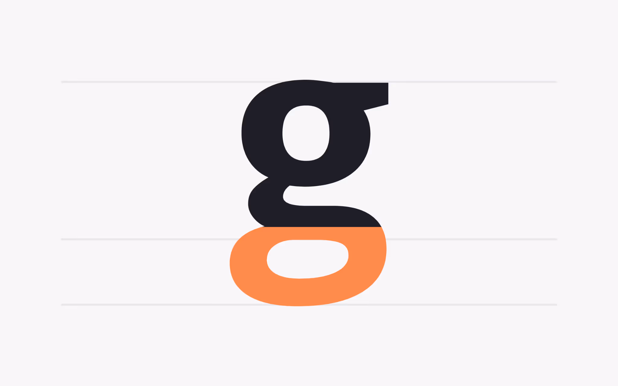
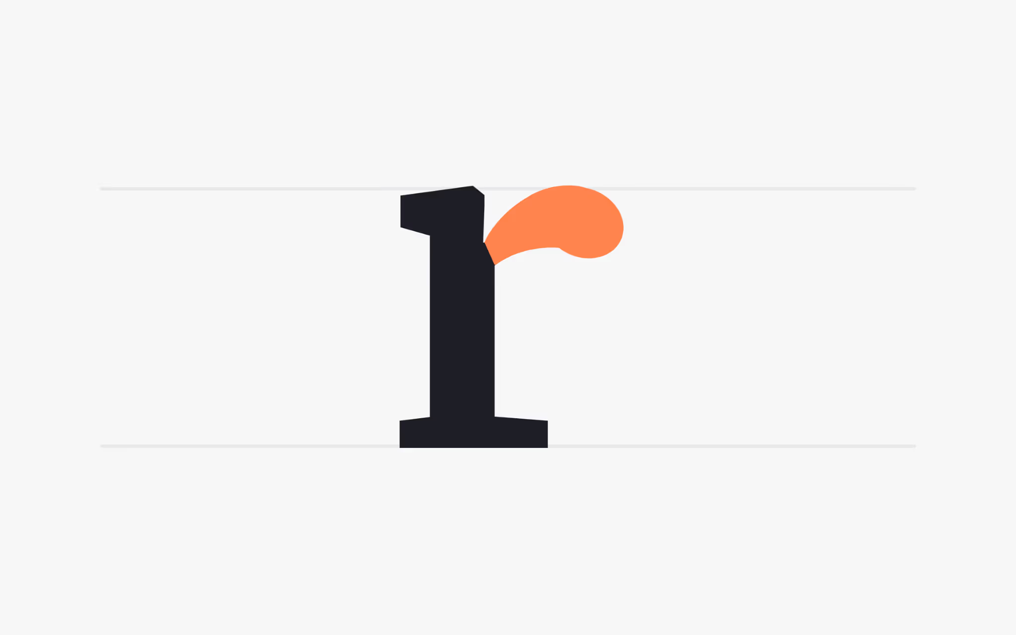
Ear
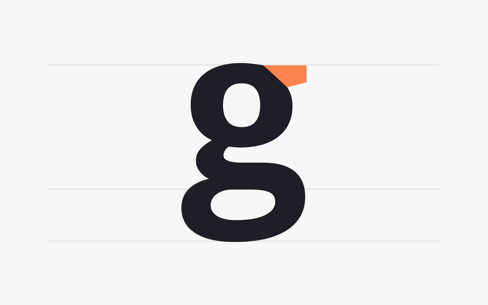
What is an Ear?
The ear is a small decorative stroke that extends from the top of a lowercase g and occasionally from a lowercase r. Just as a human ear projects slightly from the head, this typographic ear adds a bit of personality to the letter.
Different fonts treat the ear in unique ways. Some extend it outward with a playful flick, giving the typeface a friendly feel, while others keep it short and tight for a more serious appearance. Because the lowercase g appears frequently in text, the style of its ear can subtly influence the overall mood of a paragraph.
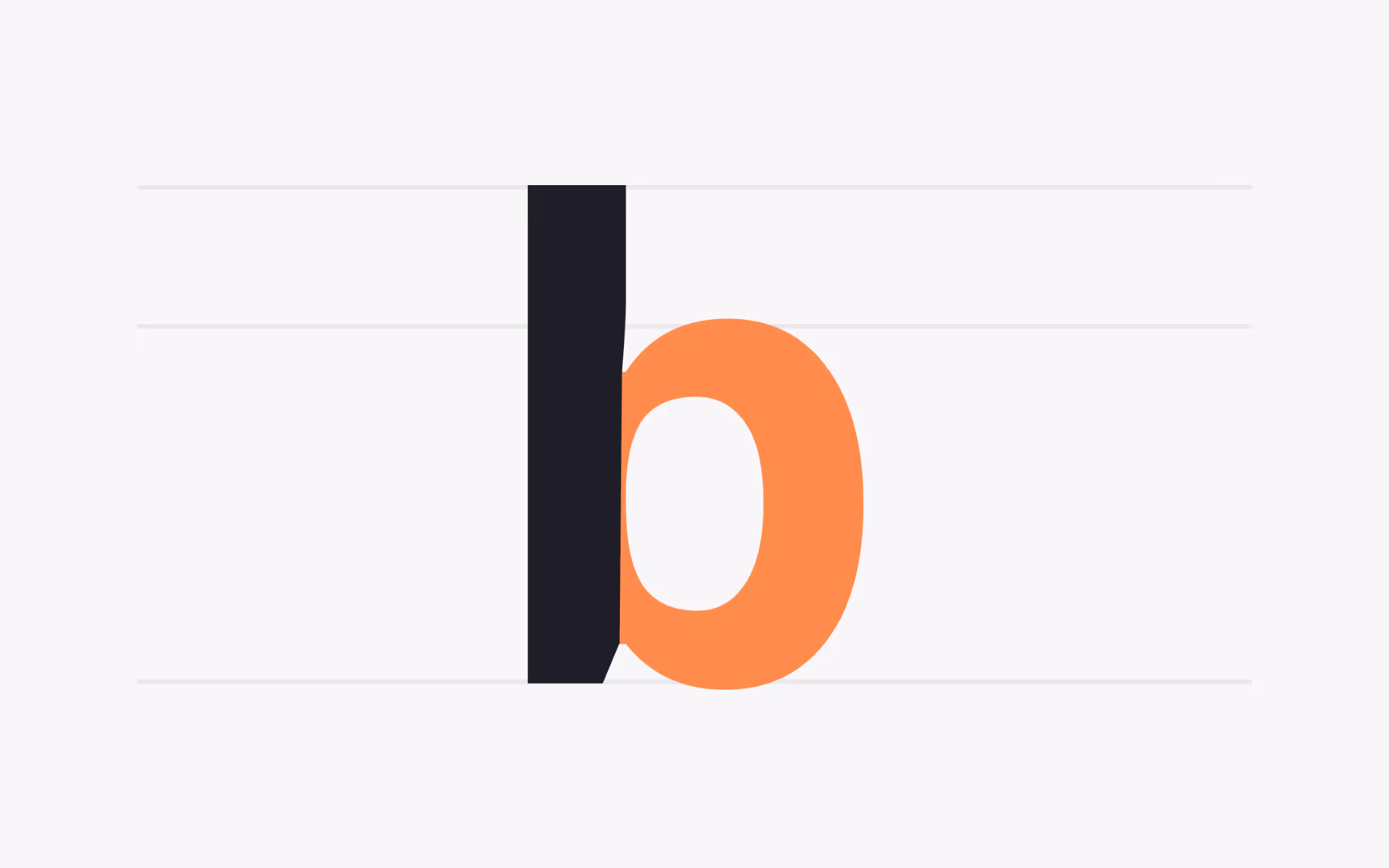
Counter
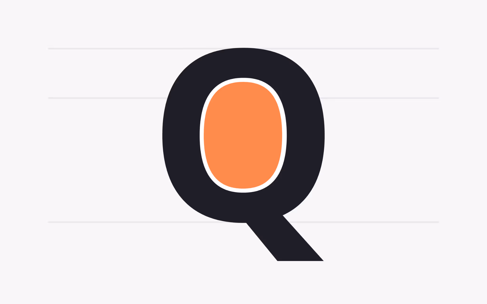
What is a Counter?
The counter is the enclosed or partially enclosed space inside a character. Closed counters appear in letters such as O, B, D, and P, while open counters appear in c, h, and s. The size and shape of counters strongly affect readability.
Large counters create open, airy letters that remain legible at small sizes or from a distance, which is why road signs and user interfaces often use fonts with generous counters. Small or narrow counters produce a dense texture that can feel sophisticated in headlines but may reduce clarity in body text. Choosing a typeface with an appropriate counter size is essential when designing for specific environments such as small screens or low-contrast print.
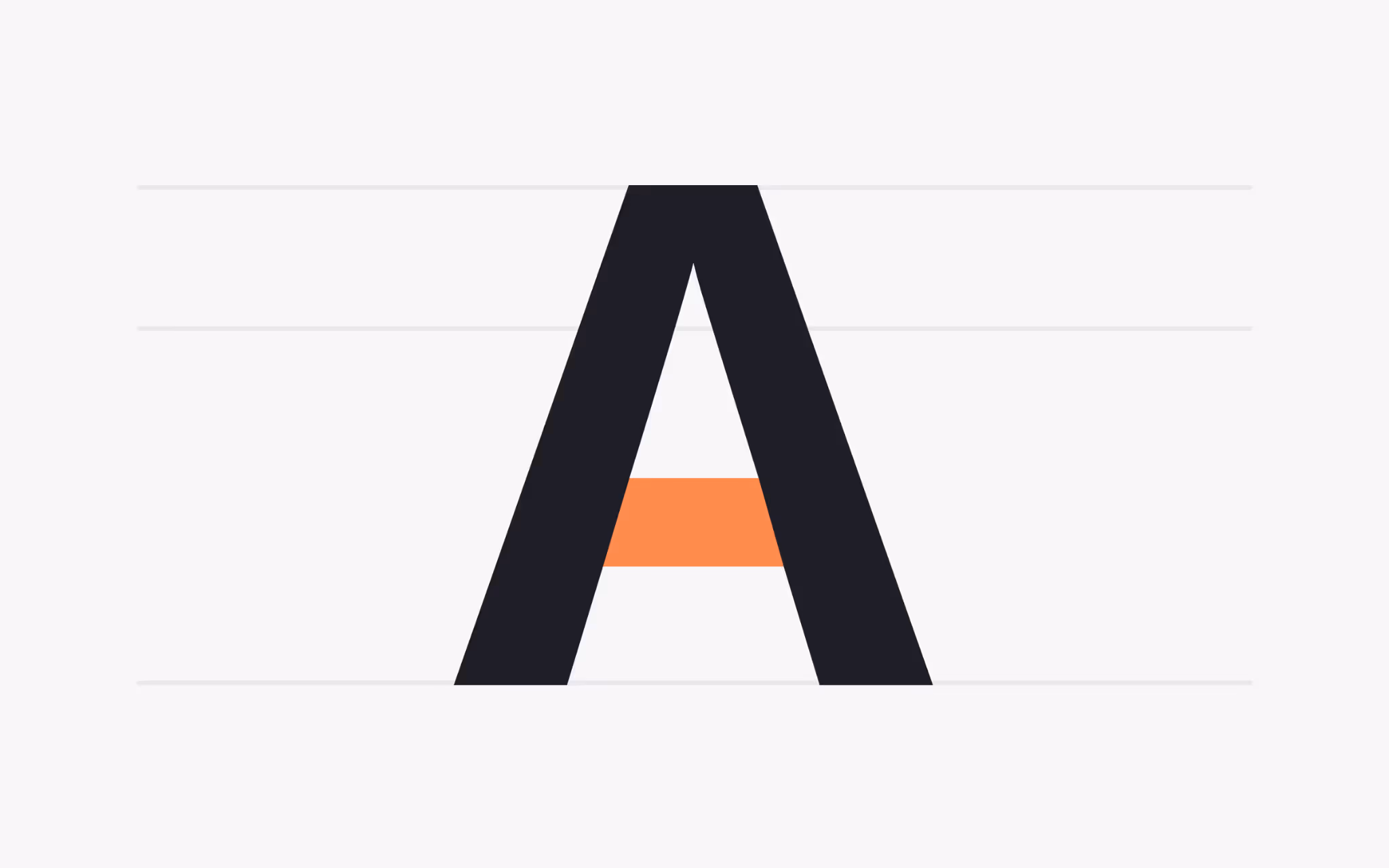
Apex
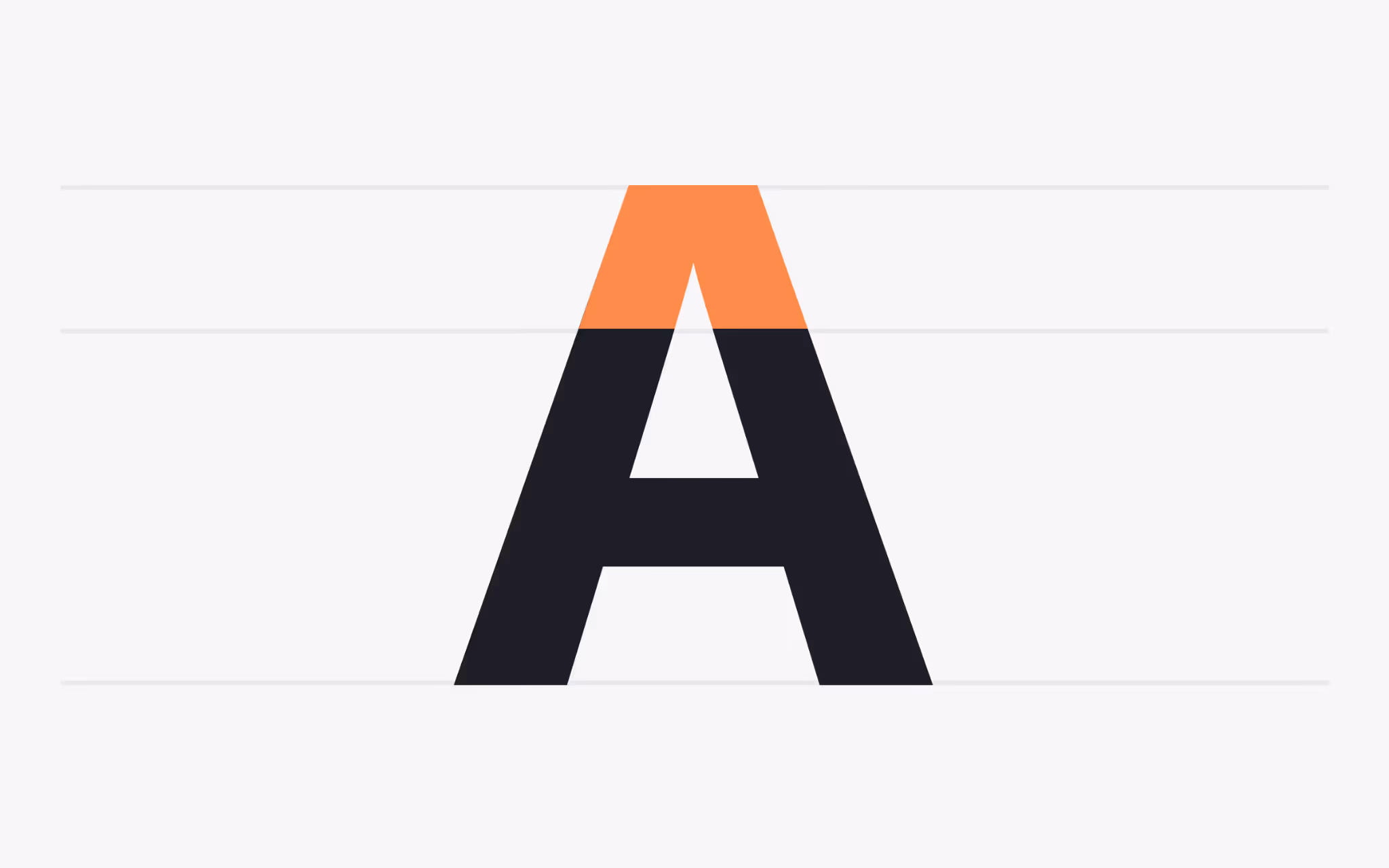
What is an Apex?
The apex is the point at which two slanted strokes meet at the top of a character, most clearly visible in A and W. This meeting point can be sharp, rounded, flat, or curved, and each variation changes the letter’s personality.
A sharp, pointed apex communicates precision and formality, while a flat apex creates a friendlier, more approachable impression. Some typefaces even soften the apex with a slight curve to add warmth. Designers often compare apex shapes when pairing fonts to maintain a consistent tone across a design.
Bowl
What is a Bowl?
A bowl is the curved stroke that encloses a counter, forming the rounded part of letters such as d, b, o, D, and B. The proportion of the bowl to the counter inside it influences both the density of a letter and its visual weight.
Thick bowls with small counters create a heavy, dramatic appearance that draws attention in headlines. Thin bowls with large counters feel light and open, making them ideal for body text. Examining bowl proportions helps designers choose fonts that balance legibility with the desired emotional impact.
Bracket
What is a Bracket?
The bracket is the curved connection between a serif and the main stroke. In transitional typefaces like Baskerville, the bracket creates a graceful transition from thick stem to thin serif, softening the join and improving readability.
Modern faces such as Bodoni often have minimal or no bracket, producing a sharp edge that feels crisp and stylish. The depth and curvature of the bracket serve as clues to a typeface’s historical classification and can help designers select fonts that convey a specific era or mood.
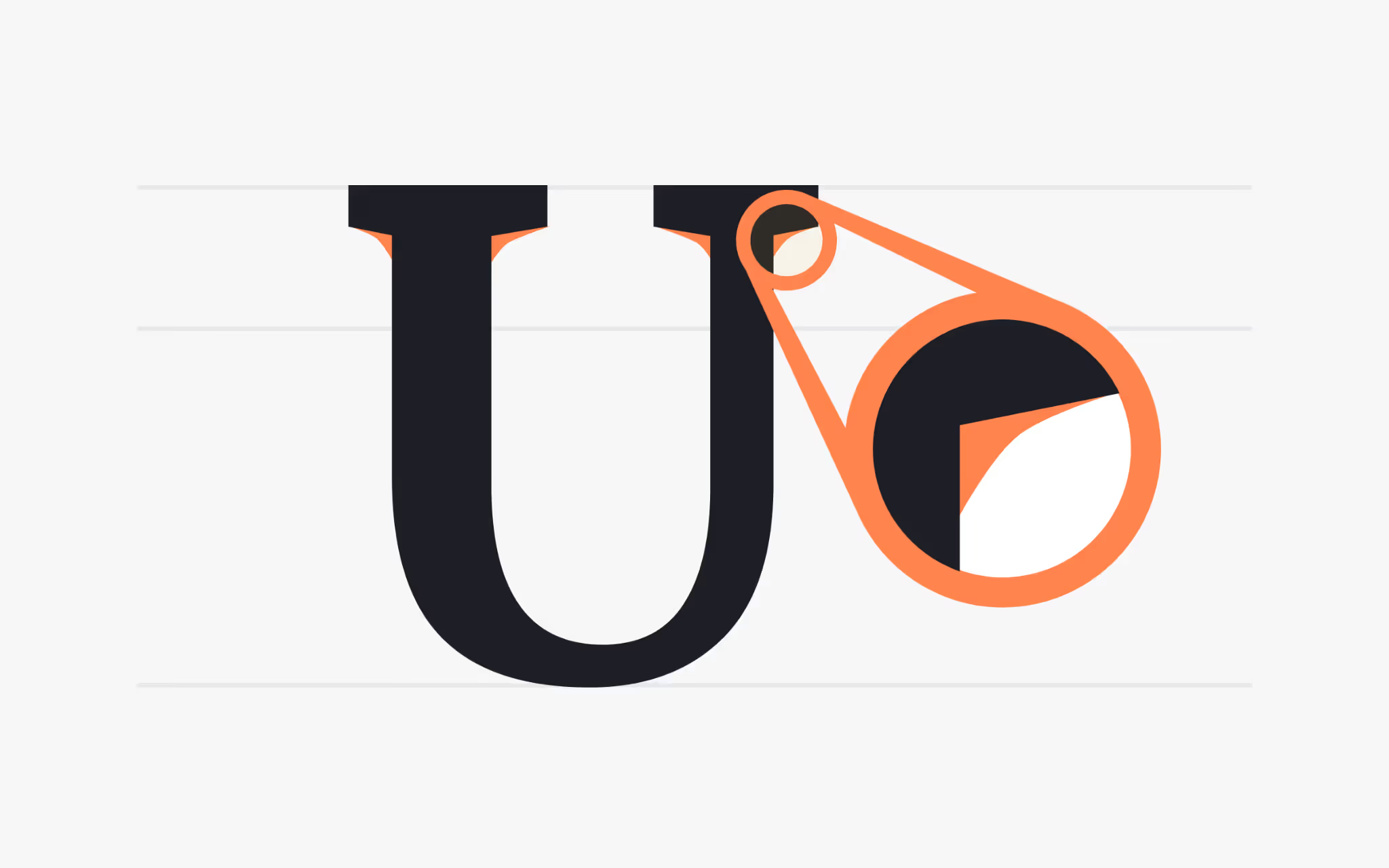
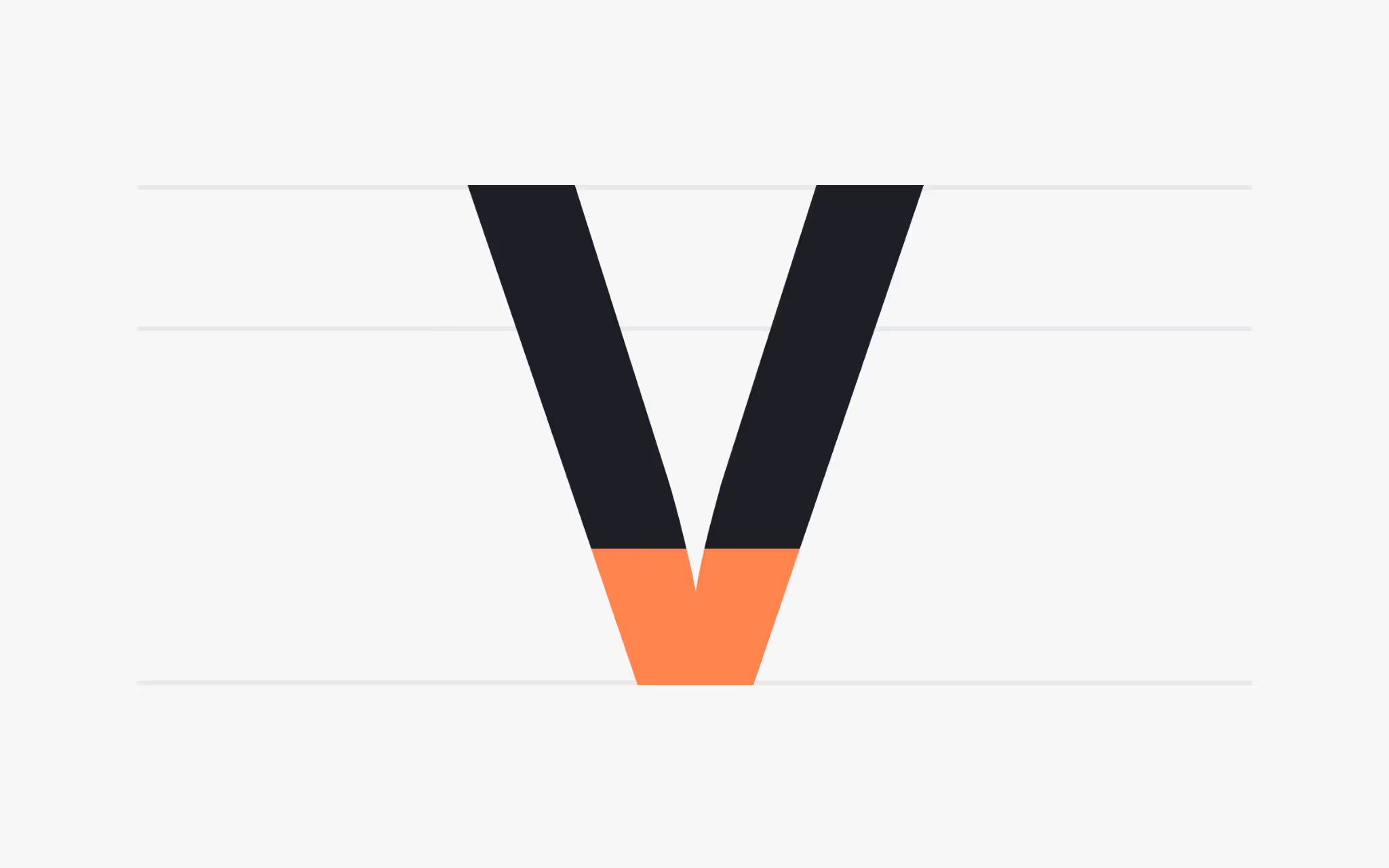
Crotch
What is a Crotch?
The crotch is the internal angle formed where two strokes meet, as in M, V, W, or Y. This intersection defines how open or closed a letter appears.
A deep, narrow crotch creates a dramatic internal space that draws the eye, while a wide, shallow crotch results in a softer and more relaxed letterform. Careful shaping of the crotch is especially important for letters used in tight spacing, where overlapping strokes might otherwise reduce clarity.
Eye
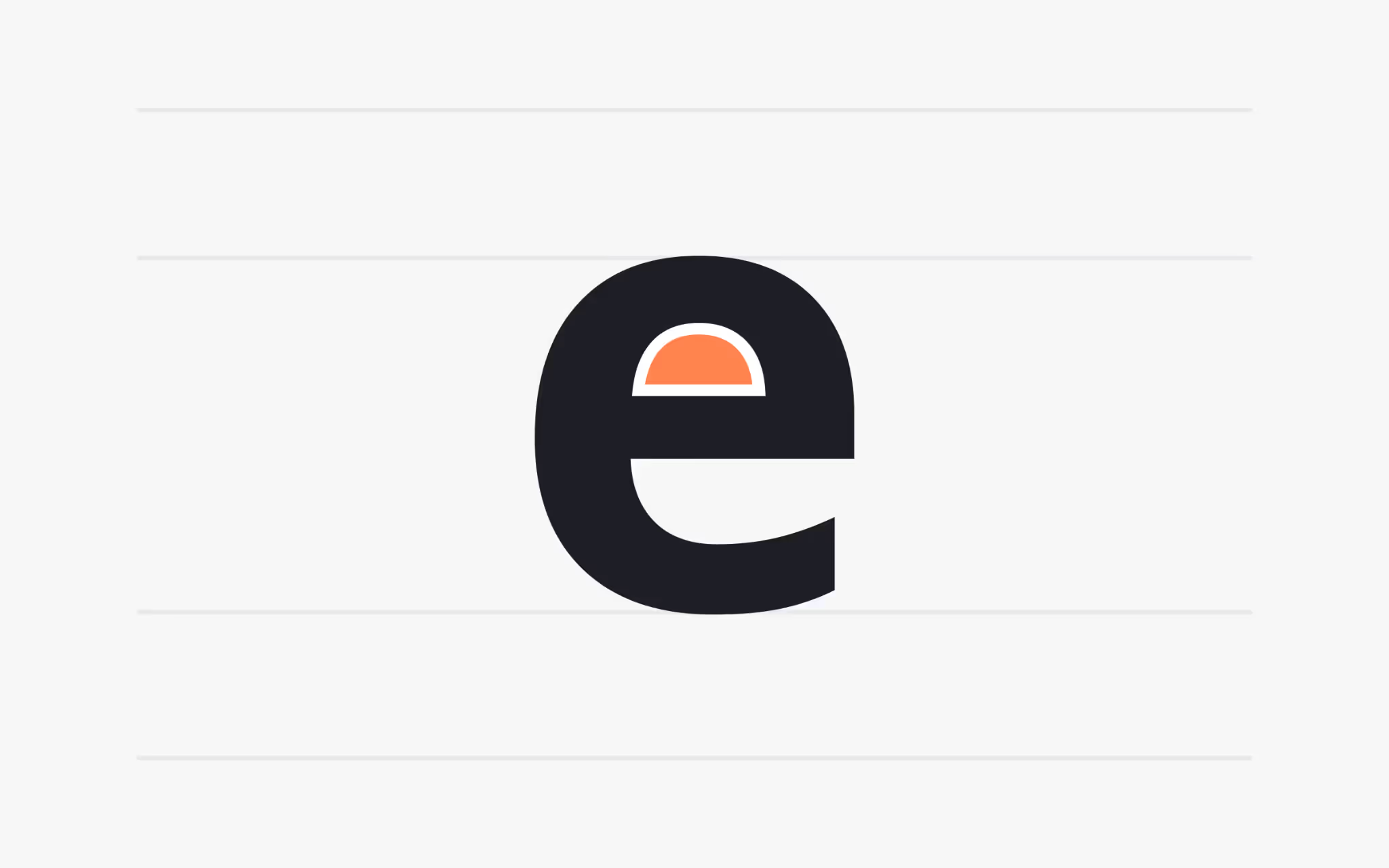
What is an Eye?
The eye is the small enclosed counter inside a lowercase e. Because e is among the most frequently used letters in English, the size of its eye has a significant impact on the overall color and readability of text.
A large eye gives a typeface an open, friendly texture, improving legibility at small sizes. A small eye creates a denser, more compact appearance that can add sophistication to headlines but may hinder clarity in long passages of body text.
Diacritic

What is a Diacritic?
A diacritic is a mark added to a letter to alter its pronunciation or meaning. Examples include the acute (´), grave (`), tilde (~), and umlaut (¨). Diacritics appear above, below, or even through letters and are essential for many languages.
High-quality fonts provide carefully designed diacritics that remain legible in different sizes and weights. Designers working with multilingual content must check that their chosen typeface supports all necessary diacritics to maintain both accuracy and readability.
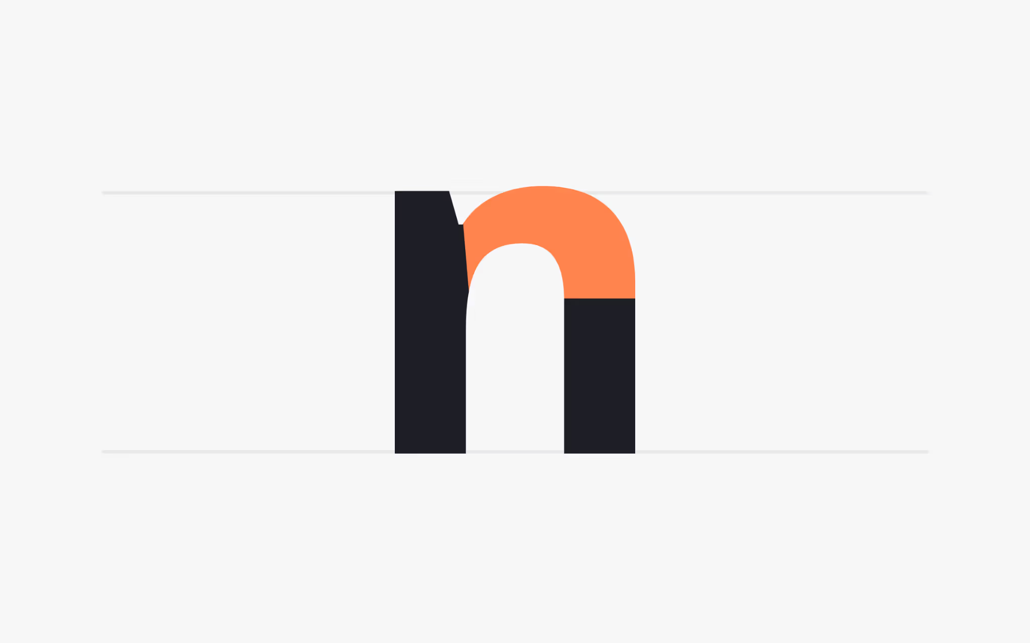
Aperture
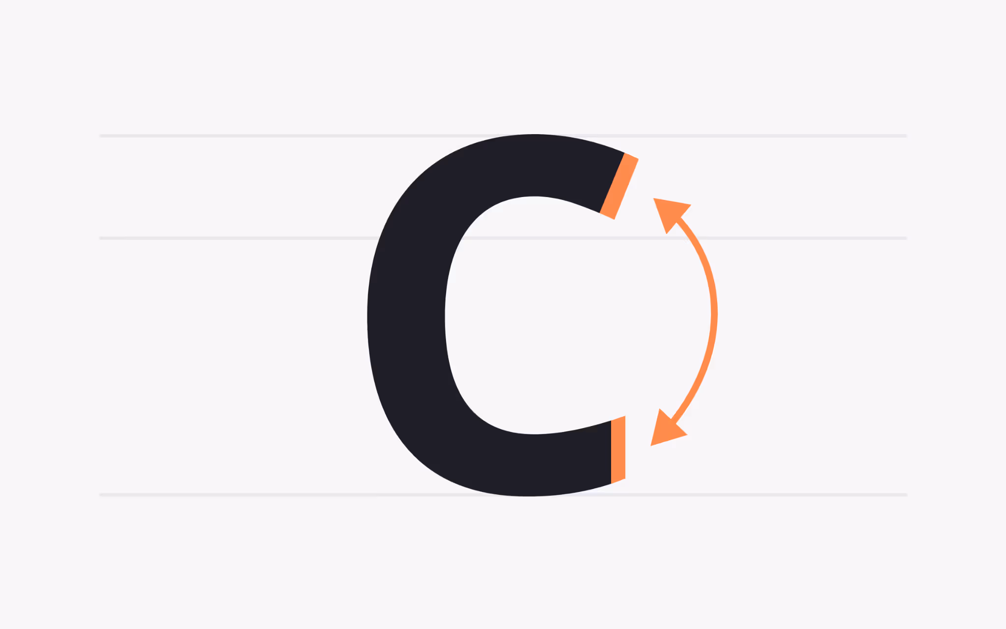
What is an Aperture?
An aperture is the opening of a counter in a partially enclosed character such as c, S, or n. This opening shapes the way a letter breathes on the page. A wide opening gives the eye a clear entry point into the form, which helps readers parse a word at a glance. A narrow opening tightens the form and creates a compact texture that can feel refined in headlines.
Aperture width has real effects on clarity. On dense interfaces or small screens, tight openings can collapse and blur into adjacent strokes. Fonts designed for signage, dashboards, or code editors tend to favor generous openings so letters resist filling in. In long-form reading, an aperture that balances openness with rhythm keeps the page calm and avoids fatigue. Variable fonts sometimes expose aperture through stylistic sets or optical sizes, letting you pick a wider or tighter feel without changing families.
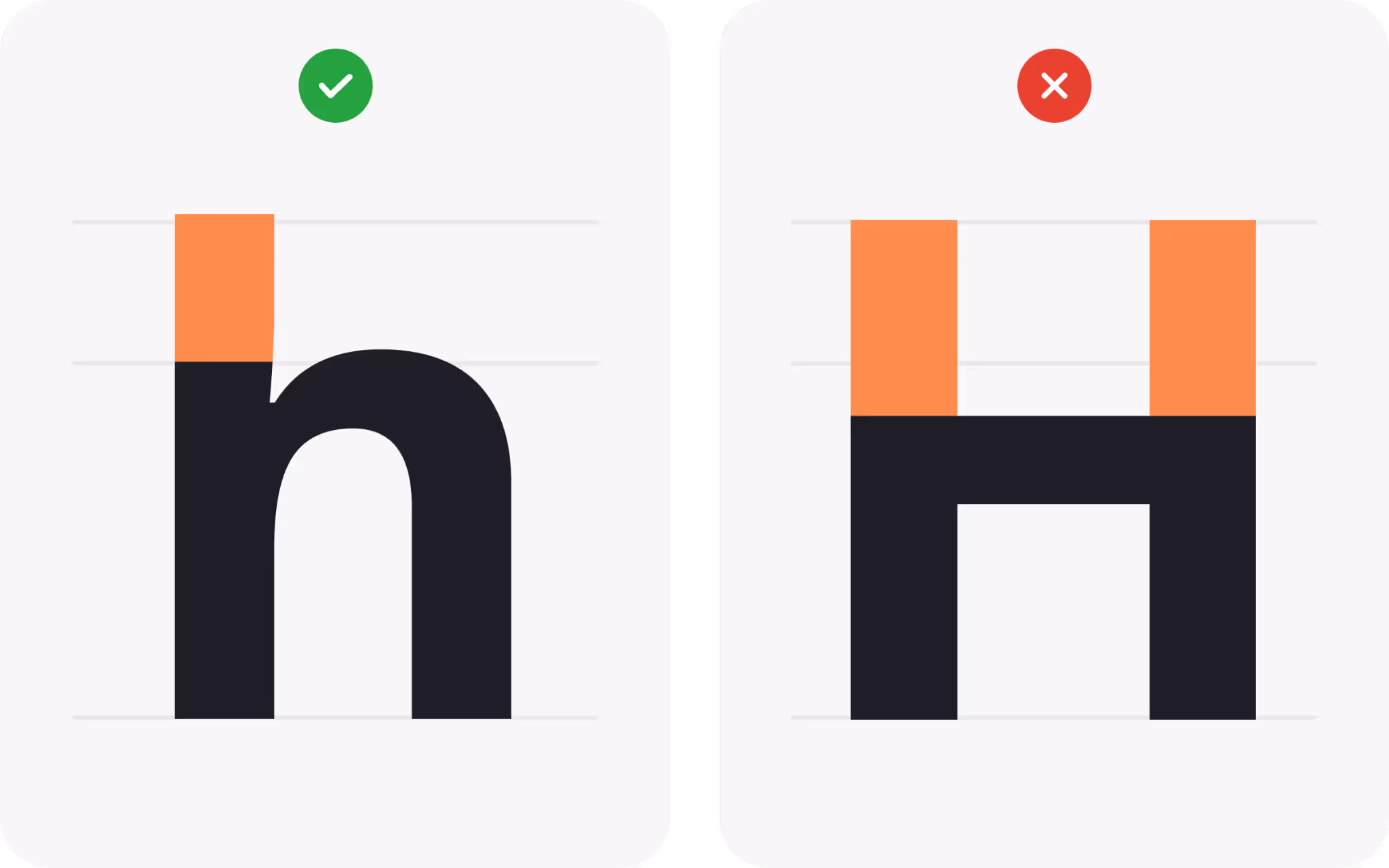
Foot
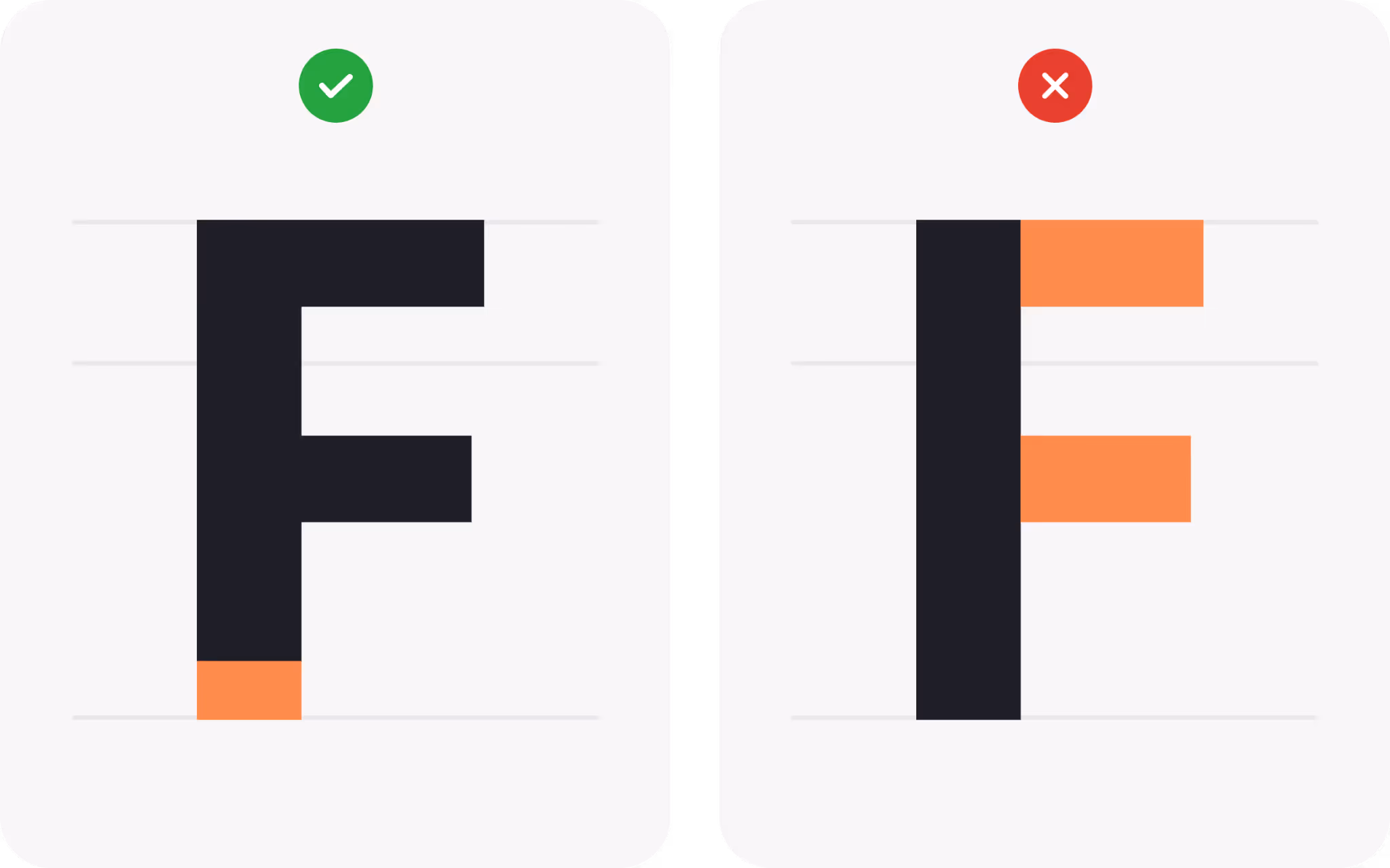
What is a Foot?
The foot is the part of a stem that rests on the baseline, providing a visual foundation. Letters such as M and H set down two stable points, while F stands on one. This detail might seem minor, yet it affects how firmly a word sits across a line. Sturdy feet make a line feel anchored. Tapered feet introduce a lighter touch.
Feet interact with spacing and hinting. On low-density screens, a thin foot can break or appear uneven across lines of copy. In print, a foot that flares slightly can help letters lock to the baseline and form a pleasing row. When choosing a text face, glance across a full paragraph and notice whether the feet create a consistent rail. That subtle baseline rhythm is one reason some families feel calm and readable even at small sizes.
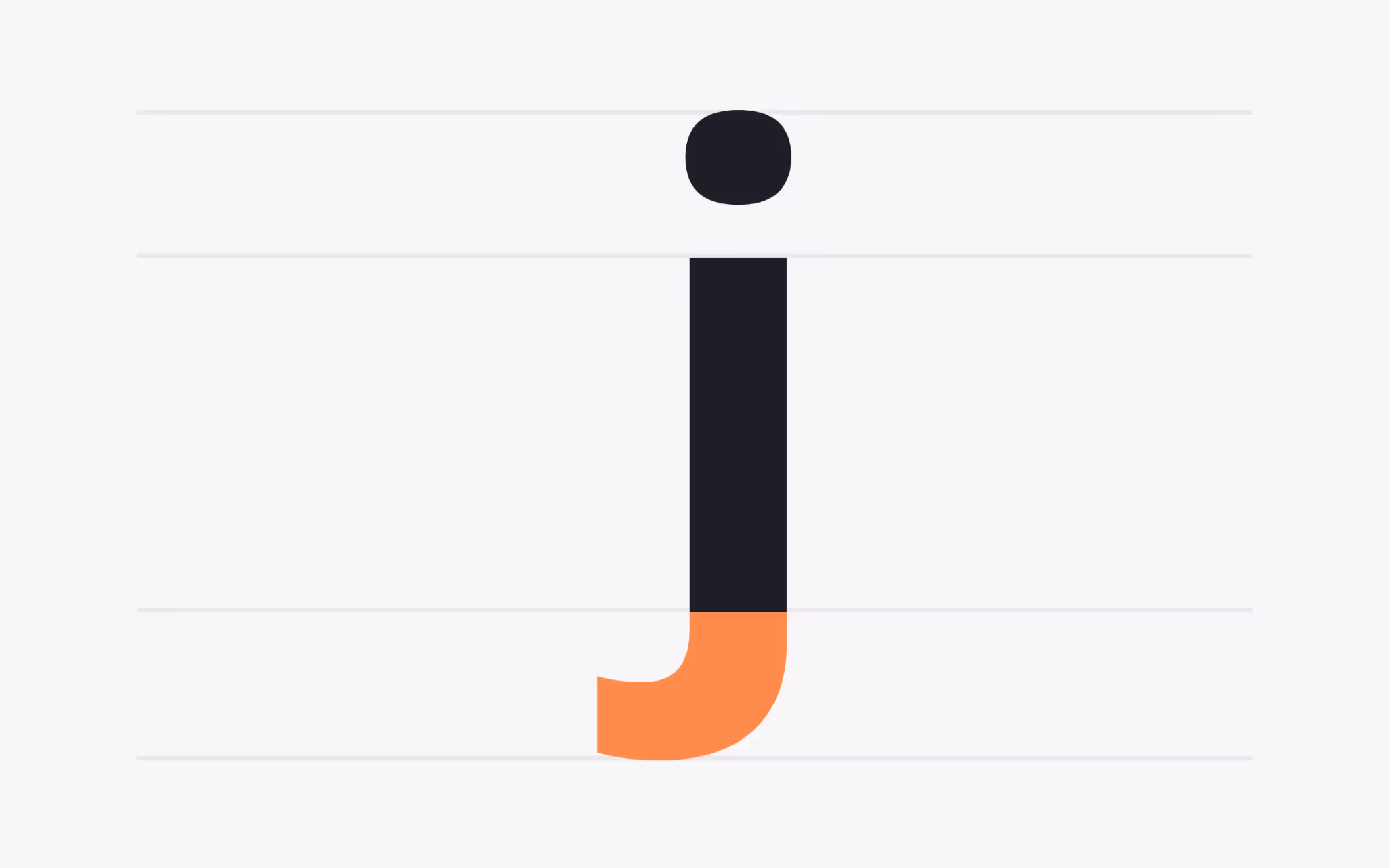
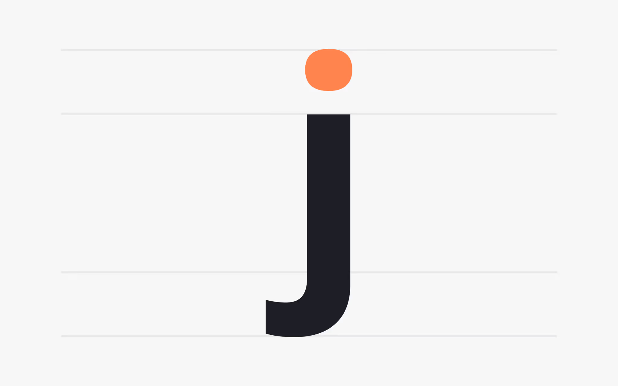
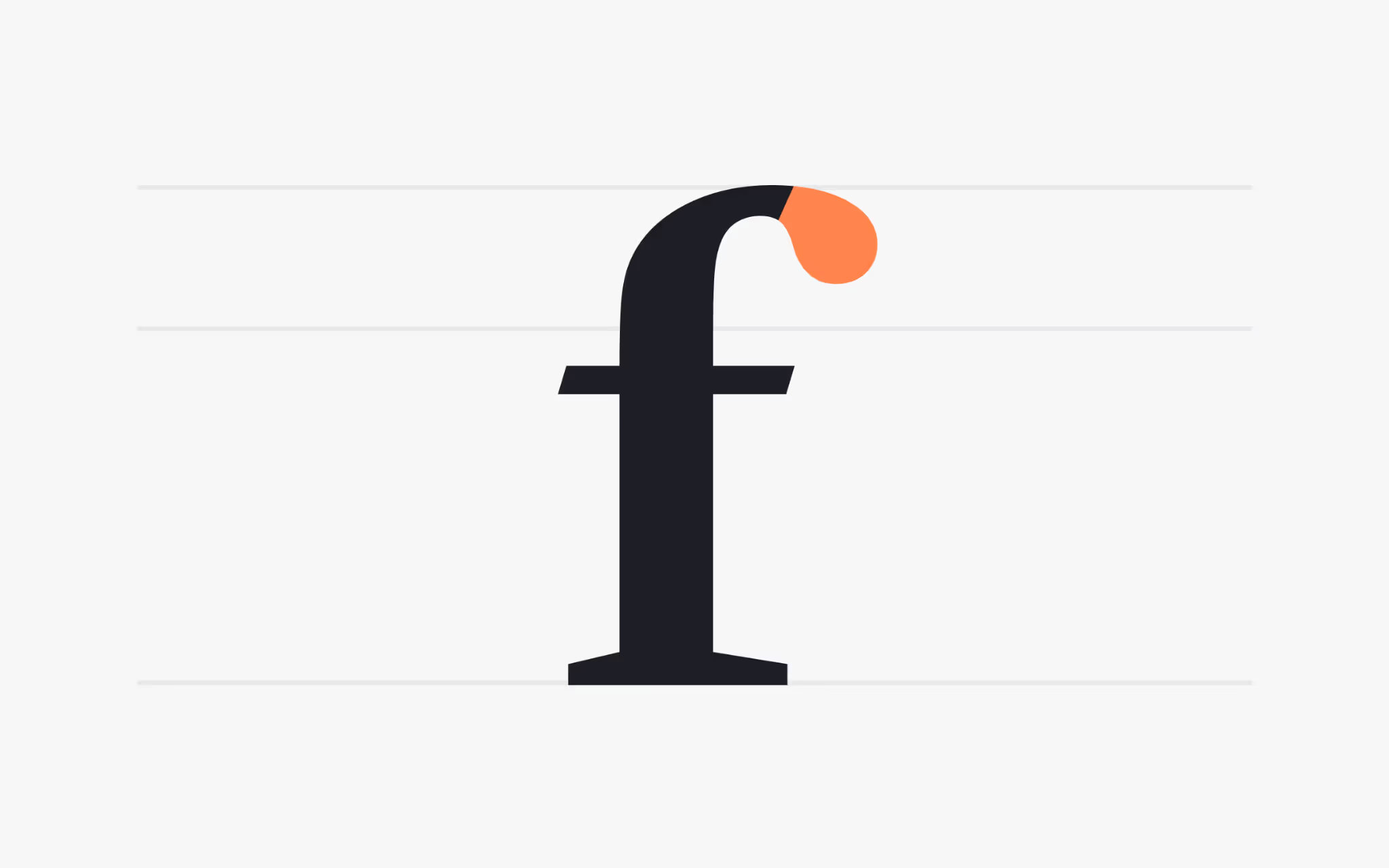
Hook
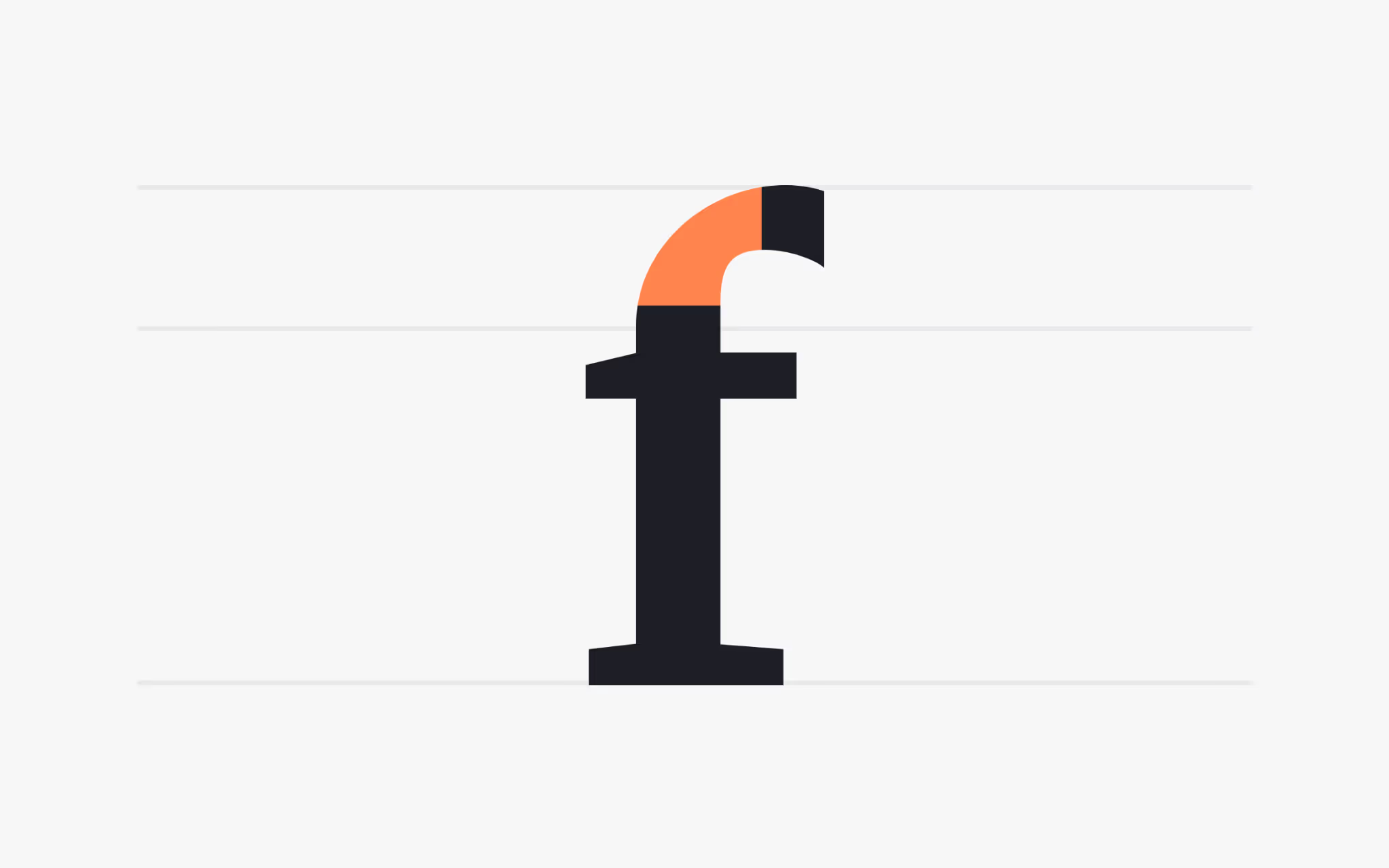
What is a Hook?
A hook is a curved stroke at the end of letters such as f, J, and j. It adds motion and gives those letters a recognisable profile within a word. A long hook can create a lively sweep that guides the eye forward. A short, compact hook keeps things tidy and modern.
Hooks influence collisions and spacing. In fi and fj pairs, a tall hook can crash into a following dot or cross stroke, which is why many families include ligatures. In display sizes, a sculpted hook can carry a brand voice. In body sizes, a simpler hook avoids visual noise and keeps text crisp. When you test a font, set words that include many hooked letters and check for comfortable spacing at your target sizes.
Swash
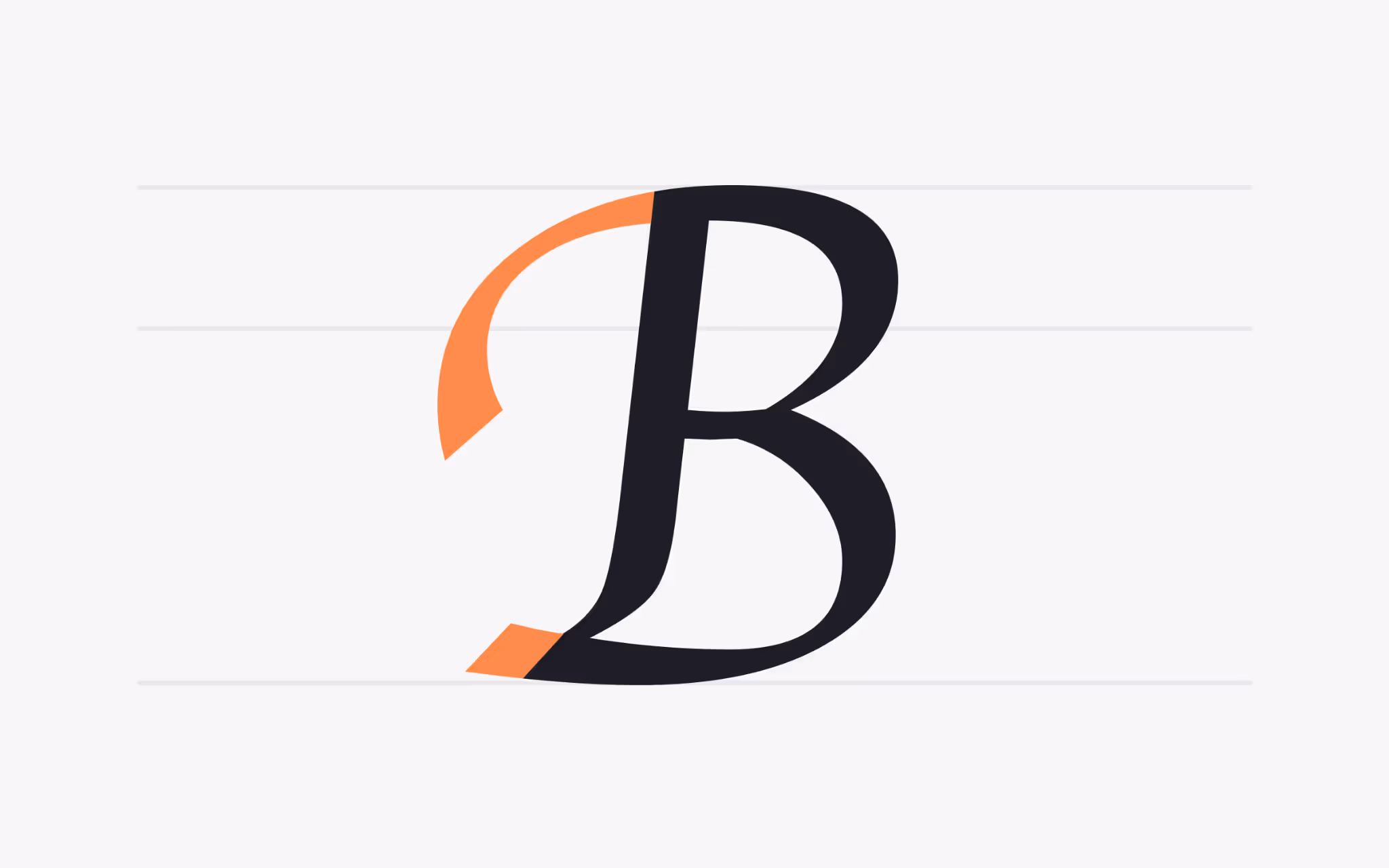
What is a Swash?
A swash is an ornamental extension that adds flourish to a letter. It shows up in italic capitals, alternate initials, and decorative endings. Swashes grew from pen-stroke habits in historical scripts and still add a sense of hand to digital type.
Swashes draw attention, so use them with intention. One swashed initial at the start of a headline can create drama and direction. Many swashes in the same line compete with each other and slow down reading. Modern families often include stylistic sets that toggle swashes on and off, which makes it easy to keep the main text clean and reserve ornaments for moments that benefit from emphasis or celebration.
Stem
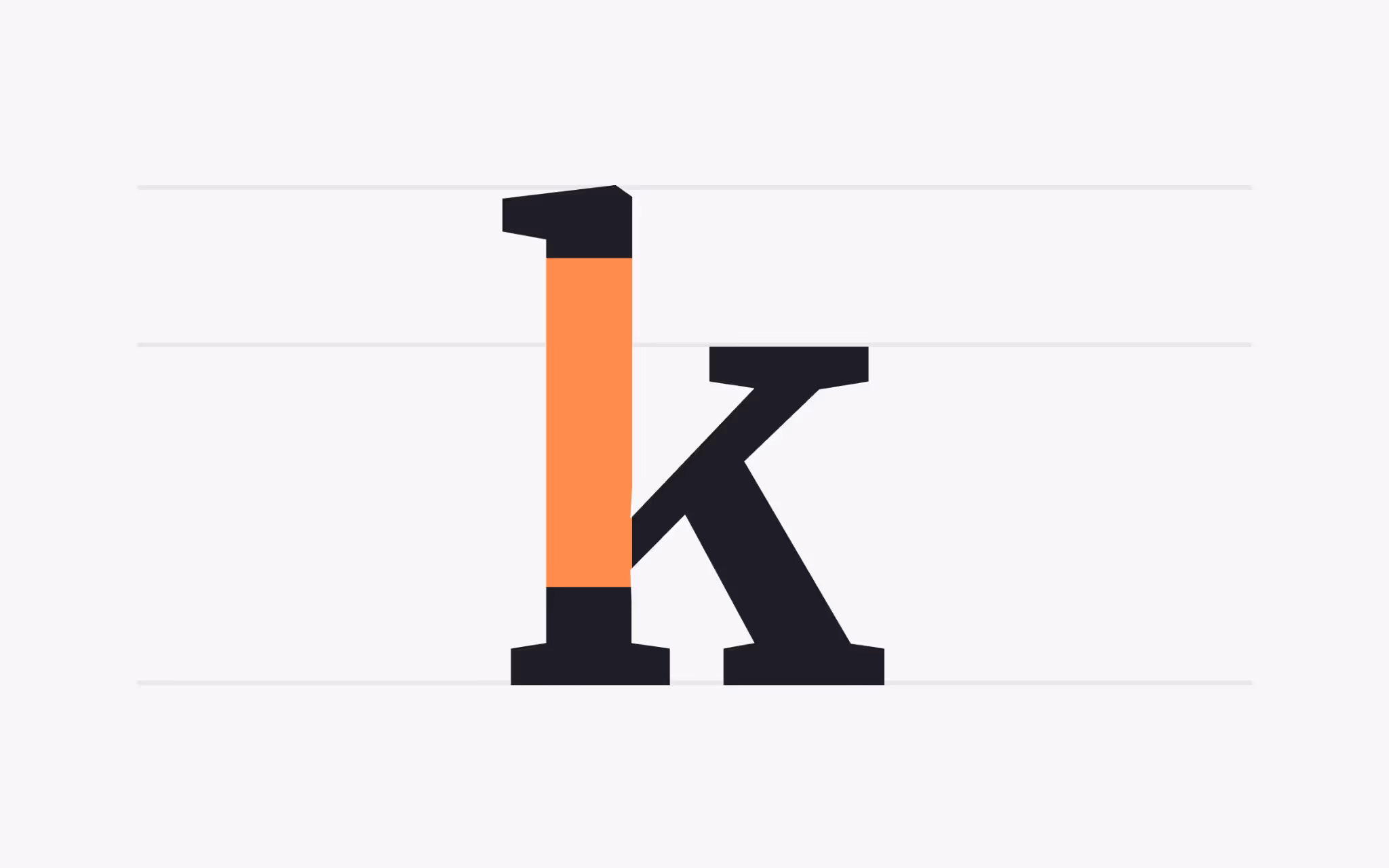
What is a Stem?
The stem is the main vertical or near-vertical stroke of a character. It carries much of the weight in letters like K, L, and t, and sets the cadence of a family. Consistent stems produce a steady texture across a paragraph. Irregular stems create a more expressive feel that works well in display work.
Stem thickness links to contrast and optical size. A text cut needs stems that hold together at small sizes. A display cut can slim the stems to gain elegance. When pairing families, compare stem weight at your intended sizes. If stems land in similar thickness ranges, the two faces will share a common beat that makes the layout feel coherent.
Stroke
What is a Stroke?
A stroke is any primary line that forms a character, whether vertical, horizontal, or diagonal. All letter parts are built from strokes, so stroke contrast sets the overall voice of a family. Geometric faces keep strokes even for a precise look. Old-style faces vary stroke thickness to echo the movement of a broad-nib pen.
Stroke shape matters as much as thickness. Rounded joins and soft curves read friendly and warm. Sharp joins read crisp and formal. At text sizes, smoother curves can reduce sparkle and help the eye glide. At headline sizes, sharper turns hold detail and carry personality. Try your chosen font at both sizes to see how the stroke story scales.
Spur
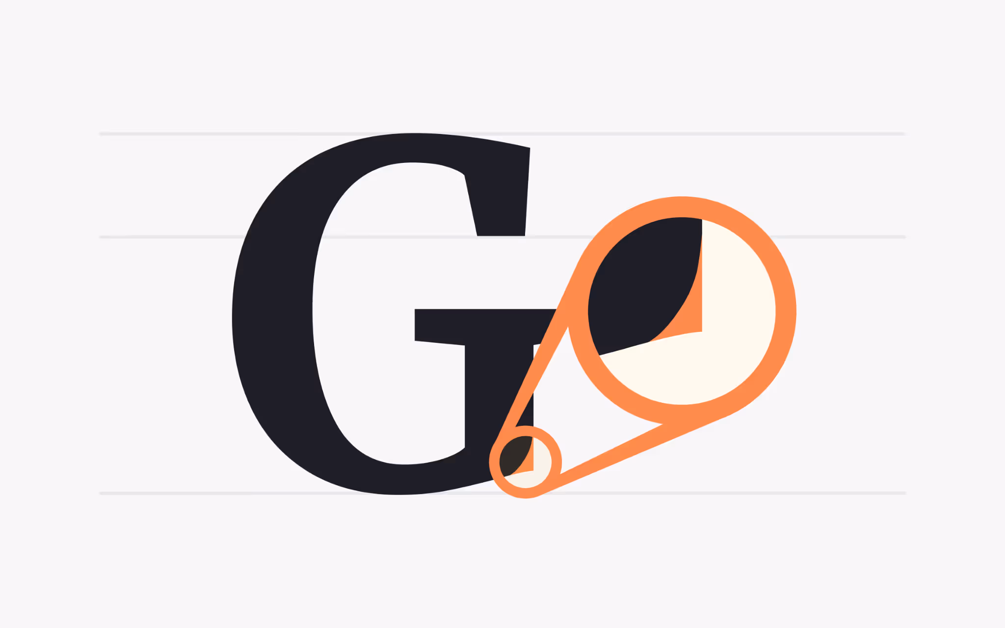
What is a Spur?
A spur is a small projection that extends from a curve, most often seen on the uppercase G and sometimes on C and S. Though small, it stabilizes a curve and prevents the letter from feeling slippery. In compact settings, that tiny tooth can be the cue that keeps similar shapes apart.
Spurs vary widely. Some faces use a minimal nub so the letter feels streamlined. Others favor a more pronounced tooth to add bite. In branding, a distinctive spur can become a recognisable feature in a logo or wordmark. In body text, a quieter spur avoids distraction and supports smooth scanning.
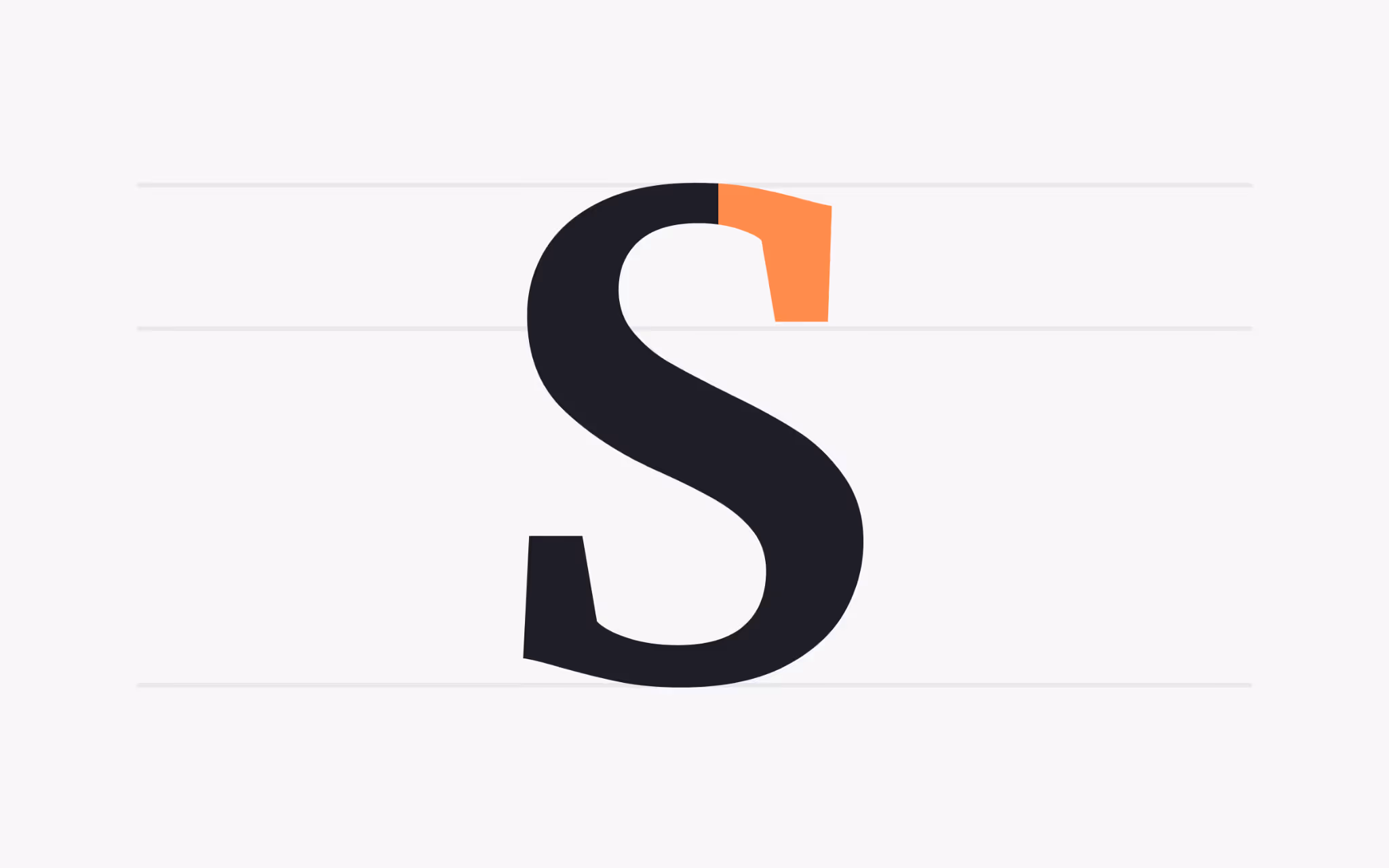
Spine
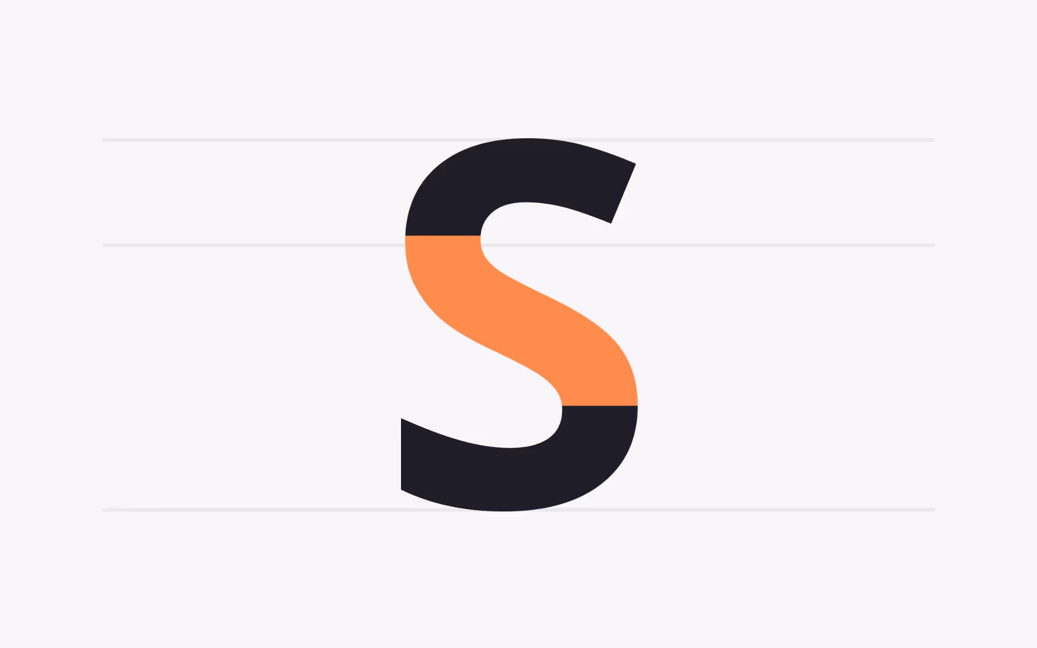
What is a Spine?
The spine is the main curved stroke of the letter S. Its bend determines the character of the S and, by extension, the entire family. A tight, high-contrast spine looks energetic and fashionable. A relaxed spine reads neutral and blends easily into long reading.
Spine angle affects spacing. A steep spine can steal room from neighboring letters, which calls for careful kerning in pairs like S A or S T. Test a font with sample words that show off the spine across sizes. If the S feels jittery in text, look for a cut with a calmer curve or a dedicated text style.
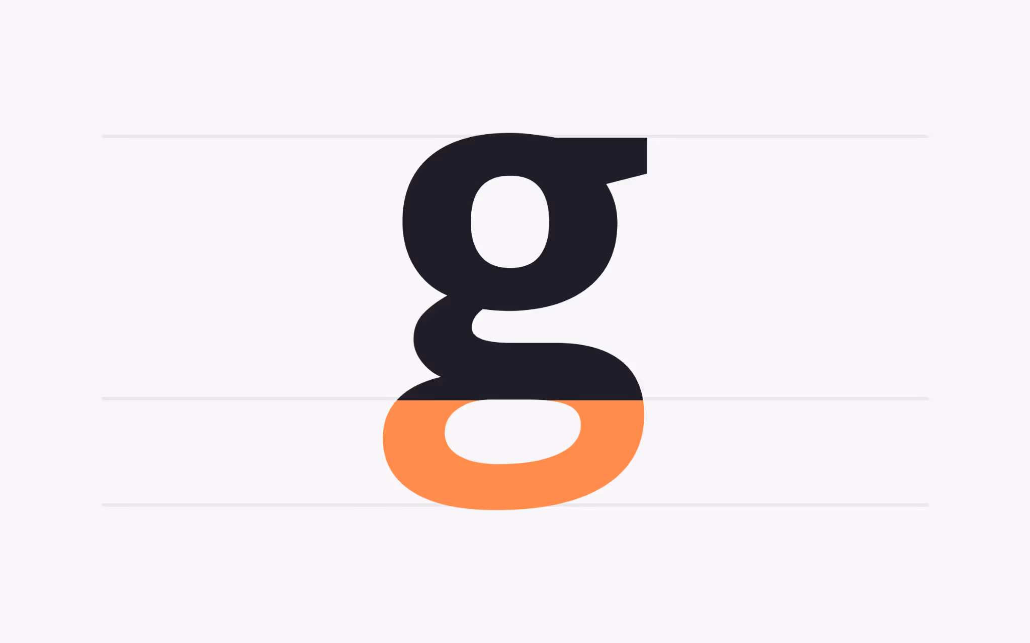
Loop
What is a Loop?
The loop, sometimes called the lobe, is the enclosed counter below the baseline in a double-story g. It connects to the upper bowl with a small link and becomes one of the most distinctive shapes in the family. A large loop can add charm. A compact loop keeps the rhythm tight.
Loops interact with hinting and rasterisation. On screens with coarse pixel grids, a narrow loop can close and look blotchy. Modern text faces often open the loop slightly to prevent that collapse. If your product uses long blocks of copy, preview the g at true production sizes. A loop that holds its shape under those conditions will help the whole paragraph read cleanly.
Flag
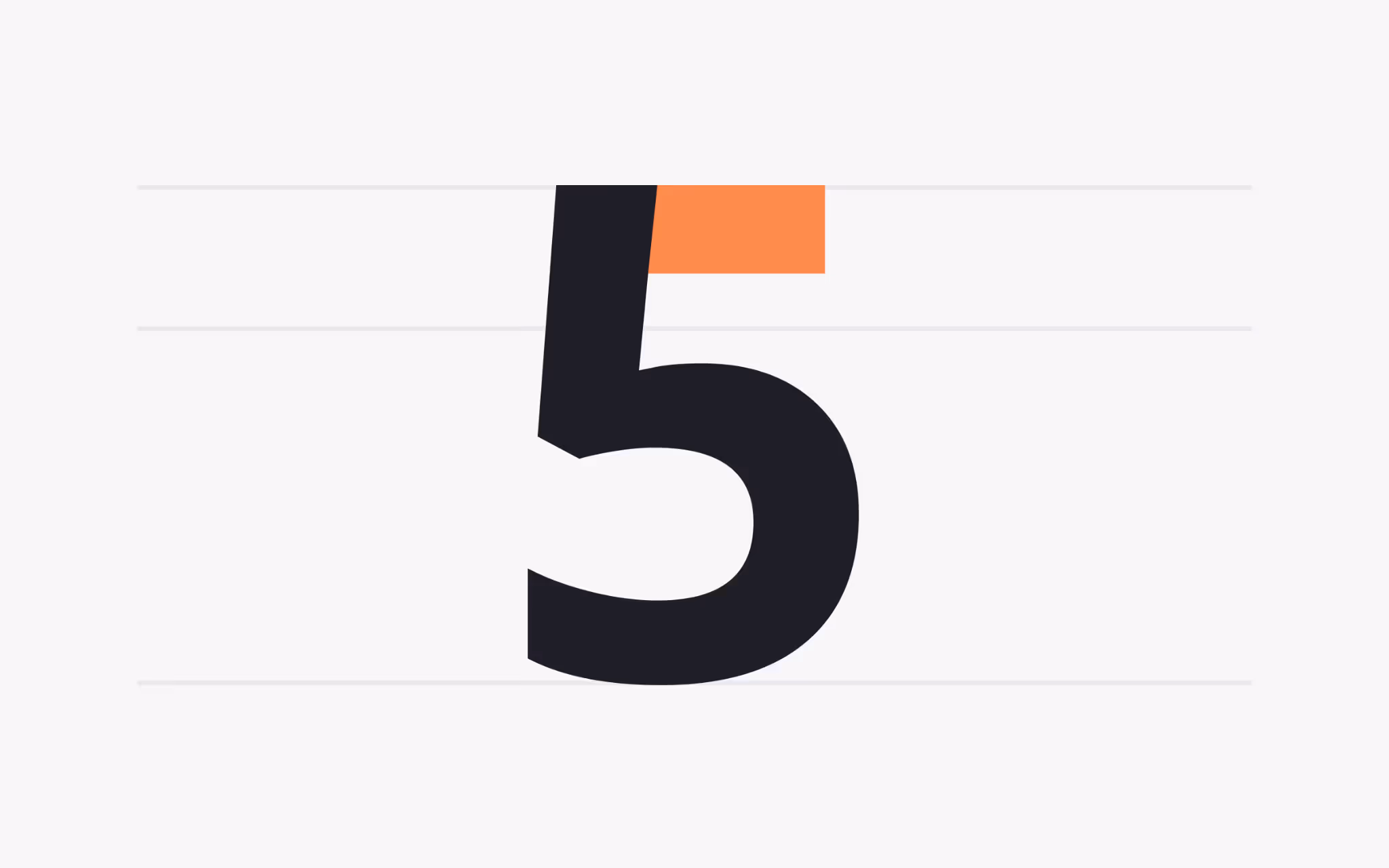
What is a Flag?
A flag is a decorative horizontal stroke seen in the figure 5 and in some blackletter forms. It carries history from scribal traditions, where pen strokes flared at the end of ascenders and terminals.
Today, flags appear mostly in display faces. They can give a numeral set a unique voice or lend a historical tone to titles. In data tables and UI components, a restrained numeral set without pronounced flags keeps numbers uniform and reduces visual chatter, which helps scanning speed.
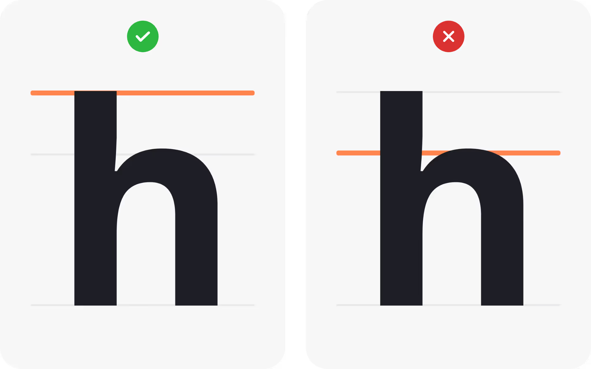
Shoulder
What is a Shoulder?
The shoulder is the curved stroke in lowercase h, m, and n. These letters appear constantly in running text, so the shape of the shoulder defines the hum of a paragraph. Smooth shoulders create a steady rhythm that supports long reading. Angular shoulders create a brisk, modern beat.
Shoulders reveal how a font handles contrast. A marked thick-to-thin transition across the shoulder adds sparkle in headlines but can flicker in small text. A more even shoulder keeps the tone calm. If your layout mixes text sizes, pick a family with optical sizes or micro cuts so shoulders stay graceful at every scale.
Link
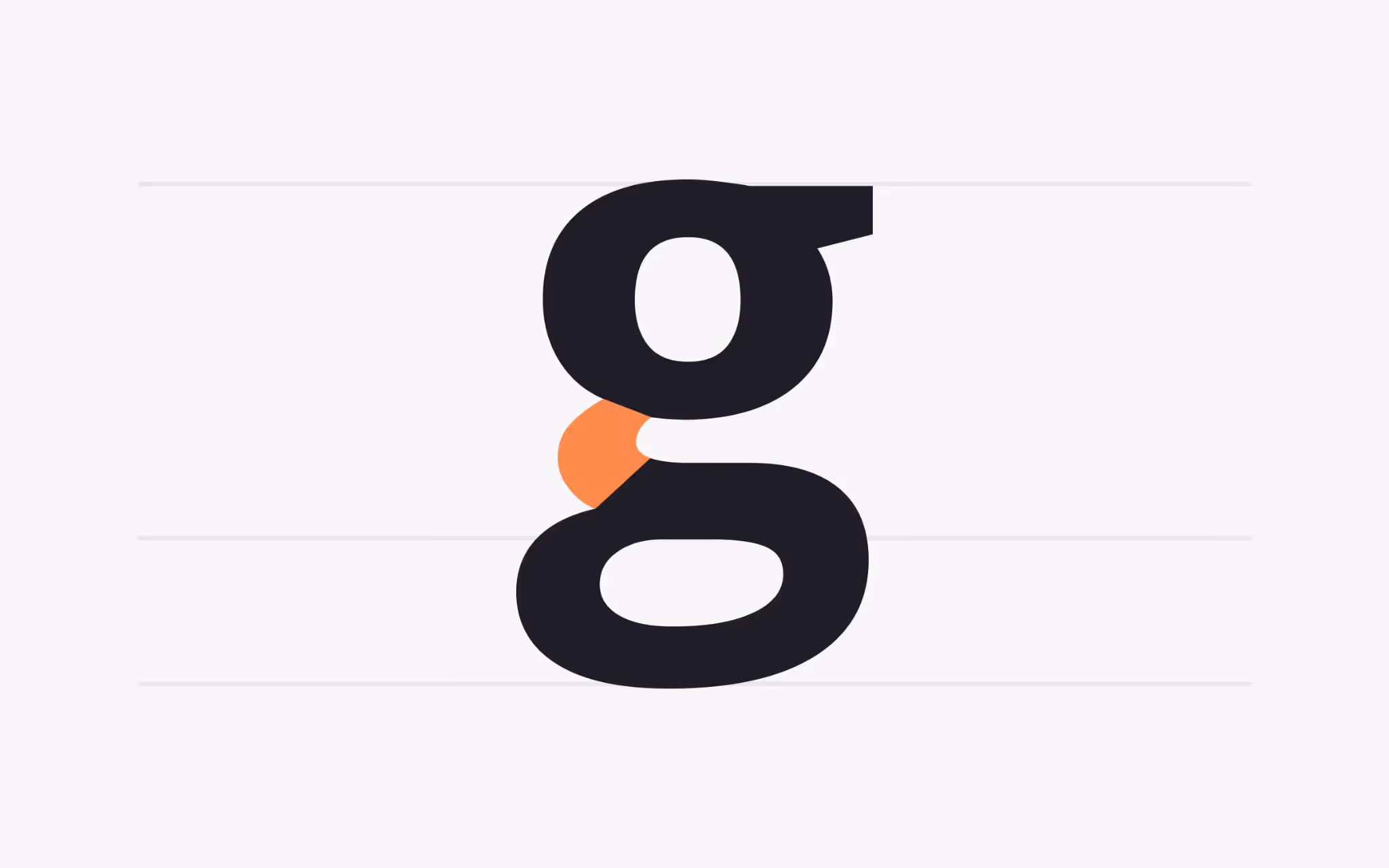
What is a Link?
The link connects the upper bowl and lower loop of a double-story g. It can be thin and delicate or thick and sturdy. That small bridge controls the flow between the two parts and sets the mood of the letter.
A delicate link reads refined and literary. A sturdy link reads confident and friendly. Because the g is common, this one decision colors the entire page. When building a brand palette, line up candidates and study only the g. You will often spot the right personality faster than by scanning full words.
Ligature
What is a Ligature?
A ligature joins two or more letters into a single glyph. Common pairs such as fi, fl, and ffi prevent collisions and smooth gaps. Discretionary pairs, such as ct or st add style in display settings.
Turning ligatures on or off changes the texture of a paragraph. In body sizes, standard ligatures remove distractions so reading stays fluid. In logos and headlines, a discretionary ligature can create a unique lockup. Always test across weights. A ligature that looks elegant in regular can feel heavy in bold if the join closes too tightly.
Ascender
What is an Ascender?
An ascender is the part of a lowercase letter that rises above the x-height, as in b, d, f, h, k, l, and t. Ascenders set the skyline of a line of text. Tall forms add grace, short forms keep paragraphs compact.
Ascenders compete for space with descenders from the line above. If they bump or kiss, reading slows. Solve this by adjusting leading, picking a text cut with shorter extremes, or editing copy to avoid letter stacks that clash. This small spacing choice can transform a dense page into a comfortable read.
Ascender line
What is the Ascender line?
The ascender line is the invisible guide that marks the height of ascenders. The gap between this line and the x-height defines the proportion of lowercase forms. That proportion shapes the feel of a family. A large gap gives an elegant, airy mood. A small gap gives a brisk, utilitarian texture.
This measurement matters in responsive design. If your layout scales type across breakpoints, a face with a sensible ascender proportion will keep the same voice on phone and desktop. Try a few sizes and judge whether the skyline still feels balanced at each step.
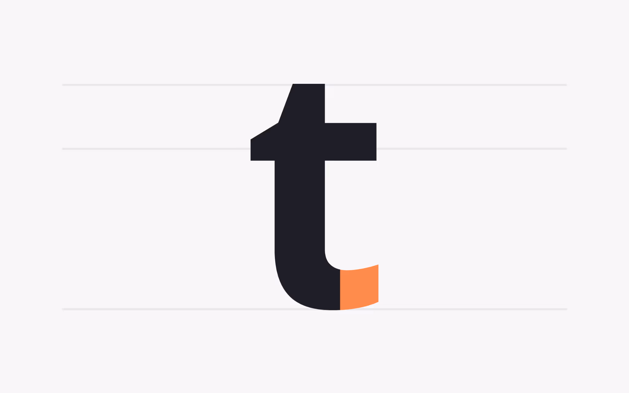
Cross stroke
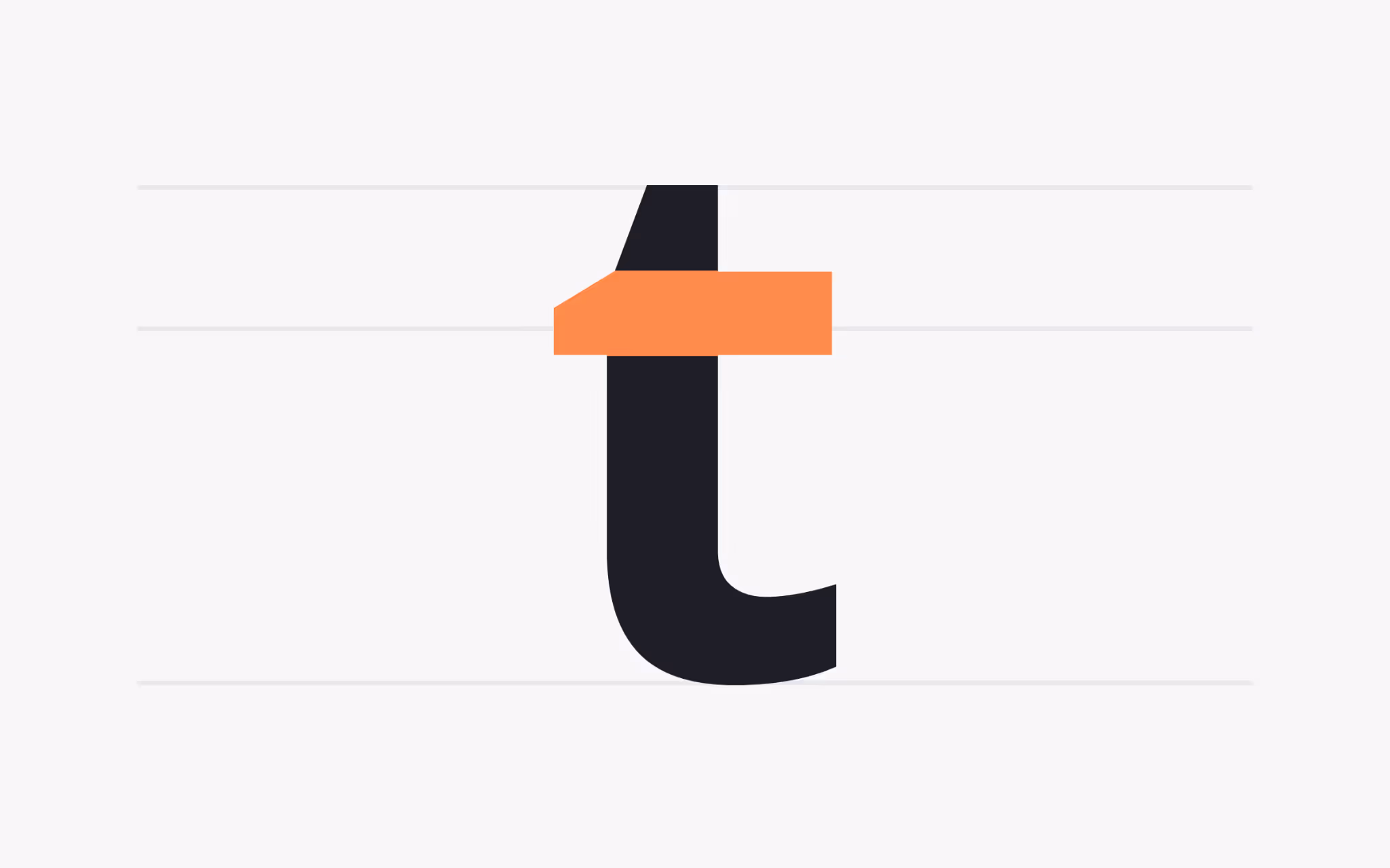
What is a Cross Stroke?
A cross stroke is a horizontal line that intersects a stem, as in lowercase t or f. It differs from an arm because it crosses the vertical stroke. Placement and weight of the cross stroke change the balance of the letter. A high cross on t looks refined. A low cross looks sturdy.
Cross strokes can collide with dots and hooks. Families often tune the height of the t cross to avoid clashing with the following letters. In scripts and italics, the cross can angle upward to keep the handwriting feel. When setting body text, pick a face where cross strokes remain clear at small sizes and do not break into noise.
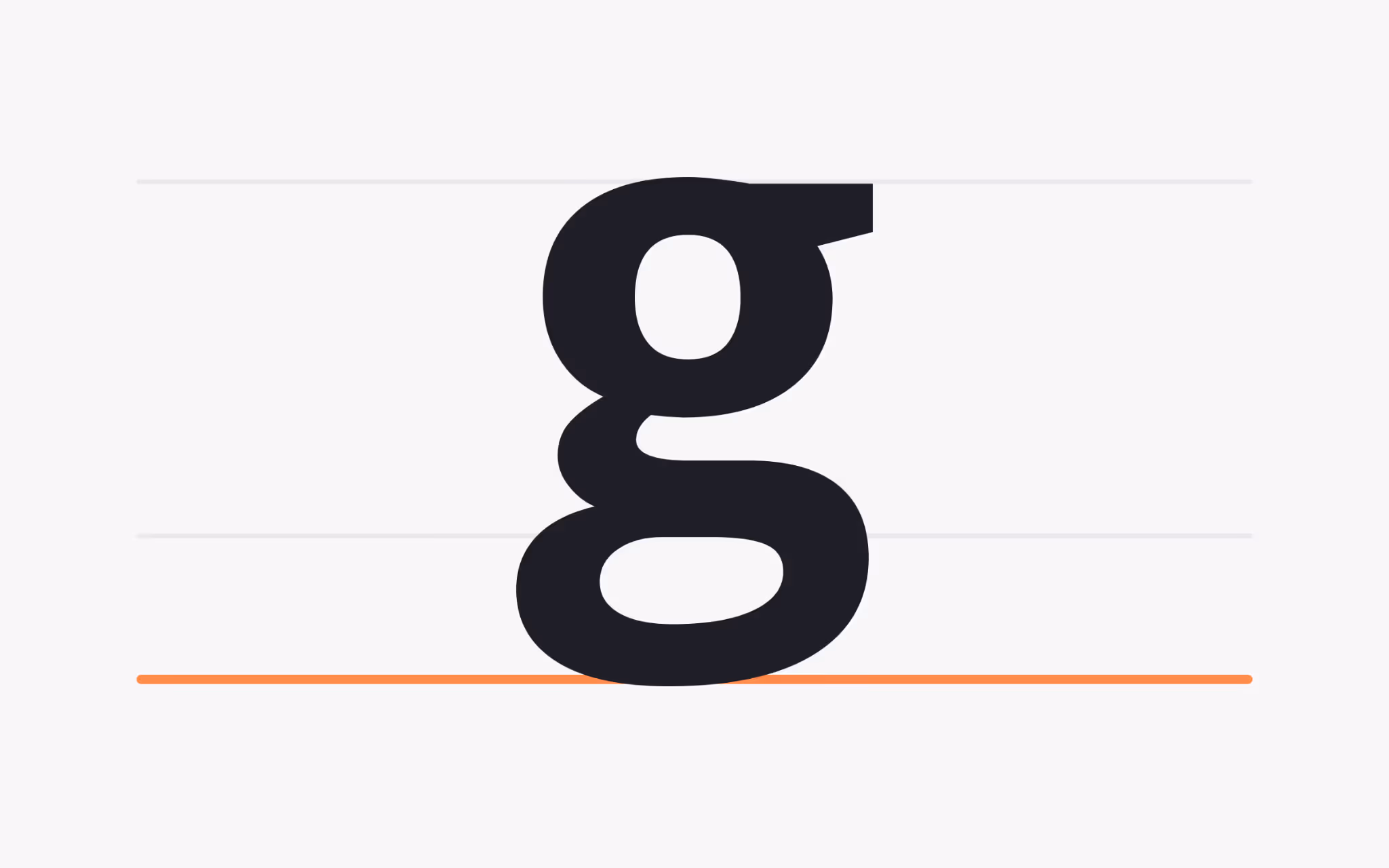
Descender
What is a Descender?
A descender is the part of a lowercase letter that falls below the baseline, as in g, j, p, q, and y. Descenders create the valley beneath the line of text and add vertical rhythm to a paragraph. Long tails feel graceful. Short tails feel efficient.
Descenders must avoid collisions with ascenders above. If you are short on space, pick a family with moderated descenders or increase line spacing slightly. In branding marks or headlines, a generous descender can add character, especially in a word that ends with y or g. In dense UI, shorter tails keep lines tight and predictable.
Descender line
What is a Descender Line?
The descender line is the invisible guide that marks the lowest point of descenders. Together with the ascender line, it defines the vertical envelope for lowercase text. When that envelope is wide, lines need more spacing to breathe. When it is narrow, you can pack more copy into a small space without crowding.
This detail affects icon and text alignment, too. If labels must align with UI controls, check the descender depth at the chosen size. A face with deep tails may look misaligned next to components that sit strictly on a grid. Testing with real interface elements avoids surprises later.
Tittle
What is a Tittle?
The tittle is the dot above the lowercase i and j. It seems tiny, yet it is a strong cue for letter recognition. Size and placement vary by family. A round, centered tittle feels friendly. A small, square tittle reads precise.
In small sizes, a faint tittle can fade and merge with noise from the screen. A text face often enlarges the dot slightly so it stays visible. In display work, a distinctive tittle can be part of a logo’s charm. Try words with many i characters to judge whether the rhythm of the dots complements the rest of the forms.
Terminal
What is a Terminal?
A terminal is a stroke ending that does not finish with a serif. It can be straight, flared, or rounded. Terminal design influences tone, spacing, and the way a word resolves at its edges. Rounded terminals soften the voice. Straight cuts look efficient. Flared finishes add warmth.
Terminals appear in both sans and serif families. In sans, they set the entire mood. In serif, they often appear as ball or teardrop forms that embellish particular letters. When setting paragraphs, consistent terminal shapes across letters produce a stable texture. In headlines, bolder terminals can act as visual accents and carry brand personality.
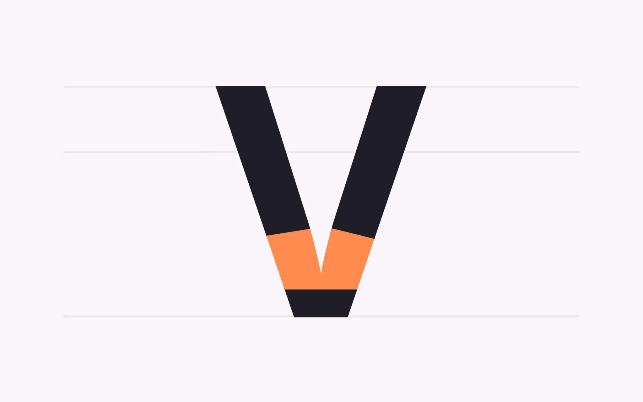
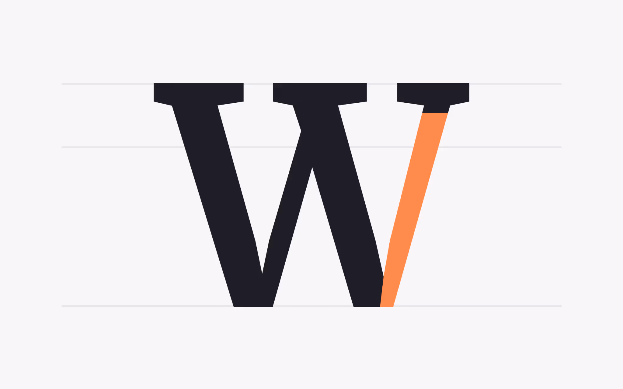
Vertex
What is a Vertex?
The vertex is the point where two strokes meet at the bottom of a character, as in V or W. It is the counterpart to the apex at the top. A sharp vertex creates a decisive point. A shallow vertex softens the feel and opens the interior space.
Vertices affect kerning. Pairs such as V A or W a can look gappy if the point does not tuck nicely under the neighbor. Good families include careful kerning for these pairs. When setting logos or headlines with large capitals, check those point-to-round relationships and adjust tracking to keep the joins comfortable.
Ball terminal
What is a Ball Terminal?
A ball terminal is a rounded ending applied to a stroke. It introduces a circular accent that guides the eye and adds a friendly glint to the line. You will often see ball terminals in transitional and old-style serifs.
Scale changes the effect. At text sizes, a small ball terminal adds sparkle without distraction. At display sizes, a larger ball becomes a strong decorative note. If your layout includes both, pick a family with optical sizes or weights that keep the ball proportionate in each context.
Tail
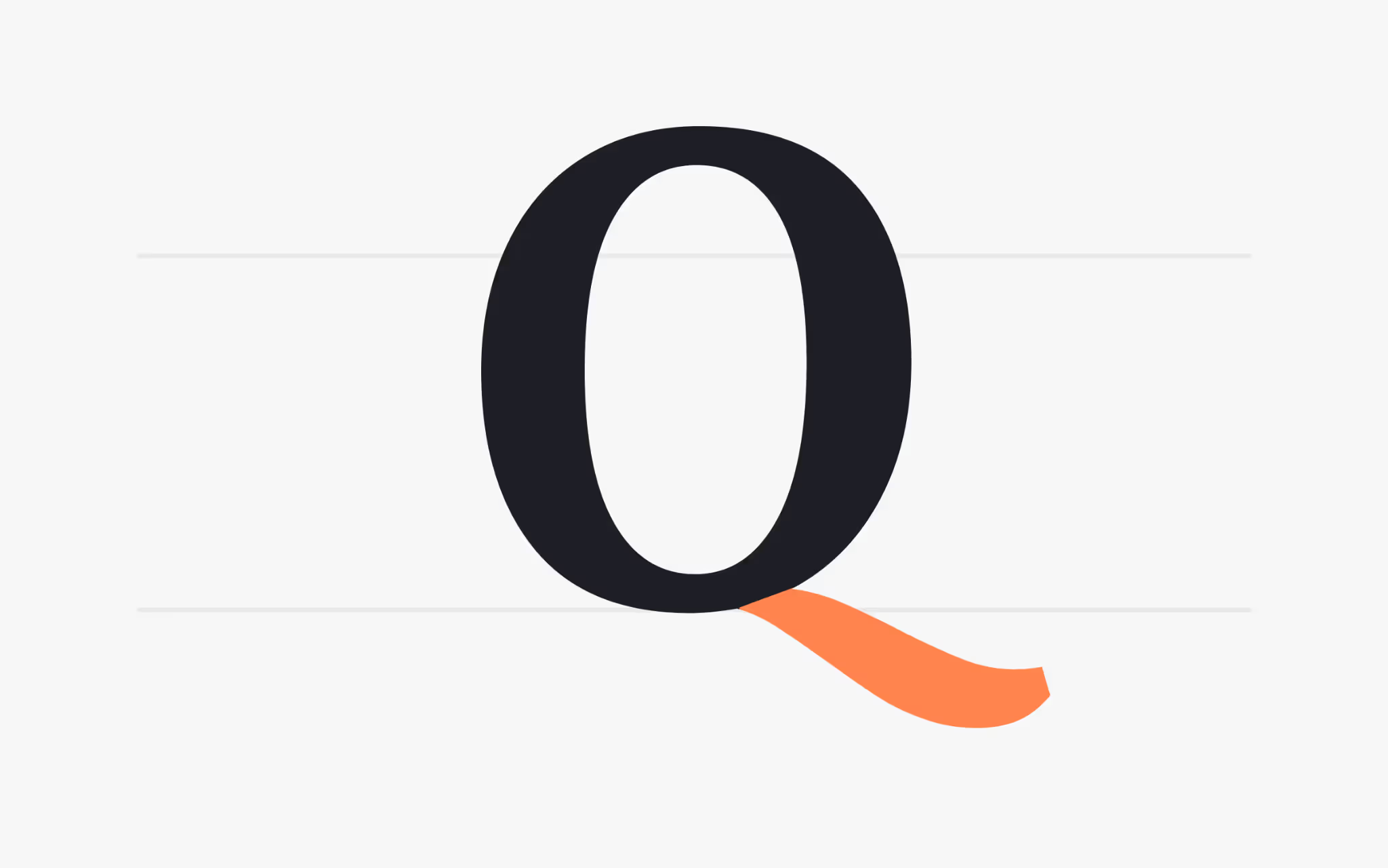
What is a Tail?
The tail is a descending, often decorative stroke that extends from letters such as Q, K, or R. In Q, the tail can define the entire voice of the capital. A straight tail feels pragmatic. A curved tail feels graceful. A split tail adds drama.
Tails claim space around the letter. In tight headlines, a long tail can crash into neighbors or cross the baseline in awkward ways. In a logo, that same flourish can become a signature move. Try a few tail variants if your family provides alternates. The right shape can turn a common word into a distinctive mark.
Teardrop terminal
What is a Teardrop Terminal?
A teardrop terminal is a droplet-shaped ending. It softens a stroke without using a full serif and adds a touch of grace to letters such as a, c, or r in certain families.
Teardrops carry emotional color. They often read poetic and refined, which suits branding, packaging, and editorial titles. In dense UI or technical documents, a plainer terminal keeps the tone neutral. If a project needs both, consider a superfamily where a text face keeps terminals simple and a display face introduces teardrops for standout moments.
Wrapping Up
Every letter holds a set of design choices that shape how words read and how pages feel. Apertures decide how forms breathe. Feet and terminals decide how lines sit on the baseline. Hooks, loops, and tails add motion. Spines, shoulders, and stems set the rhythm that carries readers from line to line. When you study these parts, you gain a lens for picking the right family, pairing faces with confidence, and tuning spacing for the medium at hand.
Carry these terms into your reviews and your prototypes. Look at the copy at true production sizes. Print a sample, then view the same sample on a phone. Swap a face with tighter apertures for one with more open forms and watch scanning speed change. Little typographic decisions compound into big gains in clarity and tone. That is the craft that turns letters into a system that serves readers and brands alike.