

.svg)


What is the law of common region in Gestalt psychology?
The law of common region is one of Gestalt psychology's most powerful principles for UX design, and one of the most practical. It states that when objects appear inside the same enclosed area, we perceive them as related, even if they differ in shape or size. Our brains assume that elements within a shared boundary serve a common purpose. Designers can use this principle to create clear relationships in interfaces by adding borders, backgrounds, or shadows that group content and guide user attention.
Applying the law of common region helps users quickly understand which elements belong together and how to interact with them. Whether it is a card layout, a navigation bar, or a product comparison table, defined regions create order and reduce cognitive load. When used thoughtfully, this principle supports hierarchy, clarity, and better user experiences across digital products.
The Gestalt principle of common region: how boundaries define grouping
The foundation of the law of the common region is the idea that a visible boundary signals a connection. Gestalt researchers Stephen Palmer and Irvin Rock described this phenomenon in 1999, showing that people instinctively group items placed within a single visual container. The key is that the area must have a clear edge, such as a border or a background color, to trigger the perception of grouping.
In digital design, this principle helps users interpret structure without needing explicit labels. A card around related settings, for example, tells people those controls work together. By carefully defining element grouping, designers reduce ambiguity and make interactions more intuitive. The clearer the boundary, the easier it is for users to understand how different pieces of information relate to each other.
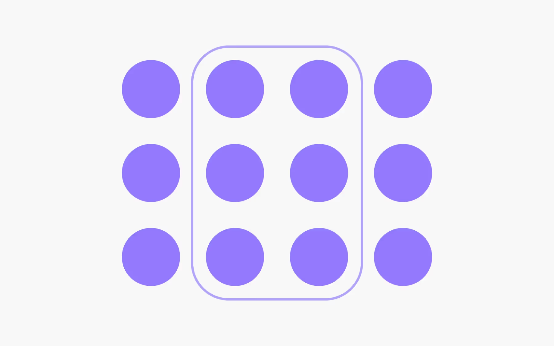
Overpower similarity
Similarity is another Gestalt principle: we often group elements that look alike. But a strong common region can override that cue. If two shapes differ in color or size but share a single container, users will see them as connected despite their differences. A contrasting background, a shadowed box, or a distinct border is enough to unite varied components into one perceived group.
This is particularly useful when designers need to organize mixed content such as icons, buttons, and text links. By placing them within a single visual region, they appear related even if their individual styles differ. Slack’s dark control sidebar is a good example: its background clearly separates navigation items from the rest of the interface, ensuring quick recognition and interaction.
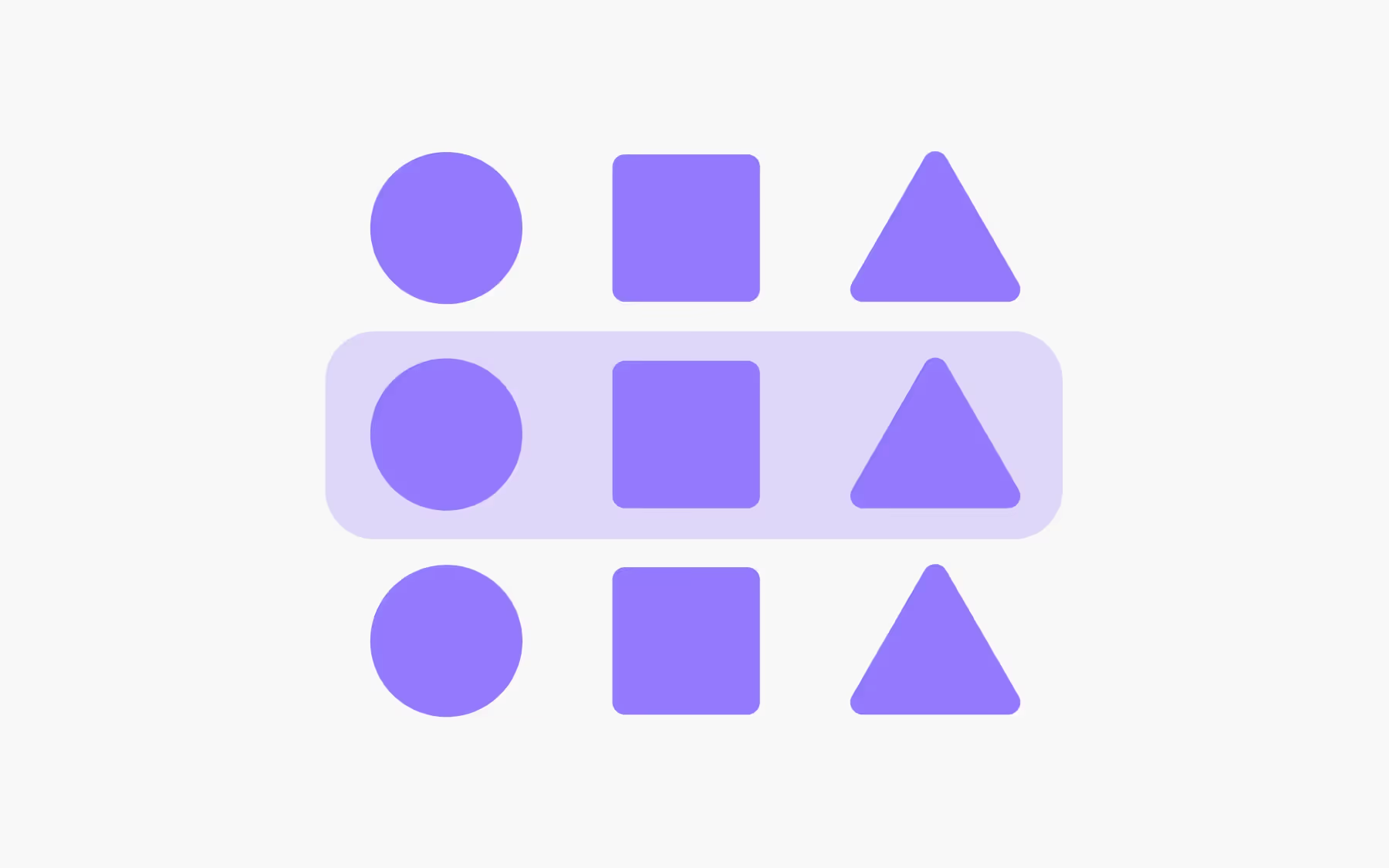
Overpower proximity
Proximity normally leads users to group elements that sit close together. However, a clear boundary can override proximity and separate items even when they are near each other. When elements are close but belong to different groups, enclosing them in distinct regions prevents confusion and clarifies relationships.
A classic example comes from early versions of the Food Network tablet app, where ratings and recipe names were spaced closely enough to cause misinterpretation. Introducing card borders around each recipe provided a stronger visual cue, letting users instantly see which rating belonged to which dish. A deliberate region beats simple spacing when precision is required.
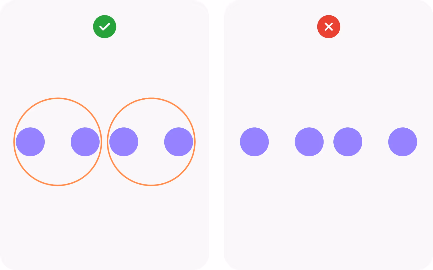
Establish hierarchy
Grouping elements within defined regions creates a visual hierarchy that guides the user’s eye. By enclosing related items, designers signal that these elements belong together and should be read or acted upon in a certain order. This is essential for complex pages where multiple types of content compete for attention.
Consider an article page where an image and caption are surrounded by a shared border or background. This grouping makes it clear that the text describes the image and distinguishes the pair from the rest of the article. Hierarchy built through common regions helps users scan quickly and focus on the most relevant sections without feeling overwhelmed.
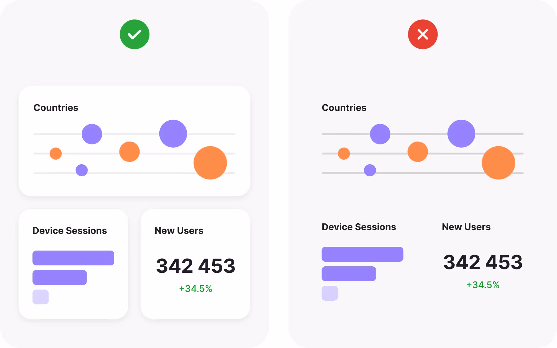
Emphasize multiple elements
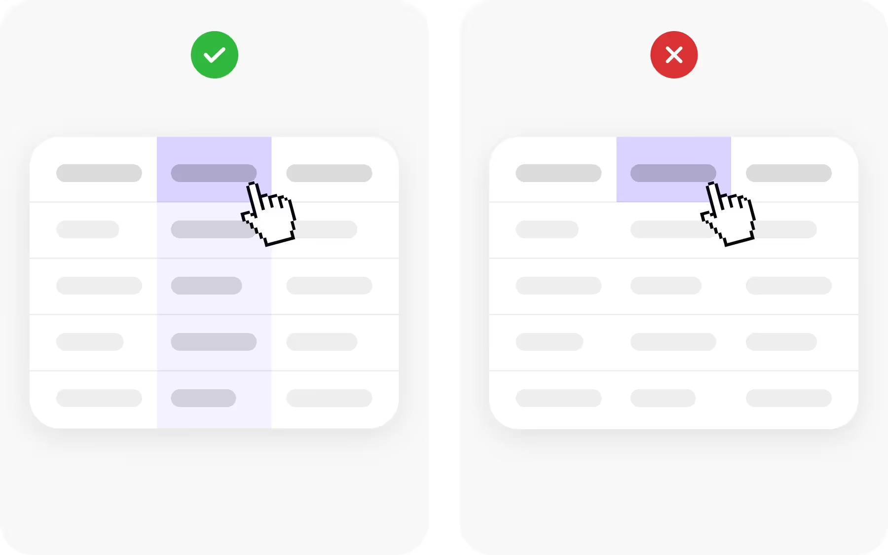
The law of common region also makes it possible to organize multiple groupings within the same interface. Tables comparing products often need to show relationships both by column and by row. Designers can alternate background colors for rows, use borders for columns, and add hover effects to highlight active cells, creating a layered set of common regions.
These overlapping regions allow users to read data in different directions while maintaining clarity. By carefully balancing background colors, outlines, and whitespace, designers can emphasize complex relationships without creating visual chaos. Structured grouping turns dense information into an accessible, scannable layout.
Highlight relevant information
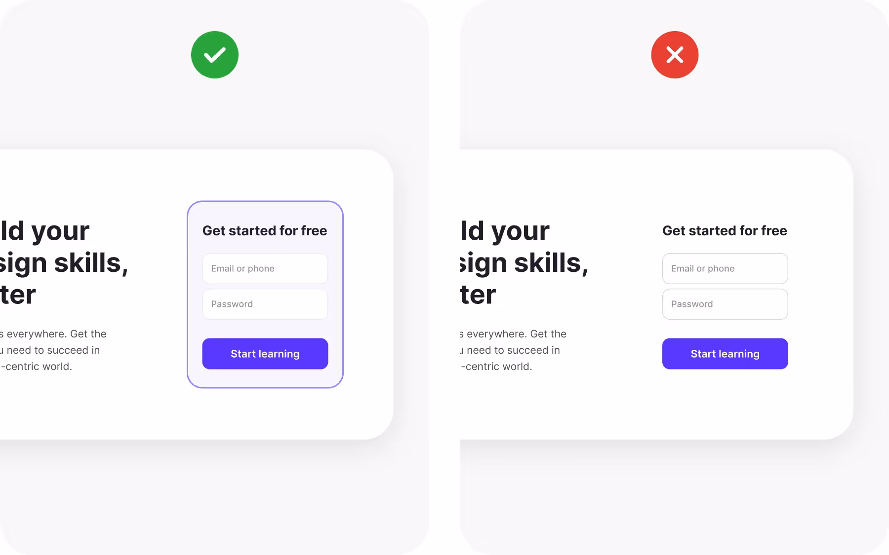
Borders and outlines do more than separate. They can also draw attention to key content. Enclosing an important element within a distinct region makes it stand out from its surroundings, helping users notice and act on it. A registration form, for example, can be emphasized with a subtle background shift and a shadowed border that sets it apart from the rest of the page.
This approach works especially well for calls to action or critical messages. By combining grouping with contrast, designers guide users toward essential interactions without overwhelming the overall design. The highlighted region acts as both a container and a spotlight.
Group-related information

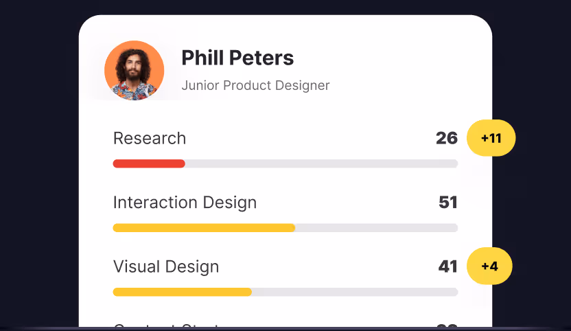
Humans constantly classify and organize what they see. Using the law of common region helps designers perform this mental work for their users. When related information is enclosed within a shared boundary, people can instantly recognize its connection and ignore unrelated details. This makes scanning faster and reduces cognitive effort.
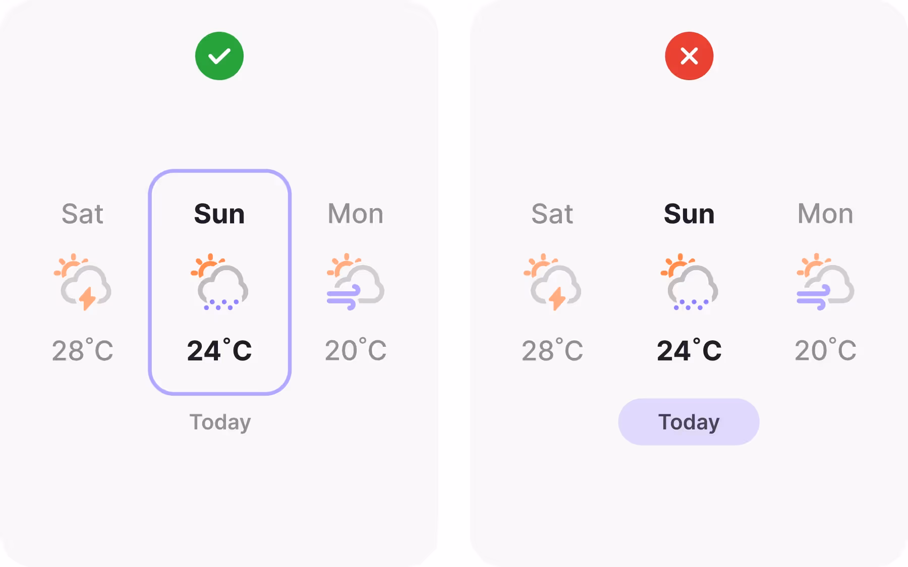
For example, a weather app might group forecast details, temperature, humidity, and wind speed inside a single card. Users immediately know these values belong together and can read them as a unit. Clear grouping streamlines comprehension and improves the overall user experience.
Bring attention to what’s important
Creating a distinct region around an element not only groups it but also elevates its importance. A subtle change in background color, combined with a border or shadow, signals to users that this area deserves special focus. Designers can use this technique to highlight forms, promotional content, or key metrics.
Because the human eye is drawn to defined shapes and edges, enclosed regions naturally stand out within a layout. By pairing grouping with visual emphasis, designers ensure that the most critical actions or messages receive the attention they need.
Show relationship
Containers communicate relationships even when no visible border exists. A consistent background or alignment can create an implicit region that ties elements together. When objects break out of that boundary, the sense of order is lost, and the design can feel chaotic.
Maintaining clean boundaries keeps the interface organized and professional. Whether the container is obvious or subtle, users rely on it to understand which elements belong together. Respecting these invisible lines preserves clarity and supports a polished experience.
How to apply multiple common regions in UX/UI design

Designers can layer multiple common regions to create complex but understandable structures. For instance, a set of product cards might each have a background to show they are individual items, while all cards share a larger bordered section to indicate they belong to the same category. This nested approach conveys hierarchy and relationship simultaneously.
However, too many overlapping regions can create clutter. When grouping becomes excessive, the interface may feel heavy or confusing. Designers should balance containers with generous whitespace to maintain visual simplicity while still communicating structure.
Wrapping up
The law of common region is a simple but powerful tool for organizing information. By enclosing related elements within clear boundaries, designers help users navigate complex layouts, notice key details, and understand relationships at a glance. Whether through borders, backgrounds, or subtle alignment cues, this principle reduces cognitive load and supports faster, more confident interactions.
Applying the law thoughtfully ensures that grouping strengthens the design rather than overwhelming it. A well-structured interface uses regions to tell a story, guiding users through content and actions in a way that feels natural and effortless.