

.svg)


A sign-up page looks simple at first glance: a few fields, a button, maybe a logo. Yet behind that simplicity lies one of the most powerful moments in any digital product. The sign-up step decides whether a visitor becomes part of your product’s world or leaves without a trace.
Studies show that many users abandon sign-up flows that feel long or confusing, and once they leave, most never return. That means every detail on this page shapes conversion, trust, and long-term engagement.
The best sign-up experiences are short, clear, and confidence-building. They ask for what matters, remove distractions, and give users reasons to continue. Let’s look at how to design sign-up pages that increase completion rates and create a strong first impression.
Keep it short: Ask only for what you need
The more information you demand upfront, the greater the chance people will quit halfway. Data from online form studies shows that nearly seven out of ten users drop long forms without finishing.
If you only need an email and password to get started, stop there. Additional details like birthday, address, or profile preferences can come later, once the person is already invested in your product. This approach lowers the barrier to entry while still allowing you to gather the information you need over time.
Think about the way modern apps structure their entry flows. Slack only asks for an email at the beginning, then gradually collects workspace details once you are inside. That first step feels light and inviting, while the later stages happen when you are more motivated.
In cases where you really must gather more information at the start, consider breaking it into smaller chunks with a progress bar. Users feel more willing to continue when they see how far they have come and how close they are to the finish.
The rule is simple: every extra field must justify itself. If the answer does not impact immediate access or security, move it later in the journey.

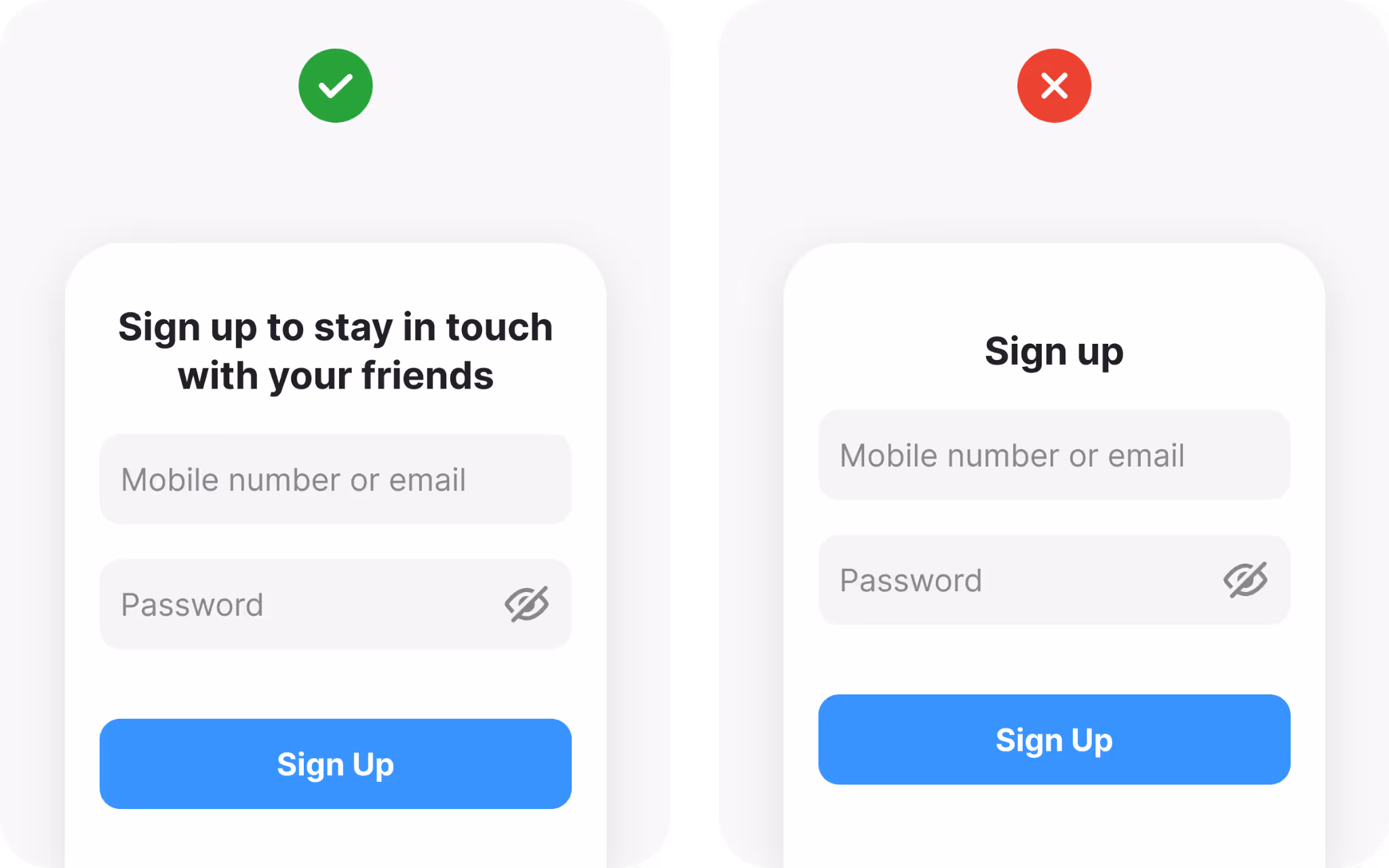
Show the value in your headline
Most visitors on a sign-up page already know something about your product. Still, that moment is a chance to remind them why joining is worth their time. A plain “Sign up” headline wastes the space.
Instead, highlight the benefits of creating an account. Spotify tells you to “Sign up for free to start listening.” LinkedIn invites you to “Make the most of your professional life.” These messages feel more like promises than instructions.
Your headline does not need to be long. It just needs to connect the form with the outcome users want. Do they get access to the community? Do they unlock features? Do they save time? Make that visible right at the top.
Headlines set the tone. A sign-up form should not feel like paperwork; it should feel like the first step toward something rewarding.
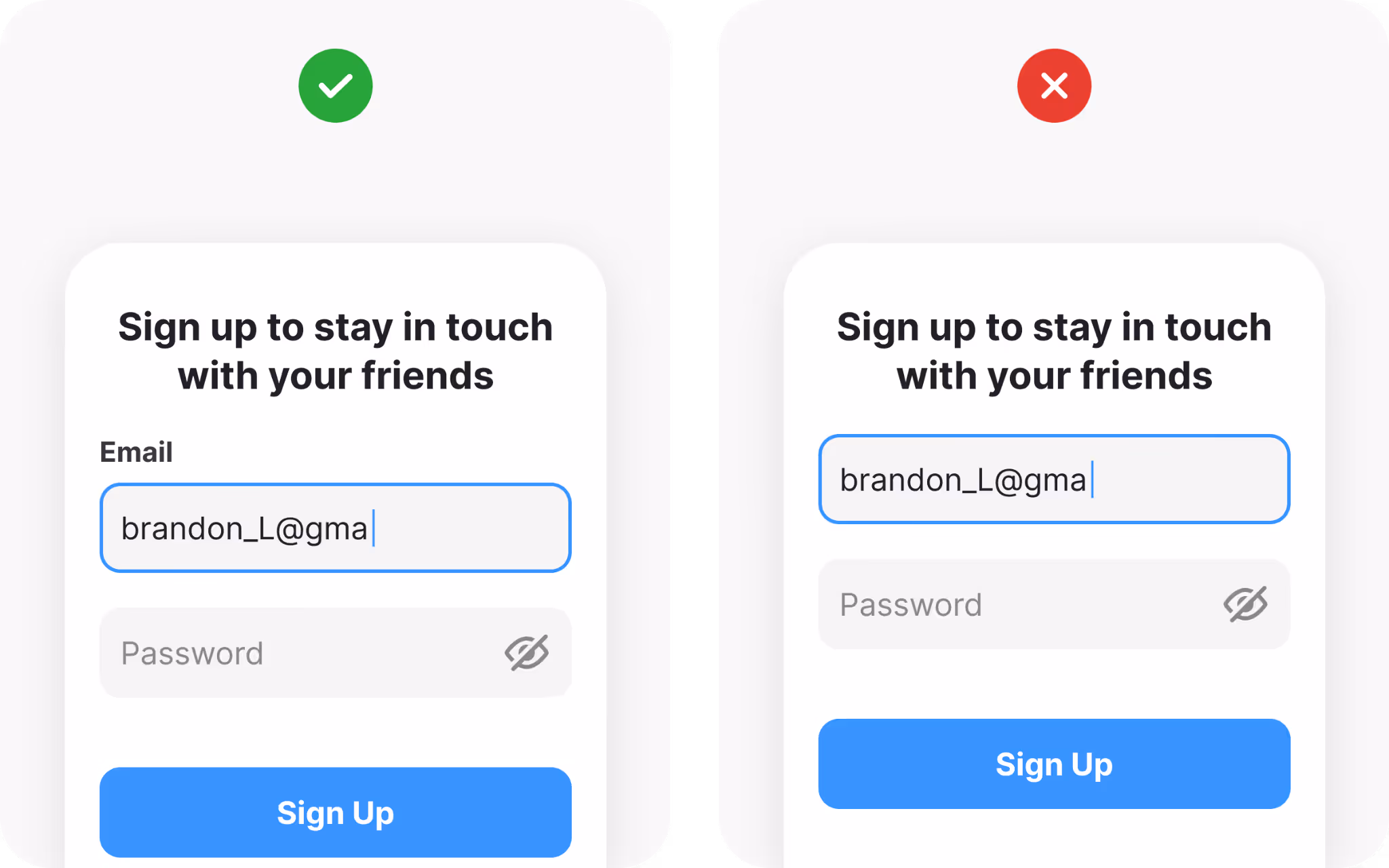
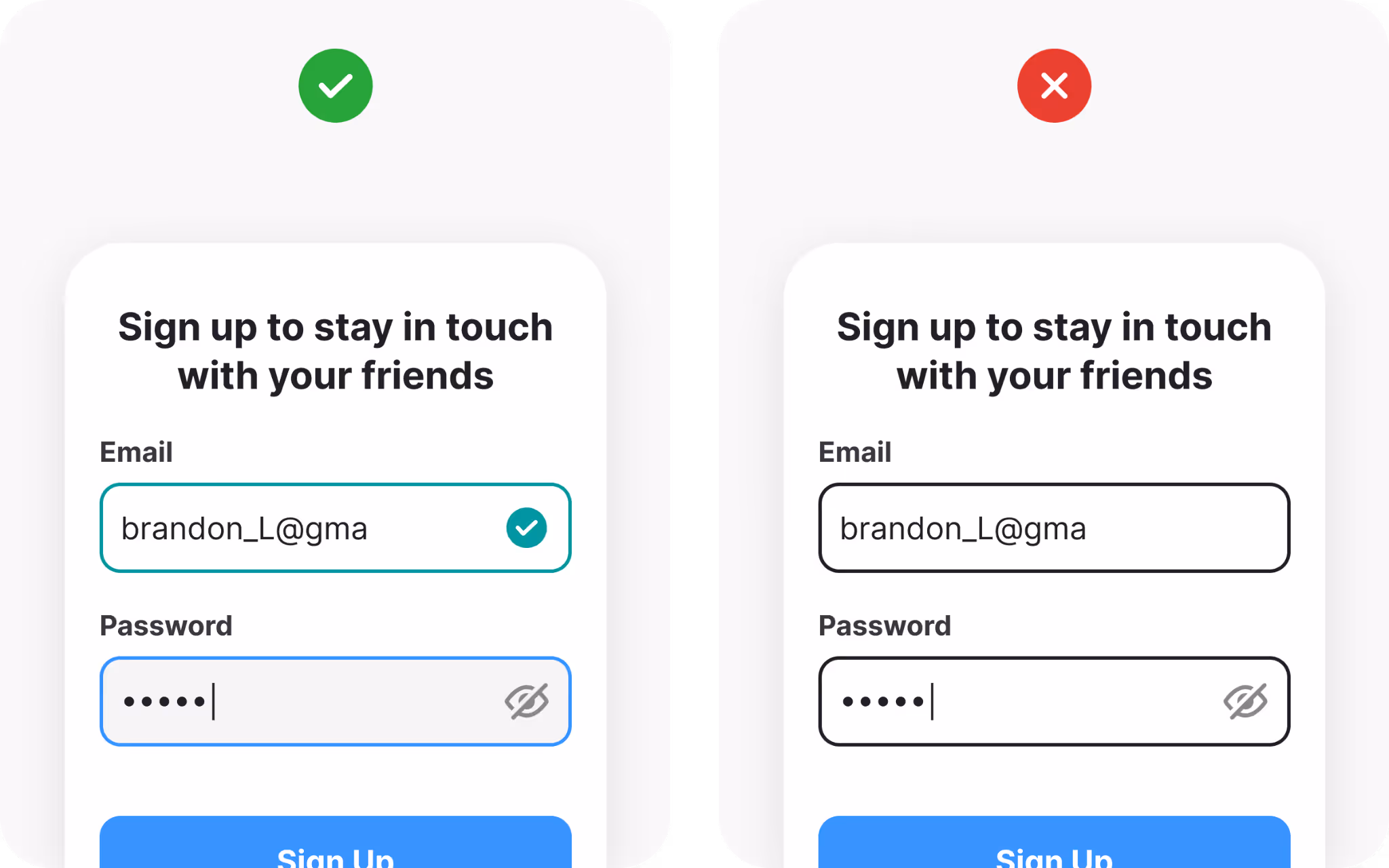
Use visible labels, don’t let users guess
Form design often breaks down at the micro level. One of the most common mistakes is relying only on placeholder text inside fields. Placeholders vanish once someone starts typing, forcing them to remember what was written. That small memory strain adds unnecessary effort.
Always provide labels above each field. Labels remain visible as users type, maintaining clear context. Placeholders can work as examples, but they should never replace labels. In this example, users should know that the field for their email is above the field for their password, but don’t let them guess here either.
Accessibility adds another reason. Low-vision users often struggle with faint placeholder text, and screen readers may skip placeholders entirely. Without labels, large groups of people find the form unusable.
One useful compromise is the floating label pattern. Labels begin inside the field and then slide above once typing begins. This approach saves space while keeping clarity intact.
Good labels are not optional extras. They are instructions that reduce errors and support everyone.
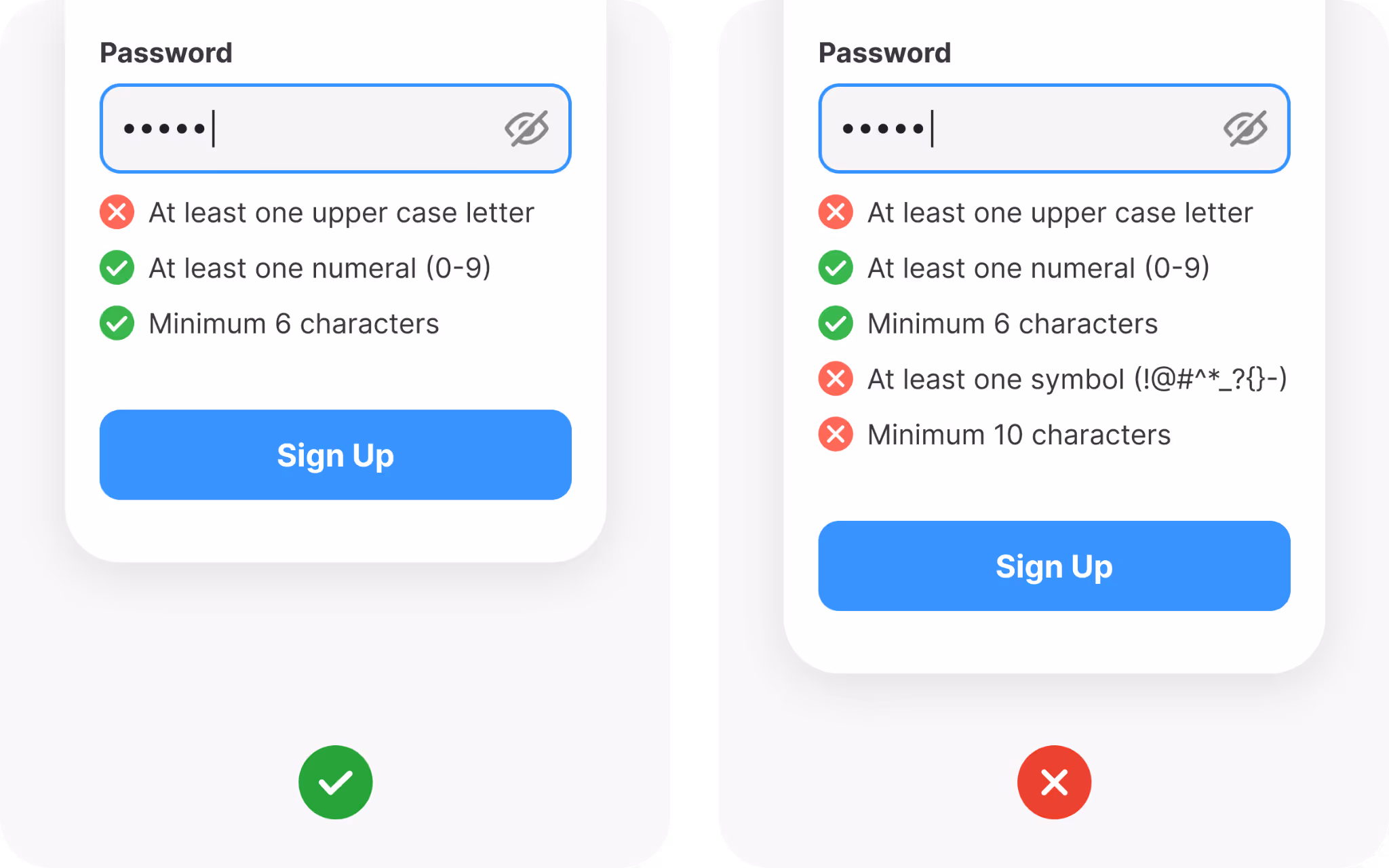
Simplify password creation
Password fields can be frustrating if handled poorly. People understand the need for security, but long lists of requirements often cause irritation.
Set clear, reasonable rules. Show those requirements near the field, not hidden in small print. Even better, add live validation so users see each rule turn green as they meet it. That feedback reduces guesswork and helps them succeed quickly.
Give people the option to reveal what they type. Mistakes often come from hidden characters. A strength meter can also reassure them by showing progress from weak to strong in a simple visual bar.
Avoid going overboard with restrictions. A password that demands uppercase, lowercase, numbers, symbols, and length all at once might feel like a test rather than a welcome. Balance security with usability.
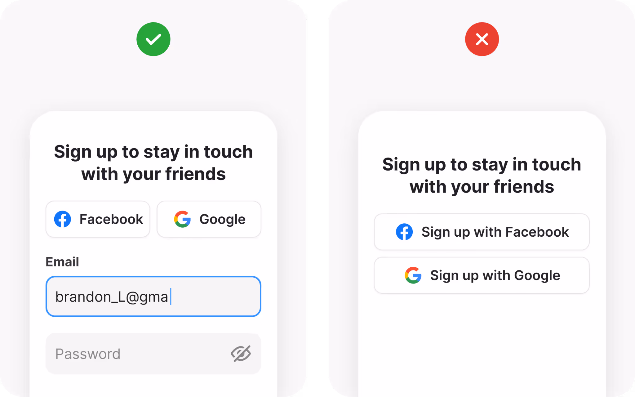
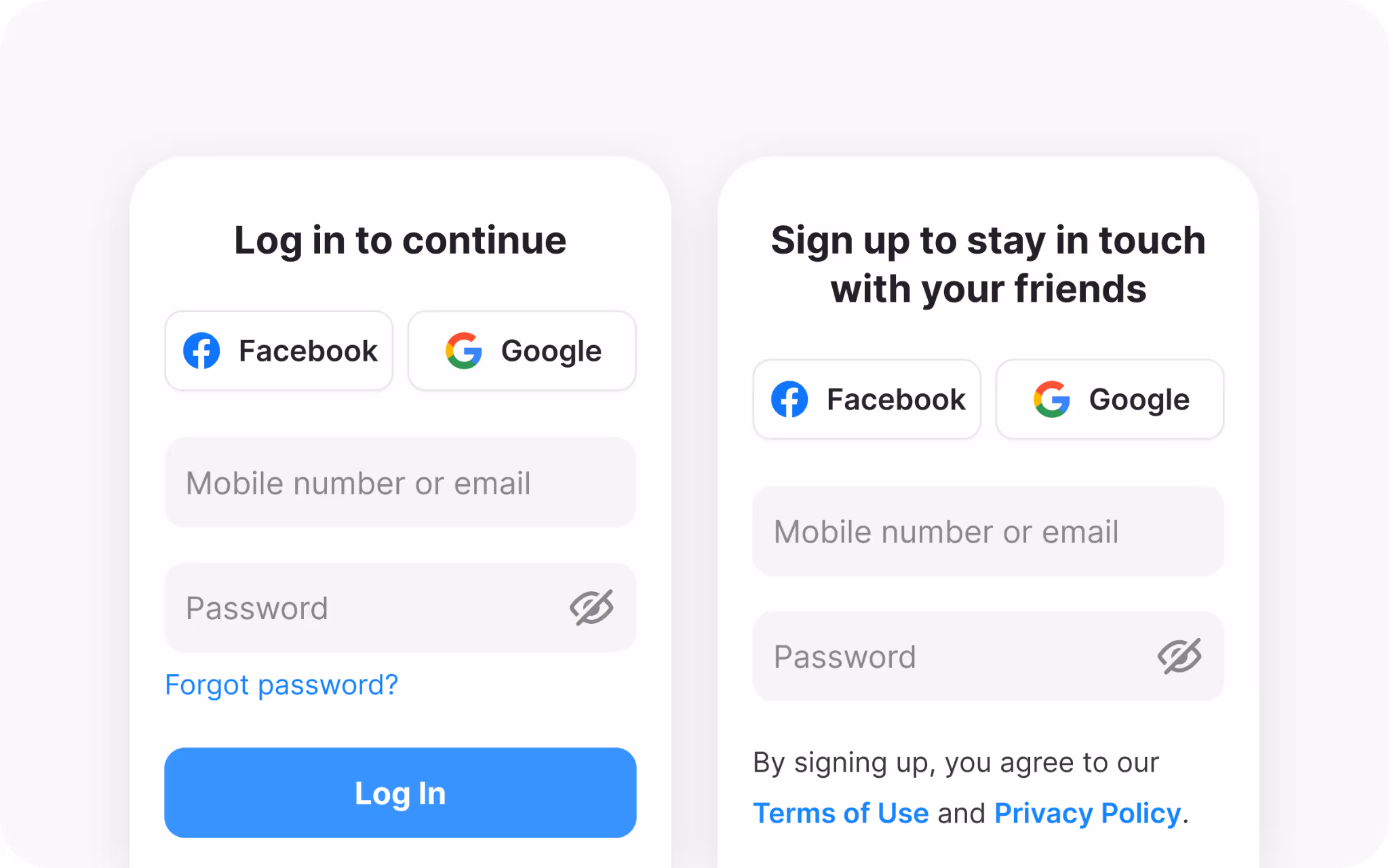
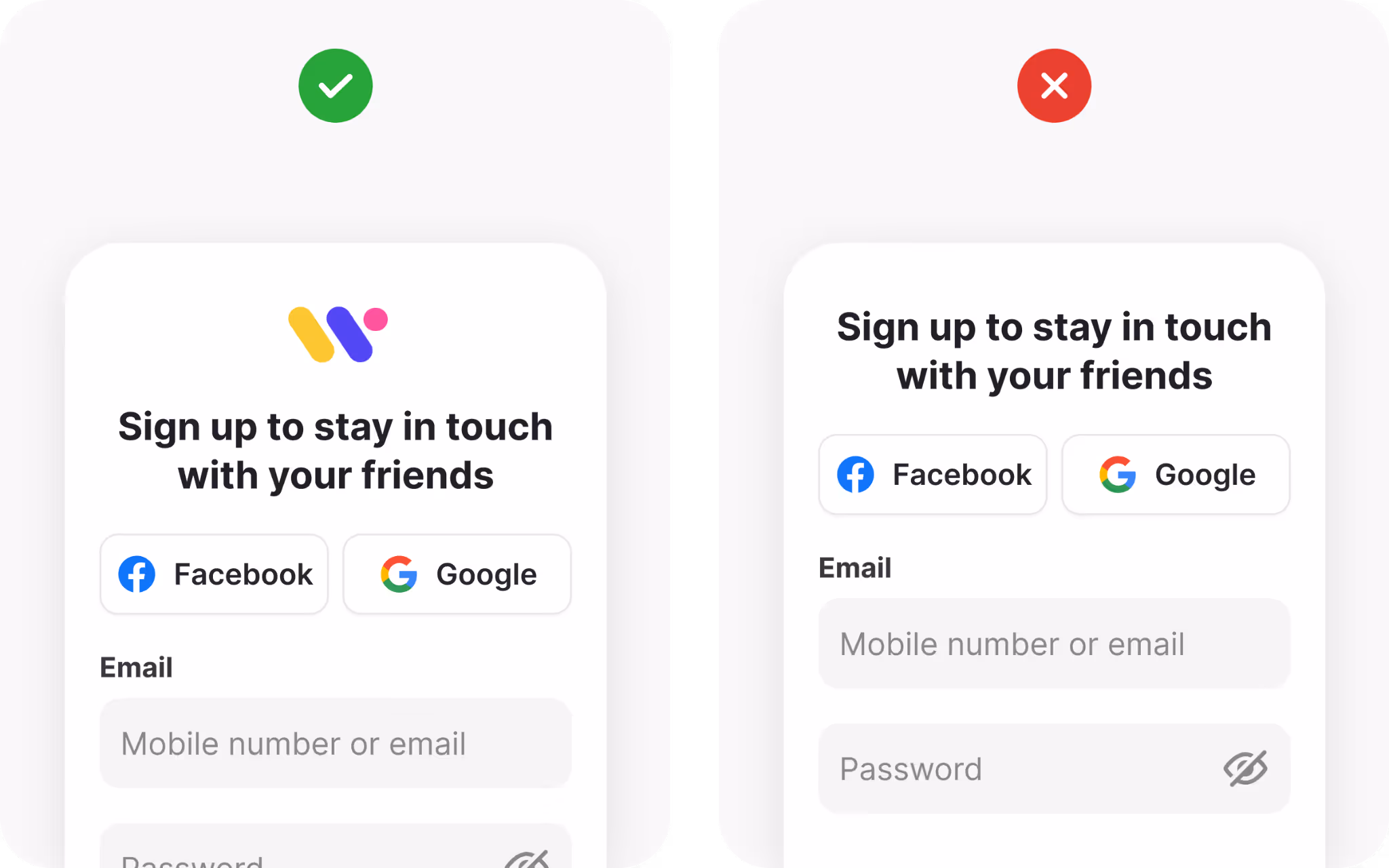
Offer third-party sign-up options
Third-party sign-up through Google, Apple, or Facebook has become a familiar feature. Research shows that apps offering these options see nearly double the conversion compared to those that do not. One click feels faster than typing, verifying, and creating yet another password.
The benefit is clear: less manual data entry, instant authentication, and fewer forgotten credentials. For your product, it also reduces the need to store sensitive password data.
That said, not everyone wants to connect personal accounts. The safest approach is to provide both a traditional email or phone option alongside third-party buttons. Users choose the path they trust most.
Style third-party buttons with official brand colors and logos. Recognition helps build confidence and prevents hesitation.
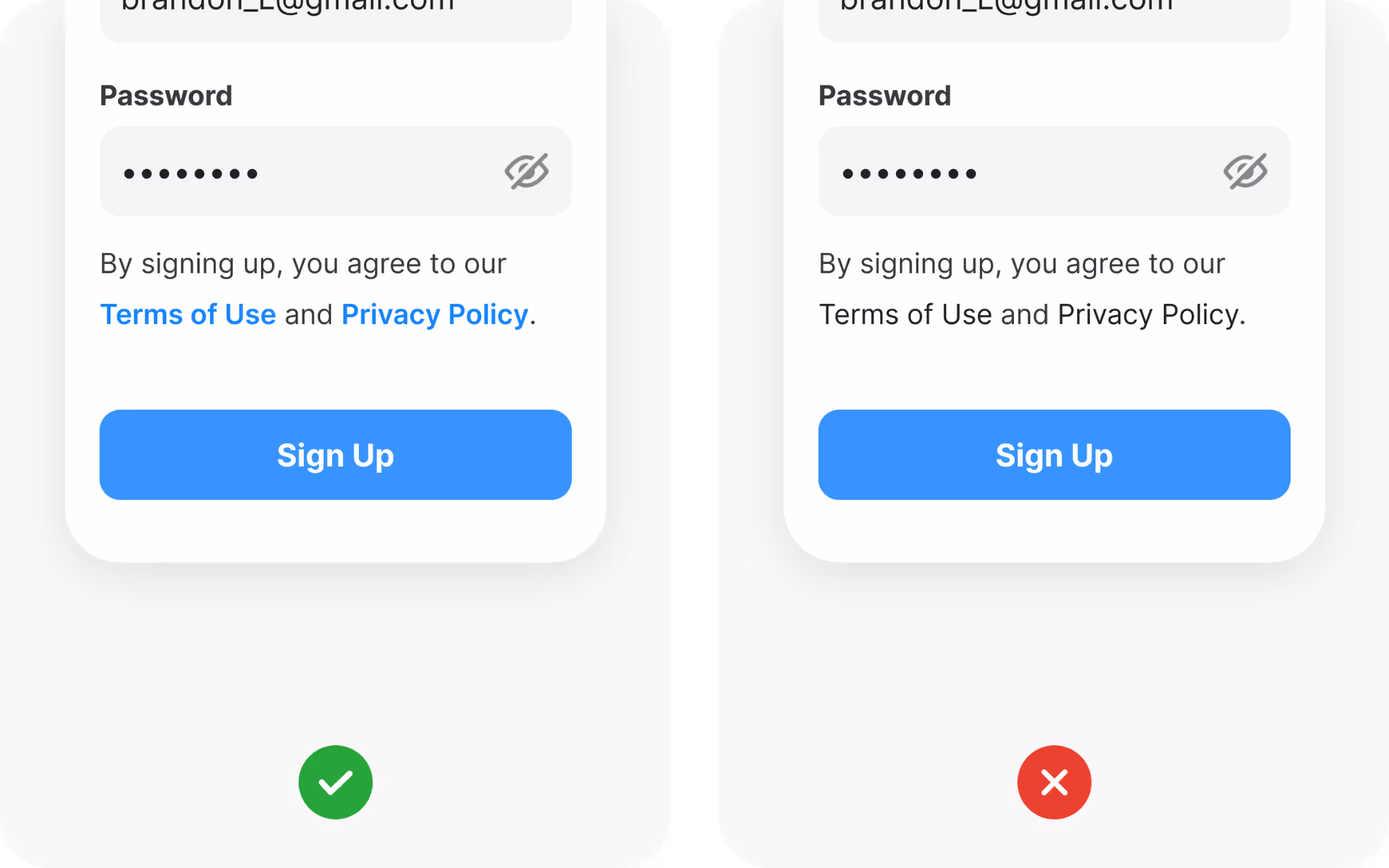
Be transparent with terms and privacy
Even though most people do not read terms and conditions, seeing links to them provides reassurance. It signals transparency and professionalism.
On your sign-up page, always include links to legal agreements. If your product operates under regulations like GDPR or CCPA, add a clear checkbox for users to give consent before registering. This protects both you and them.
Keep the language short and clear. Instead of a wall of legal text, a simple “By signing up, you agree to our Privacy Policy” paired with a link does the job.
Avoid confusion between sign-up and login
Few things frustrate new users more than entering their email only to be told they already have an account. Confusion between sign-up and login is common when forms are not clearly distinguished.
The safest approach is to keep two separate and visually distinct forms. That way, people know exactly which path they are on. Another method is a single entry point that checks if the email already exists, then guides the user to the right flow. If you use this method, design clear messages to prevent duplicate accounts.
Clarity in this step prevents lost time and lost trust.
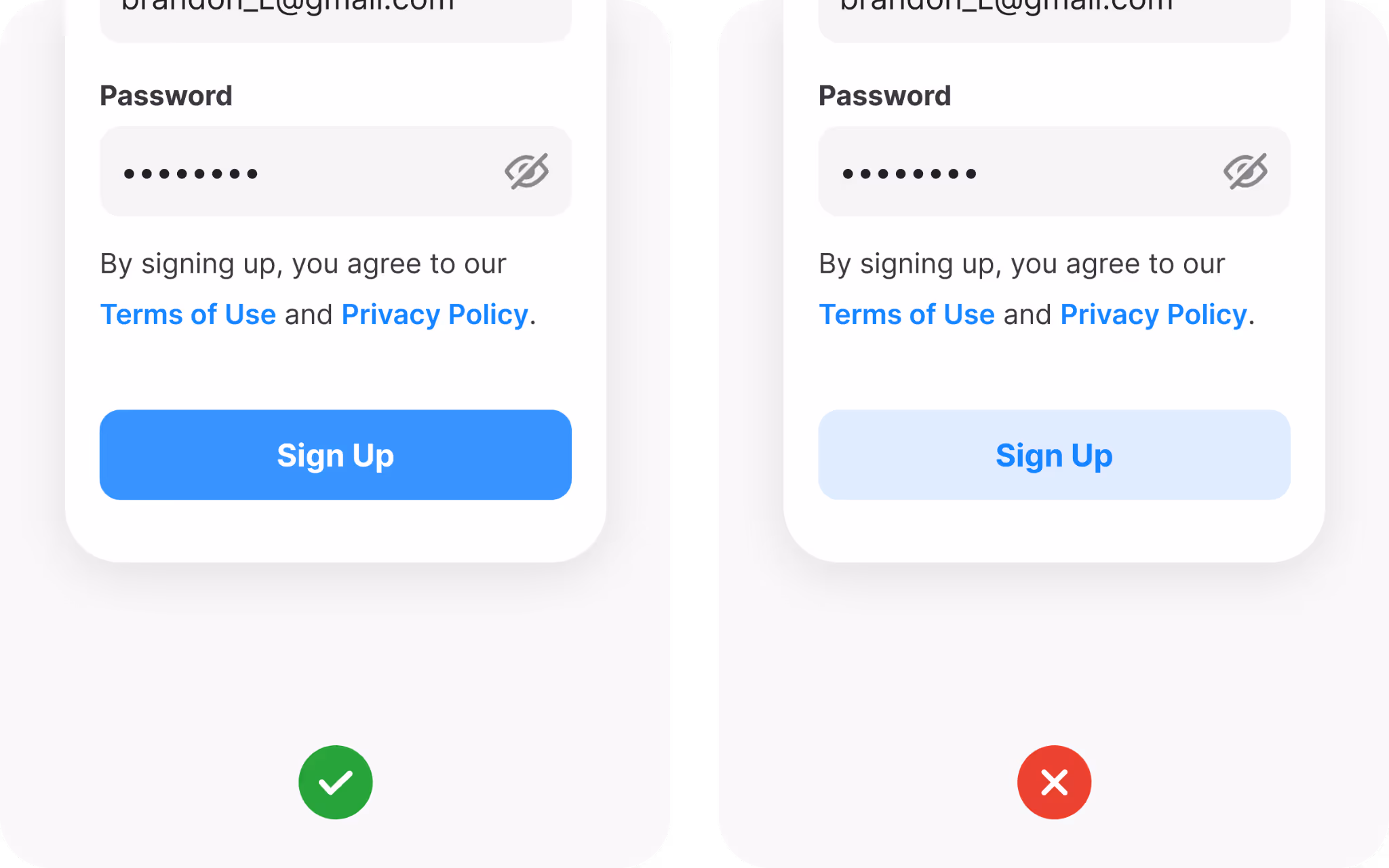
Make your sign-up button design prominent
The sign-up button is the final step, and its design matters. Users should never struggle to find it.
Use a bold color that matches your brand palette but still stands out from the background. Add states such as hover, pressed, and loading so users see the system responding.
There is no worse fumble than losing the visitor at the very end, because they don’t know (or don’t see!) how to sign up.
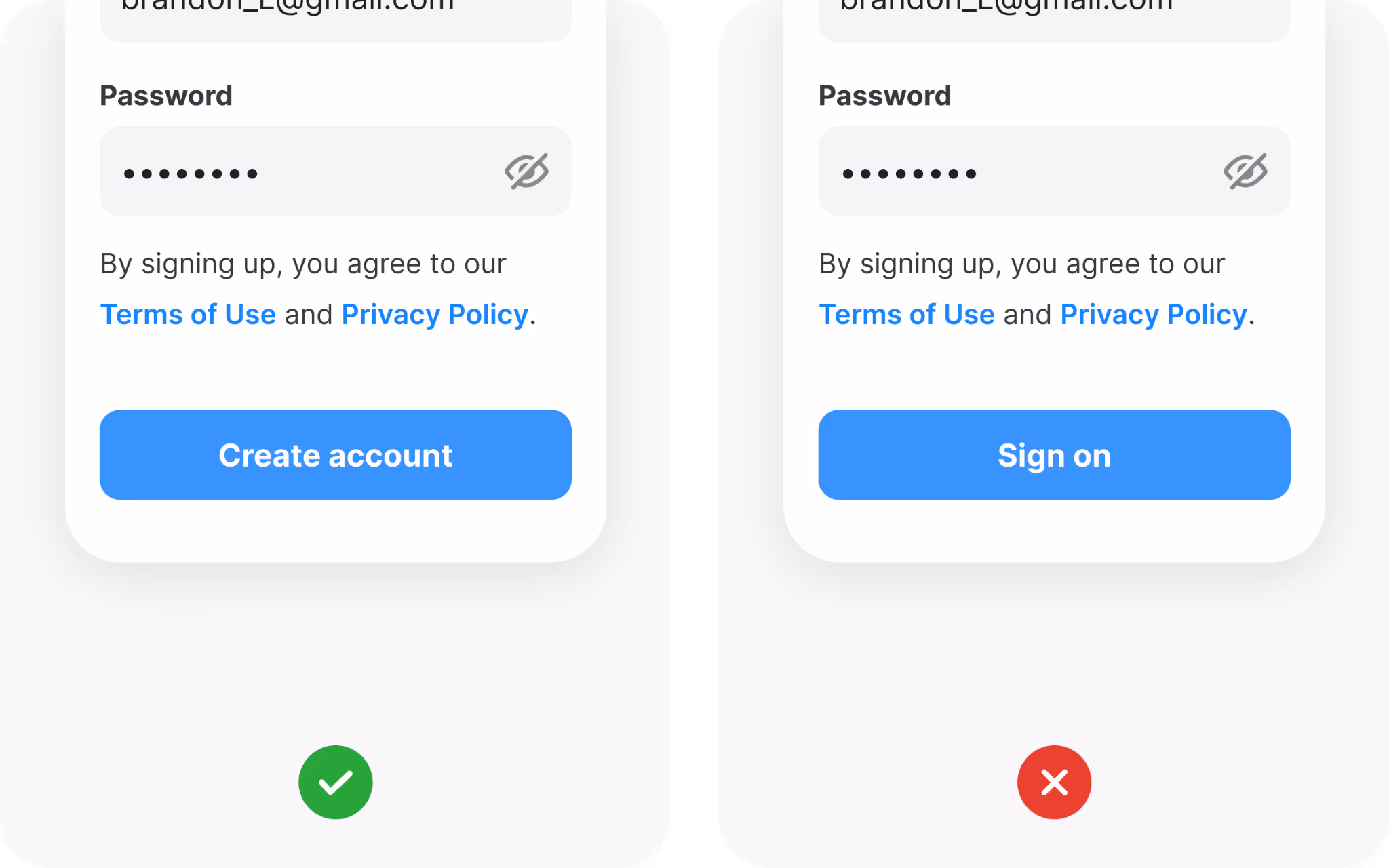
The CTA button copy is just as important
Wording is just as important as color. Instead of a generic “Submit,” choose phrases that describe the action. “Create account,” “Start free trial,” or “Join the community” all feel more personal.
The button text is your last chance to motivate the visitor to become your customer or a subscriber. If you struggle with ideas, think about what users want to do by clicking on the CTA button. They want to create an account or join the community, so putting those words on the button is always a good choice.
Sometimes, simpler is better. You don’t need to be overly creative if there is no need for that.
Stick to familiar input styles
Forms work best when they look familiar. Overly creative input designs can cause confusion. People expect rectangular fields with clear borders, and breaking that expectation slows them down.
Design distinct states for each input: default, hover, focus, error, success, and disabled. Each state gives visual feedback, showing users where they are and what they need to fix.
Check your color contrast ratios as well. Text inside input fields should be easy to read, even for people with low vision. In this area, accessibility improves usability for everyone.
The sign-up form can be a place to show off your brand
Sign-up is also a branding opportunity. Adding your logo and color scheme reassures users that they are in the right place. It reinforces recognition and trust.
Placement depends on the platform. On mobile, logos often appear above the fields. On a desktop, they may sit in the top-left corner or centered above the form. Keep sizing balanced so the logo is visible without distracting from the task at hand.
There are some concerns that the logo, or too many graphic details, could take users’ attention away. That’s why brand presence should be subtle, and only support the form, not overwhelm it.
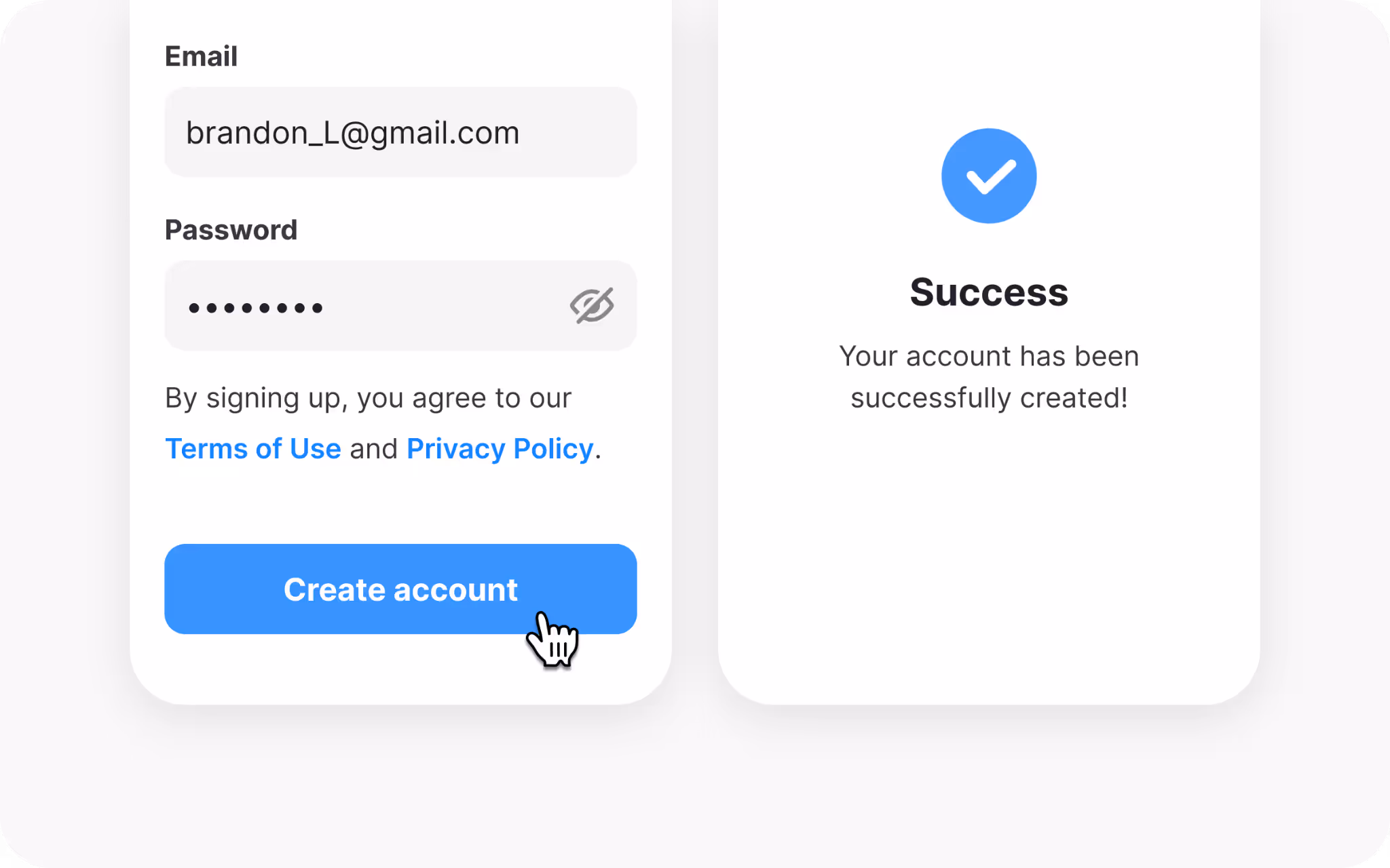
Provide feedback after submission
Once someone hits “Sign up,” feedback is critical. If nothing happens, they may click again, refresh, or leave.
Use animations, spinners, or progress bars to confirm that the system is working. Once the account is created, show a clear success message. Micro-animations, like a green checkmark or a short celebratory motion, can make the moment memorable.
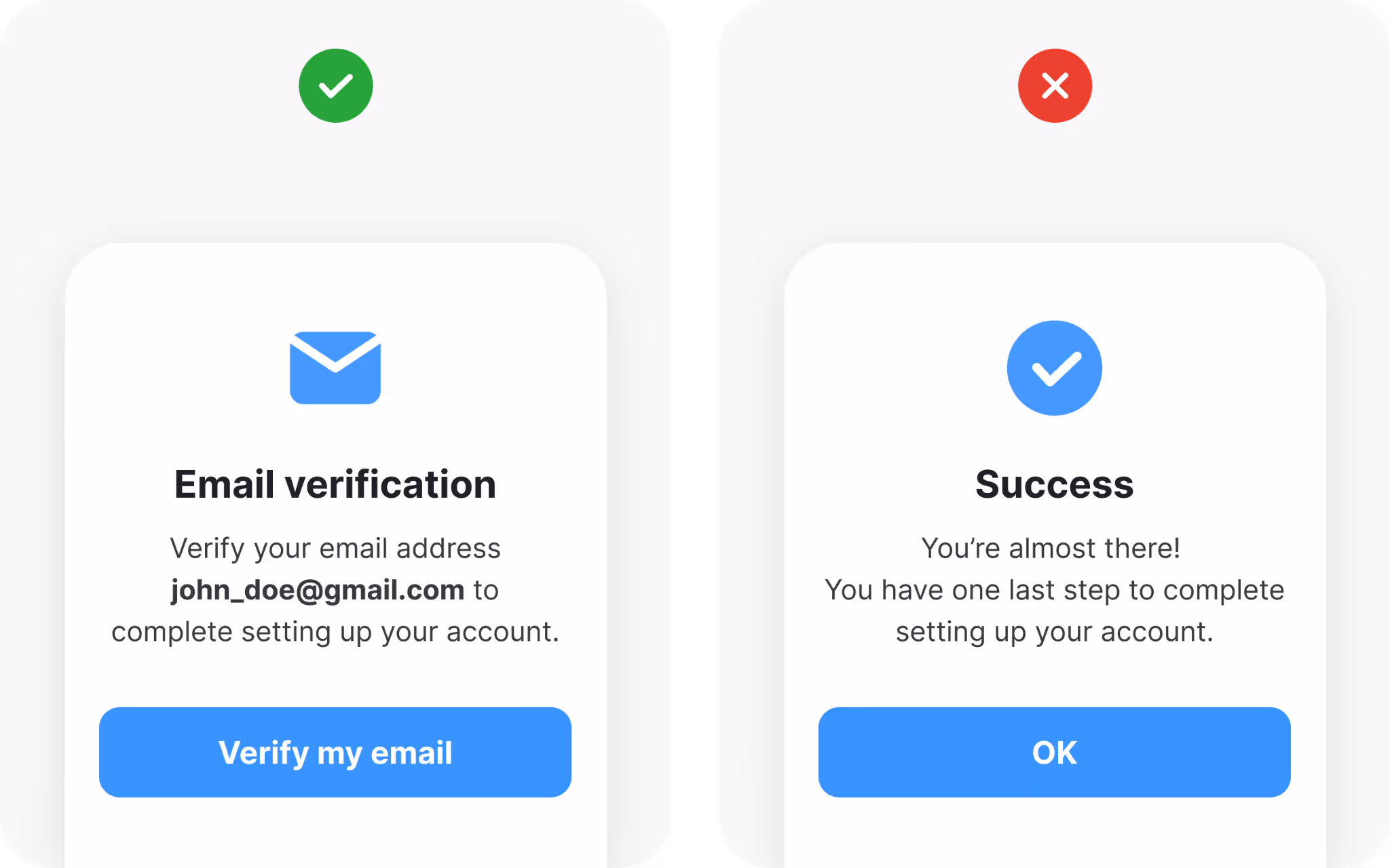
Confirm accounts for security
Verification is the last step for many sign-up flows. This can be done through email links or SMS codes.
Email confirmation is common and reliable, while SMS adds extra protection against fake accounts. Either way, verification proves the account is real and provides a recovery method later.
Make instructions clear and give options if something fails. Remind users to check their spam folder, and allow resending of codes if needed. Handle errors gently so frustration does not erase the goodwill of the sign-up.
Wrapping it up
A sign-up page is never just a form. It is the first interaction between your product and a new user. It sets the tone for trust, usability, and long-term engagement.
To design one that converts, keep the form short, highlight benefits, label fields clearly, simplify passwords, offer quick sign-up choices, show transparency with legal links, separate login from registration, design visible CTAs, stick to familiar inputs, display your brand, provide clear feedback, and confirm accounts.
Each of these decisions removes friction and increases confidence. Together, they create a flow that encourages completion and leaves people feeling positive about their choice.
A well-designed sign-up page is not only good for conversions, but it is also good for your product’s reputation. It tells new users: this is a place where your time, attention, and data are respected.