Airbnb's Rausch red, Amazon's signature orange, Google's four-color mark: brand color palettes shape how millions of users feel about a product. Brand colors often tell a unique story and represent the brand's personality. For example, red can represent determination, energy, excitement, and passion. So it's an excellent choice for companies encouraging users to act.
In the real world, companies use red to inspire users to:
- Watch videos (Youtube)
- Watch movies and documentaries (Netflix)
- Read the news (CNN)
- Listen to the radio or podcasts (iHeartRadio)
Colors also evoke different emotions and associations. Green is often used in organic and eco-friendly brands. But it's also associated with safety, dependability, and money. For example, Shopify and Fiverr don't have anything to do with organic agriculture. In their brands, green signifies their trustworthiness and reliability.
Generally, the main purpose of brand colors, especially primary colors, is to stand out, represent the brand's individuality, and trigger action. Analyzing the color palettes of different brands can help you understand the power of color and inspire you to create your own.
Brand Color Palettes for Top Services & Products
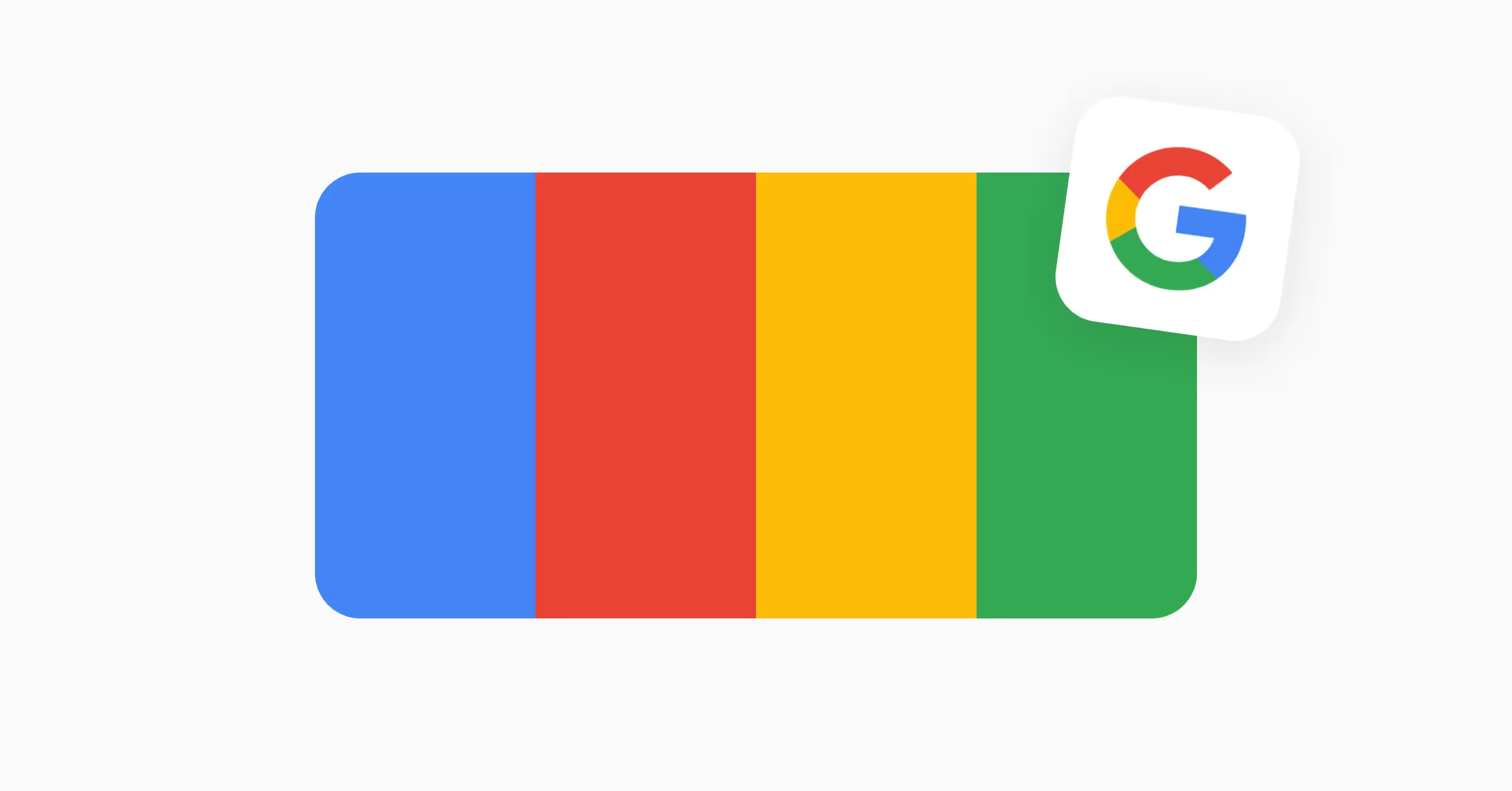
Google's logo ranks among the world's most recognizable brand symbols. The design remained largely unchanged from 1998 until 2015, when Ruth Kedar reimagined it with a modern, geometric sans-serif typeface.
The brand employs three primary colors that convey specific messages:
- Blue (#4285F4) — represents reliability and trustworthiness
- Red (#EA4335) — evokes energy and urgency
- Yellow (#FBBC05) — suggests optimism and accessibility
Google broke convention by adding green (#34A853), demonstrating innovation while maintaining visual harmony. This playful palette reflects their mission to make technology accessible and user-friendly.
Airbnb Brand Colors & Color Palette
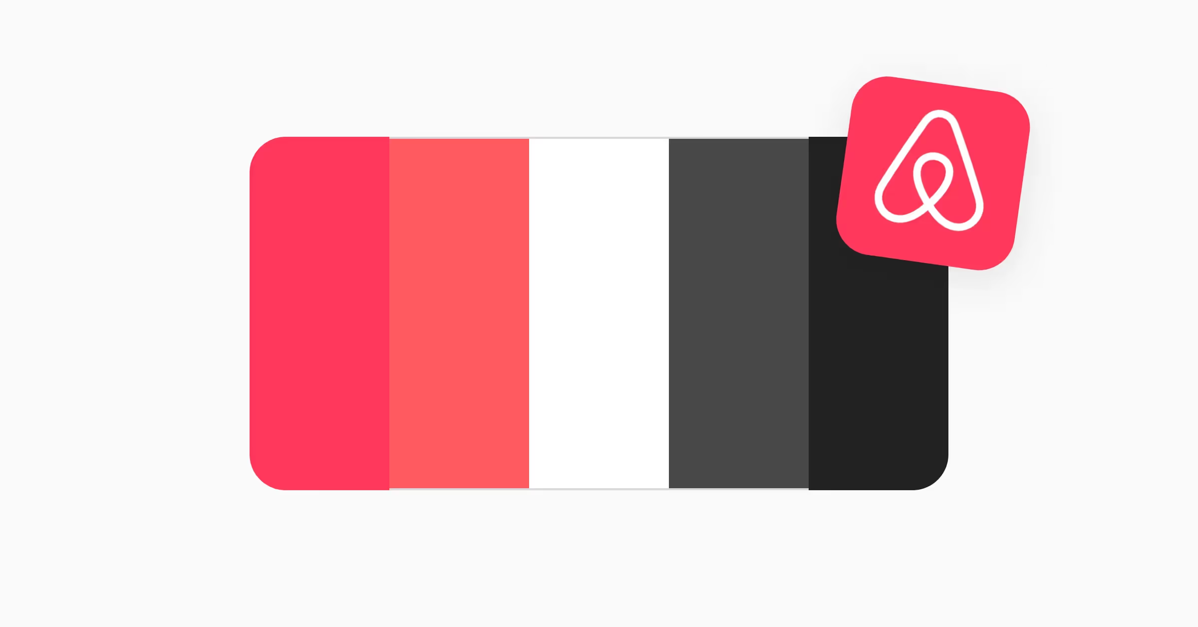
Airbnb's current brand color system employs a clear, minimalist approach. The signature Rausch (#FF5A5F) was originally their primary brand color. The name comes from 19 Rausch Street in San Francisco, where founders Brian Chesky and Joe Gebbia hosted their first guests during a design conference in 2007 when they couldn't afford their rent. It's a vibrant coral-pink that instantly became associated with the Airbnb platform. Today, the website and marketing materials use an updated, more vibrant reddish pink (#FF385C) as the primary color. Other colors include white (#FFFFFF) for clean backgrounds, dark grey (#484848) for interface elements, and black (#222222) for emphasis and readability.
This refined palette serves multiple purposes: creating instant brand recognition, maintaining clarity across platforms, ensuring strong contrast for accessibility, and supporting their content-first design philosophy.
Android
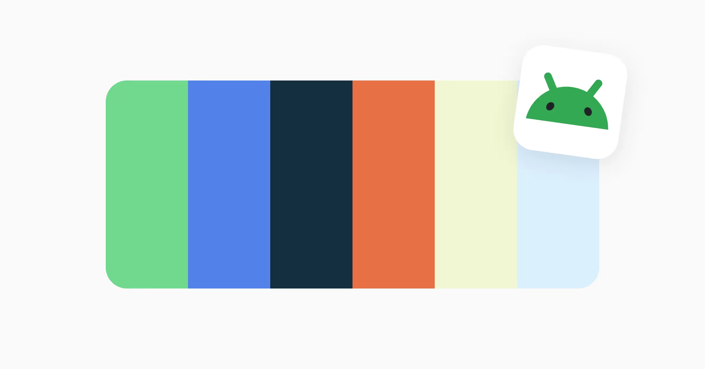
In 2019, Google redesigned the Android brand, bringing new colors that accompanied the restrictive neon green and shades of gray. The color of the robot head (the body was cut off once and for all) became less yellow and more blue to underline its playfulness and expressiveness.
Other colors were chosen around the new "Android green" (#3DDC84). Secondary blue (#4285F4) and navy (#073042), tertiary orange (#F86734), chartreuse (#EFF7CF), and light blue (#D7EFFE) feel very earthy, calming, and more human than the previous green-gray combination.
Lyft
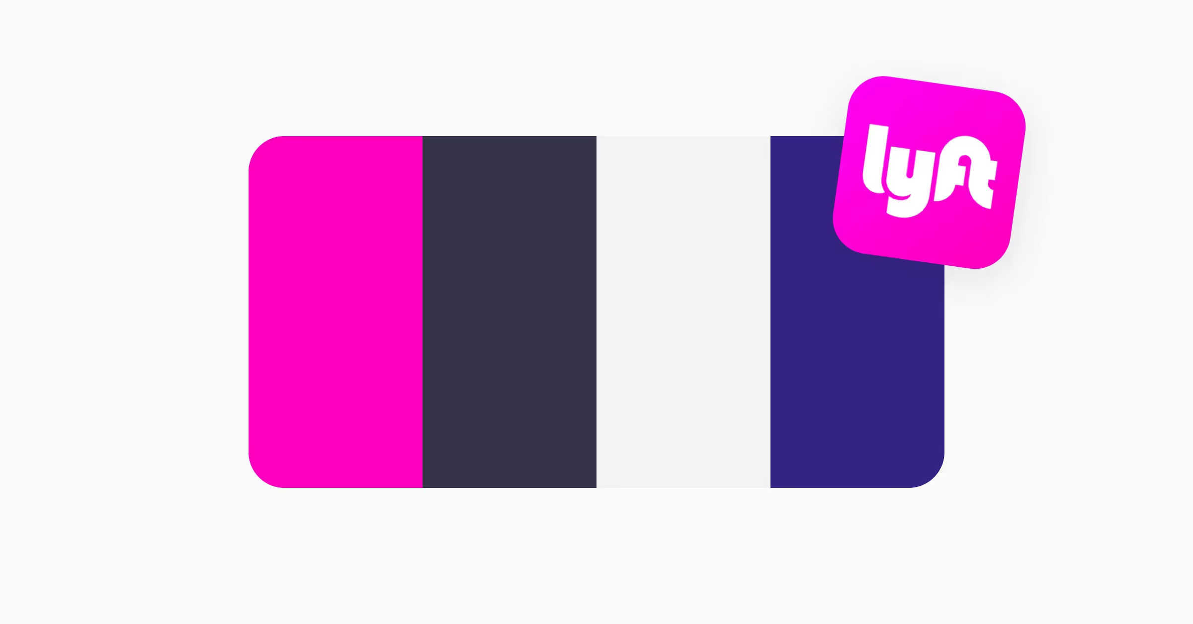
"We are as colorful as our diverse and eccentric community of riders and drivers" — this statement from Lyft's brand guidelines perfectly captures their approach to color. As one of the world's leading ride-sharing platforms, Lyft's distinctive palette sets them apart from competitors like Uber.
Their color system reflects their brand personality:
- Electric pink (#FF00BF) — primary brand color, energy and excitement
- Mulberry (#352384) — depth and sophistication
- Charcoal (#333347) — stability and reliability
- Off-white (#F3F3F5) — clarity and accessibility
This bold yet balanced palette creates instant brand recognition and at the same time, ensures interface accessibility.
Amazon Colors & Brand Palette
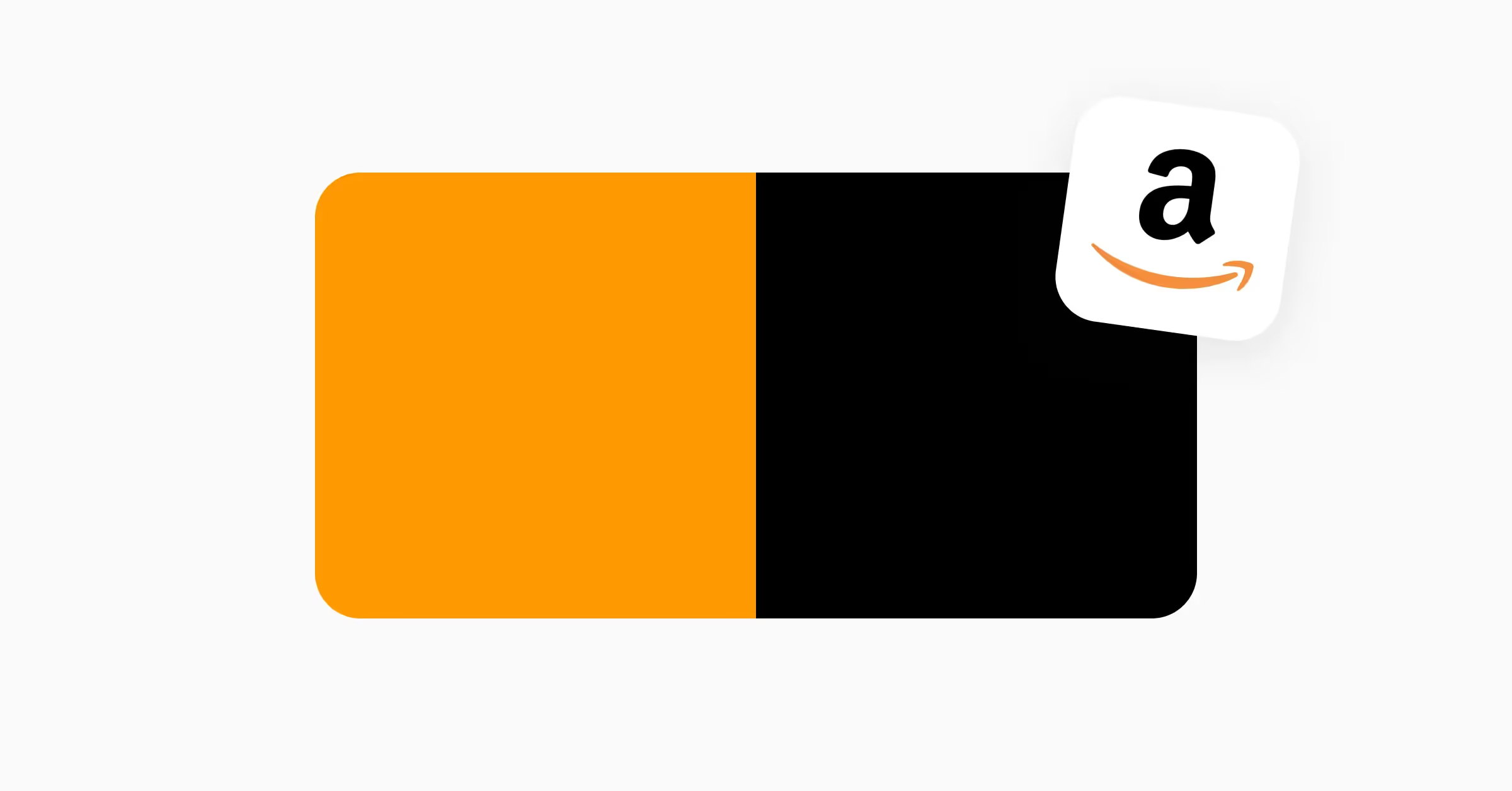
Amazon's core brand identity relies on two primary colors: orange (#FF9900) and black (#000000). This minimalist combination effectively conveys their brand message across global markets.
The orange shade, known as "Amazon Orange," represents:
- Customer satisfaction and accessibility
- Energy and dynamism
- Clear calls-to-action in the interface
Black provides:
- Professional foundation
- Enhanced readability
- Strong contrast for accessibility
Microsoft
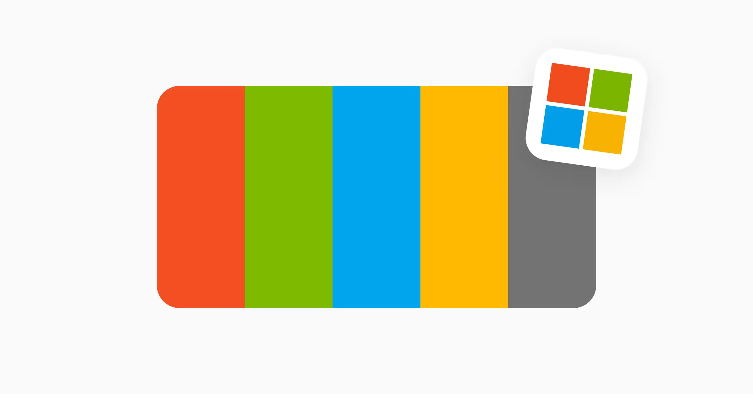
Microsoft employs a distinctive set of brand colors that form their Windows logo and extend across their product ecosystem: blue (#00A4EF), green (#7FBA00), yellow (#FFB900), and red (#F25022).
While these colors share similarities with other tech brands, Microsoft's specific hues create a unique identity that emphasizes:
- Accessibility across platforms
- Recognition in global markets
- Visual harmony and balance
Their color strategy supports both brand recognition and functional design:
- Blue — productivity and cloud services
- Green — Xbox gaming division
- Yellow — surface devices
- Red — Office suite applications
Spotify
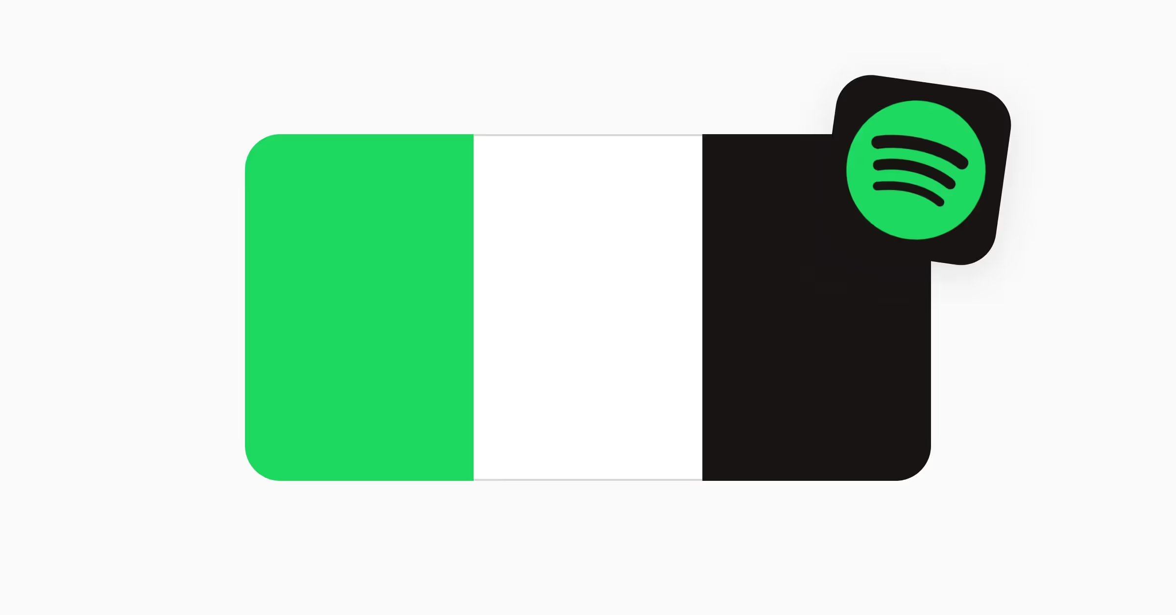
Lime green (#1ED860) has almost become synonymous with Spotify. It's a simple yet bold color accompanied by black and white that paves the way for a modern yet accessible platform.
For many individuals, green is emotionally charged and associated with creativity, renewal, and youth. Meanwhile, black symbolizes technology and innovation, making it a perfect complement to a music streaming app.
Spotify applies these colors strategically across their platform:
- Green(#1ED860) for primary actions and brand moments
- Black (#181414) for backgrounds and immersive experiences
- White (#FFFFFF) for typography and interface elements
Booking.com
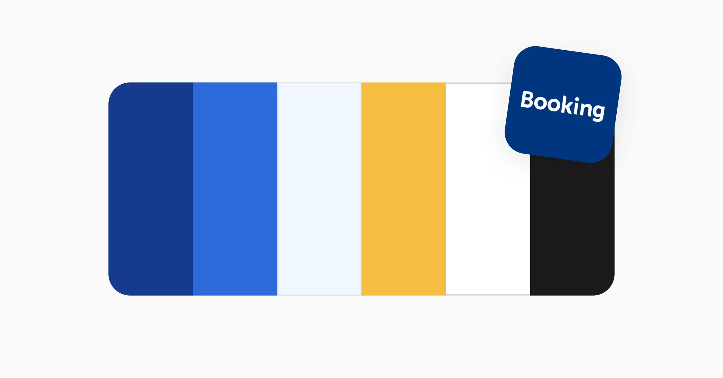
Booking.com's visual identity centers on a thoughtful progression of blues, complemented by a warm yellow accent. Their primary navy blue (#163A8E) anchors the brand with authority, while sky blue (#2D6ADC) and a lighter blue (#F1F6FE) adds depth and dimension. The palette includes bright yellow (#F4BE41) for energy and white for clarity, creating a balanced and approachable interface for their global travel platform.
This color system serves multiple purposes in their digital experience. The deep blues convey reliability and professionalism — essential qualities for a travel booking platform — while yellow highlights key actions and brings optimism to the booking journey. White space ensures content remains clear and accessible across all devices.
YouTube
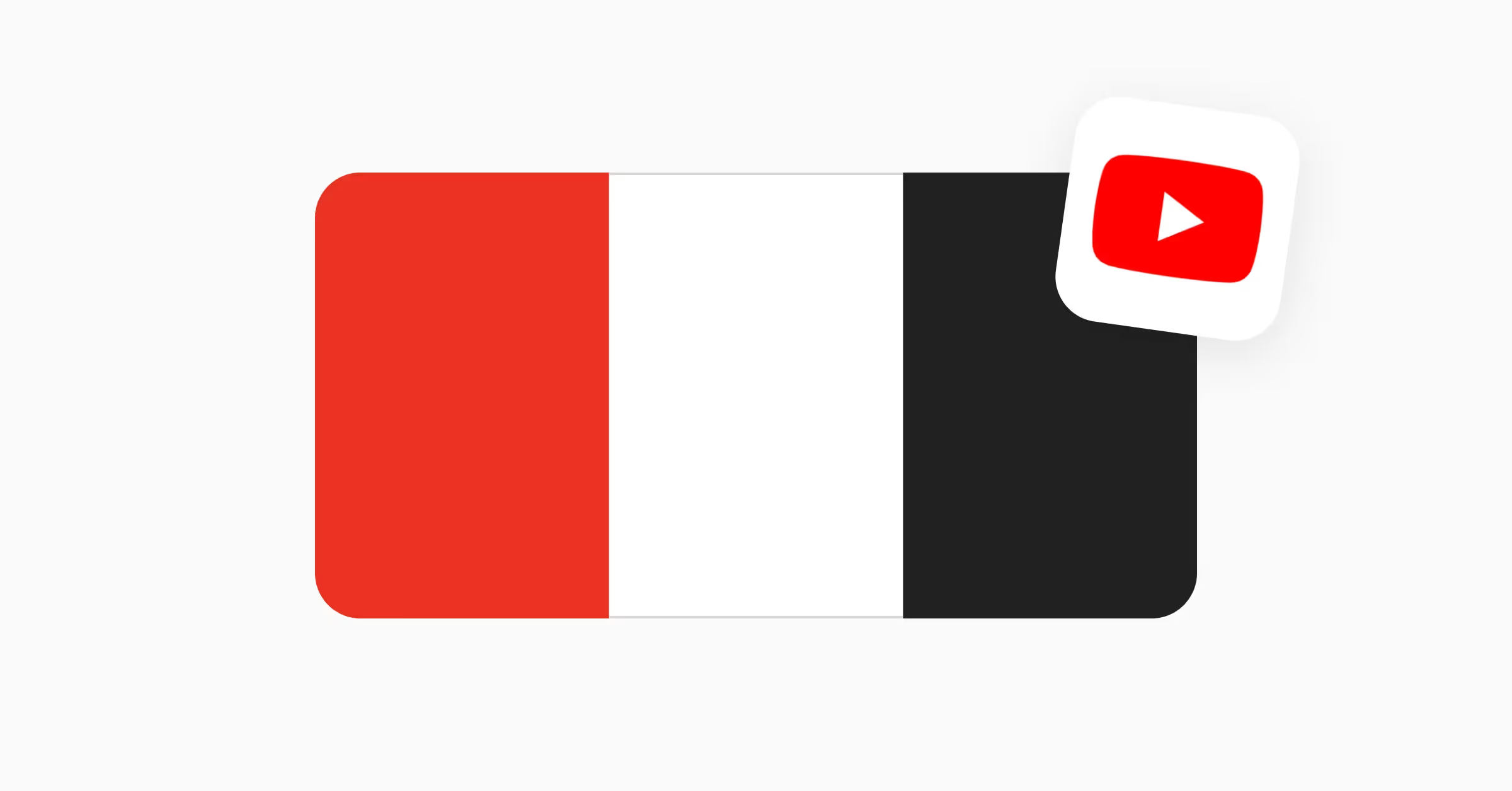
YouTube's iconic red (#FF0000) has anchored their brand identity since 2005, becoming one of the most recognizable brand colors on the internet. This vibrant hue serves as their core differentiator in the competitive video platform space.
Their minimalist color palette serves specific purposes:
- Red — captures attention and encourages exploration
- Black (#282828) — provides content focus and readability
- White (#FFFFFF) — ensures interface clarity
Pro tip: When using strong colors like YouTube's red, limit them to 10% of your interface and use them consistently for specific actions to build user memory patterns.
Major tech brands take two distinct paths when it comes to color strategy. Some, like YouTube and Spotify, keep it simple with just a few signature colors that make them instantly recognizable. Others, like Google and Microsoft, embrace a broader palette to distinguish their various products while keeping everything visually connected.These companies know they need to strike the right balance. Their colors need to make a lasting impression, yet they must work seamlessly across all devices and be accessible to everyone who uses their products.


