
.svg)


A UX designer resume is a one-page document that shows your design experience, tools, and measurable results. It works alongside your portfolio, not instead of it. Format matters more than most people think, and the evidence is blunt. In Ladders' 2018 eye-tracking study, recruiters spent an average of 7.4 seconds on a first pass before deciding whether to keep reading. Below are 10 real resumes, what each one signals, and the principle worth borrowing.
Key takeaways
- Recruiters spent 7.4 seconds on a first-pass scan (Ladders, 2018). The top third of page one decides everything.
- 97.8% of Fortune 500 companies ran an applicant tracking system as of June 2025 (Jobscan). Your resume has to parse as text first.
- All 10 examples fit on one page, including designers with 10+ years of experience.
- The strongest example reports eight separate results. The three weakest report none, and all three are early-career.
- Recruiters can only champion you using claims they can repeat. That's why results travel further than responsibilities.
What is a UX designer resume?
It's a one-page summary of your design roles, skills, tools, education, and results. It differs from a general resume in three ways: it names design tools directly, links to a portfolio, and reports outcomes as numbers rather than duties. Getting that right early pays off across a whole UX design career growth path.
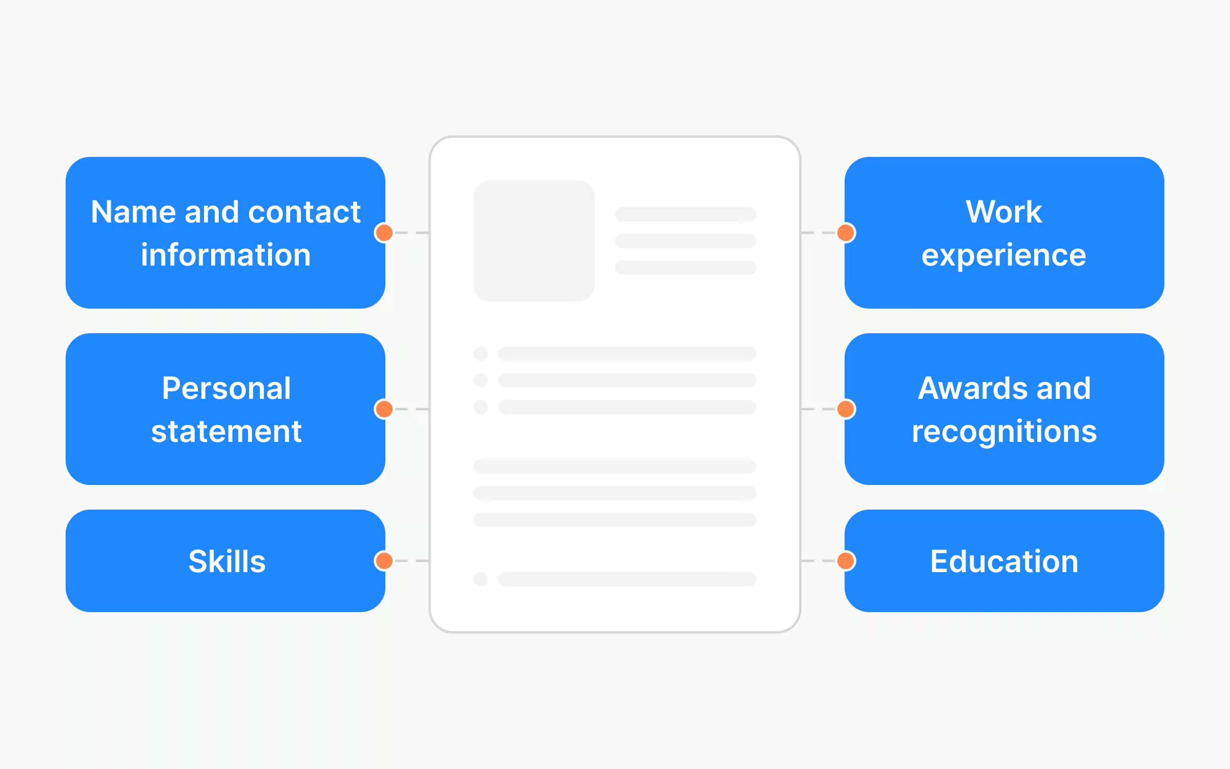
A UX resume and a UX CV are the same document. In the US, "resume" is standard. In the UK, Ireland, and much of Europe, the same one-page document is called a CV. A job ad there will ask for a UX designer CV. The long academic version, the one that lists publications, doesn't apply to design hiring. One file works for both. Just change the label.
Your resume and portfolio do different jobs: the resume gets you past screening, and the portfolio wins the interview. They work best as a pair, so a strong UX portfolio guide covers the other half. Point both at the same three or four projects.
What to look out for in a UX designer resume
Ladders' research tracked 30 recruiters over 10 weeks. First-pass scans land on six things: your name, your current company and title, your previous company and title, the dates of both, and your education. Everything else gets read only if those six survive.
Two things follow from that. Your newest role has to be readable in under two seconds, so put company, title, and dates on one line in the top third, and the file itself has to parse as text. Jobscan found 489 of the 500 Fortune 500 companies running an applicant tracking system in June 2025. That's 97.8%. Text buried in images, icons, or complex columns can get scrambled or dropped.
So when you look at any example below, ask two questions: what does it signal in seven seconds, and can a machine read it?
None of these are worth copying line for line. Each one's here because it does a single thing well. Two are template samples rather than real hires, and they're labeled. Personal contact details have been redacted.
1. The plain graduate resume: best for candidates with no paid design roles yet
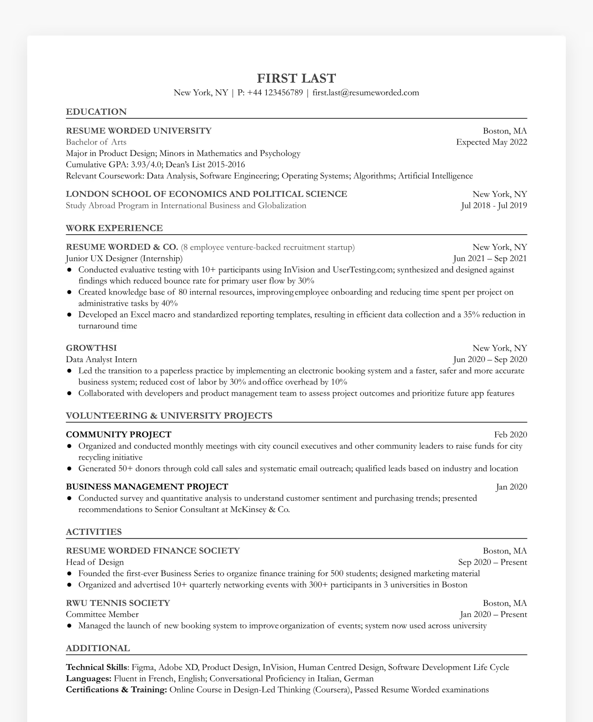
Why it works: Every claim has a number on it. That tells a recruiter this person measures their own work. It's the trait that separates a junior who needs supervision from one who doesn't. The move worth borrowing is treating coursework, volunteering, and society roles as real evidence, then quantifying them the way you'd quantify a paid job.
Where it falls short: It's a commercial template, not a real hire's document, and it shows. For a design role the resume is itself a small work sample, so looking like nobody in particular costs you something tidy formatting can't win back. Borrow the discipline, not the look.
2. The named-employer resume: best for showing range on a short history

Why it works: Recognizable employers do credibility work a junior can't manufacture any other way. In a seven-second scan a familiar name buys a second look, and four in a row implies other people have already vetted you. If you've got range but little tenure, lead with the names.
Where it falls short: It describes assignments instead of consequences, which is the most common failure in junior resumes. You finish each entry knowing what they were told to do, never what changed. Responsibility isn't achievement. A recruiter can't champion you without a claim they can repeat.
3. The capability-versus-tools resume: best for making a junior look like a thinker

Why it works: Splitting capabilities from software answers a question recruiters genuinely have about juniors. Can this person reason about design, or only drive an interface? Separating the two answers it instantly, and signals that you know the difference yourself. Naming the specific feature you shipped, rather than the team you joined, does the same job in miniature.
Where it falls short: There's no hierarchy. A weekend hackathon gets the same visual weight as an internship at a major product company, which leaves the reader to work out what matters. Ranking your own evidence is your job, and a resume that skips it invites a wrong guess.
4. The high-personality resume: best for career-changers from adjacent creative fields

Why it works: It's memorable on purpose, and that's a real advantage in a stack of near-identical files. The personality section is the sharpest idea here, because it hands an interviewer an easy opening question that makes the conversation more likely and warmer when it happens. If you're arriving from a neighboring field, being a distinct person often beats looking like a standard applicant.
Where it falls short: Clarity suffers, because several roles all marked "present" force the reader to rebuild your timeline, and in a fast scan that reads as inflation. The bigger miss is the career bridge. When your degree and your target role don't match, the document has to explain the link. A recruiter won't do that thinking for you.
5. The credential-led junior resume: best for signaling seniority beyond years worked
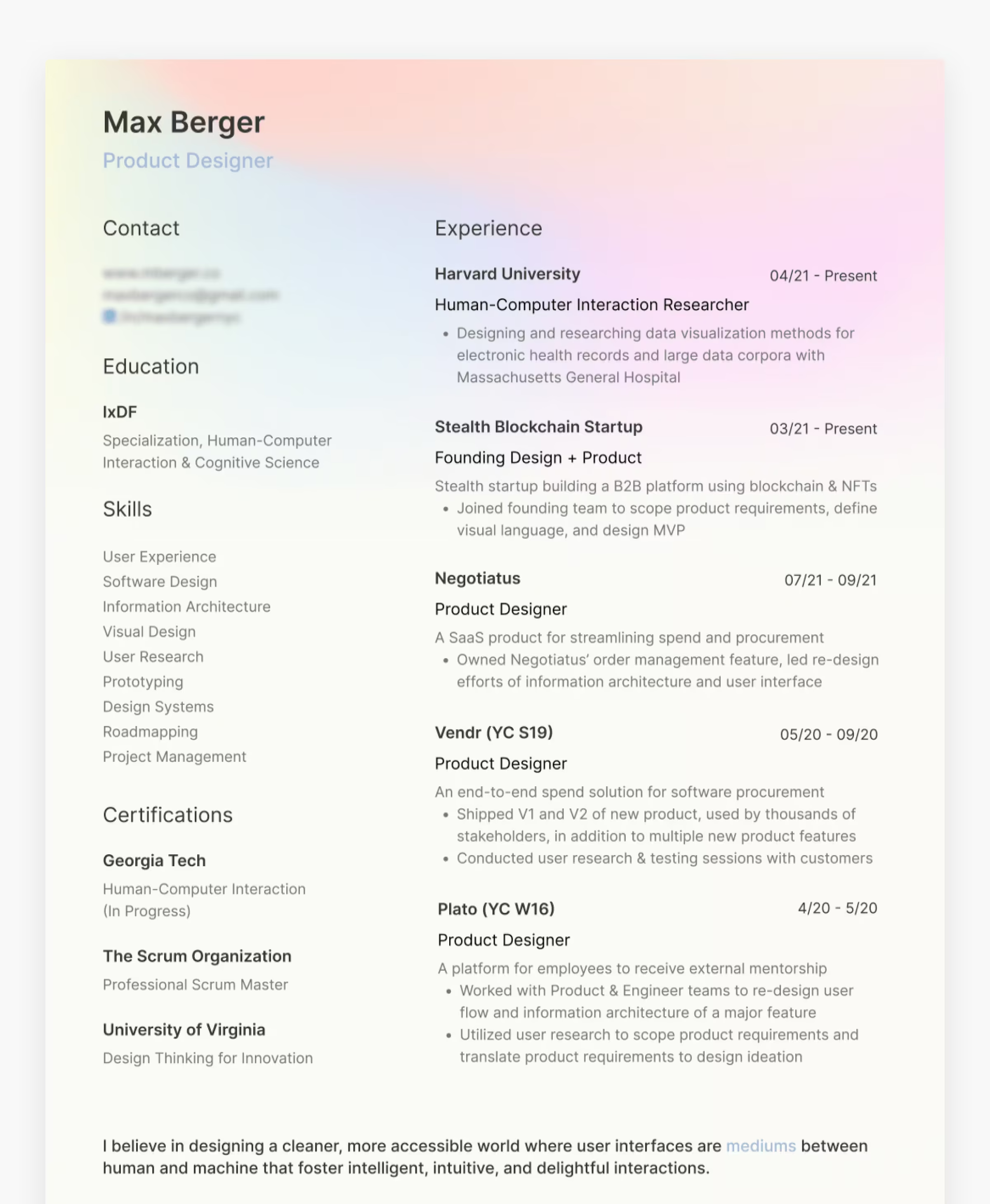
Why it works: Two things punch above this person's experience. Credentials from recognized institutions give a recruiter an outside reference point when internal evidence is thin, and the language runs on ownership verbs rather than participation verbs. Saying you owned a feature and led a redesign claims a level of responsibility most junior resumes leave vague. Claiming it plainly is usually enough to get tested on it in conversation.
Where it falls short: Some of it can't be checked: an employer described only as an unnamed startup is unverifiable, and "thousands of stakeholders" isn't a measurement. Precision everywhere else makes the vague parts stand out more, not less.
6. The positioning-statement resume: best for engineering-adjacent designers
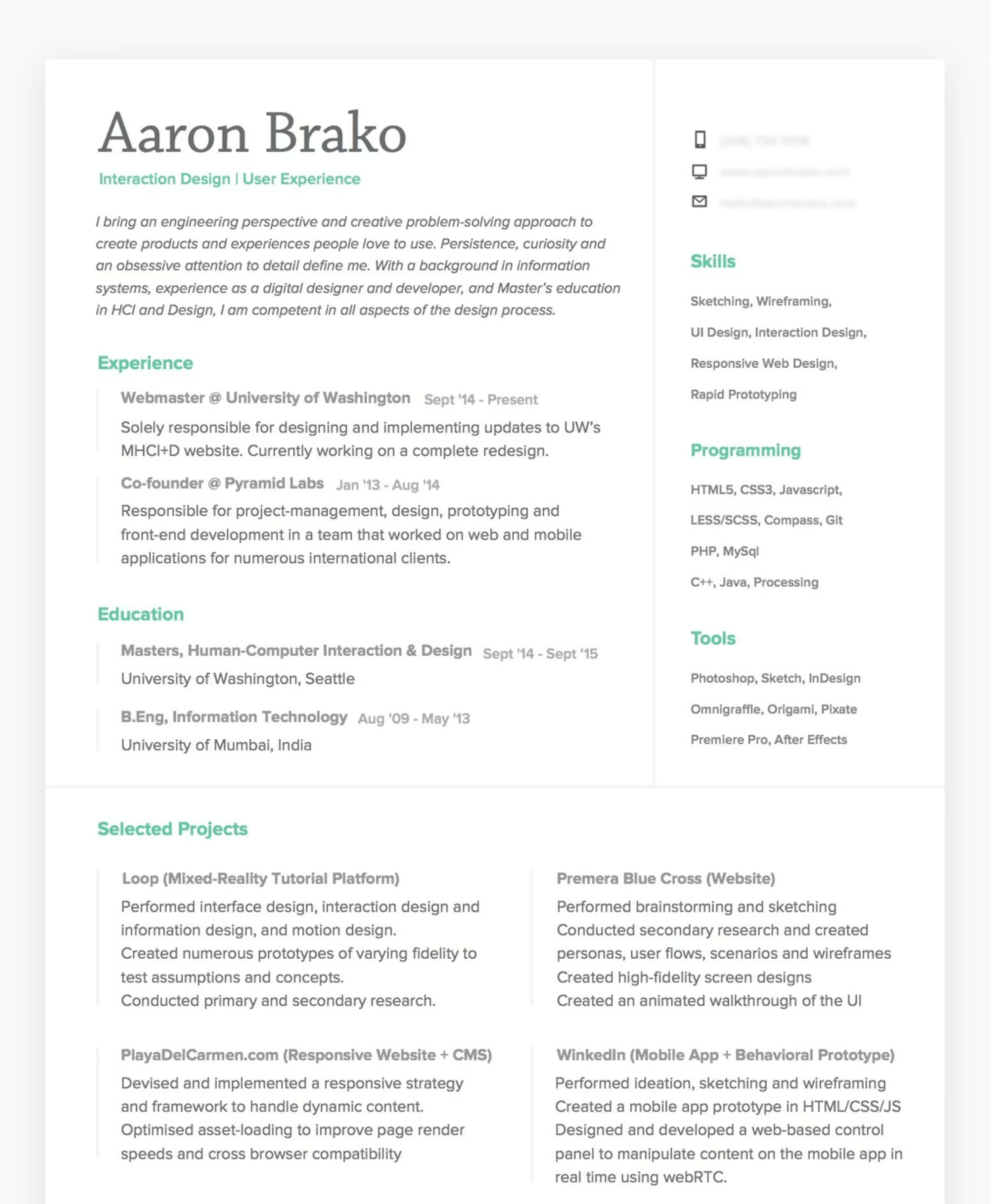
Why it works: The opening statement is the most useful thing on the page, because it tells a recruiter which shortlist you belong on before they have to judge anything. Pairing a technical background with a design qualification defines a narrow, defensible niche, and specific candidates are easier to place than versatile ones. Separating programming from design tooling reinforces exactly where you sit between the two.
Where it falls short: The claim never gets evidenced. A carefully positioned document with no results anywhere asks the reader to take the positioning on trust, and trust is thin on a first pass. A niche becomes credible once it's produced something worth reporting.
7. The stated-intent resume: best for mid-level designers with mixed backgrounds
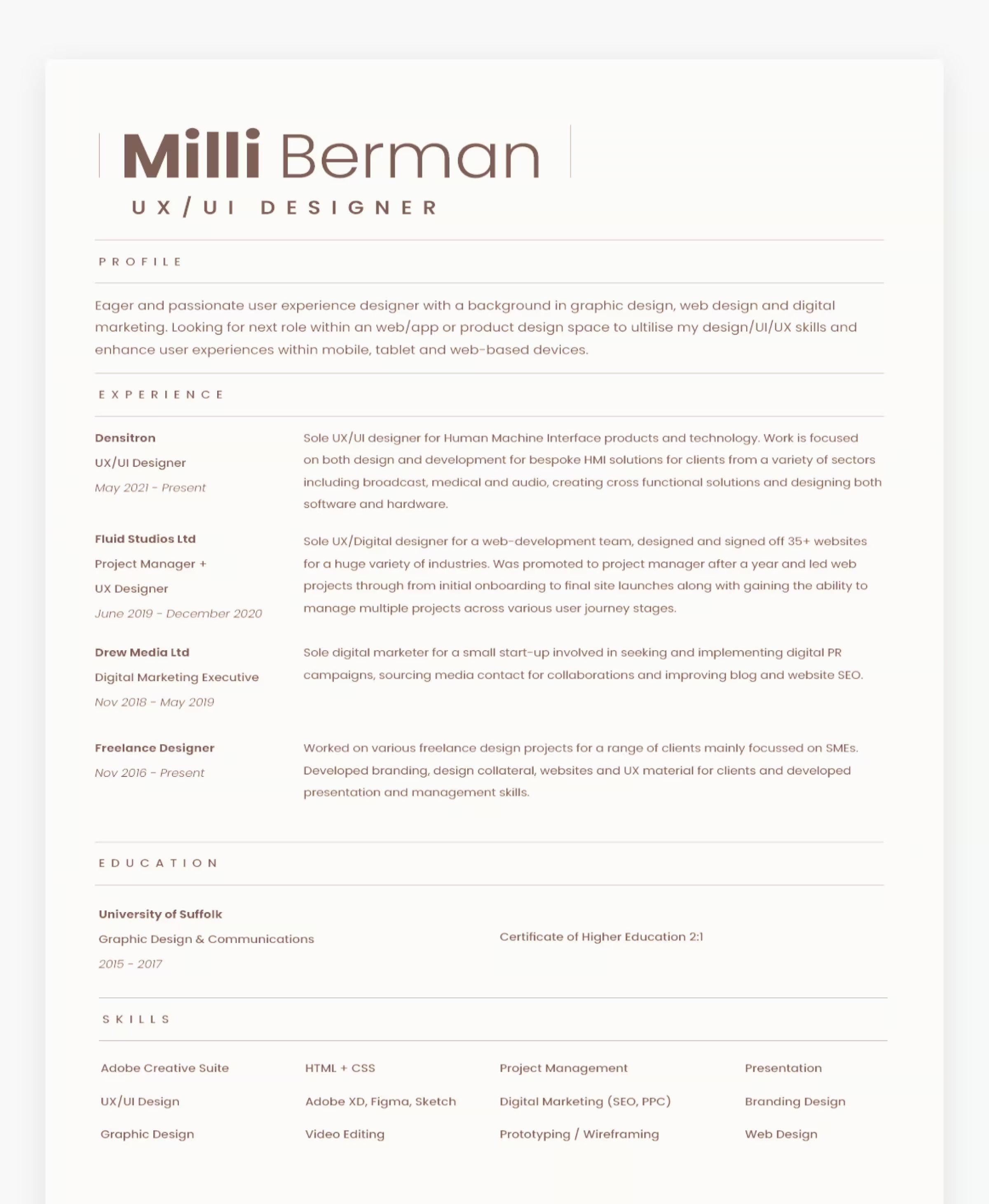
Why it works: Naming the role you want removes guesswork, and guesswork is what filters out mixed-background candidates. Showing an honest progression, sideways moves included, reads like a real career instead of a curated one, and one concrete volume figure gives the reader something solid to hold.
Where it falls short: Two habits undercut it. Capabilities and software sit in one undifferentiated block, so the reader sorts them for you, and earlier marketing work appears with no explanation of what it contributes. A typo survives in the original too, which matters more than it should. In a scan this short, a visible error is one of the few things certain to get noticed.
8. The business-impact resume: best for seniors who need to be forwarded upward

Why it works: Leading with the biggest commercial number is deliberate and smart, because the recruiter reading first usually isn't the person deciding. Figures about revenue and retention survive being repeated secondhand, and that's exactly what has to happen for a senior candidate to reach a hiring manager. Repeating the two strongest results as standalone claims makes them easy to lift.
Where it falls short: Numbers without a baseline invite doubt. A 600 percent increase raises the question of where it started, and a reader who can't answer that quietly discounts the whole thing. Big figures land when they arrive with enough context to be believed, which usually means naming the starting point or the timeframe.
9. The outcome-led resume: best for proving results at senior level

Why it works: This is the most transferable idea on the page. Roles sit in one column and their results sit beside them in another, so you can't confuse a duty with an achievement, and it forces you to produce an outcome for every job you list. Reported in percentages and currency, the results read like a track record rather than a job description. A recruiter can quote any line of it straight.
Where it falls short: The closing section undoes some of that discipline by listing personal qualities nobody can check, which a document this evidence-driven doesn't need. It's also visibly stale, with nothing recent in the history. A strong structure can't rescue a resume that stopped being maintained.
10. The single-employer resume: best for specialists with deep tenure in one place
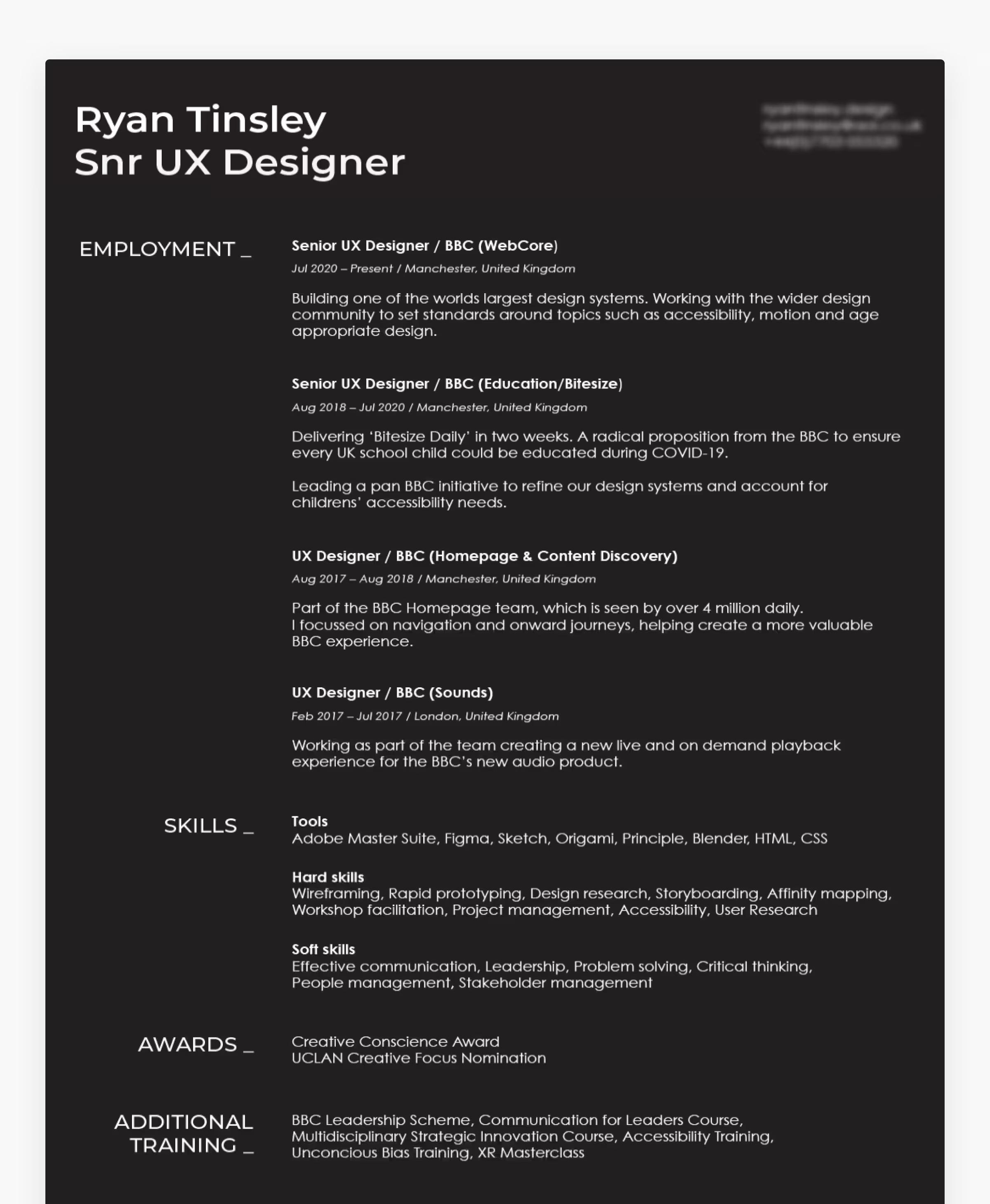
Why it works: Moving up inside one organization reads as accumulated trust, and that's harder to fake than variety. The more useful technique is describing scope in terms a non-designer feels, since an audience of millions lands immediately where a job title doesn't. If your work happens at scale, translate it into human numbers rather than internal ones.
Where it falls short: Specialists risk being unreadable outside the building, because internal product names mean nothing to an outsider and eat space that could describe the work. Design choices that look confident on screen and fail on paper are a similar unforced error.
What skills should you put on a UX designer resume?
Use three groups, not one. Six of the ten resumes above put skills in a sidebar, and the clearest ones separate what a designer can do from the software they happen to know.
- Methods: user research, usability testing, interaction design, information architecture, wireframing, prototyping, accessibility, and design systems.
- Tools: the software you actually use, listed without padding.
- Adjacent skills: HTML and CSS literacy, data analysis, workshop facilitation, and stakeholder management.
The grouping matters more than the contents. One undifferentiated block asks the reader to work out which items are judgment and which are software, and that sorting is your job. If you want your claimed skills checked before a recruiter does it, run a UX skills assessment and close the gaps first.
UX designer resume template and format
Every example above fits on one page. This structure mirrors what the strongest ones actually do.
| Section | Content | Placement |
|---|---|---|
| Header | Name, target title, portfolio URL, one contact method | Top |
| Summary | Two or three lines: seniority, domain, strongest result | Top third |
| Experience | Company, title, dates on one line, then two to four result bullets | Top third onward |
| Skills | Methods, tools, and adjacent skills, grouped separately | Sidebar or after experience |
| Education and certifications | Institution, qualification, year | Lower |
The formatting rules follow from the evidence. Send a text-based PDF, and keep critical information out of images and icons. Use one column if you're not sure how a system will parse two, and put company, title, and dates on a single line. Write every bullet as an action, a result, and a number. If you're building from scratch rather than editing, this walkthrough on creating a design resume covers the steps in order.
Entry-level vs senior UX designer resumes
The three resumes with no numbers are all early-career, and that's the clearest divide here. Seniority on paper isn't really about years, it's about whether the document reports consequences.
No experience yet? Treat coursework, self-directed briefs, and volunteer work as real projects, then quantify them anyway. "Redesigned a local charity's booking flow and cut completion time from four minutes to 90 seconds" is a result. Where it came from matters less than how precise it is.
Career-switching? Say the bridge out loud. Example 6 works because it names the link between a technical background and design work, while example 4 leaves that link for the reader to infer, which is the weaker choice.
Senior? Lead with business impact, and describe scope in numbers a non-designer understands, like team size, users affected, or revenue. Senior candidates usually get forwarded rather than hired directly, so your claims have to survive being repeated by someone else.
Common UX resume mistakes to avoid

- Listing duties instead of results. "Responsible for user research" says nothing. "Ran 10 research surveys with 500+ users, which shaped three shipped features" gives a recruiter something to repeat.
- Several roles all marked "present". Two resumes above make the current job ambiguous, and ambiguity reads as inflation.
- Claims nobody can check. Unnamed employers and lists of personal qualities cost space and add no weight.
- Numbers with no baseline. A big percentage with no starting point gets discounted rather than believed.
- Burying the newest role. All six recruiter fixation points sit in the top third.
- Typos. Seven seconds is long enough to catch one.
- No portfolio link. For design roles it's the first thing a hiring manager looks for.
What to do once your resume is ready
Send it with a portfolio covering the same three or four projects in depth, then get ready for the conversation. Most UX interview questions work straight from resume claims, so every number on the page needs a story behind it. If your resume's thin on evidence rather than wording, the fix is skills rather than formatting. Getting certified in UX design gives you a dated credential and a structured way to build results worth reporting.
For most people the fastest improvement isn't a redesign. It's rereading each bullet and adding the result that's missing.