Today, we’ll talk about the most famous typefaces and fonts and why they could be an excellent fit for your product.
In this guide, we cover 12 of the most famous fonts and common typefaces — and why they could be the right fit for your next project.
Why typeface choice is such a vital step in the UX design process? With the invention of Guttenberg’s printing press, typefaces have become a cornerstone of printed and digital communication. Typefaces play a crucial role in designing visually appealing and readable pages for both print and digital formats. The right typeface can transform a page, making it more engaging and easier to read, whether in a book, magazine, website, or app. A carefully chosen typeface can evoke various emotions, express brand personality, and enhance legibility.
Jump in to explore the unique characteristics of a few of the most popular typefaces throughout history. To learn more about the intricacies of typography, give a check to our lesson Typography Style & Classification or our interactive course, Typography.
Introduction to Typefaces and Font Types
Typefaces are everything when it comes to how we actually experience words. Whether you're reading on your phone or flipping through a magazine, it all comes down to these carefully crafted collections of letters, numbers, and symbols. We call them typefaces—or font families (sometimes font styles)if you want to get technical. And the people who create these? They're type designers. They're the ones doing the real work of type design, shaping every curve and line you see.
Here's what you need to know: typefaces have personality. Real personality. You've got your serif typefaces—those are the ones with the little lines at the ends of strokes. Think classic, traditional. Then there are sans serif typefaces. Clean lines. No frills. Script typefaces mimic handwriting, giving you that flowing, personal touch. And decorative typefaces? Those are your showstoppers, your attention-grabbers for when you need something special. But here's the thing—choosing the right one isn't just about what looks pretty. You need readability. You need impact. Whether you're designing for print, digital, or branding, understanding these nuances is what separates the amateurs from the pros.
Understanding these categories makes it easier to choose the best fonts for any project, whether you need something timeless, modern, or purely decorative.
Popular Font Types and Typeface Classifications
The world of typefaces is massive. And messy. Designers and typographers have been trying to make sense of it for years, creating systems like Vox/ATypI, British Standard, and Gerrit Noordzij Theory to organize everything. These systems group typefaces by when they were made, how they look, and what style they follow. It's not perfect, but it's what we've got.
Here's how it breaks down. You've got your serif typefaces, think old style and transitional designs with those little feet on the letters and that subtle dance between thick and thin strokes. Then there are sans serif typefaces. No feet. Clean. Often more uniform stroke widths. They range from those early grotesque styles to the geometric forms that everyone's obsessed with in modern design. Script typefaces? They're trying to be handwriting. Flowing, personal, inspired by calligraphy. And decorative typefaces—including blackletter and incised styles—well, they're the show-offs. Dramatic shapes, high contrast, ornamental details. They want your attention.
Each category comes with its own visual language. Serifs or no serifs. Letter shapes. Stroke contrast. These aren't just design choices, they're signals that influence how a typeface feels and works in your design. Understanding these categories isn't just academic exercise. It's practical. It helps you pick the right font for any project, balancing style with readability. Because at the end of the day, that's what matters.
Typeface Characteristics
Every typeface tells its own story, and you can feel it the moment you see it. The way those letterforms hit you. Whether they've got serifs reaching out like tiny hands or they're clean and stripped down. The dance between thick and thin strokes that makes your eye want to follow along. And here's the thing — all of this actually matters more than most people realize.
The x-height and cap height. Sounds boring, right? But these are the secret weapons that make or break your reading experience. When you're squinting at body text, wondering why it feels so cramped, it's probably because someone picked a typeface with a tiny x-height. Those open letterforms with generous x-heights? They're like giving your eyes room to breathe. But if you want something bold and decorative for a headline, that's when you bring out the big guns — intricate serifs and all the fancy details that would make body text a nightmare to read.
So here we are in the digital age, and honestly? It's the best time to be picky about fonts. Google Fonts changed everything. Suddenly you've got this massive playground of typefaces optimized for screens, ready to perform exactly how you need them to. Whether you're after crystal-clear readability or something that screams for attention, understanding these characteristics isn't just nice to have anymore. It's how you make sure your typeface doesn't just look good — it actually works.
1. Helvetica

Helvetica (originally Neue Haas Grotesk) is a sans-serif typeface developed in 1957 by a Swiss type designer Max Miedinger. The post-war European companies were looking for a simpler and clearer typeface drastically different from existing fancy and decorative typography. Helvetica's distinctive form, characterized by its clean lines, uniform stroke widths, and minimalistic shapes, is a hallmark of grotesque sans-serif typefaces.
Due to its neutral and clear design, which makes it usable across a wide range of mediums, Helvetica has become one of the most widely used sans-serif typefaces of all time. Its most popular successors are Helvetica Neue and Helvetica Now.
The primary goal of this typeface is not to give an impression or have any inherent meaning. That makes Helvetica one of the most versatile typefaces suitable for different design projects, from e-commerce to healthcare to financial services or social media apps.
2. Roboto
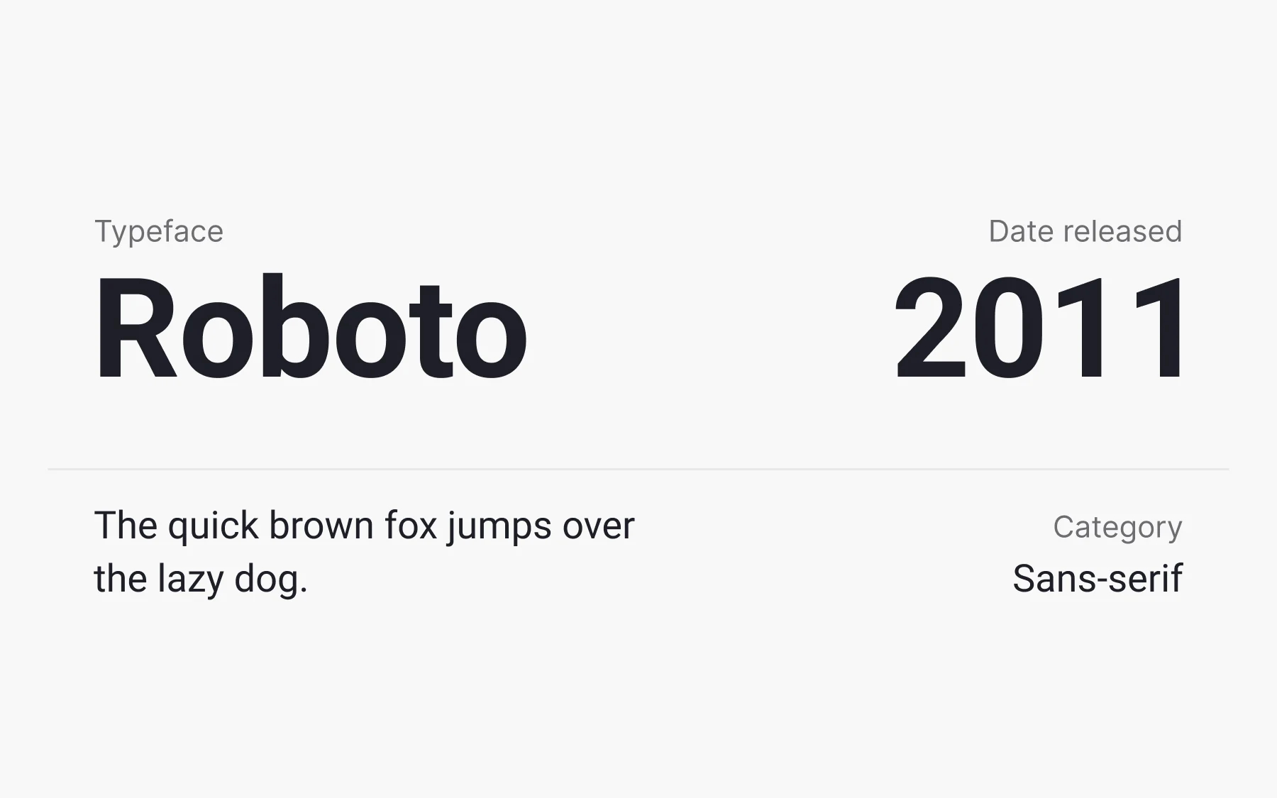
Roboto is a sans-serif typeface created in 2011 by an American type designer Christian Roberton for Google. Initially designed for Android, the typeface soon spread to other major Google products such as Google Play, YouTube, and Google Maps. Roboto is also a popular choice for website design due to its clarity and versatility. What are the reasons to use Roboto?
- It maintains a perfect balance between modern and classic, elegant and simple
- It enhances legibility
- It comes with Latin, Greek, and Cyrillic characters and has a broad compilation of fonts
3. Times New Roman

You’ll probably recognize this typeface immediately. Installed on nearly all desktop computers, Times New Roman has become one of the most popular typefaces of all time. This serif typeface was created in 1931 by an English typographer Stanley Morison for the British newspaper The Times.
Times New Roman was specifically chosen to optimize the layout of newspaper pages, enabling efficient use of space and improving readability through careful text positioning and typographic alignment.
The typeface was insanely popular in printing as it has a narrower styling that allowed fitting more words in a line. However, in digital typography, designers are prone to use it cautiously, preferring more up-to-date and flexible options.
4. Georgia
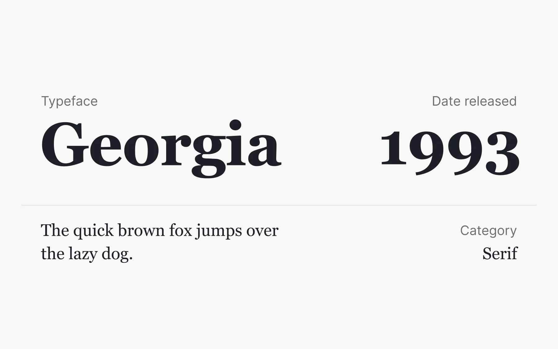
Unlike many other typefaces, Georgia didn’t fall out of fashion. This serif typeface was born in 1993 by American designer Matthew Carter for Microsoft with a mission to be elegant and legible, even on small or low-resolution screens. The designer indeed succeeded in enhancing the typeface legibility by enlarging the x-height, introducing clear outlines, and increasing character pitch. Georgia also uses proportional spacing, which contributes to its clarity and readability on digital screens.
Such media giants as the New York Times and Huffington Post rely on Georgia to preserve the nostalgic impression of paper newspapers on screens.
5. Comic Sans

Comic Sans MS is a script typeface created in 1994 by American designer Vincent Connare for Microsoft. It draws inspiration from comic books’ letters and looks like written by a small child. Each letter in Comic Sans is designed to mimic the playful, informal style of comic book handwriting, emphasizing the unique shapes and forms found in hand-drawn scripts. For better or worse, the typeface became the target of criticism and even hatred for its misuse and exaggerated simplicity. As Connare stated himself, “If you love it, you don’t know much about typography, [but] if you hate it, you really don’t know much about typography either, and you should get another hobby.”
When is it okay to use Comic Sans? Its comic styling can be helpful in informal documents and children’s materials, but avoid using it for body copy. Surprisingly, the typeface turned out to be highly legible and works perfectly for dyslexic kids.
6. Verdana

Georgia’s sibling, Verdana, is a sans-serif typeface created in 1996 by the same British designer Matthew Carter for Microsoft. In the same way as with Georgia, the designer aimed for a typeface that would be legible on the low-resolution screens of that period.
If legibility is a priority, then the serif-free Verdana with the enlarged x-height and large counters (the negative spaces inside letters such as p, c, a, R, o, etc.) makes for the perfect fit. Verdana’s design also incorporates more space between letters, which enhances readability, especially at small sizes.
7. Arial

If you look around, Arial is everywhere. You can spot it in ads, branding materials, logos, newspapers, and magazines, not to mention websites and applications.
Arial is a sans-serif typeface created in 1982 by American company Monotype Imaging. It's similar in appearance to Helvetica and comes preinstalled on most devices.
Generally, Arial is a very versatile typeface with good legibility that can be a go-to choice if you're a beginner. However, for more unique solutions, you should break a sweat and search deeper.
8. Garamond

Garamond is a group of serif typefaces initially created in the 16th century by French engraver Claude Garamond. The designer had a talent for creating calligraphic-style typefaces that were also a good fit for the printing press. Garamond's elegant capitals are reminiscent of classical Roman inscriptions, reflecting the influence of ancient stone engraving styles.
The Garamond typefaces have seen many revivals since they were first designed and have long been a favorite for books and body text. Surprisingly, the original Google logo used Garamond typeface.
Adobe Garamond is one of the first digitalized versions that you may encounter reading novels that used this typeface.
9. Baskerville
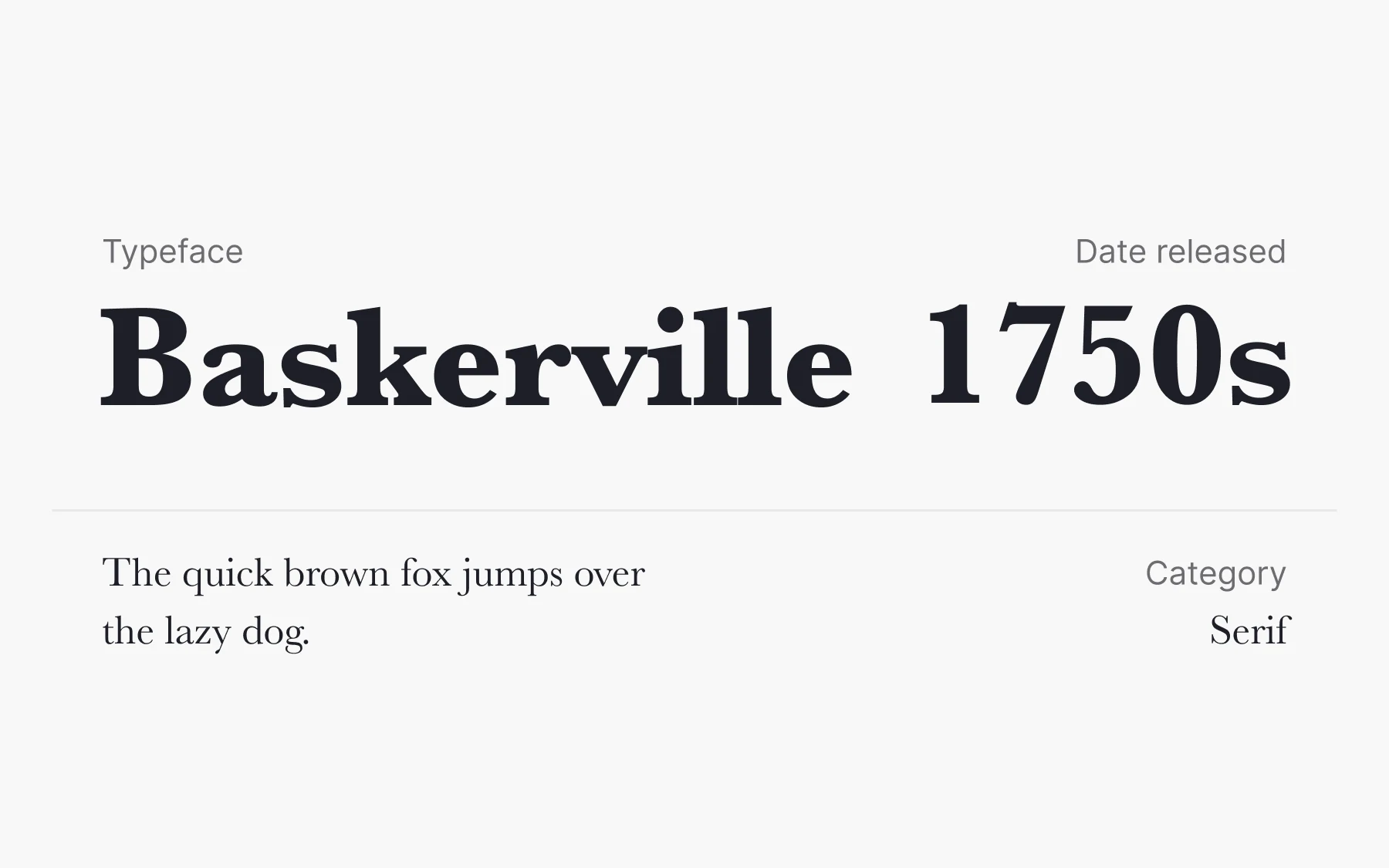
Baskerville is a serif typeface created in the 1750s by an English designer John Baskerville. It was revolutionary for its time as it increased the contrast between thick and thin strokes and had a stronger personality due to its rounded strokes. Baskerville is a prime example of serif fonts that evolved from traditional stone carving techniques, where the serifs originated from the chiseling process rather than purely aesthetic design.
Baskerville took a huge leap from old-style typefaces such as Caslon to modern typefaces such as Didot and Bodoni. Ahead of its time, the typeface didn’t gain enough glory during the life of John Baskerville. Today, Baskerville is one of the most refined and legible classic typefaces for print.
10. Futura
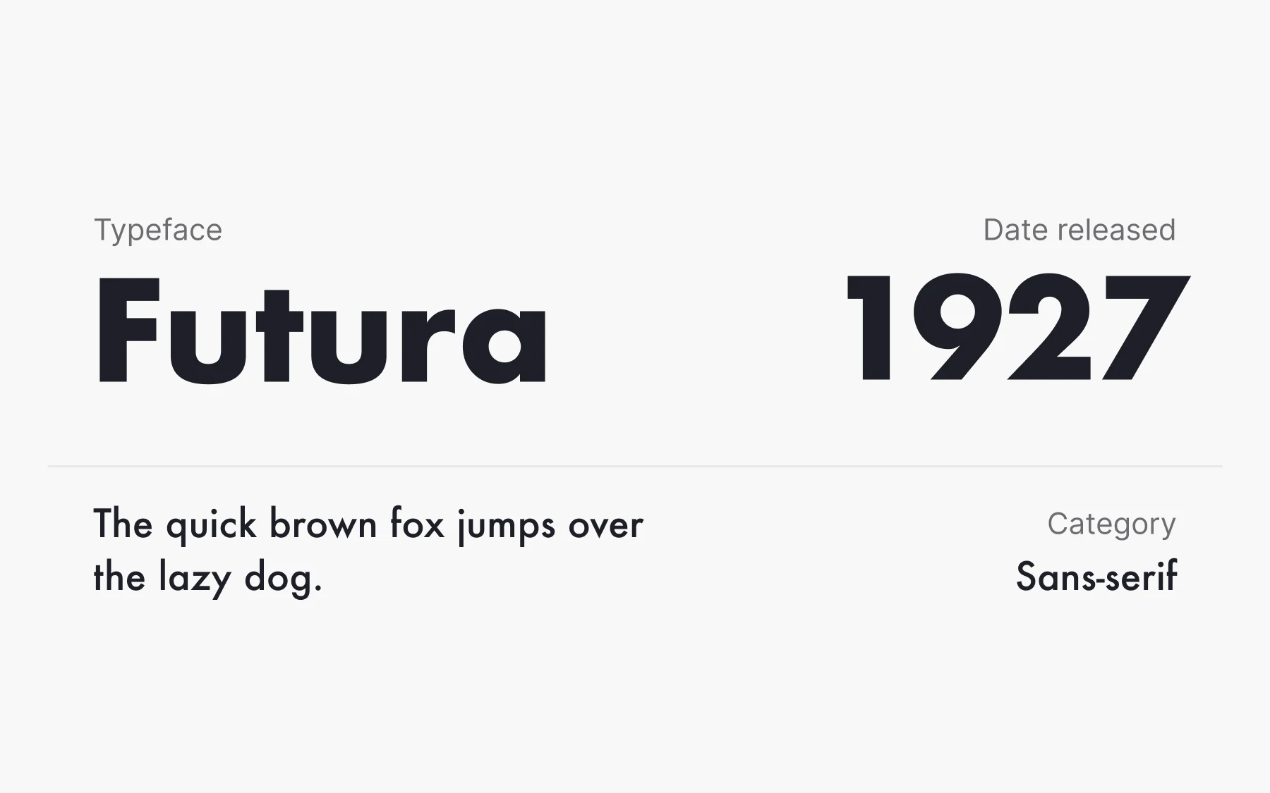
Inspired by the Bauhaus design philosophy, German designer Paul Renner created Futura — a geometric sans-serif typeface stripped of unnecessary serifs and frills. You can say that this typeface represents the belief in functionality over aesthetics. Futura’s letterforms are notably squarish, giving the typeface a geometric and modern appearance.
Due to its simplicity, Futura was Stanley Kubrick’s most favorite typeface — he used it religiously in many of his films, e.g., 2001: A Space Odyssey and Eyes Wide Shut. On top of that, it became the first typeface that has been on the Moon! In July 1969, the Apollo 11 crew left a memorial plate that used the Futura typeface to record the first humans set upon the Moon.
11. Bodoni
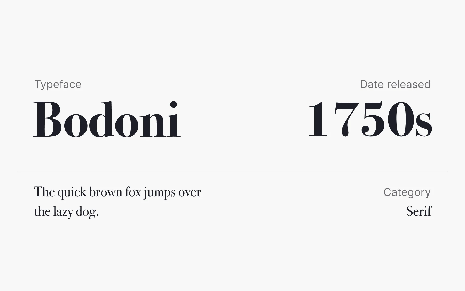
Bodoni is a serif typeface created by an Italian typographer and type designer Giambattista Bodoni in the late eighteenth century. There have been numerous revivals since its creation — the two most successful are ATF Bodoni and Bauer Bodoni. Bodoni produces a striking visual effect through its high contrast between thick vertical and thin horizontal strokes, a hallmark of Didone typefaces.
Due to the alternating thick and thin strokes, this typeface can be challenging for users to read, so avoid using it for large paragraphs. However, its refined and elegant style can be a perfect match for printing, like book covers or advertising, as well as for titles and logos in web design.
12. Rockwell

An updated version of 1910’s Litho Antique, Rockwell was released in 1934 by an American company Monotype Imaging. It became one of the most popular geometric slab-serif typefaces constructed almost entirely of straight lines, perfect circles, and sharp angles. Slab-serif typefaces like Rockwell originated at the beginning of the 19th century to meet the demand for attention-grabbing display fonts used in large sizes. Rockwell's block structure stands in contrast to the narrow styles of earlier typefaces, and its bold, almost drawn appearance makes it ideal for impactful headlines.
The blocky nature and sharpness make Rockwell perfect for headlines rather than body copy. On the other hand, the typeface can create a warm, friendly, or playful feeling. For example, Malibu Rum uses it to create a beachy and carefree vacation atmosphere.
From Helvetica to Garamond, these famous fonts have stood the test of time for good reason. Whether you're after the best fonts for readability, brand identity, or visual impact, understanding these popular typefaces gives you a stronger foundation for every design decision. The right choice isn't just about aesthetics — it's about how the font works for your users.