Let's take a look at some shocking statistics — on average, people need JUST 90 SECONDS to make up their mind on whether they want to interact with a service or product. Impressive, right? More importantly, about 62-90% of their assessment relies solely on color. Your brand can't make a first impression twice to engage your audience.
With social media and messengers, color is even more important. When users open their smartphones or an app store, color should make your brand's logo stand out against your competitors and showcase your brand's individuality. Even social media giants like Instagram or Slack ventured into redesigning their brand color palettes to engage an even broader audience and become platforms that people can't live without.
It's critical you put time and effort into developing an amazing color palette. To get started, explore the impressive color palettes of the most influential social media companies and the messages hidden behind the colors they've used.
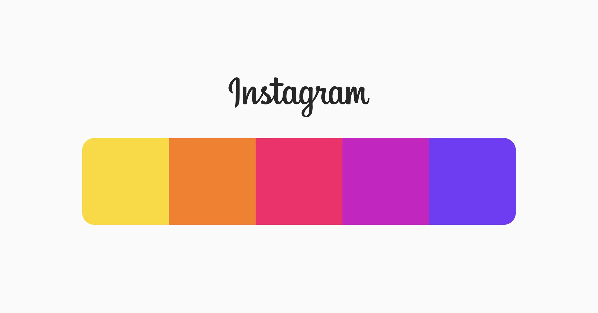
Instagram's color palette is a vibrant and cheerful rainbow, featuring a spectrum of hot pink, orange, yellow, blue, and violet. These colors, often used in a gradient effect, create a sense of energy, playfulness, and warmth, inviting users to explore the app and engage with its content.
This colorful palette reflects Instagram's identity as a fun, creative, and inclusive platform that celebrates self-expression and visual storytelling. It's a palette that captures the essence of the brand's personality, conveying a sense of joy, creativity, and optimism that resonates with its users.
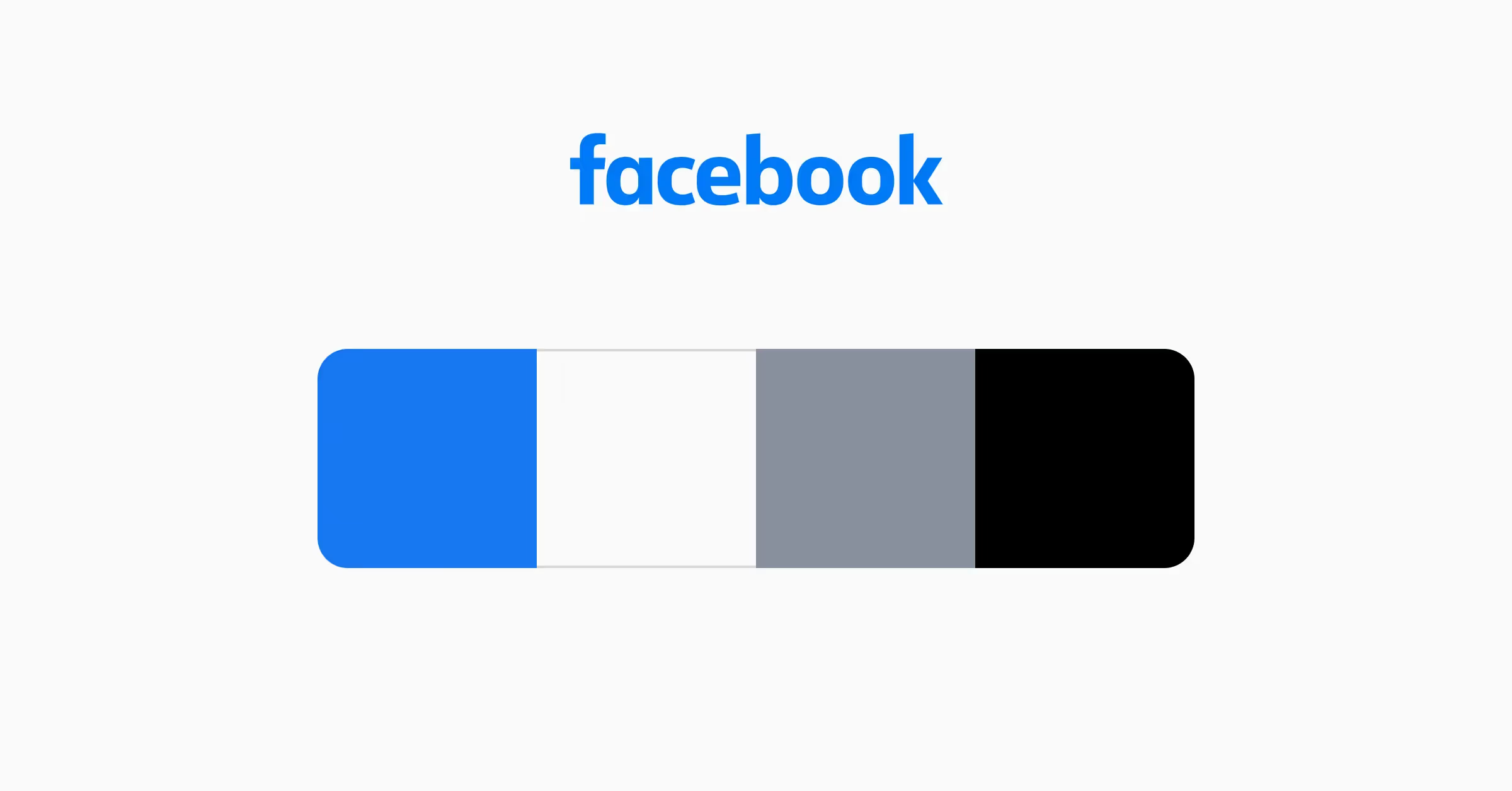
The Facebook color palette is an excellent example of how accessibility won over visual appeal. Mark Zuckerberg's vision condition (red-green colorblindness) defined blue as a primary color and gray, black, and white as secondary. In his own words, "Blue is the richest color for me; I can see all of blue."[2] Besides, the Facebook color palette is strong and classic. Blue and gray stand for intelligence, dependability, and security, making them ideal choices when you display Facebook feed on various platforms, ensuring consistency and brand recognition.
Twitter (X)
.avif)
Another social media platform, another shade of blue. Like Facebook, Twitter initially opted for the path of least resistance by selecting the world's most likable color for its primary palette. Accompanied by the Twitter bird, the classic blue and white color scheme was used to symbolize freedom, lightness, and the swiftness of short messages delivered as quickly as a flap of wings. Light colors further underlined the service's transparency and honesty. Darker shades in the Twitter palette were intended to signify intelligence and trustworthiness — qualities essential for brands that manage personal and confidential data.
The new color palette of after its rebranding to X features a minimalist and dark-themed design. It primarily uses black as the dominant color for backgrounds and key elements, while white contrasts for text and certain highlights. Dark gray is often used for interface backgrounds and menus, with light gray applied to secondary text and subtle icons. Blue, a holdover from Twitter's previous branding, remains as an accent color, typically used in links, notifications, and interactive elements. The overall palette leans heavily into dark-mode aesthetics.
Snapchat

Daring to be different, Snapchat adopted an electric yellow for its primary color. It's remarkably cheerful and energizing and feels just right for a fun and entertaining platform. While yellow alone can become overpowering and flashy, combined with black, they create a strong, recognizable identity. Plus, black counterbalances yellow's edginess and adds a pinch of style and flair.
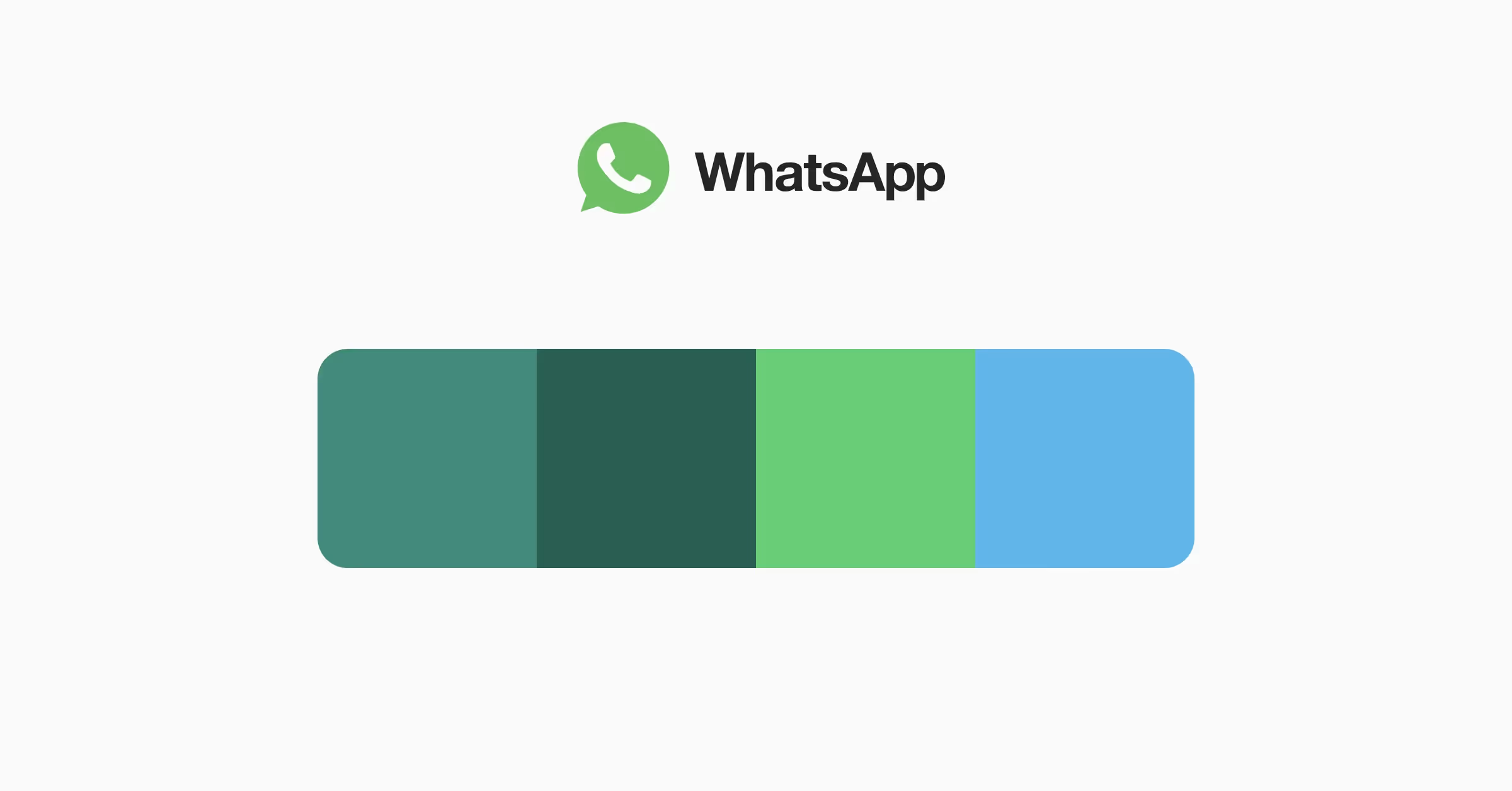
What do people expect from a messaging app? The right answer is the privacy of their conversations. That's why WhatsApp selected a series of greens and blues for their color palette to show security and trustworthiness. Apart from that, the palette feels refreshing, inviting, and friendly — qualities you expect a communication platform to have. Moreover, green is associated with money, which is a positive association considering the payment functionality of the platform.
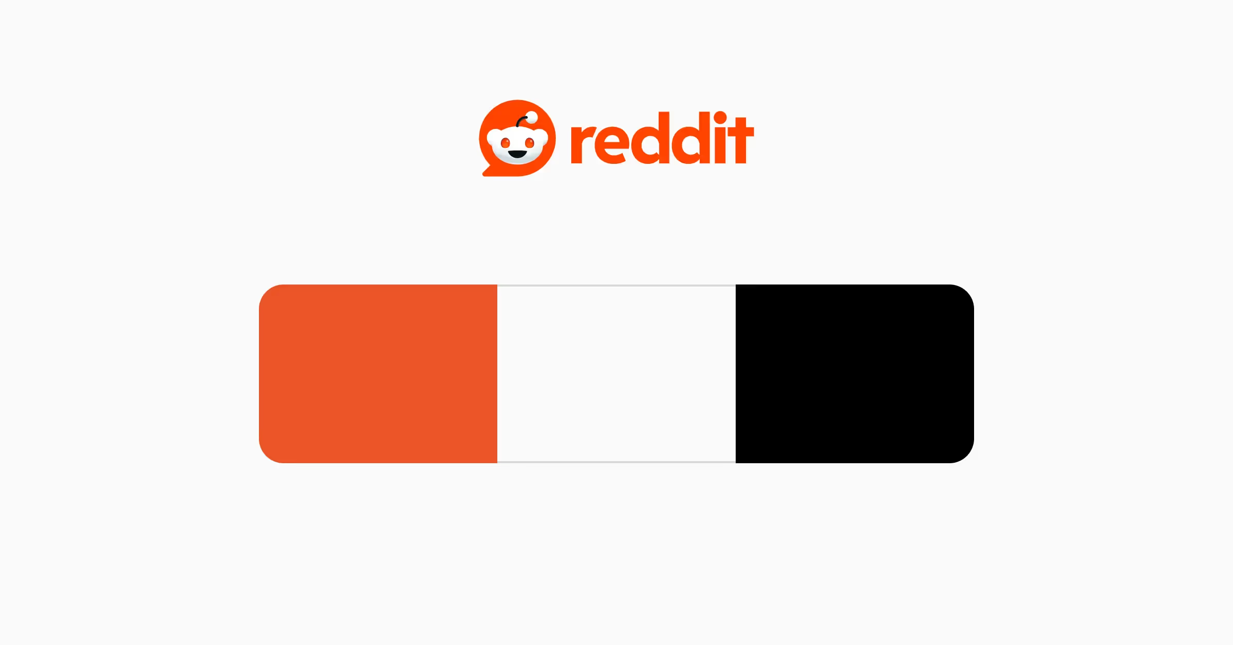
Reddit's color palette is centered around a striking orange-red hue, complemented by black and shades of gray. The use of the bright orange-red color is a bold move that captures the attention of users and creates a sense of excitement and stimulation. It's a color that exudes energy and enthusiasm, perfectly reflecting Reddit's platform's lively and dynamic nature. This hue is also known for increasing appetite, whether for food or endless pages of news, sports, technologies, or cute pet videos, making it a perfect choice for a platform that encourages users to indulge in a wide range of topics and interests. The use of black and shades of gray in the color palette adds depth and sophistication and also serves as a backdrop for the vibrant orange-red, allowing it to stand out and capture the attention of users.
Slack
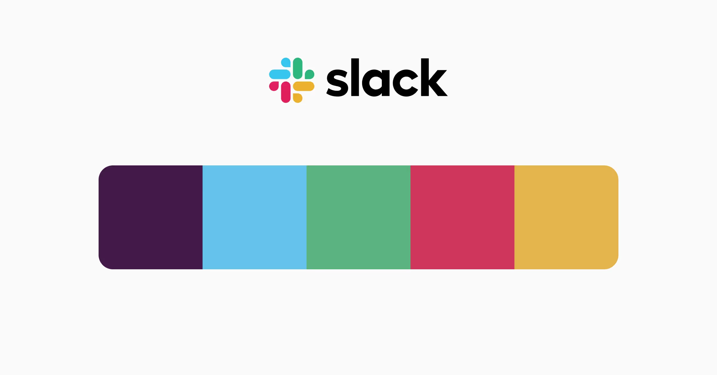
Although Slack is a communication platform for work, its color palette is anything but boring. The primary Slack color is aubergine, which stands for creativity, curiosity, and intelligence. For the secondary colors, Slack has adopted the 4 classic color pairings: blue, green, red, and yellow. They're shown in the logo and also used as accents throughout the platform. Their palette greatly expresses Slack's personality as human, warm, quirky, thoughtful, and collaborative.
TikTok
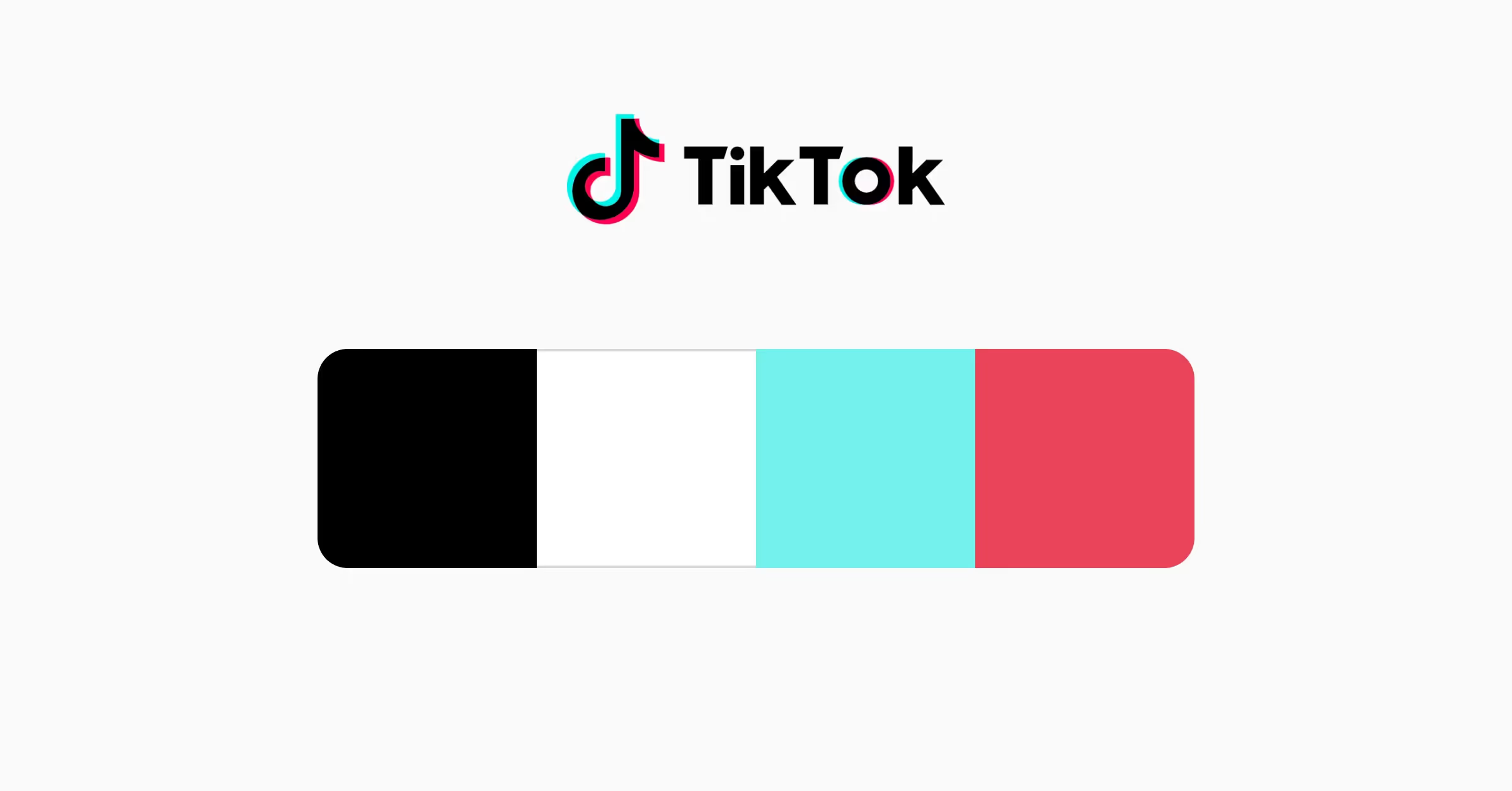
With 4 main colors — black, white, bright pink, and turquoise blue — this color palette captures the essence of TikTok's personality and appeal. Black and white give TikTok a sleek, modern look that exudes confidence and sophistication. They also add a sense of clarity and simplicity that resonates with users who crave clarity in an otherwise cluttered digital world.
The pink color is a burst of energy and vibrancy that ignites the platform with a playful and entertaining vibe. The refreshing and calming turquoise color brings to mind the ocean and the outdoors, adding a touch of natural inspiration to TikTok's brand identity. It's a palette that reflects TikTok's fun, youthful, and creative personality, and it's a testament to the power of design in building a successful brand.
🧠 Pro Tip: Take our Color Psychology course to learn about color associations and how to use them effectively in your designs.
Color palettes are more than just pretty pictures — they're powerful tools that shape how people see and feel about a brand. Each color palette we've looked at tells its own story, showing what the platform cares about and who it's trying to reach. As designers, it's super important to understand how colors affect people. Choosing the right colors can make your app or website stand out and connect with users in a world with many options. So, next time you're picking colors for a project, remember — you're not just making things look good, you're telling a story and creating an experience!


