

.svg)


Typography hierarchy is the foundation of readable design. It involves organizing text through font size, typeface, color, and weight so readers instantly know what matters most. No headings, no titles, no captions, just text. It’s hard to read, right? I’d bet that you’ve even avoided reading content in that format on more than one occasion. Without clear paragraphs, the content lacks structure and flow, making it even more difficult to follow. It strains your eyes, and makes it hard to understand and figure out what’s important, ultimately hindering the process of communicating information clearly to the reader.
What is typographic hierarchy?
Typographic hierarchy is one of the most important elements of designing written content. Without a hierarchy, you get the “wall of text” effect that makes reading difficult.
Creating an effective typographic hierarchy involves a few elements that, when combined, create a visually appealing structure for written content that makes it a joy to read. It highlights which content is the most important, signaling to the reader what to pay attention to. Various factors—such as size, weight, color, style, position, and spacing—contribute to establishing a clear text hierarchy and improving the organization of information.
The basic elements of typographic hierarchy include the type size, typeface choice, and things like weight, color, capitalization, and style. Text hierarchy and type hierarchy refer to the structured organization of these elements, and using a system to order font sizes and styles helps guide the reader’s attention through the content. Different methods can be used to create or enhance typographic hierarchy, such as adjusting spacing or combining font weights. An effective typographic hierarchy helps convey the intended message or emotional tone of the content, while ensuring legibility is crucial for making the content user-friendly and visually appealing.
Typographic Hierarchy Principles
At the heart of effective design lies the principle of visual hierarchy, which allows designers to organize content in a way that is both visually appealing and easy to read. A strong typographic hierarchy is essential for creating a clear structure, helping readers quickly identify the most important elements on a web page or document. By thoughtfully combining font sizes, font styles, and a cohesive color palette, designers can establish a visual organization that communicates the relative importance of different elements—such as headings, titles, and body text.
For example, using a bold font style and a larger font size for headings and titles immediately signals their importance, drawing the reader’s attention. In contrast, body text is typically set in a smaller, regular font style, providing the necessary context without competing for attention. This deliberate use of hierarchy not only makes the content more readable but also helps guide the reader’s eye through the information in a logical order. By applying these principles, designers can create layouts that are both attractive and functional, ensuring that the most important content stands out and the overall message is communicated effectively.
Font Size and Typography Hierarchy
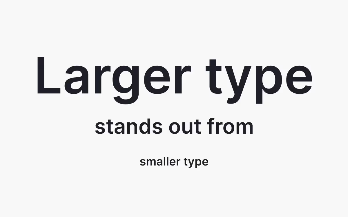
The most obvious way to create typographic hierarchy is by using different font sizes for different elements. Larger type is generally used for things like titles and headlines, while smaller type is used for body copy, captions, and meta information. Headings play a vital role in establishing hierarchy, capturing attention, and organizing content visually. Properly structured headings not only engage readers but also enhance SEO by guiding both users and search engines through the content.
But simply making a font larger doesn’t necessarily create a hierarchy that looks good. Following sizing rules like the golden ratio or Fibonacci sequence creates a more aesthetically pleasing appearance.
There’s also a classic typographic scale that’s been used in typographic design for centuries. You might be familiar with it from the default font size options used in many word processing apps. It consists of: 6, 7, 8, 9, 10, 11, 12, 14, 16, 18, 21, 24, 30, 36, 48, 60, 72. It’s also sometimes expanded to include 96 and 144 pts.
One mistake I see digital designers repeatedly make is using body copy that’s too small. Standard body text size in printed matter has long been 12 pt, reflecting the influence of print design principles on digital typography. But on screen, 12 pixel fonts can be uncomfortable to read for long periods. Instead, consider using type between 14 and 24 pixels for body copy, and base the rest of your hierarchy on that baseline size.
For example, if you start with an 18 pixel body text size, you might want to use a 36px font for your title or H1 headlines, 30 px for H2, and 24 px for H3. On web pages, heading tags (<H1> to <H6>) are used to structure content, establish typographic hierarchy, and improve SEO by helping search engines understand the organization of each page. The downside to only using type size to establish hierarchy is that it limits the number of headers you can effectively have without using huge type (which can be a valid design choice, too).
Using larger sizes for titles and headings helps highlight the most important information for the reader, ensuring that key messages stand out and guide attention effectively.
Multiple typefaces
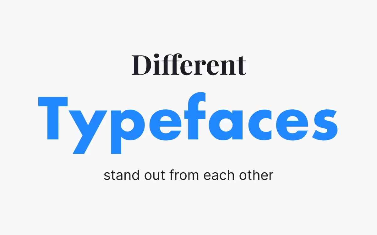
You can enhance typographic hierarchy by using different fonts for different elements. A designer's expertise is crucial in selecting and combining typefaces for effective hierarchy, ensuring that each choice supports the overall visual identity. Combining typefaces can be challenging for many new designers, but there are a few things to keep in mind that make it easier.
Be aware of the contrast between typefaces. Too much and one font can drown out the other. Too little and the fonts will clash. For example, if you pair a font with very thick strokes and another with very thin strokes, the first will likely overwhelm the second. Pay attention to the structure of the letterforms, too. If one typeface has condensed letterforms and the other has stretched letterforms, the contrast will be too much and end up visually jarring.
The basis for the letter shape is also important. Picking two typefaces with geometric letterforms, for example, will often work better than typefaces with wildly different underlying shapes. When combining typefaces, maintaining a consistent approach to typeface selection and spacing helps create a cohesive and professional appearance.
One technique beginners can use to effectively combine typefaces is to choose fonts from two different classifications. For example, pairing a serif with a sans serif typeface or display typeface.
Differing typefaces alone aren’t enough to create effective visual hierarchy. But it is an important element in creating typographic hierarchy, especially when header sizes and body sizes aren’t that different. This is common with lower-level headers, such as H4 and H5, if used in content.
The benefit to using multiple fonts in a typographic hierarchy is that different typefaces are more readily recognizable than subtle differences in sizes. The arrangement of words using different typefaces can guide the reader's attention and establish clear separation between headings, subheadings, and body text. Particularly when different headers aren’t seen side-by-side.
Capitalization, color, weight, and style
The final method for creating typographic hierarchy is by changing the capitalization, color, weight, lines as visual tools, or style of the type. Lines can be used to create alignment and hierarchy, helping to organize elements and guide the viewer’s attention. Any of these elements will make a header or other element stand out (or recede) against other elements.
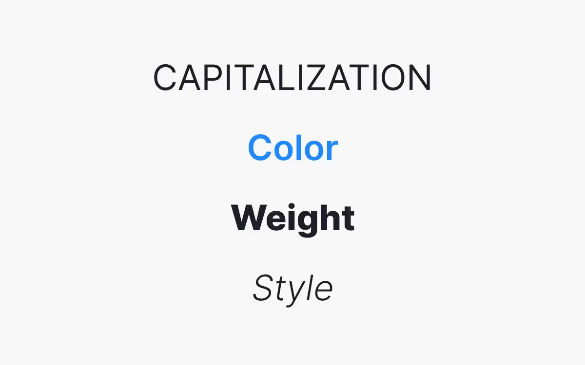
Using all-caps for a header makes it stand out from surrounding text. While all-caps can be hard to read in larger blocks of body text, it’s more readable at larger sizes, as would be used in a header.
Changing the color of a typeface can have a dramatic impact on the importance of the text. Making text a lighter shade of gray, for example, can make it recede in a design. This is commonly used for things like meta information or image captions. It indicates to the reader that the text is less important than surrounding text and helps guide the reader’s eye through the content.
By contrast, using a vibrant color for type can make it stand out against the surrounding text. This is why links, historically, have been bright blue—it makes them instantly recognizable as a link and stand out from the surrounding content. The same can be done with headers to make them stand out from body text. This is particularly useful for lower-level headers that might not be significantly larger than the body copy.
Weight is also a useful way of creating hierarchy. Heavier weights (bold or black weights) make text stand out while lighter weights make it recede. Be wary, though, of using typefaces that are particularly heavy or light for large blocks of text, as it can affect readability.
Style is the final method for creating typographic hierarchy. Italics can be used in headers to differentiate them from other header levels, or for things like captions to set them apart from body copy. For example, using bold italics for subheadings or colored lines beneath headers are common techniques in real-world designs to establish clear visual separation and hierarchy.
Breaking up content visually by using these methods helps divide information into smaller chunks, making it easier to read and improving the overall structure of the design.
Organizing content
Organizing content is a crucial step in creating a strong typographic hierarchy. Designers must assess the importance of different elements—such as headings, subheadings, and body text—and arrange them in a way that makes the hierarchy clear and the content easy to navigate. Breaking up large blocks of text with well-defined headings and subheadings helps divide information into smaller, more digestible sections, making it easier for readers to scan and understand the material.
Strategic use of spacing, such as white space and line spacing, further enhances readability by preventing the design from feeling cluttered. Proper spacing between different elements creates a sense of order and allows each section to stand out, guiding the reader’s eye naturally from one part of the content to the next. By thoughtfully organizing content and using hierarchy to highlight the importance of each element, designers can create layouts that are both visually appealing and easy for readers to engage with.
Visual flow and navigation
A well-designed typographic hierarchy not only organizes content but also creates a visual flow that guides the reader’s eye through the page. By varying font sizes, font styles, and color palettes, designers can establish a clear path for readers to follow, making it easier to find and absorb important information. Grouping related elements together and using clear, distinct headings and subheadings help readers quickly scan the content and locate what they need.
Incorporating images and other visual elements can also break up text and reinforce the hierarchy, making the overall design more engaging. For example, placing an image near a key section or using a contrasting color for a call-to-action can draw attention to important elements. By carefully considering how readers will navigate the content, designers can create a seamless experience that makes information easy to find and understand, ultimately improving the usability and effectiveness of the web page or document.
Common mistakes to avoid
When creating a typographic hierarchy, there are several common mistakes that can undermine the effectiveness of your design. One frequent error is using too many different fonts or font styles, which can create a confusing and inconsistent visual flow. This makes it difficult for readers to distinguish the importance of different elements and can detract from the overall readability of the content.
Another pitfall is neglecting the use of white space and proper spacing, resulting in a dense, overwhelming layout that is hard to navigate. Insufficient contrast between elements—such as using similar colors for headings and body text—can also make it challenging for readers to identify key information. Finally, failing to consider the context in which the design will be used, such as the platform or audience, can lead to a hierarchy that doesn’t effectively communicate the intended message.
To create a clear and effective typographic hierarchy, designers should limit the number of fonts and styles, use spacing and contrast thoughtfully, and always keep the context and needs of their readers in mind. By avoiding these common mistakes, you can ensure your design communicates the importance of each element and provides a positive reading experience.
Typography Hierarchy Examples
Typographic hierarchy does not have a one-size-fits-all solution. There are a lot of options for designers to consider to create the visual appearance that fits their project while also improving the readability of text content. Using a system for organizing font sizes and styles helps maintain a clear hierarchy and ensures that the design remains structured and easy to follow.
It’s a good idea to start with the body text size and style. This sets a baseline for the rest of the typography in the design. From there, you’ll need to figure out which header sizes you’ll need (H1-H6), as well as any other text elements the page will contain.
Let’s say you’ve decided to use a 16-pixel body text size. You’ll have four header levels (H1-H4), plus captions for images and meta text for a date and author byline. And just to make things more interesting, there will also be pull quotes included in the text.
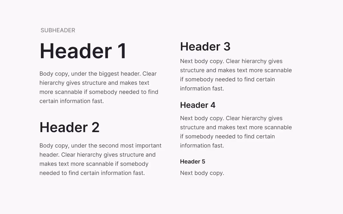
The above example shows how to effectively combine the typographic elements mentioned throughout this article in one hierarchy. Real-world examples like this help clarify how typographic hierarchy principles are applied in practice. Two fonts are used—Evolve Sans for the headers and meta information and Cardo for the body text.
Evolve Sans and Cardo work well together because there’s sufficient contrast without either typeface overwhelming the other. They have similar letter shapes, but are also from two different typeface classifications (sans serif and serif, respectively). It is important to be consistent in applying these typographic choices throughout the design to maintain a cohesive and professional appearance.
Using different type sizes and capitalized letters for the first and second level headers immediately differentiates them from the body text. They follow the classic typographic scale, with 16 pixel body copy, 24 pixel header 2, and 48 pixel header 1. The meta and caption format is also set apart through size, at 10 pixels.
The second level header also adds visual interest through a color change. The opposite is done for the meta and caption text, appearing in a lighter gray so it stands out less.
The third level header is the same size as the body copy, but is set apart by being bold. The first level header is also bold, increasing its importance in the hierarchy.
You can see from this simple example how combining the techniques described above results in a typographic hierarchy that make it easy to pick out the most important elements in the design. It also makes the text more readily scannable (readers can easily see the main points in each section indicated by the header to find the sections that have information applicable to them).
Creating effective typographic hierarchies requires knowledge of these principles, plus a fair amount of experimentation. The principles give designers a framework while also allowing for a lot of freedom in how they are implemented.