

.svg)


Russian painter Wassily Kandinsky used to say that everything starts from a dot. In digital design, a dot is an intersection of lines and, thus, the most basic element. In fact, we can decompose even the most complex and sophisticated designs and get the basic elements of design — lines, shapes, colors, textures, type, space, and motion. As an artist uses paints and brushes to fill out a canvas, designers use design elements to create their designs.
You may wonder why you need to know these basics. Before you learn UX design and dive into its principles and best practices, it’s vital to know your toolkit and understand how each element may affect your design and overall user experience.
In this article, we will explore 7 basic design elements and discover the primary goals behind their use.
What are the 7 Elements of Design?
1. Lines
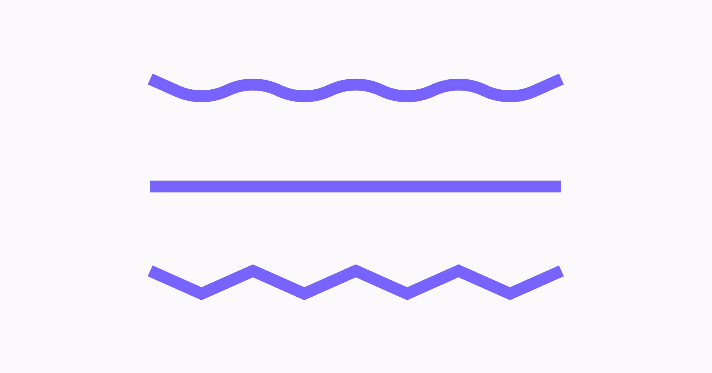
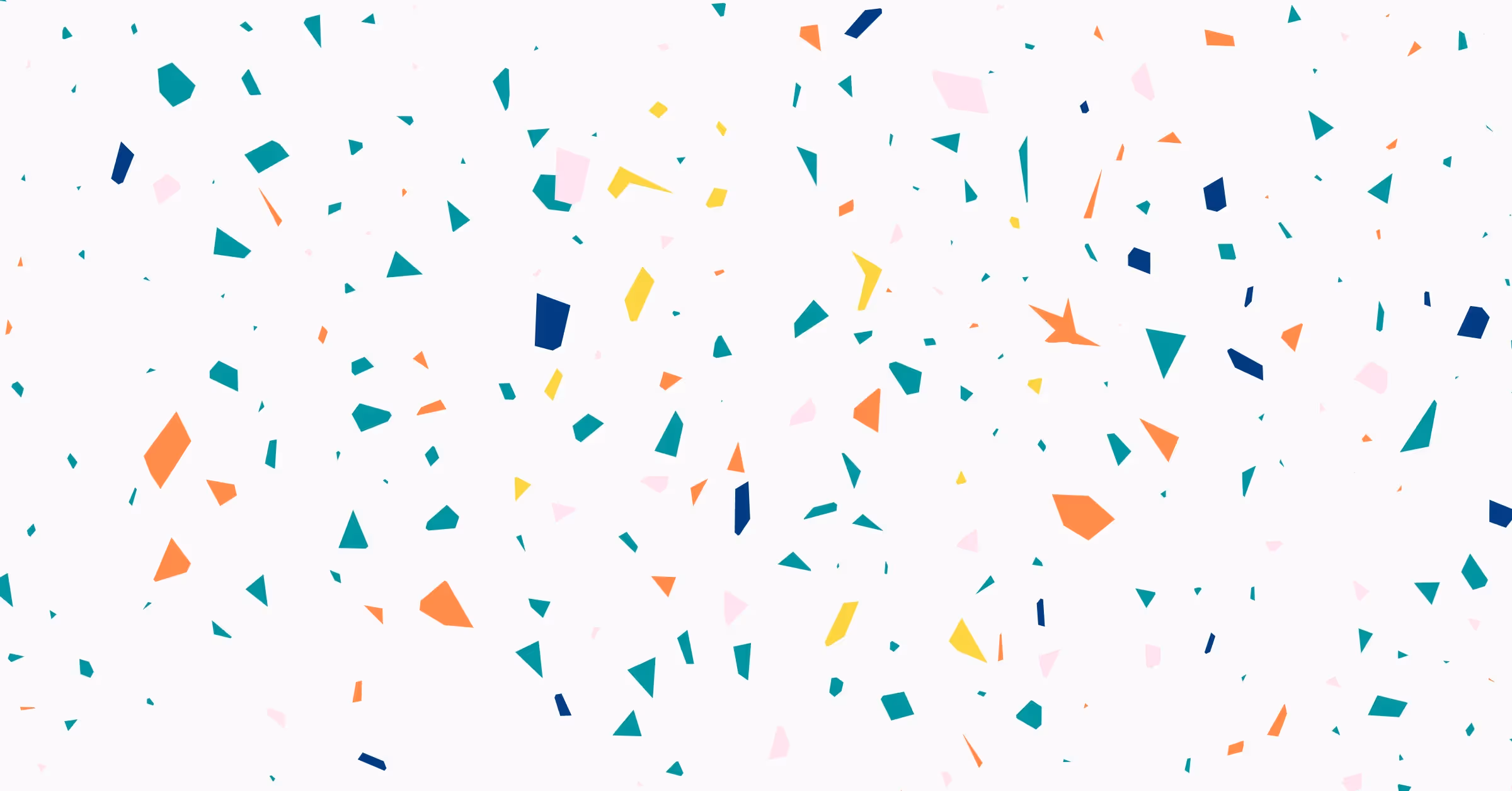
A line is a basic design element consisting of two connected points. In geometry, this element would be called a line segment, but in design, we just call it a line. Lines can be used on their own or to form other shapes, such as a circle, or combined together to form shapes like a square or triangle.
In design, lines are often used as dividers or to outline something like an image. Lines can be straight, curved, wavy, thick, or thin. And in design, we sometimes use dotted or dashed lines to create a less visually impactful divider.
The purpose of lines
Simple at first sight, lines play a vital role in establishing design composition and hierarchy. We use dividers — horizontal or vertical straight lines — to separate different content groups. Lines help direct users' attention toward specific information or focal points.
Take the design elements quiz to learn more about the usage of lines, dots, and planes in composition.
2. Shapes
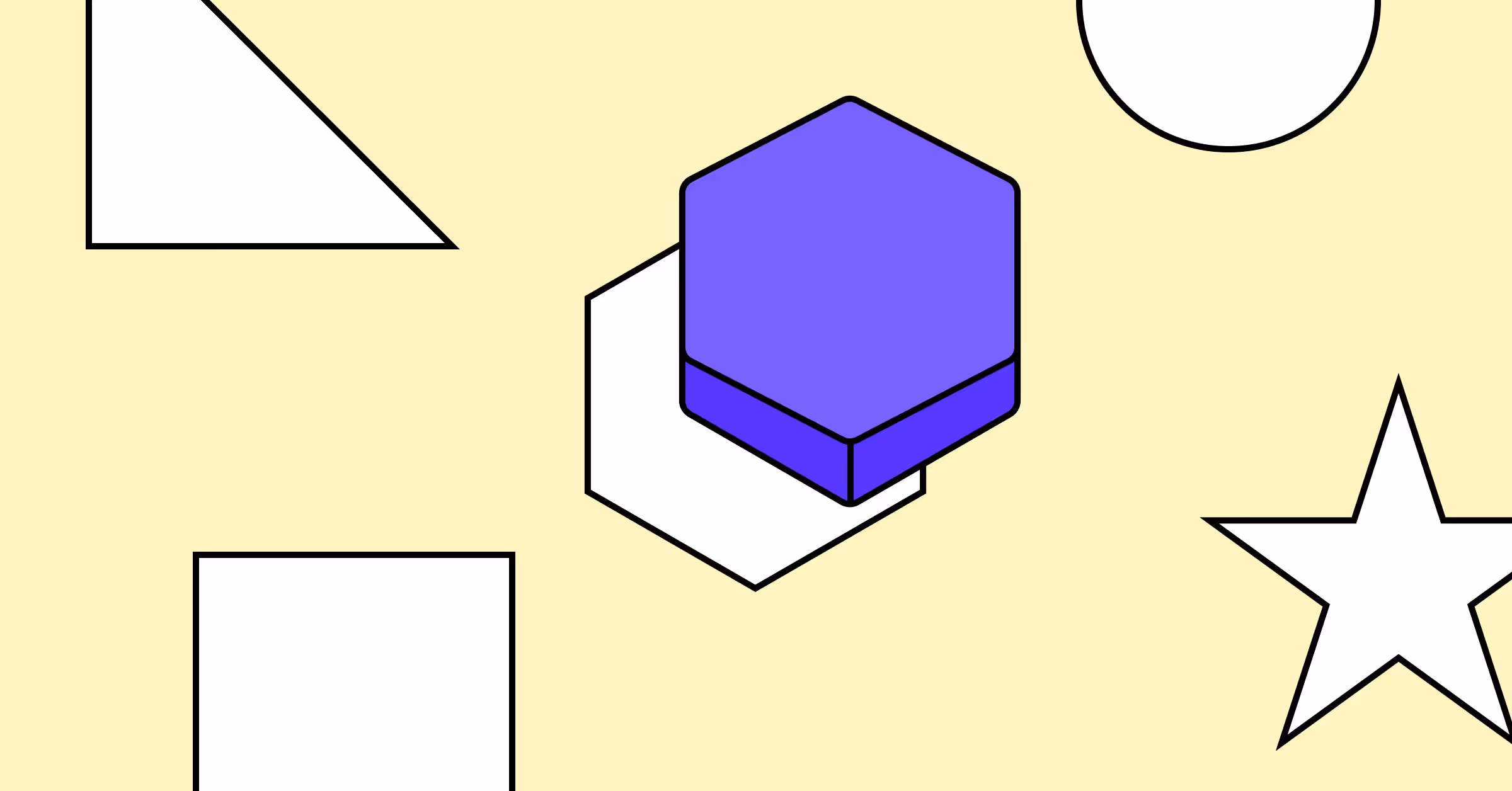
When a two-dimensional line encloses, we get a shape — another important basic element of design. There are two types of shapes: geometric and organic. Think of geometric shapes like those you studied in math class, such as squares and circles. Whether simple or complex, these shapes create a feeling of order and control. Organic shapes can be drawn freehand or using a mouse or digital pen - they are often found in nature, like leaves or clouds. Organic shapes produce a natural feel.
The purpose of shapes
Every element of design is a shape in some way. Using recognizable shapes for various functions maintains visual consistency. Users know that rectangles are for buttons, cards, images, or videos; circles for avatars or badges; and arrows for navigation or the Play button. If you want users to intuitively know how to use your interface, stick to common shapes.
3. Space
Space refers to the area between, around, and even inside design elements. Any space taken up by design elements is called positive. Negative space or white space, on the other hand, refers to the area surrounding the element.
The purpose of space
White space is vital for design success and helps achieve the following objectives:
- Improved readability. White space makes content easier to follow and scan. It creates breathing room for elements and content groups and makes designs look neat and clutter-free.
- Increased discoverability of relevant content. Empty space guides users' eyes and makes the element stand out against less important content. Negative space can emphasize key objects in logos, illustrations, posters, and creative lettering.
- Making your design look elegant and minimalistic. Large areas of white space make your design look clear and spacious, like a fancy ballroom.
- Achieving balance. White space can help balance out the other elements in a design, creating a sense of harmony and visual stability.
Overall, the purpose of white space in design is to help create a sense of order and clarity. It also draws attention to the most critical aspects of a design.
Discover the rules of applying negative space in design by taking our lesson on Negative & Positive Space within the Composition course.
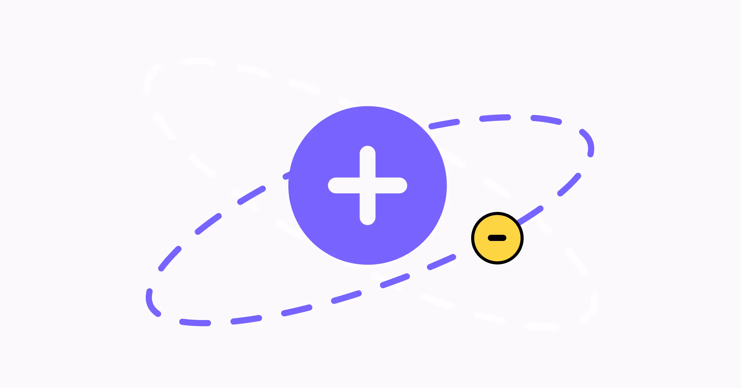
4. Color
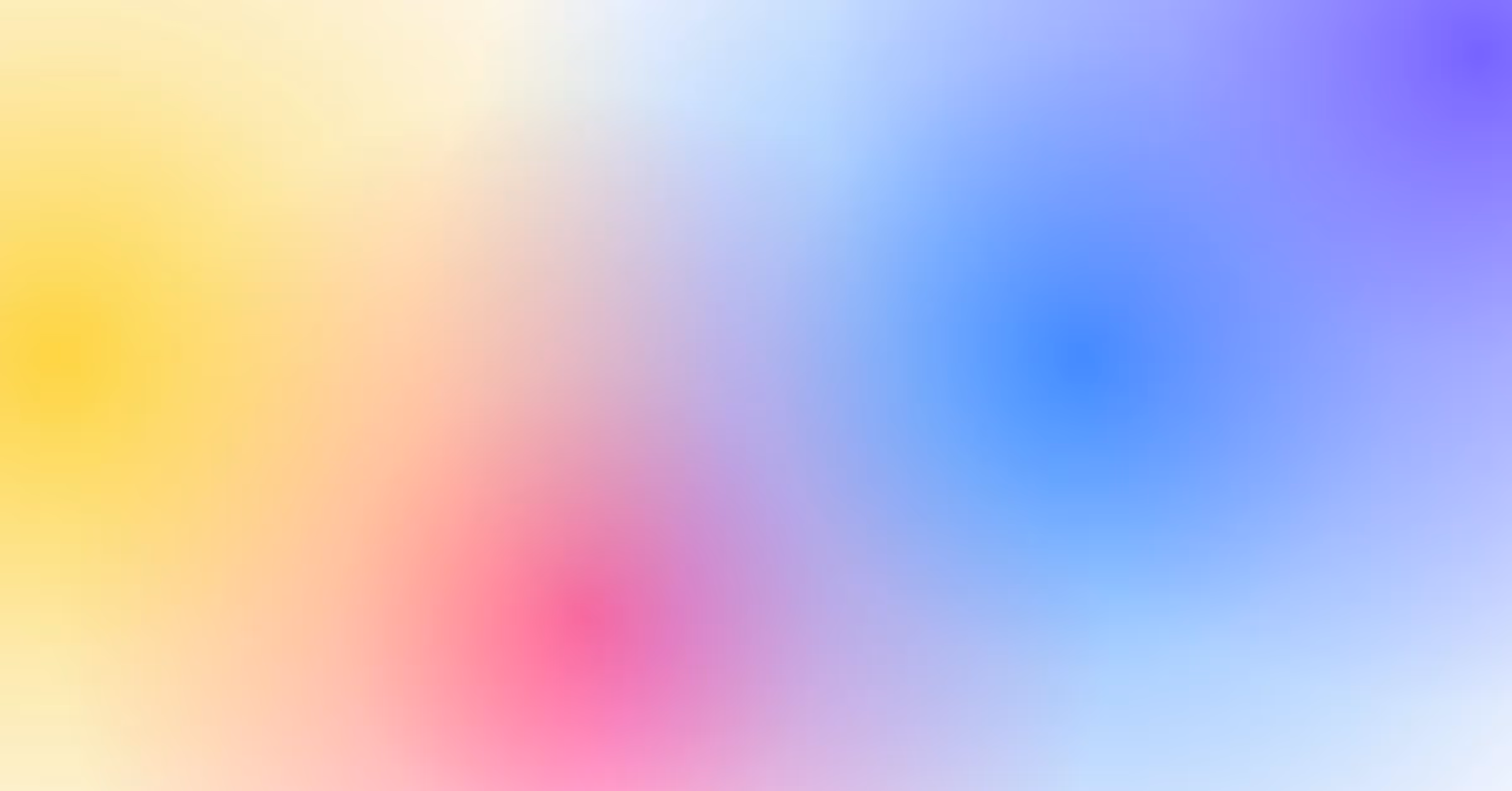
Color is a visual property of objects that is determined by the wavelengths of light that they reflect, emit, or transmit. Commonly, people associate color with the visible spectrum of light, which is made up of the rainbow colors: red, orange, yellow, green, blue, indigo, and violet.
Color is a somewhat amorphous term that can be described with other terms like hue, tint, tone, saturation, value, and brightness.
The purpose of color
Color fulfills several essential functions in design, such as:
- Communicating the states of elements
- Highlighting crucial components
- Alerting users when something goes wrong
- Conveying the mood
- Establishing a hierarchy
- Evoking emotions
Discover the psychological aspects of color and learn how to use it to create a more delightful user experience with our Color Psychology course.
5. Texture
Textures are all about how surfaces feel to the touch. In the physical world, we can touch the subject, e.g., a flower, and feel the texture of its petals — smooth, thin, and veined. In design, we can simulate a tactile feeling with visual patterns, lines, and color — the better the texture is, the easier it is to imagine how it would feel.
The purpose of texture
In design, texture can be used to create visual interest, add depth, and make designs more realistic and alive.
6. Typography
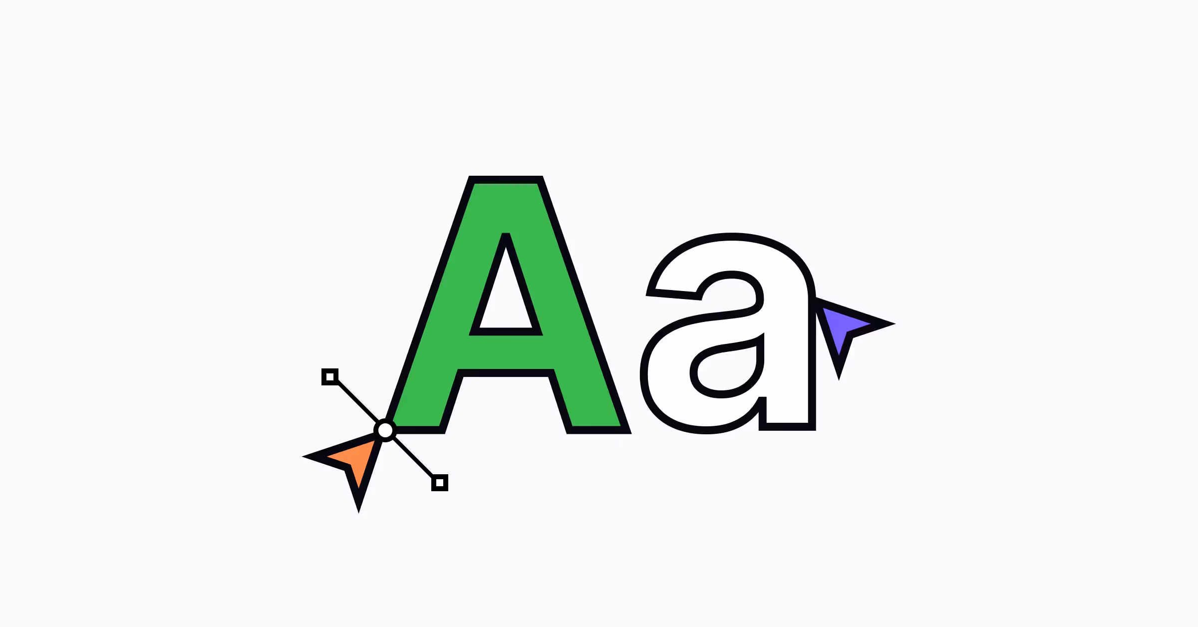
Typography can be viewed from two angles. Firstly, it's the style and appearance of printed text. Secondly, it's the art and process of arranging text to make it readable and legible to meet print or digital design needs.
Typography refers to a vast number of activities, namely selecting and adjusting:
- Typefaces
- Point sizes
- Line lengths
- Line spacing
- Letter spacing
- Kerning
When selecting and arranging typefaces in designs, designers should consider different factors like legibility, readability, hierarchy, contrast, and alignment.
The purpose of typography
Typography is one of the most essential components of design. It’s not just a tool for conveying text but a powerful tool for communicating brand image and influencing users’ emotions. Typography helps designers:
- Establish a strong visual hierarchy that helps users navigate content
- Improves legibility and readability, making products more accessible
- Set the mood
- Convey the personality of a brand and build brand recognition
Learn the history, concepts, and best practices of working with typography in design by taking our Typography course.
7. Motion
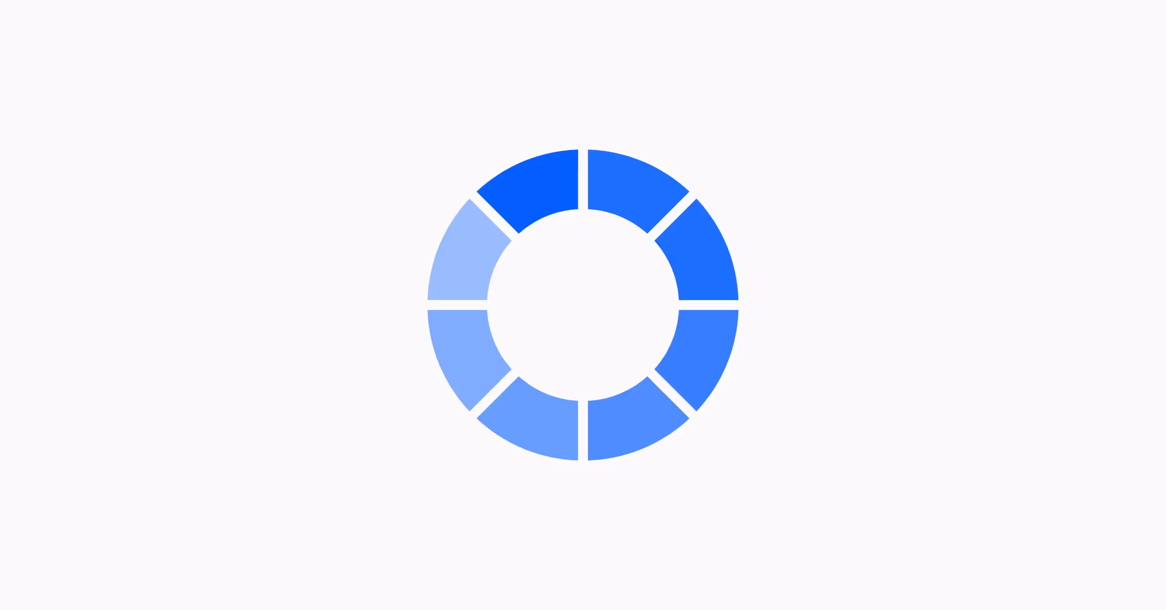
Motion refers to movement and animation that help designers enhance user experience and communicate information about a product or service.
There are a few key principles that designers should consider when applying motion to design:
- Function: Don’t use motion without a specific purpose. It should enhance the user experience, not harm it
- Consistency: Motion elements should be consistent and comply with the visual style and brand personality
- Simplicity: Avoid using motion elements that distract users from the content or functionality of the product
The purpose of motion
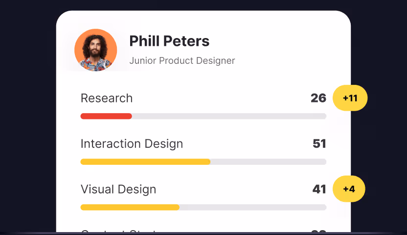
- It indicates a state and provides feedback for microinteractions. For example, an animated spinner indicates that a page is loading or a success state animation.
- It attracts user attention as our eyes are drawn to moving objects. For example, adding a radiating halo to the button encourages users to click it.
- It guides users on a page. For example, smooth animation of accordions and anchor links helps users understand their position on the page.
- It indicates interaction, especially on mobile. For example, a short animation can show that users can delete or archive a chat when they swipe across it.
- It makes a brand memorable and the user experience more delightful and entertaining.
How the Elements and Principles of Design Differ
The elements of design described above are the building blocks of any composition. Don’t confuse them with the principles of design — unity, balance, proximity, alignment, contrast, emphasis, repetition, proportion, hierarchy, movement, and figure-ground. Design principles help designers arrange elements on a page in the most logical, functional, and appealing manner.
Want to Learn More About UX Design & Boost Your Skills?
Whether you’re just starting your design career or have been in the design industry for a while, you'll always find something to learn at Uxcel. The online UX design courses cover various design disciplines and provide practical tips, informative facts, and real-world examples that you can use to improve your UX design skills or brush them up before an upcoming job interview.
UX Design is a multifaceted discipline that requires designers to have various skills and knowledge to implement design work efficiently. You can train your technical and soft skills by taking our UX design courses and upscale your portfolio by completing design challenges inspired by real-world tasks UX designers are assigned at their jobs.