Think of your favorite cartoon characters. What first comes to mind? Is it their voice, personality, catchphrases, or maybe their colors? All these components help show creators make unique characters that people can relate to or fall in love with.
Color is an important instrument that allows us to tell the character's story without actually telling it. In the days before color psychology studies, creators would use colors intuitively. Usually, studios would choose either the brightest and most eye-catching color or one of the available colors at the time.Contemporary shows can base their color choices on actual data about how people react to different colors.
Color is a key element in creating cartoon characters, making them easy to recognize and remember. The colors chosen for a character do more than just look good; they communicate important details about the character’s personality, emotions, and role in the story. For example, bright colors like red or yellow often suggest energy and optimism, while darker shades like purple or black might indicate mystery or a darker role.
Looking at iconic cartoon characters and analyzing how they ended up with their color palettes can help you better understand storytelling with color.
Mickey Mouse Color Palette
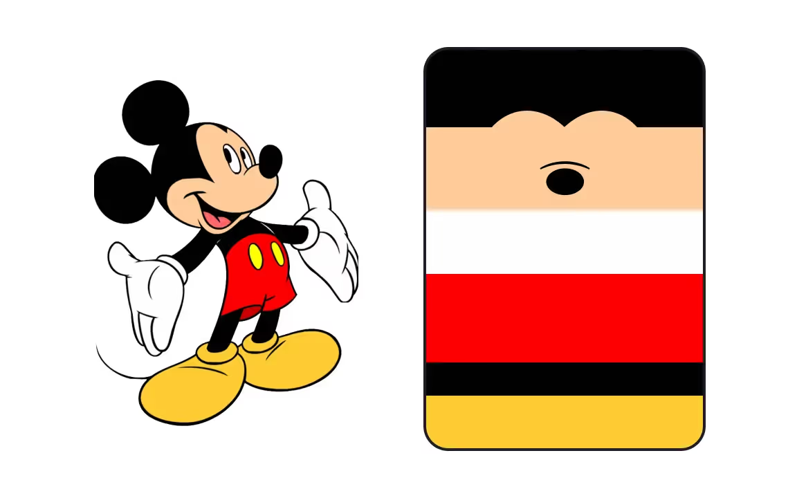
Who doesn't know Mickey Mouse, the famous mascot of The Disney Company? While the character first appeared in a black and white cartoon in 1928, his look underwent significant changes in 1935, when Mickey appeared in color.
Mickey's color palette is a bold mix of black, white, red, and yellow. He inherited his black fur from when he appeared in black and white. Later, Mickey got white gloves to help distinguish his hands from the remainder of his body. In the era of Technicolor, red shorts and yellow shoes were added. This color choice is easy to understand — these are two of the brightest, most eye-catching colors technically achievable at the time.
🧠 Pro Tip: Learn about color psychology in design and discover how to effectively use it to evoke emotions and influence behavior.
Charlie Brown Color Palette
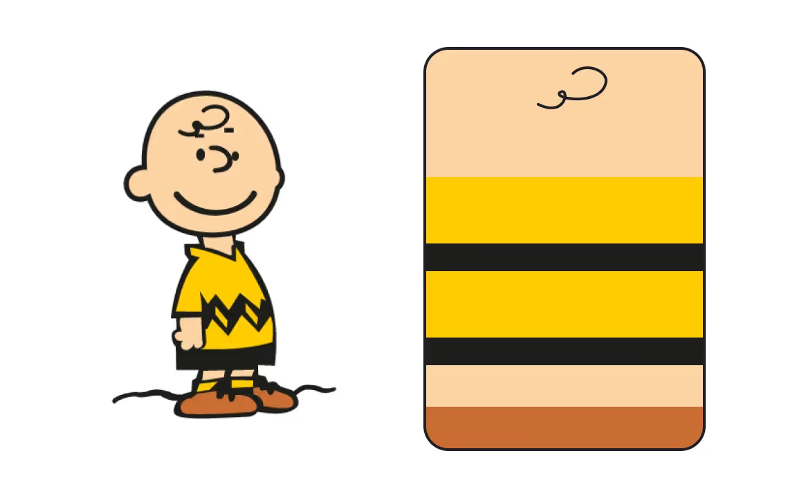
Charlie Brown is the character that first appeared in the Peanuts comic strip in 1950. At the time, it was a black and white 4-panel comic strip that was published in daily newspapers. Later, it was adapted in comic books, film, television, musical theater, and video games.
Charlie Brown is probably best known for his single lock of hair and bumblebee wardrobe of yellow and black. However, over the years, his shirt has been red, orange, green, blue, and yellow, with red and yellow used most often.The color palette also depends on the kind of media Charlie appears in — whether it's a comic, a TV show, or a figurine.
Fred Flintstone Color Palette
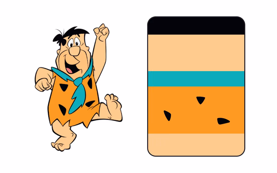
Yabba dabba doo! Fred Flintstone is an iconic character from the animated sitcom The Flintstones. The first two seasons on the show ran in black and white, so we can say that Fred didn't acquire his final look until 1962.
Fred wears a bright orange leopard print combined with a blue tie. Orange is a vibrant and powerful color, just like Fred's personality. Blue is associated with security, and in fact, Fred is a very loving husband and father. Blue and orange are complementary colors — they have high contrast to one another and make the character stand out. Contrasting color schemes are found in nature, so this combination lends the character design a vibrant yet natural feel.
Winnie-the-Pooh Color Palette
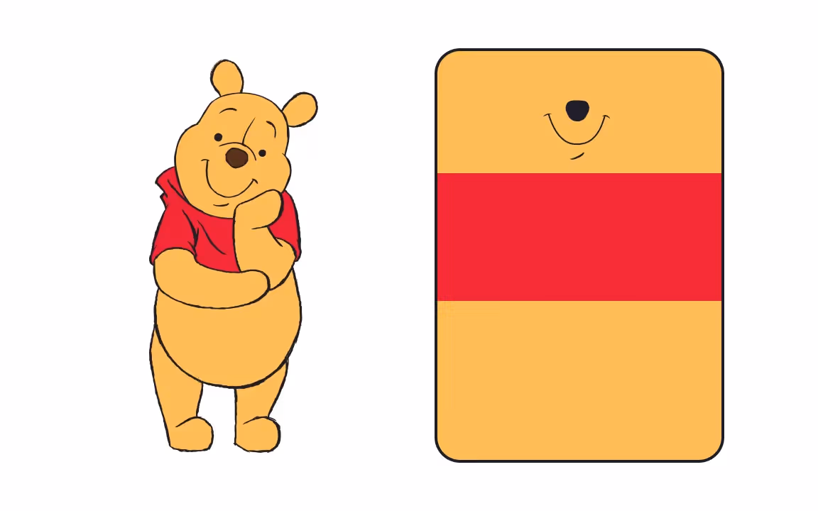
Winnie-the-Pooh is a fictional teddy bear that first appeared in the book Winnie-the-Pooh by A.A.Milne in 1926. The book included black-and-white illustrations by E.H.Shepard based on a toy Shepard's son's owned. In 1961, Disney licensed rights to the Winnie the Pooh stories and adapted them into one of its most successful franchises. That's when Pooh got the look we all know today.
Pooh's color palette consists of red and yellowish-orange. The yellow fur comes from the story. The red t-shirt that is now a Pooh signature appeared in 1932.Red is the most eye-catching color, so it's no wonder colorists chose it. Combining these two warm colors makes the character evoke feelings of warmth and comfort, reflecting Pooh's personality. He is a friendly and thoughtful (although sometimes naïve) character who is always willing to help his friends.
Homer Simpson Color Palette
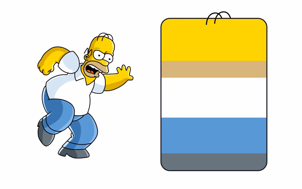
The Simpsons is perhaps the most beloved American comedy series of all time. It started running in 1989 and is still going, making it the longest-running sitcom on the air today. The show's characters have many quirks, and most of them have a bright yellow skin tone. At the time, it made them stand out from other cartoons on the air.
Homer Simpson's everyday clothing consists of a white shirt, pale blue jeans, and gray shoes. While Homer embodies some negative American working-class stereotypes (being immature, aggressive, and ignorant), his clothes hint that there's more than meets the eye.
White is considered an honest and down-to-earth color, matching Homer's habit of always speaking his mind. Blue evokes feelings of security, and Homer is shown to be a good man who is staunchly protective of his family.
Marge Simpson Color Palette
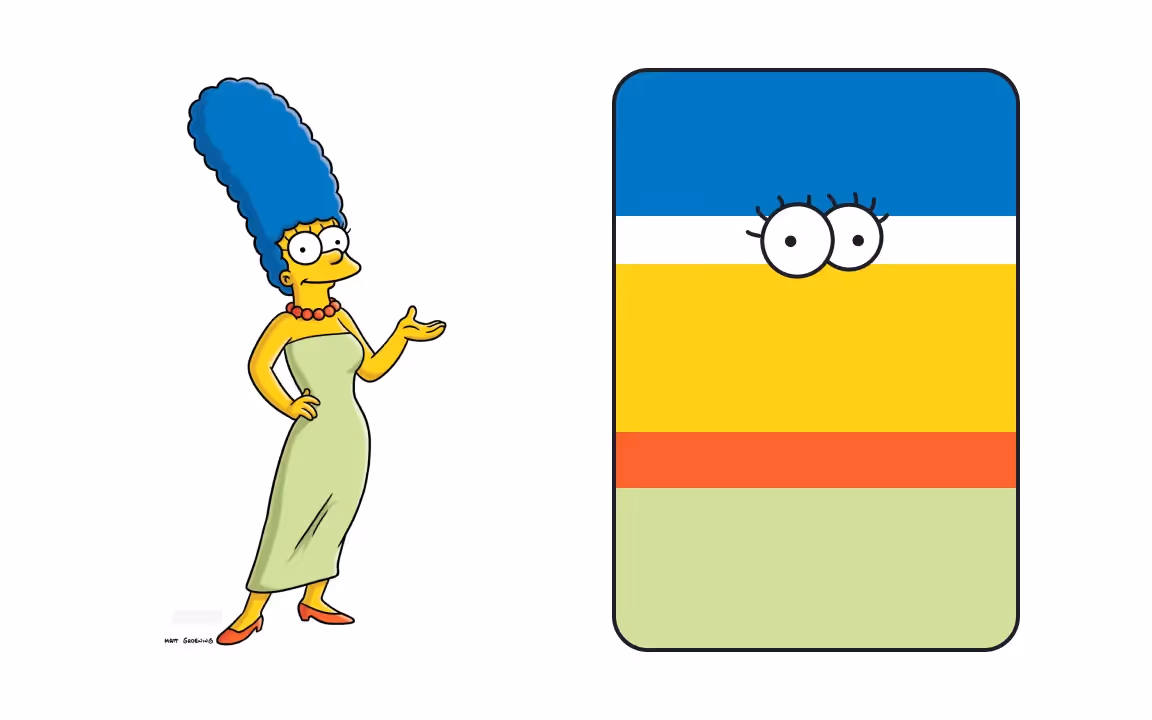
Marge Simpson is another character from The Simpsons, an animated TV show that makes fun of American culture and societal stereotypes.
Most characters have a yellow skin tone because of a creative decision by the show's creator, Matt Groening. He chose yellow to make the Springfield residents more memorable and interesting. With so many other animated series on the air, he wanted to make his characters stand out.
Marge usually wears a pale green dress, red shoes, and a red beaded necklace. The color green is associated with calm, comfort, harmony, and peace, and the pastel variation emphasizes this effect. It fits Marge as the person in the family who often serves as the voice of reason and tries to maintain order. Red is a complementary color to green, adding an exciting contrast to the character's look and hinting at Marge's occasional feistiness.
Bart Simpson Color Palette
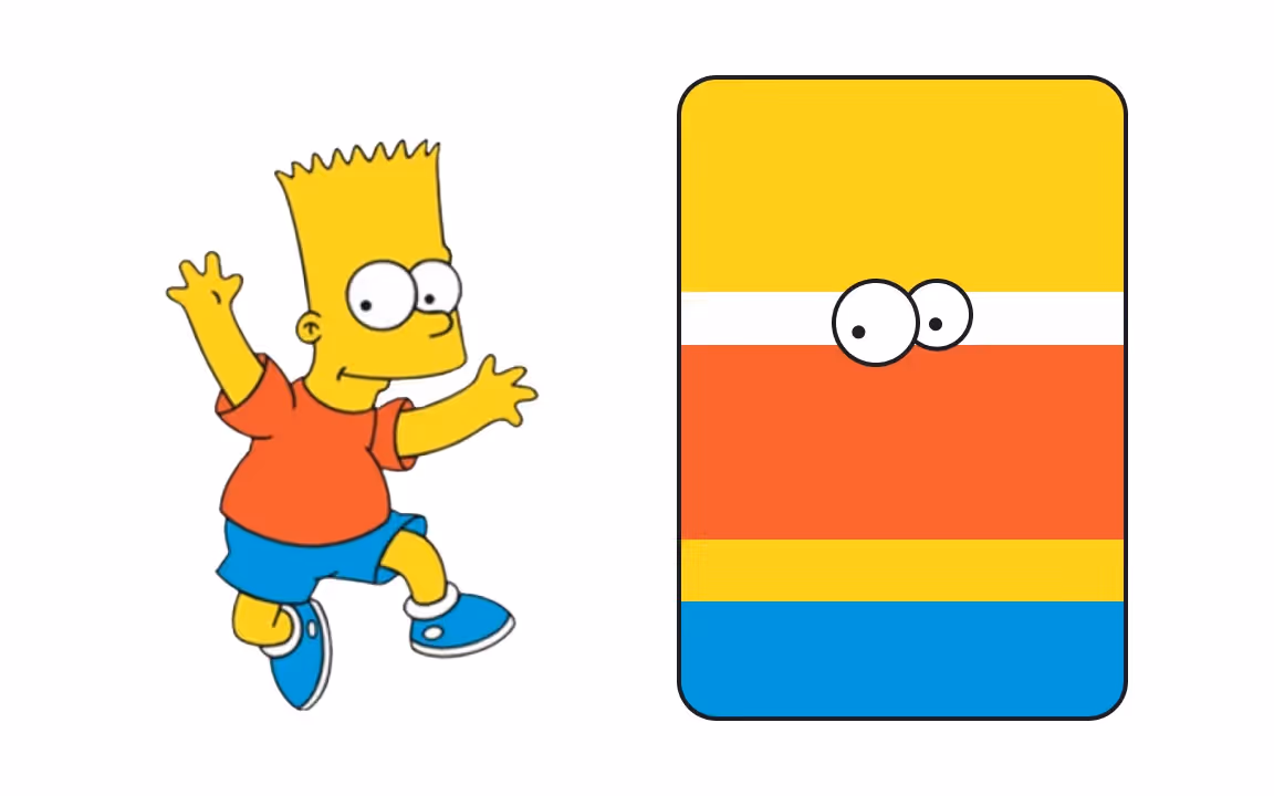
Just like his family, Bart Simpson from The Simpsons is also yellow. Yellow is one of the most visible colors to the human eye because of the way our eyes process light. It's also known to be a color that represents optimism and joy. It makes total sense that the Simpson family, who have spread so much joy in their 30-year history, are painted this color!
"When you're flicking through channels with your remote control, and a flash of yellow goes by, you'll know you're watching The Simpsons," Groening once said when asked about why he chose the color.
Bart wears a bright red-orange shirt, vivid blue shorts, and blue sneakers with white socks. Blue and orange are complementary colors, creating an energizing effect that fits Bart's personality. He's known for his mischievousness, rebelliousness, and disregard for authority.
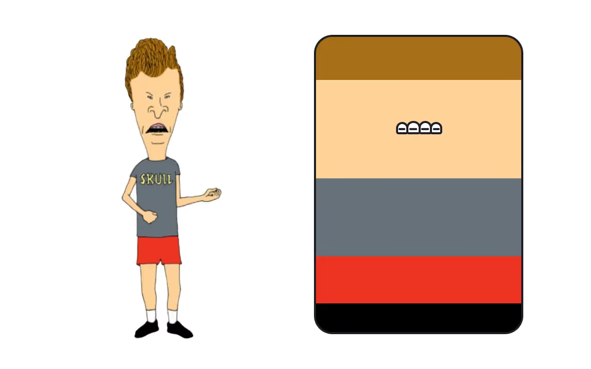
Beavis Color Palette

Beavis is the titular character of the animated TV show Beavis and Butt-Head. This adult comedy show aired in 1993 and ran for seven seasons. At the time, the show was at the vanguard of TV crudeness with its two controversial protagonists.
Mike Judge, the show's creator, wanted the two main characters to look different. They are like yin and yang, two parts of the same stupid whole.While both boys are active pranksters and neither show good judgment, Beavis is hot-blooded, brash, irritable, and violent. He has big blonde hair, and he's usually wearing a blue Metallica t-shirt.
Why does the more violent of the two wear blue and not red, a more aggressive color? The irony, dude! Now let's go break something!
Butt-Head Color Palette
Butt-Head is the second titular character from Beavis and Butt-Head. When it aired, its purpose was to change the stereotype of viewing the audience as "lazy, unintelligent teenage slackers who did nothing but watch videos all day and were easily amused by bodily functions and dirty jokes." Beavis and Butt-Head was a cultural phenomenon that truly defined the 90s and inspired an entire generation.
The creator, Mike Judge, said that the characters were inspired by the relationship between his brother and himself — although it was wasn't a conscious decision.
The characters look and sound very different, although they are both voiced by Judge. They are also contrastingly color-coded, with Beavis wearing blue and Butt-Head wearing red. You'd think that the calmer character should wear blue, but it's a show that doesn't take itself seriously. So brown-haired Butt-Head, who wears red, is actually the more laid-back, calmer, and (barely) smarter of the two.
Cartman Color Palette
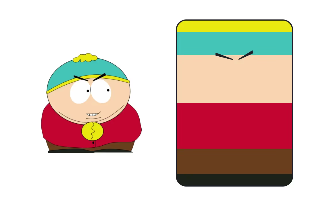
Eric Cartman is one of everyone's favorite South Park characters. The animated sitcom started airing in 1997 and quickly became infamous for its profanity and dark humor. The show also satirizes a wide range of topics for an adult audience.
Cartman is the bad boy and has the dirtiest mouth of all the characters. His palette includes a red coat, brown pants, yellow gloves, and a turquoise and yellow hat.
Red, yellow, and blue are triadic colors, meaning they are equally spaced on the color wheel. This vibrant combination fits the bright character. While Cartman can be psychopathic, sociopathic, and manipulative, he's never dull.
Peter Griffin Color Palette
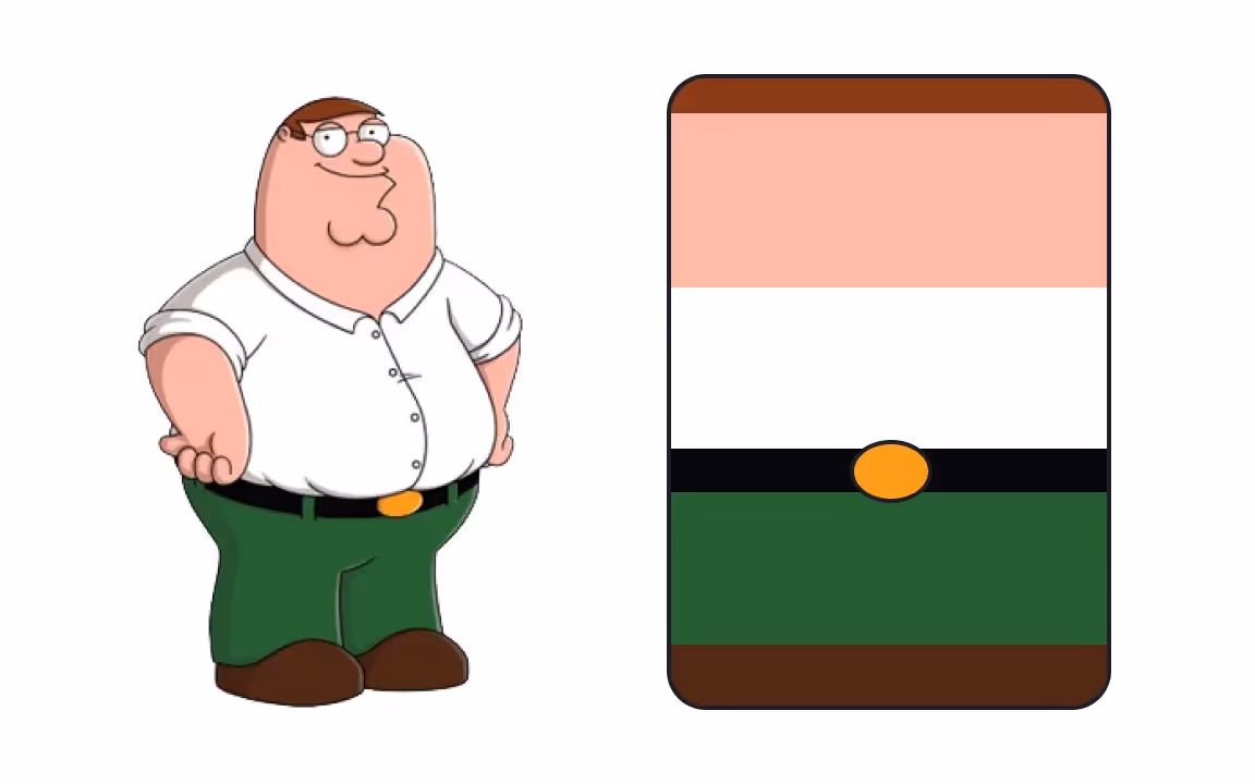
Lovable and dim-witted, Peter Griffin was created in 1999 by Seth MacFarlane for the animated sitcom Family Guy. The show follows a dysfunctional New England family of five (plus their incredibly intelligent dog). It's notorious for targeting every subject under the sun and being willing to go out of its way to offend.
Peter Griffin's palette consists of bright and simple colors, reflecting his personality. He wears a white shirt and green pants with a black belt. While Peter may look like your average middle-aged American dad, his mind is that of a giddy toddler. He gets amused very easily, but he is also easily bored — which is often the root of what gets him into the most trouble.
🧠 Pro tip: Products usually have their own personality, and developing the right voice and tone is a key objective. Explore our UX Writing course to learn how to do this correctly.
Bender Color Palette
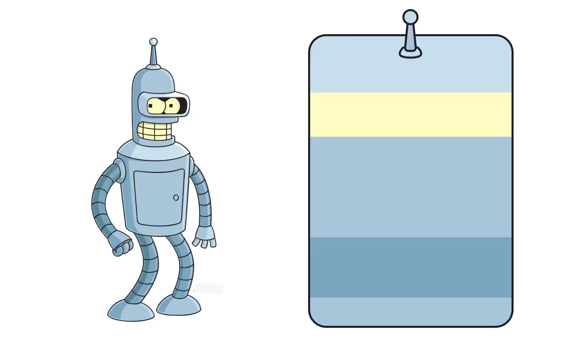
Many people use the catchphrase 'Bite my shiny metal ass!' without even knowing its origin. Bender is everyone's favorite sociopathic cynical robot from Futurama that premiered in 1999. Or, as described by his friend Leela, "an alcoholic, whore-mongering, chain-smoking gambler."
Bender's palette is mostly monochromatic, consisting of two tints of cyan blue and pale yellow. It makes sense for a robot to be steel blue since he's made out of metal.
Pastel colors that are thought to be calming and peaceful clash with Bender's over-the-top personality. This hints at him being a more profound character who cares about his friends and would make an exception for them in his plan of killing all humans.
SpongeBob Square Pants Color Palette
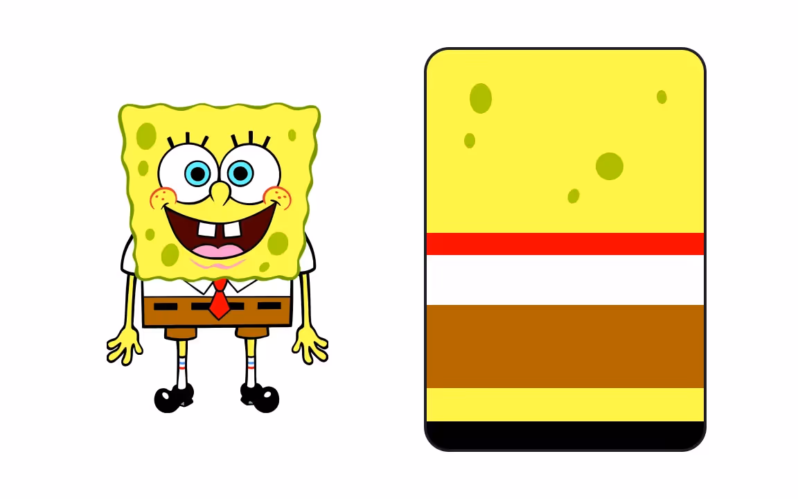
SpongeBob is the titular character from the TV show SpongeBob SquarePants. It was created by marine science educator and animator Stephen Hillenburg and started airing in 1999. The series follows the adventures of SpongeBob and his friends in the underwater city of Bikini Bottom.
SpongeBob is a yellow kitchen sponge with blue eyes that wears brown shorts, a white shirt, and a red tie. The bright yellow color dominates his palette. In the RGB color model that television uses, yellow is the complementary color of blue, which is the main background color of the show. Because, obviously, most of the action takes place underwater.
Yellow is also a universally happy color thought to be cheerful, confident, exciting, optimistic, and friendly — just like SpongeBob.
Patrick Star Color Palette
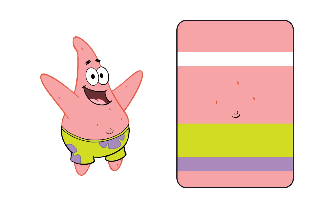
Patrick Star is the best friend of SpongeBob from the show SpongeBob SquarePants.
Patrick's color palette is a lovely combination of pink, purple, and green. Why is he pink? Well, Patrick is a starfish, and many starfish species are brightly colored in various shades of red or orange.
But another reason is that red (which pink is a tint of) together with blue and yellow are tetradic colors. And these are the colors of the 3 sea neighbors: SpongeBob, Squidward, and Patrick.
While Squidward is usually portrayed as grumpy and miserable, Spongebob and Patrick are almost always happy and optimistic. Yellow and pink do make for a joyful match, emphasizing the pair's joyful personalities and putting them in contrast with Squidward's blue or Mr.Crab's red.
🧠 Pro tip: Characters are based on people. Learning about human behavior and the reasoning behind it is what UX designers and researchers do to create products that people actually love to use. Explore our UX Design Psychology course to understand more.
Rick Sanchez Color Palette
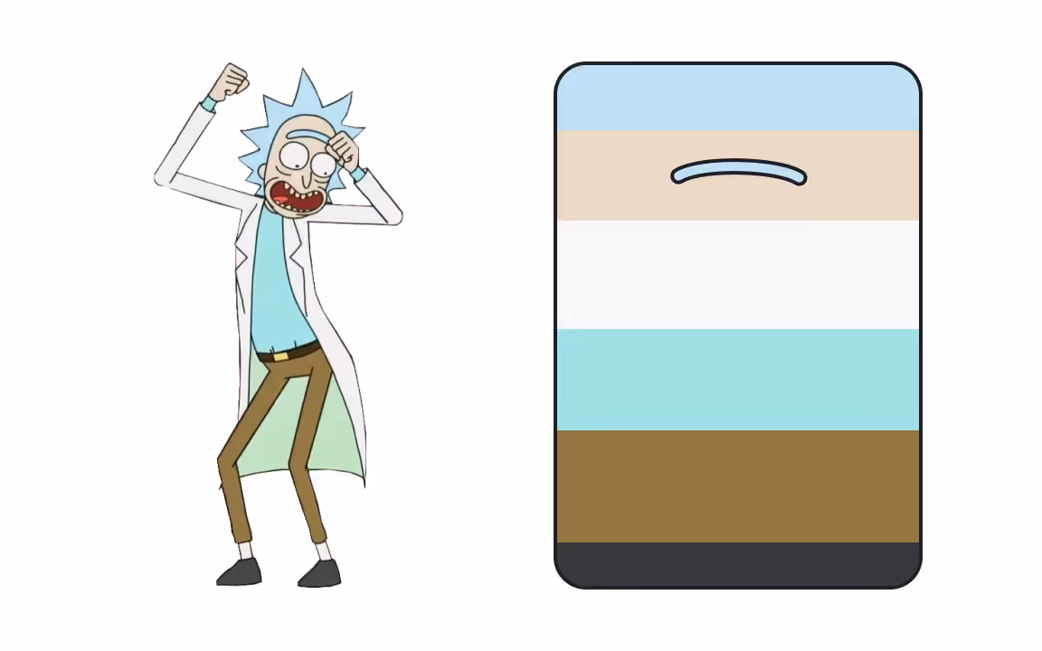
Rick Sanchez is one of the titular two main protagonists of the sci-fi adult animated comedy series Rick and Morty. The show started airing in 2013 and is still ongoing as of 2021.
The series follows the misadventures of Rick and his grandson Morty, who split their time between domestic life and interdimensional adventures. It's always easy to know where the heroes are as fantastic surroundings have bright saturated colors. The scenes in the real world use more pale and unsaturated colors to communicate that the real world isn't that exciting.
Rick's color palette consists of blue pastels and neutral brown, grey, and white. His look was inspired by Doc Brown from Back to the Future and Reed Richards from Marvel Comics. Although this isn't stated in the series, fans speculate that Rick's grey skin is most likely from alcoholism.
The neutral and pale colors of Rick's palette function as a foil to his bright and sometimes crazy personality.
How to select the right colors for your characters?
When defining the primary colors for a character, it's important to consider several key factors to make them memorable:
- Align with personality: Choose colors that reflect the character's personality. For instance, a bold, adventurous character might be best represented by vibrant colors like red or orange, while a calm, wise character could be associated with cooler tones like blue or green.
- Create contrast: Use contrasting colors to make the character visually striking. A character with a strong color contrast in their design will stand out more easily and be more memorable.
- Consider cultural meanings: Be mindful of the cultural associations of colors. Different cultures may interpret colors in various ways, so choose colors that resonate with the intended audience.
- Keep it simple: Limit the color palette to a few key colors. Too many colors can make a character’s design feel cluttered and harder to remember. A simple, well-chosen palette is often more effective.
- Think about the environment: Consider how the character’s colors will interact with their surroundings. A character’s primary colors should stand out against the typical backgrounds they’ll be placed in, ensuring they remain the focal point.
By carefully selecting colors, creators ensure that characters not only stand out but also leave a lasting impression. The right colors can make a character instantly recognizable and easy to connect with, turning them into icons that stick with viewers long after the show ends. Whether it’s through bold contrasts, simple palettes, or thoughtful cultural considerations, these choices are what make characters not just memorable but truly unforgettable. So, when it comes to creating cartoon characters, color isn’t just about looking good — it’s about making sure those characters leave a mark, sparking a connection that keeps them alive in our imaginations for years to come.