Design is always a team sport. Even when you have talented individual designers in your organization, they can achieve good results only when they work together as a team. One of the goals that team management should have is to improve the team's skills — measurable through our UX UI design certification expertise — so that all team members can contribute to product success. If you're the one who is working with the design leadership in your company, then this article is for you. Read how to understand and manage top core design skills. Uxcel for Teams skill management brings the same approach to design leaders running entire groups.
Design foundation

User experience is a broad field that incorporates many different disciplines. Yet it's possible to identify two pillars of UX design. The foundational elements of user experience design are information architecture, a discipline that defines the principles of organization information in a clear and logical way, and interaction design, a field that explores how people interact with digital products.
Regarding information architecture design, there are a few tools that product creators must master—site mapping, card sorting, and tree testing. Those tools will help label the content items available in a product, create a navigation scheme, and validate this scheme with the target audience.
Explore the main pillars of information architecture and its most common types by taking the Information Architecture lesson and improve your content strategy skills.
Interaction design is a broad discipline per se, but it's possible to identify its major cornerstones. First and foremost, it's vital to learn the best practices for using functional UI controls such as buttons, checkboxes, toggles, dropdown lists, etc. After that, it's vital to dive into design heuristics to understand how to design good interfaces.
When all team members have good knowledge of information architecture and interaction design, they can use the knowledge to evaluate the navigation structure of a product or individual design decisions, such as the selection of an interactive component in a particular scenario. The great thing is that team members can apply this knowledge during the ideation session when team members join together to discuss the solution. It will help identify potential problems in the solution early on in the design process and, thus, save time and money.
If you want to start a career in design or brush their design knowledge and seek a structured approach to learning design, Uxcel's Design Foundations course is a good starting point.
Visual design

Designers should have the ability to create aesthetically pleasing and usable interfaces. Solid visual design skills help product creators communicate solutions to users or stakeholders, and they come in handy during the design handoff, a procedure of sharing UI design with developers. Visual design encompasses many different elements—color schemes, typography, iconography, illustrations, and layouts. Those elements work together seamlessly and establish a visual language that product creators use to communicate with the target audience. Good visual design skills will help team members be on the same page when they discuss a design solution. When everyone on a team understands the color theory, it will be much easier to agree on specific design decisions, such as color selection.
It's nearly impossible to talk about visual design and not mention design systems. The design system should enable the team to reuse components and visual styles when they create layouts. Everyone on a product team should understand how to create and support a design system. When team members are familiar with atomic design principles, they strive to add new components/styles in a way that allows for creating a consistent system.
So, how can you improve UX team's visual design skills? The first step is to learn the principles and best practices for visual design. The second step is to take assessments to understand the gaps in your knowledge so you can improve your skills.
UX patterns

Design patterns are repeatable solutions to commonly occurring problems. No matter what kind of product a team designs, it's possible to reuse existing patterns to create a more user-friendly product. Since patterns are unified among the types of products and users are familiar with them, patterns help to create more usable products for people.
Swipe to refresh is a perfect example of design patterns that product creators use when they design content refresh for a list or scrolling feed in a mobile app. It's one of the universal design patterns for mobile apps, and most users know how to use it.
It's vital not only to learn the common design patterns but also to understand the contexts in which they can be used. Patterns that work for desktops might not necessarily work for mobile users. One typical example is a tooltip that becomes visible on mouse hover. There is no such thing as a hover-over element on mobile because fingers can't cover, so it's impossible to use this pattern. That's why when designing for a particular medium, it's essential to understand the specifics of this medium.
Learn the nature of common design patterns and how best to implement them in the Common Design Patterns course by Uxcel.
Mobile design

There are 6.64 billion smartphone users in 2022, more than 80% of the world's population. It's no longer a question of whether you should design for mobile or not but rather how you should do it. No matter what product you design, whether a mobile app or website, it should be optimized for mobile usage. If you create a website, you must ensure that your web design is responsive. The website should look equally good on the smartphone's small screen and the large screen of a TV.
What does creating a genuinely responsive design mean? It means that designers should be aware of the standard breakpoints for the major mediums (mobile, tablet, desktop) and techniques that allow optimizing content for the browsing experience (resizing or reflowing the content to match the viewport dimensions).
Context of use is another vital aspect of the mobile experience. People can use mobile on the go, and this behavior impacts product design decisions. When team members understand the nature of mobile design, they strive to make the content digestible, optimize the product experience for short user sessions and ensure that users can quickly reengage with the app/website.
Explore design patterns for mobile design, the basics of mobile platforms, mobile accessibility, and the nuances of iOS and Android operating systems in the Mobile Design course.
UX writing

Along with the product's functionality, content is another reason why people start using products. Is it possible to design user interfaces with content placeholders? Yes, but this design will likely require a rework once the team receives actual content. UX writing is a vital skill for designers because it allows them to write a realistic copy and use it in user interfaces instead of Lorem Ipsum.
There are two types of copy: macrocopy (larger blocks of text such as text in the hero section of the landing page) and microcopy (small bytes of text such as form and button labels and error messages). Product designers should master both writing macrocopy and microcopy. When writing copy, it's essential to consider the brand voice, the distinct personality that a brand wants to communicate to its customers.
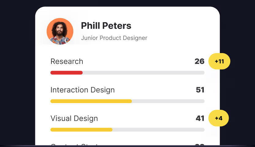
Evaluating the level of UX writing is easy if you have an existing product — and a quick look at what's a skill graph can show whether the team has the underlying breadth to fix it. Simply check the copy in a product, and if you notice that in some areas of your product, you have text that sounds too robotic (i.e., the system shows an error message like "error code XXX" instead of "we cannot complete a transaction because of network error") it will be a clear indication that there is a room for improving the UX writing skills.
Not everyone should be a UX writer, but a good understanding of UX writing will give team members a huge advantage. Every time team members scan the layout, they read and evaluate the micro and macro copy, increasing the chances of creating a user-focused product.
Uxcel's UX Writing course will teach you how to write copy that helps users navigate digital products and services intuitively.
Accessibility

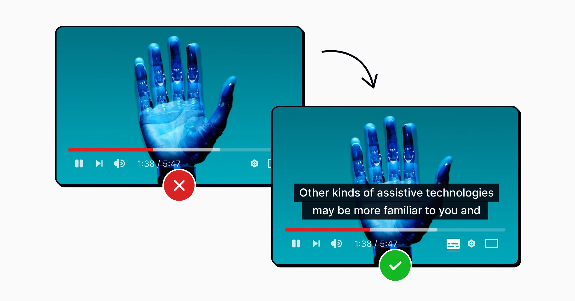
Good design is an inclusive design, a design accessible to all groups of users, including users with disabilities. Ignoring users' needs with vision, hearing, or moving problems is a critical mistake many designers make when crafting new products. Most of the time, designers do it unintentionally; they simply don't think about these groups of users. It's true that to make design accessible, a team has to invest more time in finding proper color combinations, font sizes, and interaction patterns — among the many ways to improve UX skills systematically. But if the team achieves this goal, it will be rewarded with a design that will be better for everyone.
Introducing proper color contrast, adding support for keyboard navigation, and adding screen reader labels—are just a few things designers can do to make the user interface more accessible. Web Content Accessibility Guidelines (WCAG) provide in-depth information about creating accessible user interfaces, and it is vital to check the guides before making the products. Once the design is ready, the team can use manual or automated tools to evaluate the compliance of a design with accessibility guidelines.
In the Accessibility course, you'll gain practical tips on how to improve your designs, meet accessibility criteria, and make your product available to all users.
UX research

UX research helps the product team to take the guesswork out of the design process — one of the latter milestones in any UX UI designer skill mastery arc. When product designers discuss a design, instead of saying "I think," they say "I know" and refer to qualitative or quantitative research data. It's vital to invest in UX research early on in the design process because it will create a foundation for the future product. The more a team invests in UX research, the better they will understand the target audience and the market niche they're working at.
The ultimate goal of UX research is to find the sweet spot between user needs and business objectives and create a product that will both be valuable for users and commercially successful. That's why UX research typically includes identifying the target audience and learning about their needs, as well as conducting market research (conducting competitive research & analysis to understand how the product will perform on the market).
The best way to understand what users need is to talk to them; that's why user interviews are one of the most critical UX research tools. Mastering user interviews will require improving soft skills. A good interviewer not only asks the right questions but also creates the proper atmosphere that makes it more comfortable for the interviewee to answer them.
UX research is the essence of any successful product nowadays. In the UX Research course, you'll get familiar with the methodology and deliverables and learn how to discover what users want and need and how to use those insights to improve the design process for products, services, or software.
Conclusion
A team's design skills create a foundation for your future product. The more skills team members have, the better (and faster) they can make a user-friendly product — a foundation strengthened through our design leadership skills course.
Improving UX design skills should be one of the most critical tasks for team managers.


