

.svg)


We interact with typefaces and fonts on a near-continuous basis — you’re interacting with both right now. Type design is a form of art, requiring creativity and artistic skill to craft unique and visually appealing typefaces. Understanding the terminology around typography is an important part of communicating about UX design and is crucial for effective visual design. Type design plays a foundational role in shaping visual design across digital and print media.
What are Typefaces & fonts
It’s useful to have a thorough understanding of how each of these concepts works in relation to UX design. Choosing the right typefaces and fonts can have a huge impact on readability and emotional impact, as these choices directly influence user perception and the overall design experience, so wrong choices can have a detrimental effect on user experience.
What's the different between typefaces and fonts?
It’s easy to confuse typefaces and fonts, or to think of them as the same thing—they’re sometimes used interchangeably, after all. But while the terms are related, they’re two different things. If you want to master typography and create designs that are both readable and aesthetic — explore an interactive Typography course at Uxcel.
Typefaces are like the parent, while fonts are like the children. Or think of them like your wardrobe. A typeface would be a type of clothing, like dresses, pants, or shirts. A font, on the other hand, would be something like a little black dress or a pair of cargo pants.
When we talk about Helvetica or Times New Roman, we’re talking about typefaces. When we’re talking about fonts, though, we’re talking about things like 12 pt. Helvetica or 14 pt. Times New Roman Bold—the font is a specific weight, style, and/or size of the typeface. Typefaces are often organized into collections or font families, which include multiple styles, weights, and variations. This allows designers to choose from a range of options within a single collection to maintain consistency and flexibility in their projects.
Typeface varieties
Understanding the varieties of typefaces available, the moods they can create, and what they’re each suitable for is key to using type effectively to create exceptional user experiences. Depending on who you ask, there are anywhere from five to eight (or more) different varieties of typefaces. It all depends on how you break them down.
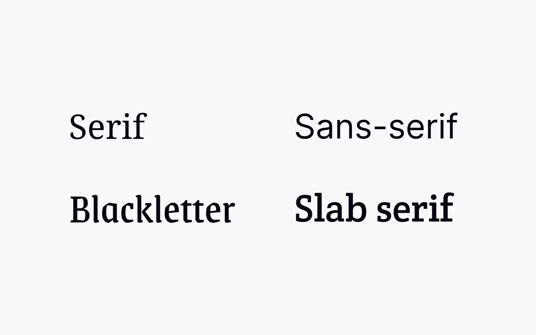
Serif typefaces include slight decorative strokes (called serifs) at the end of letters. They’re one of the oldest types of fonts, dating back to the 1470s and Nicolas Jenson’s Roman Type. Serif fonts have a rich historical development and are categorized into subcategories such as old style, transitional, and modern serif fonts. Old style serif fonts are influenced by early Italian lettering design, featuring moderate contrast and bracketed serifs, while transitional serif fonts, like Baskerville, bridge the gap between old style and modern, with stronger contrast and more refined shapes. Common examples of serif fonts include Times New Roman (transitional), Garamond (old style), and Bodoni (modern).
Serifs are very traditional and were originally popularized by early print magazines. Because of their rich history and long-standing usage, they can give users a feeling of class, romance, and sophistication. They’re excellent for a product or brand that wants to create a trustworthy, reliable, and even formal image.
Blackletter and Gothic typefaces have their origins in medieval manuscripts and are characterized by dense, angular, and geometric letterforms. Blackletter, sometimes called Gothic, was widely used in Europe from the 12th to the 17th centuries and is still seen today in contexts like beer labels, music ephemera, and certificates to evoke a sense of tradition or formality. Examples include Fraktur and Textura.
Sans-serif typefaces are, quite literally, “without serifs”—they do not include decorative strokes at the ends of the letters. While they come across as quite modern, the first sans-serif typeface was Caslon Egyptian, designed in 1816 by William Caslon IV. They became popular in print advertising and are often thought to be more readable on-screen than serif typefaces, though that is widely debated. Common examples of sans-serif typefaces include Helvetica, Arial, and Futura.
Sans-serif typefaces are sometimes thought of as having less personality than other typeface varieties, though that’s largely dependent on the context in which they’re used and the specific typeface in question.
Slab serif typefaces shook up the entire typography world when they were released in the 19th century with their robust look—they are bold, thick, and may have either rounded or angular serifs. They were often used in early newspaper advertisements, as their blocky shapes were more eye-catching than more traditional serif and sans-serif typefaces. Examples of slab serif fonts include Rockwell and Clarendon.
The downside to slab serifs is that they can be challenging to pair with other typefaces due to their massive, block-like shapes, which can overpower other typefaces. They’re also generally best-suited to shorter pieces of text, such as headlines or titles.
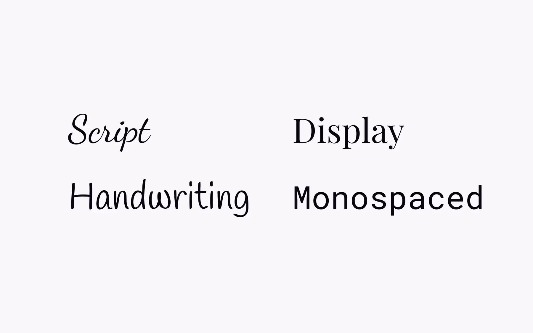
Script typefaces are most commonly seen in things like logos (think of the Coca-Cola logo for an example). Script typefaces get their origins from handwriting and calligraphy. Many script and handwriting typefaces are drawn or inspired by hand lettering, giving them a handcrafted, artistic, and illustrative quality. Lettering in this style is often used for logos, signage, and decorative projects to evoke originality and artistry.
Script typefaces vary widely and can evoke anything from a very feminine, laid-back feeling to a very formal feeling. They’re suitable for headlines, titles, and logos, but don’t work well in large blocks of text or at small sizes, where they can be very difficult to read. Common examples of script typefaces include Brush Script and Pacifico.
Similar to script typefaces, handwriting typefaces mimic a person’s handwriting. They’re generally very casual typefaces and should be used only for creative flair. Handwriting typefaces are perfectly suited to represent a person’s signature (such as signing off on an email newsletter) or for short headlines.
Display typefaces are a motley crew and anything but modest. There are display typefaces for virtually any occasion or type of design since they draw inspiration from a range of typefaces and font styles. They first appeared during the Industrial Revolution and were originally used most often in posters and commercial printing. In modern UX design, you’ll commonly see them in headlines and titles. Display typefaces are specifically designed for use at large sizes to create emphasis and visual impact, often featuring tighter spacing and dramatic details. They’re not suitable for use for body copy, as they can be hard to read at small sizes. Examples of display typefaces include Impact and Cooper Black.
Letters in monospaced typefaces each occupy the same amount of horizontal space—think of typewriters or MS-DOS, or typefaces like Courier New. This contrasts with other kinds of typefaces, where each letter has its own proportional spacing, based on the actual width of the character. Many monospaced font families offer variations with different widths, such as condensed or extended versions, to suit various design needs.
Monospaced typefaces are easier to scan than proportional typefaces, and are often used for things like code because they can make it easier to spot mistakes. But overall, they have lower readability than proportional typefaces. Common examples of monospaced typefaces include Courier, Consolas, and Source Code Pro.
One variety of typeface you won’t see used for actual text is the dingbat. Think of dingbats as the original emojis. You might have even used them as a kid as a sort of “code” language, where all you had to do to decipher the code was change the typeface.
Dingbat typefaces consist of pictograms and non-alphabetic symbols and are sometimes referred to as typographic ornaments. While they aren’t used for readable text content, they do have functional typographic uses, such as for bullet points, borders, checkboxes, or just as decorative elements. Common examples include Wingdings and Webdings.
Throughout history, the development of typefaces has been influenced by calligraphy, engraving techniques, and the tools used by designers, resulting in the wide variety of styles we see today. In addition to Latin-based typefaces, global varieties such as Japanese typefaces—including Mincho, Goth, and Maru styles—offer unique characteristics and design traditions, further expanding the typographic landscape.
Typeface styles
Choosing the specific kind of typeface to use is important, but the style used for that typeface can have a huge impact on how that typeface is perceived. It can also affect readability and either help or hinder the user experience.
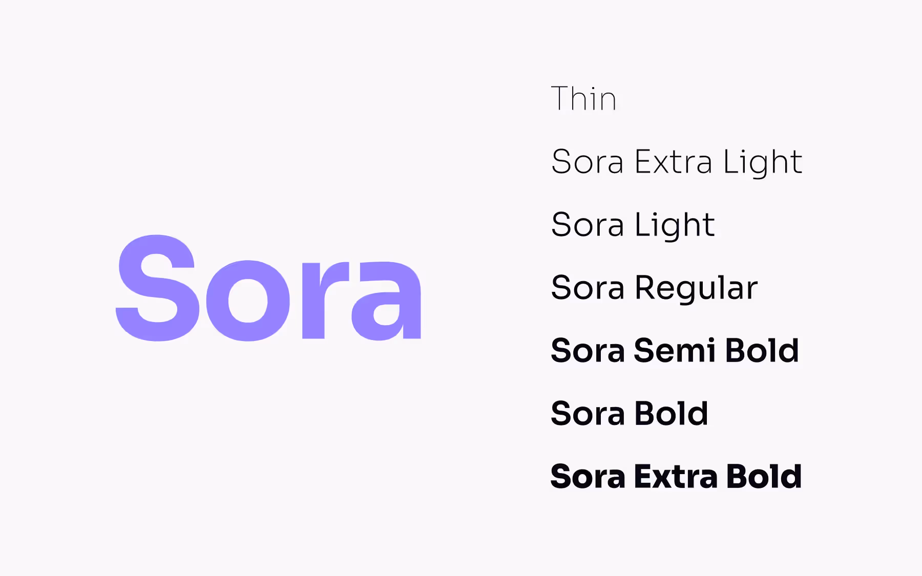
Discussing weight might be a sensitive conversation when it comes to people, but with typefaces, it’s an important consideration. Fonts range from thin (also called hairline or light) to black (heavy), with a lot of weights in between. In CSS, font weights are set anywhere between 100 (thin) and 900 (black). The most commonly seen weights, though, are bold and regular.
Regular is the most emotionally neutral font and is generally the default for most typefaces. Like in the story of Goldilocks, regular fonts are not too thick or too thin. These fonts are suitable for large text passages that require a lot of reading. They can work for things like headlines but aren’t seen as commonly there.
Some typefaces are designed to use only capitals (uppercase letterforms), such as those inspired by Roman inscriptions like Trajan. These all-capitals fonts are typically used in display or formal settings, especially where a historical or engraved style is desired.
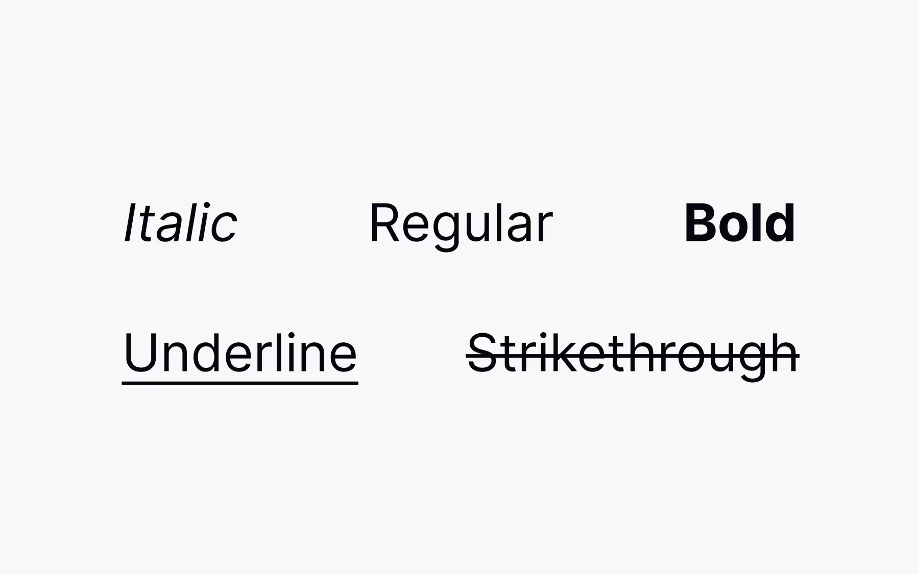
After regular, bold is the most commonly seen font weight. They stand out from surrounding text with darker and thicker strokes. Because of this ability to stand out, they’re excellent for adding emphasis where you want to grab the user’s attention or in headlines. Use discretion when using bold fonts for emphasis; if you try to draw attention to everything, you end up drawing attention to nothing.
Bold isn’t the only way to emphasize text. Italic fonts can be used similarly, though they tend to be more subtle. Still, like bold fonts, they should be used sparingly for emphasis—only a few words or sentences.
So what are italics? Italic fonts (also sometimes referred to as oblique fonts) are slanting or script-like. Besides emphasis, they’re commonly used for titles of things like movies, books, or plays.
What happens when a browser can’t load the bold or italic font you’ve used for emphasis? In that case, if the browser can’t load a chosen font style, it may try to fake the style by inserting what is called a faux style.
With faux style, characters are stretched or slanted to mimic bold and italic fonts. In most cases, though, this can dramatically undermine the readability of the text and hurt the design’s aesthetics. If you’re going to use bold or italic fonts in a design, be sure to pick typefaces that have those styles available natively, so-called true style fonts.
True style fonts have native bold and italic versions of a typeface (and may contain additional weights). If using web fonts, be sure that the various weights are all included in the CSS; otherwise, the browser may still substitute faux style fonts.
Underlined text is most commonly associated with links on the Internet. Because of this, its use for emphasis has fallen out of favor, as it can be confusing and frustrating for users who attempt to click on what they think is a link only to have nothing happen. For that reason, it’s best to stick with bold or italic fonts for emphasis.
If you’ve ever gotten a test back from a teacher with your answers crossed out in bright red, you’re already familiar with strikethrough. This type of text style is generally not used for text meant to be read, but can commonly be found in a couple of instances.
The first is on marketing pages, which often employ this technique to bring emphasis to discounts or promotions (by crossing out the “full” price, or by crossing out a word to replace it with a better one). The second instance is when a correction has been made to text, and rather than deleting the incorrect information, authors will use strikethrough so that it remains visible, for transparency’s sake.
Special types of characters
We don’t often think about all the types of typographic characters that make up words and sentences, but there are important typographical terms you’ll need to learn here to properly discuss UX typography. While you might not already know all of the terms, you’re likely familiar with the concepts.
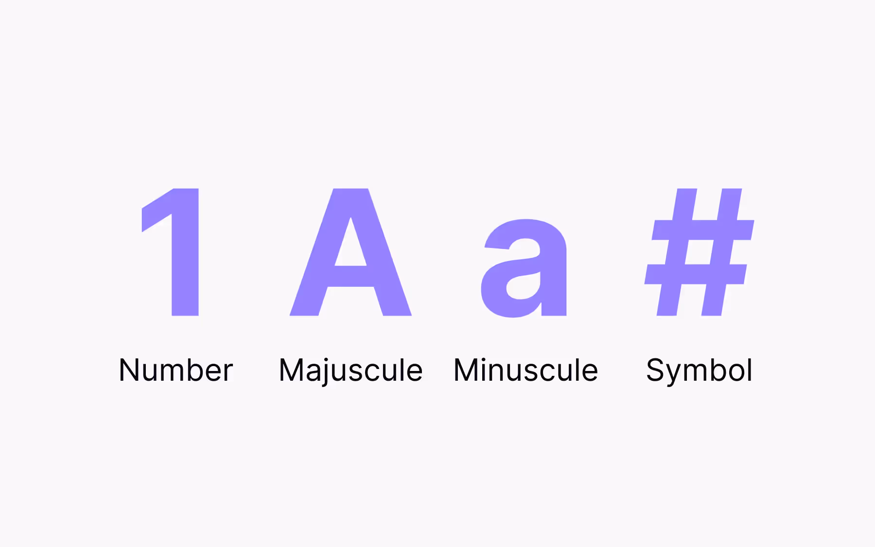
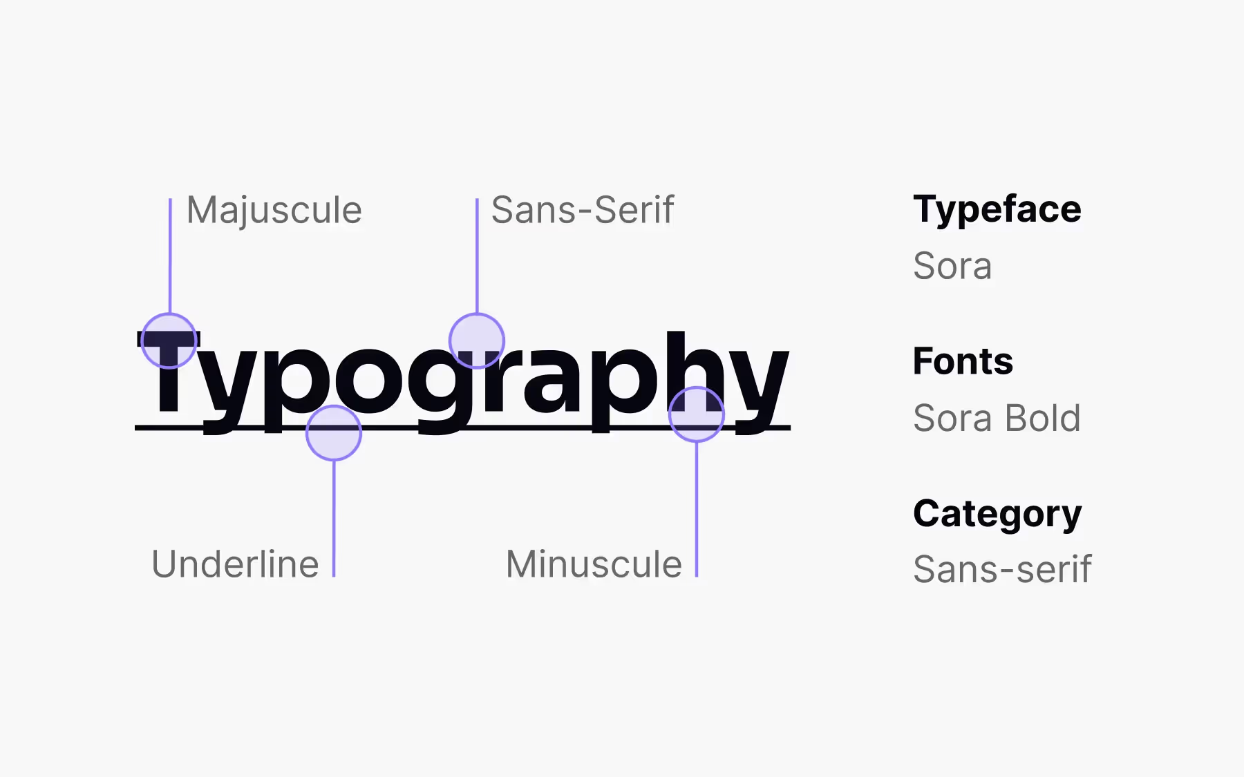
You might not be familiar with the term majuscule, but all it refers to is uppercase or capitalized type. It’s primarily used in capitalizing the first word of a sentence, for proper nouns, and sometimes on headlines or labels. Majuscule type can be hard to read in large blocks (and can come across as screaming at readers), so use it sparingly in body copy outside of standard grammatical rules.
The opposite of majuscule is minuscule, also known as lowercase or non-capital letters. This makes up most of the text you’ll find in digital interfaces. It’s far more legible than majuscule type and creates less eye strain thanks to its diverse shapes and contours. While majuscule type makes sight-reading almost impossible (slowing down readers), minuscule type supports it and makes reading faster and easier.
We’re all familiar with the term number, but what does that actually mean? Numbers are a value expressed by a word (such as “one”) or symbol (like “1”). In UX, they’re used for everything from scheduling dates to specifying delivery addresses. Date-related information is often formatted in typefaces using tabular or lining figures to ensure clarity and consistency. They’re also used in pricing and adding new contacts, among other uses. In typography, numbers are also referred to as figures or numerals.
If you’re working with numbers in tables or charts, you may want to look for a typeface that includes a tabular figure style. Tabular figures are monospaced versions of numbers, colons, and commas that make it easier to align text for comparison. Otherwise, numbers of similar values (such as 1,000,000 and 1,111,111) take up dramatically different amounts of space, making them hard to scan and compare.
In regular text applications, however, proportional figures are more useful (and are most often seen). In proportional figures, each number, colon, and comma’s width is dependent on their actual size. They look better in places like body copy but are less useful in tables.
Symbols are another special character style that we touched on in discussing dingbat typefaces. Symbols are non-alphabetical characters that are commonly seen throughout product design. We use symbols in all aspects of UX design, from the @ (at) symbol in email addresses to the * (asterisk) when using a wildcard in a search query to the # (number or hashtag) used in social media tags, among other places.
Finally, we come to ligatures. Ligatures are two or more letters that are combined in a single character. They were significantly more common in printed matter in the early days of the printing press, but are still used today in a variety of instances. The development of letterforms and ligatures is closely tied to the history of writing and the tools used to create them.
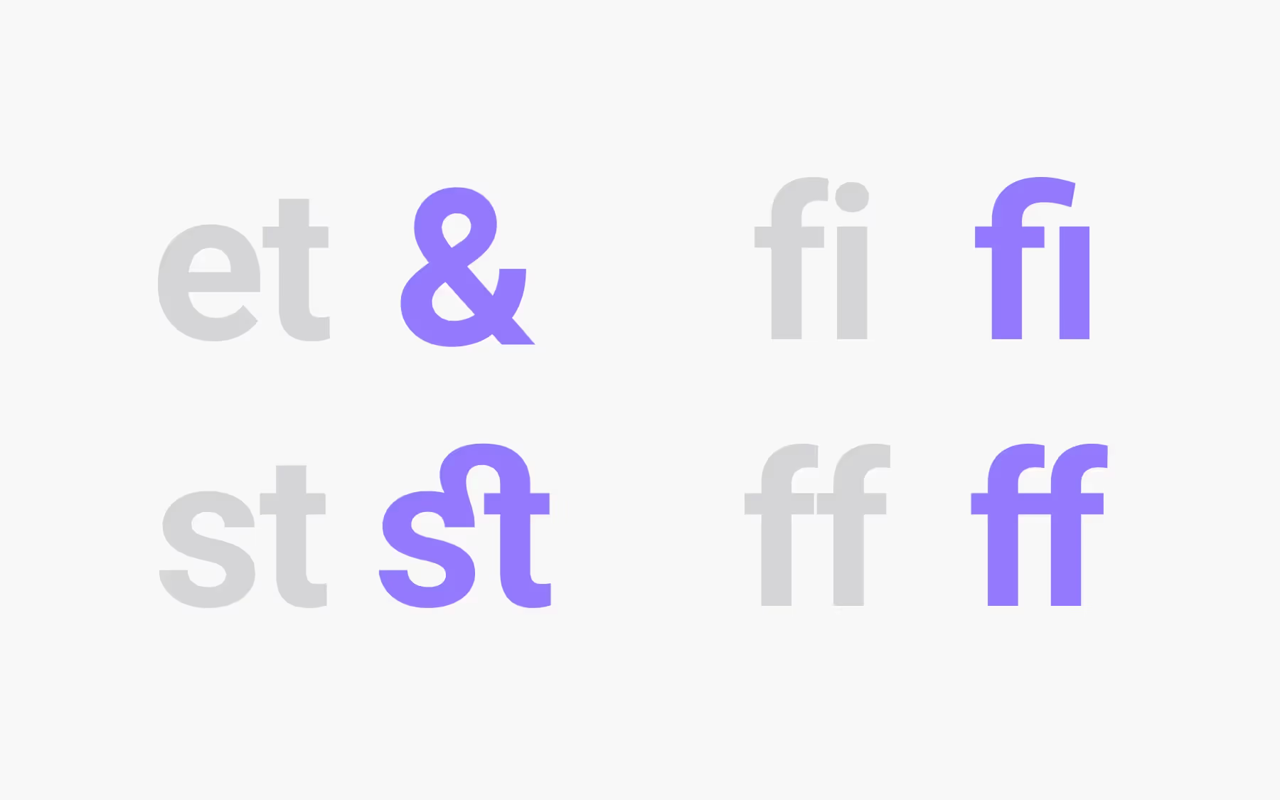
The most famous of these—and one you may not even realize is a ligature—is the ampersand (&), which is a combination of the letters “e” and “t”. In Latin, “et” is the word for “and,” which is what the ampersand stands for. Other ligatures can be used to create entirely new sounds, such as when “a” and “e” are combined to form “æ.” You may have also seen ligatures in logotypes, such as the one for CNN (where the “N”s are combined).
Put your Typography skills to test and benchmark yourself with the design community with our free interactive Typography Skill test at Uxcel.
Choosing the Right Typefaces
Selecting the right typefaces is a foundational step in shaping the personality and effectiveness of any website, application, or printed material. A typeface, or font family, is more than just a set of letters—it’s a visual language that communicates mood, professionalism, and brand identity. Most typefaces come with a range of variations, including different font sizes, weights, and styles, allowing designers to tailor their typography to fit the needs of their project.
When choosing a typeface, consider the intent and audience of your design. For example, sans serif typefaces like Helvetica are renowned for their clean, modern appearance, making them a popular choice for corporate branding, digital interfaces, and signage where clarity and simplicity are key. On the other hand, serif typefaces such as Times New Roman evoke a sense of tradition and reliability, often used in formal documents, books, and print media to convey professionalism.
Designers should also think about the medium—whether the typeface will be used for display on screens, in print, or across both. Most typefaces offer a variety of weights and styles, enabling flexibility in visual hierarchy and emphasis. For instance, a single font family might include light, regular, bold, and italic versions, each suited to different roles within a layout. By carefully considering these factors—style, weight, font size, and the specific needs of the project—designers can ensure their typography not only looks great but also enhances readability and user experience.
Best Practices for Using Typefaces
To make the most of your typography, it’s important to follow best practices that ensure both visual appeal and functional clarity. Start by choosing typefaces that offer a wide range of variations and distinct characters, as this flexibility allows you to create a cohesive yet dynamic design. Many sans serif typefaces and serif typefaces come in multiple weights and styles, making them ideal for building a consistent visual hierarchy.
When designing for a global audience, select typefaces that support multiple languages and scripts. This ensures your content remains accessible and visually consistent, no matter where your users are located. Pay close attention to the similarities between characters, especially in sans serif typefaces, to avoid confusion between letters like “I” (uppercase i), “l” (lowercase L), and “1” (one).
Decorative typefaces and display typefaces can add personality and flair to your design, but they work best when used sparingly—typically for headlines, logos, or special callouts. Pair these with neutral serif or sans serif typefaces for body text to maintain readability and balance. Mixing font weights within the same typeface family is another effective way to create contrast and guide the reader’s attention without overwhelming the layout.
Assign clear roles to each typeface or style you use. For example, you might use a bold sans serif for headings, a regular serif for body copy, and a decorative script typeface for accent elements. A well-chosen combination, such as pairing the playful script Lobster with the versatile sans serif Roboto, can infuse your design with both style and clarity. By following these best practices, you’ll create typography that is both visually engaging and easy to read.
Common Mistakes to Avoid
Even experienced designers can fall into common traps when working with typefaces. One of the most frequent mistakes is using too many typefaces in a single design, which can result in a cluttered and inconsistent appearance. Sticking to one or two complementary typefaces—such as a sans serif for headings and a serif for body text—helps maintain a cohesive style and reinforces brand trust.
Another pitfall is overlooking legibility, especially at small sizes. Some sans serifs and modern typefaces feature minimalistic letterforms and thin horizontal strokes, which can make it difficult to distinguish between similar characters. This is particularly problematic when displaying alphanumerical data or working with languages that require clear differentiation between letters.
Failing to test how your chosen typefaces render across different languages and layouts can also lead to unexpected issues, such as awkward line breaks or inconsistent spacing. For example, while the geometric sans serif Futura offers a sleek, modern look that’s perfect for branding and advertising, its uniform shapes and squarish forms may hinder readability in body copy or at small sizes.
To avoid these mistakes, always review your typography choices in context—across various devices, font sizes, and languages. Prioritize legibility and consistency, and remember that effective typography is about more than just style; it’s about clear communication and a seamless user experience.
Conclusion
Understanding these typographical concepts is an important building block in your UX design education. The foundation for this is understanding the terminology commonly used in typography.
Knowing the difference between things like majuscule and minuscule, what a ligature is, when to use tabular vs proportional figures, and the effects different typographic styles can have on readability are essential for creating typography that delights users and is pleasant to interact with.