
Spatial computing presents a dramatic shift in how we engage with digital content. Unlike traditional computing that limits interactions to a two-dimensional screen, spatial computing lets users operate within the three-dimensional space that surrounds them. This creates an immersive experience where digital and physical environments interact seamlessly.
The Apple Vision Pro exemplifies this technological leap. This advanced spatial computer blends the boundaries between digital and physical spaces, allowing users to interact with their digital environment as naturally as they would with the physical world. This lesson will delve deeper into this exciting new design discipline, using Apple Vision Pro as a tangible example of spatial design.
The principle of familiarity
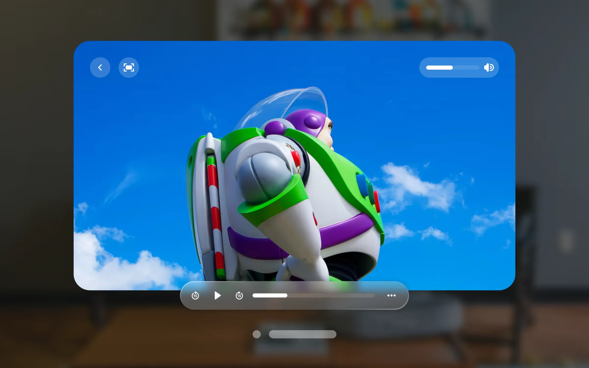
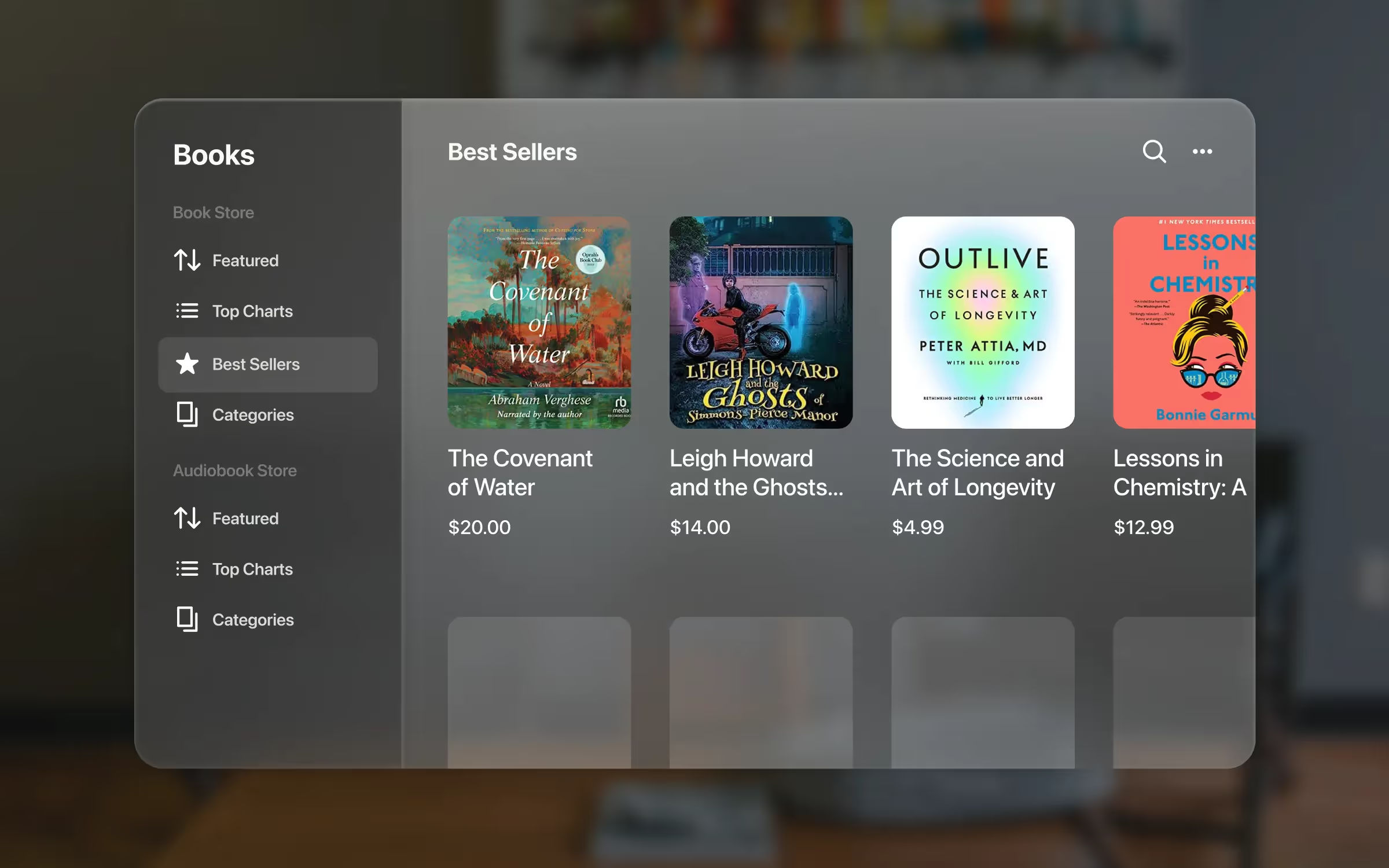
In spatial design, keeping things familiar is crucial. Designers achieve this by incorporating recognizable elements from 2D interfaces, like sidebars, tabs, and search fields, into the 3D space.
These elements now exist in a whole new dimension, adding depth to the digital world and making it more immersive. It's not just about looks; it's about making users feel at ease in this new 3D environment.
To maintain familiarity, designers should think about the 2D interfaces we all use and incorporate similar elements into their 3D designs. The functions should stay consistent too. For example, if clicking a tab in 2D reveals related content, using a gesture in 3D should do the same thing—showing relevant information. This seamless connection between 2D and 3D ensures a smooth and enjoyable user experience.
Windows as a new visual language
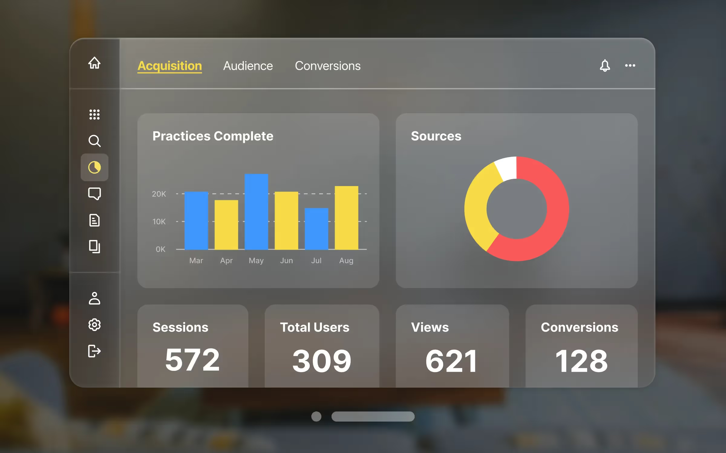
Windows play a fascinating role in spatial design, forming a unique visual language. They mimic real glass, bringing a cool contrast to the surroundings and making users more aware of their environment, adapting to different lighting conditions.
In this new spatial setting, users won't feel lost because they're already familiar with windows from 2D design. They can easily move, close, and resize windows, placing them wherever they like. Plus, the windows automatically adjust to face users, making everything readable and accessible.
The best part of spatial design is the ample space it offers. So, if your design needs a larger canvas, go ahead and create it! Multiple windows are also possible, perfect for side-by-side content display or showing separate actions happening simultaneously.
For instance, imagine a data visualization app with intricate charts needing more space while keeping control buttons compact. With multiple windows, you have the flexibility to present content in a way that suits your design. It's all about making your spatial app comfortable, user-friendly, and efficient.
Points
When creating apps for a spatial environment, like with Apple's Vision Pro, designers aim to ensure that everything remains easy to see and use, regardless of how close or far the window is from users. In simpler terms, the interfaces should scale well and maintain their clarity. This is where points play a crucial role.
If you have experience in other kinds of design, you're probably already familiar with points. They adjust as windows or elements move closer or farther from users, safeguarding legibility and functionality. For instance, if an object is designed to be 10 points at one meter, it will appear twice as large at half a meter, and half as large at two meters. This principle is essential in preserving a consistent visual experience within a 3D space.
Designing with points ensures that users have a seamless experience.
Think of it as zooming in or out on a photo — the entire image expands or contracts, yet it continues to look like the same image. This concept applies to designs in spatial apps, making them feel more natural and user-friendly, even in a 3D environment.
The principle of human-centered design
Another key principle of spatial design is being human-centered. The aim here is to put users in the driver's seat, making the user experience a vital part of the design itself. With devices like Vision Pro, for instance, users' eyes, hands, and movements become an integral part of the interaction with the digital world. This approach ensures a deeply personalized and immersive experience.
When crafting apps for spatial computing, it's crucial to consider how users will see and move within this digital 3D environment. It's not just about ease of use — it's about crafting an experience that feels like a natural extension of the user's world.
Consider users’ field of view

A critical aspect of human-centered design is to consider users’ field of view. With devices like Vision Pro, users encounter their digital environment within their natural visual range, which is approximately 180 degrees horizontally and 120 degrees vertically. When we place content, it's important to remember that users can see and focus best on the content that's straight ahead — approximately 30 to 60 degrees from the center of their vision. This is where you'll want to put key content and interactions.
Landscape layouts should fit in this central area comfortably, and avoid having important details too far to the sides where they can be hard to see. The scale of objects is another vital consideration. Elements should be large enough to interact with and read easily, but not so large that they overwhelm the field of view or make users move their heads excessively.
Remember, designing for spatial computing isn't just about immersion — it's also about considering what's comfortable, accessible, and practical for your users.
Place content comfortably to reach and view
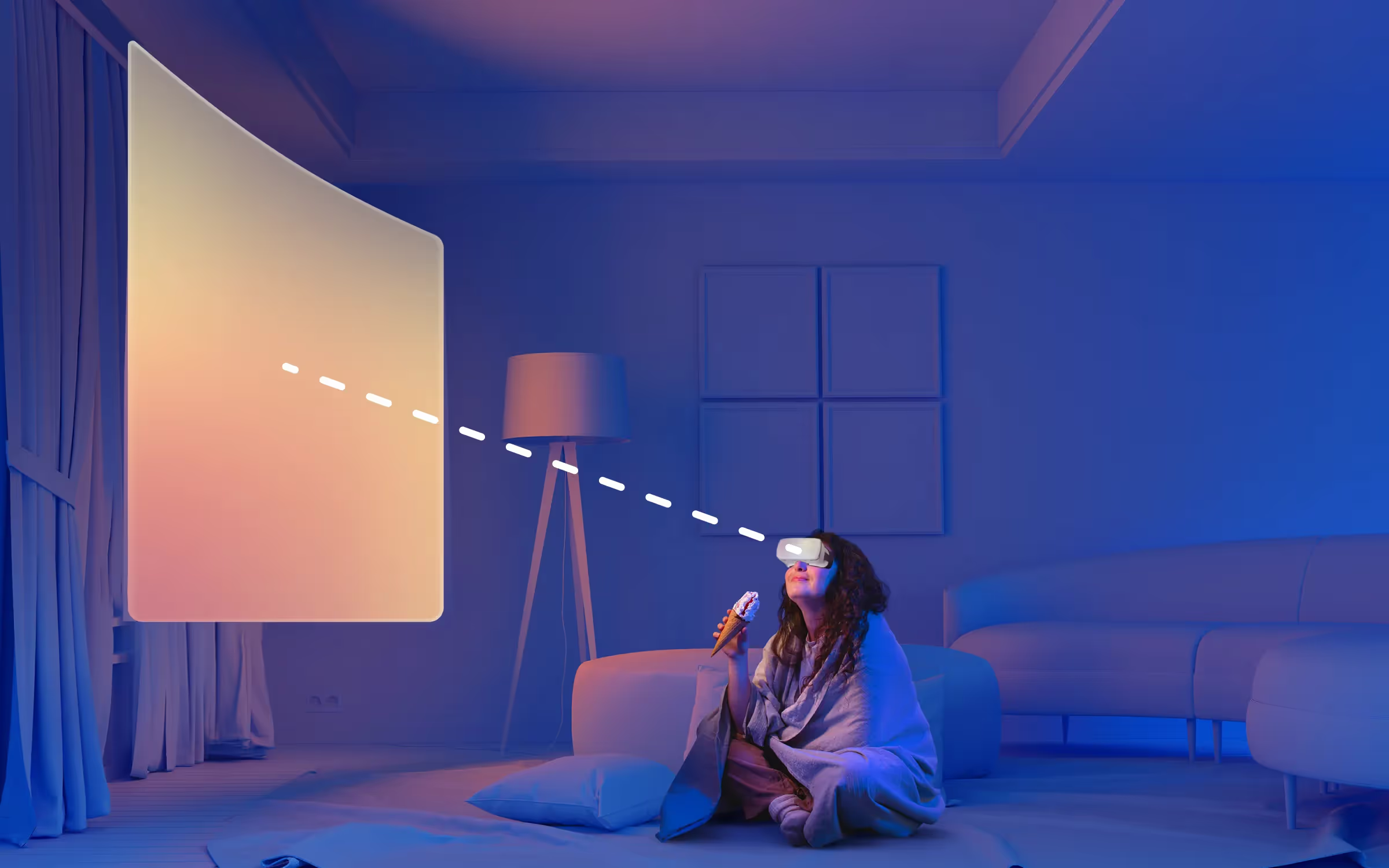
Designing for spatial computing, like with Apple's Vision Pro, demands a deep understanding of ergonomics, or how people physically interact with their environment. Why does ergonomics matter in spatial design? Simply put, the placement of your content directly affects how users react physically to your design. That's why we want to position objects comfortably in all dimensions.
- Place windows along a natural line of sight. This promotes a healthy and comfortable posture, saving users from unnecessary strain. When you place your own content, consider users’ head direction. This practice helps users see and interact with your content more naturally, whether they are tall, short, standing, or lounging on a couch.
- Remember the interaction distance. Typically, it's better to place content a bit further than arm's reach. This encourages interaction at a comfortable distance and avoids content placement behind users or at extreme heights or lows, which can cause discomfort.
- Avoid sticking content to users’ view. It may feel unnatural and disorienting. Instead, anchor content in users’ space, allowing them the freedom to look around naturally. This careful balance between comfort and an immersive experience is essential in effective spatial design.
Create stationary experiences
When designing for spatial computing like Apple's Vision Pro, it's essential to consider creating stationary experiences. This means designing apps that users can comfortably use without having to move around too much or at all. This approach ensures that everyone can enjoy your app, regardless of their physical ability or preference.
However, if users do happen to change their position or direction, they can easily recenter the digital environment by pressing and holding the Digital Crown. This simple action adjusts the content back in front of them, making it easy for users to continue using your app from a new position.
As a spatial app designer, you don't need to create a special feature to handle repositioning or resetting the scene in your app. The built-in system function takes care of this for you, making it a user-friendly and seamless experience for everyone.
Using space
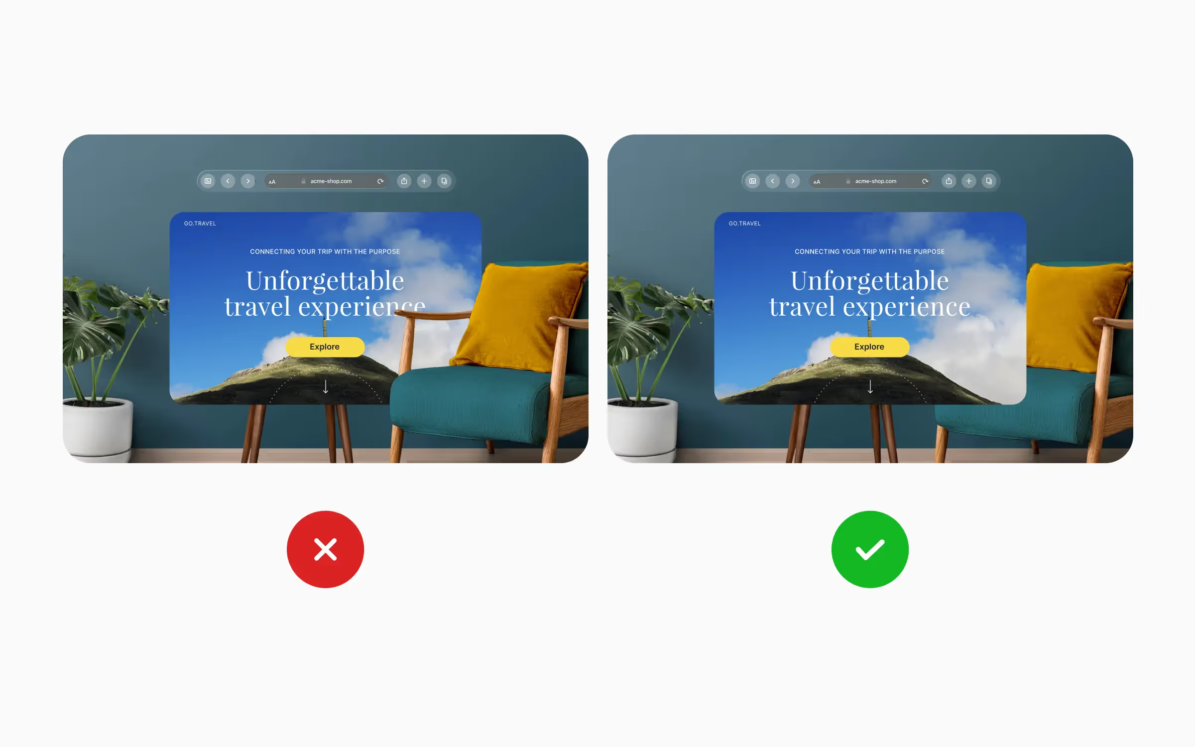
The dimensional design principle focuses on creating an amazing experience in spatial computing. By adding depth to your app, you make it feel more real and immersive, going beyond the limits of a regular screen. It's all about utilizing the space around users to make them feel like they're part of the digital world.
Consider the physical space your users might be in. It's crucial to design your app to function well in any space, from a tiny apartment to an expansive office. For example, take Apple's TV app. When users move a window, the system ensures it doesn't interfere with physical objects like a chair in the room. And when users release the window, the app becomes fully visible, enabling people to interact with it. The system handles how the windows fit into users’ space, so designers can focus on the content.
Moreover, dimming is a simple yet effective way to maximize the spatial experience. By darkening the real-world view when a video plays, it enables users to focus on the content while still being aware of their surroundings.
Adding depth
Depth plays a crucial role in spatial design. It helps organize content and guides users' focus. Similar to the real world, distant objects can appear large and intriguing, while closer items invite users to examine them up close. It's like bringing nature into the digital realm.
To enhance the sense of realism, designers use light and shadow. Objects that emit light should cast color on nearby elements, while others should create shadows to ground them in the virtual space.
However, it's essential not to overdo depth, as it can become overwhelming. Sometimes, a subtle layering of elements works better to capture users' attention. For instance, when a pop-up appears, a gentle push back can be more effective without being too distracting.
And remember, not everything requires depth. Text in 3D can be challenging to read, so it's typically kept flat for clarity and ease of use.
Adjusting scale

In spatial design, scale plays a crucial role in crafting meaningful and intuitive experiences. When objects are small, they create a sense of intimacy and ease of interaction, while larger objects evoke grandeur and awe. For example, a massive movie playing over a lake can be an impressive spectacle, completely transforming the user's experience.
Yet, scale isn't just about grandeur. Certain objects are best presented at their real-life scale. Consider a shopping app, where items are more effectively displayed at their actual size. This helps users to better evaluate and visualize the products as if they were physically present.
Experimentation is key in utilizing scale effectively. Designers should explore various scales for their content — from tiny to monumental. Observe how these changes influence user perception and interaction. This exploration can help designers find the perfect scale to make their spatial design interfaces more engaging and immersive.
Providing immersive experience
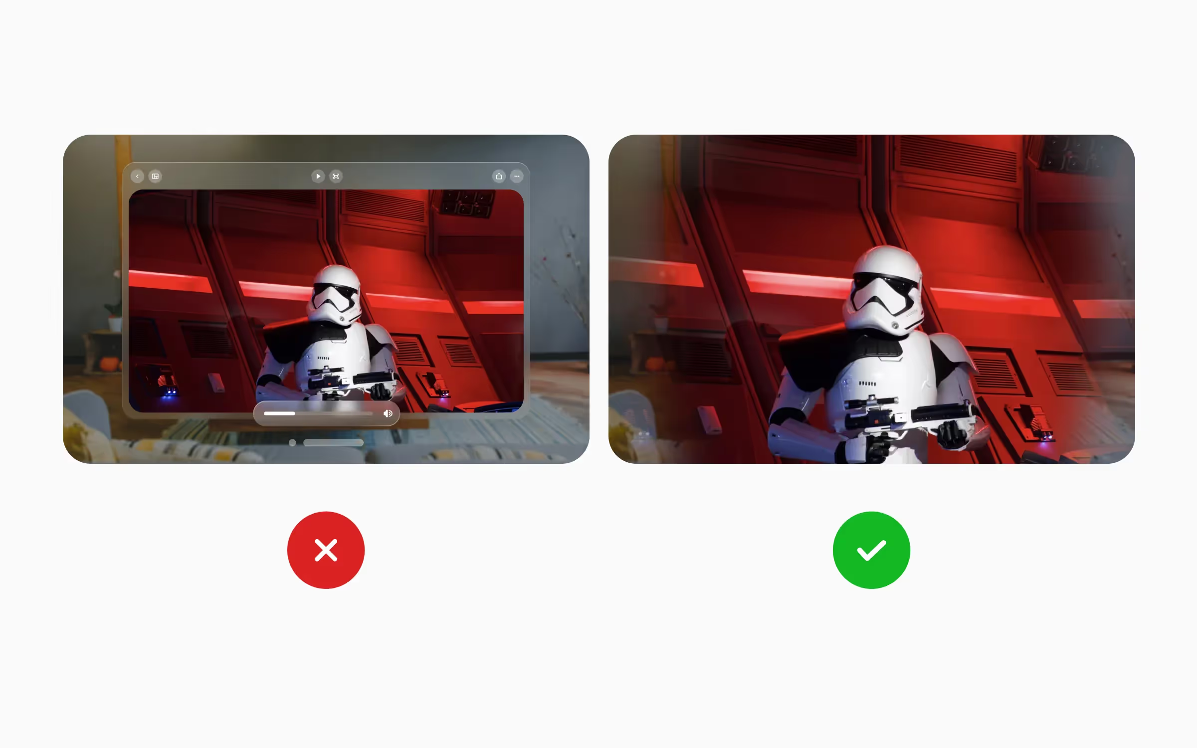
When designing apps for spatial environments, the goal is to create a world that can either blend in with the surroundings of users or totally change it, depending on the app's purpose. Take the Keynote app as an example. It starts off in a shared space with other apps, but when it's time to rehearse a presentation, it expands to a full-sized theater, taking over the whole space and giving users a truly immersive experience.
Yet, even when an app takes over the full space, it doesn't always mean a total transformation of the environment. It can still make users feel like they're in their own space, just with some added dimensions. For example, imagine a digital element that casts a shadow on a real-life table.
But the key thing to remember when designing these experiences is flexibility. Every space is unique and can change over time, so your designs need to be able to adapt and work well anywhere. Ultimately, spatial design is about striking a balance between making users’ space personal while providing a thrilling, immersive experience.
Spatial computing isn't just another tech trend — it's changing the entire way we interact with digital content. Instead of being stuck behind flat screens, we're now stepping into a world where our natural movements, gestures, and even eye contact become the way we control and create. It's like the difference between looking at a map and actually walking through the streets.The designers behind this transformation are walking an interesting tightrope. They're keeping the familiar stuff we all know, like menus and buttons, while adding new layers of depth and dimension that make everything feel more natural. They've figured out that we don't need to reinvent the wheel — we just need to make it roll in three dimensions.Devices like Apple Vision Pro are just the beginning of a future where technology feels less like a tool and more like a natural extension of how we already work and think.


