Symbols and icons are all around us — in road signs, airports, and of course, UI design. Sometimes, symbols are abstract, vague, and ambiguous. However, when designed right, they communicate a lot of information while increasing usability.
Have you ever wondered about the origins of the most famous symbols and icons and why they look the way they do? Explore our Intro to Icons lesson to learn more about how you can use icons efficiently in your designs. We’ve put together 10 of the most intriguing ones and their origin stories, so let's take a look!
The Floppy Disk Save Icon
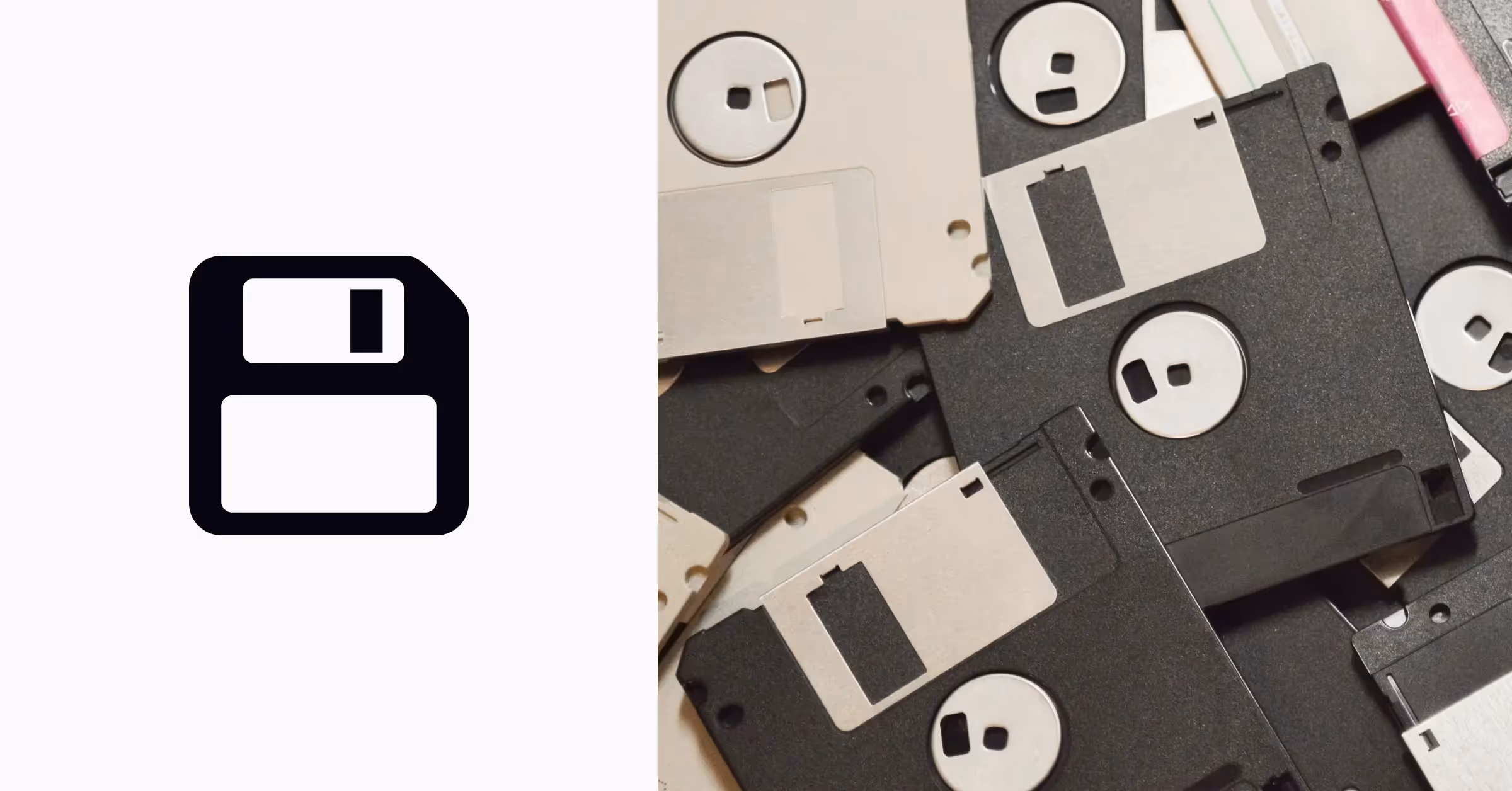
Skeuomorphic design was all the rage up to the early 2000s, and for a reason — it helped introduce new digital concepts and ideas imitating their real-life counterparts. For example, seeing a familiar image of a floppy disk made it obvious to users that it stood for the Save action.
But what about newer generations who might have never seen floppy disks, handsets, or VHS tapes in real life? It turns out that the classic floppy disk icon has stood the test of time and still communicates the meaning perfectly, even to younger users. You've probably seen the popular Internet meme about a kid who saw a floppy disk and asked his dad if he 3D printed the Save icon. It perfectly sums up how the symbol has outlived the physical object and cemented its place in the list of most recognizable icons. Take our UI Design Elements lesson to understand what makes a design memorable.
The Command Key Icon on macOS
.avif)
How did the looped square, which is also the Swedish road sign for locations of cultural interest, find its way into Apple's design? In August 1983, the dev team of Apple Mackintosh decided to add a special modifier key to the keyboard. Its purpose was to work in combination with other keys to invoke menu commands. At first, the Apple logo was supposed to be the symbol on the keyboard, as well as all of the context menus to show key shortcuts. However, a few days before the release, Steve Jobs threw out the idea, saying it was a ridiculous waste of the brand logo.
Finding another symbol for the command key symbol wasn't easy. Susan Kare, Apple's graphic designer, stumbled upon this flower-looking symbol — according to the dictionary, it "depicted an interesting feature in Sweden campground." What seemed a bit too abstract at first turned out to have deep roots. The symbol is quite popular in Sweden, where you can often see it on road signs — probably modeled after ancient castles with rounded turrets at each corner.
The Bluetooth Symbol & Icon
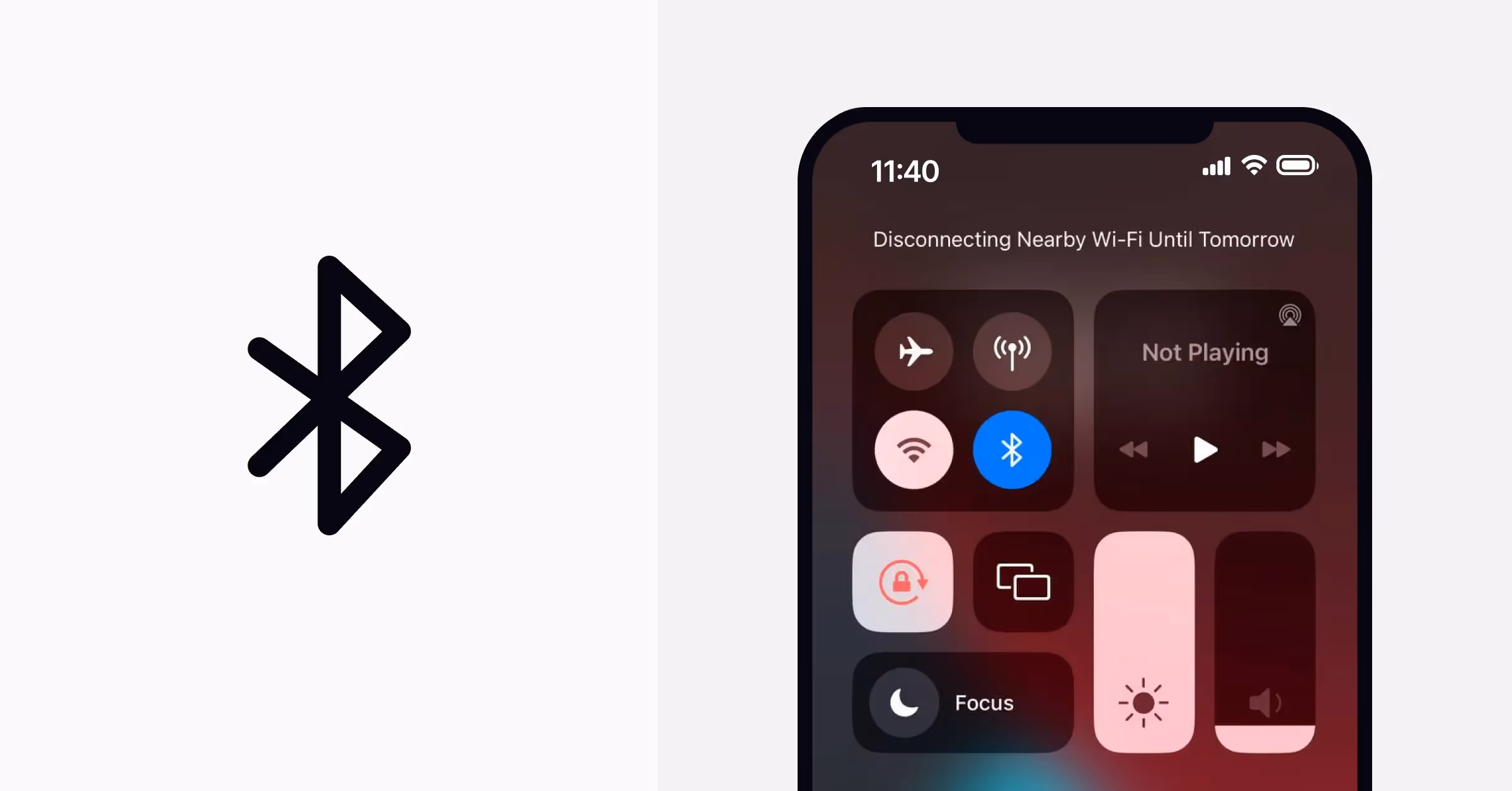
It may sound like a medieval fairytale, but the word "Bluetooth" originates from the 10th-century Danish King Harald Blåtand, or Harald Bluetooth in English. The king earned his name over his passion for blueberries, due to which his teeth were always stained blue.
Legend has it that Harald Bluetooth unified the tribes of Denmark into a single kingdom. The creators of Bluetooth technology expected that their invention would unite all devices in the same way. The Bluetooth icon depicts two joined Scandinavian runes representing the king's initials, equivalent to H and B in English. Conveniently, the combined icon looks like the letter B, making it easy for users to grasp the meaning.
The Hamburger Menu Icon
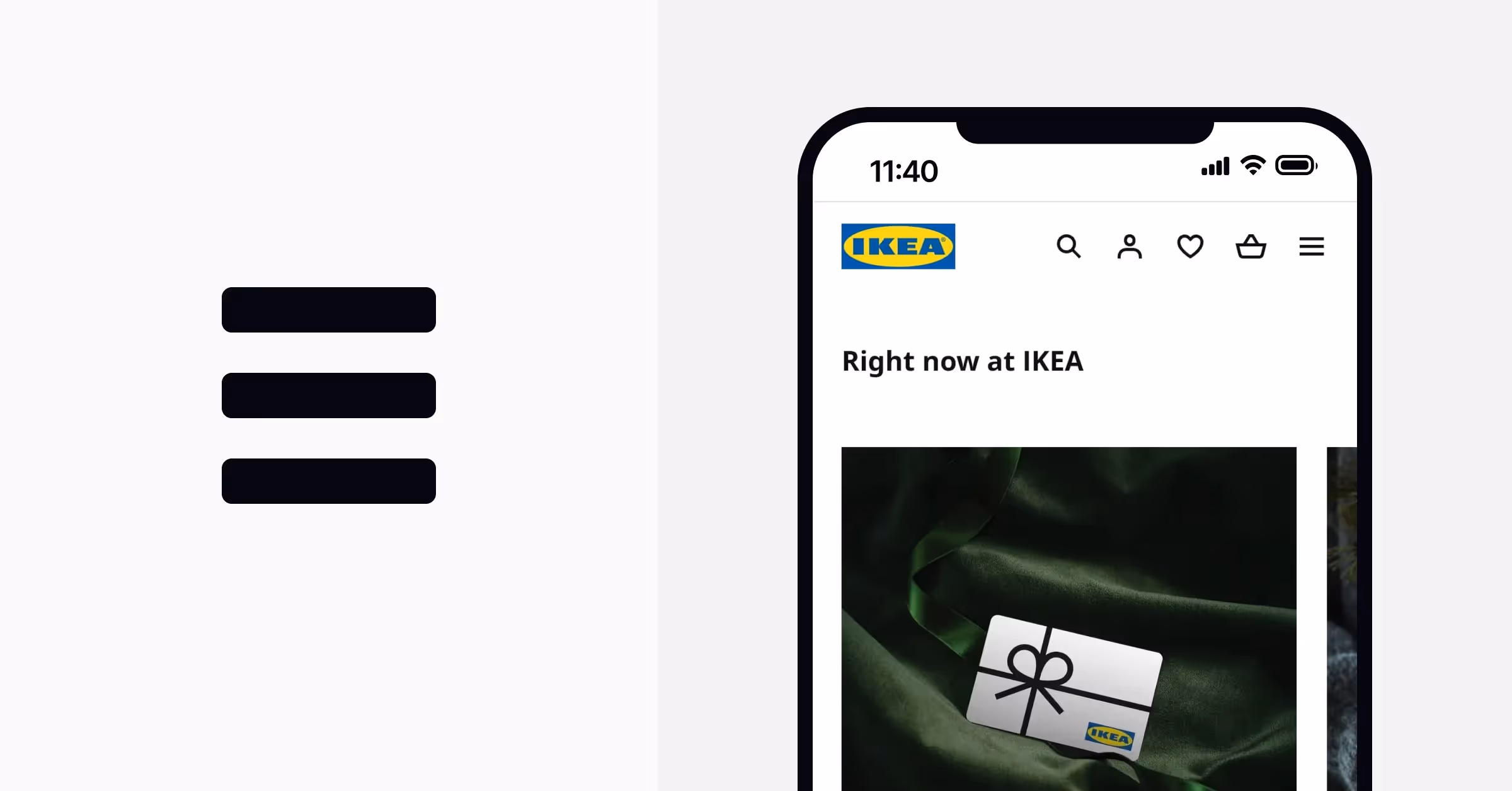
Some designers call this icon unclear and inefficient, while others think it's a good option to hide unnecessary commands under it and save some space. We’re talking about the hamburger menu icon, of course! Surprisingly, its origins have nothing in common with cooking or food consumption.
In 1977, Xerox buckled down to develop Star — the first commercial personal computer. The design team worked hard on its iconography, except for this hamburger menu. It was a trivial way to include a few leftover commands that didn't fit anywhere else. Norman Cox, the lead visual designer at Xerox Systems Development Division, acknowledged that no one expected that "the least thought out part of the whole thing would become such a ubiquitous feature."
The USB Port Icon
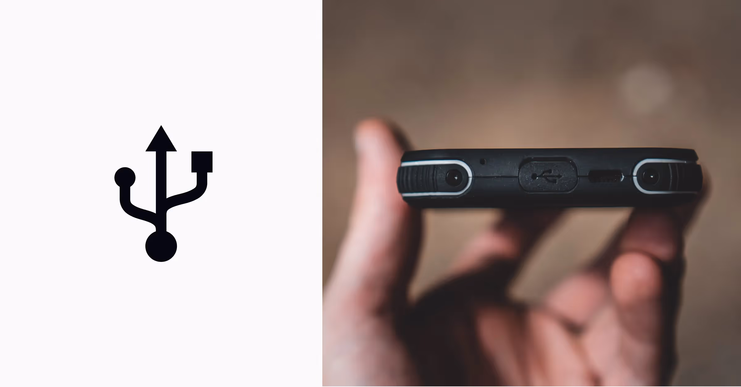
You probably saw this icon today when connecting your phone to a power outlet using the charging cable and a power adapter. That's right — we're talking about the USB icon. There's no official knowledge of who designed it, but the most popular theory suggests it mimics the Roman god Neptune's trident, the mighty Dreizack. Like the trident, the USB icon symbolizes the power that allows users to connect multiple devices using just a single port.
Okay, but what is at the end of each prong? The triangle, circle, and square signify multiple devices that a USB connection can support and stand for universality and versatility.
The Recycle Symbol & Icon

In 1970, the first celebrated Earth day brought an awareness of environmental issues to the forefront of society. One of the most significant threats at the time was the disposal of consumer waste, like plastic bags or takeaway food containers. Taking note, the Container Corporation of America initiated a national competition to create a universal symbol for recycling. The idea was to encourage individuals worldwide to recycle and help our planet breathe.
Over 500 students sent their designs and ideas, but 23-year-old architect Gary Anderson won with his simplistic design. The artist confessed that he took inspiration from Maurits Cornelis Escher's artworks — the concept of mandala, Möbius strip, and even the Woolmark symbol of spinning fibers! The recycling symbol's final design represents an infinite loop of arrow-pointed lines, defining the main principles of recycling — reduce, reuse, recycle. It took years before the symbol started appearing on boxes, packages, and containers like we see today.
The Peace Symbol & Icon

This simple symbol consisting of a circle and three lines made its way from the hippies to punk counterculture to high fashion. The history of the peace sign goes back to 1958. At that time, thousands of people marched for 4 days in an anti-nuclear weapons demonstration from Trafalgar Square in London to the Atomic Weapons Establishment in Berkshire.
That's when Gerald Holtom, a graphic designer and a Christian pacifist, created the sign inspired by the naval semaphore signals. Two flags angled down at 45 degrees represented the letter "N" (nuclear), while one flag pointed straight up and one flag pointed straight down stood for "D" (disarmament). Later on, the symbol migrated to the US, and the Committee for Nonviolent Action made it their logo. Today, you can see the peace sign everywhere in chalk, spray paint, or marker as a symbol of pacifism and non-violence.
The At @ Symbol
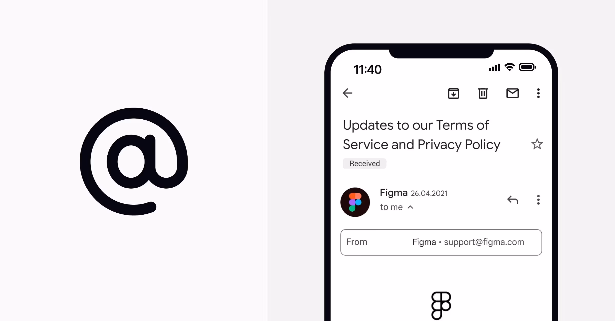
The first appearance of the @ sign dates back to the 14th century, long before it became a keyboard symbol. It replaced the capital letter "A" in the word "Amen" in the Bulgarian translation of a Greek chronicle. Unfortunately, no one knows the reasons for using the symbol in this context. Despite its unknown origin, the history of usage is quite clear. In Catalan, Spanish, and Portuguese, people used the "at" symbol for measuring purposes. It stood for an abbreviation of "arroba," a unit of weight equivalent to 25 pounds. Eventually, it turned up on typewriter keyboards for commercial and financial purposes to denote the abbreviation "at the rate of."
Today, people use the @ symbol in emails and social media tags to call attention or reply to comments. The credit for the current usage goes to the American electrical engineer Ray Tomlinson. In 1971, he created the first email and decided that @ could be a good symbol for indicating that a user is located at a specific computer or domain.
Surprisingly, the creativity of naming this symbol knows no limit in many languages. For example, in Chinese, it translates into "a little mouse"; in Afrikaans — "a monkey tail"; in Italian — "a snail"; and in Hebrew — "a strudel cake."
The Play Icon
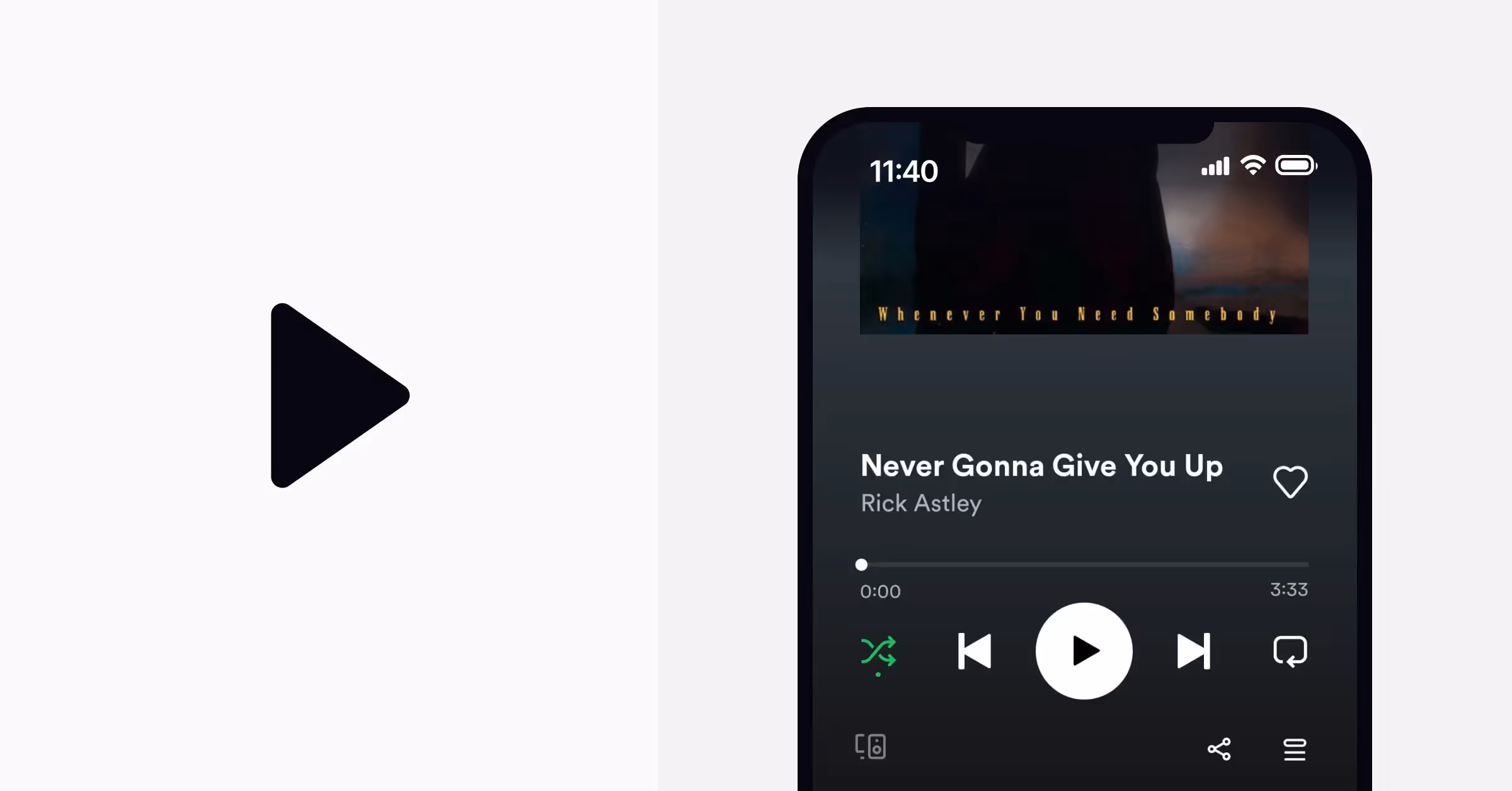
Although the Play button seems pretty obvious in its meaning — indicating the direction in which the tape will move — it wasn't always universal. In the tape players' era, different brands used totally different symbols for play and rewind — and some had explanatory labels instead of icons.
Supposedly, the play button symbol originated in the 1960s and spread over the 1970s when the International Electrotechnical Commission and International Organization for Standardization created a database of universal graphical symbols for equipment. While reel-to-reel tape recorders are somewhat antique these days, the Play symbol's concept has outlived its physical object and cemented its place among the most universally recognizable icons.
The Pause Icon
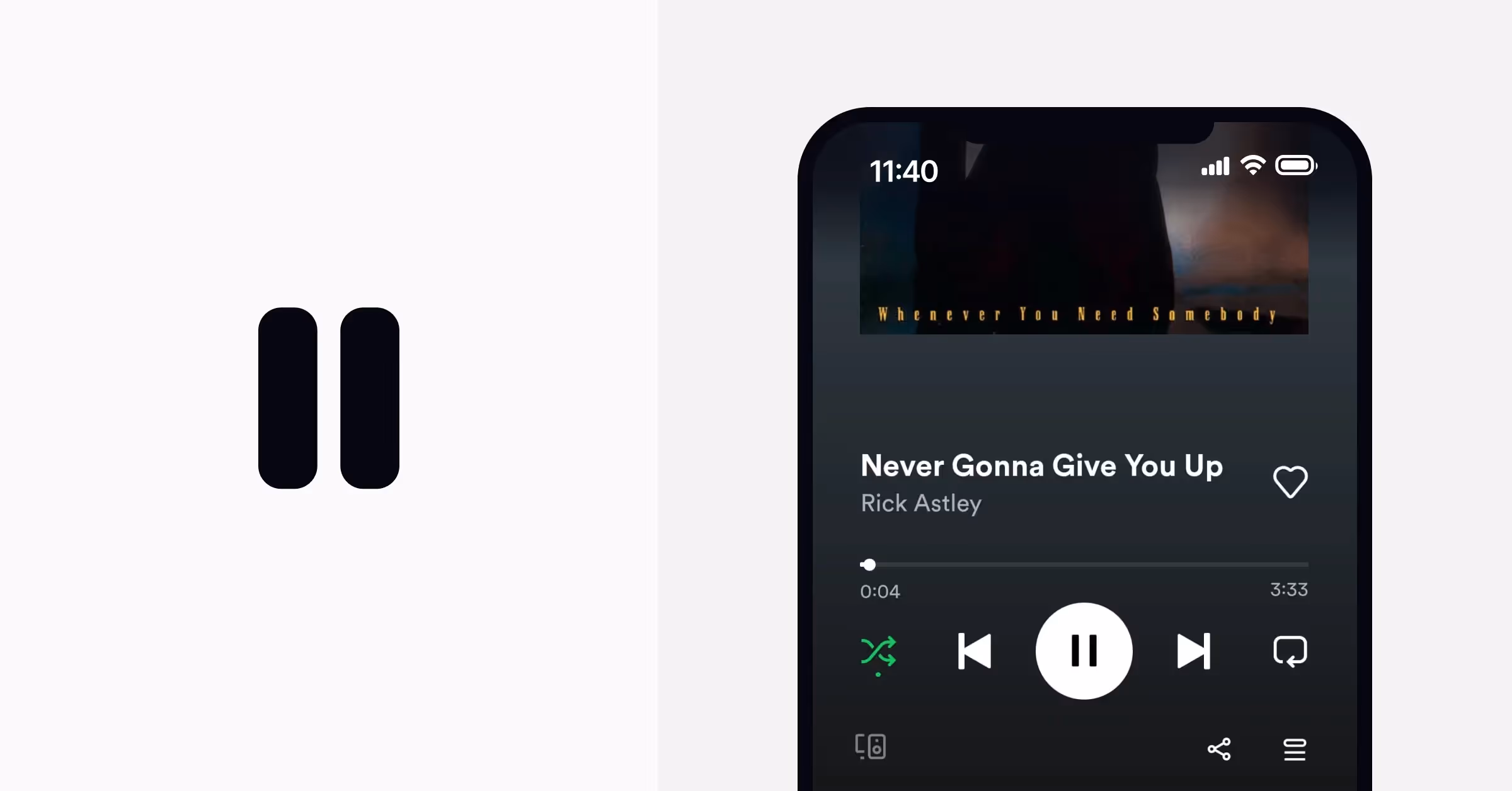
While the Play symbol seems quite straightforward and explicit, the Pause symbol requires some digging to find out its meaning. One theory suggests its resemblance to an open connection on an electrical schematic. Other people believe that this symbol came from written poetry, where it denotes a pause in the middle of a verse. For the same purpose, musicians use these two vertical lines, known as a caesura mark, to introduce a break. Interestingly, there's also a symbol of two vertical strokes in Japanese — it stands at the end of the word 句切り (kugiri), which describes — wait for it — a pause or stopping point.
Check out our Guide to Iconography Design for Enhancing Your UX/UI Abilities to learn how to create powerful icons that represent your product and brand.