

.svg)


This article is about design system icons, otherwise known as product icons, which users need to interact with a product or online experience. Marketing icons (also called unique) are often more complex and used to communicate branding and messaging.
What is Iconography Design?
Iconography is a form of visual language that adds up to product identity. Iconography designers are responsible for creating icons — illustrations that help users to navigate through various digital products. These tiny symbols are crucial to product design, not only because they save space, but because they are instantly recognizable and will help users establish visual muscle memory.
❤️ There are a million ways to draw love. It’s up to you to find the best one for this project.
Understanding the design principles of iconography
There is obviously more to drawing than learning about shapes and curves. Creating an icon is also about composition, balance, and unity between the icons. When I am designing icons, here are some of the questions I ask myself, and if I can say 'yes,' I know that I'm on the right path.
- Is the icon centered in the frame?
- Does this icon feel like it goes with the others I have already created?
- Have I simplified this icon as much as I can?
- Have I cleaned up this icon and removed hidden layers?
- Is the message an icon conveys clear to users?
The basic design principles of iconography include:
- Clarity: an icon should clearly communicate a concept. You only increase cognitive load if it's ambiguous and users spend too much time figuring out the icon's purpose.
- Readability: avoid using too many fine and decorative lines and leave enough space between an icon and a label.
- Alignment: find the right adjustment to balance out an icon, so it feels harmonious.
- Brevity: find a way to say more with fewer decorative details, fewer lines, and a simpler concept.
- Consistency: apply the same style (visual weight, stroke thickness, size, corner radius, shape, and fill) throughout all icons.
- Personality: what mood do you want to create with icon design? What does it say about your product personality?
- Ease of use: more than great design is needed for icons. Designers must ensure an icon set is organized and easy to use by other designers and developers, well-documented, and tested before the implementation.
The basics of an icon system
When you're ready to start building your first icon design, you'll want to create a system of many icons. Because these icons need to live in harmony, you'll want to establish some guidelines for yourself upfront that will determine specific characteristics of your basic set.
Start with Uxcel's Icon Terminology lesson within the UX Design Foundations course to get familiar with the types of icons, icon styles, how they're best used, and what makes a "good" icon.
Size
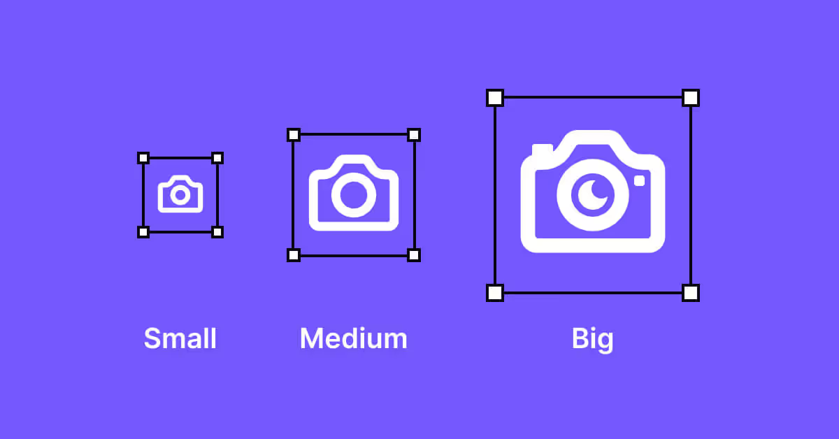
The first element to consider is size. While icons are designed to be scalable, you will want to build everything in one size to maintain consistency. This will help your engineering team out when implementing these icons. I normally recommend you build your set of icons at 24x24px or 32x32px. Because your engineers are likely using the 8-point grid, you need a size divisible by 8. Check with your dev team that this is indeed the grid system they are using before you start creating the first draft.
If you want larger, more refined icons to be used on a marketing website, for example, start with the largest size and go down. It's much easier to remove details gradually and simplify icons step by step.
Strokes and fills
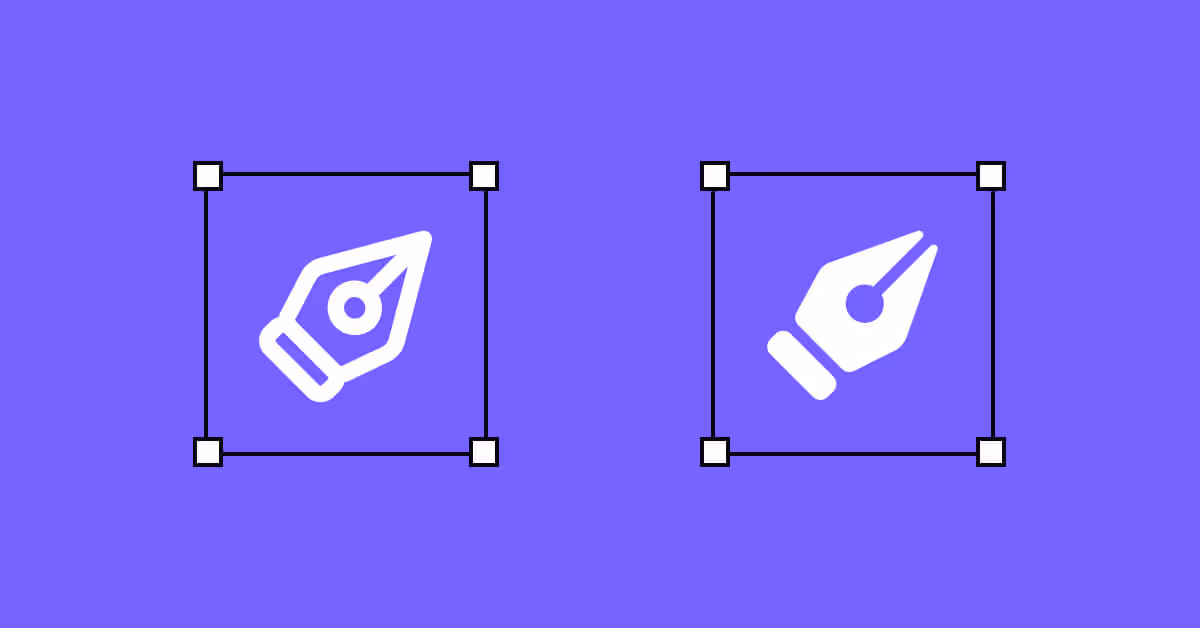
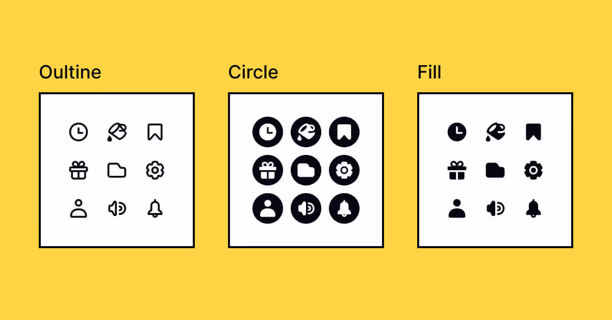
The next step is to decide whether you want stroked or filled icons in your icon set. For stroked icons, everything should be outlined with a stroke of the same weight, for example, 1 to 2 pixels.
Filled icons are made of solid shapes with negative space building out more complex parts of the icon. Typically filled versions are easier for people to scan, which makes them ideal for products. Sometimes you will need both stroked and filled icons. If so, you want to make sure they are cohesive and use the same basic shapes. Consistency is the general rule. Using stroked and filled icons side by side creates chaos on a page and confuses users. I recommend using a filled icon design to show a selected state.
Color
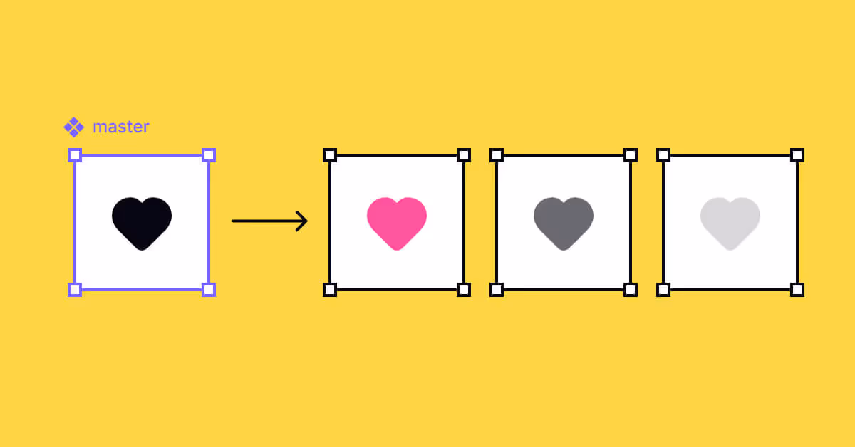
Even though your icons might be used in different colors within the product, you'll want to build an icon design system in one color. I recommend using all icons in a single color, for example, black. When your icons are used in designs, you and other designers can adjust the icon color to suit the design rather than having to fit the preferences of someone else.
A 2-colored icon style can be appropriate for marketing purposes, but rather than that stick to one color.
Don't underestimate the impact colors can have on users when setting colors for icons within a product. It's one of the 7 main elements of design — building blocks that designers use to create interfaces.
Learn color psychology to create the right mood for users and provide a more satisfactory user experience.
Grids
A pixel grid is a fantastic tool for building icons. They make designer life so much easier by keeping icons "on-pixel" and spacing icons more flexibly.
Once you've created an icon on a pixel grid, it's time to check whether your icons are optically balanced. An optical grid helps figure out the center of mass of icons and how human eyes perceive them. For example, sharper and more detailed icons should occupy more visual space on a grid. To prevent size inconsistencies, place icons in fixed containers to keep icon dimensions identical when exported.
Starting to design
You have your size, your style, and your color ready. Let's start designing icons. It can be tempting to just dive in and start drawing. Before proceeding with this step, I recommend you make a list of all the icons you will create. Starting with the simpler icons will allow you to drive your style choices and help you make decisions later on.
Determining the purpose of your icons
First thing, decide what you're going to design and what concept you're willing to illustrate. For example, your task is creating an icon representing a chat. Go for inspiration in Google, Dribbble, or Behance. What objects represent a chat: a bubble, an envelope, or maybe a piece of paper and a pen? Sketch your first ideas on paper, trying out different forms and adding and removing elements as you go.
Which tool should I use?
There are many great design tools out there that you can use to design new icons.
- Adobe Illustrator. It's the most traditional vector-based tool to design icons, logos, and other print media, available for both macOS and Windows. However, Illustrator has a steep learning curve, and there are better choices for beginners. Another deal breaker can be platform's cost— $20.99 per month.
- Figma. Figma is one of the most popular tools for creating UI elements, including icon sets. Figma is much simpler to learn than Illustrator and offers a free plan for 3 projects. It's a cloud-based solution and is available for macOS and Windows. Figma is perfect for collaborative tasks and quickly generates a link to share files with colleagues or clients.
- Sketch. Sketch is a vector-based easy-to-learn solution. Like Figma, it encourages collaborative work on one project and contains a large library of plugins that makes designer work a tad more comfortable. One of the major disadvantages is that Sketch is available for macOS users only. Sketch offers a free 30-day trial and costs $9 monthly or $99 yearly.
I personally use Figma. This tool is precise, fast, and will create the cleanest SVG exports. For the purpose of this article, I will be using the terminology used in Figma app.
The first steps
You're going to create a frame at the size you decided on earlier. You'll want to add a grid to your frame if you haven't made icons before. It will help you keep things straight and you'll be able to more easily see when shapes aren't centered. I recommend a 2px grid on top of the 1px grid built into Figma upon zooming in.
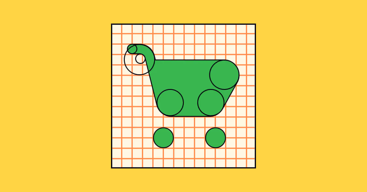
Geometric shapes
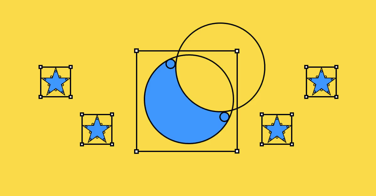
The rectangle and ellipse tools are your best friends. Start with those when you're designing anything geometric. The rectangle tool will allow you to adjust things like corner radius more easily. The ellipse can easily bisect circles and will create perfect curves. You can use boolean operations (similar to the pathfinder in Illustrator) to create combinations of shapes. Starting with geometric forms will give your icons an extra polish. Of course, not all icons can be made from geometry, and being made from geometry doesn't automatically make them perfect. Use your best judgment.
Bezier curves
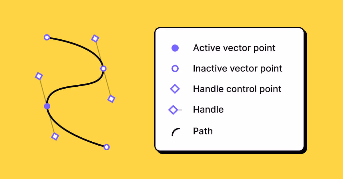
When you aren't using straight lines and geometric shapes, you're going to need bézier curves created by a pen tool. A bézier curve is a parametric curve used in computer graphics and related fields. The curve is named after Pierre Bézier, who used it in the 1960s for designing curves for the bodywork of Renault cars. For our purposes, bézier curves are created by handles that extend from any vector point or anchor. At the end of each handle is the handle control point. These handles seem to magnetically pull the shape toward them. To learn more about them, I recommend this article by Peter Nowell. Even though he's using Sketch, the same principles apply regardless of the program.
What makes an icon good?
When you start working on your design system of icons, make sure that each icon represents your brand and makes user navigation easier and faster. Keep in mind a set of criteria for effective icon design:
- Clarity. Beyond making balanced, beautiful icons, what matters most is that the icon is communicating its meaning clearly. I believe icons should demonstrate one core concept – once you start combining a bunch of conflicting elements together, your icon will become confusing and messy.
- Simplicity. Icons should be, at their core, simple. If there is too much detail, it can be harder to scan, and user experience will suffer.
- Brand representation. Your icon should reflect your brand when possible. For instance, if you can use clever metaphors, your icons will stand out. My favorite icon metaphore is the Twitter home icon which is a birdhouse. Clever, yet beautifully subtle, for a company whose logo is a bird.
Learn the best practices of icon design by taking Uxcel's Intro to Icons lesson within the UI Components I course.
Getting good at the metaphor
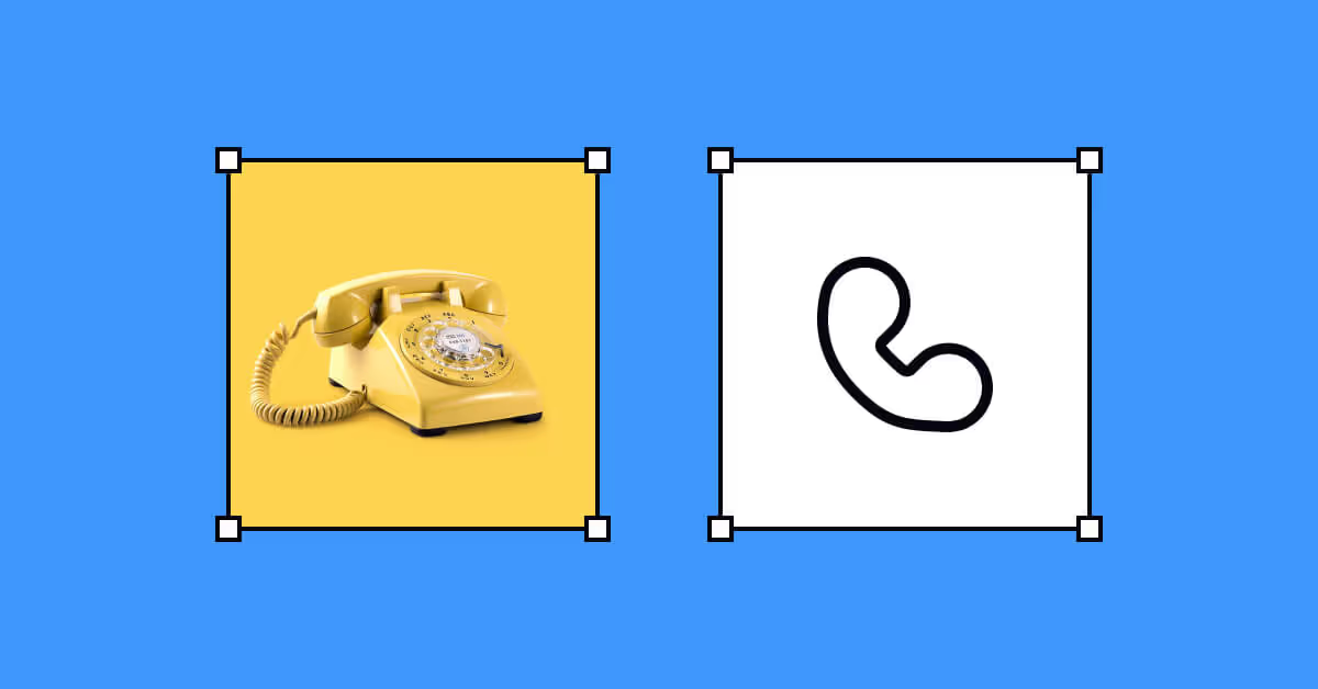
To create great icons you should know how to craft great metaphors. We all see a floppy disk and understand it means "save" or that a pencil means "edit." These concepts have stood the test of time. The best illustration of this, I find to be the phone icon, which on most devices is a landline handset. Most people don't own landlines anymore, but the image is so iconic now, that even people who haven't ever seen one know what it means.
One way to learn how to do this is to observe the work of others. When I'm starting to draw a new icon, I will start by going to The Noun Project and searching for the icon's meaning. I like to see what others have recently released. There is always space to learn from others. Sometimes, when I have an icon that is really stumping me, where the concept doesn't already have imagery associated with it, I will search for similar terms. For instance, if "VIP" isn't getting me the results I want, I'll try "king," "luxe," or "exclusive." Being able to find core meanings in what you are looking for is a skill that is essential for an icon designer.
As my late mentor, Paul Bowman, told me "There are a million ways to draw "love." It's up to you to find the best one for this project." There's often no right answer. You'll have to try a lot of things once you start building icons, making sure your metaphors are clear and helpful.
Organization
You've created your icon set. It's elegant, cohesive, and clear, and your file is beautifully clean. But how might you organize and name all these icons? Icon design isn't the end of the process.
Once you're done with your icons, you want them to be as clean as possible for the best possible export. First, turn all your icons into components. Keep naming simple. For instance, an icon of a lightbulb will be named "lightbulb," not "idea-lightbulb-light." Give your icons the simplest, clearest names possible. You can use the component description box to add tags and keywords. Components are searchable in your design system, which means you can add extra search terms.
To best organize your components, you can put all your individual frames into larger frames that organize them by category.
Conclusion
Your icons are a representation of your product and your brand. They are the tiny, unsung heroes of any product. They often don't get the love they need. But you now have the tools to start learning how to make fantastic icons.
Uxcel offers great tools for learning about icon best practices, as well as online courses on UX and UI.