Color psychology is a fundamental aspect of branding and product design. It's important to under the emotional impact of colors in order to know how to apply them correctly. Uxcel offers great tools for learning about icon best practices, as well as courses on UX and UI.
Every day, tons of things and factors affect our mood, attitudes, choices, and decisions. For most people, color is one of the most powerful of them. It evokes human emotions instantly and builds strong associations faster than we can realize it. It's no wonder that designers have to explore how this magic works to make interfaces, both functional and emotional. To support the block of color studies in Uxcel, in this article, we welcome you to review the basics of color psychology and its impact on user behavior.
What is color psychology?
Color psychology is the study of how and why color affects us, our emotions, and behaviors. As soon as we perceive color, our brain and endocrine system (the hormone producer) receive the input, releasing hormones throughout our body. As a result, this subconscious interaction has a powerful impact on our emotions.
The Institute for Color Research found that people make subconscious snap judgments about an object, person, or environment within 90 seconds of initial viewing. Additionally, an incredible 62% to 90% of that assessment is based only on color. As a result, designers must study and understand the psychology behind colors in UX/UI design.
While color theory helps designers understand the nature of colors and to create harmonic color combinations, color psychology dives into our minds and emotions. Additionally, colors can not only catch users' attention but also hold it for much longer than black and white visuals. As a result, colors increase the lasting memorability of UX/UI design.
Basic principles of color psychology
Color psychology contains six fundamental principles:
- Color has a meaning
- Color meaning is based on biological and environmental experiences
- Color perception automatically triggers human evaluation
- Color evaluation determines color-motivated behavior
- Color exerts an influence
- Color meaning and its effect are determined by context
By understanding these basic principles, designers can use them for specific business and social goals to increase usability.
Why is Color Psychology Important in Branding?
Research on the impact of color on marketing revealed that about 62‐90% of snap judgments about a product are based on colors alone. In marketing and branding, we rely on color psychology to create the right impression, evoke the right emotions, and encourage users to consider engaging with a brand.
The tricky part is that designers can't fully rely on universal interpretations of color meaning and their relations to specific feelings. Research shows that people perceive colors depending on their personal preferences, experiences, upbringings, cultural differences, and context. If someone has had a negative experience with yellow (e.g., has been hit by a yellow car), this color could potentially evoke negative associations, regardless of its universal meaning of positivity, optimism, sun, and happiness.
The good news is that if people find your brand color appropriate to what your brand sells, the individual color meaning recedes to the background. So what are the recommendations for finding the right brand colors?
Shows off your brand's personality
Forget stereotypical color associations and focus on selecting colors that portray your brand personality in the best way.
According to psychologist and Stanford professor Jennifer Aaker, there are 5 dimensions that play a role in a brand's personality, i. e., the human characteristics customers use to describe a brand. A brand is most commonly dominated by one trait but can sometimes combine two of the following:
- Sincerity: Down-to-earth, honest, wholesome, and cheerful
- Excitement: Daring, spirited, imaginative, up-to-date
- Competence: Reliable, intelligent, successful
- Sophistication: Upper-class, charming
- Ruggedness: Outdoorsy, tough
Listen to your audience
Choosing your brand colors based on your audience's demographics is a highly debatable initiative. Some studies prove that men prefer bold colors and shades (colors with black added), while women prefer softer colors and tints (colors with white added), but this evidence shouldn't be your only source of truth. Instead, focus on learning what your users like. Moreover, stepping aside from cultural and gender color stereotypes and breaking users' expectations can benefit your brand even more.
Empower your brand recognition
Although some colors are associated with certain industries (red and orange are related to fast food, while green recalls ecology and bio-products), picking brand colors that stand out and create contrast will make your brand memorable among its competitors.
Besides, using the same brand colors consistently throughout marketing and branding materials (logo, website, social media, advertisements, etc.) and in the interface will intensify your brand’s association with those colors and brand awareness in general.
Psychology of Brand Colors & Their Meanings
The human eye processes and decodes color in the blink of an eye, enabling designers to amplify visual hierarchy and draw attention to particular elements. That is why learning the psychology behind colors is an essential chapter in UX design education. Let's review some color meanings and why color affects us. But note that these are typical of western cultures.
Red color psychology
The color red is the first distinguishable color for babies. As one of the brightest daytime colors, it attracts a lot of attention. Red has quite a broad range of meanings, yet all of them are associated with power, energy, and strength. Depending on the context, it can be related to love and passion or anger and danger. As this color provokes high tension, too much of it may be tiring for the eyes and even cause anxiety. Red should be applied wisely in your designs!

Red color attributes
- Reds and oranges stimulate appetite and are often used in fast-food diners and apps
- Red is associated with passion, energy, confidence, and sexuality
- Red also symbolizes aggression, war, and power
Green color psychology
The color green is strongly associated with nature; it's called a color of balance and harmony. This color is also connected to youth, growth, and renewing. Green is often applied in designs related to "green" topics: ecology, sustainability, environmental protection, and healthy food.

Green color attributes
- Green has a calming effect and increases concentration
- Green is associated with wealth, health, and growth
- Dark green inspires trust, credibility, and loyalty
Blue color psychology
Blue is a color of trust and stability, often associated with reliability and competence. It is widely popular in business and banking software. However, when compared to warm colors, blue may seem more distant and unemotional.

Blue color attributes
- Blue evokes serenity, trust, and security
- Blue can also appear cold, unappetizing, unemotional, and aloof
Purple color psychology
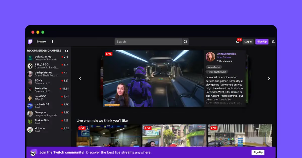
For a long time, color purple (or violet) was a rare pigment, so it became exclusive to the rich and was considered a royal color. That historical background made it strongly associated with luxury, royalty, and exclusiveness. It mixes the energy of red and the trustful balance of blue, but when applied too much, it can distract users.
Purple color attributes
- Purple brings a feeling of spirituality, luxury, sophistication, and creativity
- Purple can also make your brand appear extravagant, melancholic, and introverted
Black color psychology
As with the color red, black has a broad range of meanings, from tragedy to mystery, from traditions to innovations. It is usually a perfect match for any color. It is useful in creating contrasts, so it is popular as a background color, especially for web and mobile interfaces based on visual content. Many luxury brands choose black because of its association with exclusivity and prestige. Black implies negative connotations like death, mourning, depression, and war.

Black color attributes
- Black is often used in the fashion industry for its associations with elegance, luxury, and refinement
- Black signifies intelligence, authority, and power
- Black is also associated with negative feelings, mourning, depression, and war
White color psychology
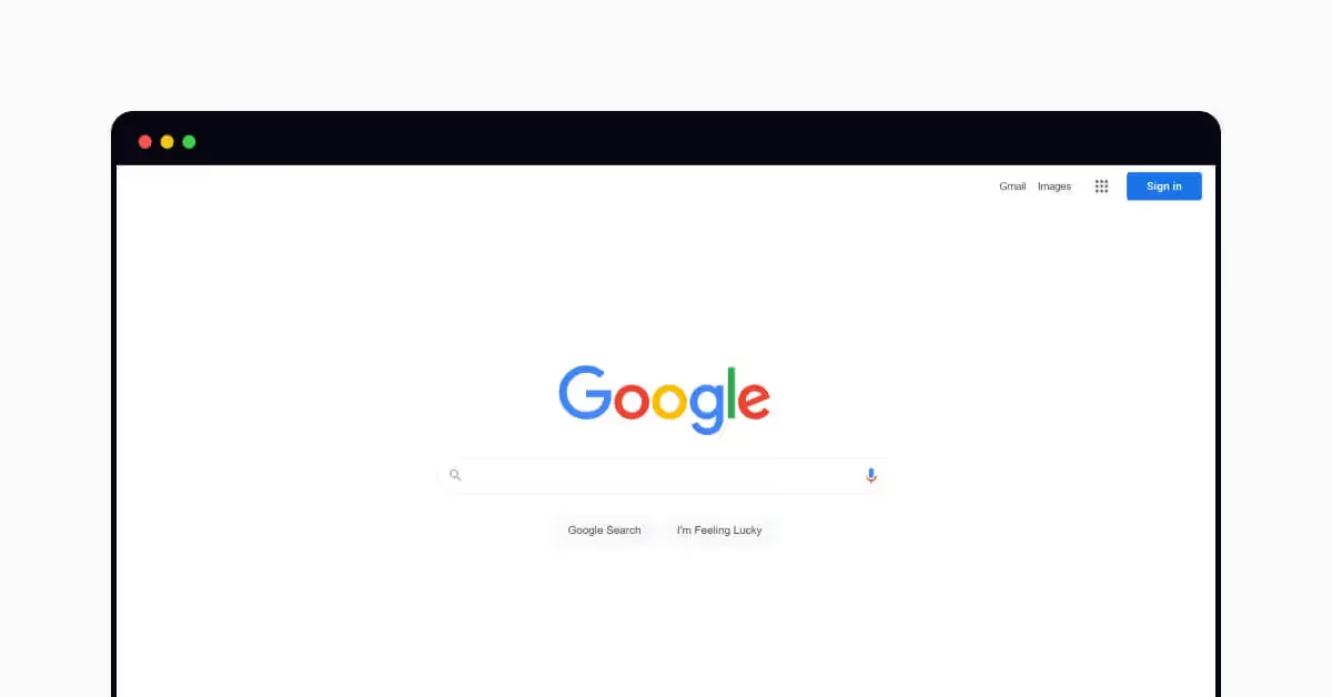
White traditionally transfers the meanings of innocence, purity, and clarity. It's often associated with a blank sheet of paper or untouched canvas, engaging a person to generate new ideas. However, too much white can also result in such reactions as emptiness and loneliness. Popular as a background color, white adds space to interfaces and builds a solid foundation for readability.
White color attributes
- White is associated with purity, simplicity, and clarity
- White can also appear unfriendly, isolated, empty, and sterile
Grey color psychology
Grey is often on the cool end of the neutral color spectrum. Utilizing a variety of grey tones in design allows for a sophisticated and elegant look, as it will allow other colors to stand out. Grey is also referred to as gray in American English.

Grey color attributes
- Grey can appear classic, serious, and reliable
- Designers love grey for its neutrality and balance
- Grey can also be related to depression, lack of energy, and muddiness
Brown color psychology
Brown is associated with the earth and woods. Due to its natural origins, brown is perceived as a color of security, protection, comfort, and stability, and is often used as a background color.

Brown color attributes
- Brown is an earthy color that brings feelings of warmth, coziness, and stability
- Brown can make a brand personality appear serious, reliable, and mature
- Brown can also appear dull, dirty, sad, or conservative
Yellow color psychology
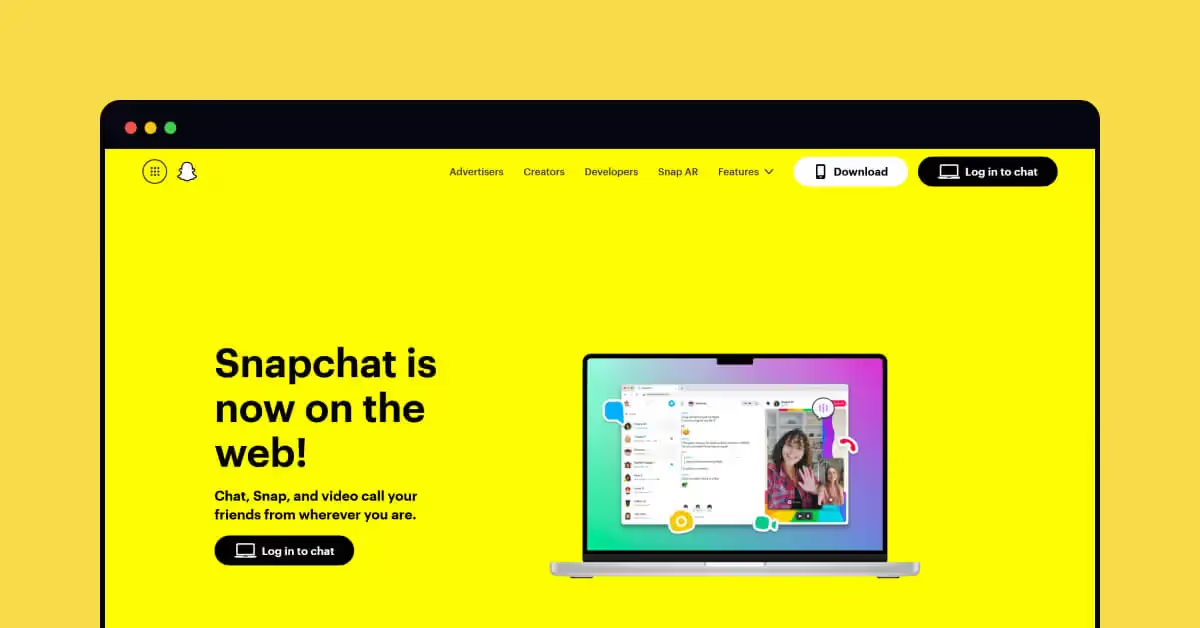
Color yellow will forever be associated with the sun. It's the color of happiness, friendliness, and joy, and bring nature makes it inspiring. However, choosing too much yellow can result in negative perceptions and make people feel fear.
Yellow color attributes
- Yellow can evoke feelings of optimism, happiness, and warmth
- Yellow may also cause anxiety, fear, and frustration
Orange color psychology
Orange is said to combine the power of red and the joyfulness of yellow, so it is an energetic and positive color. Orange is associated with motivation, cheerfulness, and enthusiasm. As well, it is often used in design to create emotions of fun and adventure.

Orange color attributes
- In western culture, orange is associated with autumn, Halloween, and coziness
- Orange inspires optimism, cheerfulness, and energy
- Orange is also used on warning signs and can symbolize immaturity, sluggishness, and ignorance
Pink color psychology
Pink is a color of romance, sincerity, and sensitivity. Historically, it is gender-marked and strongly associated with youth, sophistication, and femininity. As a result, it is the color of choice in products and brands targeting girls and young women.
Learn about how Color Affects Mood & Emotion with an interactive lesson on Uxcel
Pink color attributes
- Pink can signify youth, innocence, and creativity
- Pink can also make brands appear extravagant, eccentric, and impulsive
Demographics in color psychology
It's crucial to consider demographics when selecting brand colors. Color perception and psychology change depending on gender, age, and culture, so it's important to consider the demographics of your users.
Preferences by gender
Gender plays a strong influence on color preference, so it's essential to know and understand differences. The Color Assignment research group conducted one of the most well-known studies, which I'll summarize below.
- Cool colors > Warm colors. Furthermore, both genders prefer blue, green, and their respective tints.
- Color blue is #1 for all genders. Both men and women selected blue as their preferred color. Women also show greater interest in different shades of blue - sapphire, cerulean, azure, beryl, and others.
- Brown & orange aren't very popular. Brown is less popular with men whereas orange is the least popular with women.
- Men love pure colors, women love tints.
Preferences by age
The age of your target audience is also a factor in determining the color palette. Children tend to like warm colors, such as yellow and orange. According to Color Psychology and Color Therapy, by Faber Birren, as people age, they prefer cooler colors over warm ones.
Additionally, children are more likely to change their color preferences, as their tastes are not well-defined, while adults stick much more to their favorite colors.
Preferences by culture
Culture plays an essential influence on color preference, so when choosing your color scheme to represent your brand image, make sure to consider this. Let's examine a few key findings below.
Blue is considered a masculine color in the west, but the Chinese perceive blue as a feminine color.
White represents death and bad luck in Chinese culture whereas orange is associated with good health.
Yellow symbolizes sanctity and commerce in Hinduism.
In Latin America, red symbolizes war and military, especially when combined with black.
Even these quick insights make it easy to see how important it is to define the target audience of the product and take it into account, choosing the colors.
Conclusion
Color psychology is a powerful tool for creating a positive user experience. It's the cherry on the cake to make a product genuinely shine and delight users. Whichever color scheme you choose, make sure to test it with your audience.


