Color theory in UI/UX design is one of the most foundational skills for any designer to master. Understanding how colors work, and how users perceive them, directly shapes every interface you build. In this guide, we'll cover the essentials of color theory for UI and UX, from the color wheel to color schemes you can apply in your projects today.
Let's take a look at color theory, a crucial part of UX/UI design learning and education.
What is color theory in UI/UX design?
Color theory is the practical science of mixing colors according to how people see and perceive them. The modern color theory focuses on the color wheel, and its definition of primary, secondary, and tertiary colors.
In the physical world, all the objects reflect light, each with a different wavelength. The human brain perceives these wavelength combinations and interprets then into various colors. This process is incredibly fast and takes place in a fraction of a second without us even realizing it.
So why do designers need to know this? Designers have to understand the importance of color. It is one of the most influential factors on our perception of nearly everything we see, be it a web page, book cover, cereal box, or a piece of art. As mentioned in the article about color psychology, the Institute for Color Research study found that people make a subconscious judgment about an object, person, or environment within 90 seconds of initial viewing. What's more, 62% to 90% of that assessment is based only on color alone!
Not only does color have a significant psychological impact, but it also directly impacts the overall user experience. So, your color selection is of the highest responsibility, so choose wisely. The good news is that it's easy to learn the basics and to avoid making costly mistakes.
What is the color wheel?
A color wheel is a tool that has helped people organize, classify, and mix colors for over several centuries. In 1666 Sir Isaac Newton designed the first version of the color wheel, which is amazingly still used to develop color combinations and palettes today.
Color wheel features:
- Primary colors: red, yellow, blue
- Secondary colors (mixed from primary colors): green, orange, purple
- Tertiary colors (mixed from primary and secondary colors): red-purple, red-orange, yellow-orange, yellow-green, blue-green, blue-purple.
The purpose of the color wheel is to allow designers to quickly understand the nature of each color and combine them effectively.
What is color temperature?
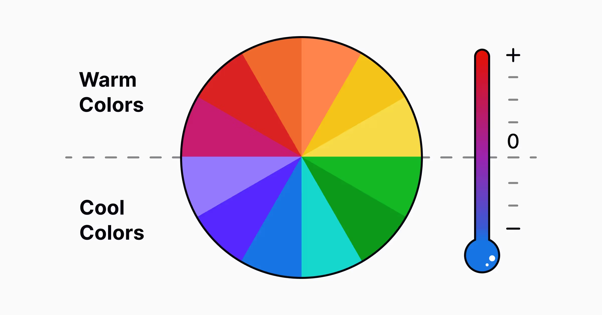
Colors also have a temperature, and that doesn't mean they're running a fever. It means they can be either warm and cool. It's easy to define this relationship using the color wheel: divide it by half along the y-axis. The right side features warm colors, and the left cool colors.
Warm colors are composed of red, orange, yellow, and all of their combinations. They are generally associated with the sun at various times of the day and help provide energy, activity, strength, and passion. Warm colors are fantastic for catching a user's attention.
Cool colors are blue, green, purple, and their variations, but blue is the coolest of the cool. It's the only primary color that lies within the cool spectrum. The other cool colors are created using a combination of blue and warm colors. Cool colors represent water, night, and nature, and are usually associated with balance and calmness.
What are color variations?
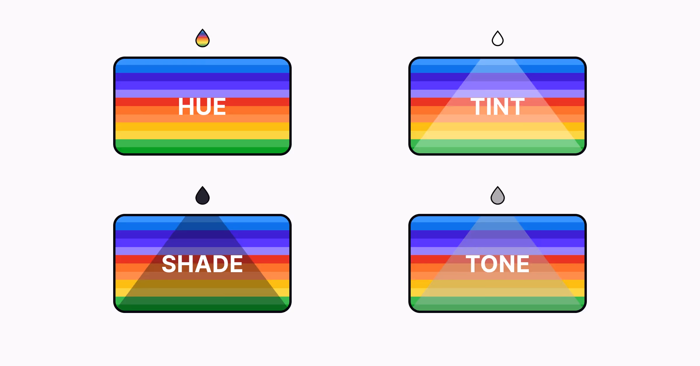
Many of us are familiar with the color wheel and the standard range of primary, secondary, and tertiary colors, but how do we create even more variations? Diving deeper into color theory, let's look at hue, shade, tint, and tone and how they can be used to create a nearly limitless range of colors.
- A hue is a pure color, with no additions. It's what you see when looking at the color wheel
- A tint is a hue with white added to it. We create pink by combining white and red.
- A shade is a hue with black added to it. We create burgundy by combining black and red.
- A tone is a hue with black and white (otherwise known as grey) added to it. Working grey provides more flexibility, as it's easier to adjust the intensity and darkness of the original hue.
Furthermore, you can also adjust the following properties to create even more color variations.
- Chroma is a color's purity. The higher the chroma, the more pure the color.
- Saturation is the overall strength or weakness of the color. The higher the saturation, the stronger the color.
- Value is the level of darkness or lightness. The lighter the color, the higher the value.
What are color models?
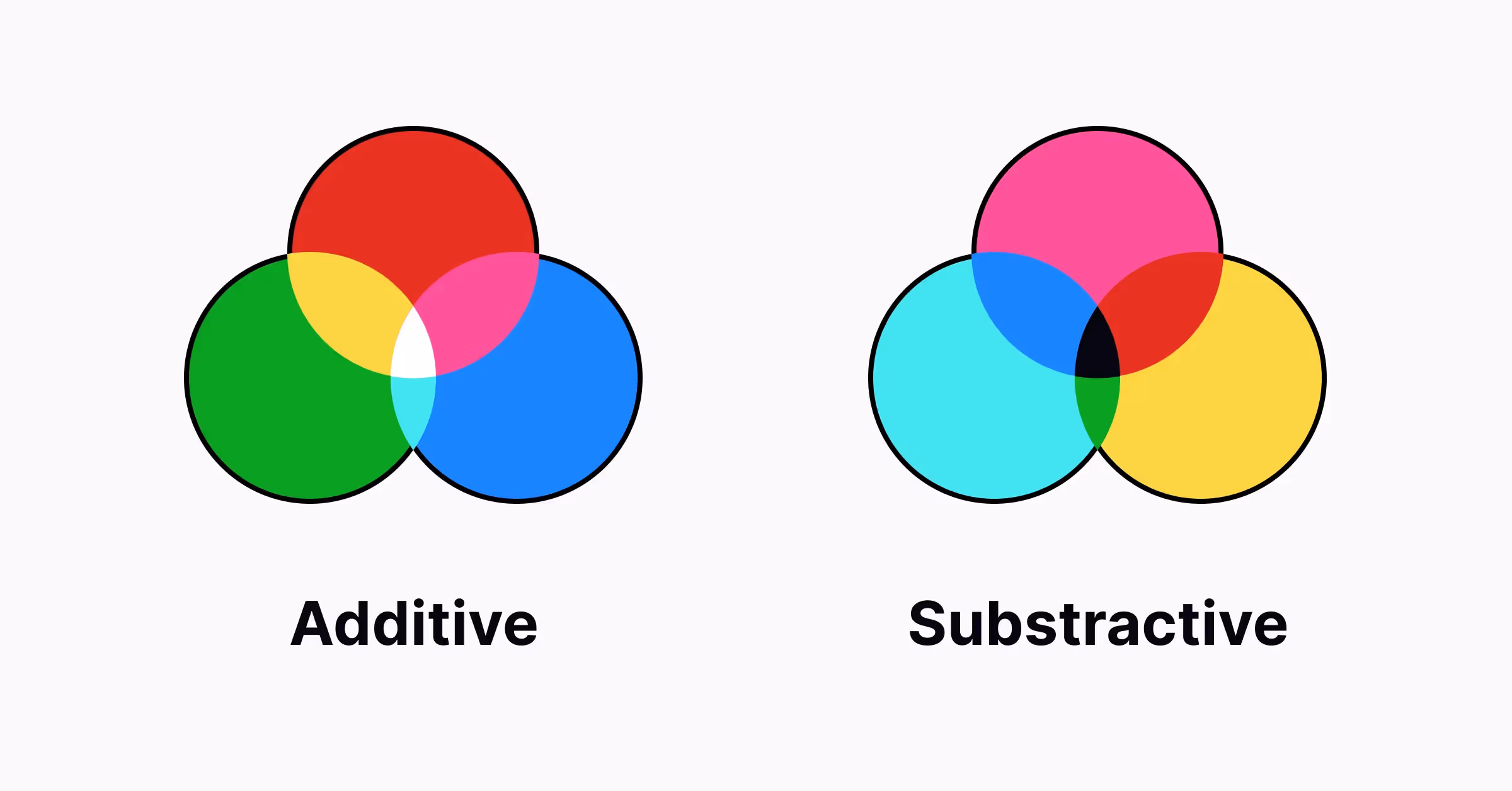
To apply colors effectively in a user interface or graphic design project, designers also need to know about two basic color models based on their physical characteristics: additive and subtractive.
Additive color model (also known as the RGB color system) is the foundation of colors used on various screens. It defines red, blue, and green as primary colors. The combinations of the mentioned primary colors give such secondary colors as cyan, magenta, and yellow whose brightness can be moderated with the level of light added.
Subtractive color model gets colors by subtracting light and is presented by two color systems, RYB and CMY. RYB (red, yellow, blue) is also known as artistic and is popular in painting. CMY color system considers cyan, magenta, and yellow as the most effective set of colors to combine. It was initially used in printed stuff and then was transformed into CMYK (cyan, magenta, and yellow) with the advent of photomechanical printing.
What are color schemes in UI design?
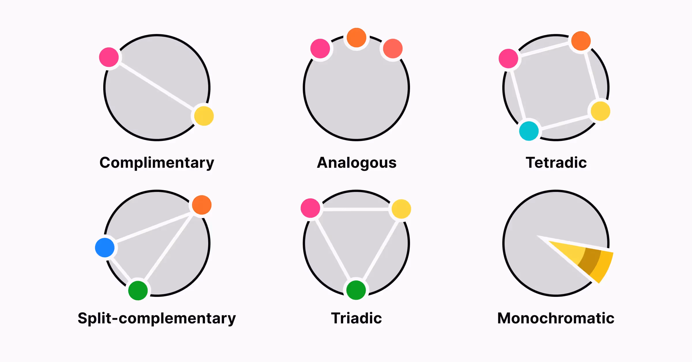
Now let’s take a closer glance at using the color wheel for effective color combinations in your designs.
According to color theory, to create a harmonic combination of colors, you are recommended to use:
- two opposite colors on the color wheel
- three colors situated in the equally-spread points of the color wheel to form a triangle
- four colors standing on the points forming a rectangle, which means you get two pairs of colors opposite on the color wheel.
Whatever angle of the mentioned schemes you choose, they will stay harmonic.
Here are some popular color schemes.
Monochromatic color schemes use one color that may be presented in different shades and tones. Its superpower is simplicity: it doesn’t leave room for a mistake in mixing colors and supports a sort of minimalistic approach.
Analogous color schemes use colors that lie together on the color wheel. This kind of scheme doesn’t create much contrast and looks good on various web pages, banners, and popups.
Complementary color schemes use colors opposite each other on the color wheel. This kind of scheme is perfect for creating catchy and obvious contrast.
Split-Complementary color schemes extend the previous with more colors: they use one color from one side of the wheel and two colors neighboring the color opposite it, this way forming a triangle on the color wheel. It lowers the contrast level but allows for employing more colors.
Triadic color schemes use three colors equidistant on the color wheel. To keep the harmony and balance with this scheme, it’s recommended to choose one of the colors as a dominant and two others could be used for details and accents.
Tetradic (aka Double-Complementary) color schemes use an even more complex approach. They use four colors that present two pairs of colors opposite each other on the color wheel, so you will get a rectangle by connecting the points marking their positions on the wheel.
Learn more about how different color schemes can produce vastly different effects on viewers with Color Scheme Personalities lesson on Uxcel
Conclusion
Applying color theory in UI/UX design takes practice, but the fundamentals here give you a solid starting point. Sure, color theory, as well as color psychology, is not a simple thing to fully cover after one article. However, the basic points mentioned above will help you start working on colors for your UX design projects with a deeper understanding. Also, it may equip you with a more thoughtful approach to designs done by masters: analyzing the color schemes they apply allows you to effectively train your designer’s eye, taste, and understanding of color theory in practice.