Your marketing website is an essential tool in your business toolkit. It is the face of your business online and can significantly impact its success. A well-designed marketing website can generate leads, sell products and services, and improve customer satisfaction rates. Additionally, it can help build brand awareness, which can lead to increased customer loyalty and trust.
Creating an effective marketing website may seem daunting, but it doesn't have to be. By following a few simple tips, anyone with basic web design skills can create an engaging and effective website.
Create A Great First Impression With Your Home Page
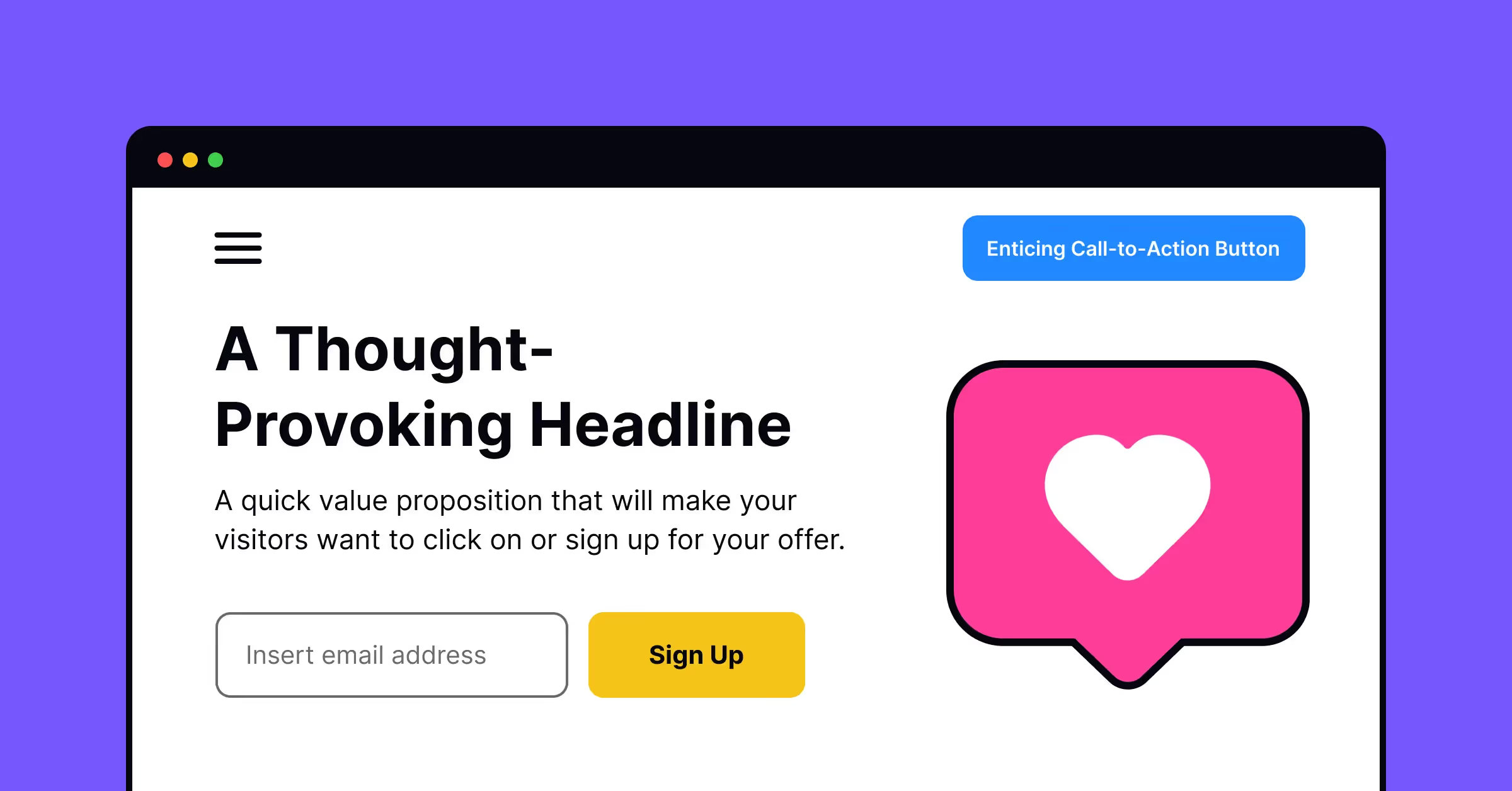
First, it's essential to create a great first impression with your homepage. Your homepage should be creative, inviting, and engaging enough to encourage visitors to stay on your site and ultimately convert them into customers. You must ensure your creative service team utilizes the best web design practices to do this.
Here are some tips for creating a powerful first impression:
- Use good design. Your website needs to look professional, clean, and well-organized.
- Use great headlines. Headlines should be short but catchy enough so that people will read more about what you have to offer.
- Have compelling images. Images are important because they help capture attention and keep readers engaged in the content on your page. Before uploading visuals, using an HD photo converter ensures that images are crisp and clear, contributing to a professional and appealing website appearance. Additionally, an image generation tool from Depositphotos can help create high-quality, custom visuals that align with your brand and enhance the overall look of your website.
Heuristic evaluation is an affordable and easy-to-use tool for evaluating your website's usability. The best part is that it can be performed by a group of design experts in a minimum amount of time and doesn't require special equipment. It can even be implemented using paper interfaces or screenshots! Check out our lesson on 10 Usability Heuristics by Jacob Nielsen to learn more about this topic and get started on your first evaluation.
Optimize Your Landing Page For Conversion
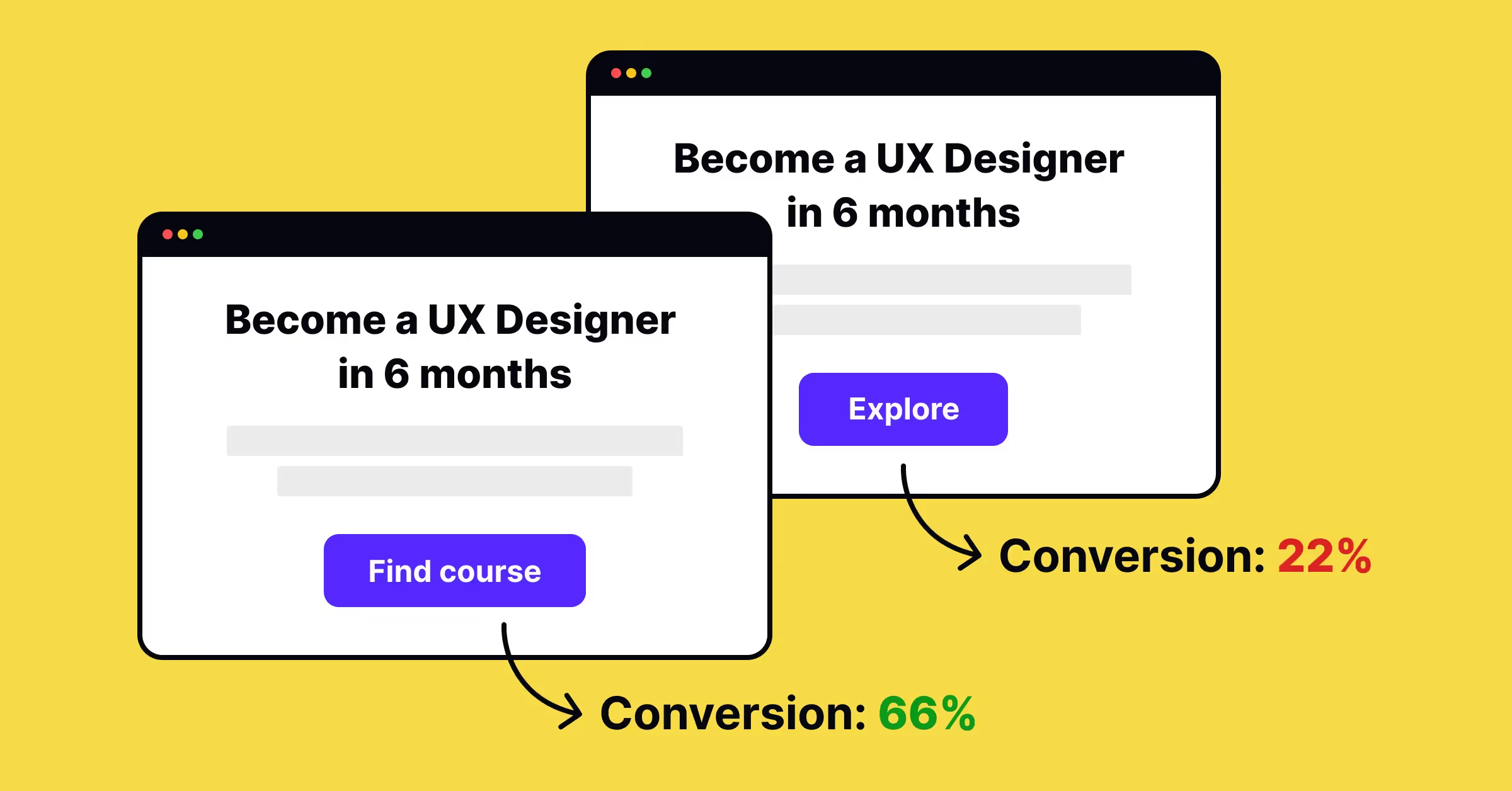
When it comes to web design, it's important to understand the difference between a landing page and the rest of your website. A landing page should be designed specifically for conversion and optimized for lead generation or sales.
The goal of your marketing website isn't just to attract visitors, but to convert them into leads or customers as quickly as possible. Having a creative services team can also be beneficial in developing custom graphics and content for an effective landing page. With the right team, you can create an attractive and impactful landing page that will help you achieve more conversions from your website.
Designing a high-converting landing page is not about magic or talent; it's a design pattern that follows specific rules to engage users and convert them into leads. Start with our Landing Pages: Basics and Best Practices lesson and continue exploring other design patterns that can simplify your work as a designer.
Design The Website With The Customer Experience In Mind
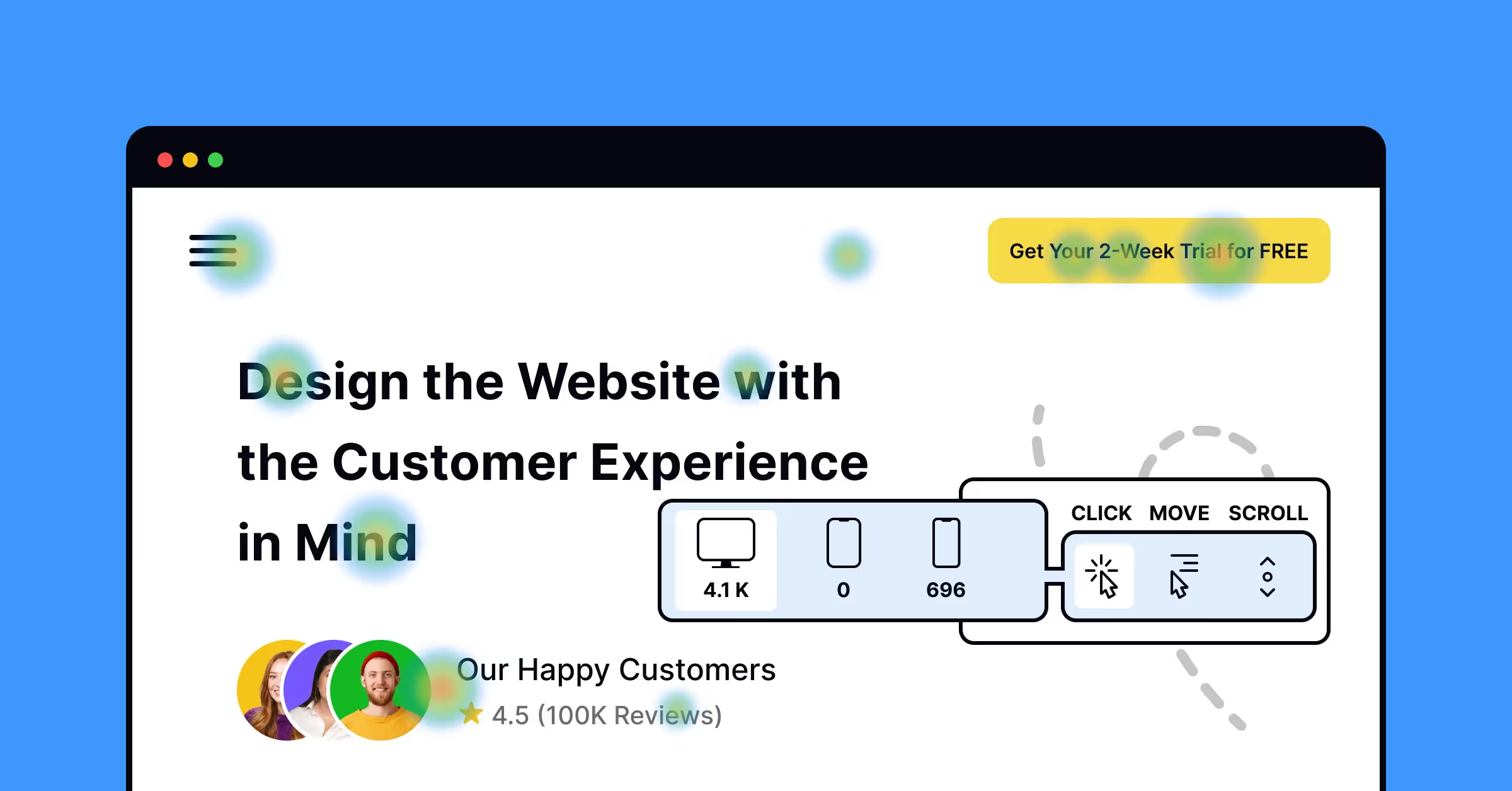
When designing your website, it is crucial to keep the user experience in mind. Here are some ways to do so:
- Use a customer experience design process to create an effective marketing website. This involves exploring the needs and preferences of your target audience. By understanding your customers, you can guide the planning and development stages of your website from concept to launch.
- Use customer experience design tools like HotJar Heatmap or Smartlook to see where people click on web pages. This way, you can focus on those features while designing your websites or apps.
User research is key to user-centric design. Understanding what your users and customers need will help prevent your team from trying to please everyone and instead create a product that fulfills someone's needs. Our comprehensive User Research course will help you begin incorporating research into your design process and build intuitive and helpful products.
Build Confidence In Your Brand
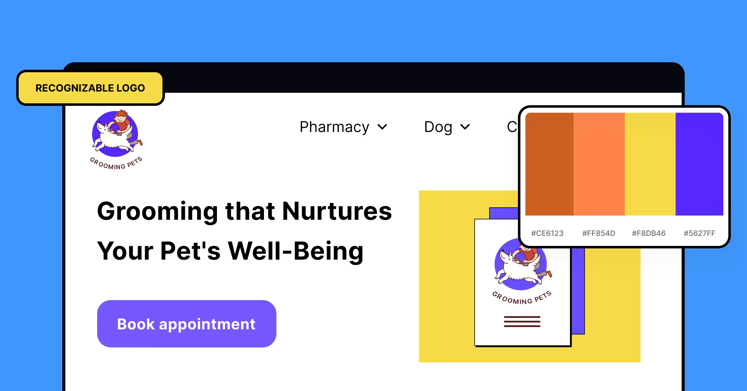
Web design is not just about how a site looks, but also about how it feels to use. If a visitor lands on an unfamiliar page and needs to figure out where they are or what to do next, they will likely leave and never return.
To avoid this situation, use a consistent look and feel across all marketing materials, including websites, social media profiles, email newsletters, and ads on other websites. This means having:
- A recognizable logo design
- A color palette that unifies all of these elements
- A tone of voice for communicating with customers using copywriting on each page and voice-over narration as users navigate the site.
Explore the traditional meanings of colors and how they can affect our moods. Learn how designers can use this knowledge to create accessible and harmonious color palettes in our Color Psychology course.
Create A User-Friendly Navigation Bar
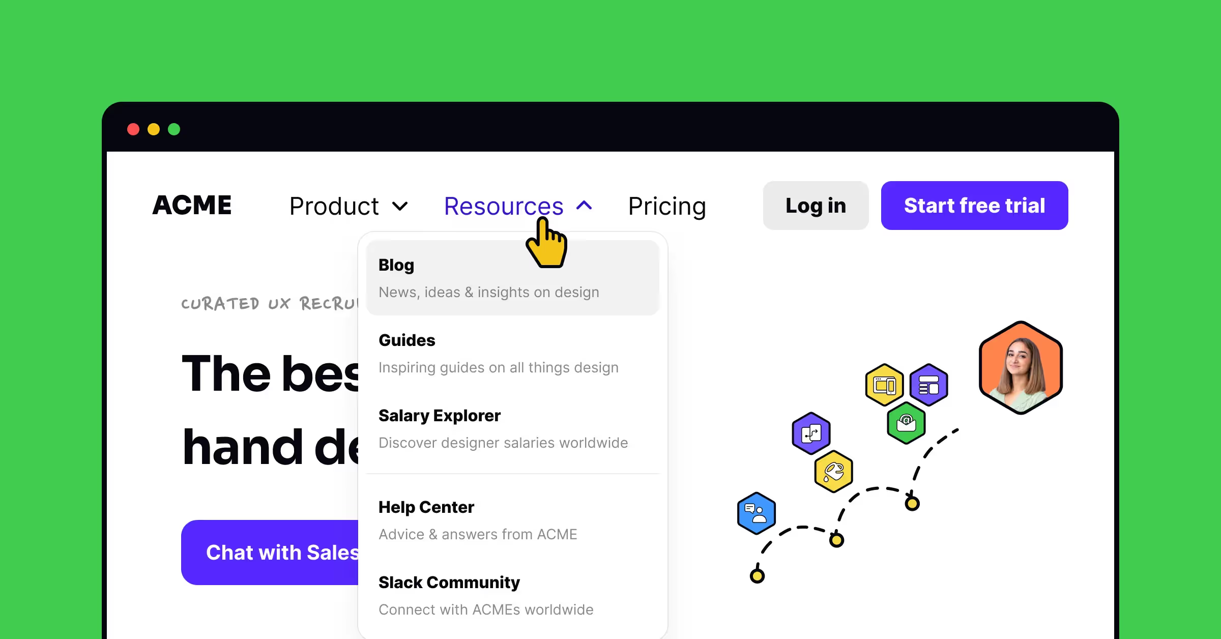
Your website's navigation bars are crucial in helping customers find their way and navigate between pages. A good navigation bar will have clear labels and be easy for visitors to use. On the other hand, if you don't have one, your site could be confusing or even frustrating for some people.
The design and layout of your navigation bar should match that of other parts of the site so that it doesn't stand out from the rest visually or functionally. This helps create consistency throughout the website, making users feel more comfortable using it.
Get The Right Tone Of Voice For Your Marketing Website
Your brand's personality can be found in its tone of voice. It sets you apart from other businesses and makes you memorable to customers. Your tone of voice can help build trust with potential customers, leading to more conversions or sales.
When creating a marketing website for your business, you must choose words carefully to reflect the tone of voice representing who you are as an organization. The best way to do this is by making sure every piece of content on your website sounds like something someone from within your company would say — not just some generic copywriter who doesn't know anything about what makes your company unique or special.
As a designer, you may think that you don't need to know how to write website copy or microcopy. However, the truth is that many designers, especially at small companies, are responsible for creating text. Having UX writing skills can be a great supplement to your design work. Even if your team has staff writers, being able to create copy for your website or app means that you can test your designs before the actual copy is ready.
Our UX Writing course is helpful for designers who write for their teams, and for those who simply want to feel more confident in their writing skills and be able to substitute for a writer when necessary.
Take Advantage Of Content Management Systems (CMS)
.avif)
A content management system (CMS) is software that allows you to edit and add new content to your website. It's similar to using Microsoft Word or Google Docs but specifically made for creating and maintaining websites.
As a web designer, you can use a CMS to create and manage your clients' websites more efficiently. Instead of coding every page and content update manually, you can use a CMS to make changes quickly and easily. With a CMS, you can manage your website's content, including text, images, and videos, as well as your website's layout and design.
There are many popular CMS today, and here are the leaders of the pack:
- WordPress – This is the most popular CMS, with over 80 million active websites using it as their platform. It has an extensive library of plugins and themes to customize your site however you like.
- Drupal – A powerful open-source system that gives developers more control over website performance, content management, and security.
- Joomla – A free, open-source CMS that offers much flexibility in building your website. Great for small businesses looking to get started on their first website.
Overall, using a CMS can save you time and effort as a web designer, allowing you to focus on creating a great design and user experience for your clients.
Create Engaging Calls To Action On Every Page Or Section
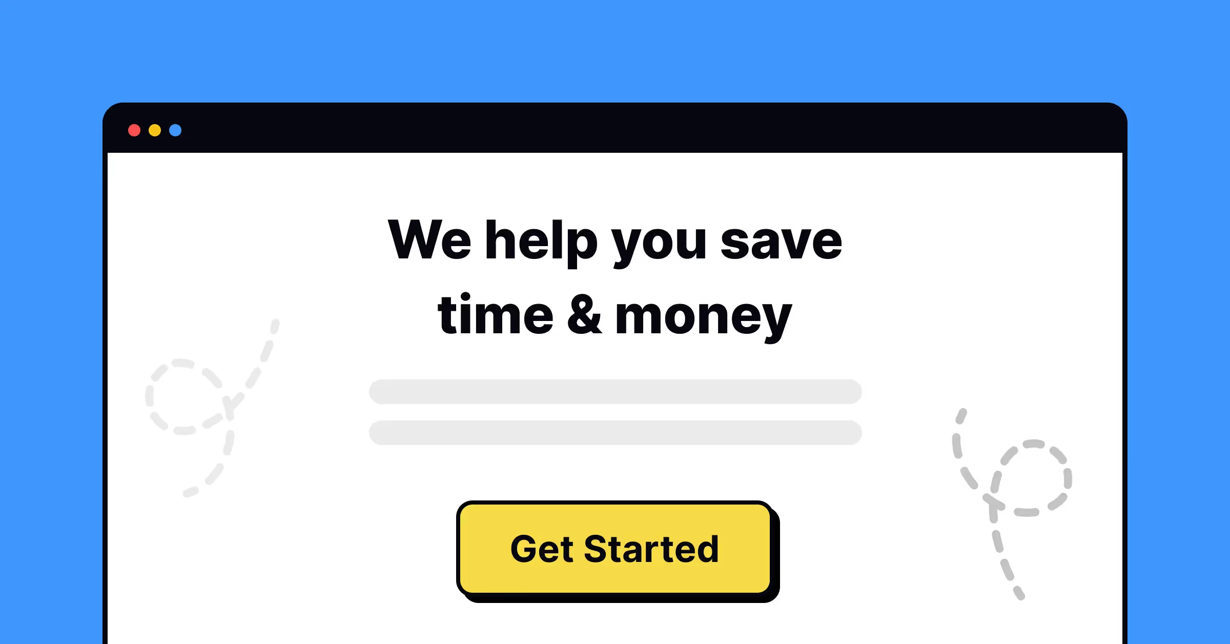
A call to action (CTA) is a way to get people interested in what a website offers and willing to buy it. Designers use CTAs to encourage visitors to take specific actions on the website, such as signing up for a newsletter, downloading an e-book, or buying a product. Effective CTAs are clear, concise, relevant to the content displayed, and have a specific goal. By using CTAs, designers can help boost conversions and sales on their website.
The best calls-to-action are:
- Clear and concise. Your goal with this type of CTAs should be clear and concise enough so that users can understand them without any problems or confusion (even if they're not native English speakers).
- Relevant. You need to ensure that each CTA on every page or section of your website relates directly to whatever content was displayed right before it.
- Specific. This means having a clear goal when creating these types of CTAs, whether getting people signed up for trial accounts or buying directly through the PayPal payments system, etc. Don't just throw anything out there because chances are those clicks won't convert into sales.
Learn more about design tools for marketing websites by taking our Design in Marketing lesson.
Final Thoughts
Since the beginning of time, people have sought ways to communicate with each other. Today, we have more options than ever before. An effective website is essential for maximizing your online marketing efforts. By applying the right web design tips, you can create a website that is attractive, informative, and user-friendly.
To achieve this, it's important to stay organized and prioritize the user experience. This will allow you to create an effective website that enhances your online presence and encourages repeat visits. Additionally, keeping up-to-date with the latest technology and tools will help you stay ahead of the competition. With some effort, you can develop a website that drives your business to success.
Start creating engaging websites with Uxcel
Creating functional, user-friendly, and engaging websites doesn't necessarily require a bachelor's degree in design. You can start by learning the fundamentals of UX and UI design through free online courses.
One option for learning these essential design skills is through Uxcel's online courses and lessons. Uxcel's platform offers a wide variety of lessons on key design topics, including color psychology, gamification, common design patterns, and even HTML and CSS for designers. These courses can help improve your skills as a web or UX/UI designer, and ultimately, lead to better website design.
Don't worry if you're new to web design – Uxcel's online courses are designed for anyone who wants to learn the fundamentals of UX and UI design. With free access to a variety of topics, you can start learning and improving your skills today.
Sign up to get started and take the first step toward creating engaging websites.


