During this time of year, we all look forward to the new year and anticipate what it will bring us. The design community is no exception. Every year, design experts try to predict which design trends will come and go or stay and coexist. New digital technologies and design tendencies evolve gradually — that’s why it's not surprising that we see certain trends move from year to year.
Let’s take a look at the most promising and intriguing trends in UI, UX, and product design awaiting us in 202.
1. Bold Colors
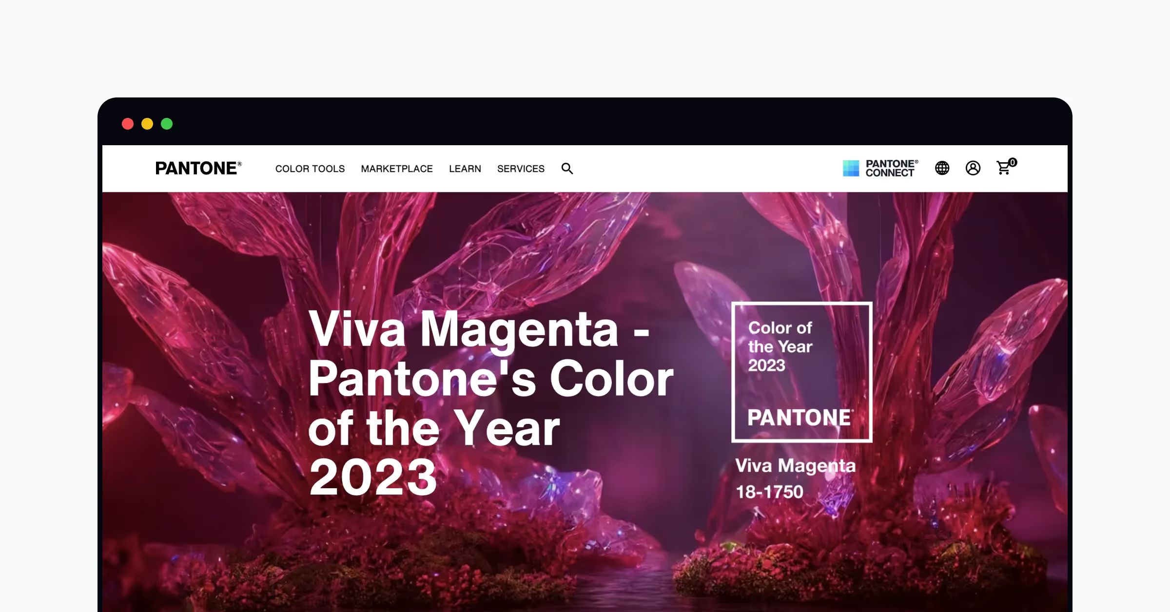
Bold and vibrant — those are the attributes of Pantone’s color of the year for 2023 — Viva Magenta. It’s a crimson-red tone that presents a balance between warm and cool. Characteristically, the color is:
- Assertive but not aggressive
- Powerful but not arrogant
- Fearless but not careless
Generally, reds symbolize life, power, passion, and dynamics. Using the viva magenta color on your website or app will inspire people to take on new challenges, be brave and confident, but remain compassionate.
Learn about color psychology and the profound impact it has on design with Uxcel's Color Psychology course.
In light of all the disruptive events of 2022 — the pandemic, war, global warming, an unstable economy, and social unrest — this color was chosen to inspire people to fight for humanity. While many interfaces tend to use pale and soothing colors, designers can try viva magenta for primary brand colors to create a fearless and engaging brand personality.
Reds draw the eye and stand out against other colors. Whether you use it in your website's illustrations and imagery or add some splashes to app interfaces, it will ensure your product stands out.
2. Nostalgia and Y2K Aesthetic
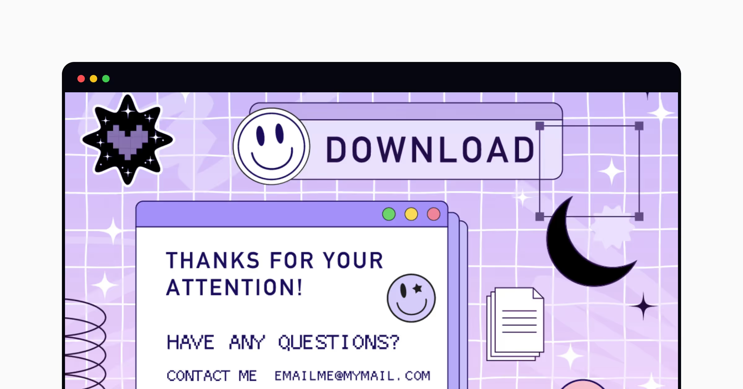
The Y2K aesthetic is everywhere in the digital world today — from fashion and pop culture to technology. Graphic design trends popular in the late 90s and early 2000s are currently experiencing their second birth. Among them are:
- Pixelated images
- Clipart icons and stickers
- Contrasting colors
- Cheesy illustrations
- Gradients
- Shiny imagery
- Thicker lines
- Metallic colors
- Loud and bold typefaces
Like many things in life, design is cyclical, and bringing back design trends can be notably beneficial for a product. On the one hand, nostalgia evokes a sense of familiarity and sentimentality in people who remember the old times. On the other hand, old trends appear fresh and unique for the younger generation because they are experiencing them for the first time in their lives.
Today, designers can take the best of two worlds and bring back Y2K design trends with all the benefits of a new technology era, including superfast internet and personalized user experience. Before applying the Y2K aesthetic to your designs, investigate whether it suits your audience’s preferences. If you want to use such a style on a dating app, it’s likely to be a great fit. A banking app designed with a Y2K aesthetic, on the other hand, would probably look discordant.
3. Neo Brutalism
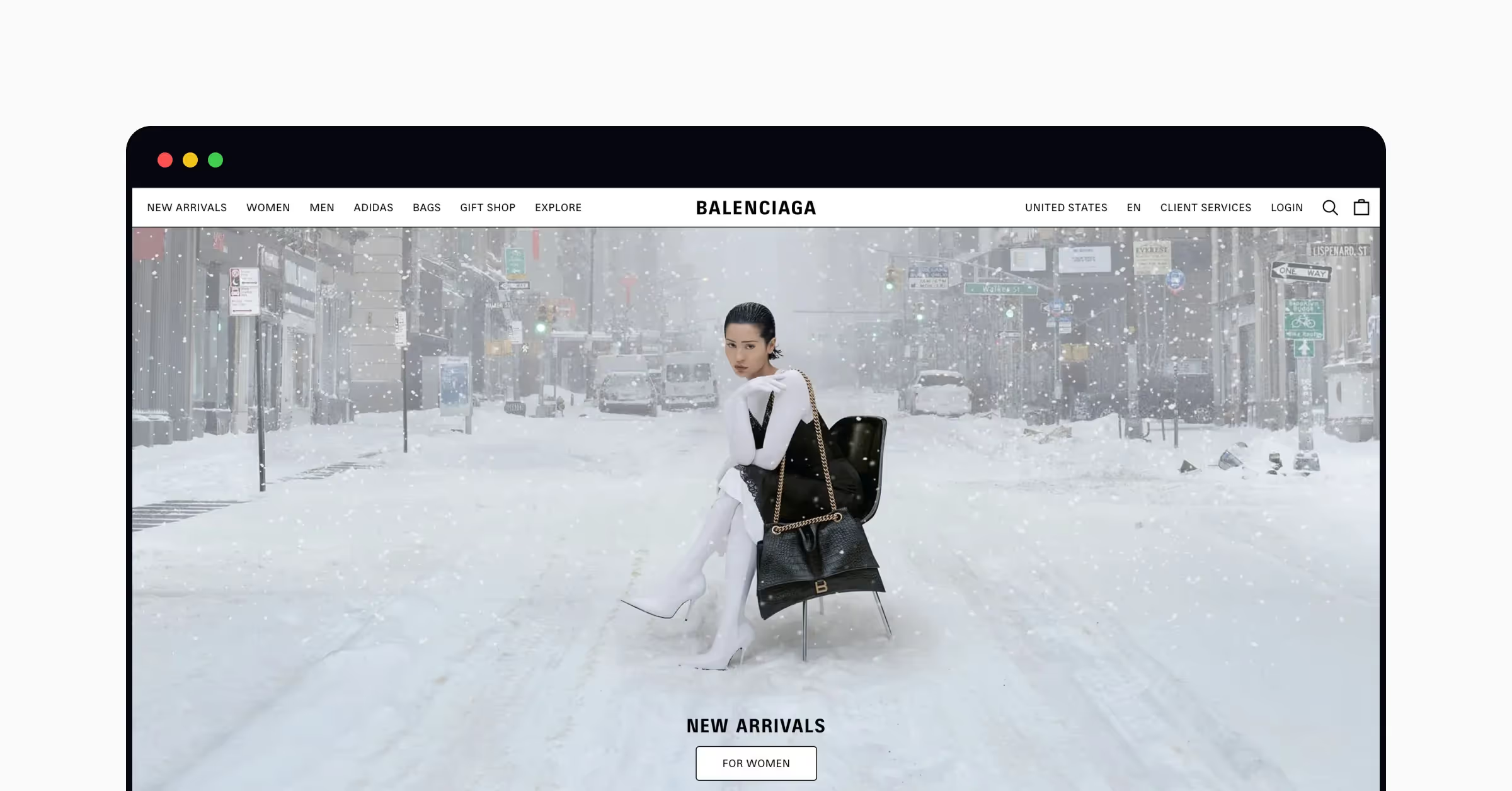
In digital design, brutalism manifests itself in raw forms, exposed grids, massive typography, layers, and almost unstyled HTML. In recent years, polished, clean, but boring and similar-looking websites and products have flooded the Internet. As a response to such design, brutalism uses provocative and rebellious shapes to give your interfaces a fresh and authentic feel. As a part of Y2K design trends, neo brutalism brings a nostalgic feeling of the early days of the Internet, when functionality and efficiency dominated form and aesthetics.
The characteristics of neo brutalism include:
- Raw text
- Geometric design
- Unprocessed photography
- Outlined buttons
- System fonts
- Underlined hyperlinks
- Monochromatism
- Solid color backgrounds
- Open navigation (in contrast to dropdown or hamburger menus)
Although brutalism is all about breaking the rules and creating unique forms, you should be careful about maintaining the visual hierarchy. Unusual shapes and sizes can overwhelm users and confuse their navigation and task completion on a page. Remember that user experience is paramount regardless of the visual design you select.
Besides, the style should fit your brand personality and meet user expectations. Before you apply this trend to your design, discover your audience's needs, preferences, and pain points.
4. 3D Interactive Objects
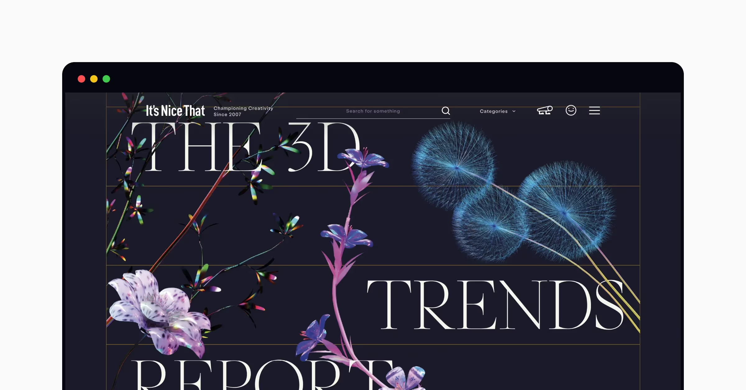
In recent years, designs have felt more three-dimensional, real-life, tactile, and textured than ever. It’s like you can extend your arm and touch these objects. Many UX and UI designers have started incorporating 3D elements into designs to remove boundaries between the physical and digital worlds and reimagine reality. According to a 3D Trend Report prepared by It's Nice That and Adobe Substance 3D, the most recent trends in 3D design include:
- Everyday objects: 3D design can help us rethink our relationship with a variety of commonplace objects, especially plastic and disposable ones. Our world faces an expanding climate crisis, and 3D design is one of the tools to make people think differently about everyday life and find more innovative ways to produce and utilize products.
- Uncanny avatars: Almost terrifyingly accurate and detailed 3D human models help us reconsider and understand the idea of being human today. Should we strive for flawless shapes, hair, and skin or accept our imperfections?
- Natural shapes and structures: Nature is one of the main sources of inspiration for 3D designers. Nowadays, it isn't just about replicating natural forms and lines but also about recreating and remodeling them. Designers illustrate how the organic and manmade worlds coexist and adapt to each other.
- Textures: 3D design software allows artists to create any realistic texture, from wood and shiny metals to fuzzy fur and glossy mirrors. Lifelike textures are fantastic tools for playing with the sense of reality and reimagining the ways everyday objects interact with each other.
Even if you don't intend to become a 3D artist, get familiar with the 3D design concepts to stand out against other designers and be able to operate 3D design definitions. Uxcel offers the 3D Design Foundations course that covers all the basics in modeling, texturing, lighting, and rendering.
5. Gradients
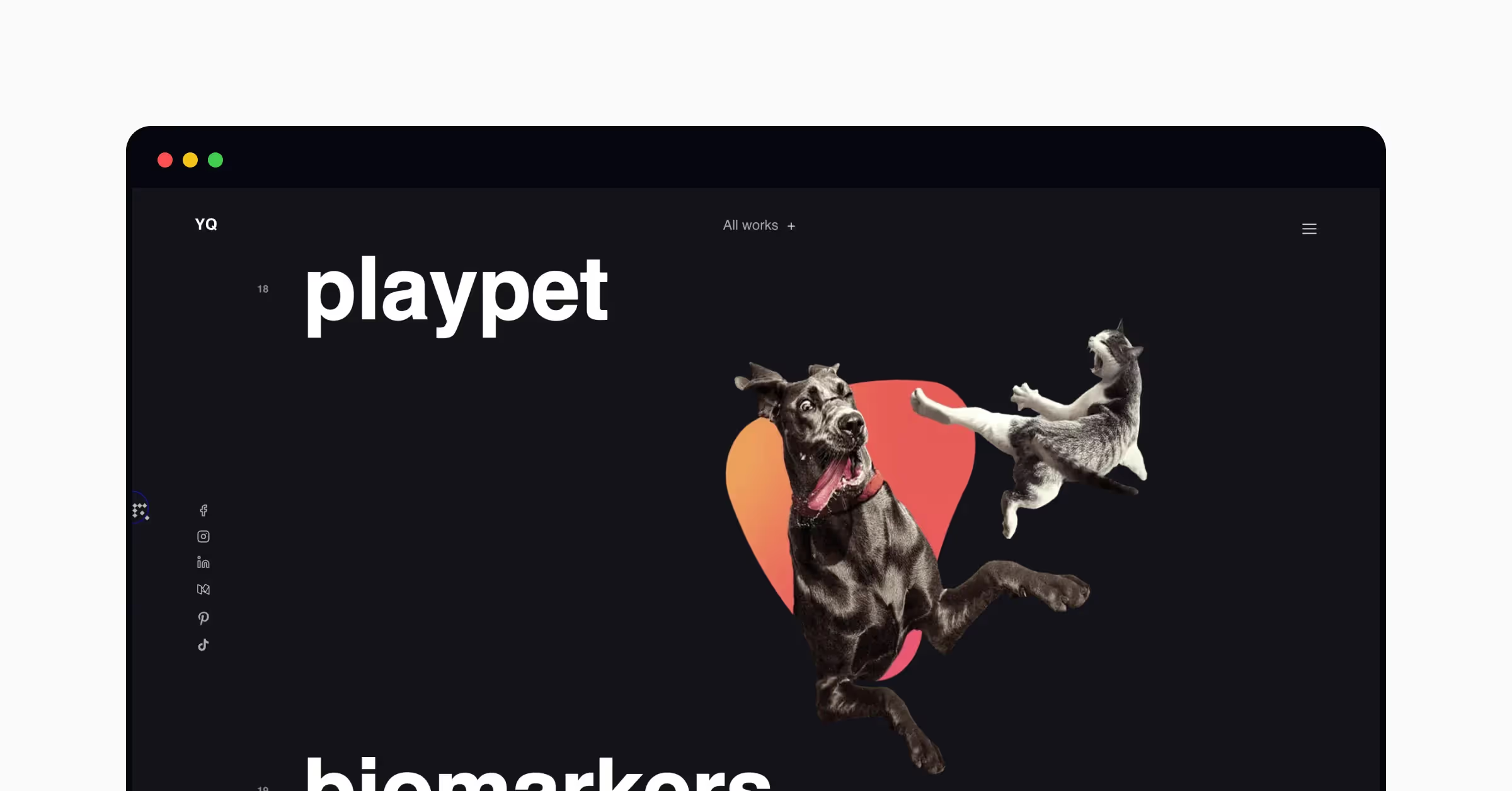
Popular in the 90s to late 2000s, gradients have come back to stand against flat, monochromatic designs in 2023. Colorful and vivid gradients can now be seen in backgrounds, photo overlays, logos, cards, or buttons. Combinations of dark and saturated colors increase depth and add a futuristic, mythic feeling to designs. Soft, muted gradients carry Y2K vibes and create dreamy, visually appealing aesthetics.
When combined with a variety of textures (furry, smooth, gritty, wooden, or metallic), gradients add an element of depth and visual rhythm to a design. For a clean and simple design, gradients should be used sparingly.
6. Personalization
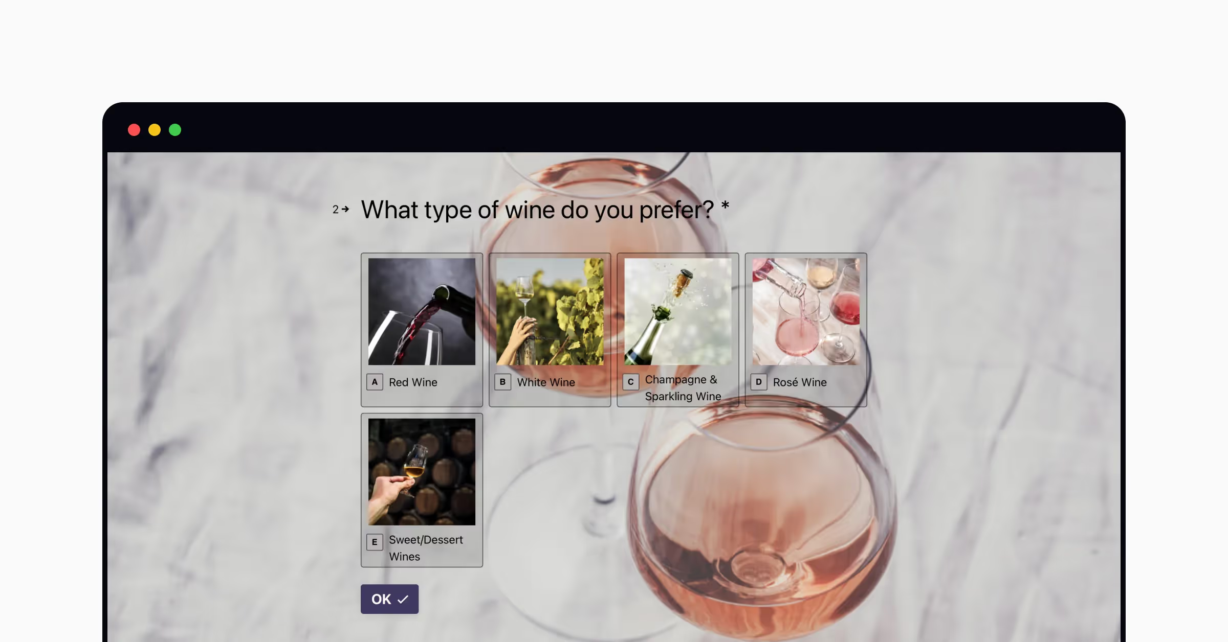
Personalization is growing faster than ever these days. According to LawnStarter's study, 90% of consumers expect products and services to be tailored to their needs and expectations. About 76% get frustrated when this doesn’t happen.
How can designers inject personalization into a product in a cookieless reality without violating user privacy? Consider adding:
- Personalized recommendations and offerings based on product quizzes
- Personalized deals and rewards based on users’ recent purchase history
- Personalized mobile notifications based on users’ behavior analytics and customer data
- Curated subscriptions based on users’ preferences and expectations
Customization is a variation of a personalized user experience. Unlike personalization generated by a system, customization allows users to adapt their experience to meet their preferences and needs. Memojis for iOS is one well-known creative way to engage users and add some fun to their interaction. These 3D animated avatars mimic users’ voices and facial expressions and can be used in messages and FaceTime.
The biggest concern when introducing personalization into your designs is user privacy. You have to make sure first that your customers consent to share their personal data with you and reassure them that your company takes data privacy seriously.
Any business will benefit from personalization. Not only does it increases a company’s revenue but also promotes customer loyalty and engagement.
7. AR & VR Designs
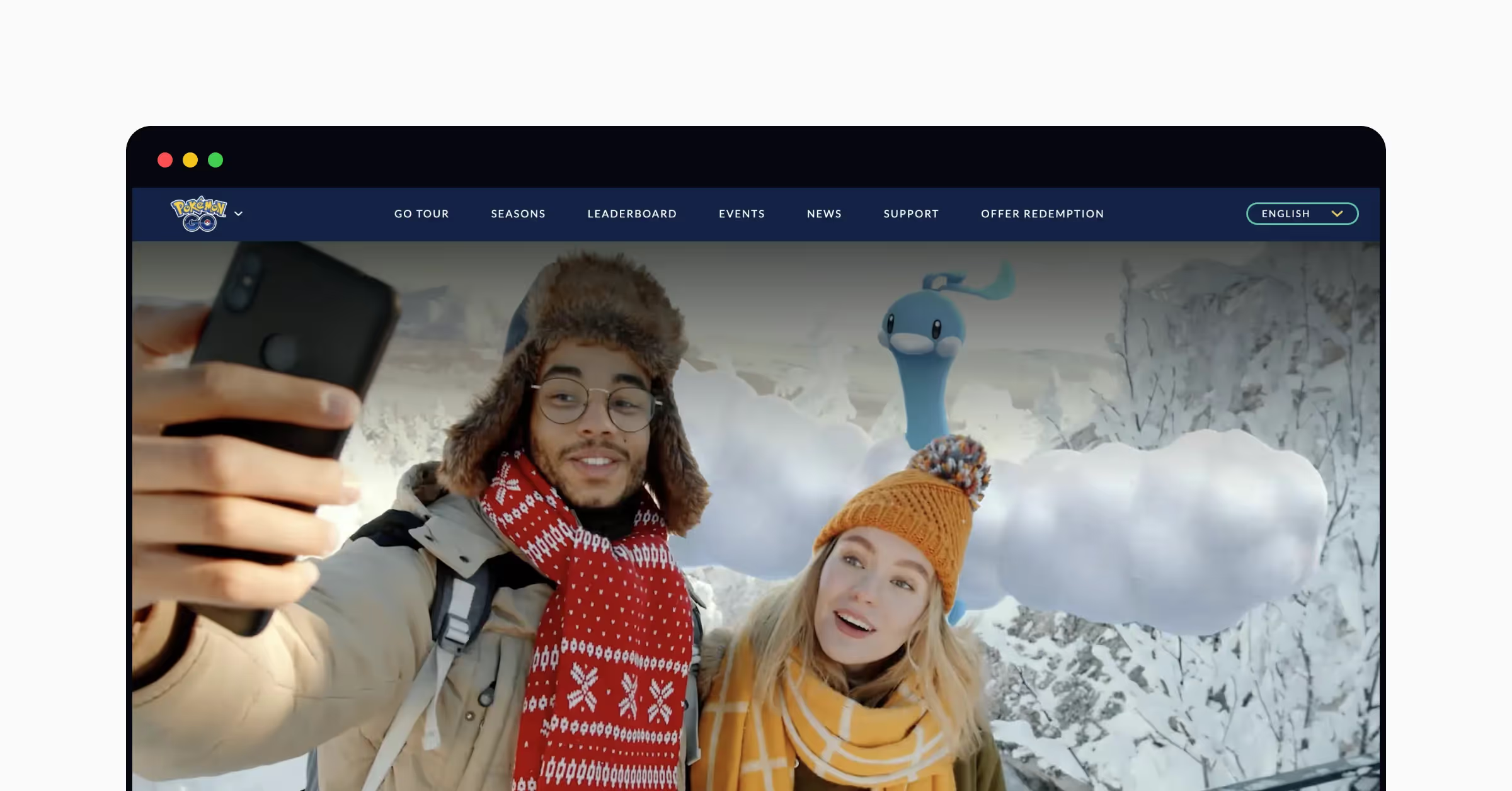
Although we’ve all heard of VR and AR technologies, not that many web products and services use them to enhance user experience. Until now, AR and VR have mostly existed in mobile apps like Pokémon GO and Google Lens.
Let’s first define what each of these technologies can do and how they function.
AR (Augmented Reality) is a technology that alters our reality when we look at it through our devices, like smartphones. Instagram filters are the most common example of AR that you might be familiar with.
VR (Virtual Reality) is a technology that recreates simulated experiences and allows us to interact with them using a dedicated VR headset.
While both technologies have huge potential in gaming, film and TV, social media, education, retail, and healthcare, engagement is still low. In 2023, designers will continue developing awareness of these technologies and incorporating them into their projects.
Virtual reality is becoming increasingly popular among companies that are focused on tech-savvy customers or those who want to stay up-to-date with cutting-edge technologies. For example, in 2022, Meta introduced their first Meta Quest VR headset that allows playing games, socializing, working with your team in a virtual room, or creating prototypes in 3D. For example, Pizza Hut produced limited-edition pizza boxes as a part of the company's "Newstalgia" campaign. Boxes contained QR codes which, when scanned on a smartphone, allowed customers to play an augmented reality version of the “Pac-Man” game.
Augmented reality (AR) takes things a step further in the world of e-commerce too. Online shopping is steadily growing in popularity. In 2022, online sales made up nearly 20% of worldwide retail sales. At the same time, 41% of US shoppers preferred physical shopping due to the opportunity to touch and feel goods before they purchased them. Augmented reality technologies can solve this problem.
Many e-commerce websites and apps enable customers to try on beauty products or apparel using their cameras. For example, with Sephora Virtual Artist, customers can see how beauty products are applied to their faces. With ASOS See My Fit, shoppers can select a virtual model and try clothing items of the relevant size on them.
There are a few significant benefits that businesses will get if they use AR and VR technologies:
- Increased engagement and conversions due to more immersive and interactive content
- Brand recognition and memorability against competitors
- Decreased refunds, returns, and dissatisfaction due to more informed purchasing decisions
8. Inclusive and Accessible Design
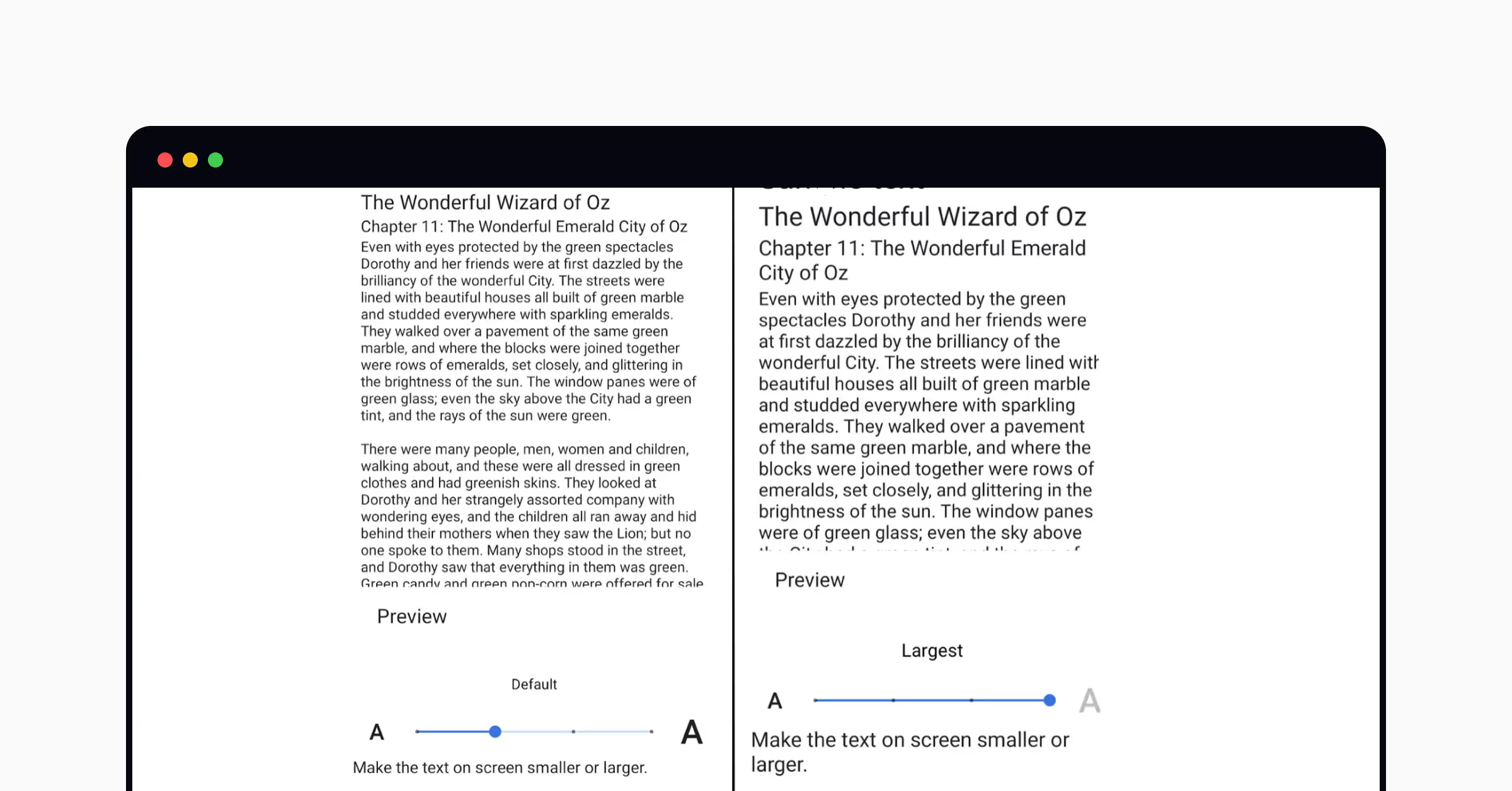
Inclusivity and accessibility are becoming paramount in a world where companies serve a global audience and aim to stand out against competitors.
Inclusive design provides solutions that fit everyone and doesn't leave any person or group out. Inclusive products are designed with the full range of human diversity in mind with respect to ability, language, culture, gender, age, and other forms of human difference.
Accessible design has a narrower scope than inclusive design. It's focused on ensuring that people with disabilities can access products and environments. Accessibility standards for digital products can be found in the Web Content Accessibility Guidelines (WCAG).
The most common inclusive practices include:
- Legible text for older users
- Accessible name and surname inputs for a global audience
- Inclusion of various demographic options when talking about race, ethnicity, religion, gender, or sexual orientation
- Avoiding gendered language
- Diverse imagery and illustrations
To comply with WCAG's requirements, ensure your interfaces:
- Comply with contrast ratio standards and allow all people, including individuals with visual impairments, to read texts
- Use transcripts and captions to ensure people with hearing disabilities can follow the content
- Include alternative text for images so screen reader users can decipher images
- Use headings and lists to simplify scanning and reading for users with cognitive disabilities
- Allow keyboard navigation so users with motor disabilities can navigate your products
- Avoid using flashing videos and animations or allow users to disable them
Learn all about the intricacies and best practices of accessible design in our Design Accessibility course.
9. Typography
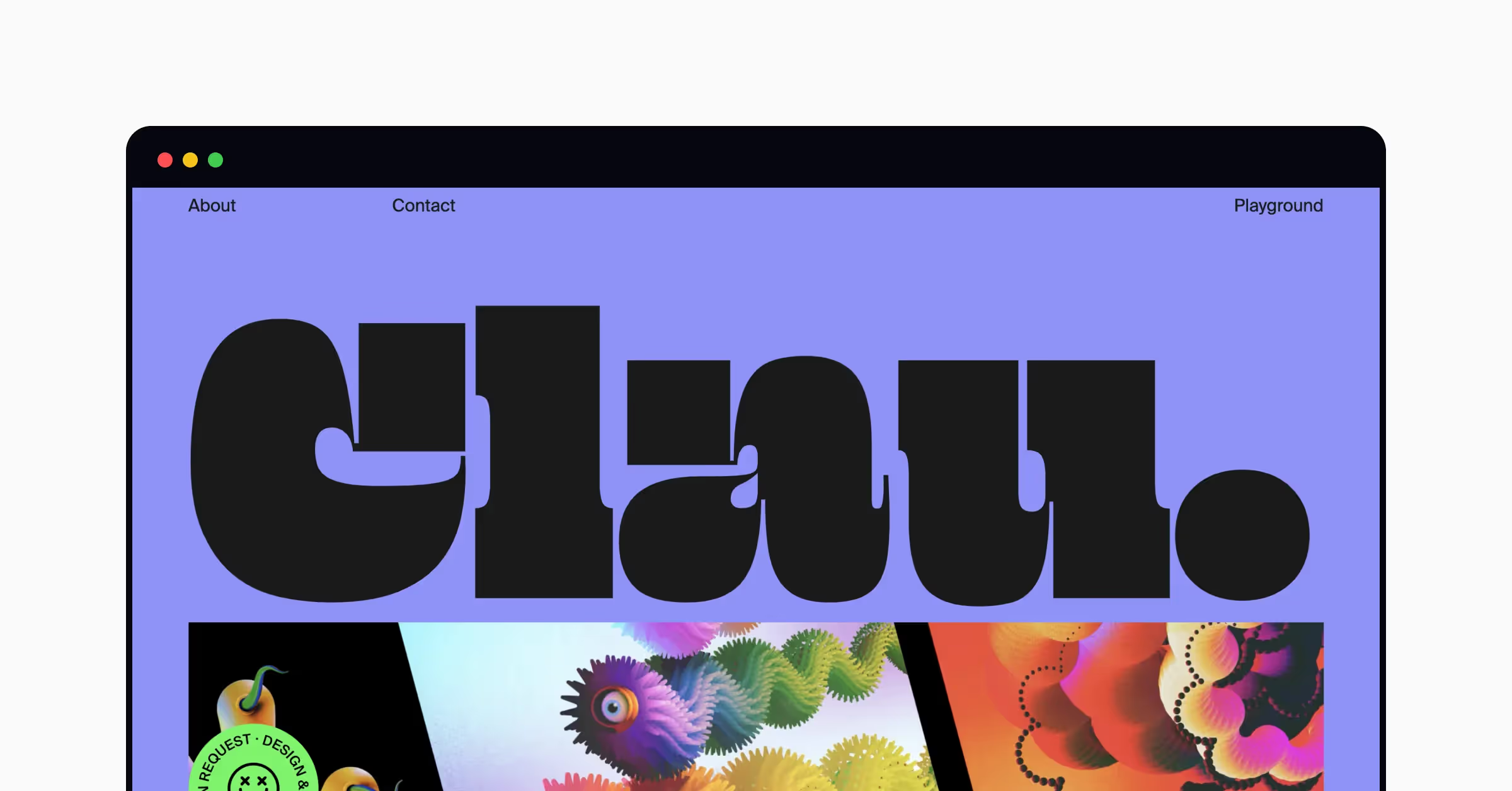
When choosing typefaces, designers should never follow typography trends blindly and instead focus on accessibility and legibility. However, trends reflect cultural shifts and attitudes in the design industry and help capture the spirit of the times.
Accessibility is above all
With 15% to 20% of the global population considered to be neurodiverse, large fonts and increased kerning seem like an effortless win. Designers should take a more serious approach to select typefaces for their interfaces and focus on understanding the needs of users with ADHD, dyslexia, and other learning disorders.
Recruiting users with accessibility needs for user research will help you identify problematic areas and improve your product’s typography to address the needs of all of your users.
Nostalgia
Nostalgic vibes of the Y2K aesthetic have spread into the typography field too. In 2023, we’re going to see fluffy, bubbly, puffy, shiny, liquid chrome, and all sorts of living letterforms everywhere. This iconic era will inspire designers to recreate fonts used in fashion, films, music videos, and magazines.
Custom type design
With a focus on enhancing brand recognition, designers will put a lot of effort into creating original typography. With the growing popularity of no-imagery designs, creative and impactful typefaces will become the major medium for communicating a message and representing a brand identity.
Iconography mashups
With reference to the 2000s, we’ll see icons, doodles, and abstract shapes in typography. Youthful and rebellious, these fonts are likely to resonate with audiences that accept the diversity and unpredictability of today’s world.
Although you should never follow typography trends blindly and better focus on the accessibility and legibility of typefaces, keep in mind that trends reflect cultural changes and attitudes in the design community.
Typography is commonly believed to be a UI design asset, but UX designers must understand how typography affects user experience. Uxcel's Typography course describes typographic principles and teaches how to choose and combine typefaces to deliver the message, represent a brand, and meet accessibility standards.
10. Microinteractions
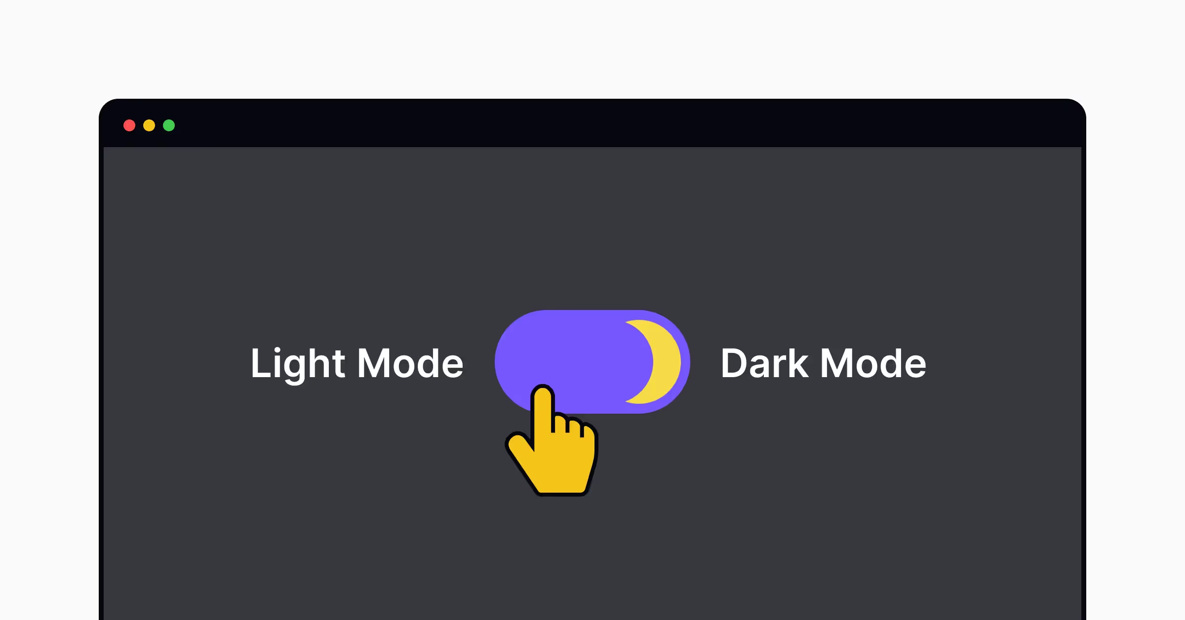
Microinteractions — small, single-purpose interactions that users have with a digital product or service — aren’t new in web design. They can serve many purposes, such as providing feedback, communicating status, or helping users achieve a specific goal.
Examples of microinteractions include setting the alarm on a smartwatch, liking a post on social media, or turning on the flashlight on a smartphone.
Coming into 2023, microinteractions will become a more significant part of user experience as they help make the product more usable and engaging for users.
Why do microinteractions matter? When done right, microinteractions evoke positive emotions, personify your product, and make it more memorable. More importantly, microinteractions can help brands gain recognition amid increased market competition.
Consider adding microinteractions to:
- Empty pages and 404 error pages
- Inputs and navigational elements to keep users engaged
- System statuses to inform users of what’s happening
- Onboarding tutorials to add some fun and engage users
- CTAs to nudge users to action
Don’t overdo microinteractions and avoid using them when they can distract users from completing the main task.


