

.svg)


In the early days of the internet, a header was simply a navigational slip at the top of the page containing a logo, contact information, and the CTA button. Today, we consider everything that is “above the fold” to be part of the header.
The header is the first thing that users see when they come to your website. At the very beginning of the user journey, a strong header sets the tone and engages visitors right away. Headers play a crucial role in branding by incorporating your brand’s colors, logo, and messaging to enhance recognition and identity. It should be informative and accurate so that users can understand what your page offers in a split second. Plus, the header should capture users’ attention with eye catching visuals and encourage them to explore your product further. Studies show that users take less than 50 milliseconds to make their first opinion of a website. And the responsibility to make a good impression falls almost entirely on the website’s header from the very moment it appears.
Get acquainted with the basics of designing headers with our Intro to Headers lesson. What type of header is best for your website depends not just on your aesthetic preferences but also on the type of product you want to sell.
Introduction to header design
Header design is an essential element of any website, acting as the first point of interaction between your site and its visitors. A well-crafted header not only sets the tone for the entire web experience but also plays a crucial role in usability and accessibility. By providing clear navigation and easy access to key pages, a thoughtfully designed header can enhance the overall user experience and leave a lasting impression. Whether you’re looking for inspiration or aiming to create a unique look for your site, exploring different header design examples can help you discover new ideas and approaches. Ultimately, a great header is more than just a visual feature—it’s a strategic component that guides visitors, supports your brand, and elevates your website’s design.
Understanding header components
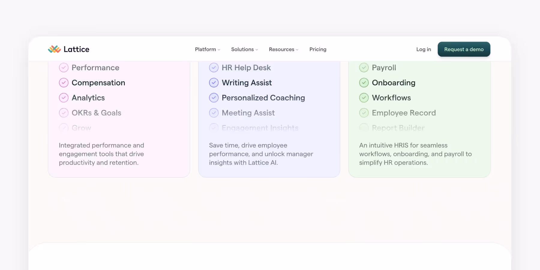
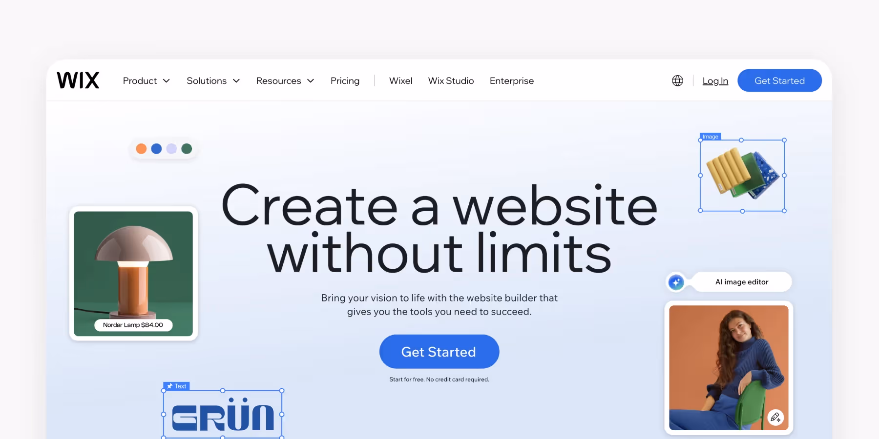
A header is made up of several key components that work together to create a seamless navigation experience for visitors. The logo, often positioned on the left or center, is a simple yet powerful way to reinforce brand identity and provide a familiar anchor point for users. The main navigation menu should be concise and intuitive, featuring links to essential pages such as the homepage, about, and contact sections. Including a search bar in the header can be especially helpful for content-rich websites, allowing visitors to quickly find what they need. Call-to-action (CTA) buttons, such as “Sign Up” or “Contact Us,” can be strategically placed to encourage user engagement. By combining these elements thoughtfully, designers can create a header that is both functional and inviting, making it easy for visitors to navigate the site and access important content.
Designing for brand identity
The header is a great place to showcase and reinforce your brand identity. A simple header design can effectively communicate professionalism and trust, while a more creative approach can highlight your brand’s unique personality. Consistency is key—make sure the header’s style, colors, fonts, and images align with your overall brand guidelines. Designers should choose elements that reflect the brand’s tone and values, whether that means using bold colors for a dynamic business or subtle hues for a more refined look. Adding distinctive images or textures can help your header stand out and leave a memorable impression on visitors. By thoughtfully designing the header to match your brand’s personality, you ensure that every visitor’s first interaction with your website is both impactful and aligned with your business goals.
Header types
Although the header section plays the same role on websites — introduce the primary navigation, include CTA buttons, and represent the logo — there are different types of headers you can encounter on the Internet. It all depends on the type of your website and your brand style. Maintaining a consistent design approach across each header section is important for reinforcing your brand identity and building trust. At the same time, you can customize header elements such as logos, colors, and layout to suit different needs or campaigns.
- Classic header
- Magazine-style header
- Hero header
- Vertical navigation drawer
- Header with a hamburger menu
- Sticky header
- Header with a double menu
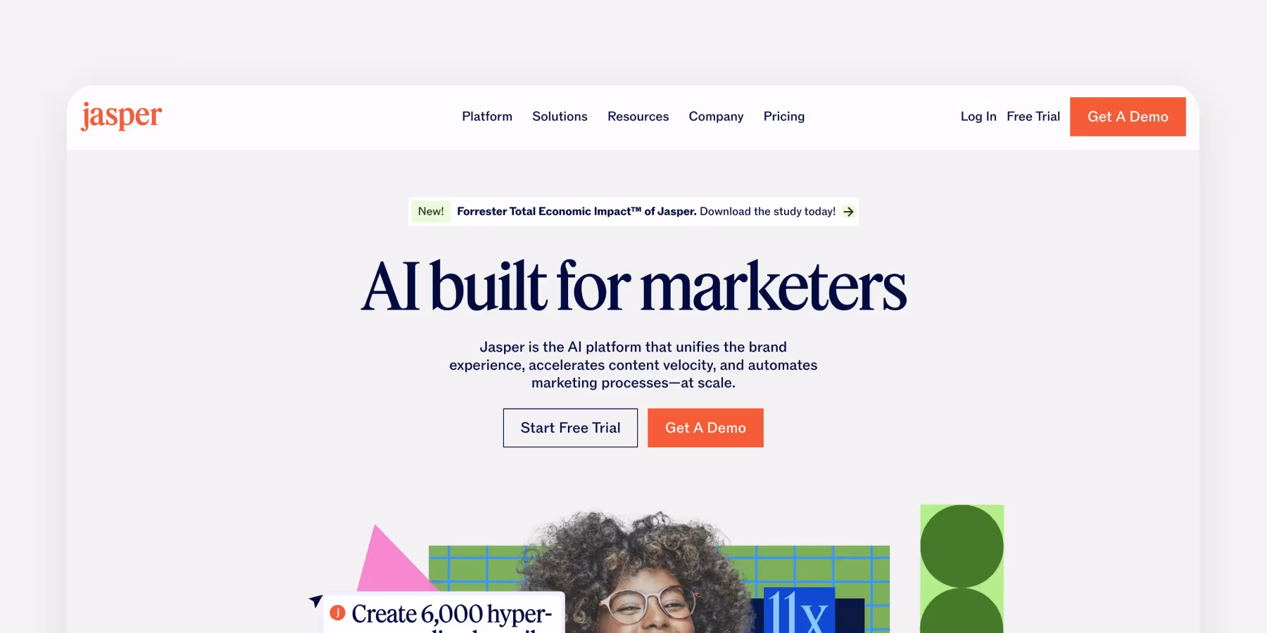
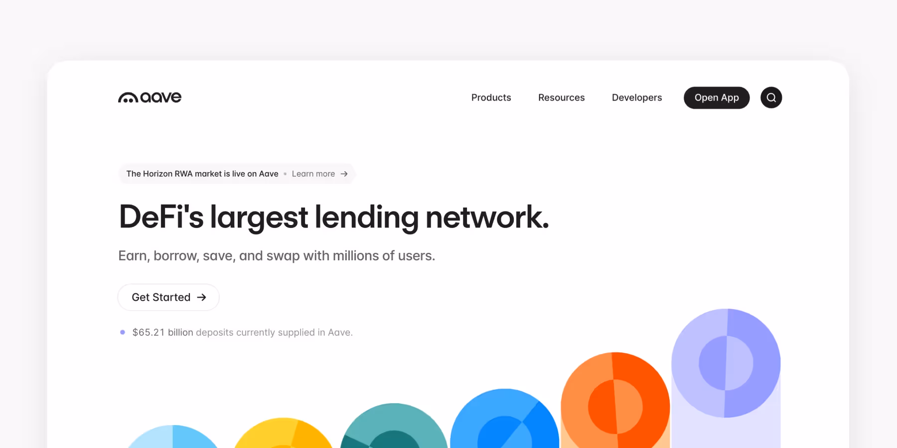
1. Classic website header
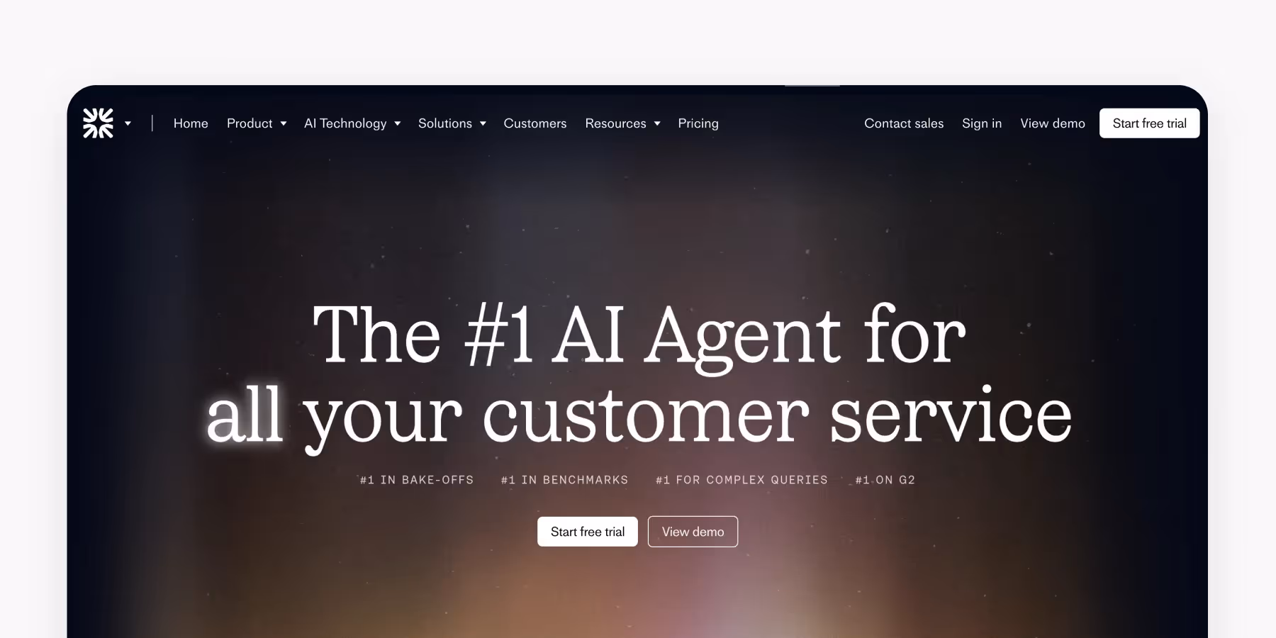
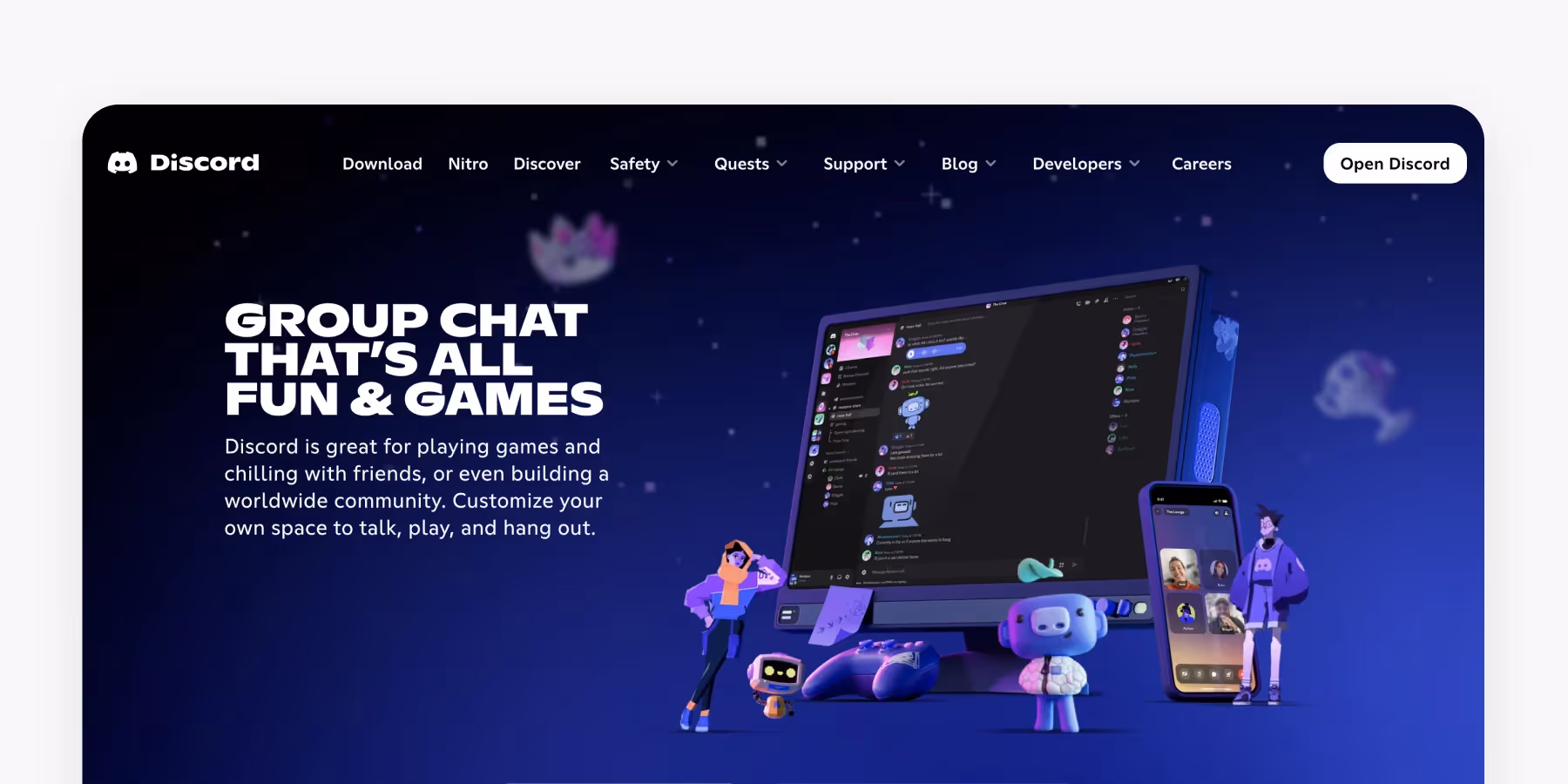
The classic header is the most popular and most recognizable type of header found on the web. It usually consists of a bare minimum: the logo, contact information, the CTA button, and links to basic categories of website content. These navigation links are essential for guiding users' attention and improving usability by providing a clear visual hierarchy within the header.
Where should you use it? Well, classic things never go out of style. Such headers are functional enough for landing pages or simple websites without a complex hierarchy.
Plus, classic headers comply with the most common eye-tracking patterns, like the Gutenberg pattern, Z-pattern, and F-pattern. The human eye starts to travel from the top-left corner and moves horizontally to the top-right — meaning that such a header becomes the strongest focal zone.
2. Magazine-style website header
Magazine-style headers are an excellent choice for digital newspapers and magazines that want to preserve the retro styling of printed editions. A magazine-style header usually has an enlarged logo that sits separately from the navigational menu, the Subscribe button, and other elements like the Search icon. You can also add more icons, links, or buttons to the header to enhance functionality and improve user experience.
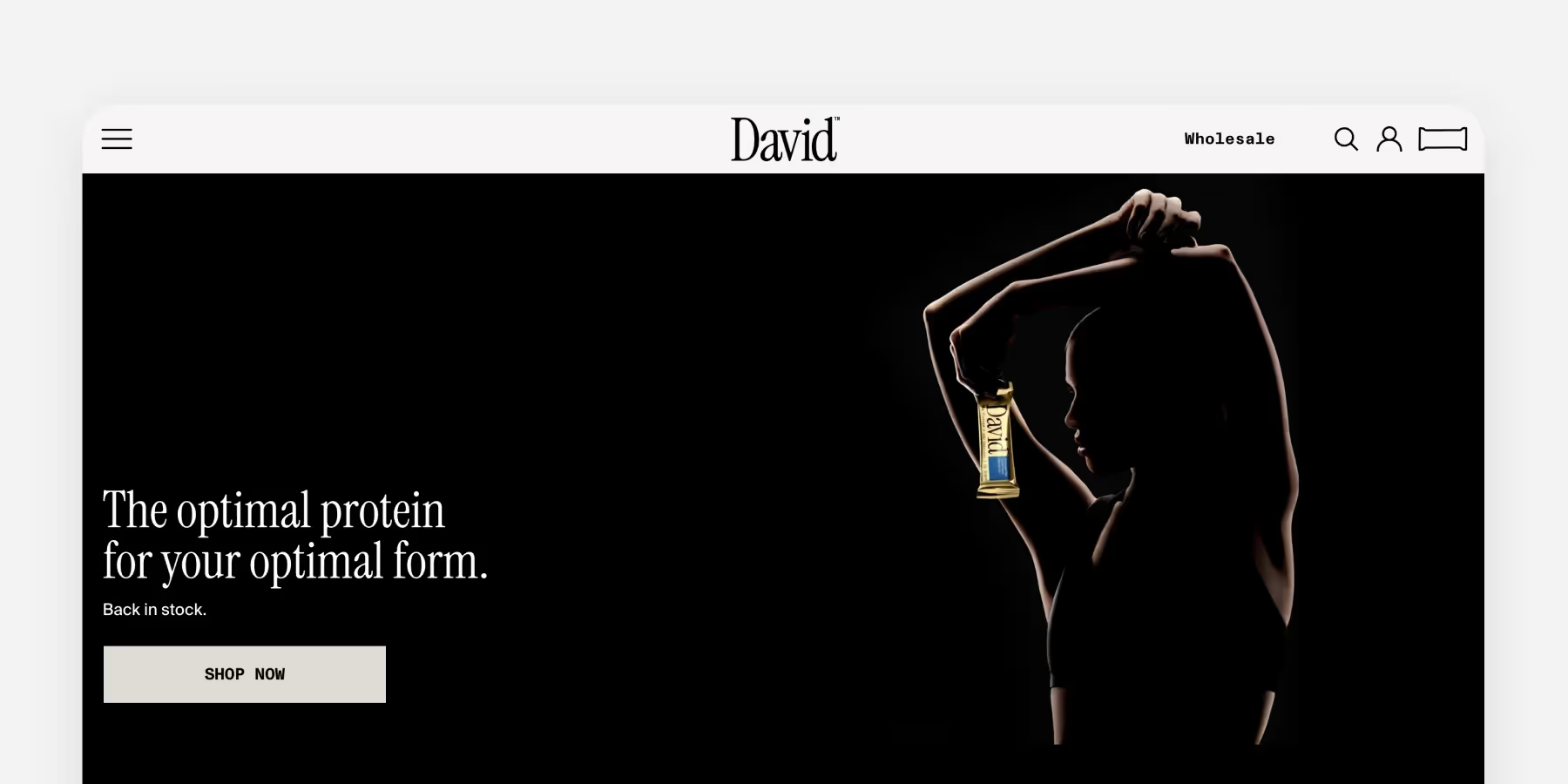
3. Hero website header
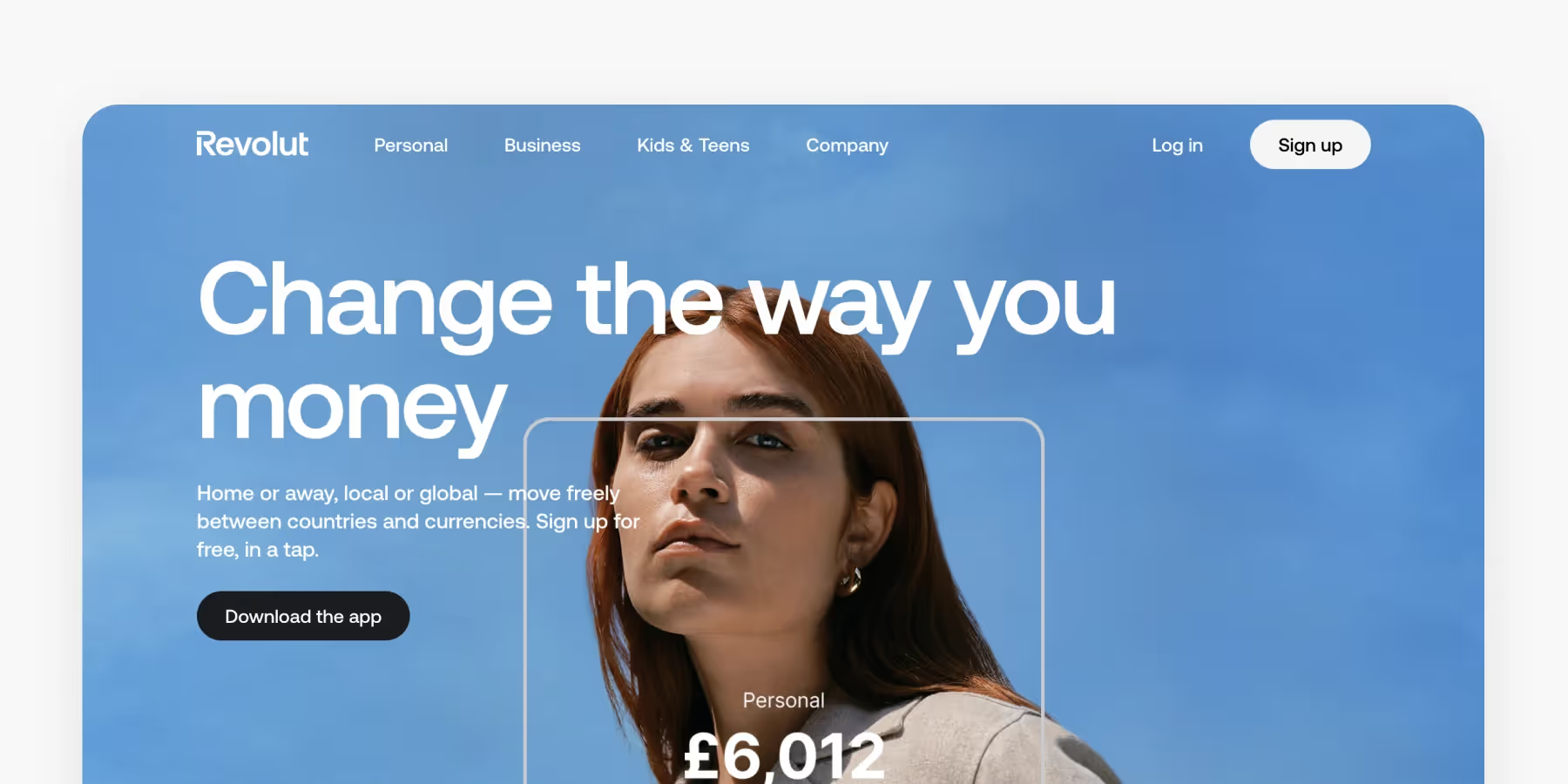
As the name suggests, a hero header sits where the hero image is placed. It results in a minimalist design that immediately draws users’ focus to the visuals in the center of the page. Hero headers are an excellent choice for simple websites, such as portfolios or landing pages. A portfolio section is essential for creatives and service providers, as it showcases their best work and helps attract potential clients.
Pay greater attention to picking the hero image. Besides being aesthetically pleasing, it should communicate the website’s theme and value clearly.
4. Vertical navigation app drawer
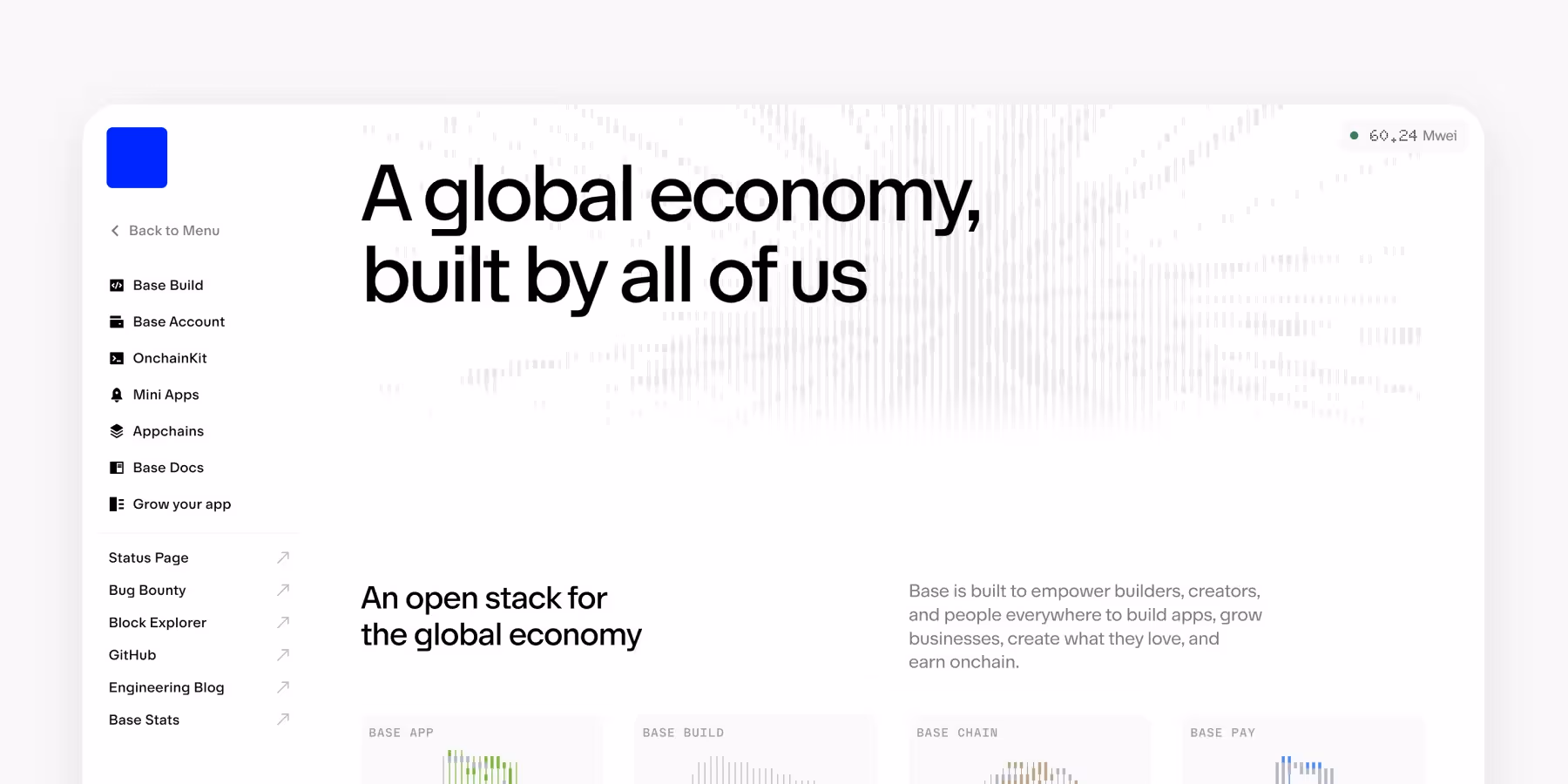
A vertical navigation drawer placed on the left represents a very flexible type of header. While this type of navigation fits almost any product, the sidebar menu is particularly beneficial for complex applications and websites. For example, you can encounter it in admin apps, desktop apps, and products where users can configure navigation options — think of Slack channels, Outlook folders, or Confluence hierarchical menus.
5. Website header with a hamburger menu
Nothing is worse than a messy page with multilevel headers. The hamburger menu icon helps keep the header clear and concise and provides easy access to additional navigation options. Its mouthwatering name comes from its design — the three identical horizontal lines that made people think of hamburgers, and the name found its way into users’ hearts. Visually, the hamburger menu area often appears as a horizontal strip at the top of the website, serving as a prominent design element that enhances navigation and branding.
To avoid friction, place the hamburger menu button in the left or top-right corner — because that’s where users expect it to be. Regular website visitors understand the function of this button and don’t have trouble finding the main categories. Headers with hamburger menus have an elegant, minimalistic look and save place for other essential layout elements. Such headers also conform to responsive and adaptive design principles, as they ensure that the UI looks uniform and cohesive on different devices.
Use hamburger menus cautiously as they can significantly affect user engagement. According to Nielsen Norman Group findings, products with hidden navigation are 20% less discoverable than sites with visible or combo navigation.
6. Sticky website header
As the name suggests, sticky or persistent headers stay on top (or the bottom) of the page at all times and aren’t affected by scrolling.
On the one hand, sticky headers are an excellent usability solution. They allow users to quickly access the main navigational categories, return to the home page, or search content without scrolling up to the top of the page. Sticky headers also make it convenient for users to log in to their accounts from anywhere on the site. Compared to headers with hidden navigation (hamburger menu), sticky headers increase discoverability and lower the chance of users getting lost. Plus, they’re an excellent choice for mobile interfaces, leaving the most critical actions at users’ fingertips.
On the other hand, poorly implemented sticky headers can be annoying, take up too much space, and distract users from page content. Consider partially sticky headers that appear on scroll up. They still keep navigation accessible from anywhere on a page but don’t get in the way when users scan the content.
7. Website header with a double menu

A double menu in the header offers two levels of navigation. For example, it may provide primary and secondary levels of navigation in full view, which is particularly relevant for large websites with complex hierarchies. However, it’s essential to find the right balance and not sacrifice clarity and scannability when trying to keep all navigational options visible. Make sure the double menu matches your site's branding and layout to maintain visual consistency. Conduct thorough user research to understand what your users need. A few extra clicks may not be a problem as long as they create a cleaner design and a positive user experience.
Creating an Effective Search Function
Including a search bar in your header is a smart way to enhance usability and help visitors quickly locate the content they need. When creating a search function, it’s important to position the search bar in a prominent spot—typically the top right corner of the header—so it’s easy to find. The search bar should be clearly labeled and simple to use, with features like autocomplete or search suggestions to make the process even smoother. Designers can further enhance the search experience by ensuring that results are relevant and easy to filter. By prioritizing an effective search function in the header, you make your website more accessible and user-friendly, encouraging visitors to explore your content and stay engaged.
Customization and Personalization
Customization and personalization are powerful strategies for making your header stand out and resonate with your audience. Designers can create a unique header by starting with a template or building a custom design tailored to the website’s specific needs. Personalization can take many forms, such as displaying a user’s name, showing location-based information, or highlighting content relevant to individual visitors. Using dynamic content in the header helps create a more engaging and relevant experience. Additionally, leveraging A/B testing and analytics allows designers to refine the header design, ensuring it performs effectively for different audiences. By focusing on customization and personalization, you can create a header that not only looks great but also delivers a tailored experience that keeps visitors coming back to your website.
Header Design Best Practices
Here are some best practices to keep in mind while designing headers:
- Keep header height relative to the page size
- Maintain visual hierarchy
- Use a prominent CTA button
- Use relevant images
- Leverage readable fonts
1. Keep header height relative to the page size
It’s hard to define perfect header height since it’s impossible to guarantee the same size on all devices, not to mention the different screen resolutions. The trick is to control the header’s height relative to the page size — the header should look proportionate without blocking essential content areas.
As for headers with large hero images, it’s better to leave some space under the fold to intrigue users with a glimpse of what’s next on the page and engage them to scroll. This approach encourages visitors to dive into the content below the header for a more immersive experience.
On touchscreen devices, ensure that the touch target is at least 8-10mm (30-38px) and that the text is readable.
2. Maintain visual hierarchy
Research shows that users prefer predictable visual hierarchy over unique and unconventional designs. For example, according to NN group findings, traditional top-left logo placement is more comfortable for users and guarantees an 89% upraise in brand recall. You can experiment and place the logo in the header’s center, but its recognition will still be lower than the top-left alignment.
The navigational menu should include only the most important links that help users understand where they can find all the information they need. Stick to the magic number of 7±2 items to prevent cognitive load and the agony of choosing between too many options. Use hover effects for menu links to provide visual feedback and help users navigate.
Finally, always test your header design by conducting usability and accessibility tests to ensure it meets WCAG 2.1 AA criteria and provides a positive user experience.
3. Use a prominent CTA button in the header
The CTA button is another crucial element in the header’s hierarchy. There are a few things to consider when designing it:
- The CTA should have sufficient contrast to the rest of the page. We won’t get tired of reminding you to follow WCAG recommendations on color contrast ratio. An acceptable minimum is 4.5:1, but it can vary based on the font size or target WCAG conformance level.
- Put some thought into the button’s label. Use precise, task-related language to explain exactly what happens after users click or tap the button.
- Place the CTA where users expect it to be. The usual place for a CTA button is the top-right corner of the header. If in doubt about placement, consider your audience or how the choice aligns with your brand to ensure the most effective result. However, if you’re settling on a minimalistic hero header, the CTA would sit right at the hero image in the limelight.
4. Use relevant hero images

Conventional wisdom says that a picture is worth a thousand words. Needless to say, relevant images can help prove the point. According to studies conducted by Richard E. Mayer on people’s learning styles, individuals learn, recall, and retrieve information about an object better from words and pictures than words alone. So how to implement this in your header?
- Use images that are relevant to your business. A hero image isn’t just a decoration — it’s a powerful communication tool. Use it to convey the message to your users and explain what your product offers.
- Use high-quality images. This way, you show users your respect and willingness to provide the best content.
- Use pictures and illustrations that speak for your brand personality. Using on-point images doesn't mean you cannot be creative. When choosing pictures, make sure they evoke the emotions and mood you aim to create. Tools like VistaCreate can help you design and customize visuals that perfectly reflect your brand’s identity and tone.
5. Use and leverage readable fonts
An excellent hero image or the most sellable CTA button won't be of use if users can't read button labels. That's why it's also important to choose easily readable fonts — don't sacrifice legibility in favor of aesthetically pleasing but vague and low-contrasting fonts.
Check your fonts for contrast with the Colorable tool or WebAIM first, so you can then adjust other colors on the website and be sure everything is impeccable from the accessibility perspective. Our Intro to Typefaces & Fonts article can also be a good starting point to explore the world of readable fonts. If you find yourself looking for a more detailed study of the subject, consider taking our Typography Course.