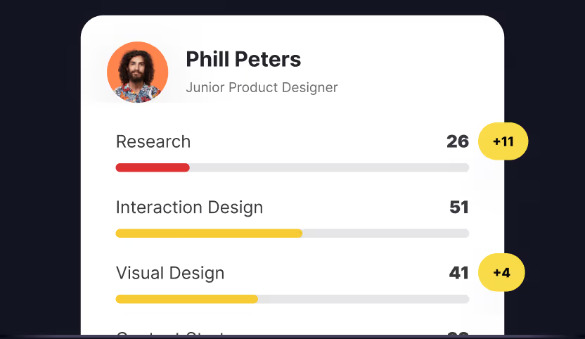
Professional skills evolve faster than most tracking methods can capture. Companies need real-time insights into their team's capabilities to stay competitive, while workers who are trying to find a job or get promoted also can benefit from measuring their skills. Skills that a worker possesses are assets on the market and the reason why some workers are more attractive to companies and why they can demand better wages.
Having a precise skill map is a huge benefit and advantage over the competition. However, it is not easy to make a good skill graph. Uxcel and Excel represent two distinct approaches to understanding professional competencies, one automated, the other adaptable.
Excel survived on the market for all these years because of its versatility. It often feels punishing working in it, the interface is a relic of some past time, but it gets the job done. Among other things, Excel can be used to create great skill maps. On the other hand, Uxcel provides automated skill diagnostics, and upon completing the initial test, you will get an accurate measurement of your skills instantly.
In this guide, we will compare Excel and Uxcel with a sole focus on making skill maps and give you an insight into how these two apps work.
What is Skill Mapping and How to Make the Most Out of it?
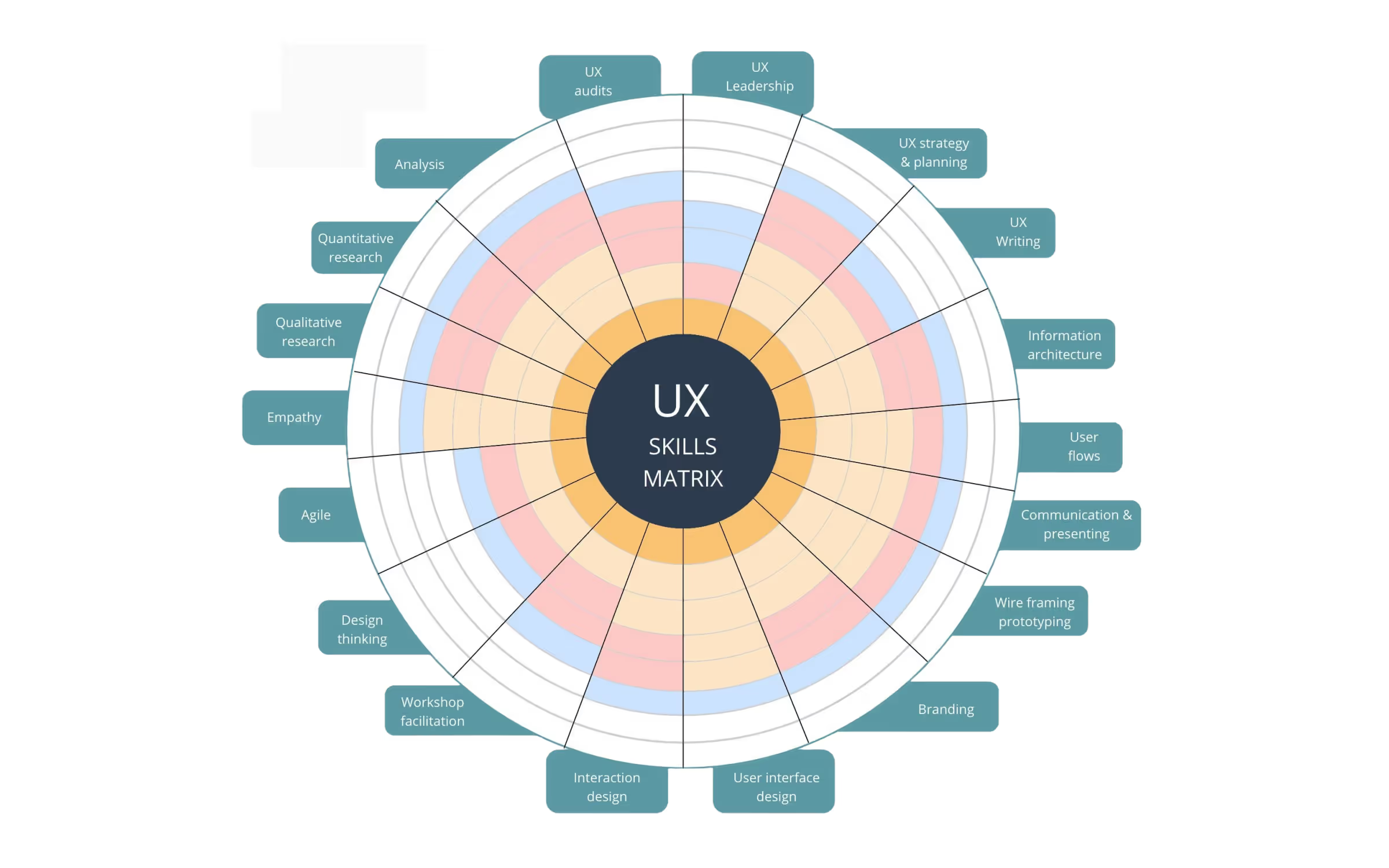
Data visualization trumps raw words and numbers every time. The brain processes visual information faster than text or speech, especially today when we're drowning in an endless ocean of information. Converting complex information into charts and graphs helps us spot patterns and understand relationships instantly.
Skill mapping builds on this principle, and offers a systematic and creative solution to track professional development in our digital world. Skill graphs are very versatile. You can represent marketing metrics, design capabilities, human resource skills or almost any other profession on the skill graph. However, since we're comparing Uxcel and Excel, we'll focus specifically on mapping UX design skills.
UX designer skills are naturally open to data visualization. By presenting your skills on a graph, you can quickly identify strengths and pinpoint areas needing improvement.
To create an effective skill map, you need to identify the key skills to track. The core skills of UX designers are:
- Research
- Content Strategy
- Leadership
- Product Thinking
- Visual Design
- Interaction Design
Beyond these fundamental UX design skills, you might be tempted to track additional skills like Wireframes Prototyping, Content Design, Service Design, Information Architecture, and others.
However, simplicity is key. Each additional metric increases complexity exponentially, and in most of the cases, there is no need for that. These six core skills we mentioned above form the foundation of UX design, with most specialized skills falling under one of these categories.
On the other hand, the final structure of the graph depends on your specific needs. If you want flexibility, and you are able to create a skill map from scratch, using Excel as your tool might be ideal. If you are interested in other options, you can find out how to map design skills in Figma or map design skills in Miro.
In the next section of the guide, we will show you how to map your skills with Excel.
Creating a UX Skill Map in Excel
Excel has been around since 1985, which is ancient in terms of digital apps. During that time it mostly remained the same, with the interface looking very outdated to almost everyone younger than the app itself. Excel was created as a program that uses spreadsheets and organizes numbers and data with formulas and functions. As a spreadsheet program, it can’t look much better anyway, and its longevity is a testament to its usability. Over the years, Excel users found a way to be creative with the app, and part of it is creating skill graphs. We will now describe the process in several key steps:
- Setup the Basis
- Create the Radar Chart
- Customize the Chart
- Style Labels and Data
- Add Skillsets
- Export and Finish Up
Setup the Basis
First, you should open a new Excel workbook. Then, select a range of cells (recommended: 20x20 grid) Set all selected cells to equal width/height, with right clicks:
- Right-click → Column Width → set to 2
- Right-click → Row Height → set to 15
Create the Radar Chart
Start by entering your data. In column A, write your skill names (Research, Content Strategy, Visual Design, etc.). In column B write your skill ratings (0-100 or 0-100%). Finally, in column C set the maximum possible rating for reference. Select your data range, and then go to Insert tab, and Insert Radar Chart. Choose "Radar with Markers" for better visibility.
Customize the Chart
First, you need to format the plot area by right-clicking Chart, and then Format Plot Area. Remove the fill color and add subtle gridlines. You might need to edit axis settings as well. Right-click Axis, and then Format Axis. Set the minimum and maximum values based on the skill ratings so in this case 0 and 100. Next, you need to format gridlines. Select Gridlines, set color to light gray, and then choose dashed or dotted style.
Style Labels and Data
Formating skill labels is straightforward. First, you need to select category labels and font (we recommend Arial or Calibri), set the size to 10pt, and optionally bold it for better visibility. Formating data points starts with selecting data series, and changing the marker style. You should set line color and thickness, and don’t forget to fill color with 40% transparency.
Add Skillsets
This step is optional, but it will complement your skill graph in a really useful way, especially if you are a manager and want to rate your whole design team. Add another column for comparison, for example, put team average in column D, and industry-standard in column E. After that, you should select a new data range, by right-clicking on the chart and selecting Data from the menu, and then add a new series.
Export Options and Finish Up
We are nearing the end, we need only a few finishing touches. To export the chart select it, and then right-click and Save as Picture. Choose a format, if you want to digitally use it, we recommend PNG, while PDF should be used for print. The resolution should be around 300 DPI. To get better results, you need to use a consistent scale across all skills, keep data in adjacent columns, and use conditional formatting for data validation. Also, consider adding notes for context and use color coding that matches your brand.
Best Excel Skill Map Templates to Download
As we already said, and you certainly know, Excel is a spreadsheet tool that is not primarily used for making graphs, but there are several templates available for download that can be handy for UX designers.
The pioneers of UX design, Nielsen Norman Group, have created their own UX design skill graph in Excel. It is also the best Excel template we found, and the only one which is ready to use:
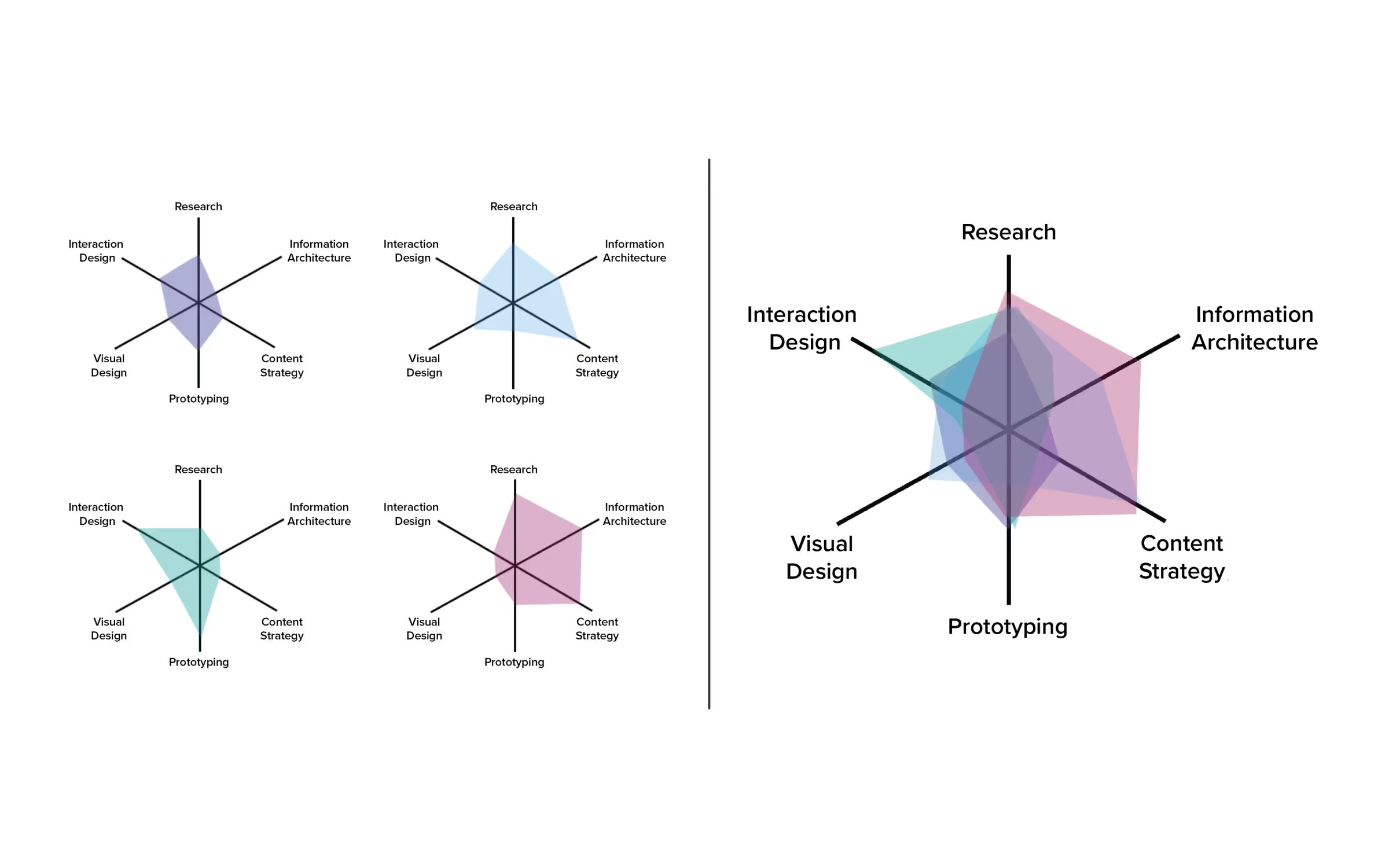
As we can see on this graph, there are six core skills presented, and the skill sets of different designers are also colored in different colors, so you can easily differentiate one from another.
There are also templates from other users available for download, but they are not optimized for UX designers, so you would have to optimize them yourself.
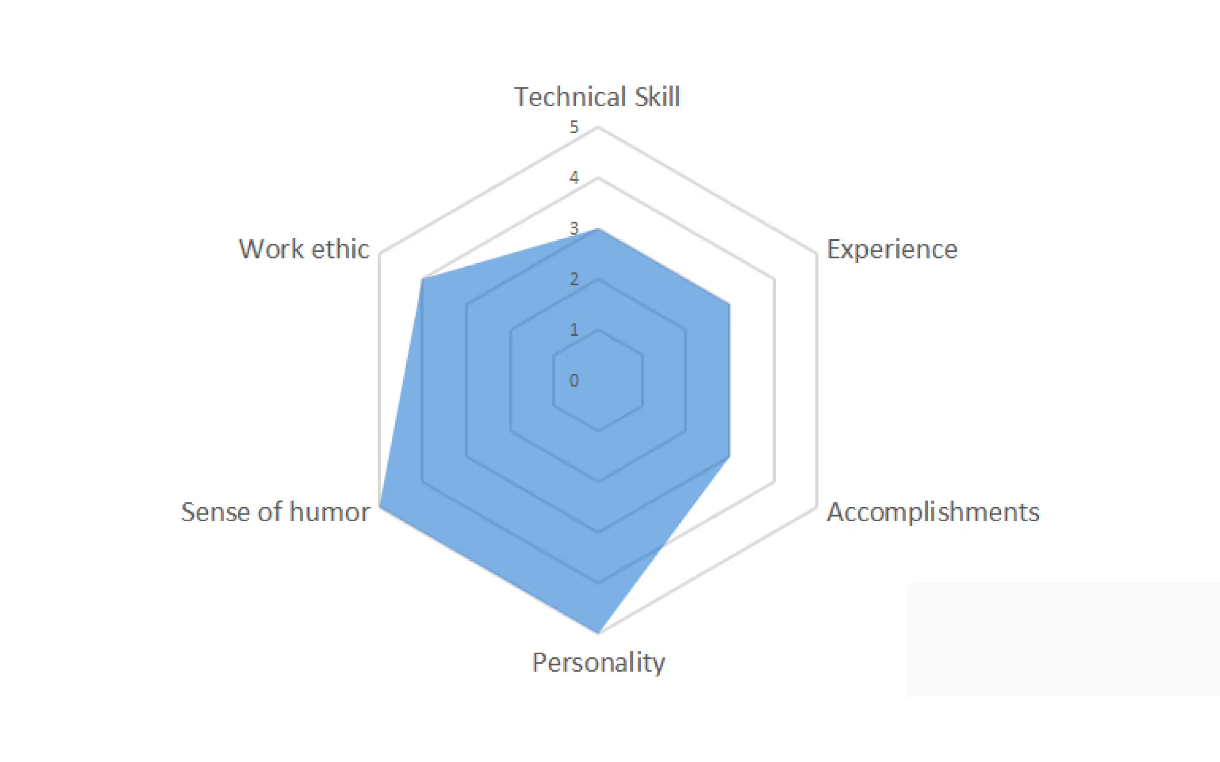
The next template can be easily modified by just replacing the names on the chart. Use your UX skills instead, and everything else should remain the same:
The third chart has more places for your skills, and this might be a good solution for designers who like to be more detailed about their skills:
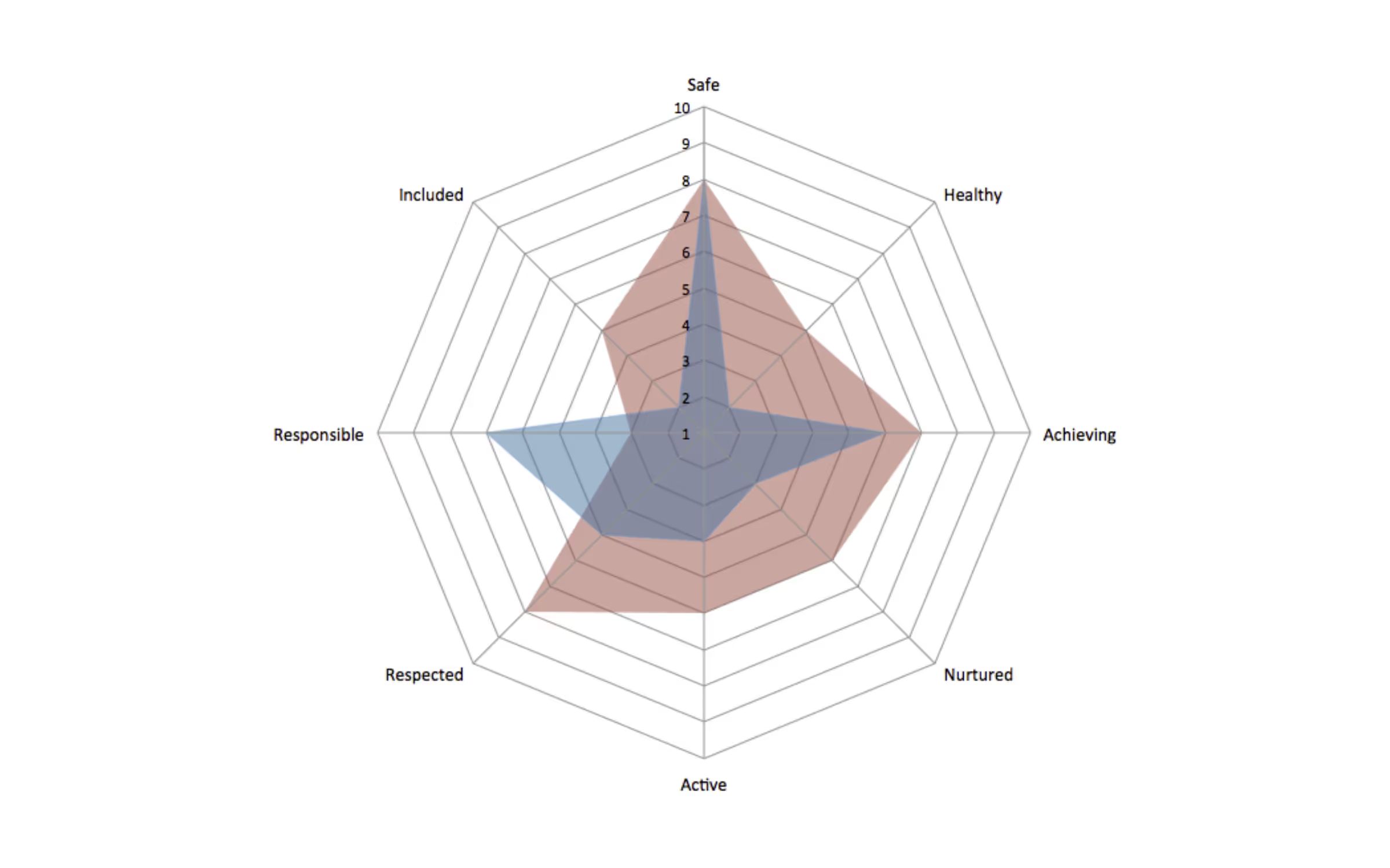
The next template can be usable for managers who want to compare the skills of two or more designers. With this design, the differences are becoming very clear and easy to spot. However, you will still have to replace the labels with the correct skill names:

Uxcel Automatic Skill Mapping – The Easiest Way to Map Your Skills
Creating a template for your skills in Excel is doable, but it takes too much time and effort. You can download a template someone else created in Excel, but it is very likely that it needs polishing and editing skills, as we have already seen.
Even if you are happy with the skill map you created or downloaded, there is a question of updating it and keeping all the values in it genuine and correct. Every task you make, and every lesson you take, will affect your scores positively, and if you are not an active learner, your skills may deteriorate.
If you are working alone, you are responsible for updating and managing your skills and learning schedule, and it is a daunting task when you are a full-time worker. It would be amazing if all that could be automatic, right?
Well, it is possible, and Uxcel will provide exactly what you need! Uxcel was created by designers for designers and one of the biggest benefits of the app is an auto-updating skill graph for UX designers. You should just create a profile on the platform, take the Uxcel Pulse test, which will accurately measure your skills, and your UX designer skill map will be generated. And not only that, every learning assessment you make on Uxcel will be measured with Skill Graph and your progress will be mapped. Here is how that looks:
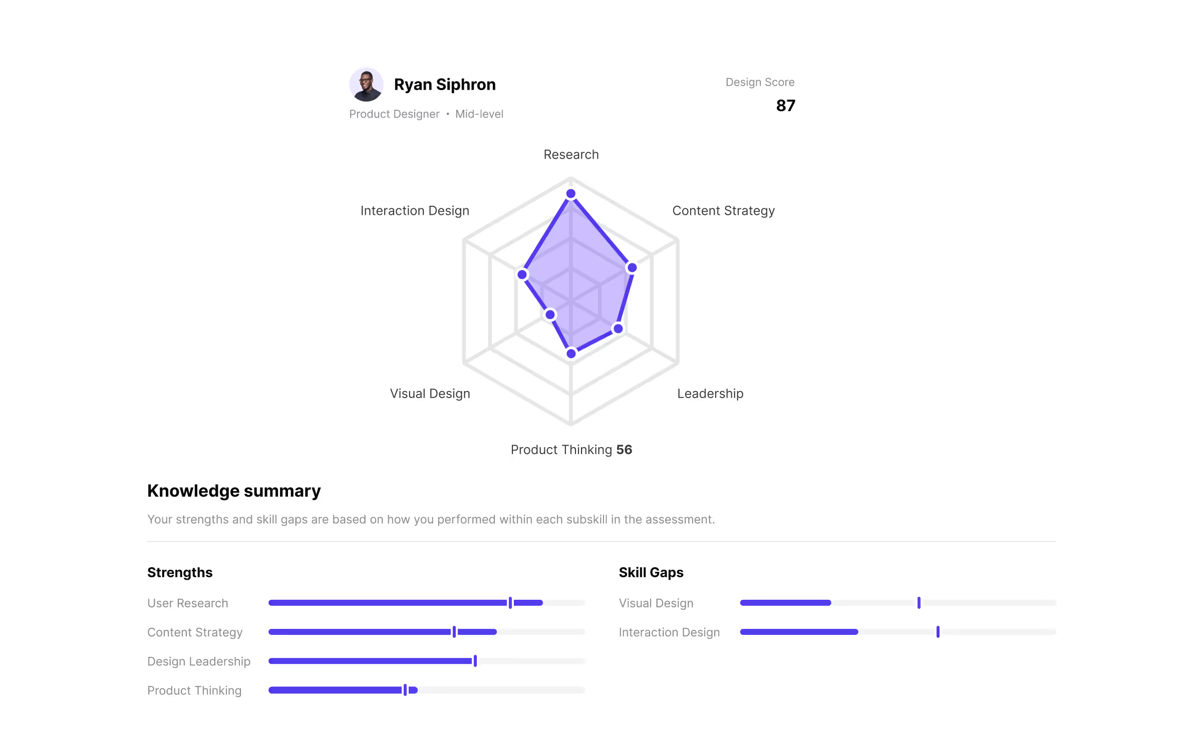
Uxcel Pulse Assessment will be over in less than 30 minutes, and it is better to spend that time on testing your knowledge than trying to figure out how to create a skill map yourself.
You can also compare your skills with other designers. We can see that Ryan is amazing in User Research. Their score is 15% better than the benchmark! However, they need to work on Product Thinking and Visual Design.
There are lots of ways to improve your skills. You can take lessons on an online learning site such as Coursera or Udemy, you can take an instructor yourself, but you can also stay on Uxcel. Uxcel is not only a Skill Graph-making app, it is a complete package since it also provides learning materials to UX designers. Also, Uxcel won’t just randomly assign you learning materials vaguely related to the field in which you didn’t get great scores during the Uxcel Pulse assessment.
Uxcel will automatically pick the exact learning materials related to the question you failed to answer correctly! Another great thing about Uxcel is the gamification of the platform. You won’t spend hours and weeks listening and watching instructors teaching lessons in a conventional way. You will get the concrete and direct pieces of information you need.
As we saw above, the Uxcel Skill Graph measures performance across six critical UX design skills:
- Interaction Design
- User Research
- Content Strategy
- Design Leadership
- Product Thinking
- Visual Design
While earlier Excel templates we showed you sometimes had an unnecessary complexity in their design, Uxcel's approach demonstrates strategic simplification. The platform's founders, seasoned UX designers with extensive corporate experience, deliberately crafted a framework that focuses on six key skills and addresses real-world professional development challenges.
The Skill Graph's elegance lies in its purposeful minimalism. By concentrating on six core skills, Uxcel enables both individual designers and team managers to quickly identify skill gaps and development opportunities. An overcomplicated graph would make comparisons and reviewing the skills ineffective, and make it hard for both designers and managers to get a complete grasp of the UX skills of an individual designer.
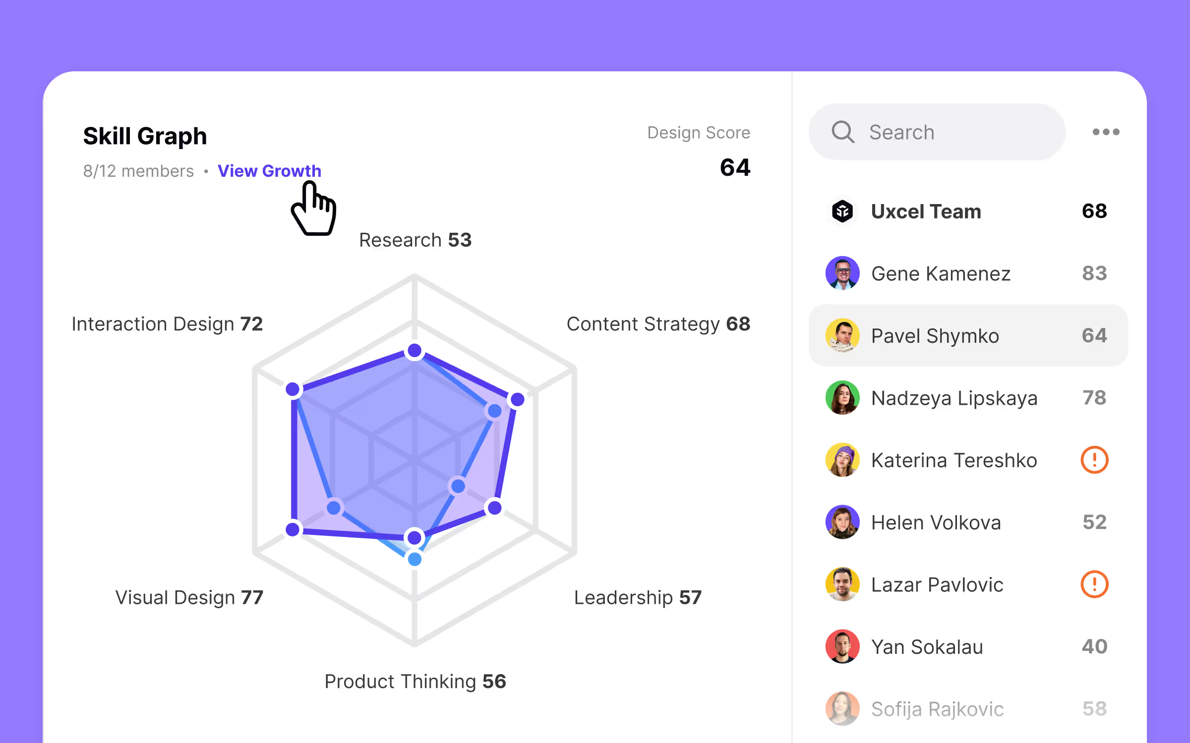
Most importantly, Uxcel tracks your skill progression. It means that every past assessment remains visible, allowing you to trace your development visualize your advancement, and unlock your full potential. It is easy to see all that by clicking on „View Growth“ on Uxcel Skill Graph:
While Uxcel offers powerful individual design tools, Uxcel Teams revolutionizes team management for modern design leaders. This platform not only redefines skill tracking, but also personal and team development, and managers can use it as a strategic resource allocation as well.
Traditional skill mapping approaches have easily visible flaws, especially if you are an executive manager of a design team within a company. First, you would need to manually create designer profiles, you would have to endure perpetual updates, giving them learning material by evaluating their skills on your own, and possibly the most time-consuming process would be monitoring their progress. All of that would soon become overwhelming and make you spend indispensable time doing tasks that Uxcel can do for you.
In today's hyper-competitive industry, understanding team capabilities isn't just advantageous, it might be the difference between a success and a fail. Without precise skill diagnostics, you risk losing resources and time, and you won’t be able to figure out where is the problem with your design team either. Uxcel Teams is the platform that can take care of all these issues, and cause strategic growth for your company, by raising up the level and efficiency of your design team.
Uxcel Teams will give you the complete overview of your design team, and show you the skill gaps of individual designers, but also their strengths and top skills, which will allow you to allocate the work you get from clients to the right designers all the time. Also, they won’t feel overwhelmed when using Uxcel for learning, since the material is gamified and easily digestible. The growth shown on Skill Graph will leave an impression on all designers, and they will be motivated to continue learning and evolve their skills even more.
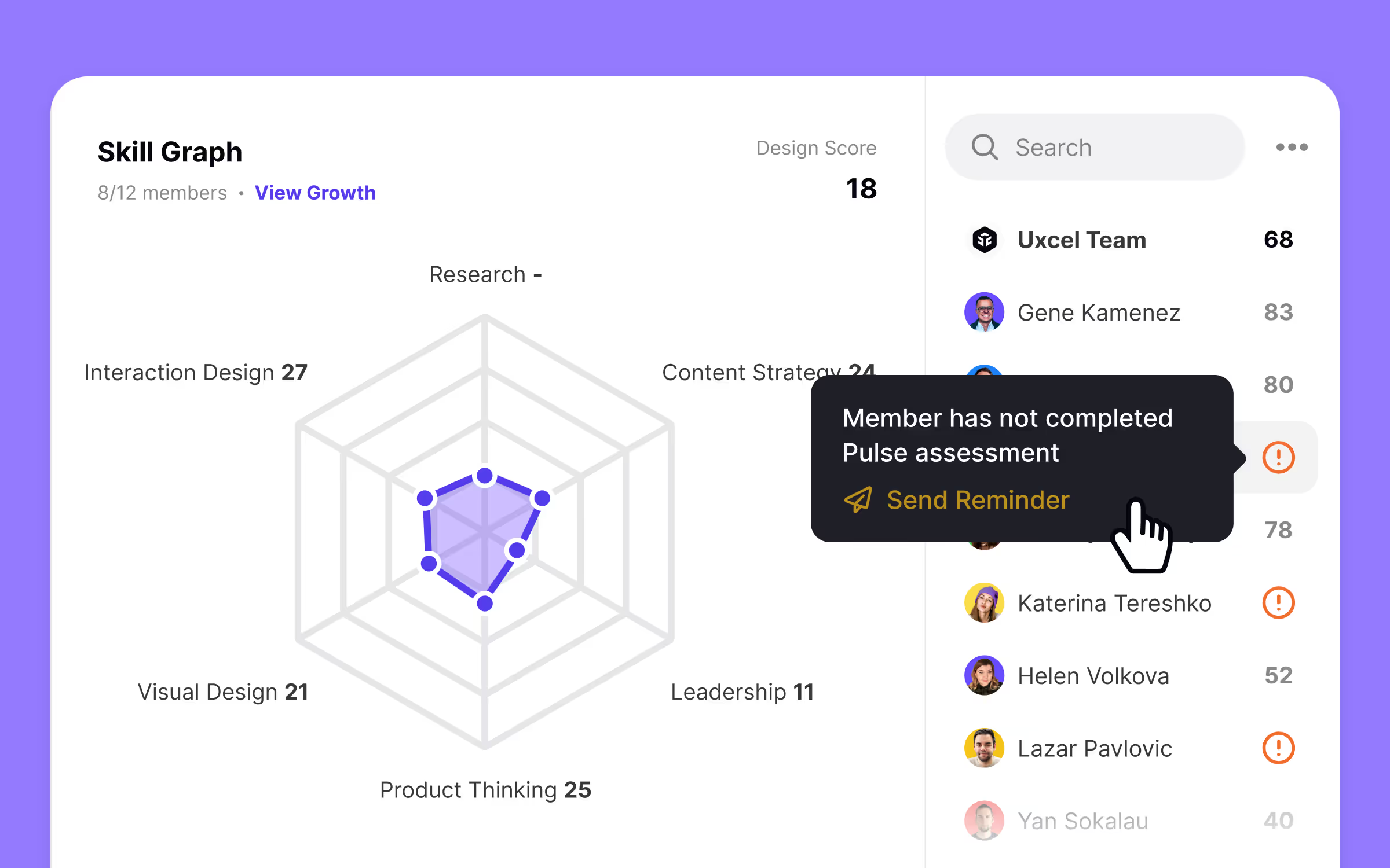
As a manager, you will be able to see your complete team, within one app, and one admin, which is a feature unique within the UX design industry. Here is how it looks:
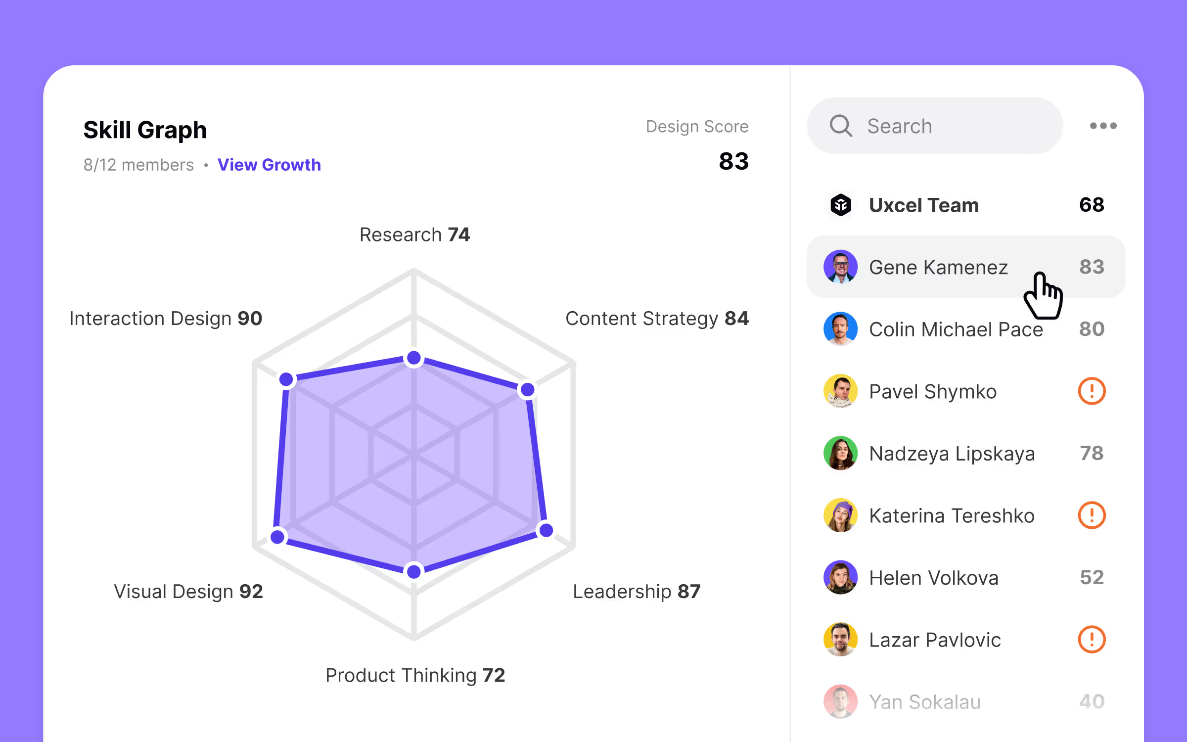
The dashboard lets you view your team at a glance. Click on any designer's profile to dive into their details. Skill graphs break down each person's capabilities, making team comparisons straightforward.
Gene's profile shows that his skills in Visual Design and Interaction Design are amazing, with room to develop in Product Thinking and Research. His potential looks promising. Managers can use Uxcel Pulse insights to assign targeted learning resources that help designers level up quickly.
Each profile highlights top skills, helping you match team members to the right projects. Need someone killer at visual design for a complex interface? Now you'll know exactly who to tap.
Watch for red exclamation marks next to names - these mean an incomplete Uxcel Pulse assessment. Click the symbol to ping the team member. Getting everyone to finish their assessment is key to understanding your team's true capabilities and growth paths.
You can send them a reminder from here:
Uxcel vs Figma Comparison Table
Uxcel vs Excel Skill Mapping Verdict

Excel is a widespread tool used across industries for data tracking. But when it comes to skill mapping, it falls short compared to Uxcel.
Creating a skill graph in Excel is a task that can take hours. Even if you're an experienced Excel user, you'll waste a lot of time building maps from scratch. Excel templates exist, but they're not high quality, nor do they target UX as Uxcel Skill Graph, so they require lots of editing.
Manual updates are a nightmare. After each project or task, you'll need to manually adjust your skill map. This gets boring very fast, and most people will give up, leaving their skills chart collecting digital dust.
Uxcel Skill Graph is built by professionals who understand skill tracking. It's not just for designers, managers and executives can also use it to measure individual and team capabilities. You'll spot skill gaps instantly, and Uxcel suggests targeted learning resources to bridge those gaps.
For solo designers, Uxcel saves time and provides clear growth paths. For design leads, Uxcel Teams is the ultimate solution. It's the most efficient way to track, analyze, and develop your team's skills.
If you want smart, automated skill mapping that actually helps you improve, Uxcel beats Excel hands down. It is the best app that provides Skill Graph for UX designers and its automatic updates on the market by a country mile. Schedule a personalized tour with our specialists to show you how Uxcel can help you upskill and develop your teams in design.


