Skill mapping is recognized as one of the best tools for students, freelancers, and full-time workers for the ability to accurately show strengths and weaknesses in the skillset of a given individual — and for those looking to validate that expertise formally, a structured UX/UI design certification program provides an assessment-based path to stand out professionally.
Recently, skills mapping became interesting to executives in big companies as well, since they realized it would be very beneficial for the company to know the exact skills of workers within a department, let's say design or marketing. With this data, the executives would be delegate work and study materials more effectively and they would identify problems and where they need to hire more specialists.
There are many software solutions that can provide skill graphs, but you would mostly need to at least find a suitable template and customize it yourself. Miro has several templates that can provide you will what you need, while Uxcel is one of the rare apps that can map your skills automatically.
In this guide, we will compare Miro and Uxcel in the skill mapping department and show you how to make the most out of both apps.
What is Skill Mapping and How to Make the Most Out of it?
Graphics and pictures are strong mediums of communication. You know the adage: "A picture is worth a thousand words"? It is often easier and more effective to represent something with a picture than to describe it with words. A picture can be etched in your memory, while a wall of text will be forgotten within minutes, especially nowadays when the human attention span is constantly going lower.
Skill mapping relies on these principles and represents an elegant way to describe someone's skills and experience in a particular field. The use cases of skills mapping is very wide, and you can represent skills from any profession on a skill map. It can be human resources, marketing, design, copywriting, and many other things. We will focus mainly on UX design here.
UX designer skills are suitable for this type of representation. The skills (and skill gaps) can be translated into a skill graph to show the areas which are specialties of a given designer, and areas they need to work on.
To create an accurate skill map, you need to know which skills you should map first — a process that becomes much clearer when you see how each skill fits within a defined UX/UI design career path. The core skills of UX designers are:
- Research
- Content Strategy
- Leadership
- Product Thinking
- Visual Design
- Interaction Design
Of course, there are many other skills you might want to represent, such as Wireframes Prototyping, and Information Architecture, and you can also break Visual Design into Content Design, Service Design, and so on. However, the process becomes extremely complex when adding more and more skills. Unless we talk about very specific situations and requests, the six core skills we mentioned above should be enough, because most of the other skills you come up with can be represented with these six. Ultimately, it is up to you to decide.
If you are interested in other resources than Figma, take a look at this resource on how to map design skills with Figma.
In the next section, we will show you how to map your skills with Miro.
How to Map Your Skills with Miro
Miro is one of the most popular whiteboard tools currently. You can use it for many things, but it is most commonly used for ideation, planning, diagramming, and workflows — though for designers serious about building real UX expertise, pairing any whiteboard tool with structured UX design foundations training ensures skills actually stick.
Miro's benefits are vast, including an AI assistant that can help you with ideation, creating copy/short messages, or workflows when you get stuck. There is also a huge number of pre-built templates in the library you can use and only edit it until it fits your needs.
When we talk about skill graphs, unfortunately, Miro has only a few templates that you could use, so you might decide to build it yourself from scratch. Here is how you can do it.
After you enter the whiteboard select an arrow tool. Count how many skills you want to represent. Draw one arrow for each skill from the same dot in the center. All arrows should be equal in length and the distance from ends of arrows should be equal. In other words, if you want to represent six skills, by connecting the ends of arrows you will get a hexagon with straight sides and equal angles.
Next, every arrow should have a value from 0 to 100 attached to it, where zero is at the beginning of an arrow, and 100 is its tip. Any number in between will be located somewhere in the body of the arrow, in relation to its length. For instance, if you want to represent a 74 value as a score for one of your skills, the dot representing it should be located at the end of the 74% length of the arrow, measured starting from the center of the diagram to the tip of the arrow.
Repeat that process for each of the skills. After you finish, connect the dots, and you should get something like this:
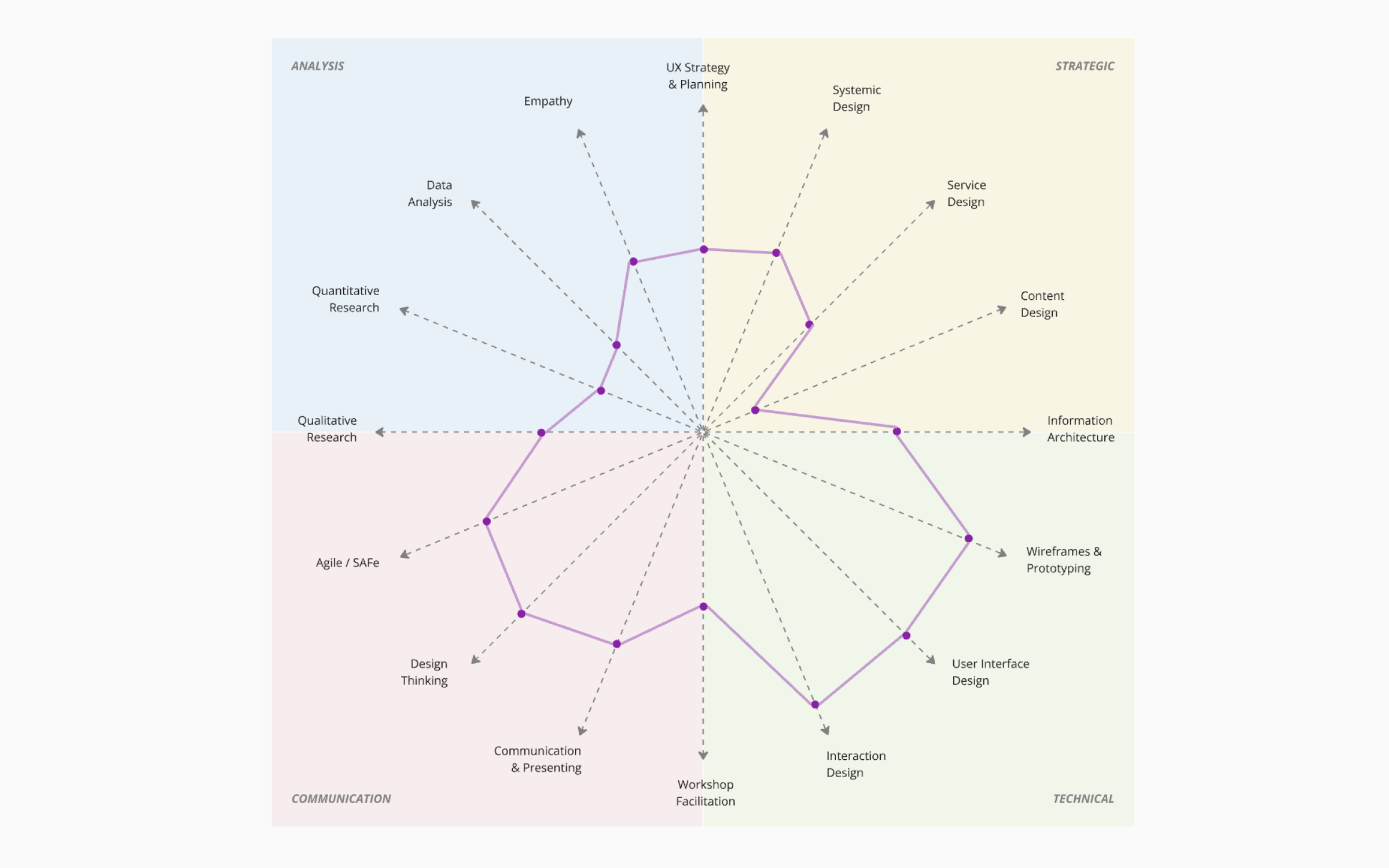
If you managed to create something similar, congratulations! You have your skill graph now. However, if you have a goal to represent your skill growth, and how lessons and courses you take affect them, it becomes trickier — and not all courses are equal; those built around UX design psychology tend to produce more durable skill improvements than generic content.
First, you would need to rate every single learning material you use and keep your test scores after each completed lesson or course. If those lessons or courses don't have tests embedded in them, you would need to find corresponding tests to check your knowledge and how much you learn. By doing so, you would be able to check the quality of the given learning material and see if you gained knowledge you can apply to work, which is your ultimate goal.
Even if you are able to keep track of these things, you would need to manually insert new values on the graph each time when you complete a task. After a while, the graph will become messy, and you won't be able to keep track of your progress from the start of the journey to the present day.
For individuals who are searching for a way to map their skills, this is a task that will take a lot of time. If you are a manager in charge of a team within a big company, and you are trying to find a way to accurately represent the skills of each individual within your time, this method is borderline impossible. The amount of time you would have to invest in this renders it unusable.
So, what are the other available solutions? If you want to stick with Miro, you might want to check out skill mapping templates that are available for download on the platform.
Best Miro Skill Map Templates to Download
When we checked Miro for great skill mapping templates, we unfortunately came across only two usable ones. That's why you would probably have to make your own graph as a UX designer, although you might be able to convert one of these into something you need.
The first template we will present is pretty detailed, but you would still need to edit it heavily:
https://miro.com/miroverse/skills-map/
It consists of the board part and the skills part, and it is very analytical. If you want to keep it detailed, we believe it has good foundations.
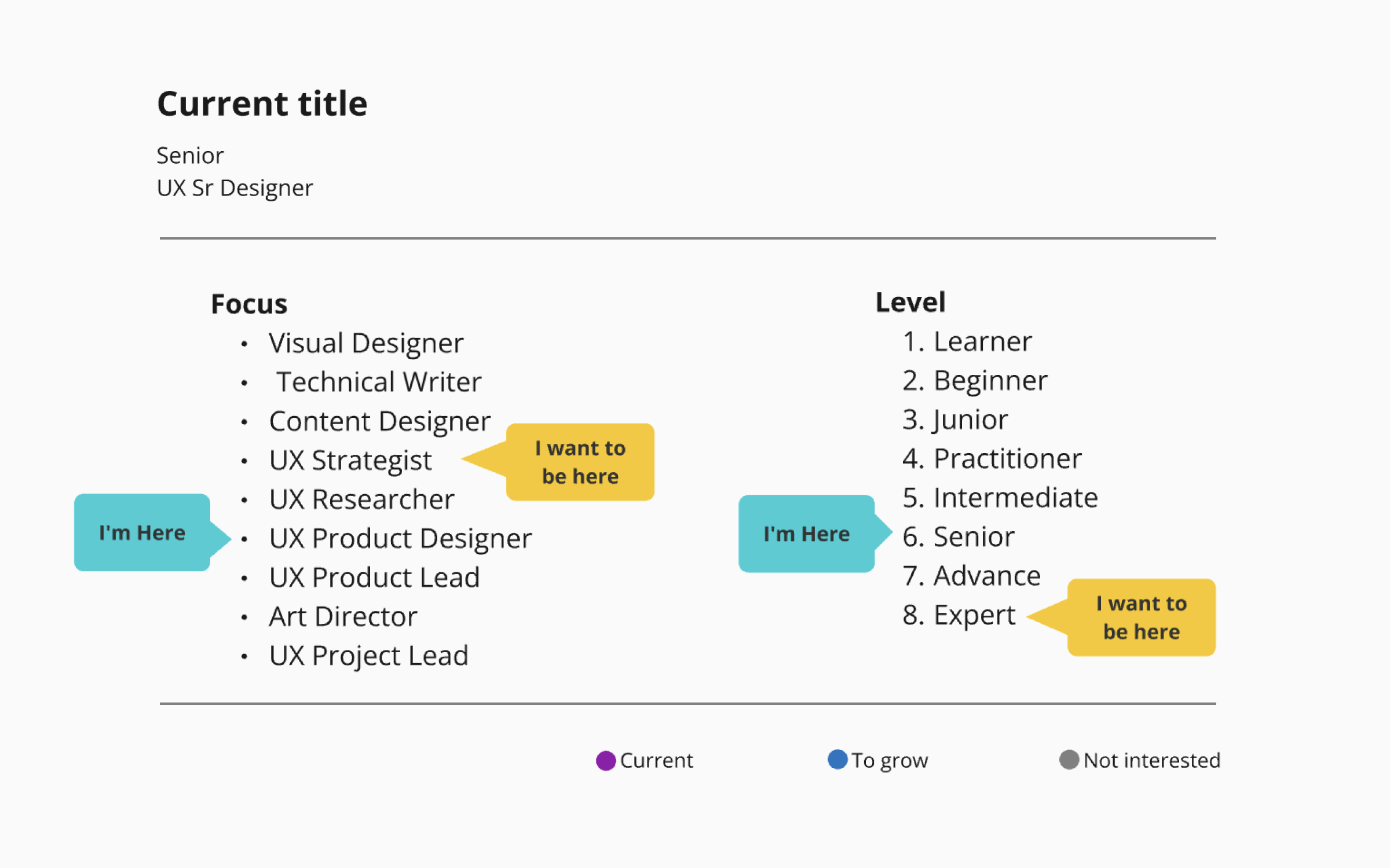
The first part shows where the designer is currently in terms of level and position, and where they want to be. It is good to ask yourself this question as well because knowing the answer means knowing which skills you need to work on.
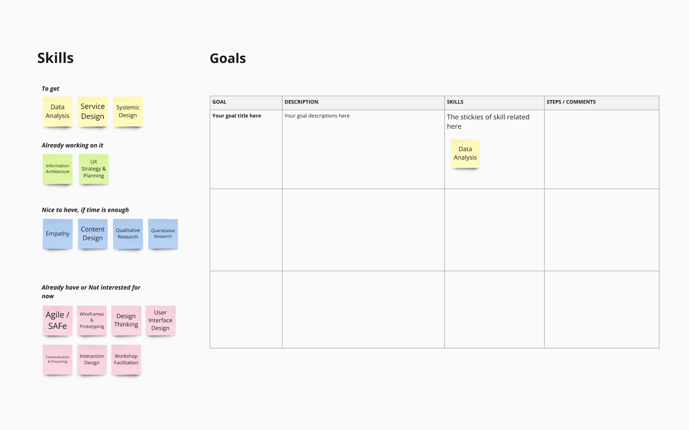
In the second part of the template, you can list the skills that are essential to get in order to achieve your goals, skills you already work on, skills that are a great bonus if you have the time to work on them, and skills which are not needed for now, or already mastered.
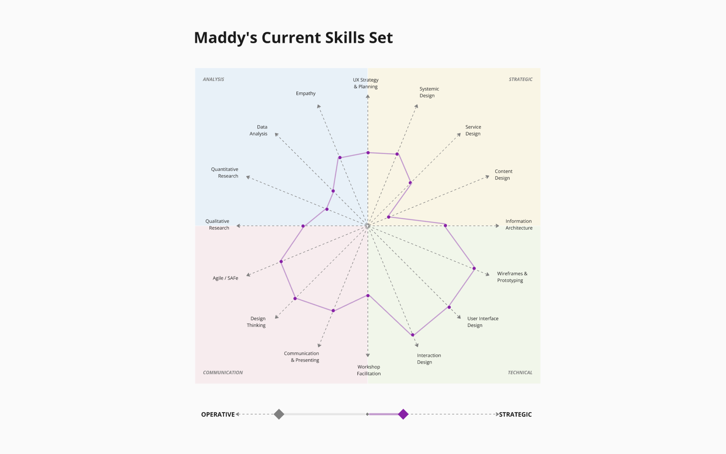
In the third part of this template, we finally come to the current skillset and how it is presented. There are many skills here, and you should probably group some of them into one. It is very hard to keep track of all these parameters, which is a main flaw of this template.
Of course, if you have the time and you want all the details, this skill division is not bad, but we would still recommend a skill graph with fewer skills on it.
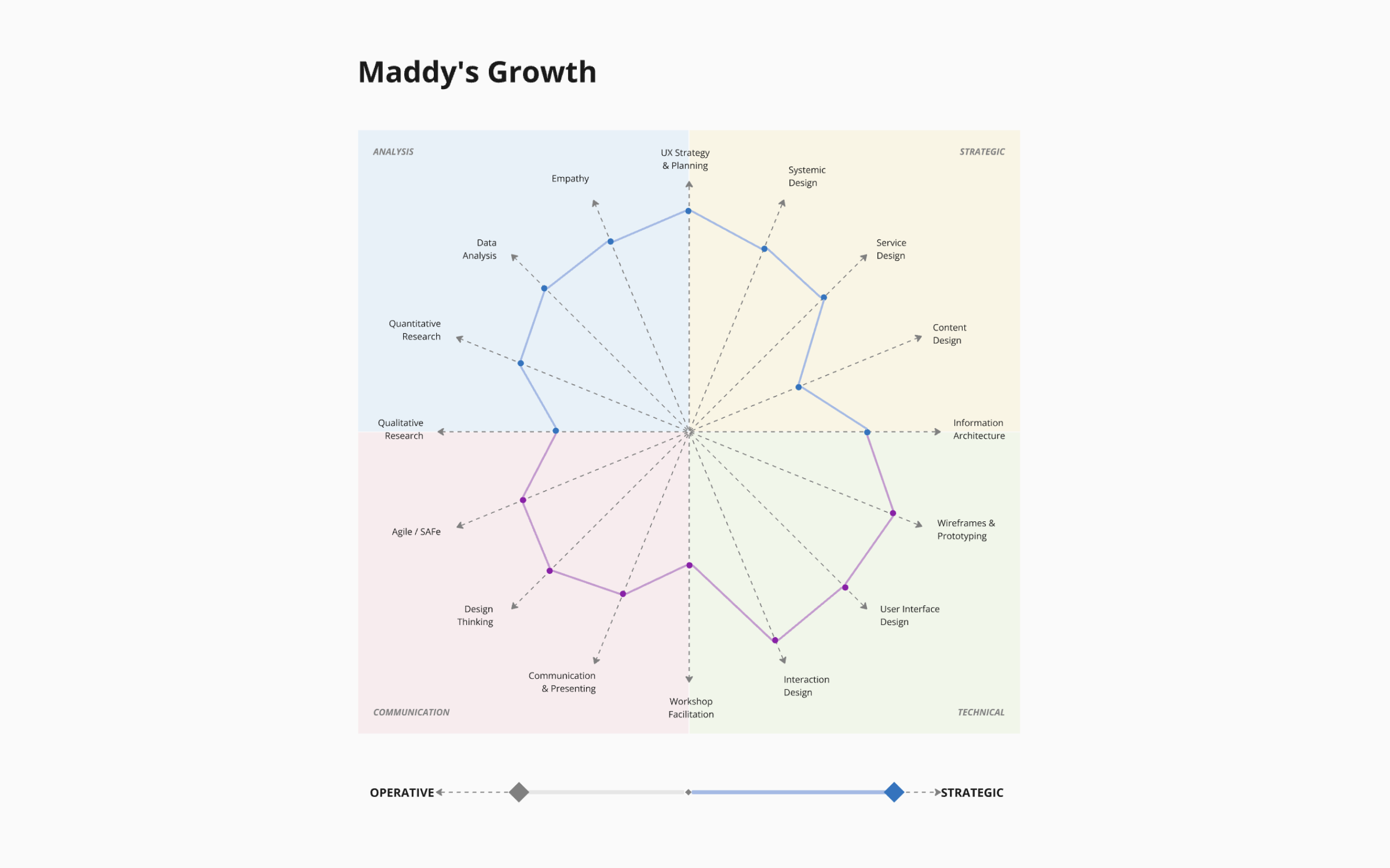
Finally, in the last part of the template, we are able to see the growth of this designer after successfully implementing knowledge from the learning material. If the changes are this massive, it would certainly allow the designer to achieve their goals.
However, as we previously stated, it is hard to accurately measure the impact of some learning material you get from some course or instructor on the skill map you created or downloaded from Miro in this case.
Only learning material tested and created by the same source as the skill graph can easily and correctly measure its impact, which is the primary benefit of the Uxcel Skill Graph — and for those curious about which competencies that graph tracks, our guide to UX design skills breaks down exactly what each category means at every career stage.
The second Miro Skill Map template we found is simpler than the first:
https://miro.com/miroverse/design-skills-matrix/
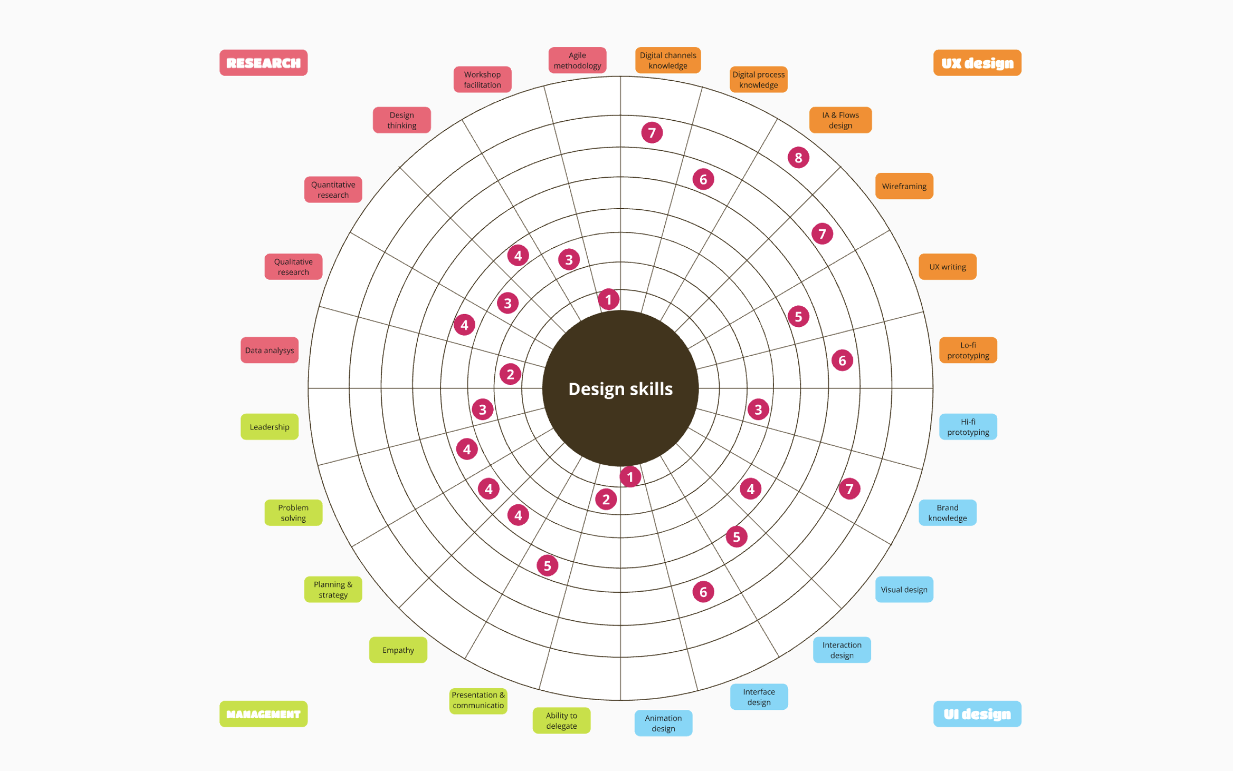
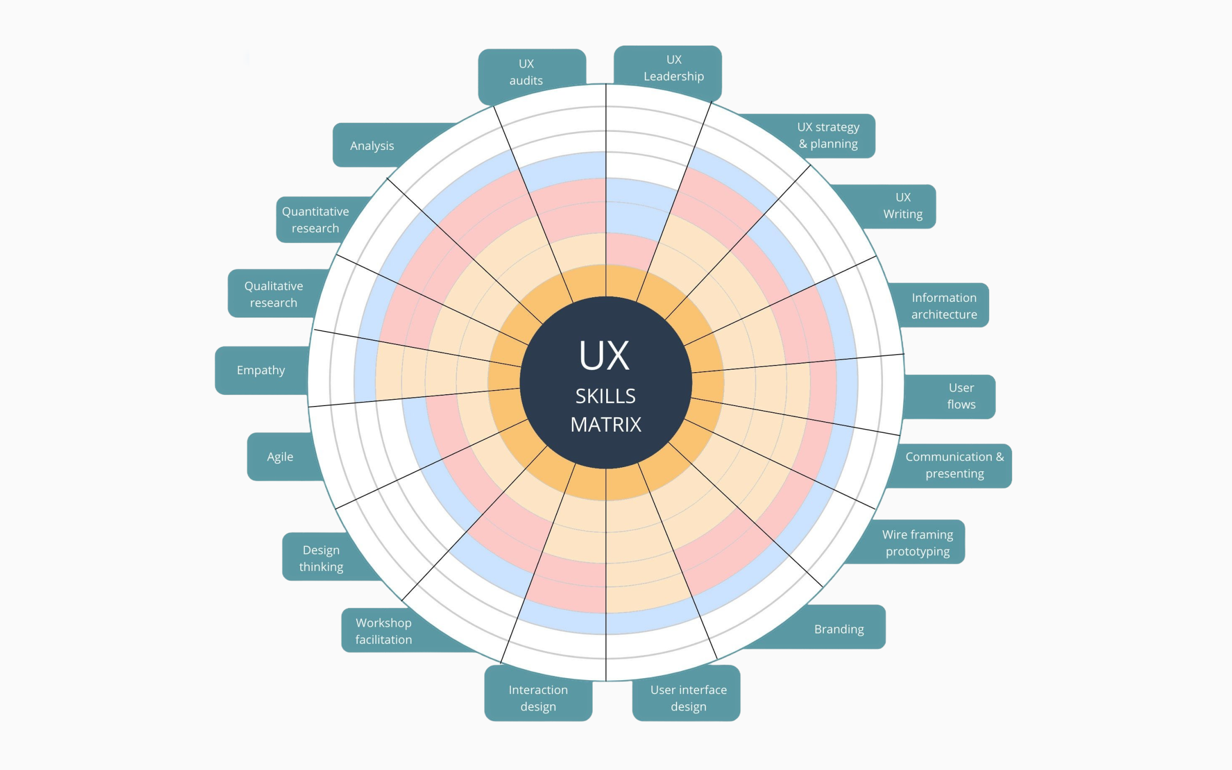
Here the scores are on a scale from one to eight, and you can't connect the dots to form a nice graph like on the previous template, but the design of this template is better for adding new skills in the mix if needed.
However, it is very hard to keep track of all these things, it looks busy, and the score is not descriptive enough, especially if you want to monitor your improvement. Uxcel Skill Graph has an advantage over this template in every segment.
Uxcel Automatic Skill Mapping – The Easiest Way to Map Your Skills
Uxcel is a modern design learning platform that focuses on the efficiency of learning, reporting, and following progress. It is great for both individuals and teams, and one of its greatest assets is Skill Graph.
We saw that you can use Miro to make your own skill map. There are several pre-built templates you can also use and adjust them according to your needs, which is better since it will significantly reduce the time needed to build the map you need.
However, even if you build a perfect skill graph in Miro, you would need to quantify and keep track of your progress, and update the graph every time you finish a course, test, or a short assessment. This might not be a problem at first, when you are all hyped up because you are starting a new professional journey, but over time it will become harder and harder, and it will consume precious time that can be used more productively. Luckily, other options out there, and here we will present the best skill graph for UX designers currently.
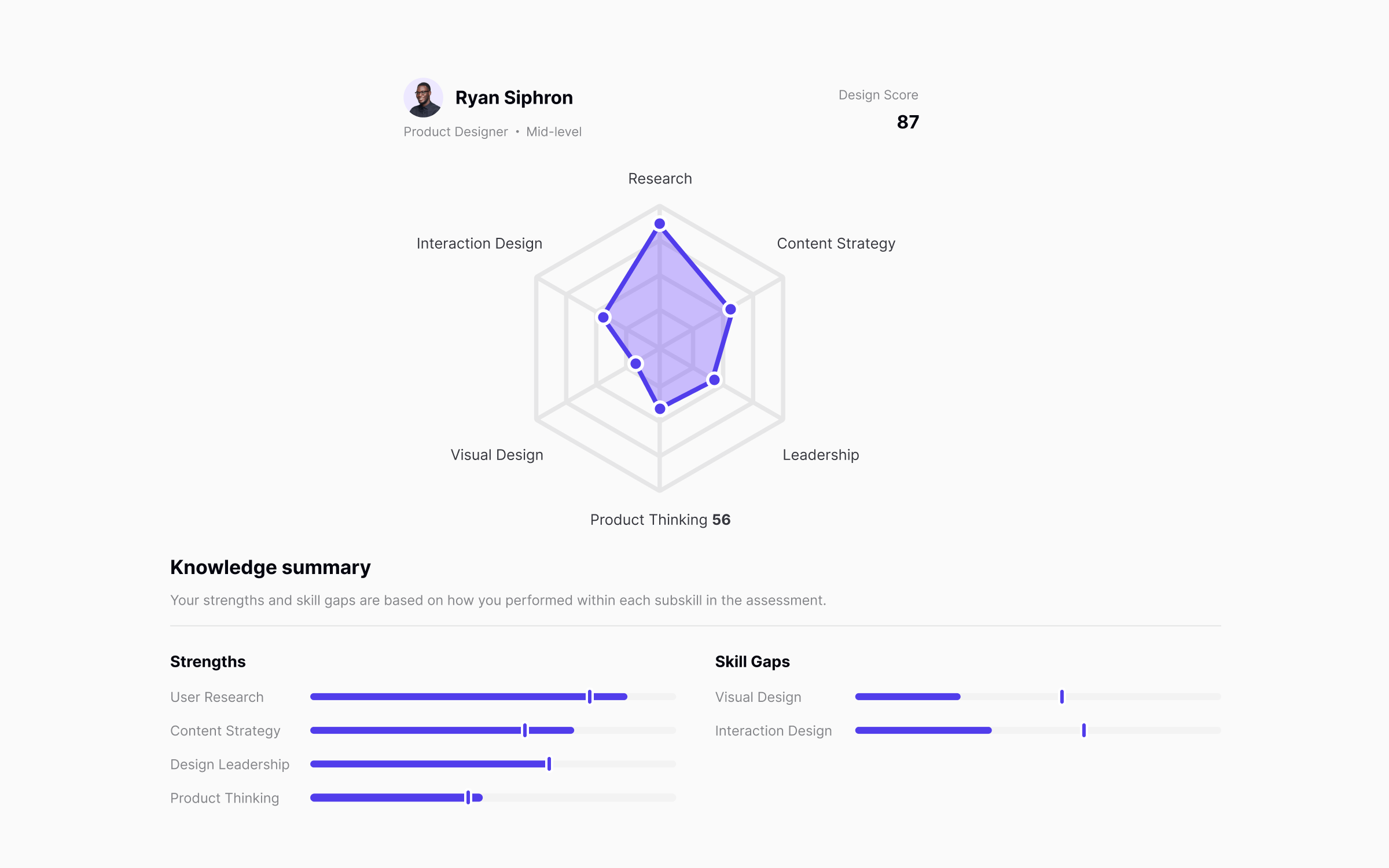
Uxcel Skill Graph is a core feature of the platform. UX designers can use it to map their entire skillset in under 30 minutes! So, not only you don't have to bother with making the graph, but you will also get an accurate assessment of your skills as fast as possible, as represented on the graph.
Uxcel will also show you how your skills compare to other designers. In the example above, Ryan has an excellent User Research score, which is 15% better than the benchmark. They clearly need to work on Product Thinking and Visual design, and Uxcel will provide learning materials according to the level shown during the assessment.
As we can see, Uxcel Skill Graph presents the score in six fields:
- Interaction Design
- User Research
- Content Strategy
- Design Leadership
- Product Thinking
- Visual Design
Previously, we presented Miro templates with many more skills on the map. Uxcel is a platform founded by experienced UX designers who had the opportunity to previously work with enterprise clients, and this Skill Graph was tested and approved by thousands of designers, so you can take these skills as the most relevant for every UX designer.
To get an accurate assessment of your skills, you need to register on Uxcel first. After that, take the Uxcel Pulse assessment, and you will receive your scores in the form of a Uxcel Skill Graph right after you complete the test.
The best thing about this feature is not even the fact you will get the score almost instantly. The biggest benefit you will get is the knowledge of which areas of your skillset need additional work, and Uxcel will provide learning materials based on that.
Your Uxcel Pulse assessment consists of questions equally distributed among the six essential skills for UX designers. You will get a score for each skill, from one to 100, based on your answers. The algorithm will randomly select your questions from a much bigger pool, but the test will be the same in length and difficulty for everyone, so it guarantees consistency.
The mistakes you made will be processed, and you will get recommendations for learning materials which consist of lessons about the things you didn't know on the test!
After you complete those assessments and a new test shows your improvements, it will be automatically embedded in your Uxcel Skill Graph. Not only that, you will be able to follow the progress for each step of the road and see how much you improved after every assessment. So, not only the latest scores will be visible, but you will have access to your previous scores as well.
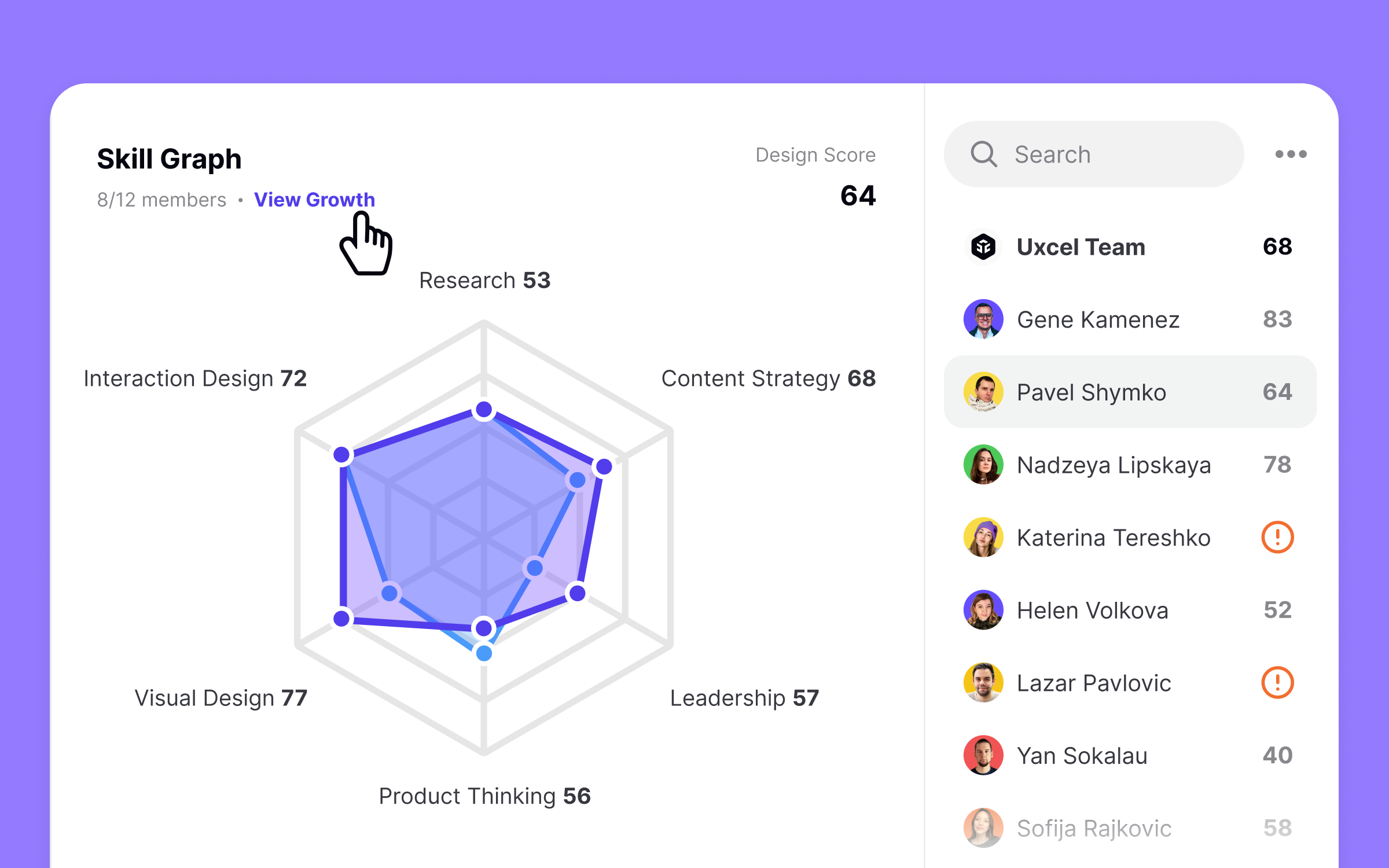
Uxcel is simply a great choice for individual designers, but if you are a manager of a design team within a company, Uxcel Teams is the biggest gift you can get!
Imagine creating separate skill maps for each of your designers with Miro, updating them, delegating learning materials to your designers, and then tracking their progress. That would take way more time than you have as a manager. But, these things are essential for your business. The competition is fierce, and you need to know if your design team is up for a challenge.
Uxcel Teams is an ideal partner for you, that will allow you to evaluate the skills of your designers, delegate them tasks and learning materials and follow their progress effortlessly, all within one app, and one admin.
Here is how Uxcel Teams looks:
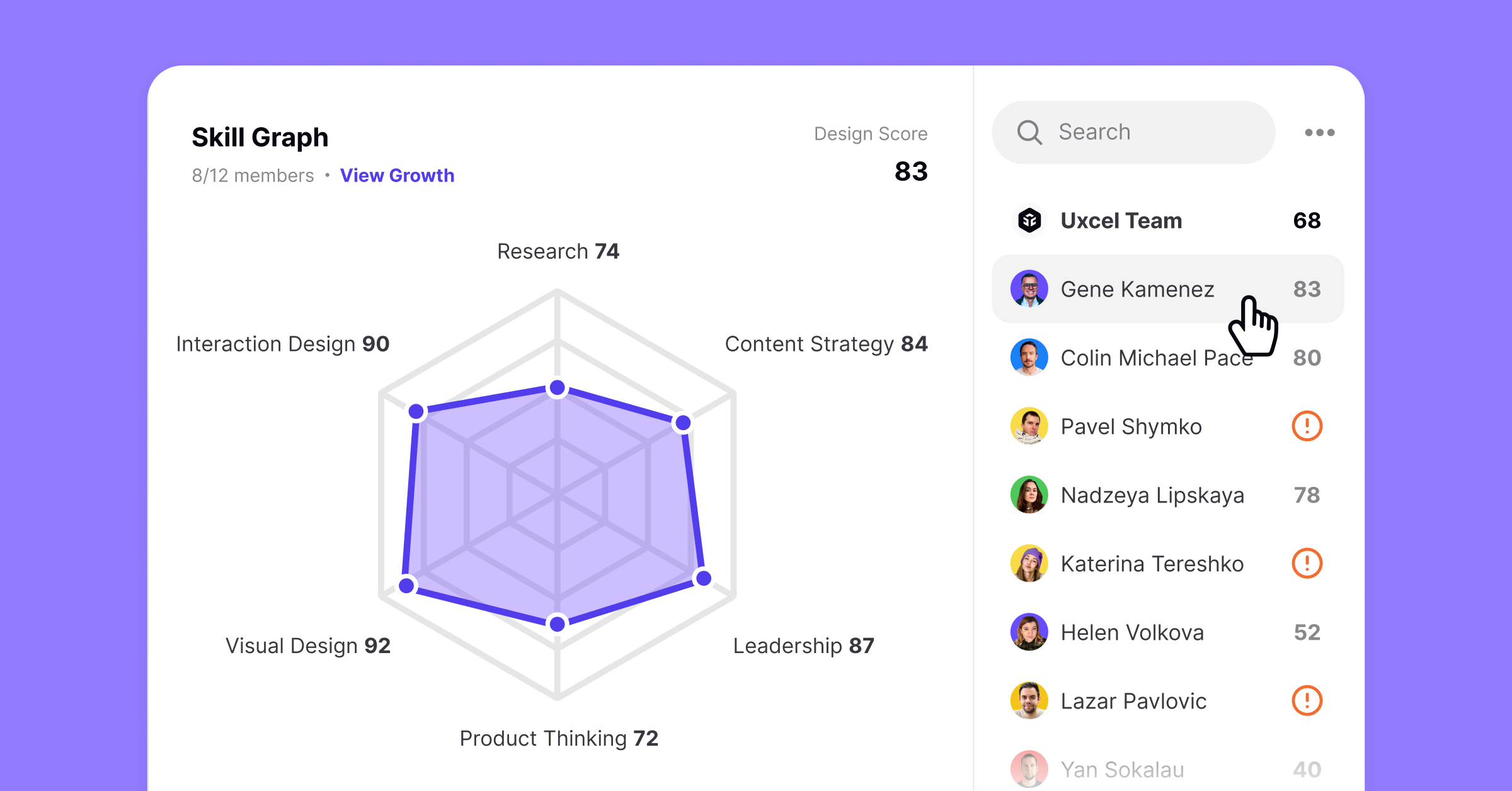
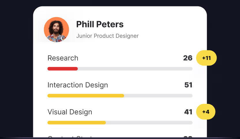
You can see your entire team on the right-hand side of the screen. By clicking on the name of the designers, you can see their skill graph and how they compare to other designers in the team.
The skill graph above has great scores for Visual Design and Interaction Design, while it is a bit lower for Product Thinking and Research. If you have a designer with such scores, you know they are amazing professionals and they need only a small nudge to become one of the best in the industry. So, based on their Uxcel Pulse assessment, you can delegate targeted learning materials to them, and watch them improve even further.
When you go through the list, you will see the top skills of each designer named, so you will able to delegate the tasks you get from clients to the designer who will complete the job successfully in the shortest amount of time.
However, if you see red exclamation marks next to the designer's name, it means they didn't complete the Uxcel Pulse assessment.
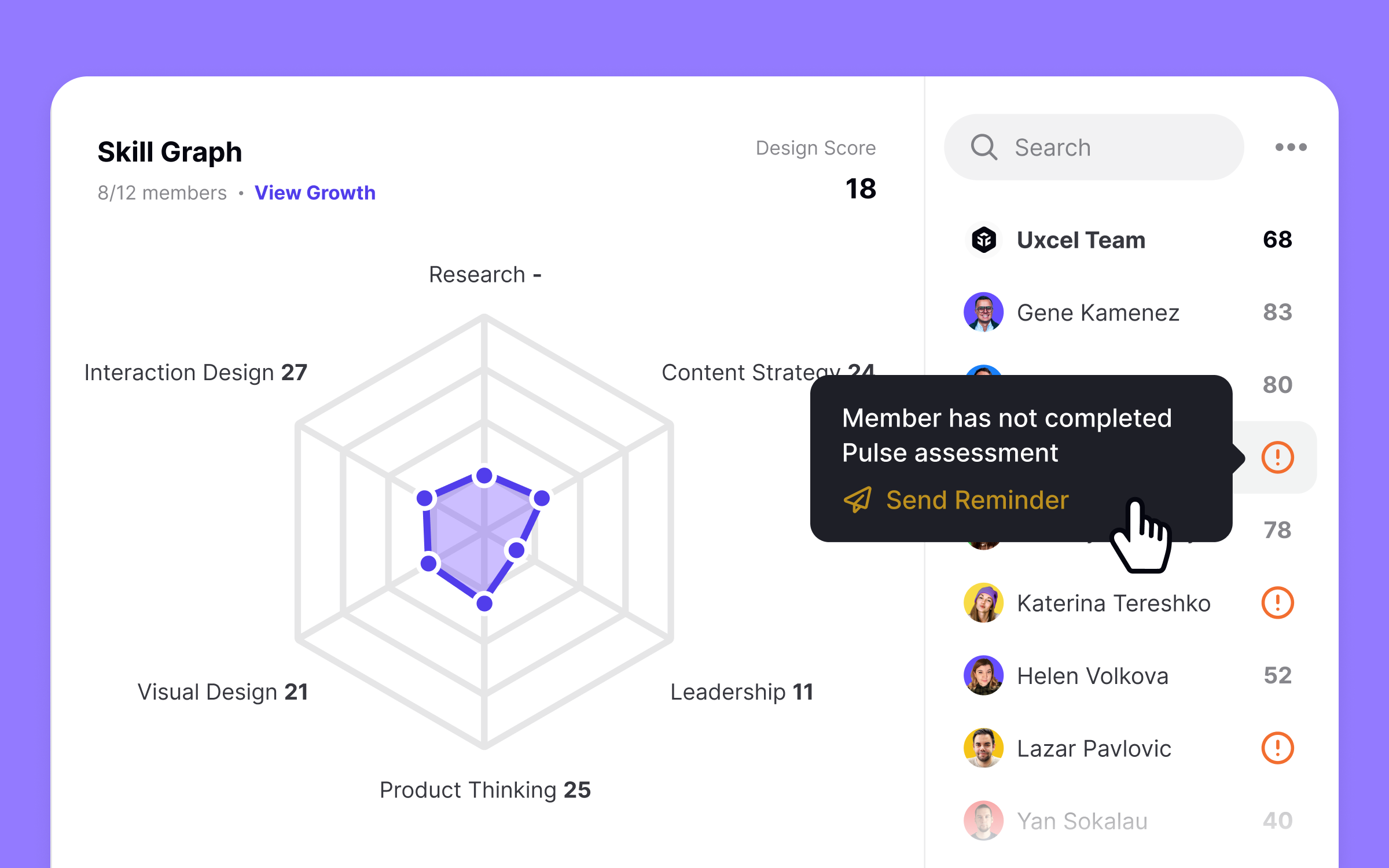
You can click on that symbol and send them a reminder wrong this menu. It is essential that all your designers complete the Uxcel Pulse as soon as possible, so you can evaluate all of them individually and as a team.
Uxcel vs Miro Comparison Table
| Benefits | Uxcel | Miro |
|---|---|---|
| Automatic skill mapping | ||
| Recommended learning assets | ||
| Customizing skill graph | ||
| Visualize growth over time | ||
| Compare team members | ||
| Skill Graph Templates | ||
| Real-time updates |
Uxcel vs Miro Skill Mapping Verdict

Miro is a great and versatile tool, you can do many things with it. Its popularity is well deserved, but if we talk about skill mapping specifically, it falls short compared to Uxcel.
Miro doesn't have enough skill graph templates in the library, and building a skill map from the outset is a daunting task. Even if you manage to create a reasonable graph, you would have to update it after every test you take, you would have to save all the previous versions to keep track of your progress, and after a while, you will feel fatigued and lose time on that process — time better spent on skills that raise your market value, as reflected in current UX/UI designer salary benchmarks.
On the other hand, the Uxcel Skill Graph feature is made with the intention to shorten the process, accurately describe the skill of UX designers, and even recommend targeted learning materials for the skill gaps a designer showed while doing the Uxcel Pulse assessment.
If you are a manager of the design team, this is a no-brainer. Miro is no match to Uxcel Teams which will show you everything you need automatically, with only a few clicks. Schedule a personalized tour with our specialists to show you how Uxcel can help you upskill and develop your teams in design.


