

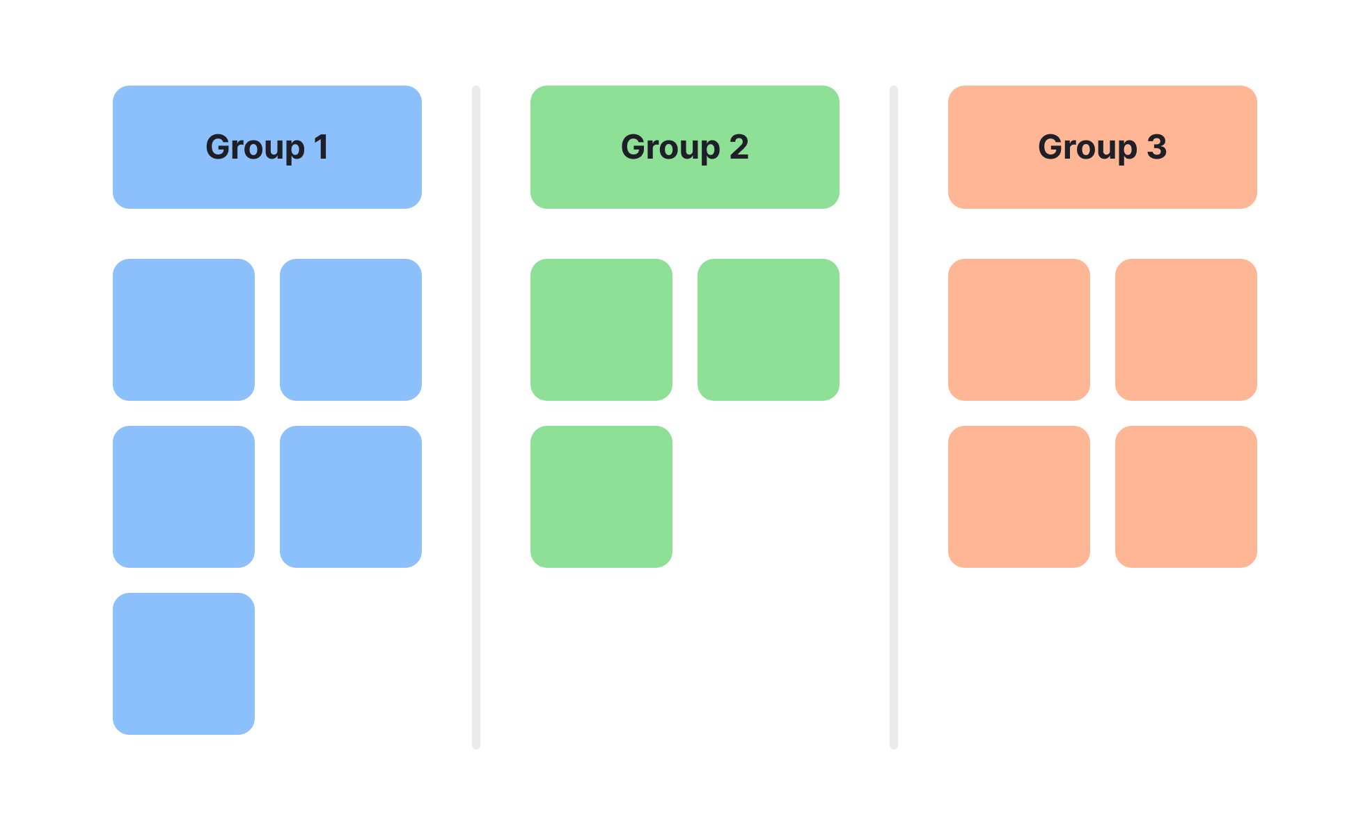
Affinity diagrams are a collaborative tool for sorting large amounts of qualitative data into logical categories. They are commonly used in brainstorming, user research analysis, and workshop settings to uncover hidden relationships between ideas.
In UX/UI design, affinity diagrams are often applied after user interviews or usability tests. Designers gather all observations, insights, and quotes, then group them into clusters that reveal patterns in user behavior or pain points. This method helps move from raw notes to actionable design priorities.
In product management, they are valuable during feature planning or retrospective analysis. Grouping related issues or opportunities makes it easier to see where the greatest impact can be made, guiding roadmap decisions.
The process is simple but effective: write each idea or observation on a separate sticky note, place them all on a board, and let the team group them based on natural similarities. The resulting clusters can then be labeled with descriptive headings.
This approach supports consensus-building, as the grouping process encourages discussion and alignment. It also creates a visual reference that can be shared across teams to maintain context and reasoning behind decisions.
Affinity diagrams work well for any project involving diverse inputs, turning a mass of unstructured data into a clear and actionable framework.
Learn more about this in Affinity Diagrams in UX Research Lesson, a part of UX Research Course.
Key Takeaways
- Groups related ideas to reveal patterns.
- Useful in design research and product planning.
- Encourages team discussion and consensus.
- Turns raw data into actionable insights.
- Easy to create with simple materials or digital tools.


