

What is body text?
Body text is the primary written content of an interface, document, or screen. It's the text users read to understand something: a product description, an onboarding explanation, a help article, a terms clause, an error message body. It sits below headings, beside labels, and carries the main informational content of a product's written communication.
The term contrasts with other typographic roles in a design system. Headings establish hierarchy and section structure. Labels name form fields and UI elements. Captions describe images. Display text creates visual impact at large scale. Body text is what carries the actual explanatory content between those structural markers.
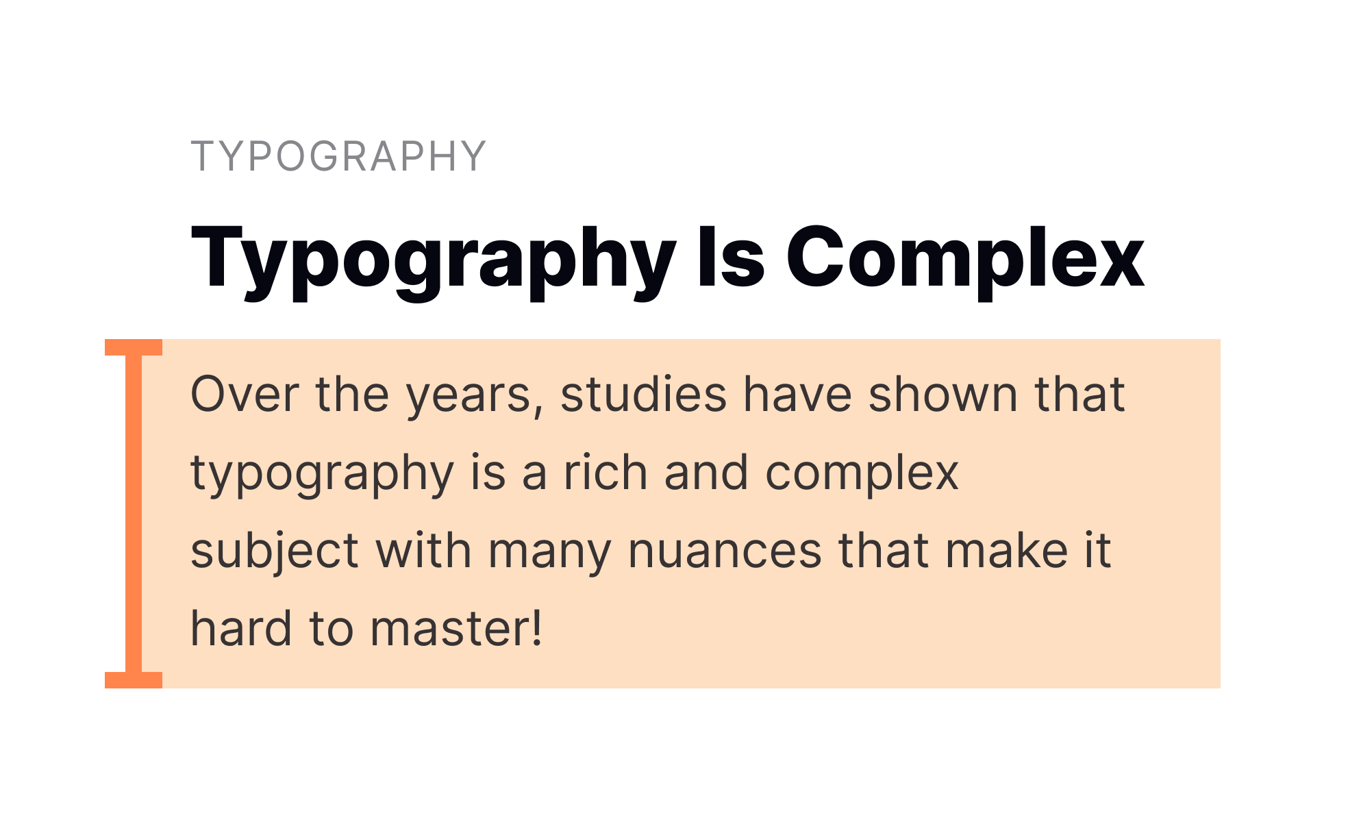
Getting body text right has practical consequences for how users experience a product. Text that's too small, too tightly spaced, or set in a typeface that sacrifices legibility for character creates friction that accumulates over time. Text that's well-sized, well-spaced, and set in a legible typeface can be read for extended periods without fatigue. In a product where users need to read significant amounts of content, this difference is felt directly.
What affects the readability of body text?
Readability is the outcome of several interacting typographic decisions, and no single factor determines it in isolation.
Font size is the starting point. Body text in web interfaces is most comfortably read at 15 to 18px. 16px is the browser default and a widely used baseline. Text smaller than 14px becomes difficult to read comfortably for many users, particularly on lower-resolution screens or in non-ideal lighting conditions. Apple's Human Interface Guidelines recommend a minimum of 17pt for body text on mobile, acknowledging that handheld devices are viewed at closer range.
Line height, the vertical space between lines of text, is as important as size. A common guideline is to set line height at 1.4 to 1.6 times the font size for body text. Too-tight line height makes text feel dense and claustrophobic; too-loose makes it hard to track from the end of one line back to the start of the next. Neither extreme serves extended reading.
Line length, the number of characters per line, directly affects reading flow. Research and practitioner consensus points to 50 to 75 characters per line as the range that supports comfortable reading rhythm for most users. Shorter lines require too many eye returns; longer lines make it difficult to track from the end of one line to the beginning of the next without losing place. This is why body text in well-designed reading interfaces, like Medium's articles, is constrained to a narrower column even when the page has more width available.
Typeface selection matters, though it's sometimes overweighted relative to size and spacing decisions. For body text at standard sizes, a typeface with clear letterform distinction between similar characters (1, l, I; 0 and O; b and d) supports reading speed and reduces misreading. Highly decorative or display typefaces that sacrifice clarity for expressiveness are not appropriate for body text, regardless of how they look at larger sizes.
How does body text connect to visual hierarchy?
Body text does not exist in isolation. Its design only makes sense in relation to the other typographic roles in the product's scale.
A heading draws the user in and establishes the topic. Body text provides the substance. The visual contrast between them, primarily through size and weight difference, tells users at a glance how content is organized and how to prioritize their attention. When heading and body text sizes are too similar, hierarchy collapses and users have to read more to understand the structure of a page. When the difference is clear, users can scan headings to find what's relevant and read body text only where they want detail.
Within body text itself, hierarchy can be added through typographic variation: using a slightly larger or heavier weight for the first sentence of a section (a lead-in or deck), using a smaller size and lighter color for captions or supplementary notes, or using inline emphasis (bold or italic) to mark key terms. These tools should be used deliberately. Overuse of emphasis within body text defeats its purpose: if everything is emphasized, nothing is.
What does accessible body text look like?
Accessibility requirements for body text are specific and measurable, which makes them more tractable than some other aspects of inclusive design.
- WCAG 2.1 specifies a minimum contrast ratio of 4.5:1 between body text and its background. For large text, defined as 18pt regular or 14pt bold, the threshold drops to 3:1. These ratios are minimum thresholds, not targets: higher contrast is better for users with low vision, those viewing screens in bright ambient light, and anyone using a screen with lower display quality.
- Text must be resizable to 200% without loss of content or functionality. This means that using fixed pixel sizes for text in CSS, set in ways that prevent browser zoom from functioning, fails this criterion. Relative units (rem, em) allow text to scale with user and browser settings.
- Supporting Dynamic Type on iOS and text scaling on Android means implementing interfaces that don't break when text is larger than the design assumed. This requires layouts that can accommodate expanded text sizes without clipping, overflow, or element overlap.
- Color should not be the only way body text conveys information. A paragraph where certain text appears red to signal a warning communicates nothing to users with red-green color blindness. Text-level meaning should be conveyed through wording, not solely through color.
How does body text relate to brand voice and tone?
The visual properties of body text, its typeface, weight, and size, contribute to a product's brand character in ways that complement the content itself.
A product that uses a humanist serif for its body text communicates something different from one that uses a geometric sans-serif. These impressions are subtle but real, and they accumulate across every page of content a user reads. Design system decisions about body text are partly typographic and partly expressive: the typeface should be appropriate for the content type, legible at the sizes it will be used, and reflective of the brand's intended character.
The language of body text, its clarity, tone, and register, is equally part of the brand experience. Body text that uses plain, direct language reduces cognitive load and signals confidence. Body text that defaults to jargon, passive constructions, or unnecessarily complex sentence structures makes users work harder and can erode trust. This is the overlap between body text as a typographic decision and body text as a UX writing concern: both shape how users experience written content.


