

TL;DR
- Arrangement of type for readability and design.
- Includes fonts, spacing, and hierarchy.
- Shapes user experience and brand identity.
- Essential across digital and print products.
Definition
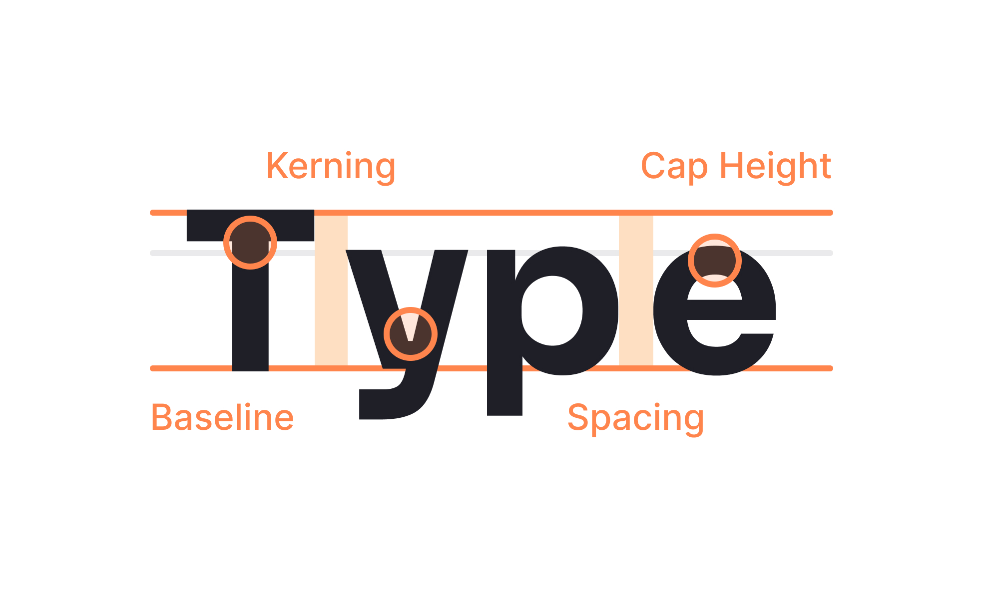
Typography is the discipline of arranging typefaces, sizes, spacing, and layout to optimize readability, structure, and aesthetics in both digital and physical communication.
Detailed Overview
Typography is at the heart of visual communication. It involves not only the choice of typefaces but also how they are arranged on a page or screen. This includes size, weight, spacing, alignment, and hierarchy. Good typography ensures text is legible, information is structured clearly, and the design feels cohesive.
A frequent question is how typography impacts user experience. Text is the primary way users consume information, so clarity and readability are critical. Poor typography creates friction, making content difficult to scan or understand. Well-executed typography guides the eye, emphasizes priority content, and supports accessibility for a wide range of users.
Another common query is how typography connects to brand identity. Typography communicates personality as much as logos and colors do. A serif typeface might suggest tradition and authority, while a sans-serif feels modern and approachable. Brands that maintain consistent typography across interfaces, marketing, and documentation build stronger recognition and trust.
Teams also ask about the technical aspects of typography. Concepts like kerning (spacing between characters), leading (line spacing), and tracking (overall letter spacing) influence both readability and aesthetic balance. Designers fine-tune these elements to improve the user’s reading experience across devices, from mobile screens to printed reports.
Accessibility is a recurring concern. Typography must meet minimum size requirements, use sufficient contrast, and avoid overly decorative fonts for body text. These practices ensure content is inclusive, supporting users with visual impairments or reading difficulties. Accessibility-focused typography prevents exclusion and improves comprehension.
Finally, typography evolves with technology. Variable fonts, responsive scaling, and dynamic layouts now allow text to adapt seamlessly across devices. This adaptability ensures typography remains functional and engaging in diverse digital contexts, while still rooted in principles that have guided print design for centuries.
Learn more about this in the Typography Style & Classification Lesson, a part of the Typography Course.


