

What is a font?
A font is the digital file that makes a typeface usable. It's what tells your browser, app, or operating system how to render each letter, number, and symbol on screen.
People often use "font" and "typeface" interchangeably, but they mean different things. A typeface is the design family: Helvetica, Roboto, Georgia. A font is a specific instance of that design: Roboto Regular, Roboto Bold, Roboto Italic. One typeface can contain dozens of fonts across different weights and styles.
In practice, when a designer chooses "the font for the product," they're really selecting both: the typeface family and the specific weights and styles they'll use from it.
How do fonts affect readability and hierarchy?
Readability is the most important job a font does in a digital product. If users have to work to read text, the experience breaks down before any other design decision gets a chance to matter.
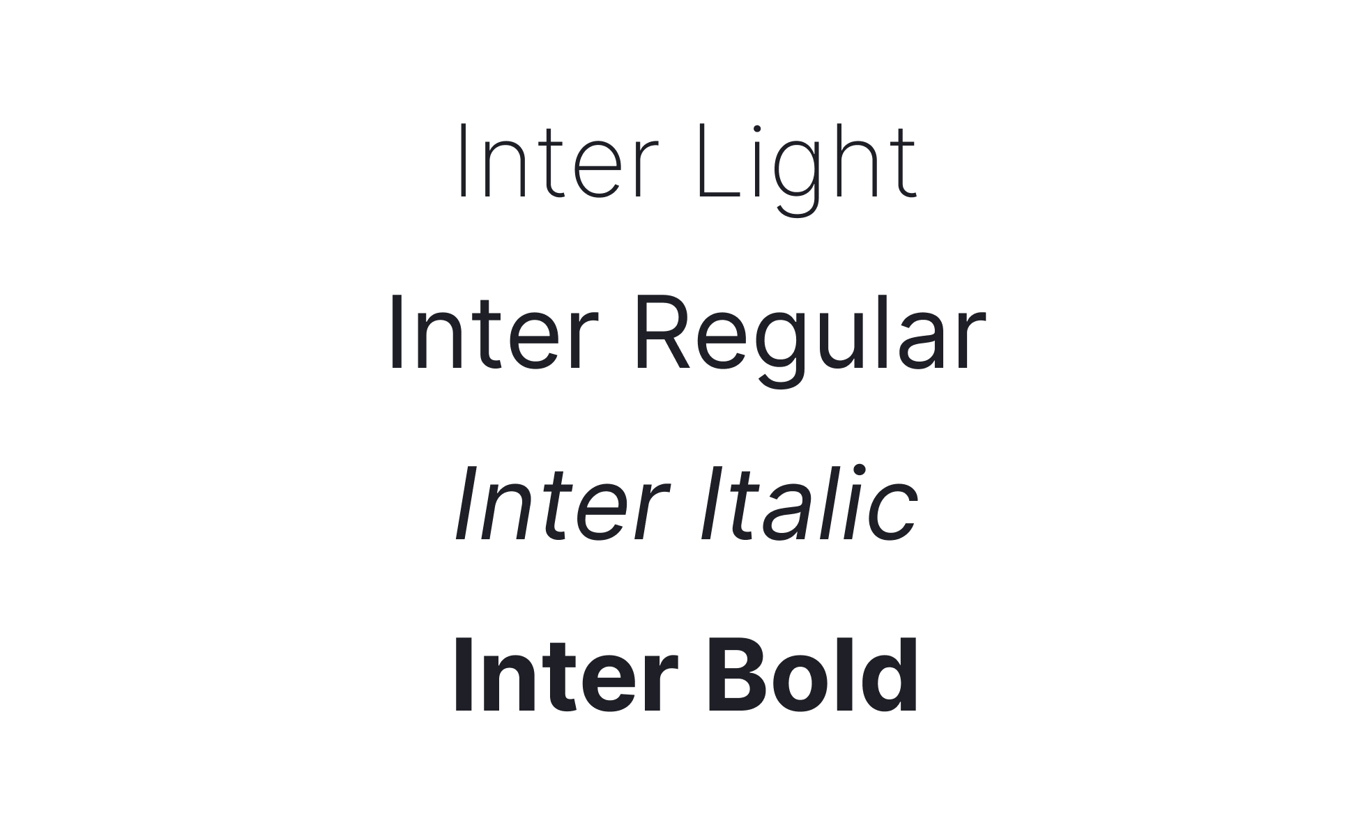
Several factors determine whether a font reads well on screen: x-height (the height of lowercase letters relative to capitals), letter spacing, stroke contrast between thick and thin parts of a letterform, and how it behaves at smaller sizes. Fonts designed specifically for screens, like Inter or Apple's San Francisco, optimize for all of these. Inter, for example, was built from the ground up for computer displays, with strong readability at small sizes and highly predictable behavior across weights.
Hierarchy is the other major role fonts play. Within a single typeface, weight and size variation does most of the work: a heavier weight for headings, a regular weight for body text, a lighter weight or smaller size for captions and metadata. This visual rhythm tells users what to read first, what to skim, and what's supplementary, without requiring them to consciously think about it.
What's the difference between serif and sans-serif fonts?
The distinction comes down to one detail: serifs are the small strokes or feet attached to the ends of letterforms.
Serif fonts (like Georgia, Garamond, or Times New Roman) carry those finishing strokes. They've traditionally been associated with editorial content, formality, and print, where serifs were thought to guide the eye along lines of text. Serif choices are making a notable comeback in digital product design in 2026, particularly in content-heavy interfaces and premium brand contexts.
Sans-serif fonts (like Inter, Helvetica, or Roboto) drop those finishing strokes entirely. Cleaner at small sizes on screen, they've dominated interface design for decades and remain the default choice for most digital products. For UI work specifically, sans-serifs reduce visual noise and perform more reliably across different screen densities and resolutions.
Neither category is inherently better. The right choice depends on the context, the brand, and the specific reading environment you're designing for.
What are variable fonts, and why do they matter now?
A variable font is a single font file that contains an entire range of styles and weights, instead of requiring separate files for each. Rather than loading Roboto-Regular.woff2, Roboto-Bold.woff2, and Roboto-Italic.woff2 separately, a variable font gives you continuous control over weight, width, and other axes from one file.
These days, variable fonts have moved from trend to standard practice. Product teams use them for a few reasons. Performance: one file instead of five means less to load, which matters on slower connections. Flexibility: designers can fine-tune weight for each breakpoint or density rather than jumping between rigid steps. Consistency: a single asset keeps branding steady across sites, apps, and campaigns without managing multiple static files.
Inter, which many SaaS products use as their primary interface font, ships as a variable font with wide browser support and excellent readability. Roboto Flex, the variable upgrade to Google's flagship typeface, adds even more axes for fine-grained control. For most digital product teams today, choosing a variable font isn't a special consideration. It's just the sensible default.
How do fonts influence brand identity?
A font choice carries meaning before anyone reads a single word. The visual character of letterforms, their proportions, their weight, and their spacing, signals something about the brand behind them.
A geometric sans-serif like Futura or Montserrat reads as modern and precise. A humanist sans-serif like Gill Sans or Myriad feels warmer and more approachable. A high-contrast serif signals editorial credibility or heritage. A condensed grotesque communicates density and urgency. These aren't arbitrary associations: they come from decades of how these typefaces have been used and where users have encountered them.
Major companies invest heavily here. Apple designed San Francisco specifically to work across all its products and platforms, integrating weight, spacing, and legibility requirements into every detail of the typeface. Google Fonts maintains hundreds of free, open-source fonts optimized for the web, giving teams of any size access to professional-quality typography without licensing costs. When a company changes its typeface, it's rarely just a visual refresh. It's a signal about where the brand is positioned and who it's speaking to.
What role do fonts play in accessibility?
Accessibility shapes font decisions in ways that go beyond aesthetics.
WCAG guidelines require text to meet minimum contrast ratios against its background: 4.5:1 for normal text, 3:1 for large text. A font that looks beautiful at full opacity on a light background might fail contrast requirements when set in a lighter weight or muted color. Font choice and accessibility aren't separate considerations: they're connected from the start.
Legibility at varying sizes is another factor. Fonts need to remain readable when a user scales text up through their OS or browser settings. Fonts with tight letter spacing, unusual letterforms, or thin strokes at default sizes can become unusable when scaled. Choosing fonts with generous x-heights and clear letterform differentiation helps here, particularly for characters like lowercase L, uppercase I, and the number 1, which are commonly confused.
Dyslexia-friendly fonts like OpenDyslexic specifically address how certain users process letterforms, using heavier bottoms on characters to reduce the visual flipping that some dyslexic readers experience. While these fonts aren't appropriate for every context, they're a useful consideration when designing for audiences where accessibility is a primary concern.
How do global products handle fonts across different languages?
Typography for a single language is already complex. For global products supporting multiple scripts, the challenge compounds significantly.
Latin scripts (used across most European languages) share proportions, spacing conventions, and rendering behaviors. But Arabic, Hebrew, Devanagari, Chinese, Japanese, and Korean scripts each have their own structural logic. Arabic and Hebrew read right to left. Chinese and Japanese characters (CJK) have different spacing requirements and typically need larger type sizes to remain legible at the sizes where Latin text would be comfortable.
Most major global typefaces include extended character sets, but coverage varies. A font that handles Latin and Cyrillic perfectly may lack support for Thai or Vietnamese. Products serving global audiences need to audit their chosen fonts for character coverage, or stack font families so that a fallback handles scripts the primary font doesn't cover.
Google Fonts' Noto family was built specifically to address this. Its name comes from "no tofu," referring to the empty rectangles browsers display when a character isn't supported. Noto covers hundreds of languages and scripts under a consistent visual approach, making it a practical choice for products with genuine international reach.


