

TL;DR
- Defines rules for typography use in design.
- Covers font families, sizes, and hierarchies.
- Ensures clarity, readability, and brand cohesion.
- Guides consistency across interfaces and content.
Definition
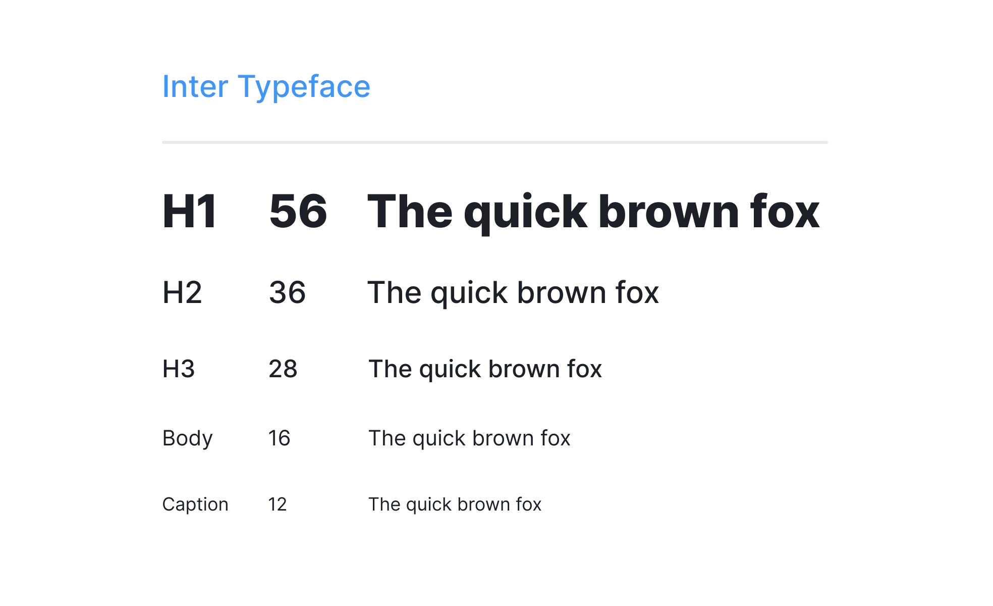
A type system is a framework that organizes typography through structured rules, including font selection, sizing, spacing, and hierarchy, to create cohesive and usable designs.
Detailed Overview
A type system acts as the backbone of visual communication in design. It provides structured rules for how typography should be applied across digital and physical products, ensuring consistency and coherence. Without a defined system, products risk mismatched fonts, uneven hierarchy, and reduced readability, which can weaken both usability and brand identity.
A frequent question is how a type system differs from simple font guidelines. While font guidelines may specify which typefaces to use, a type system expands into how those typefaces are applied in different contexts. It defines headers, subheaders, body text, captions, and interactive elements, establishing scale and hierarchy that make content scannable.
Another common query involves why type systems are critical in product design. Users rely on text to navigate, learn, and interact with interfaces. A structured type system ensures that important information stands out while secondary details are supported without distraction. For example, a mobile app might use large, bold headers to guide attention and smaller, consistent body text for descriptions, helping users orient themselves quickly.
Teams also ask how type systems intersect with brand identity. Typography communicates personality as much as it conveys information. A formal serif typeface may suggest tradition and professionalism, while a geometric sans-serif conveys modernity and minimalism. A type system ensures this identity is applied consistently across touchpoints, from product interfaces to marketing materials.
Accessibility is another central issue. A strong type system accounts for legibility with appropriate font sizes, line heights, and color contrast. It ensures text is readable across devices and environments, supporting inclusivity. For example, ensuring a minimum size for body text and sufficient spacing between lines prevents fatigue and improves comprehension.
Finally, type systems evolve alongside products. As new features or design directions emerge, type systems must adapt while preserving consistency.
Learn more about this in the Type Systems Exercise, taken from the UI Design Deliverables Lesson, a part of the UX Design Foundations Course.


