

What is font size?
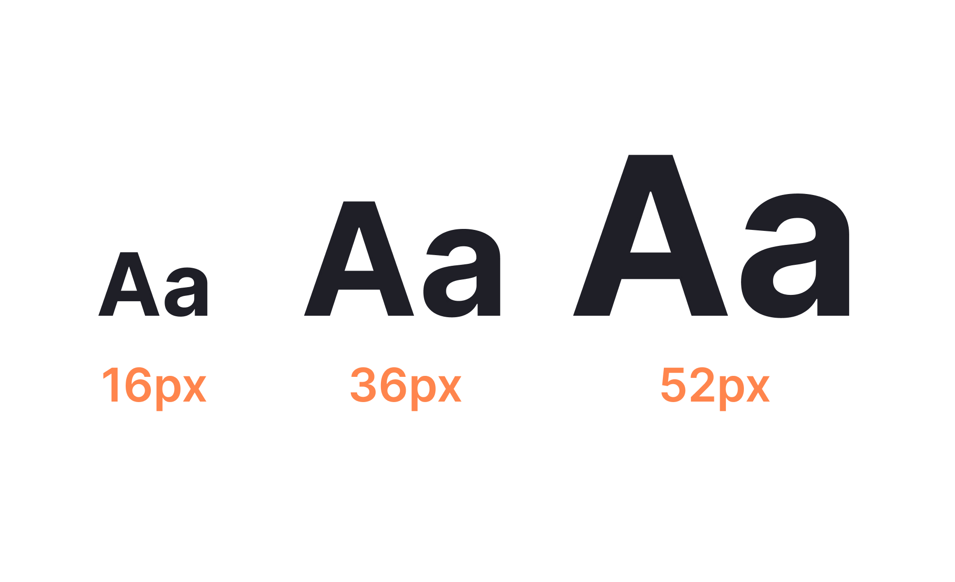
Font size is the measurement that determines how large or small text characters appear in a design. In print, it's traditionally measured in points (pt). In digital design, it's most often specified in pixels for screen-level decisions and in relative units like em or rem in web code, where text needs to scale in response to user settings and viewport size.
The number itself is only part of what font size communicates. The relationship between font sizes in a design matters as much as any individual value. A heading set at 32px is only meaningful as a heading if the body text below it is significantly smaller. Without that contrast, the hierarchy collapses and users lose the visual signals that tell them where to start reading and how content is organized.
Font size also affects how text is perceived emotionally and contextually. Large type feels confident, modern, or urgent. Small, tightly set type can feel refined or dense. These qualities are used deliberately in brand expression, and they interact with typeface choice, weight, and spacing to create a product's typographic character.
How does font size affect readability?
Readability is the primary functional concern around font size, and it's governed by several interacting factors:
- Body text in digital interfaces is generally most readable in the 15–18px range for desktop screens. Smaller sizes require users to move their eyes more carefully across the text, which slows reading and increases fatigue over longer content. Apple's Human Interface Guidelines recommend a minimum of 17pt for body text on mobile, accounting for the typical viewing distance from a handheld device. Google's Material Design provides a typographic scale with specific size values for each text role, from display headings down to captions, designed to maintain readability and clarity across Android interfaces.
- Line length and line height interact with font size to determine readability at the paragraph level. A large font size set with too-tight line height creates a dense, claustrophobic feel that slows reading. The same size with generous line height reads comfortably. A widely recommended guideline is to set line height at roughly 1.4 to 1.6 times the font size for body text.
- Viewing context matters as well. Text on a television UI is read from several meters away; text on a mobile device is held at arm's length; text on a desktop monitor sits at an intermediate distance. These differences mean that a font size appropriate for one context can be too small or too large in another. Responsive typography systems address this by scaling font sizes across breakpoints rather than using fixed values throughout.
What is a typographic scale?
A typographic scale is a defined set of font sizes used consistently across a product. Rather than choosing sizes ad hoc for each screen or component, a scale establishes a fixed vocabulary of sizes with predictable relationships between them.
Most typographic scales define a small number of named roles: display or hero text, heading levels (h1 through h4 or h5), body text, labels, and captions. Each role has an associated size, and sometimes additional specifications for weight, line height, and letter spacing. Consistent use of the scale creates visual rhythm across the product and ensures that hierarchy is communicated the same way everywhere.
Scales are often built with a geometric ratio, where each step is the previous step multiplied by a fixed factor. A 1.25 ratio (the major third), for example, produces the sequence: 10, 12.5, 16, 20, 25. This mathematical basis means sizes feel proportionally related rather than arbitrarily chosen, which contributes to a sense of visual coherence.
Design systems like Material Design and Apple's HIG define their typographic scales explicitly, giving teams a pre-built starting point. Many product teams define their own scales as design tokens, which feeds the size values into components and code and makes system-wide changes tractable.
How does font size connect to accessibility?
Accessibility standards treat font size as a threshold concern. WCAG 2.1 defines large text as 18pt (roughly 24px) or 14pt bold (roughly 18.67px bold) and applies different minimum contrast ratios to large text versus normal text, acknowledging that larger characters are more readable at lower contrast levels than smaller ones.
Beyond contrast, WCAG requires that text can be resized up to 200% without loss of content or functionality. This means that interfaces built with fixed pixel font sizes set in ways that prevent browser zoom from working correctly fail this criterion. Using relative units (em, rem, or %) rather than fixed pixel values in CSS is the standard approach for building text that scales correctly with user settings.
Dynamic Type on iOS and text scaling on Android allow users to set their preferred reading size at the system level, and well-implemented apps respect those settings by scaling their typography accordingly. This is one of the most impactful accessibility features for users with low vision, and it requires that interfaces are built with flexible layouts that don't break when text is larger than the design assumed.
How does font size relate to branding?
Font size choices are part of a product's visual identity, not just a functional decision. The scale and rhythm of type across a product communicates something about the brand before the content is read.
Products that use large, bold type in their interfaces signal confidence, openness, and accessibility. Products that use smaller, tightly controlled type suggest precision, density, or sophistication. These impressions are created by the combination of font size with typeface choice, weight, color, and spacing, but size is one of the most immediately perceptible factors.
Large-scale editorial typography, where display text is set dramatically large to create visual impact, has become more common in product interfaces as design tools make it easier to work with variable fonts and fluid type systems. This trend treats the typographic composition of a screen as something to be considered as carefully as the page structure.

.svg)


