

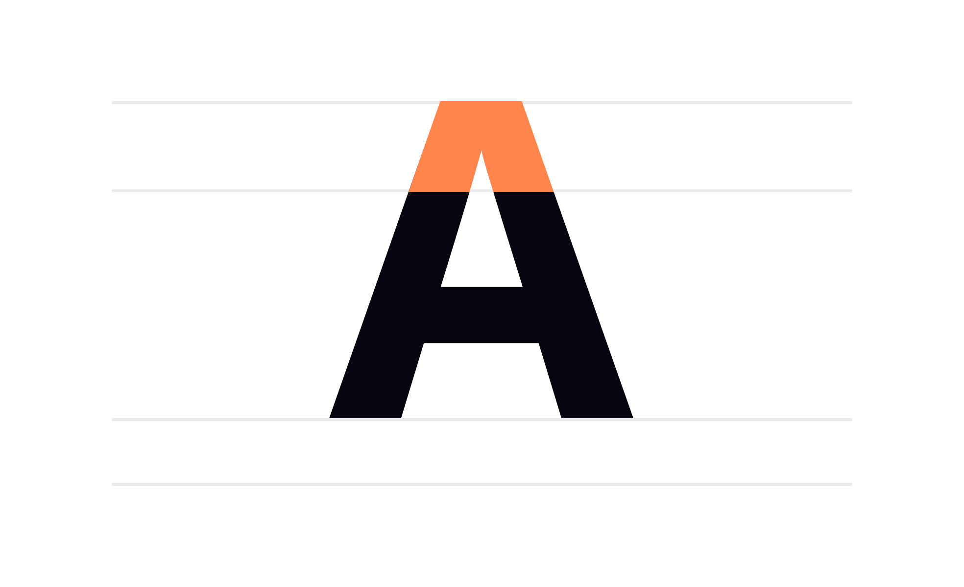
What is an apex in typography?
An apex is the uppermost meeting point of two converging strokes in a letterform. It is most visibly present in the uppercase letter A, where the two diagonal legs of the letter rise and converge at the peak. The shape of that peak, whether it comes to a sharp point, ends flat, turns rounded, or curves in a concave hollow, is the apex's defining characteristic.
The apex is one of many anatomical features that type designers describe with technical precision. Others include the arm (a horizontal or upward-angled stroke attached at one end), the bowl (the enclosed curve of letters like B, D, and P), and the serif (the small finishing stroke at the end of a stroke in serif typefaces). These terms give type designers, typographers, and anyone working with type a shared vocabulary for discussing the specific qualities that make one typeface feel different from another.
Beyond the letter A, apex-like convergences appear in M, where two diagonal strokes meet at the center, and in some stylized versions of V and W, depending on the typeface design. The uppercase A is the most studied example because it's the first letter of the alphabet and often the most visible demonstration of a typeface's apex treatment.
How does apex design affect a typeface's character?
The apex is a small feature with a disproportionate effect on the personality of a typeface. This is partly because the uppercase A appears so frequently in headings and display text, and partly because the apex is one of the first places where a type designer's aesthetic philosophy becomes visible.
- A sharp, pointed apex communicates precision, formality, and authority. Typefaces with crisp, angular apexes tend to feel modern, technical, or professional. Helvetica's A has a flat apex, which contributes to its neutral, functional character. The sharp, geometric apexes in a typeface like Futura give it a sense of mathematical order.
- A rounded apex creates warmth and approachability. It softens what might otherwise be an angular letterform, making the typeface feel more humanist and less clinical. Typefaces used for children's products, consumer goods, and brands that want to project friendliness often favor rounded apexes.
- A concave or hollow apex, where the meeting point dips inward rather than coming to a point, creates visual distinctiveness. This kind of detail is more common in display or decorative typefaces where the apex is large enough to read clearly and the designer has chosen it as a signature feature.
- A flat or chopped apex, where the converging strokes simply terminate horizontally rather than meeting at a point, has a functional, sturdy quality. This treatment is common in many widely used sans-serif typefaces because flat apexes render cleanly at small sizes and across different screen densities.
How does the apex affect legibility at different sizes?
The apex's design becomes functionally significant at small sizes and on lower-quality display surfaces.
- A sharp, pointed apex works well at large sizes where the point is clearly visible and reads as an intentional design choice. At small sizes, particularly on lower-resolution screens, a sharp apex can begin to appear jagged or irregular, because the rendering engine doesn't have enough pixels to describe the point precisely. The apex either renders as a few pixels that feel ragged or blunts to a flat termination regardless of the designer's intent.
- Flat or slightly rounded apexes render more predictably across sizes and screen densities. This is one of the reasons that typefaces designed specifically for screen use at body text sizes, like Roboto, Inter, and SF Pro, tend to have restrained, clean apex treatments rather than elaborate or highly angular ones.
- The implication for UI design is the same as for most typographic detail decisions: features that read well in a logo or a display headline at 80px may not hold up at 14px in a data table. Typeface selection for functional interface text should account for how typographic details like the apex render in the actual contexts where that text will appear.
How does the apex contribute to brand identity?
Typography is one of the most consistent brand signals in a product, and the apex is part of what makes typeface choices feel distinct. Brands that use custom typefaces, or that have selected a typeface specifically for its typographic character, are often making choices that include how letters like A feel at their peak.
A financial services brand that selects a typeface with angular, precise apexes is communicating precision and authority through a detail most users won't consciously notice but will register subliminally. A health and wellness brand that chooses a typeface with rounded, humanist apexes is making the opposite choice. These decisions are most visible in large-scale usage: in wordmarks, in headline typography, and in the first few words of display text where the A is likely to appear prominently.
Custom typefaces, developed for specific brands, often treat the apex as a place for differentiation. A distinctive apex treatment can become a recognizable signature that distinguishes a brand's custom type from off-the-shelf alternatives.


