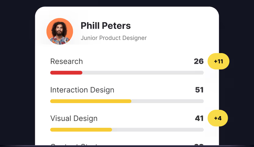

Cards: AI Skill for UX Design
Cards is an AI skill that keeps every card to one topic with clear hierarchy and restrained styling. It also tells you when cards are wrong and a list or table fits better.
npx skills add Uxcel-Lab/product-skills --skill ux-cards
Copied
What this skill does
Helps an AI assistant design cards that hold one topic each, read in a glance, and invite the click.
- Checks whether users browse or search before reaching for cards at all.
- Keeps each card to one topic in one container.
- Truncates supporting text so the card teases instead of telling everything.
- Builds hierarchy inside the card with size, weight, color, and placement.
- Limits each card to one shadow and one emphasized element.
- Keeps padding consistent so content never touches the edges.
- Checks text-over-image contrast and media quality.
- Surfaces container styles and interaction choices as decisions with trade-offs.
When to use it
Use it when you need an AI assistant to:
- design a card, card grid, or content tile;
- decide whether cards fit the content at all;
- build a browse view from cards;
- declutter an overstuffed card;
- design user or profile cards;
- pick between elevated, outlined, and flat containers;
- review card layouts for hierarchy and restraint.
Decisions this skill helps you make
| Decision | Options |
|---|---|
| Elevated card | Default for interactive cards, one shadow maximum |
| Outlined card | Grouping without depth, for low-emphasis surfaces |
| Flat card | Only with a contrasting background and a hover cue |
| Fully clickable card | Whole card clickable when there is a single action |
| Rich media card | Media earns its space or gets cut |
| User card | Identity plus one action, the rest on the profile |
| Cards vs. list or table | Cards for browsing, lists and tables for lookup |
How the skill works
1
Establish the content
The skill checks whether users browse or search, what each card holds, and how many actions it needs.
2
Apply the core
It keeps one topic per card, builds internal hierarchy, and truncates content to invite exploration.
3
Surface trade-offs
It presents container styles and interaction choices with trade-offs tied to your context.
Try it with
Related skills

1.0.0
MIT
UX Design
Components