

.svg)


Icons can add so much personality to even the most minimalist designs. Mastering the use of icons allows you to use them to enhance user experience and actually make your products more usable.
Understanding the types of icons (glyph icons, outline icons, universal icons, conflicting icons, and other types), how they’re best used, and what makes a “good” icon will help you implement them effectively in your UX designs.
Types of icons
An icon is an icon, right? Well, not so much. There are a lot of different kinds of icons out there, and understanding what each type is and what they’re suitable for is the first step in using them in your designs. Dig deeper into Icon Terminology with the interactive lesson at Uxcel.

Originating from the Greek word for “carving,” glyph icons are graphical symbols and are usually solid. They can be scaled to whatever size you need and can be customized with different colors and shadow effects. Because they’re generally a solid color, glyph icons can work really well at small sizes, but may not hold much visual interest at larger sizes. You can find examples of free glyph icon sets at Fontawesome, Glyphicons, or Fonticons.
Colored icons are just that — colored. They can either have a solid color or gradient color scheme, and can make icons appear less formal and more playful. The downside to colored icons is that they can be more challenging to integrate into a product’s aesthetic and can even distract users from meaningful content. Because of that, overuse is generally detrimental to UX.
While colored icons generally use one color (or a gradient), duotone icons contain two similar colors that are distinctly separated. To create one, you take an icon, split it’s elements into two layers (such as an outline and fill space), select a starting hue, experiment with layer opacity, and a duotone icon is born.
Duotone icons can add some extra visual interest to your designs without overpowering them. Just beware that at very small sizes, they can be hard to decipher.
Outlined icons are created by vector strokes, and are empty inside. They have pros and cons. On the upside, they’re clean, minimalist, and can look very polished. On the downside, they can take users more time to process and recognize.
Universal icons are immediately recognizable, and usually represent repetitive actions like home, print, or search. Universal actions in your product should be represented with universal icons to avoid confusion.
For example, the search icon is traditionally a magnifying glass. Getting creative by using binoculars instead is only going to confuse users. While you can adjust the exact style of the icon to fit your design, the basic shape and idea behind it should be the same.
Unlike universal icons, unique icons represent unique functions or features. The downside to using them is that they can be hard for first-time users to figure out. If you use them, make sure that you include text labels so users don’t have to decipher their meanings.
Logo icons would be one example of unique icons. The Sketch logo is a stylized diamond. For someone unfamiliar with the program, the diamond will be meaningless. But for those who have used the product, it’s immediately recognizable. Keep that kind of impact in mind when using unique icons.
In some cases, you’ll have to decide between multiple icons that commonly represent a single concept. These are called conflicting icons. For example, to like a post on Facebook you’d use a thumbs up, but on Instagram it’s a heart, and on still other sites it’s a star. While you can use any of those icons in your design, the key is to be consistent and only choose one for your interface.
Conflicting icons can sometimes have different meanings on different sites. Going back to the heart icon, on Instagram it likes a post, but on Facebook it loves a post, and on sites like Etsy it will add a product to your favorites list. That doesn’t mean you shouldn’t use a heart icon; just be aware of the different meanings users may attribute to it and make sure your usabe is clear and consistent. Labels can help remove any doubt about the icon’s meaning.
Icons can enhance the usability of your interface by giving users immediate visual cues, while also enhancing the aesthetic appeal of your design. Naturally, they are vital to creating user-friendly designs. Learn more about iconography and test you knowledge with the interactive Iconography Design lesson at Uxcel.
Anatomy of an icon
Now that you have a firm grasp of the different kinds of icons, you should understand the anatomy of an icon. This is important when working on iconography design, though it also comes in handy when evaluating the suitability of an existing icon set you’re considering using.
Not every icon is the same size and shape, so keeping each of them within a standard-size container makes a developer’s life way easier. Make sure the icons are the same size within the container in at least one dimension to prevent them from appearing to be all different sizes.
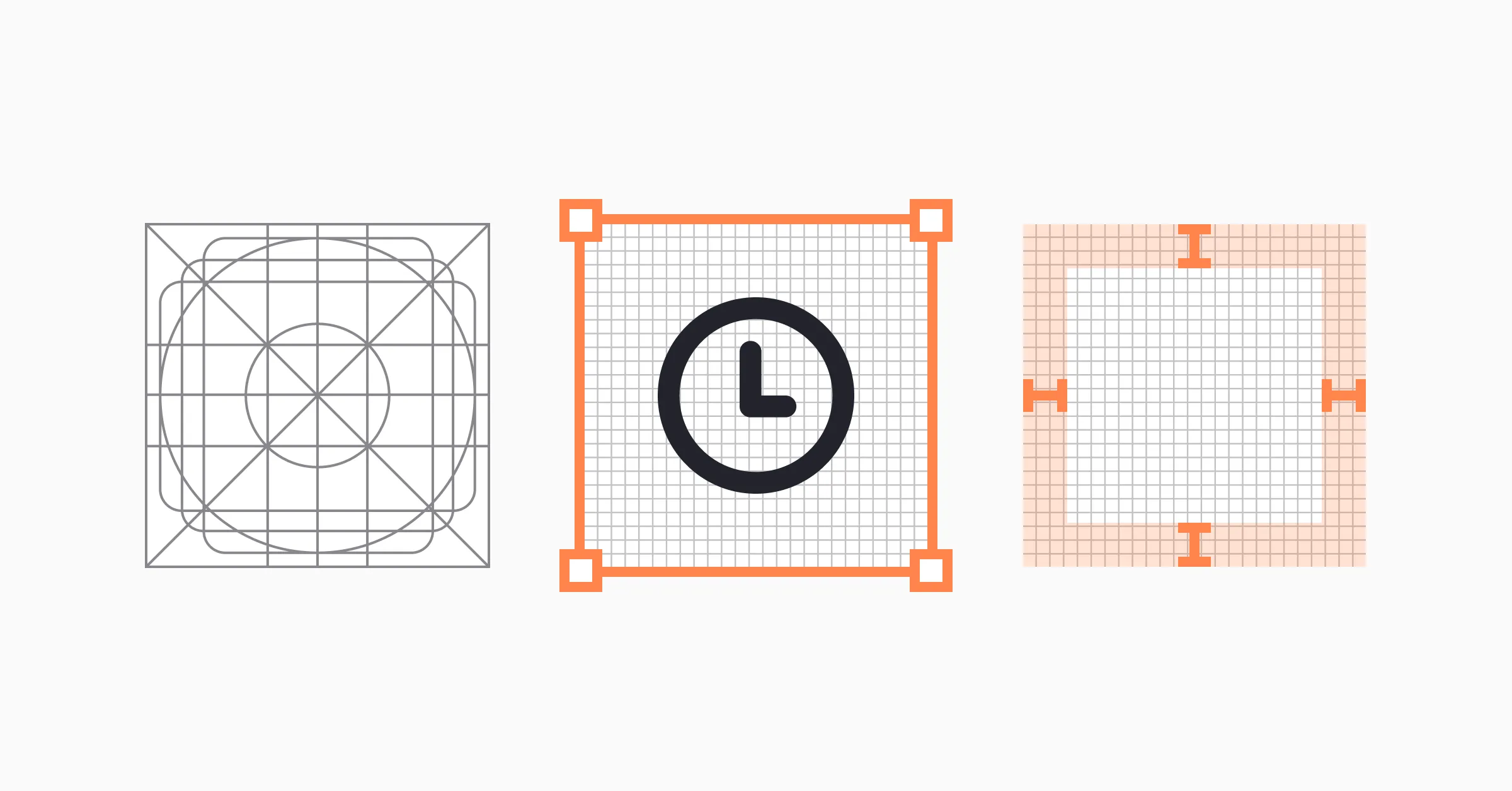
Grids can seem really rigid to those who haven’t seen them before (or like a cryptic mess), but think of them like a starting canvas for designing your icons. They establish clear rules for making your graphic elements consistent. By using grids, you’ll spend less time trying to make sure your icons all work cohesively together and make fewer mistakes.
Within your container and grid, you’ll deal with padding. Padding is the inner space between the icon and the border of the container. It should be adjusted for each icon to be sure they’re visually consistent.
While the grid gives a basic structure to start from when designing an icon, keylines provide a more nuanced guide. The keylines are like a starter kit for creating your icons and include a few basic shapes—usually a square, rectangle, and circle. They help you maintain consistent visual proportions in your icon designs without restricting your creativity.
Border radius (how much corners are either pointed or rounded) is another key to creating visually consistent icons. If one icon has crips, sharp corners, you’ll want to make sure all of your other icons also include them.
Want to learn more about best practices of using icons in UI design — explore the interactive Iconography Design lesson lesson at Uxcel.
Conclusion
Icons are an important part of creating a visually interesting UX design, but they can also greatly add to the usability of a website or other digital product. Consider how the different types of icons might work within your design, taking into account the overall style as well as the sizes at which the icons will be used.
Ultimately, being familiar with basic UI components and knowing how to use them helps simplify communication with teammates, reduce usability errors, and ensure more consistent user experiences.