

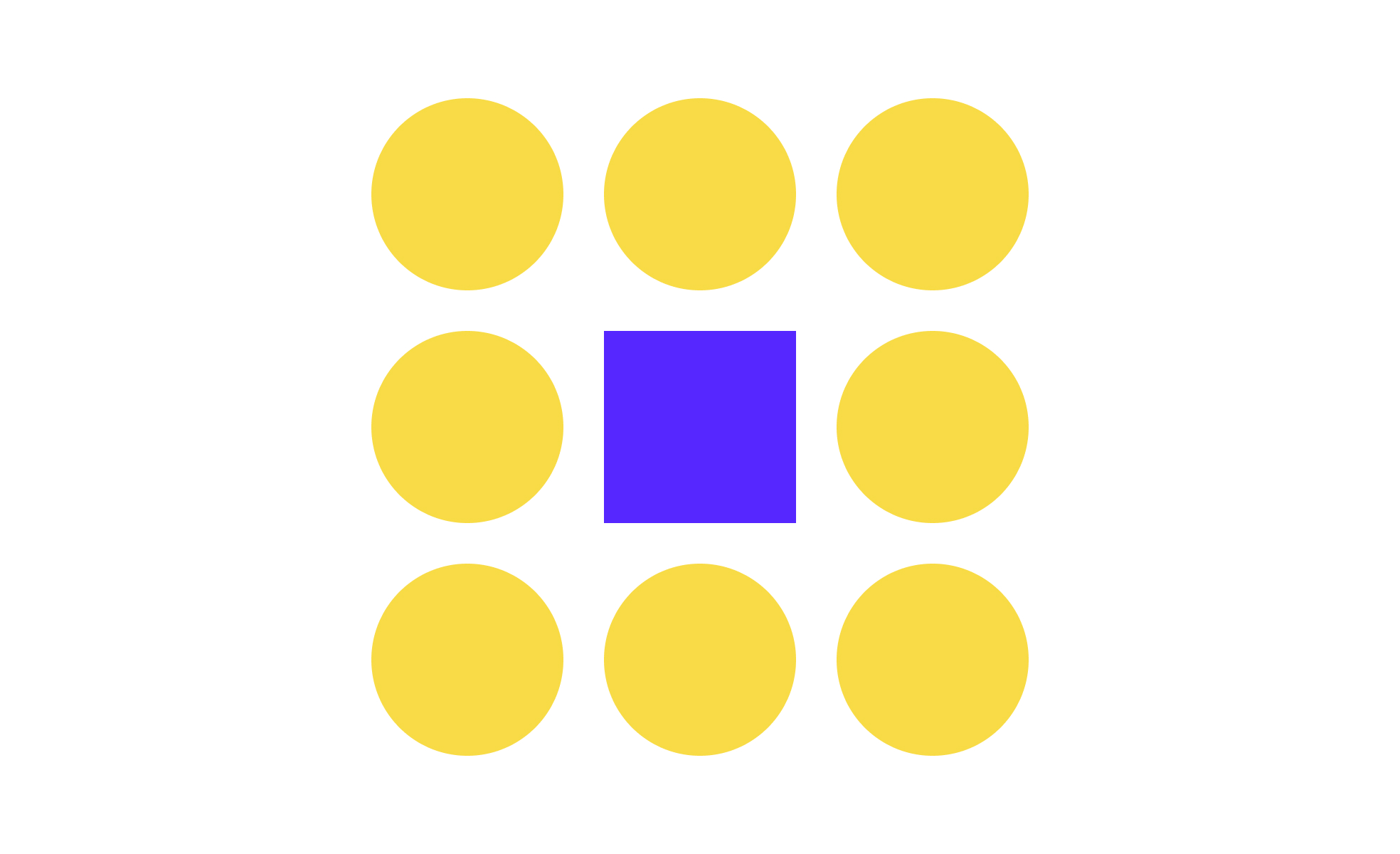
Contrast is a foundation of both UX design and product management because it guides how users perceive and process information. At its core, contrast creates distinction between elements so that important content stands out and less important content recedes. This can apply to color, size, shape, typography, and even timing in motion design. A high level of contrast ensures users notice what they need quickly, while low contrast can cause critical information to be overlooked.
In typography, contrast helps readers distinguish headings from body text. For example, using a heavier weight and larger size for headlines compared to body copy ensures the text hierarchy is clear. This is not just an aesthetic choice but a usability one, as it allows users to scan and process information at speed.
Color contrast is often discussed in accessibility standards. Tools like the Web Content Accessibility Guidelines (WCAG) specify minimum ratios between text and background colors to ensure readability for users with visual impairments. Meeting these standards is not only about compliance but also about inclusivity and broadening reach. Brands like Apple and Google consistently apply strict color contrast checks in their design systems to ensure that their products are usable by millions of diverse users.
Beyond color and text, contrast is also about structural clarity. Designers can apply it by varying shapes, spacing, and alignment to signal relationships between elements. For example, a primary button might be rectangular and bold, while secondary actions are outlined and lighter. Product managers recognize this as critical for reducing errors in workflows. If all actions look the same, users may choose the wrong one, causing frustration and drop-offs.
Real-world product examples highlight how contrast drives results. Spotify uses high-contrast text over album covers to keep music titles readable in any condition. E-commerce platforms like Shopify ensure that “Add to Cart” buttons pop against product images so that users never doubt where to click. In both cases, strong contrast directly supports conversions and customer satisfaction.
Learn more about this in the Contrast in Design Composition Lesson, a part of the Design Composition Course.
Key Takeaways
- Contrast creates clear distinctions between design elements.
- Strong color and text contrast improve readability and accessibility.
- Structural and motion contrast guide focus and interaction.
- Brands like Spotify and Apple rely on contrast to boost clarity.
- Poor contrast reduces usability and can lead to user errors.

.svg)


