

What are design elements?
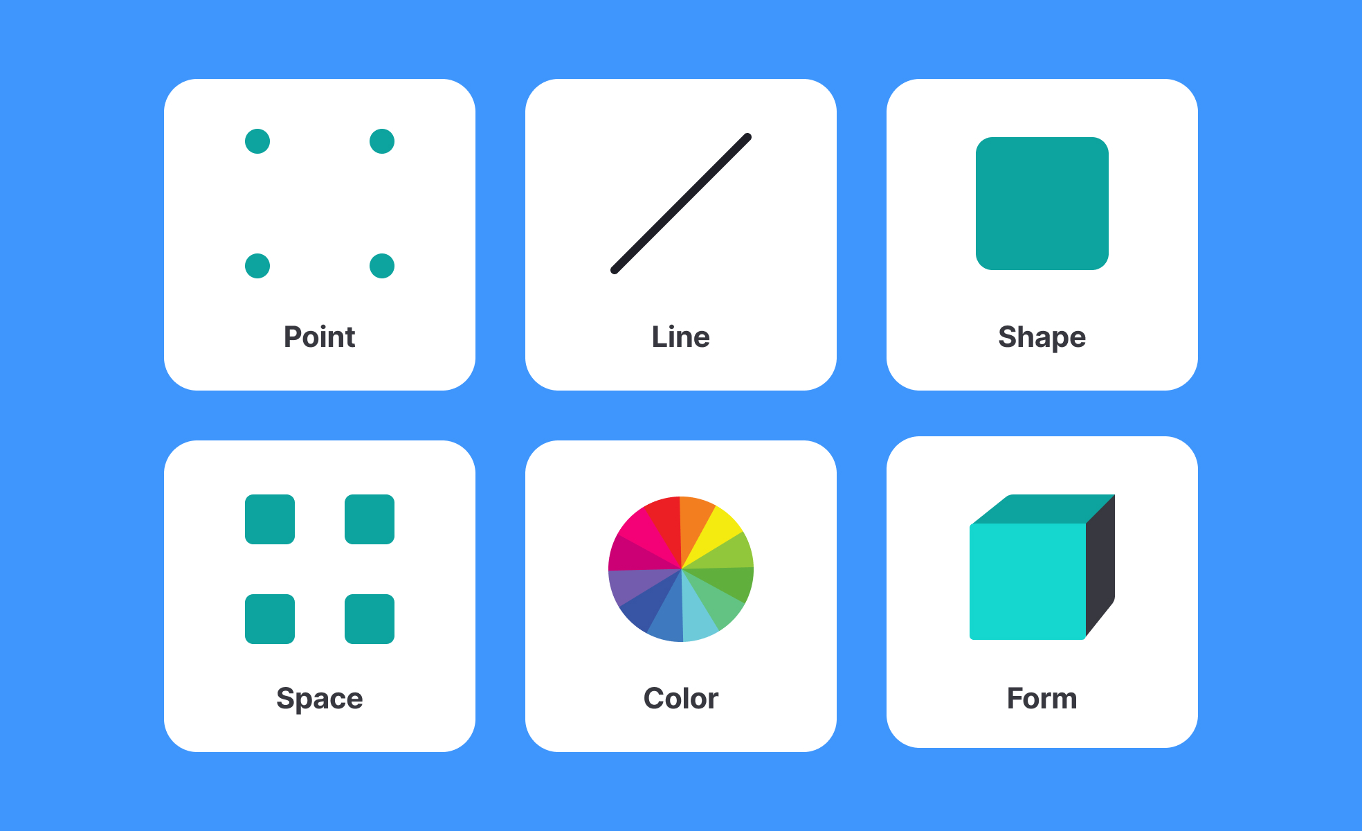
Design elements are the basic visual components that every interface is made from. Individually, they're simple: a line, a block of color, a typeface, an image, an area of space. Together, deliberately combined and arranged, they determine whether a screen feels legible or cluttered, trustworthy or chaotic, focused or overwhelming.
The classic list of design elements includes line, shape, color, texture, space, typography, and imagery. Each one carries meaning and function beyond appearance. Line directs the eye and creates structure. Shape defines areas and draws attention. Color influences mood, signals system states, and establishes brand recognition. Texture adds depth or warmth. Space (what's left empty) gives elements room to breathe and stand out. Typography communicates not just words but personality and hierarchy. Imagery provides context, emotion, and identity.
Understanding these elements is less about memorizing a taxonomy and more about developing the judgment to use each one intentionally. An interface built on thoughtful element choices communicates clearly even before a user reads a single word.
How do design elements affect usability?
The relationship between design elements and usability is direct and practical, not abstract.
- Color does some of the heaviest usability work in an interface. It signals which elements are interactive, which states are active or disabled, where errors have occurred, and what actions are available. When color is used without adequate contrast, text becomes harder to read. When color is the only way something is communicated (an error shown only by a red outline, with no text or icon), users who are color blind may miss it entirely. Roughly 8% of men and 0.5% of women have some form of color blindness, which makes this a design decision with real consequences.
- Space, specifically how much whitespace surrounds elements, affects how readable and scannable an interface feels. Crowded layouts increase cognitive load because the eye has no natural resting point and no clear sense of what to look at first. Generous whitespace around key actions draws attention to them and creates a sense of calm and control.
- Typography shapes comprehension at a granular level. Font size, line height, letter spacing, and typeface weight all affect how easily text can be read and how quickly hierarchy is understood. A heading that doesn't visually differentiate itself from body text flattens the hierarchy and forces users to work harder to find what they need.
- Line and shape create structure and boundary. Borders, dividers, and containers group related elements together and separate unrelated ones. Used well, they reduce ambiguity. Used carelessly, they add noise.
How do design elements connect to brand identity?
Design elements are one of the primary ways brand character is expressed through a product. The specific choices made across color, typography, and imagery accumulate into something recognizable over time.
Apple's product interfaces rely heavily on whitespace, restrained use of color, and precise typography. Those element choices communicate simplicity, precision, and premium quality without stating it explicitly. Spotify's use of bold color contrast, energetic imagery, and expressive typography signals creativity and intensity. Each brand's design element choices are deliberate signals to users about what to expect and how to feel about the product.
This is why brand guidelines typically specify design element rules in detail. Typography choices, primary and secondary colors, image treatment styles, and spacing standards are documented precisely because consistency in these elements is what makes a brand recognizable across every surface it appears on.
What's the difference between design elements and design principles?
Design elements are the raw materials: the specific visual components a designer works with. Design principles are the guidelines for how to use those materials effectively.
Color is a design element. The principle of contrast explains how to use color (and other elements) to create visual hierarchy and ensure readability. Space is a design element. The principle of proximity explains how to use space to communicate relationships between elements. Typography is a design element. The principle of hierarchy explains how to size and weight type to communicate what matters most.
Understanding elements answers "what are the tools." Understanding principles answers "how do you use them well." Both are necessary, and neither is sufficient on its own.
How is AI changing the use of design elements?
AI has introduced practical changes at several points in how design elements are selected, generated, and evaluated.
In the ideation phase, tools like Midjourney, DALL-E, and Adobe Firefly allow designers to generate imagery from text prompts rather than sourcing from stock libraries or commissioning illustrators. This changes the speed and economics of the imagery element significantly: a designer can explore ten different visual directions in the time it previously took to source one image. The tradeoff is that AI-generated imagery still requires careful evaluation for brand alignment, appropriateness, and accuracy.
For color and typography, AI tools can now generate palette suggestions and type pairings based on a described mood, brand direction, or seed value. Tools like Colormind and AI features within Figma suggest combinations and flag contrast issues automatically, moving accessibility evaluation earlier in the process.
The broader tension is that AI-assisted generation has produced a wave of visually similar interfaces, with designers and design commentators noting that AI-generated layouts and element combinations tend to converge around a narrow aesthetic. In response, many teams are making more deliberate and distinctive choices in design elements, reaching for texture, hand-drawn illustration, expressive typography, and photography to differentiate from algorithmically generated defaults. The goal for design element choices in this environment is distinctiveness that still serves usability, not novelty for its own sake.

.svg)


